 As part of the graduation program at the Gerrit Rietveld Academy, we were asked to write a thesis. I conducted a research into the early days of Modernism and Constructivism. One of the books on my list was the English translation of Die Neue Typographie, by Jan Tschichold.
This publication included an introduction by Ruari McLean, translator of the original, German version, who was also a personal friend of Jan Tschichold. On the first page of his foreword, McLean tells us that already in 1967, Tschichold asked him to translate Die Neue Typographie. McLean continues his introduction: “He planned it as a second, revised edition.” McLean states that he translated the greater part of Die Neue Typographie, incorporating all the revisions, but no publisher could be found. For the 1995 edition, McLean together with the University of California Press, made the editorial decision to translate the original text, treating it as a historical document.
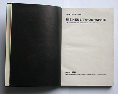
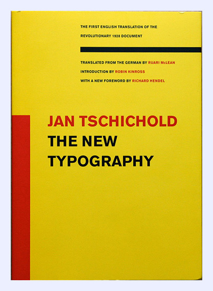
original ©1928 "Die Neue Typographie" by Jan Tschichold - first English edition "The New Typography" ©1995
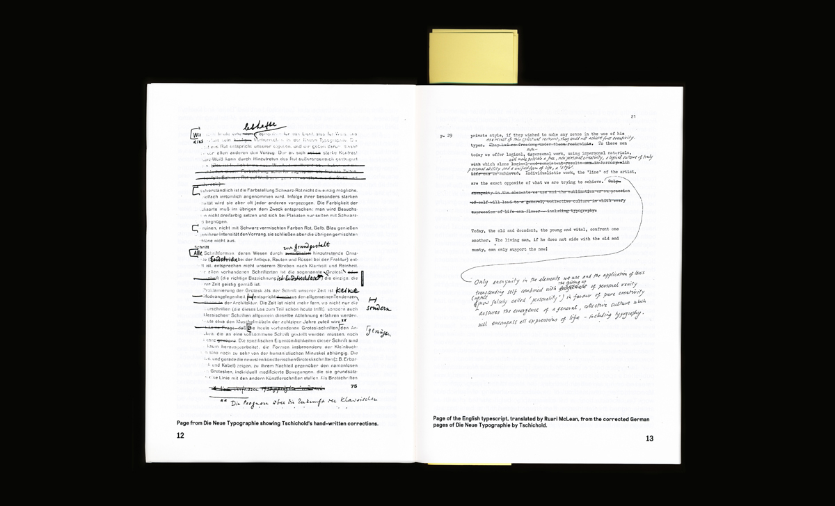
After finishing the introduction, I was curious about the revisions Tschichold made to his original text. McLean tells us in his introduction that after the death of Tschichold, in 1974, he placed the draft of his translation in the St Bride Printing Library. So, the next day I called the library. It took me some weeks, to finally get hold of the document, but these weeks gave the opportunity to research Tschichold’s personal and professional life.
Tschichold transmogrified from a traditional, German trained typographer, into a “true modern designer” (his own words), to finally reform back into his old working method, a classical and traditional approach to typography. Over time, he became his own frenetic antagonist, with Die Neue Typographie in the center.
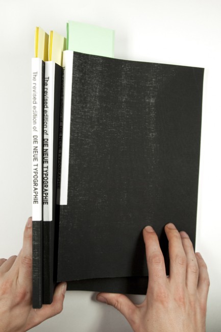
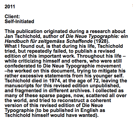
What I found out, is that Tschichold during his life, tried, but repeatedly failed, to publish a revised edition of Die Neue Typographie. Throughout his life – while criticizing himself and others, who were still confederated to Die Neue Typographie movement – he worked on this document, trying to mitigate his rather excessive statements from his younger self. This revised edition of Tschichold was now fragmented in different archives. As an archaeologist I started to recollected these sparse pages and revisions by Tschichold, and incorporated all my findings into a version, as coherent as possible.
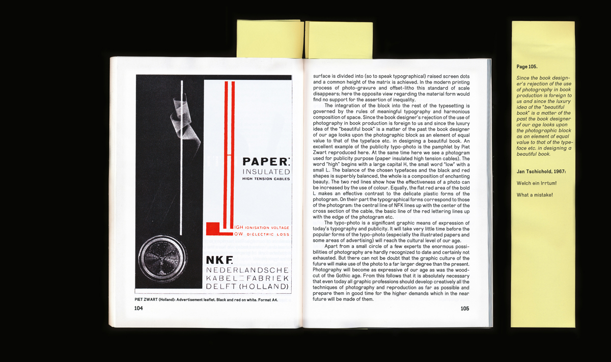
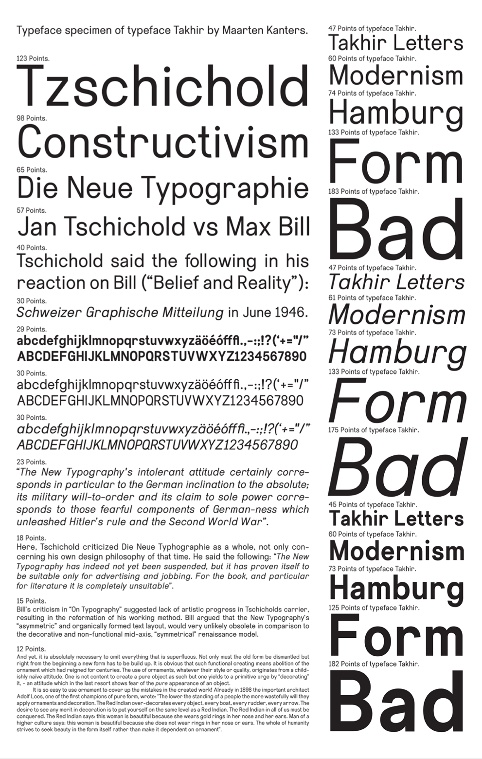
While working out the manuscripts by Tschichold, I tried to find out in what physical form, Tschichold wanted to present his revised edition. In correspondence with Piet Zwart, he speaks about presenting it in A4 format, a format he later labeled as: “devils format”. Die Neue Typographie was set in either Aurora Grotesk, or Akzidenz Grotesk. The choice of typeface, was decided by practical circumstances: no other sans serif font was available in an amount large enough, to set a whole book. I took this opportunity to design my own sans serif font, called Takhir. The shapes of Takhir were drawn, to tell a story about Modernism. But, it is too bumptious to appear, as pure, as Modernism would have wanted it to be.
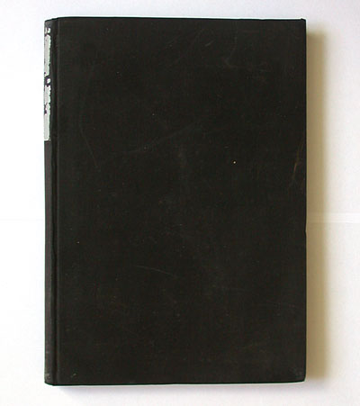
This whole project resulted in the revised edition of Die Neue Typographie, containing all the revisions I collected in my research. The publication is introduced by a foreword, that I wrote as my thesis [presented as pdf at the end of this post], in which I present the historical background of Die Neue Typographie movement, and the publication by the same name. Beside all the revisions Tschichold made to his text, he made a number of personal comments, which reflected or criticized the content. The combination of these two, are really important for me, because it shows Tschichold’s difficult relationship to Die Neue Typographie. In one hand he rewrites its whole content, but he no longer agrees with its tenor. In the final publication, these personal comments are presented on errata’s, placed on the corresponding page of the content.
The whole publication is set in the typeface Takhir, which was finally created in two weights, both with Italics. Printed digitally in an edition of 50 copies 157 pages on 110 grams silk machine coated paper with a silkscreened cover, for sale at San Serriffe Bookstore [x].
text by Maarten Kanters [graduate student department of Graphic Design 2011] : more www.mrtnkntrs.nl


