This is a book I choose from the library.
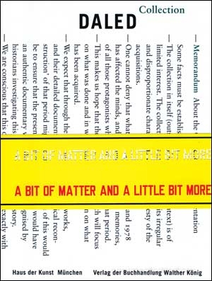
I find books very beautiful, both as reading material, but also simply as design objects. What got my attention when I chose this book is the very noticeable yellow paper band around it, with a line of cut out text over it. This creates two overlapping layers of text, which I find an intriguing choice both because of the unusual amount of text appearing on the cover and because of the confusing effect it generates.
Anyway, the book itself is actually simply a catalogue, yes, nicely organised and curated, but still just a very simple catalogue like many others, illustrating an art collection and describing it’s value.
The designer is Walter Nikkels [x], a rather well known dutch typographer based in Dordrecht. He had a very broad career, even winning two prizes for his work as a designer. He curated many books and catalogues, worked as a graphic designer for Stedelijk museum, but also curated several exhibitions and did the interiors for Museum Kurhaus Kleve.[x]
As I was researching him, I found that in 2013 he published a book called “Walter Nikkels: Typography: Depicted [x]” written and designed in collaboration with graphic designer Wigger Bierma, who actually taught at Rietveld until a few years ago. It is a chronological survey of Nikkels’ work trough images, a sort of dictionary of his visual voice.
Graphic design is a language that uses elements like typography, colour, composition and paper kind, to communicate information visually.
Each graphic designer develops a style during their career, and in a way, it becomes a personal voice. Sure, it’s usually very much related to the aesthetics of the historical context the designer is working in, there will always be a ruling combination of colours or the particularly popular font of the moment, but I think what makes a very good graphic designer, is the ability to develop a personality that makes his work recognisable and unique, but without becoming overly repetitive (and therefore boring).
Walter Nikkels worked mainly on museum catalogues, it’s very important to him for the content of the books to be neat and legible to the reader. In the Daled collection catalogue I borrowed from the library his attention to the balance and to highlighting the value of each image and art piece featured in the book is particularly evident.
He treats graphic design like architecture, the page like a vast blank space where elements are organised to give meaning and importance to the content, like art pieces in a museum. There is a great sense of rhythm in his work, and a great sense of silence, reached through colour, composition and most importantly, typography combinations.
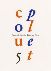
“Couplet 5” Invitation card design (for Stedelijk museum 1995)
Vertical composition – The word couplet is divided in its two syllabs (cou – plet) written on two separate but parallel columns. Number 5 appears in the first one to balance the symmetry, maybe confusing the reader at first, but “couplet” is written in blue and orange letters (in contrast to the black number) guiding the reader’s eyes through the word.
Interesting in particular, even though hardly noticeable, is the difference in typography between the columns, the first one bearing text in regular style, as a pose to the second one in italic.
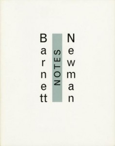
Catalog “Barnett Newman Notes” 1993
Use of vertical composition appears again – and, again, a peculiar orientation of text – to make a separation between the name of the artist ( Barnett Newman) and the book content (notes), while keeping the two together in the same composition.
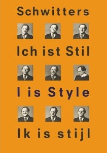
“Ich ist Silent” catalog, 2000
Once again a very simple, regular, geometric composition – Once again the variation of typography (in this case spacing between characters and size) to maintain a certain composition
It’s a form of graphic design that may not appear as very creative, in the sense that it’s mainly driven by practical purpose of clarity. I mean, there are many ways of treating the content of a book by making it more playful, while still keeping it very easily understandable.
Nikkels’ style definitely belongs to a more traditional kind of graphic design, focused on the meticulous search for the right balance in elements such as: the dialogue between text and image, the overlapping of different layers of text (like, as I mentioned before, on the cover of the Daled collection book), the choice of typos combinations and colours, the relevance of the background, composition, spacing, size, proportion and more.
However I think one defines balance for him/her self.
I mean, of course there are composition rules that one can’t ignore because they are shaped on the way we process visual input by nature, but balance doesn’t necessarily mean neat, and this took me a while to understand and accept.
I always just assumed that Walter Nikkels’ way, was the only way, because it makes sense, but I figured, it just really depends on one’s purpose at the end of the day.
By understanding balance and the rules of composition a graphic designer develops a “handwriting”. Manipulating and experimenting with the possibilities they offer, just like pretty much everything the art world. And this also made me think of the fine line there is between art and design. How personal can graphic design become before it is considered a form of expressive art?
But –
maybe it doesn’t make sense to separate the two anyway.
Everyone has an innate individual way of visualising words on paper. It’s in the way one writes notes or thoughts on a sketchbook, even. We are naturally inclined to express ourselves visually and this visual language is universally understandable no matter how personal it is. Graphic designers communicate information, as well as expressing themselves through their work.
And even Walter Nikkels. He filled a whole book depicting his graphic vocabulary, maybe a bit cold and hardly “expressive” in the strict sense of the word, but his style still features elements reflecting his individual personality, otherwise he wouldn’t have had a point in making the book in the first place.
Daled : a bit of matter and a little bit more : the collection and archives of Herman and Nicole Daled, 1966-1978. /Rietveld library catalogue no : 700.5 dal 1
Walter Nikkels Depicted /Rietveld library catalogue no : 757.3 nik 1