The Sun and The YPP3

An issue of the Sun, or any other tabloid newspaper, is designed to grab your attention, and to stand out on shelves filled with newspapers and magazines. The tabloid newspaper uses bright colors, large bold typography, and shocking headlines next to eye-catching suggestive photos. The cover of the YellowPress periodical #3 does not share many of these features, and it does not use any of these visual tools in the same way, but the publication’s bright red cover with it’s abstract black shapes still managed to grab my attention. Sitting on the shelf in the library it was the first item that caught my eye, and it intrigued me enough to pick it up and have a further look.
The name YellowPress refers to yellow journalism or yellow press, a term used to describe what is more commonly known as tabloid or sensationalist newspapers, publications that focus on the amount of newspapers it can sell and not on actual journalism. The type of newspapers that will annoy you when you unintentionally encounter them in a shop or on a table in the hospital waiting room. Cheap, unprofessional and frequently unethical printed content. The YellowPress periodical is by contrast a publication platform for artistic research, based in the St Lucas School of arts in Antwerp, where the designer of the book (periodical) also teaches. The name is an allusion to this trivial form of journalism, that graphic designer Ward Heirwegh also refers to in the design of the publication.

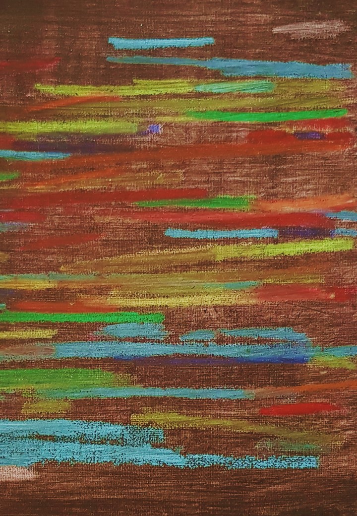
When it comes to the front page, the only immediately recognizable feature shared by a tabloid newspaper and the YellowPress periodical #3 is the use of color. The use of red on the cover could be a reference to tabloid newspapers, as their titles are often surrounded by the vibrant color known to evoke emotion. The red on the dust jacket has an eye-grabbing effect, but it’s also used inside the book with one full red page introducing each of the four chapters. On the lightweight almost newspaper–thin pages the color has a different effect. The reflection of the full red pages on the white paper create the illusion that some pages are pink and the back of the red printed page appear to have a light pink tint. The last chapter of the book enhances this confusion by altering between red, pink and black text. The overall effect this has on the book is a soft glow of light red and pink throughout, creating continuous variation through an indirect use of the colors.
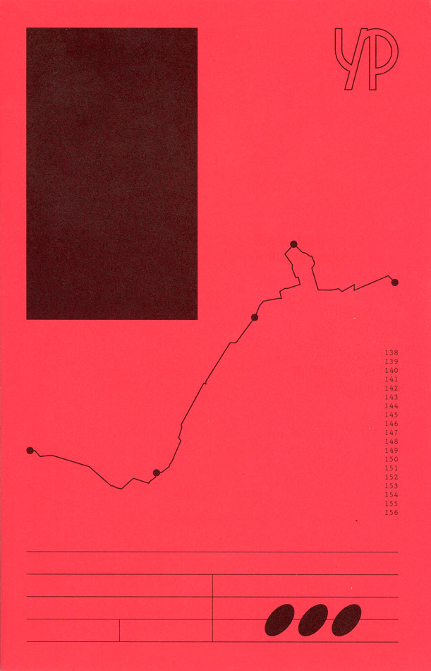
The bright red dust jacket embracing the white cover of the book features the YellowPress Periodical logo – an outline of the letters “YP” – as well as four elements referencing the content of the book. A black rectangle, a line with black dots reminiscent of a map drawing, a row of three digit numbers, and a set of horizontal and vertical lines with one line covered in three black ovals make up the design of the front cover. The graphic elements are distinctively individual, but they also work together as one illustration due to their differences in form and their similarity in color. Already on the cover a play between the content and design becomes apparent, and shows that this is an unusual book with a very specific design language. Ward Heirwegh (the designer) mainly works within the cultural and creative field, and besides teaching graphic design conducts research into alternative means of distributing information (and takes photos of his work on wooden floors).
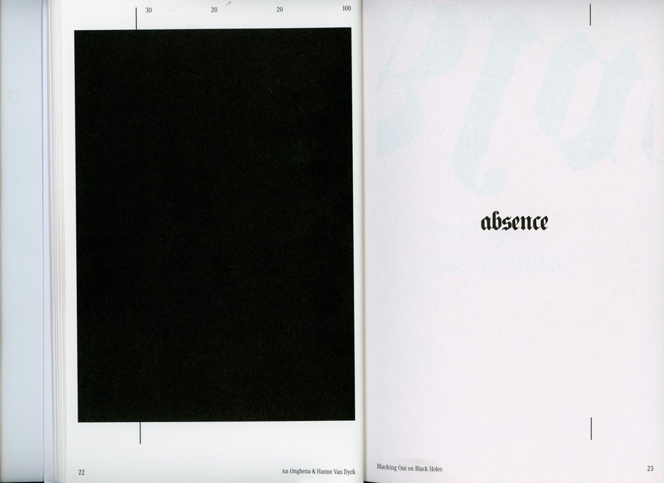
The shapes are in fact abstractions of the issue’s contents. And they are all repeated continuously throughout their respective chapters. Calling the divisions in content “chapters” is perhaps not accurate enough as the YellowPress is a non-hierarchical publication where the contents are not arranged after importance or in the same way chapters would be arranged in a conventional publication, or how content is categorized in a tabloid newspaper. The black squares referenced on the cover are featured alongside typography pages that are an addition to first text, both by artists An Onghena and Hanne Van Dyck.
The use of graphic artworks is a major contrast to the tabloid newspapers use of offensive caricature drawings, but on a stripped down level they are in both cases illustrations supporting the written content. The black vertical line featured on the back cover under the dust jacket marks the margin for the pages, and is present throughout the book either alongside text or behind illustrations. It’s even there when it isn’t, as the text follows the same margin even when the line is not printed. In the second chapter the vertical line is replaced by a horizontal one, that separates text from illustration or other text.
The layout is so far removed from the commercially driven newspaper layout that attempting to compare the two does not make a lot of sense. The same can be said of the design and the content of this magazine, so integrated that I’m hesitant to describe them as singular elements. The experimental nature of the design and the publication itself is pushing boundaries and exploring the limits of publication design. The challenge of integrating artworks, texts and illustrations from different contributors has been solved in such a way that the design becomes the content.
Elements like the vertical line are one of many elements that are played with, and this playfulness of the design is probably the most attractive element to me. The book constantly presents rules and systems that it, after establishing them, chooses to go beyond or disregard. A sense of humor is present in the references to yellow press for instance in the use of a serious and not so modern looking typeface or in the ironic nature of the publications name, when the YellowPress’ content is so far removed from that of the yellow press. While tabloid newspapers today are a major contributor to an unstable political situation, the YellowPress is a tool for academics and artistic researchers to inform and educate their readers. The YellowPress Periodical #3 uses some of the same tools as a yellow press newspaper, but by altering their intention – using them to inform and not to sell, to educate and not to frighten – the visual language changes from noisy and disturbing to something beautiful.
The YellowPress Periodical #3, designer: Ward Heirwegh, Rietveld Library Cat. no: magazine