When we read, our eyes do not move left to right in straight steady lines; the eye goes back and forth. The movement is a combination of small rapid jerky movements, saccades and fixations, where our eyes actually stop.
When we read a text, our eyes do not move in a straight line across the page. They make skips from words to words call saccades. They also skip words, repeat words, and fixate on words.
In the image, the dots show the fixations.
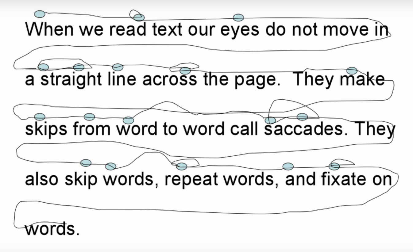
The brain creates the illusion of smooth line and that we read every word. But the eyes fixates on only about 60% of the words we read. The eye will fixate on the less familiar words. The brain will complete, fill in the blanks.
The are three regions of perception:
-
the Foveal region takes up only 1 to 2% of your total vision, which is around 3 to 6 letters we can see very clear;
-
the Parafoveal region is around 24 to 30 letters which are not perceived very clearly;
-
the Peripheral region is everything else we perceive, such as gross shapes.
The page, the screen where the letters are written on, give us a frame in which our eye will stay in during the reading process. But what happens when this frame disappears?
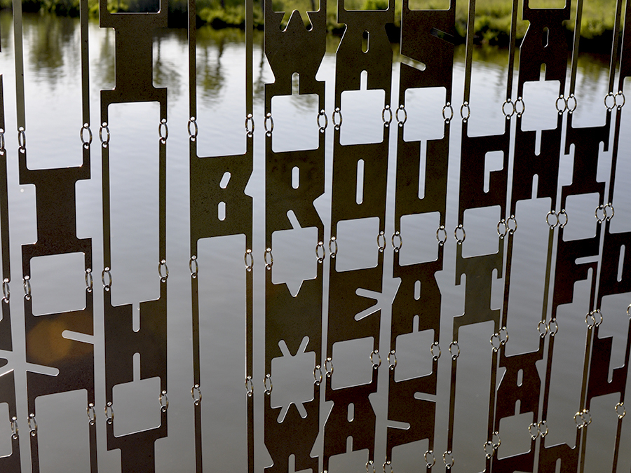
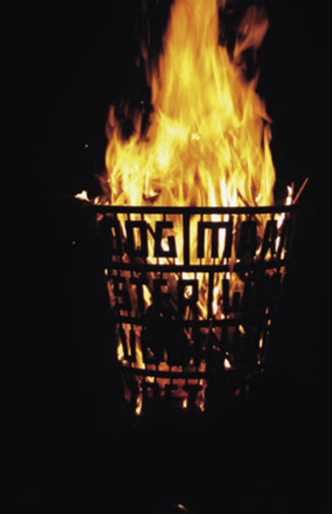
Arktype Curtain and "Fire Basket"by René Knip
René Knip challenges this idea with his Curtain Arktype typeface. This typeface is meant to be hung up in a space. It is taken out of the paper into a 3D world even though the typeface itself stays flat. The work balances between the 2 and 3 dimensional. One could call it 2,5 dimensional. The white negative space of the paper around the letters does not apply to this typeface anymore, as so is the frame given by the paper or screen in which a text is normally written on/in. The negative space is the breathing room around the subject that determines how appealing it looks.
Now that it is hung in the air, you will have to determine the frame. You will perceive the surrounding and the text as a whole. The eye will change the way how it is perceiving the text. This is also due to the fact that the letters are connected vertically even though the words are placed horizontally, still, this will guide your eye in a different way.
An interesting thing happens to the text that has now lost it frame. It is no longer just the text that creates the visual narrative, since the text is immediately influenced by its surroundings. The two are inseparable. The Curtain Arktype makes the viewer experience reading of text in a different way. As said before, the eye does not pay equal attention to every part of a text or every letter. The eyes move around, locating interesting parts of a scene.
When reading a text created with René Knip’s 3D typeface, there is almost too much for the eye to focus on. The eyes of the beholder make jerky saccadic movements from the text to the background, finding interesting parts everywhere. The words become truly visual, where meaning is created not only by the meaning of the text, but also by their sight. Furthermore, negative space has become positive, as it has become defining creator of context.
The text and the surroundings become equally important and following that you will look to it more as a composition between the text and space. Your eye movement will be guided by the shapes around it, an eye movement which is closer to one looking at a painting, sculpture rather than one reading words.