
Feeling over-saturated by images is something that everyone seems to experience and acknowledge but few choose to address. When being confronted with a new image, it is difficult to distinguish how it strikes you inside, if it strikes you at all. Having the access to infinite images and being used to face images you didn’t even agree to see, as well as having to process so many images daily is a process that eventually numbs one’s sense of perception. Over-stimulation leading to a loss of sensibility and impressionability. Extreme images of war or violence are perceived to have the same “weight” as an image of something mundane. Through images, we have had the opportunity to see nearly everything you can imagine. It seems the numbness and muted responses to visual stimuli developed as a coping mechanism to protect oneself from images. People are naturally impressionable and receptive to visual stimuli that can trigger emotions or actions. On a primal level, that is how we understand our surroundings. We are faced with events or visual qualities that we react to — this nearly automatic and intuitive reaction then enables one to better understand their surroundings and how to navigate them.

A world over-saturated by images makes seeing no longer important when everything has been seen. It turns blind those who could previously see. It’s a paradox that as we have gotten increasingly desensitized, our society still revolves around the act of seeing and considers sight to be the most important sense, creating a hierarchy of senses where seeing is the most valued. Images depicting a drastic range of content all have a different weight, depending on the relevance/extremity of the content. This glitch in perception is specifically enforced by images because of their two dimensionality. This quality allows them to be endlessly distributed and circulated, especially on the internet where it is free to do so. Digital images circulate extremely quickly and reach a much broader audience than printed ones do, and it seems this coping mechanism of numbness developed as a reaction to our increased use of technology. On a screen, you can scroll and encounter hundreds of images in close proximity to each other in a matter of minutes. The over-abundance and unlimited access to endless images lowers the value of each image. No image is truly valuable anymore because there are too many, one cannot give undivided attention to every single image they encounter, nor do they want to because everything has already been seen, and it feels that nothing is ever “new” or exciting. Images become interchangeable and meaningless, everything becomes everything, anything can be anything.

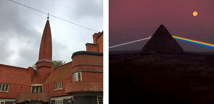
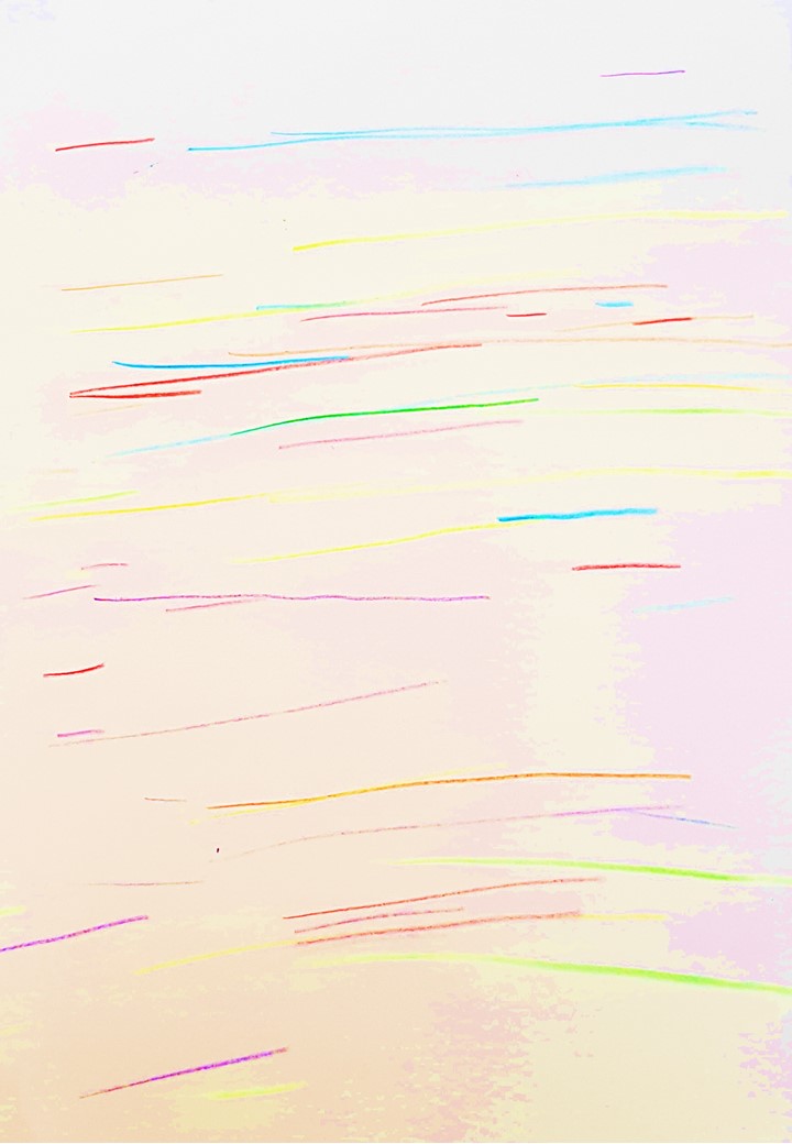
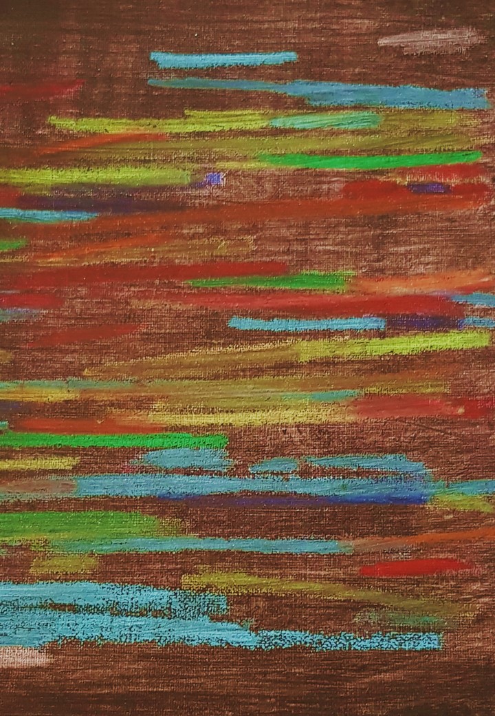
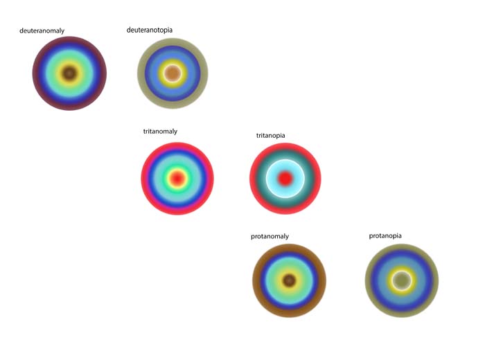
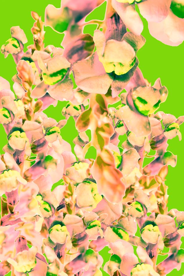
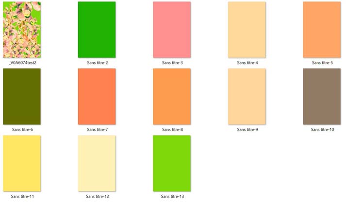
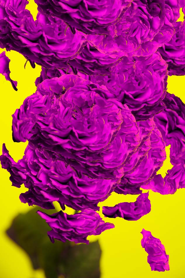
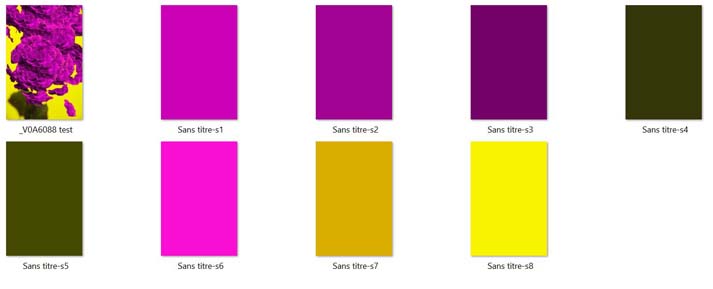
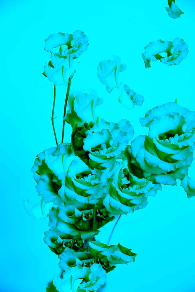
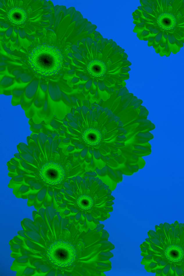
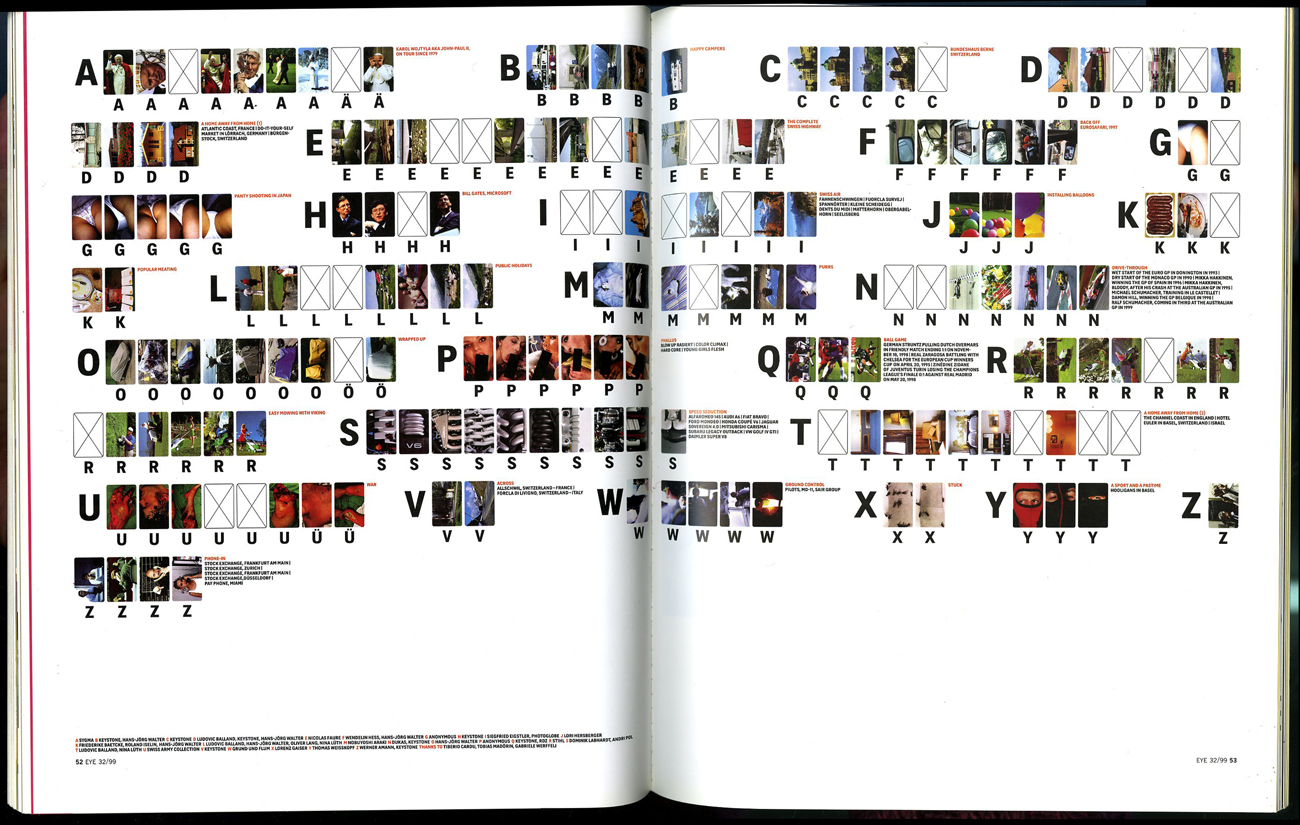
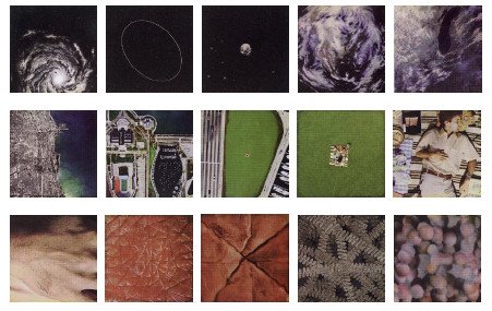
A single image, when payed attention to, conveys countless narratives and meanings and is open to a range of interpretations depending on who the viewer is, but with the notion of over-saturation, paying attention to and absorbing the meaning of a single independent image shows itself to be quite a task. When viewed in relation to another image, one that in one way or another conjures a similar feeling, visuality, or dialogue, the context and content of each extend out of the individual image and create a wider dialogue, one that makes underlying connections and systems of universality more apparent. When images are visually similar in terms of form, arrangement, and color, even if the literal content or subject is completely different, the viewer recognizes some form of universality and interchangeability. Even when visual similarities are not present, it is always possible to form connections and new understandings through their juxtaposition. It does reinforce the idea that everything is everything, and anything can be anything, and that no content is absolute or meaningful on it’s own, but when paired with a single other image, I recognize it to be relevant to enhance a deeper understanding of certain content, and it plays exactly in the terms of what I was pointing out earlier, meaninglessness and loss of attention and value. The viewer then has two points of reference, contrasting histories and content, which I believe stimulates them to realize that indeed, images are communicative tools, but they can only fully realize that potential when they are in relation to one another. In daily life, nothing is seen or experienced singularly in isolation from other things. Perception and understanding results from an interconnected processing of stimuli through a web of the physical senses, one sense and stimuli feeds the other and together, things can be understood.

When I began to write this short essay, I had a critical view of our desensitization to content, and I still do, but as I wrote this I began to realize that we do indeed understand and perceive through inter-relation of content. We cannot prevent being constantly bombarded by images in daily life, as well as on the internet — it is no surprise that we have developed “coping” mechanisms to prevent ourselves from being completely overwhelmed by external influences. Instead of surrendering to this inevitable numbness and passively allowing these coping mechanisms to grow, one could slightly redefine the act of seeing and perceiving images by paying attention to the connections that can be made between all images. As I paired images to highlight the interconnection, universality, and interchangeability of everything, I was astounded by how no matter how slight a similarity or link between two images is, it is possible to see underlying systems of life and matter — which we consistently deny…
lost
coin
ideogram
engraved
deep
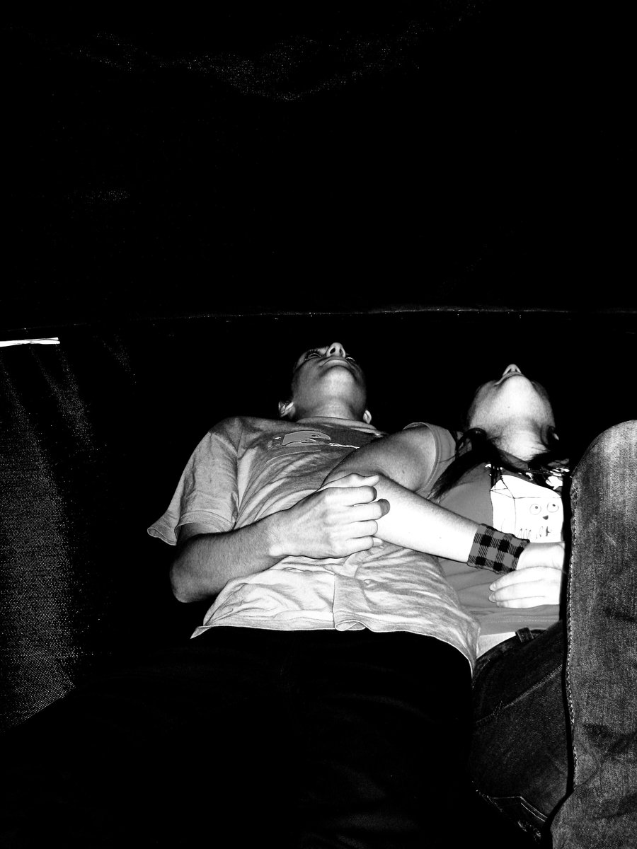
intimate
threesome
magnet
ashes
lay
play
chaos
eradicate
thrill
seems
mask
presence
nothing
whisper
hiding
transparent
dizzy
image
smog
antagonist
cry
precede
beat
emergence
swallow
moon
side
calm
reject
shocking
abject
wall
ballad
amateur
ill
why

why?


