during a 3 hour bycicle tour two parallel architectural movements from the early twentieth [The Amsterdam School and De Stijl] were highlighted


stadionkade - stadionplein - stadionweg


cliostraat - olypiaplein - valeriusplein - koninginneweg


amstelveenseweg - surinameplein - hoofdweg - mercatorplein - jan evertsenstraat


frederik hendrikstraat - nassaukade - spaarndammerbuurt


hembrugstraat - zaanstraat - haarlemmerplein - haarlemmerdijk


haarlemmerstraat - prins hendrikkade - damrak - prins hendrikkade


geldersekade - oudezijds voorburgwal - rokin


muntplein - vijzelstraat


a week later we completed the tour –started at "The Rietveld Academie"– by visiting the ultimate architectural "de Stijl" statement "Rietveld Schröder House" Utrecht
"De Bazel" Tag
Twisting: from “the Stijl” to “the Amsterdam School” by bicycle
Thursday, November 17, 2011
DeBazel
Thursday, May 19, 2011
On Chaos, Fine Matter & The Immaterial.

From a Theosophical point of view, the whole body of the Stadsarchief Amsterdam represents the three basic evolutional stages; chaos, fine matter and the immaterial. The dark, syenite foundation of the building signifies the lowest level of cosmic evolution from which all forms emerge. From the solid base rises the concrete skeleton hidden by the façade of interlaced yellow bricks and purple granite. To the Theosophist yellow is equal to gold and represents the sun and male cosmic power, the purple symbolizes the moon and female cosmic power. In this sense the façade realizes one of the most important principles in H.P. Blavatsky’s (founder of Theosophy and the Theosophical Society) work The Secret Doctrine; the cosmic creation rising out of the chaos. This is called the fine matter or Svabhavat. Finally the massive glass roof that rest on top of the building, letting the light reach all the way down to the central court embodies the spirit or the immaterial. The immaterial is the highest level of cosmic evolution and brings everything to life through astral light (imagine all the employees working on the ground floor of the building still being able to get a glimpse of sunlight). This brick spekkoek is not just a fireproof vault; it is the manifestation of cosmic evolution.
[by Olga Nordwall]
Light in ‘De Bazel’
Bazel’s unique architectural form was greatly influenced by the American architect Frank Lloyd Wright as it conveys a feeling of harmony and balance, with hidden religious influences in its simple organic form de Basel achieved to combine modern architectural ideas with ancient archetypes.
The glass ceiling of the building creates a sense of transparency as it leaves space for an everlasting game between light and darkness to be played within its chambers. In de Bazel sky is the lightest element of the building nearly unreachable source of luminosity then you have the last floors escalating like Japanese rice fields, 3 floors down , allowing thin air occupy most of the space in between. As you go down its round stairs the light becomes dimmer due to the stained glass that covers the windows, leading to the basement of the building where light slightly becomes less and less as you go further down, until the only source of light is artificial, asphyxiatin (being smothered) between the close walls of the basement, the spaces become smaller and the air thicker.
From the outside de Bazel seems like a close fortress contrasting with the true inner nature of the building, containing hidden beauties and mysterious qualities, stands and talks for itself as the great architectural piece that it is.
[by .............]
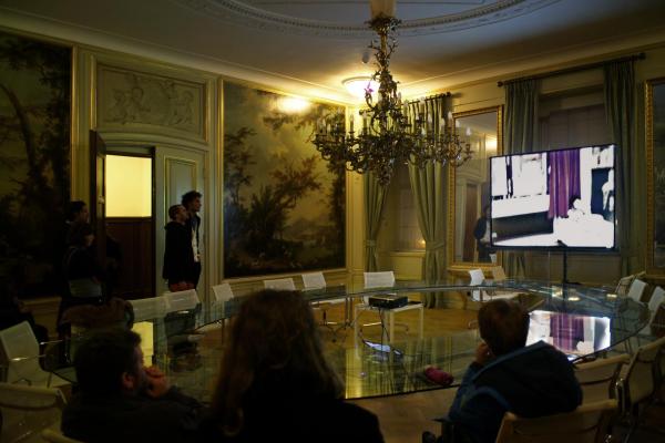
Checkout that amazing table.
I wanted to write you something about the amazing table in the Italian room/italiaanse zaal in de Bazel but I could not find any information about it from the internet and I missed the name of the designer, help me out please!
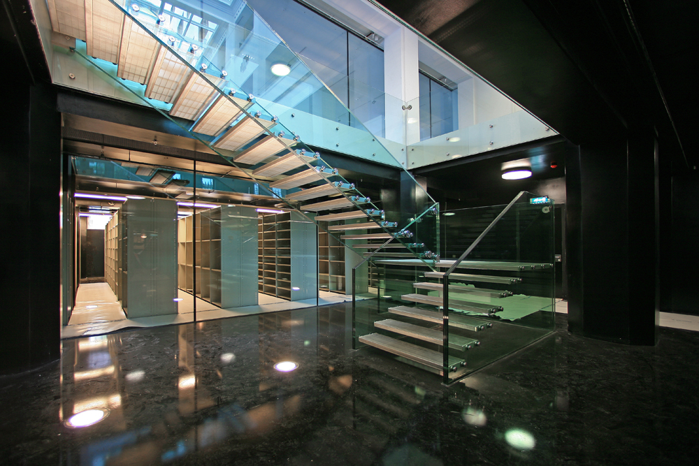
I think the contrast of something so modern with the rest of the room (18th century style Italian landscape murals) is a very cool effect. Since the weird Italian room quite stands out from the whole building and it’s style, placing such a minimal design table there was a brilliant move who ever then did it in the later years. I also had to think about a connection to the glass stairs (by Claus & Kaan) down to the archive that the guide was so enthusiastic about.
[by Katja Hannula]
Amsterdam City archives
Amsterdam City Archives was first built to be used as a bank, and it was not until 2007 that the purpose of the building changed to host the city’s archives.

The building was designed in 1919 by de Bazel and was finished at 1926, three years after de Bazel’s sudden death.

Its unique architectural form was greatly influenced by the American architect Frank Lloyd Wright as it conveys a feeling of harmony and balance, with hidden religious influences in its simple organic form de Basel achieved to combine modern architectural ideas with ancient archetypes.

The glass ceiling of the building creates a sense of transparency as it leaves space for an everlasting game between light and darkness to be played within its chambers, the glass ceiling also supports the contrast between the inside-outside impression since when you look at the building from the outside it gives the feeling of claustrophobic space but in contrary to its illusive form when you enter the space a feel like you re in the middle of an open space.

The building was officially declared as a national monument in 1991 for its distinctive formal values by the Dutch government.
[by Clair Bamplekou]
Balanced architecture
Amsterdam Archive building. A creation of Dutch architect Karel de Bazel in which each and every measurement and size are dedicated to the proportions of the human body. However the architectural tradition which seems quite unique for that period, takes its roots back in the ancient times…
The philosophical approach, formulated in 5th century BC by the Greek philosopher Pytagoras, stating that “Man is the measure of all things”, was further developed by the Roman architect and theorist Vitruvius, who created a famous code of human proportions, describing how a well-built man fits with extended arms and legs into the most perfect geometrical figures (circle and square), which was supposed to be the basis of temples and churches of those times to be able to give a person a feeling of balanced architecture.
This principle greatly inspired Leonardo da Vinci, who in the 15th century made a famous drawing of a vitruvian man as an attempt to relate human body to nature and architecture, as well as trying to define the ideal Renaissance church.
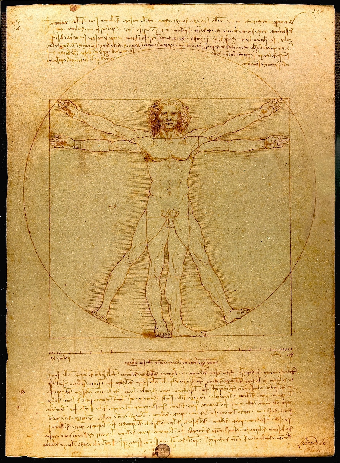

At the beginning of the 20th century, continuing the research of da Vinci, Le Corbusier created his modular, an anthropometric scale of proportions, based on the height of man with his arm raised as an attempt to discover mathematical proportions in the human body and then to use that knowledge to improve both the appearance and function of architecture.
In his own way, based on theosophical approach, de Bazel also set out in search of universal harmony and balance for his work on the Archive building. In the lay-out of the building he used a raster of rectangular’s of 3,2×3,6 meters, in other words 8/9×9/9, which reflect the proportions of the human body with and without head. A result of it – a building, which feels comfortable, inviting and truly made for a human-being!
[by Anastasia Starostenko]
personal architecture
What is fancy about building De Bazel designed by Karel De Bazel is the whole ideology he put into forms, patterns, outlays and finally the facade of the whole construction. He believed in harmony and balance in life so its projects, expressed his personal feelings and confessions. Noticeable is how every detail has been refined and his travels to Indonesia rebounded imprint on the inside of this building here. I liked the idea concerning the architecture as a bridge between cultures, beliefs. Coming into the building, despite not knowing the architect's plan was to feel the atmosphere of stability and peace. It seems to me that you have to have an amazing sense of form to achieve this effect. It is almost like being a good psychologist. Because of the openness of architect’s mind the building he constructed could be very easily called a place of a surprise and admiration but also curiosity. Indeed, when you keep moving between the rooms, halls, you almost get an impression that you are in a museum. The idea to place the archive there is the more accurate and suits his concept better than it did for the bank that was originally there, I guess.
[by Agnieszka Zimolag]
Bazel Civilization

The Bazel is not only a building, but also furniture! I had been visiting the Bazel before, but this time the guide was putting a particular accent for the furniture “designed by De Bazel”. Not only tables and chairs, but also coffee cups, inkwells, the colors of the walls. Everything inside the building was made on purpose to fit in the building and consequently I imagine the people looking like the building too! I personally find really contemporary the idea of making such big project and follow it from the beginning until every final detail (or almost, because Karel de Bazel was dead in 1923, just before finishing the project). A “total” architecture that keeps together the whole environment inside it. It makes me imagine at the creation of a new civilization where all the tools are thought in a way that consequences and growth are predictable. It sounds science fiction, but it’s what happen when design is perfectly designed. In the Bazel furniture, colors and objects have differences depending on the level of importance of the person they were made for. Most of the differences are details that say “we are almost the same, but my chair has a more comfortable seat” or “my table is bigger”. That’s why the hierarchic system of the bank, De Bazel designe, required respect and strict definition of roles. This is not difficult to understand for that time (early ’20s), but weird to realize in the proud voice of the giude talking about “the desk set for the president manager, a bit more black of the others desk sets, designed BY DE BAZEL”.
[by Sara Cattin]
De Bazel
Vijzelstraat number 32. the front of this huge building is covered completley with construction frames. Workers are shouting.
Karel de bazel is responsible for this.
Enter the 1920s. Look at this beautful wooden floor! Elegant white. Sunflooded. A sealing out of glass.
„karel did this all by himself!“ i love our guide, she fits the building.
Shocking from the outside and so sensible from the inside, like everything in this cityarchive; the cellar, massiv tresor doors.
Esotherik painted sealing.
„ de bazel designd everything in here, thats a gesamtkunstwerk!“ „ de bazel designd everything in here, thats a gesamtkunstwerk!“ i love our guide.
But she loves karel.
Black marmor. Dark green walls. Thats the chef etage. Now a days you can get married here.
This going back way back into time. 1920s and stylishe lightswitches. De bazel is a craftsman he knows his bussines. This is love for the detail.
He died before the building was finished. True romance. he would be proud.
I am.
[by Martin Kaehler]
F group presents design from the core of their homes
Monday, May 26, 2008
After visiting “deBazel”, a monumental building in the center of Amsterdam holding the new city archieves, we became intrigued by the architectonic philosophies behind the construction of this colossal building. Build around 1923 it was soon called “the Temple” a common reference to its general shape. In actual fact that name was not so far from the original theosophical philosophy architect de Bazel used for the total design concept of this building. He saw not just each house, but each room as a reflection of the cosmos, every part of which must be in harmony with every other.“ (K.P.C. de Bazel – designer to the elite, written by Yvonne Brentjens). This reflects in the buildings structure aswell as the interior and artifact he designed for it. De Bazel

Enjoying a tour through the building, we started to become fascinated by the way this concept was connected to the original use as a bank office and the details in which the theosophic ideal –that everything grows from within (wall colors become lighter as they are farther from the center)– reflects the rigid bank’s hiearchy.
How does this reflects on our own living surroundings. What object represents a “centre” in our own house, who designed it and how do we reflect upon it. 21 students of the foundation Year’s F group try to answer these questions through the small postings you can read below:
more in ...... (posting 214)
Benno Premsela says: Show Yourself!
Tuesday, April 8, 2008
When you drive through the Vijzelstraat, you might have glanced in amazement at the huge block-size buiding that you pass between Keizers- and Herengracht. This building is called “De Bazel” named after the architekt K.P.C. de Bazel. It was built between 1919 and 1926 and served as headquarters of the Dutch Trading Company. Since a year it houses the new City Archive (Gemeente Archief). If you go inside you can walk through this amazing building and enjoy the detailed interior design and visit exhibits organized in the huge bank vault in the basement. more …. (posting 299)
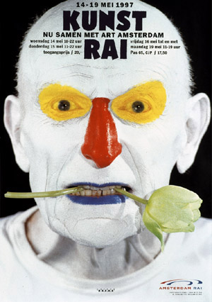 [poster by Anton Beeke
as a hommage to Premsela in the year of his death]
At this moment –until April 26th– The Gemeente Archive presents an exhibit on one of the prominent dutch designers of the 2nd half of the 20th century. Benno Premsela [1920-1997]. He was active in interiour-, and exhibition design as well as the design of shopwindows (Bijenkorf) and several interiour products. He also designed stages for the Dutch Ballet. As designer, advisor and organiser he manifrested himself in the foreground aswell as the background of the design community. Premsela was not someone to hide his private- from his professional life, which was most prominent in his manifest role in the homo emancipation movement.
The Premsela Institute is –in good dutch tradition– named after him. This institute promotes design national as wel as international. Platform 21 is is closely connected to this Institute
C group /Original, Copy or Look-Alike
Wednesday, March 26, 2008
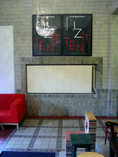
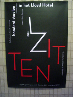
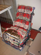
With this typical Gielijn Escher poster a wonderfull collection of 100 chairs was announced. As part of the Lloyd Hotel’s Cultural Embassy program a joint exhibitions was presented of several private chair-collections. This exhibit went beyond its boundries into the intimicy of the hotels floors, rooms and hallways, highlighting their own corporate furniture collection. Gerrit Oorthuys took the initiative of this exhibit and generously showed us around.
Coinciding with the Foundation Year’s January Project Theme “Dull”, we set out to research the origin of a few selected chairs to find out their relation to the motto: original, copy or look-alike. Erik Slothouber (participating in the exhibition with his own designs) lectured on the 2 Rietveld Academies in Amsterdam and Arnhem illustrating the complexity of the choosen motto.
(l>r: Tejo Remy/reclaiming design, Willem Rietveld’s/PYR, Ramin Visch/Eli2006)
Research material was edited down to A4 sized guided tours into selected subjects. All subjects presented in this list are also available as hard copy research prints at the ResearchFolders available at the Rietveld library.
As the two collections represent old and modern classic chairs, it gave us the opportunity to carefully select an interesting designers scala spanning the whole of twentieth century furniture design. Starting with Thonet and architect/interiour designers Mackintosh and De Bazel. Bauhaus professor architect and artist Max Bill was highlighted next to Gerrit Rietveld and the renowned interier shop Metz&Co, through which his furniture icons were often first sold. Erik Slothouber’s lecture connected the early to the late Rietveld and simultaneously presented a link to the architect/designers duo Slothouber & Graatsma. Including the company Rietveld by Rietveld constructed the ideal moebius loop in the “original versus copy” motto.
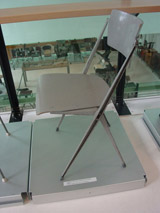
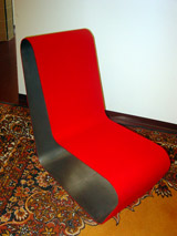
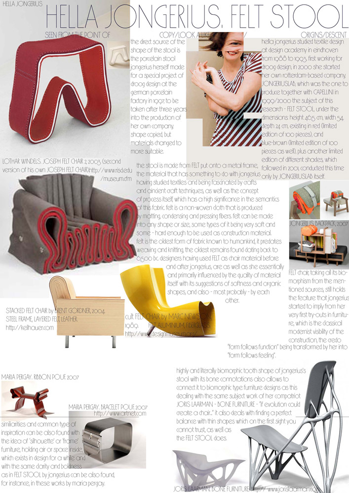
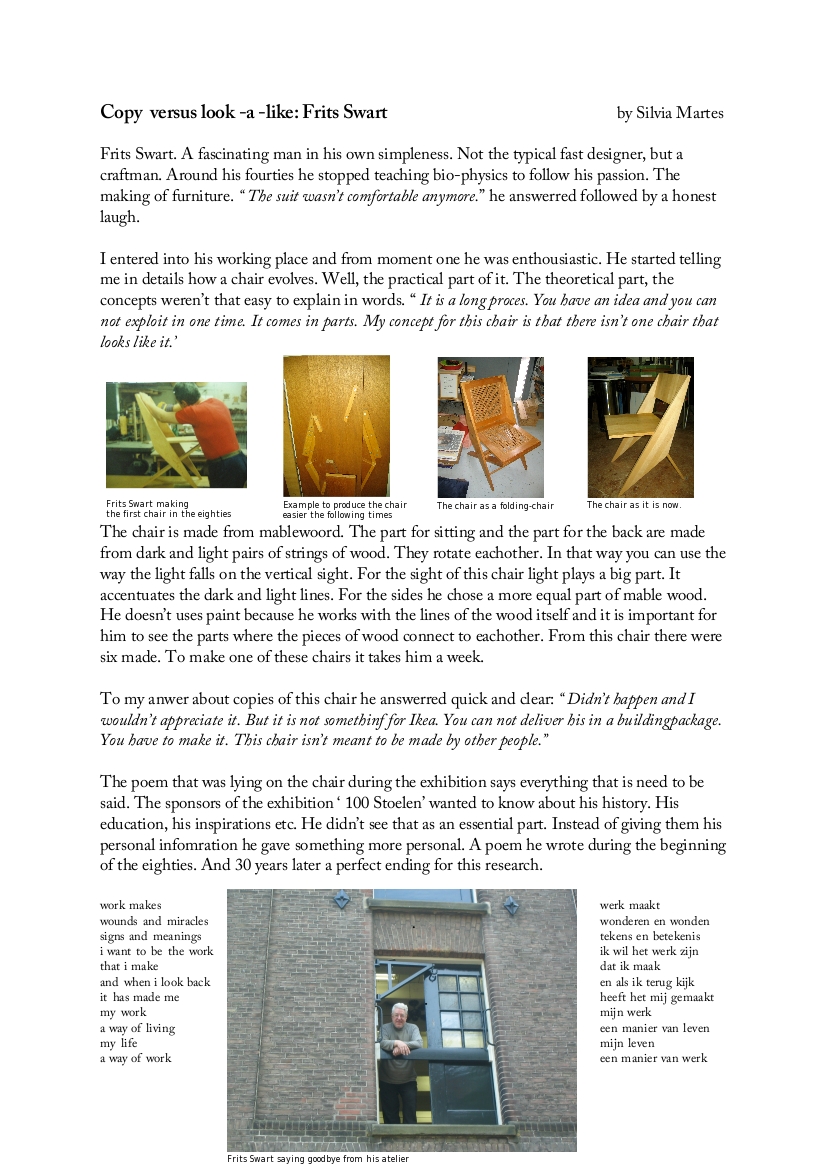
Including Charles and Ray Eames felt like a must as is Vitra for its museum’s chair collection and chair manufacturing. Don’t forget we were talking about originals versus copies versus look-alikes. The Revolt chair –present in many classrooms of our academy– introduced dutch designer Friso Kramer. Lloyds furniture collection containes many modern designer from which we selected, Tejo Remy, Piet Hein Eek, Jasper Morrisson, Hella Jongerius and Ineke Hans. Finally we added some intriguing subject we coul not resist like: an African stool, poet and craftsman Frits Swart, the poster designer Gielijn Escher and a story about the “zitzak” van Audrey Lai Ng that never saw the daylight.