Skip to Content Skip to Search Go to Top Navigation Go to Side Menu


"proun" Tag


freedom


Sunday, March 6, 2011

Being forced to see geometry everywhere and anyhow was an interesting experience at Van Abbe museum.
I feel a certain panic when I enter a museum. The urge to discover something to relate with grows bigger and bigger so then I’m obliged to think about the works surrounding me.

In my search for something familiar, I saw a black cube in one of the first rooms of this museum. I had then the curiosity to pas through a claustrophobic space to get in it. The first seconds I was feeling only disgusted by the crowded environment around me.
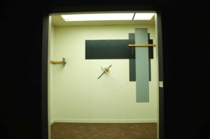
Proun was presented in this black cube, a black cube, that I associate with a black square so, of course, with political suppression. I was faced with a completely contrasting but yet, perfectly compact universe. As his paintings give the viewer the space feeling, there’s no wonder he is strongly relating with the 3d world as well.

Exploring Lissitzkys well defined visual language made me think more about politics in a way or another, that may be because I feel a certain irony in some of his works.
In a time when society was build on a strictly determined target of organizing and developing masses by being as productive as possible, he was trying to spread positive and gratefulness messages in a world were starving was the main problem. That’s quite ironic.

Still, it seemed to me that Lissitsky was more preoccupied with his intention of exploring and playing with geometrical forms and symbols, rather then with this political propaganda. Lissitzkys interest in so many fields of art, like design, photography, typography and architecture it’s something to admire. That may be caused by the lack of means in expressing one idea, or maybe by his wish of being as free as possible.

His universe condensed in that black cube make me think about his freedom as an artist. His freedom and his natural speed of development that was trying to run away from art propaganda and was expressed in the most simple and abstract way.
Proun


Wednesday, March 2, 2011

De gehele expositie ‘monumenten voor de toekomst, El Lissitzky’  trof mij als warrig, misschien mede door het eerst kijken van het theaterstuk, waar hij aan had meegewerkt, uitgevoerd door Amerikaanse theatermakers, lang na zijn dood.
Theater is een ding, experimenteel theater een ander en een video-regristratie van  experimenteel theater nog een stap verder van mijn bed. De bedoeling van de tentoonstelling is om te laten zien hoe dynamisch Lissitzky was, zijn werk is dat ook, vaak onaf, vol ideeën over de toekomst. Maar de meeste dynamiek die ik gevonden heb, zat in het kleinste kamertje van het Van Abbe Museum, het was ook de laatste ruimte die ik nog niet gezien had. Het was een video spel, geprojecteerd op een groot scherm met een comfortabele rode tweezitsbank er tegenover. Het was het spel ‘Proun‘ van Joost van Dongen, mede geïnspireerd op Lissitzky. je was een bal die voortstoof op een buis, je kon vooruit en draaien om de buis. onderweg waren er enkel geometrische vormen die uit de weg gegaan diende te worden, er was geen boven of onder, geen einde, enkel abstractie en zeer veel dynamiek. Wat het Van Abbe probeerde te bereiken via het werk van Lissitzky, is hen gelukt via een video game. Hier raakt de expositie aan de toekomst, en aan dynamiek, de kunst kan nog veel groeien en ontdekken in de wereld van de nieuwe media. Games, web-art, conceptuele kunst op je I-phone van alles is daar mogelijk. Jammer dat hier verder geen aandacht aan is besteed in de tentoonstelling. Het doel was immers een tentoonstelling te maken die lissitzky in deze tijd plaatst. bij het spel stond ook niet van wie het was, waarom het er was of dat het er überhaupt stond. een klein gemis

interacting elements in El Lissitzky’s Proun period


Wednesday, February 10, 2010

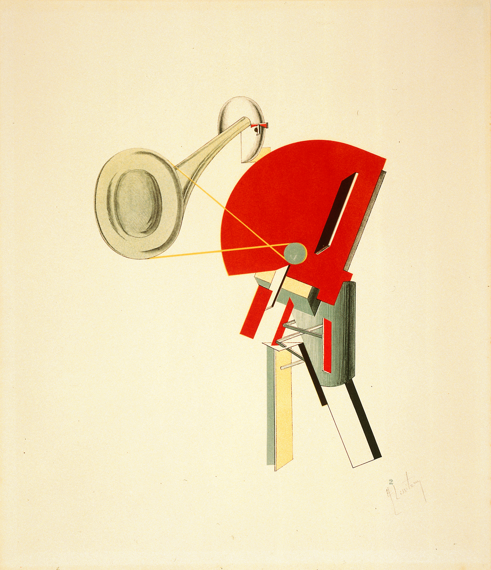
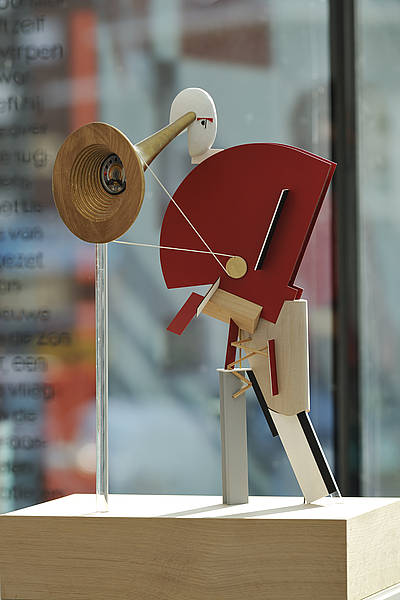
What fascinated me in the exposition is how El Lissitzky redesigned Malevich’s opera, Victory over the Sun.

Victory over the Sun was a futurist opera premiered in 1913. The costume and set design was done by the Russian artist Kazimir Malevich. The futurist opera couldn’t succeed as the suprematist techniques were pretty new. The audience reacted negatively and violently to the performance.

What happened afterwards is that following the Russian revolution, El Lissitzky worked with Malevitch for a new version of the opera as an electro-mechanical show. Lissitzky transformed Malevich’s black and red squares into figures constructed of transparent prisms and metallic rods, bending and receding in space. He created a typography specially for the libretto. Most importantly, he transformed the old costumes into new robotic figurines/figures.

The new version of Victory over the Sun was closer to El Lissitzky’s Proun principles, where his work was more focused on the interaction of his architectural, graphic and typographic experiments, transforming sounds to architecture, words to costumes, or drawings to characters. This made me realize that he is not only a painter, but a graphic artist and an architectural designer, and a designer of furniture’s, books and posters.

This is the proof that architecture and design are not just about constructing buildings or visuals, but also about how to create a coherent whole with a story, connecting different elements like the space, decors, visuals or texts.

Then maybe design is an activity one can apply to any kind of system. Architecture is a principle for making relational systems that can improve the totality of an artwork.

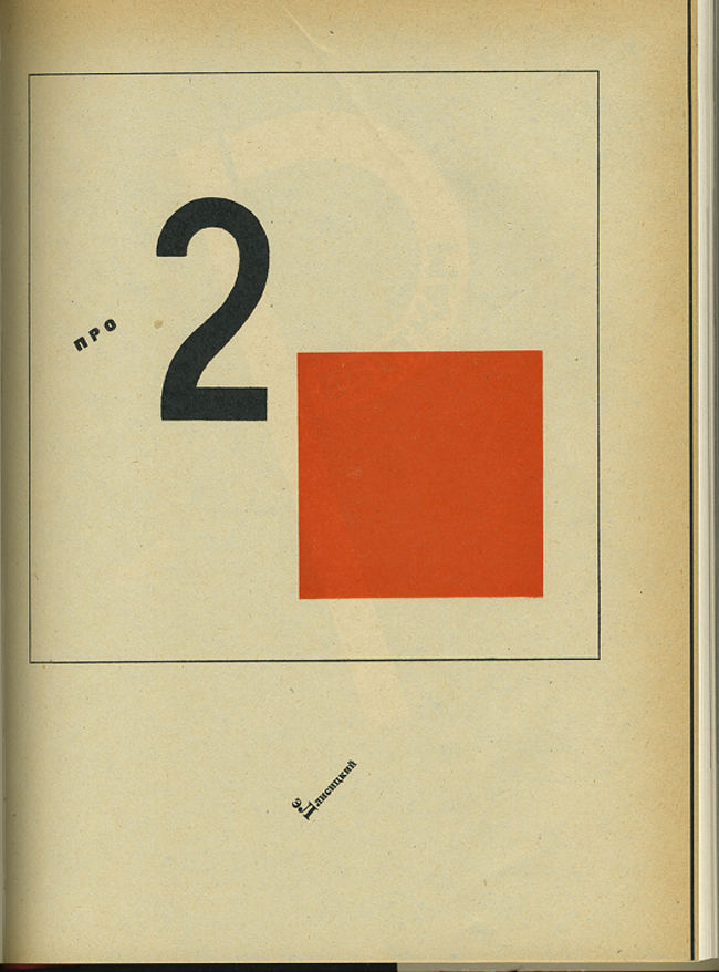
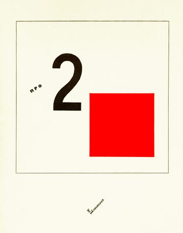
Suprematistisch verhaal over twee vierkanten in zes constructies.


Thursday, February 4, 2010

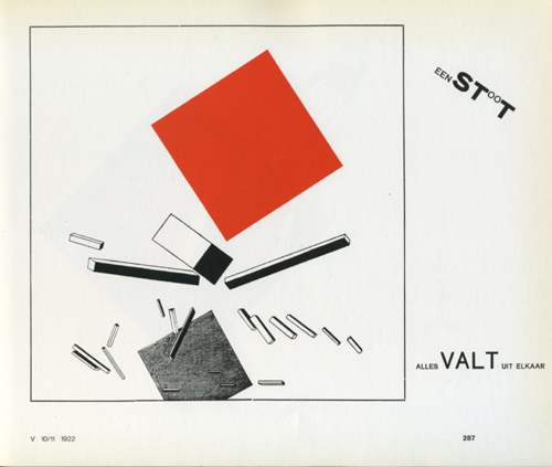
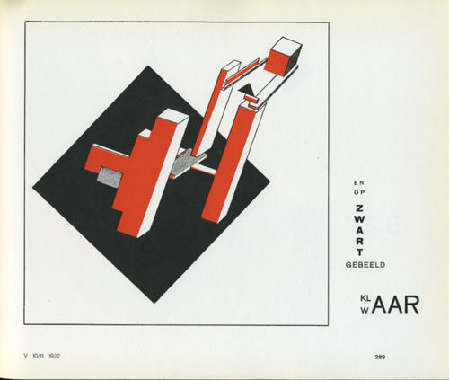
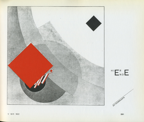
[cover] "Two Squares" / Dedication page / [page.4], from Lissitzky's "Two Squares"

Dit verhaal (1920) behoort tot de proun-serie van lissitzky.
Ik vind het een van zijn beste werken. Simpel en toch heel sterk.
In eerste instantie wist ik helemaal niet dat dit een kaft van een boek was. Een kinderboek nog wel. Over een rood en een zwart vierkant die de wereld gaan redden met behulp van een cirkel. Ze bundelen hun krachten samen om zo de chaos te vernietigen en een nieuwe orde te vestigen.

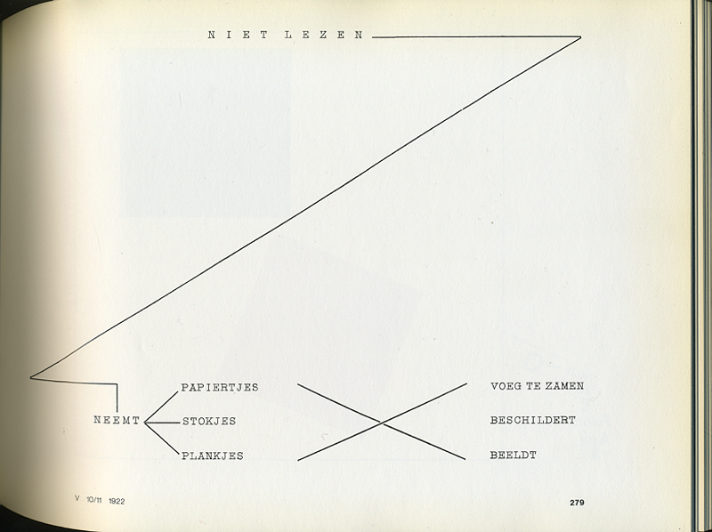
[page.4] Don’t read, get paper, rods, blocks, set them out, paint them, build.

De tekst op pagina 4 maakt duidelijk dat Lissitzky met zijn verhaal kinderen en volwassenen lezers aanspoorde tot activiteit. Zijn intentie was het verhaal tot leven te laten komen in een schouwspel. Je zou het dan ook niet alleen op een (typo)grafisch twee dimensionele kunnen zien, maar ook op een architecturale drie dimensionele manier kunnen bekijken.

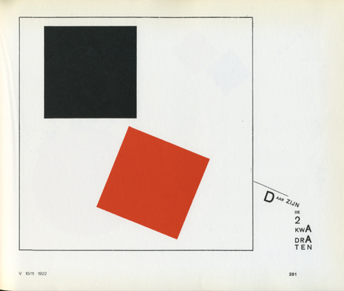
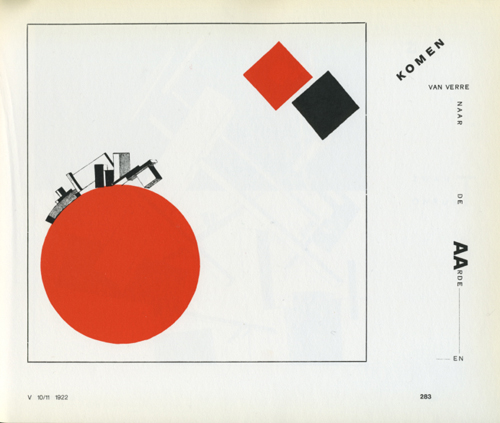
[page.5] Here are the two squares / [page.6] They fly on to the Earth from far away and / [page.7] And see a black storm.

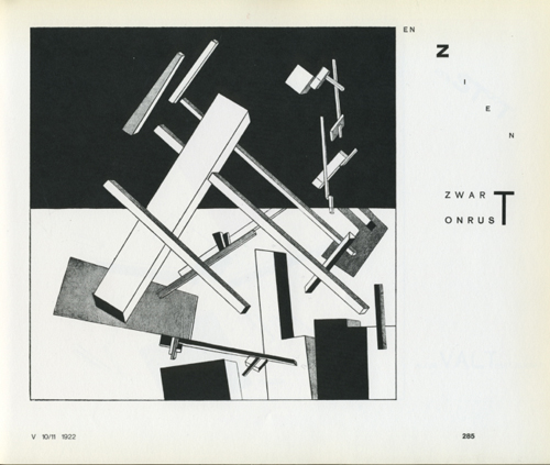
[page.8] Crash – and everything flies apart / [page.9] And on the black was established Red Clearly / [page.10] This is the end – let’s go on.

The words move within the fields of force of the figures as they act: these are squares’, zoals hij zelf zegt. De plaatsing van de woorden en het gebruik van de letters vertegenwoordigde een totaal nieuwe benadering. Het verhaal wordt dan ook over het algemeen aanvaard als een van de eerste voorbeelden van de Nieuwe Typografie.

Het werk werd voor het eerst gepubliceerd in 1922 en bestaat uit 10 pagina’s. Lissitzky maakte zelfs een speciale editie voor ons beroemde vaderlandse tijdschrift De Stijl ( in “De Stijl” 5e Jaargang 10/11). Enkele uitgaven hiervan zijn nog op te vragen bij het magazijn van de openbare bibliotheek (De Stijl : [maandblad voor de beeldende vakken], maar de editie waar ik het over heb is daar helaas niet meer in de collectie. Wel de volledige facsimile herdruk met het gehele in het Nederlands vertaalde “van tWee kWAdrAten in 6 konstrukties” in deel II. Ook kun je de volledige originele versie nog vinden in het boek “El Lissitzky”, wat door zijn vrouw Sophie Lissitzky-Küppers is geschreven.

De Stijl facsimile (red. Theo van Doesburg ; ed. by Ad Petersen1968) [page 5,6,7,8,9, 10+page 4]
El Lissitzky by Sophie Lissitzky-Küppers [top 3 pages, original print 22 x 28 cm]

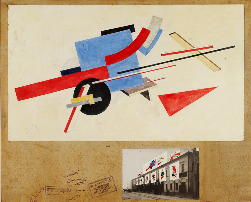
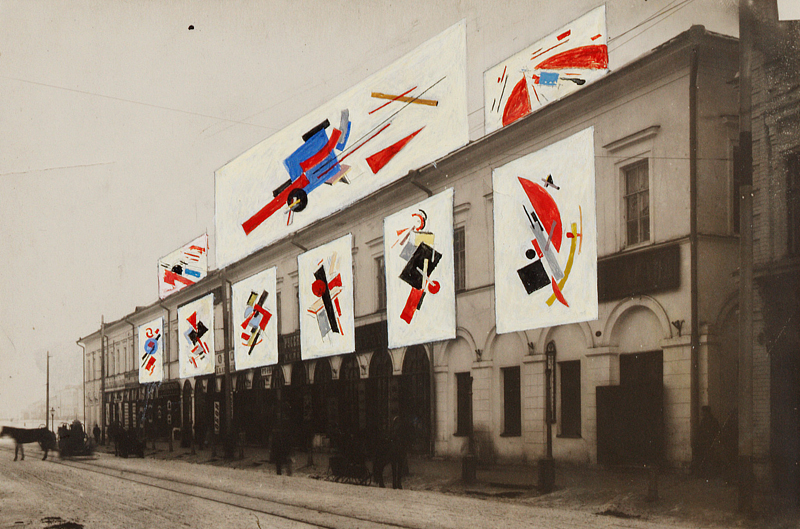
Proun. Street Celebration Design, 1921, Lissitzky


Wednesday, February 3, 2010

In this work you see influences of Design, Fine arts, Architecture and Graphic design.
A nice thing of this work is that the upper drawing can stand on his own, and therefore can be divided in Fine arts. What Lissitzky is doing in the painted photo below, can be compared with design. Almost all his work contains influences of Design, Fine arts, Architecture and Graphic design. For myself I see it back the most in this one.
I really like the composition and colour distribution and how Lissitzky combines the 2D/3D perspective, which makes the drawing much more architectural.
I think the later work of Kandinsky is in some way comparable. I’m talking about elements of composition, colour distribution wise and form contrasts.
What’s fascinating actually is that for example in these paintings ( K1, L1, K2, L2 ) the triangles, (half) circles, stripes and composition have so much in common. While the ideas of their work are so different. Kandinsky combines painting with music, which Lissitzky does with architecture.

What I appreciate is the modern way of exposing his work. I like the way he puts his drawing and his street-exhibition in one frame on the cardboard. And the fact that he paints on the photo. The street celebration design reminds me a bit of graffiti in legal manners. In Graffiti you have multiple meanings of doing it. Some do it for the adrenaline-kick, some for the group or competition feeling, some to show their design skills and others for  political statements or propaganda. This last example is what I see in a part of Lissitzky’s work.

I think it’s interesting to see how he uses his propaganda work in other work but then he integrates his in his autonomous work (proun. street celebration design).

All in all I think it’s a great work and a unique style. I really admire that Lissitzky makes so many different things, and still keeps it in one theme

El Lissitzky


Thursday, January 28, 2010

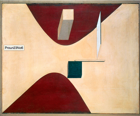
From Van Abbemuseums power point presentation I got attracted to a painting by El Lissitzky called “Proun P23, no 6”, in this presentation it has number 51. I have never really been into constructivism, suprematism or any of these kind of movements but I will try to focus on the things I actually like in El Lissitzkys painting. In general, I like the way he is able to leave empty spaces without making it comfortable. I always have to be alert so I don’t fall into the harsh abstractions of his work. The patina or aging paper makes it easier.

In this specific painting, “Proun P23 no 6”, I get the false illusion that he has done the same thing and left an empty space. But in fact the painting is packed. Trying to describe the painting, one can say that it has a fleshy colour in bottom, there are two deep red triangular forms almost meeting in the middle. Preventing them from coming together is a rectangle, a cube and two things that appear more flat, a stick and a square. The cube has a deep green coulor, the other objects are more neutral to the paintings colours. I like the colour composition and that it feels light even though it’s made in oil and on canvas. It’s a nice mix of painting and drawing. I also like the spacial aspect and the loose objects. It’s interesting the way he here presents the abstraction, I mean the space and volume is meeting some very basic shapes that seems easy to recognize and comprehend but makes an intriguing whole.

It’s hard to say anything about the texture of the painting from this point of view, but with the zoom site I attached it’s easier to get a feeling of it. From looking at other modernistic paintings, I really don’t like that dry texture from when the paint is not enough in one stroke or when the canvas is shown too much. These things create a very uncomfortable and also very physical feeling, just like some people don’t like and get chills when scratching your nails against a blackboard. This don’t seem to be a problem here with Proun 23, and I can understand that Van Abbemuseum must be very proud to have this painted Proun in it’s collection.


Log in
subscribe