Wie die Räume gefüllt werden müssen
How the space needs to be filled
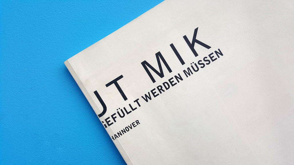
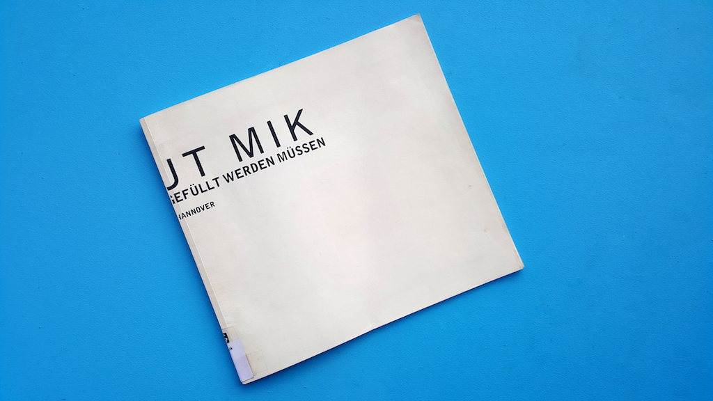
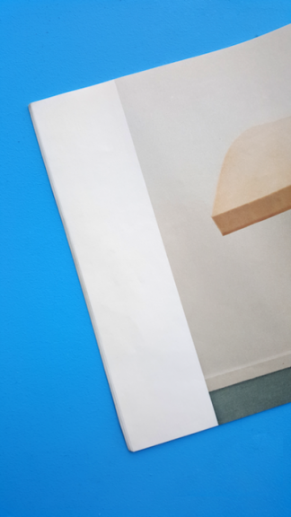
This thin book with its soft flappy cover gave me a sense of preciousness.
It needed two hands to hold, it urged for my attention.
The white lp-size cover, its simple black typography yet incomplete
title made it mysterious. It sought more effort than a
quick look to discover the meaning.
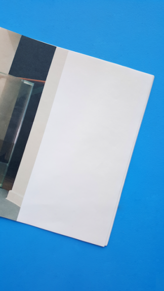
Flipping through the pages I was completely
surprised and somewhat confused as more and
more empty pages revealed themselves.
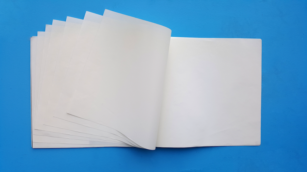
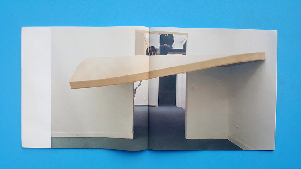
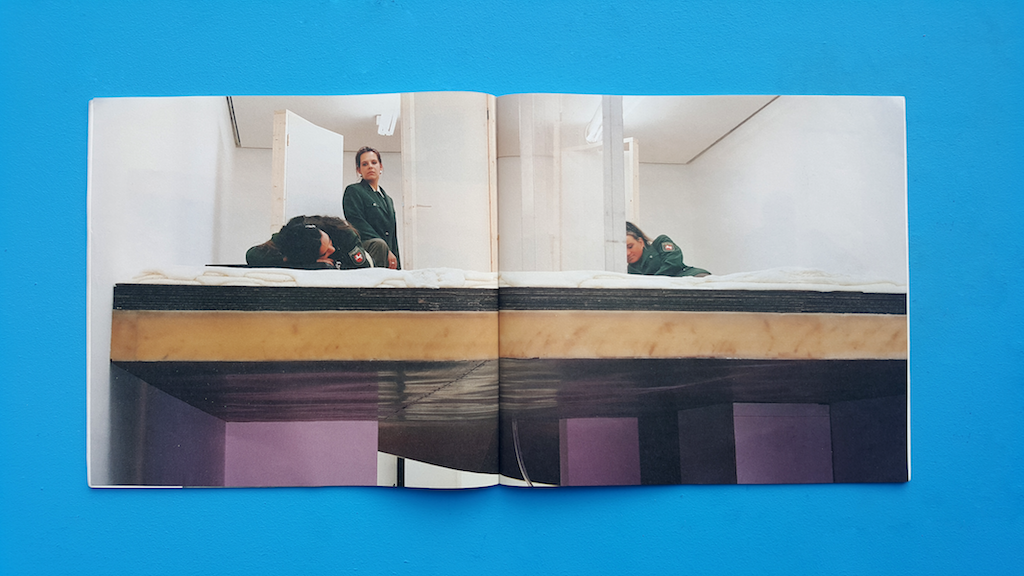
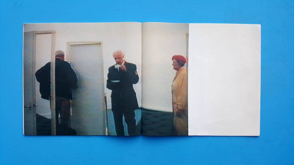
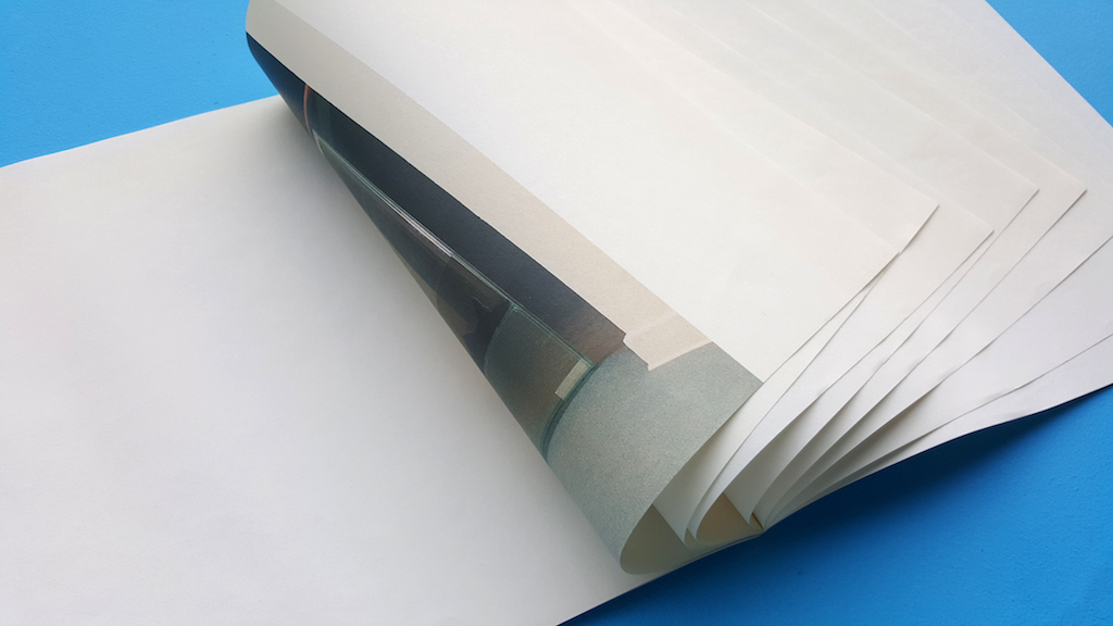
Then eventually three huge images of an installation appeared. I would probably not have looked at them with as much care and appreciation
as I did, if it was surrounded by visual or written information.
The silent white pages that led up to these images made them
more valuable. The emptiness was key to this aura of worthiness.
A fourth smaller image appeared after a few empty pages.
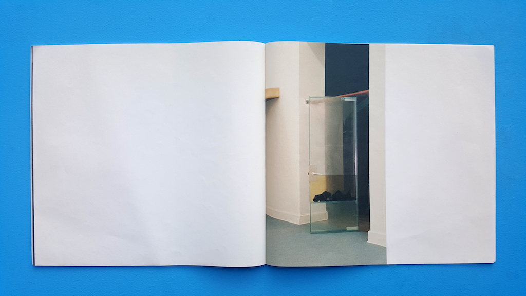
The series of images started and ended with a white bar, suggesting a
beginning and an end of the empty space.
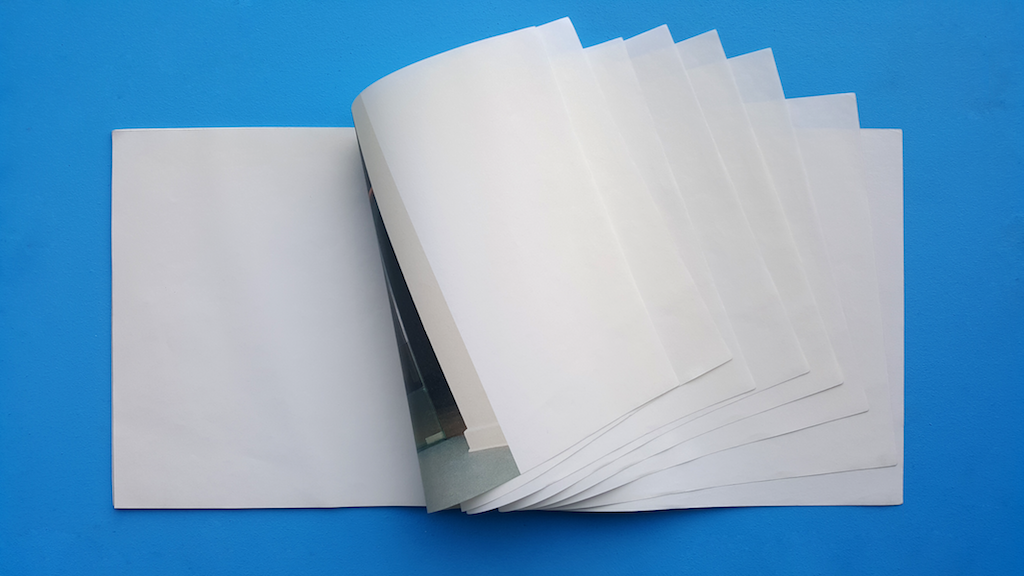
Than the catalogue ends with emptiness.
In The Elements of Graphic Design [x], Alex W. White explains the functionality of emptiness in graphic design:
”Emptiness is silence, an open field, a barren room, a blank canvas, an empty page. Emptiness is often taken for granted
and thought best used by filling in. It is generally ignored by all but the few who consciously manipulate it to establish
contrast, to create drama, or to provide a place of actual or visual rest.”
The emptiness creating visual rest and drama are actually
simultaneously existing in this book. One would think
drama and visual rest would not be ableto co-exist.
The impatient ongoing episode of flipping white pages,
the dramatic surprise of a sudden huge image and then
the visual rest to read the image with great care.
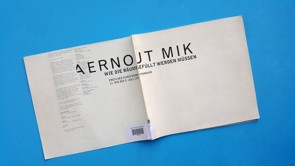
Pjotr de Jong, the designer [x] and a dear friend of Aernout Mik [x],
shed some light on the being of this book. It all started with an
exhibition in Hannover. Aernout Mik had won the Preis des
Kunstverein Hannover 1995 alongside two German artists,
Bernhard Büttner and Michael Stephan.
The three artists were given a space in which
they were able to show their art. The German
artists asked the director ‘how the space had to be filled’.
Aernout [x] was astonished by this question and made it
clear that no one but himself would decide on how his
space was going to be. He took this German question
and used it to title his work.
He [x] was asked to make a catalogue for this
exhibition and this book is the result of that.
He rebelliously decided to make
the ultimate anti-catalogue. Bare emptiness
was in a similar style to his exhibition space,
the dominant theme.
Pjotr and Aernout spent their whole budget on
the most expensive synthetic paper available.
They maximized the size of the images and printed
them on full pages. Pjotr stated that the images
were badly printed because of the synthetic paper.
In my opinion they added to the mystery of the book.
This probably is the least informative catalogue ever made,
yet it’s the most memorable one I ever came across.
Aernout Mik : Wie die Räume gefüllt werden müssen. /Rietveld library catalogue no : mik 6