Skip to Content Skip to Search Go to Top Navigation Go to Side Menu


"mysterious" Tag


Excuse me, can I analyse your personality?


Wednesday, April 20, 2016


Dealing with a personality, and making a mask out of it in order to feel it, was quite a task. I found myself both in the position of a psychologist analyzing a person’s mind and a physicist creating an object that should reproduce a feeling of a personality.

The topic we were given for this project was to find someone that fascinates us, try to understand their personality and make a mask out of it. Of course at first this immediately leads you to think of people you care about and admire. It feels a bit like putting your loved ones on a pedestal. But that wasn't the point, and in a way, analyzing their personalities didn’t give me the satisfaction and rush to work on it. I needed someone that I did not know or understand yet, I needed a challenge

.

So,              then; a girl I met last year popped into my mind. a girl I barely knew, a friend of a friend. and the little that I knew about her, was so little that it completely confused me; each time I thought I finally understood her I learned something knew that made everything I knew before fall into water like it never existed. she was so confusing, it was exactly what I needed!

.

HER BUT, WHO IS THIS GIRL?

IS SHE HAPPY? SAD? ANGRY?

DOES SHE SEE THE WORLD AS A RATIONAL PERSON DOES?
OR AS A DREAMER?

WHAT DOES SHE DO?
WHERE DOES SHE LIVE?
WHAT DOES SHE LOVE?

WHO ARE YOU???

This meant a lo-o-o-ot of thinking, struggling, rethinking, investigating (?)… I came across a problem. She was indeed perfect. Too perfect. Step by step I just got more and more fascinated by her. I put her on a 'pedestal' without wanting it. So, I had to do it all again. And again. With complete new questions, and complete different answers. After all this was just my interpretation of her. Until I finally thought of three main aspects/ideas that I thought could fit her personality and that I would use in the mask.

  • 1. She is perfect, but in a physical way. And she seems to strive to keep it that way at ALL times.

  • 2. She is ve-e-ery driven by her ambition.

  • 3. And seems to hide her feelings.

That last one got me most exited, finally something I could work with,
something NOT PERFECT. So I started:

FORM

(OR MAYBE, FIRST MATERIALS)

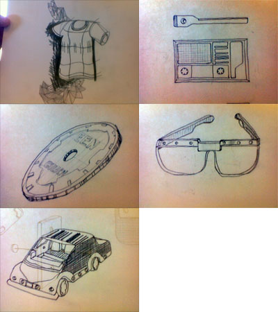
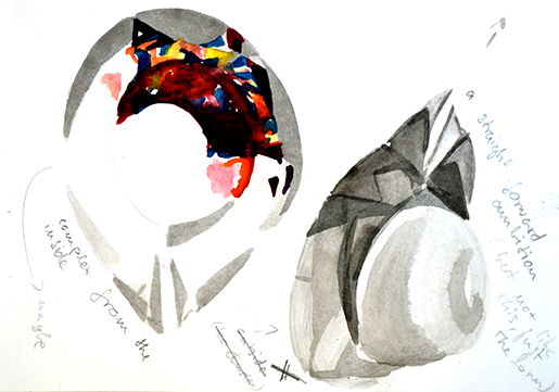
As I am a ‘devoted’ perfectionist, my projects often start with details which I then try to bring together and arrange, deprive, until I get to a purer and clearer idea. Like zooming out from a really zoomed in place on google maps. My ideas began forming a sphere.

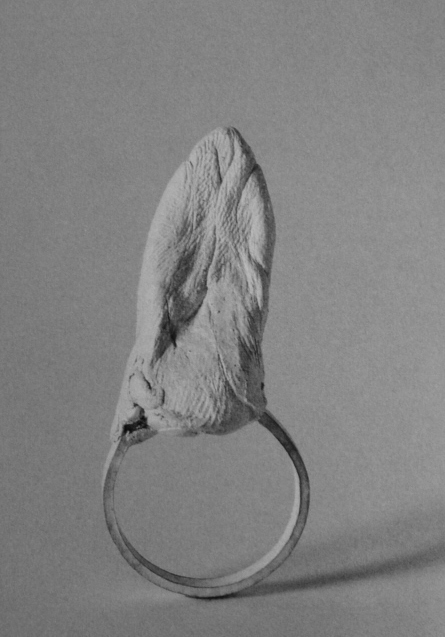
I started with stones; minerals, the presentation of deep, complex, hidden feelings.

Longing for more art in an art project I decided to make my own.

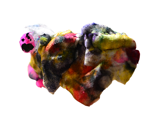
Little pieces of fabrics and foils melted into liquidised glue sticks suddenly turned into mischievous stones.

I had great fun doing it. It made me continue.

DesignBlog_materials1

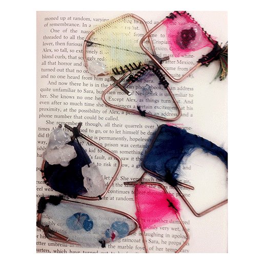
This time it would be foam, another material aching to be turned into stone.

Mineral.

Feeling.

Just a touch of aquarelle.  

Soon enough I had all the acquirements, the third step long done before the first two had even started.

minerals_mask

FRAME:

How do you make a frame of somebody’s personality?

Of someone you barely know,  a personality you imagined?

Should it be a hat?      Should it be compact?

scetch2

Or free,  and light?

scetch3

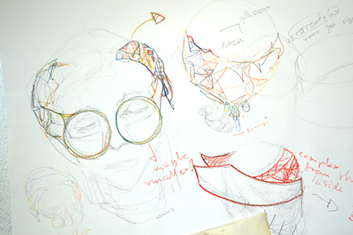
I had no answers to these questions, instead I turned to materials. Again.

frame2
joz1

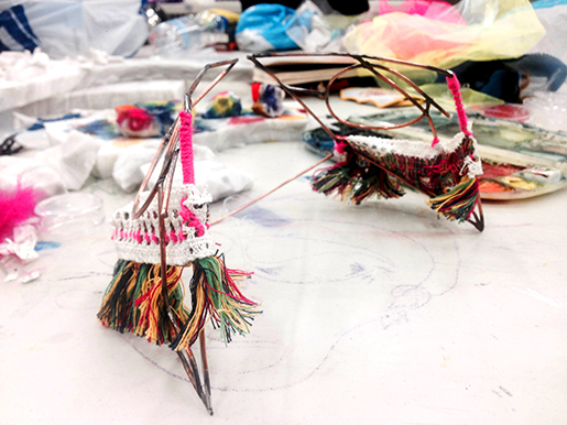
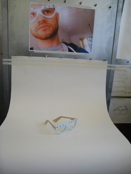
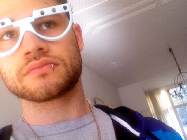
this was the result..

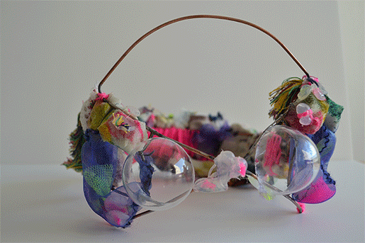
A metal construction instead of a hat, and of that kind of metal that would originally only be used for welding. Thinking back, this whole project was, at least for a little part, often based on 'giving materials another kind of life'. With the 'glue stick minerals', 'foam stones' and at last 'welding metal that turned into a construction for a crown/glasses/mask'. And at last, THE GREAT AMBITION, something I’ve subconsciously been thinking about since the beginning had to be added. It started as two plastic ‘glasses' put in between all the metal and feelings and that would only let you look RIGHT IN FRONT OF YOU, not left, not right, not even up or down, in the end turned into real glass.

And maybe a part of the three ideas got lost in the making, with the attention turned more to the materials following the idea than the idea created with materials. And maybe my guess of her personality is completely mistaken. But it turned out to be an object that could speak for itself no matter how it is interpreted.

So here, let it be seen as anyone wishes to see it:

Untitled1


The Attraction of the Unknown


Monday, May 20, 2013


In my third research I wanted to be more concentrated on the tag “paradox” because the last two researches where more based on the focus on the object chair and the humoristic association of the presentation of a chair in those books. Anyways this research now was more extended which made it also harder to find only one book fitting to the tag “paradox” but I stumbled over one book which is besides its outer appearance, the cover work, also a really interesting book about photography. “Mapping sitting” caught my eye first of all because of the title, the word mapping sitting doesn’t make not really much sense to me, not even with the subtitle “on Portraiture and Photography”, which all start to make sense when you see the front cover, together with the back  and the back cover of the book. Under the written words you can see old photography’s probably of a square in a big city where, when you take a closer look, the ghost shapes of humans are recognizable, those are overlapped over each over and seem to first build a big and hard to identify mass, on the second and closer look the mass is building a crowd. On the Third look you are also recognizing that the square is also a overlapped collage of photos of different squares which seems to be build one big picture of a square. The impression of just these photo collages on the cover, for me, means documentation, a documentation of another time (all the pictures are in black and white and obviously from the early last century), a collection of photos which have been put together in a book, one page laying over another. Therefore the word mapping start to make more sense; the photos are documented and collected as the information’s of geographical facts on a map, which is my first association of a map.  Still the word sitting stays mysterious for me, at least as the title on the cover without knowing the content, because you see actually mostly portrait photos of people sitting, inside the book, but on the cover design I cannot really find a connection to the word sitting. All in all I would probably say that this is the reason why I have chosen the book, the paradox or the not understanding of the title, which makes the book to something exciting.

Rietveld Library cat.nr: 761-bas-1

Black and White for today


Monday, October 18, 2010

We could imagine that an artist who decides to make a book to present his works, will make the choice to present it in the most realist way. The works have to be shown as clear as possible, with all the details and from the best angle in a way that the public can figure the work out as better as possible. (more…)

Irma Boom Book


Tuesday, September 7, 2010

I have chosen the book called SHV Thinkbook designed by Irma Boom.

This one caught the most my attention, although it is one of the most simple: black, thick, without any title, it is kind of brutal.  It looks like a simple dictionary. But we can discover the originality of the designer, because this book really doesn´t looks like another one. Because, it doesn´t has any title, only black without any symbol and when you look at the profile we can see the colorful side of the pages which contrast with the deep black of the front. It has something mysterious and unusual.

It has been designed in a way that you can´t guess what is inside (only maybe a strange geometric form white and red can symbolize

something). The cover of this book really makes me wondering  about  the content .

There is a details in this book that I found really beautiful, there are some few deep red bookmarks which go out between the pages. I like this three main colors (red, white and black).

Moreover , the story that Henk told us about this book makes it even more mysterious.

For the same reasons I found the book called Dutch Stampbook well designed. The same black, anything on the front page shows us the content, only a white peeler is appearing used as a kind of image of design (subject of the book).

Maxell 90 Gold


Thursday, March 4, 2010

For me sound is something mysterious, because I’m deaf. during my childhood I was fascinated by music cassettes (casette-bandjes). People love these things. For me it was hard to imagine.
Something coming out of the cassette that I couldn’t see.
some more interesting elements:
– gold/black – variety volume of lines – symmetrical holes – two hole with teeth – rectangle with round corners – easy to put in pocket – parallel lines–

scale drawing “make invisible visible”

final presentation

Exploring the possibilities for translating the idea into a product brought me to a new space for viewing the designwork. I fell in love with the PET-foamboard material and thin woods. I could change the shape and lines (movement).
During the translating I solved the technical problems/errors that I couldn’t see in my scale drawing. I had to wear the showmodel glasses in order to solve these problems and find the right shape (nose-holding, hinge and degree angles).
I’m happy with my first design product translation from the (inaudible) cassette-band and I don’t mind wearing it.

untitled again


Thursday, December 3, 2009

Again, I see myself wandering around the Rietveld Library being conscious of the way I pick up a book from the shelf. This time I was looking with in the back of head the tag ‘mysterious’. And mystery is what I found.  Interesting is that the book where I found mystery: Statische Fragmente by Hermann Gabler, again (like the second book) didn’t had a title on the cover. Only on the side of it. On the front it had an image of swans, and on the back a brief explanation about the book, by a friend of the writer Dick Higgins. For me, this explanation did not make the book less mysterious. Because when I flipped threw it, I only saw one or two sentences each page. On the left page English, on the right page the same sentence in German. Why this form? Why only one sentence each page? Why the explanation of a friend of the writer on the backside of the book?

Now I am back with some of the tags of my first post: ‘weird’ and ‘funny’, which does have a connection with mystery. The connection I just found in my last book.

Rietveld Acadamy Library: gub 1

mysterious meanings


Friday, November 27, 2009

For the first posting I chose two books, which ended up in six differend tagwords ranging from ‘tribe’ to ‘random’ and from ‘cheapfashion’ to ‘funny’. It was quiet difficult to find a new book corresponding with most of those tagwords. I ended up with a book which is really mysterious. The cover is white, except from the title: Zeven Dagen, houdbaar. Not even the author is mentioned on the cover. Also in the book there is no preface or explanation about what it is about and what is going on. Each page of the book contains three drawn objects or words. The drawings are really direct, kind of primitive which made me think of the tagword ‘tribe’. The connection between the drawings and the words is not always obvious, most of the time you have to guess what this connection would be. This reminded me of the other part of this project directed by Matthias Kreutzer, in which I am busy with this unclear connection between two images and a tagword. For me, an image doesn’t have a meaning for itself, you generate a meaning outside of the image, by for instance associatians, memory’s and certain conventions. When you place two images together, the meaning is generated between them. The same with an image and a tagword.

Rietveld Acadamy Library: No 758.3 dui 1b


Log in
subscribe