De Stijl versus Wendingen
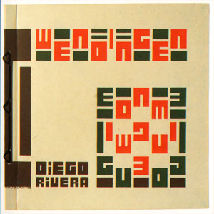
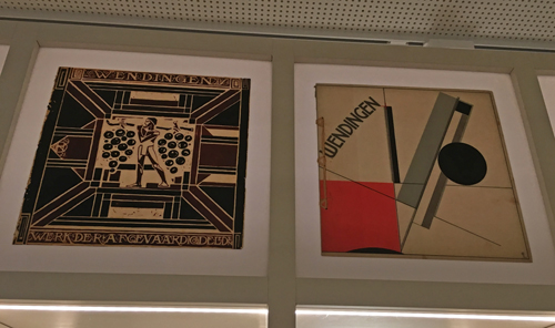
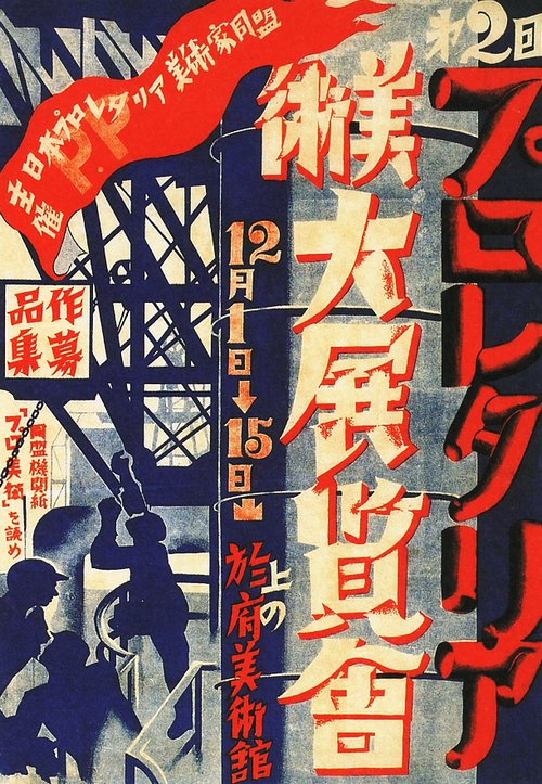
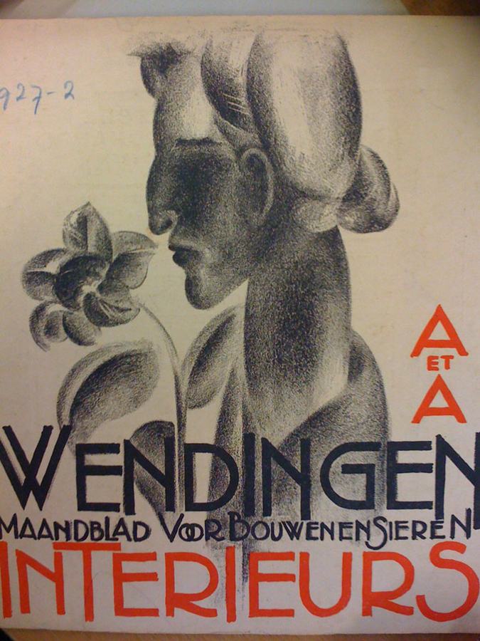
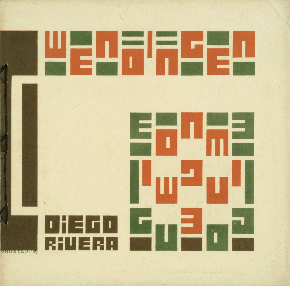
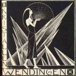
Wendingen magazine 1929 #3 on Diego Rivera. Cover by Victor Huszar
The magazines de Stijl and Wendingen were both founded around 1918. De Stijl was connected to the artistic movement of De Stijl and Wendingen was connected to the Amsterdamse school. These two movements are completely different, if not opposite to each other (De Stijl being functional and minimal, only using the primary colors and black white and grey, and the Amsterdamse School playing with different colored bricks and all these ornaments). Logically these two magazines felt like competitors when they started to publish.
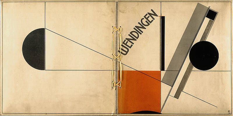
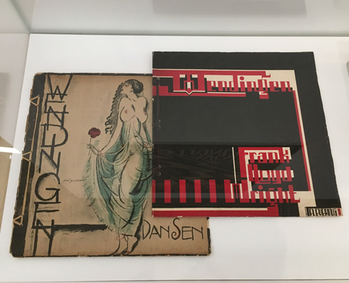
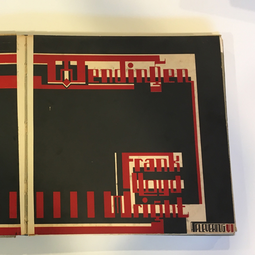
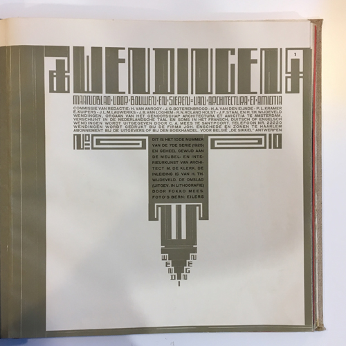
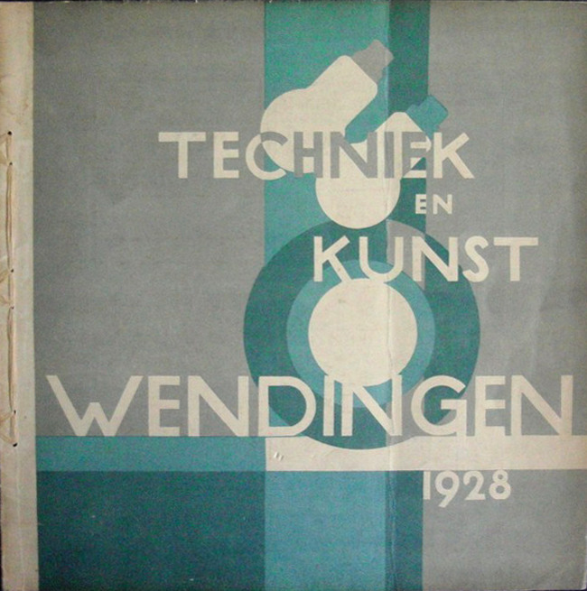
Wendingen magazine 1921 #4 on Frank Lloyd Wright and Berlage. Cover by El Lissitzky
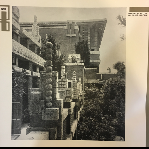
That’s why I was completely confused when I saw a cover of Wendingen depicting a work of El Lissitzky, a constructivist artist and what I’ve always been told is that constructivism was kind of close to the Stijl. This issue was about: Frank Lloyd Wright’s architecture!!! I always thought that he was the one heavily influencing the Stijl. What turned out to be the case was that the Dutch back in those days weren’t really making ‘groups’. They stayed individuals and were inspired by different sources and that’s why, how different the movements may be, also individuals brought characteristics of the Stijl into the Amsterdamse school and the other way around.
Isn’t that just great: they were existing movements but there seems to be no rules or boundaries in taking aspects of other movement, you are free to be inspired by everything.
[by Liza Prins]
SMELL it, LICK it, SUCK it, BITE it, CHEW it, EAT it.

4 years ago I went on a study trip to a curtain great house, build by a curtain great architect, that I do not remember. And just before I went in, my previous teacher at Architecture and Design, Aalborg (Denmark), told me and the rest of my class, that we would get goosebumps, when we first got inside this building. He was in love. Than I went in – but no goosebumps. I apparently did not feel a thing.
Only now I understand, what he was taking about – but in another context.
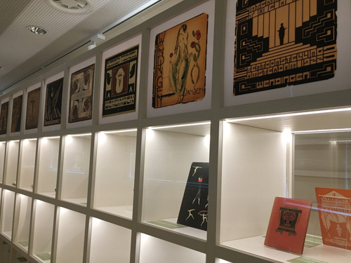
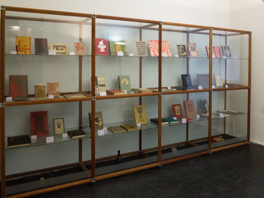
Today I was placed in front of these amazing art magazines from the 1920s named “Wendingen”. I really felt it.
I tried to smell it.
I was just about to lick it.
I would love to suck it!
I wonder how it would be to chew it.
I really wanted to eat it.
[by Kristine Andersen]
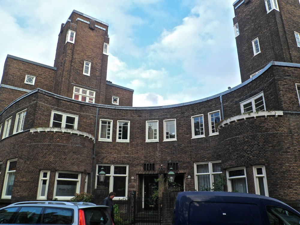
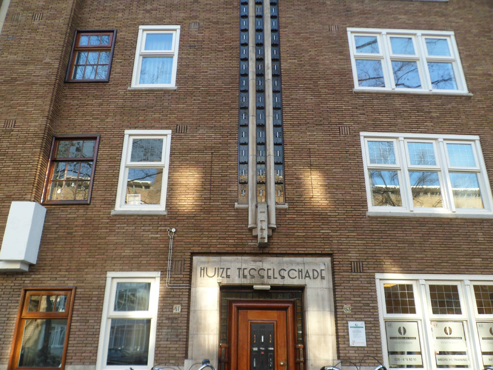
Inside and Outside the Amsterdam Ring
>As the capitol of the Netherlands Amsterdam is a popular place for new businesses and companies. Still you see that a lot of these companies place there new architectural masterpieces outside of the ring. Is this because of the high ground prices inside the ring?
> On a trip trough Amsterdam we quickly discover that the historical buildings of the city are not only in the center-canal areas. Around these canals you see a band, almost like a protecting layer, made of architecture that is maybe even historical as its center. The buildings and blocks give you an unique look on the wide collection of the Amsterdam School architecture. This is something that a lot of tourists miss when they come to the city: icons like ‘het schip’ in the Spaardammerbuurt, mercatorplein, the Berlage Lyceum and the many blocks and bridges through the city. Maybe this is a good thing; in this way it stays as an unique treasure that functions as a decor for the the daily life of many. Lets hope this architecture will be protected in the future and won’t be replaced by transient cheap Almere buildings that will be replaced every twenty years.
[by Taro Lennaerts]
B-Group goes “Wendingen”
[click left for English / click right for Dutch]
[by Henk Groenendijk]
A call from the past
In some places the atmosphere doesn’t seem to change with time. Regardless of new interior pieces, integrated technological devices or relatively fresh layers of paint on the walls, you just come in there and dive into the setting of decades ago.
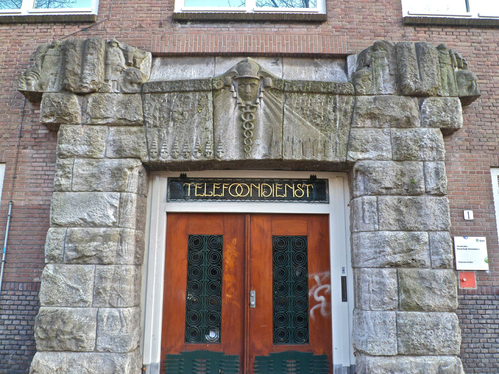
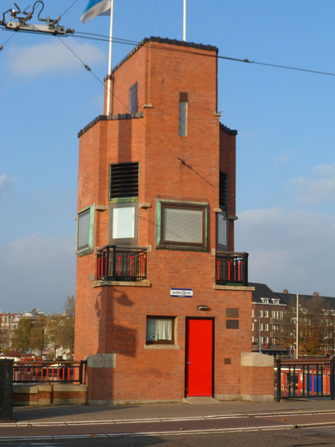
That happened to me when I stepped into the hallway of a former post office, which is now turned into the museum called ‘t Schip. Blue shiny tiles on the walls and floor, wooden benches, iron bars around and the coolness of the air immediately placed me into the first half of the previous century, when the work there was humming: post office workers were stamping, sorting or preparing for dispatch numerous letters and parcels, customers were writing addresses on envelopes, buying stamps and waiting for the telephonist to scream out loud their name and the number of the telephone booth where they could pick up the phone and hear the voices of their far away families or friends.
The booths are still there. With exactly the same heavy door, yellow tiles on the walls and little table. And even though the place of the telephone was taken by the modern computer you still get a feeling that if you come in you can hear those voices. The voices of the past.[x]

photo by Gordon Parks
[by Anastasia Starostenko]
A wrestling match
If de Amsterdamse School and de Stijl were to fight each other in a wrestling match de Stijl would totally kick de Amsterdamse School’s ass. De Amsterdamse School would be wasting time executing these beautifully choreographed moves while de Stijl would engage in some straight on pounding with it’s massive angular fists and totally destroy de Amsterdamse School’s ass. Then de Amsterdamse School would attempt to retaliate by trying to impress de Stijl through jumping around like a ballerina but like a true wrestler de Stijl would bellow out “None of this fairy Efteling crap!” And pound de Amsterdam School straight into the floor, leaving only some bricks in a beautiful brownish/red color and a perfectly square hole in the ground.

Doctors wouldn’t be able to restore de Amsterdamse School to his old self since the resources are no longer around. De Stijl however, would collapse some days after the match as it would turn out his sturdy build was way overestimated and so the next week’s competition would be between a Bijlmer “Honinggraad Flat” and a temporary complex of sea containers.
[by Sanne Hartland]
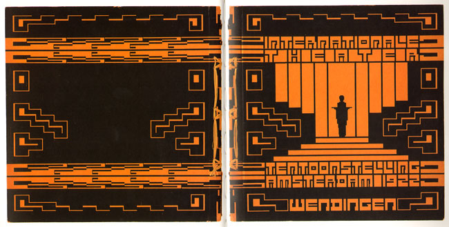
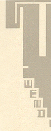
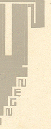
Typotecture
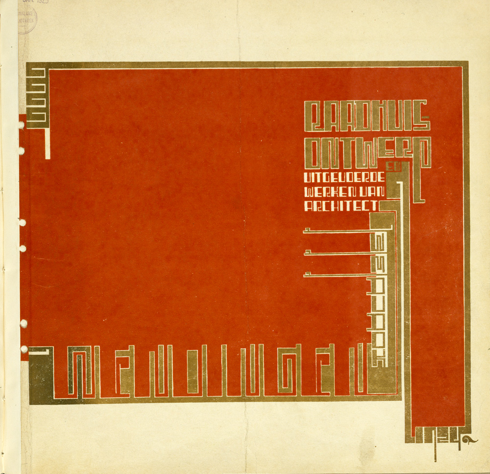
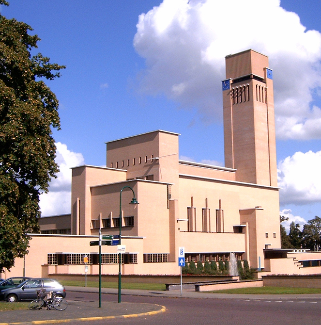
Wendingen Dudok-issue cover design by Wijdeveld • Hilversum Cityhall by Dudok
dive into the exiting world of Typotecture [x]
[by Casper Braat]
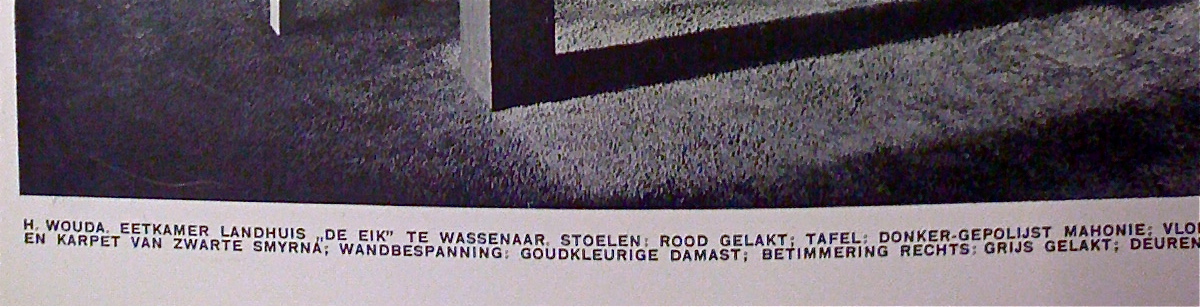
Architectura et Amicitia
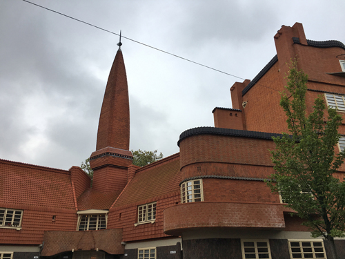
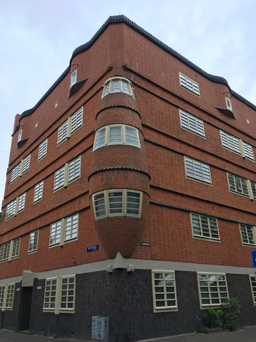
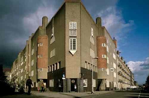
The ‘Amsterdamse School’ is a interesting architectural-style and is partly als known by it’s social-aware approach. The style belongs to a neo-style and contains architects such as: van der Mey, de Klerk [known by his work ‘the ship’], Kramer, and others.
I think it’s interesting that the ‘Amsterdamse School’ does not only stand for architectural knowable realizations, but that there’s also a whole movement for furniture [tables, chairs, clocks, lamps, textile etc], and even the idea of a ‘typical type font’, > Amsterdamse School is everywhere.
Wendingen was a interesting magazine [launched by the group, Architectura et Amicitia, of architects, artists etc] and was mainly focused on the ‘Amsterdamse School’.
I see this style as organic and yet non-organic, same as that it looks formal and family-aware. It is all and non, and that strikes me the most.
[by Petros Orfanos]
My Little Time Machine
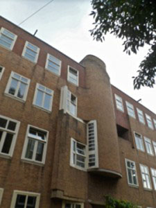
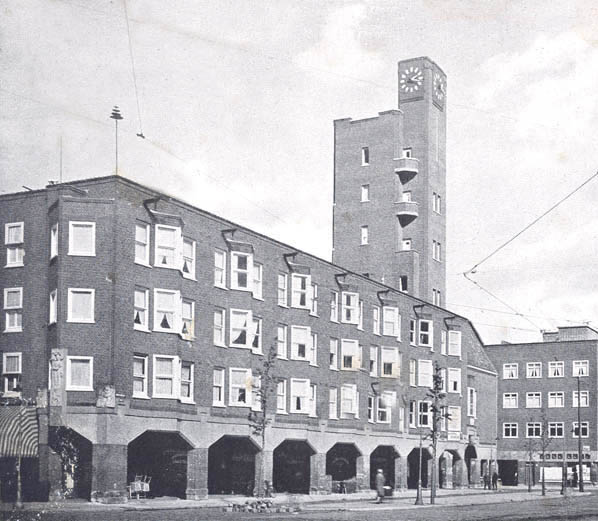
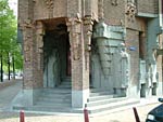 Being born and raised in Amsterdam and going around this city for 23 years I can still every now and then catch this utopian feeling by walking past the frozen canals in the winter or taking the ferry to the north part of the city by sunset, but I sometimes wonder what it must feel like being a tourist in my own city discovering new places and seeing things you have never seen before. The 5 minutes I spend inside the Scheepvaarthuis was the first time in a while that I felt this way. For this very short period, for just these 5 minutes I was a tourist, a tourist who stepped in a Time machine and was able to see inside a little part of her city from almost a hundred years ago.
[by Giulia Shah]
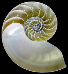
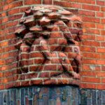
pelican + crystal + ship = Amsterdamse school
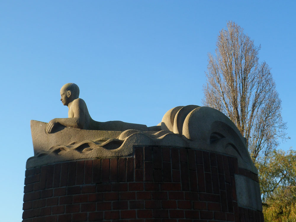
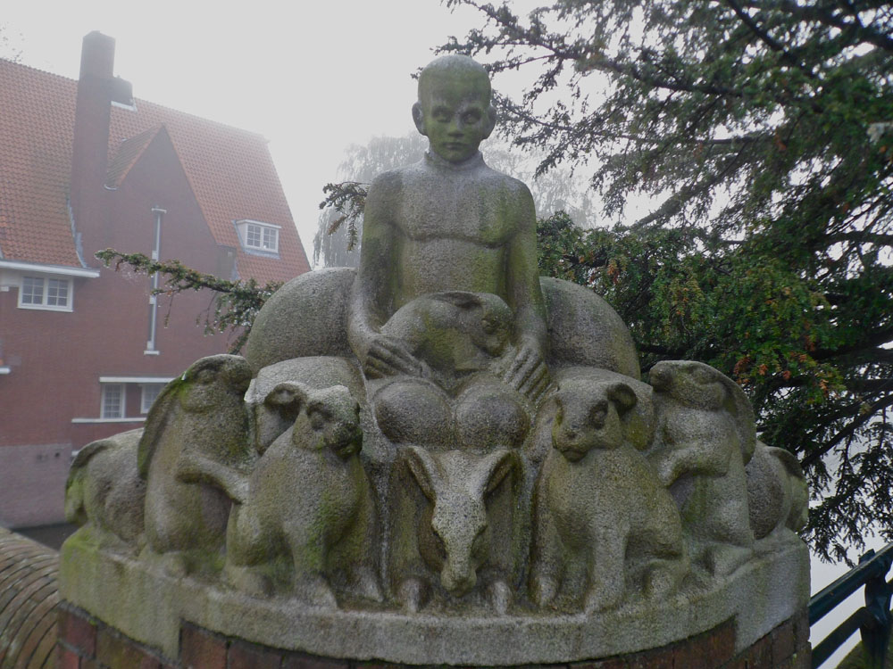
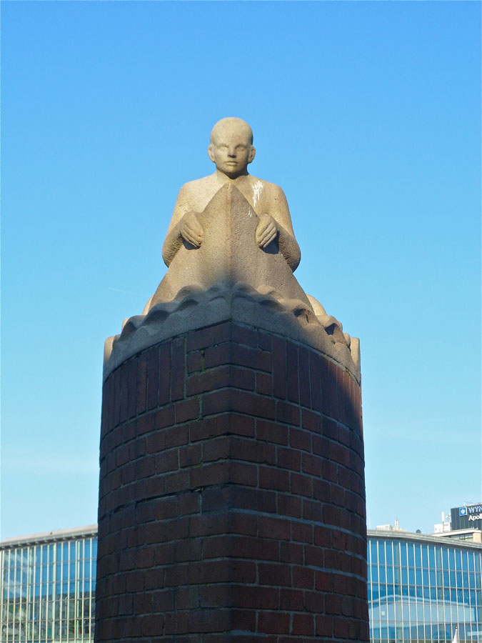
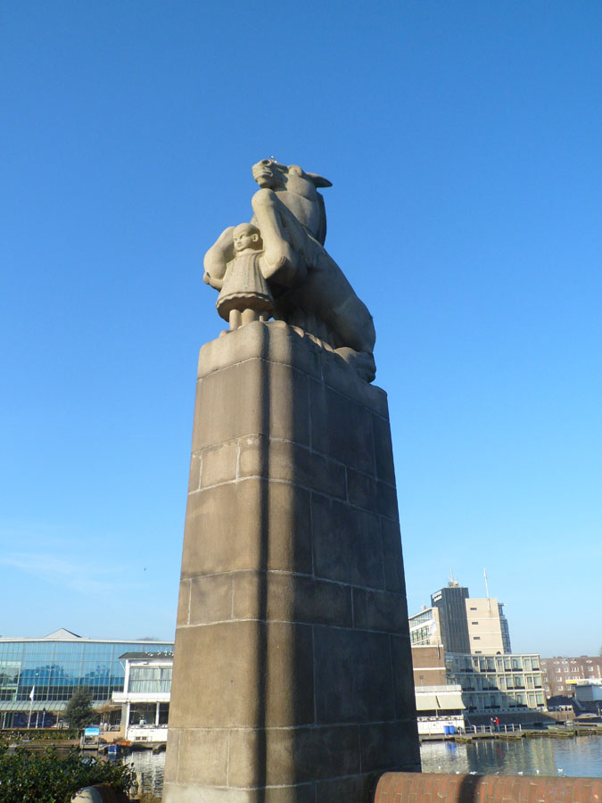
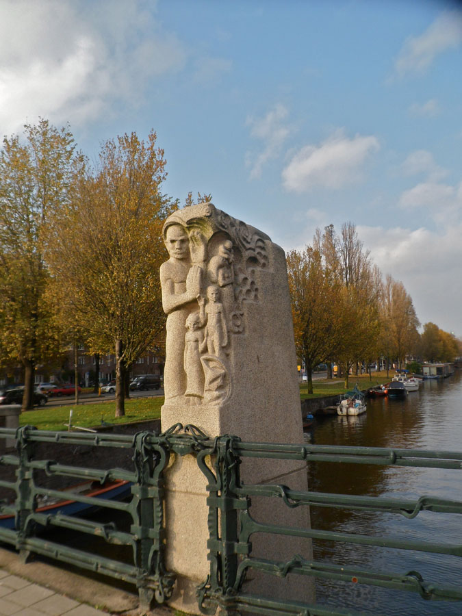
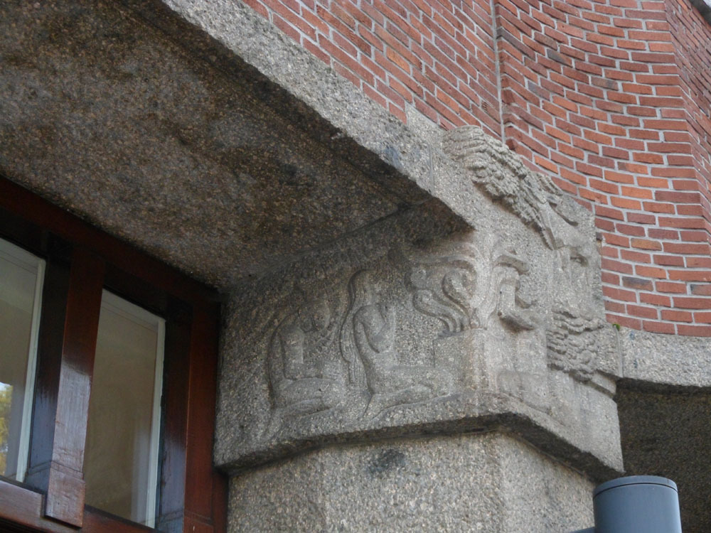
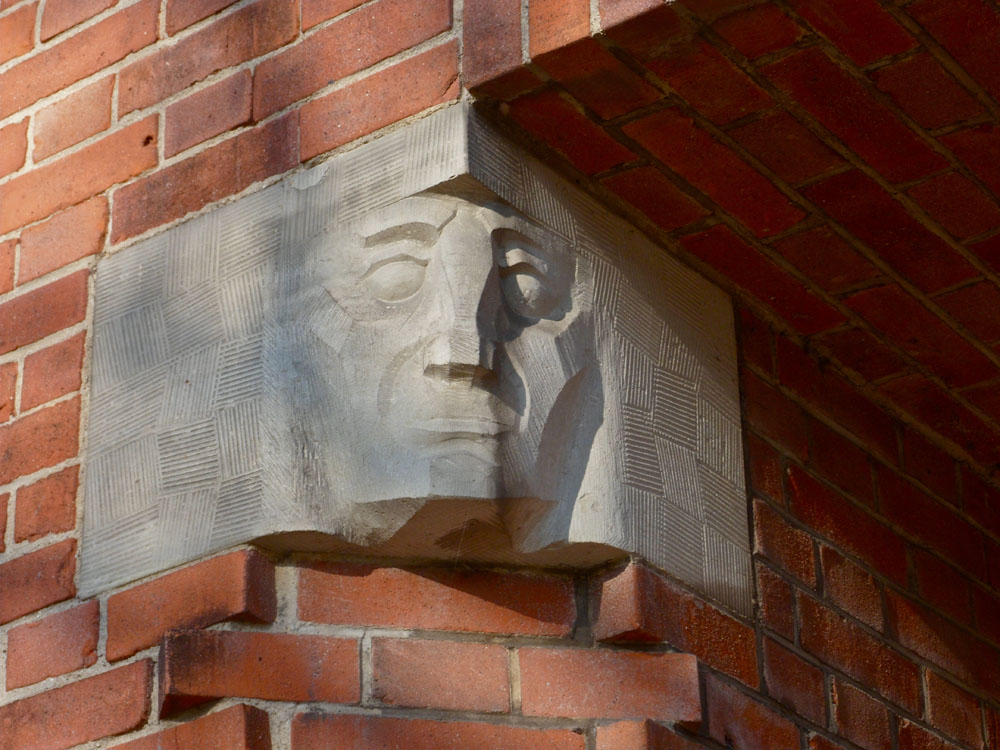
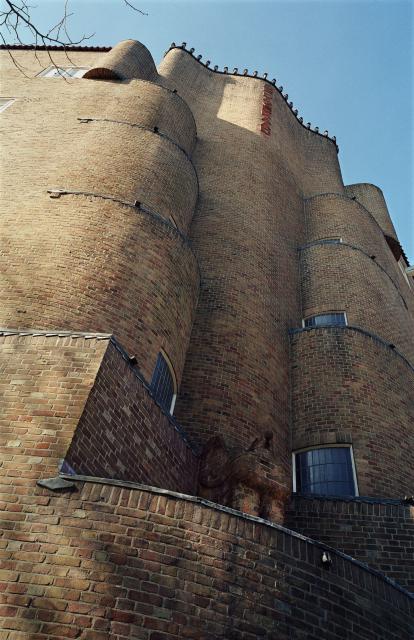
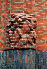
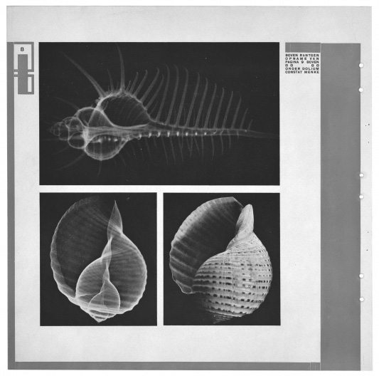
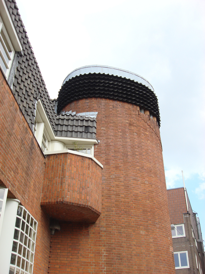
What made the Amsterdamse school style buildings so colourful was the rich use of symbols. Perhaps the easiest thing to notice was the inspiration from the nature in the structure of the buildings: flowing round forms (like a shell) or geometric forms (like a crystal). This gives the buildings a feeling of a living organism.
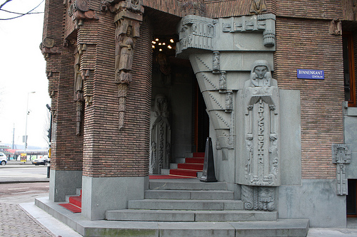
Then there are also sculptures full of symbolism. Sometimes they are telling the story about the building, like it’s function or it’s history. For example the Scheepvaarthuis is built in a triangular shape so that it looks a like a huge ship and there’s a lot of Indonesian style statues and sculptures to tell about the Dutch colony.
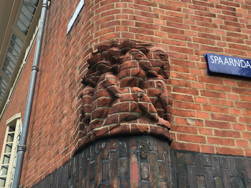
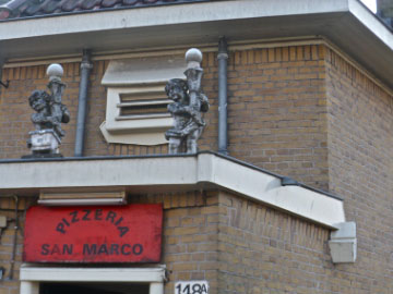
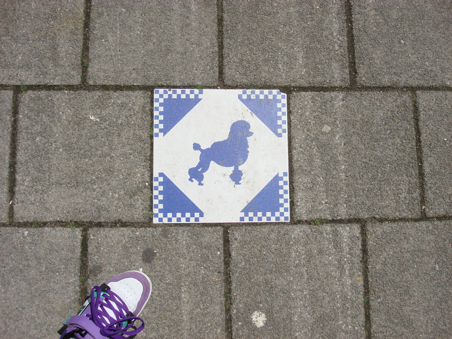
The funniest thing I saw were the pelicans in Spaandammerbuurt. One of the explanations that I found for a pelican as a symbol was that it is a sign for charity after a legend that the pelican pecks her own breast to feed her starving chicks with her own blood. Well, is this maybe something for social housing then?


– From nature to architecture and from architecture to printed matter –
[by Katje Hannula]
Een historische wandeling in een moderne stad
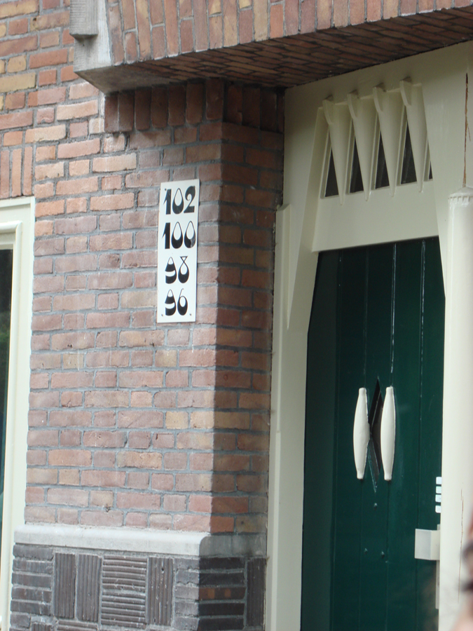
De excursie was een belevenis op zichzelf. De eerste keer dat ik zolang heb gefietst in Nederland en tegelijkertijd zoveel moest onthouden. Je leeft in het heden maar wordt omringd door het verleden. Gebouwen uit de negentiende eeuw of veel verder met hedendaagse bouwstijlen in hun glorie. Een vermoeiend uitstapje met interessante gebouwen zoals de Gerrit Rietveld academie die in de stijl van het modernisme is gebouwd met veel staal en glas. Het gebouw is een transparante doos terwijl je aan de achterzijde ervan massieve gebouwen ziet. De straatnamen die flitsen voorbij tijdens het rijden sommige heel duidelijke leesbaar o.a. Oost zaanstraat, Hembrug straat, Spaardammer plantsoen. Ik kan ook zien hoe de architecten mee gaan met de tijd: combinatie van oude bakstenen, glas, marmer, hout, enzovoort. Mijn hersenen proberen de tijd en de ruimte te bestuderen hoewel niet alles tot me doordringt. De hoeveelheid aan informatie is niet te verwerken. Ik wilde nog meer weten over het soort typografie, dat gebruikt werd voor de nummers van de gebouwen. De tijdschriften wendingen zijn heel uniek en hebben een heel diepe indruk achter gelaten. Ik zag ook hoe de verschillende architecten de stad tot eenheid wilde creëren ondanks de moderne gebouwen tussen de oude. Men wilde geen afbreuk doen aan de historie van de stad Het Olympische gedeelte dat alleen zichtbaar was voor me toen Henk erover vertelde. Door dit alles besef ik dat de exterieur van een stad ook aantrekkelijk wordt als je meer erover te weten komt.
[by Annemarie Daniël]
archi*-talent or archi-braveness
It really makes me wonder how is it possible that architecture differs so much every time you go somewhere . It happened to me in Amsterdam in even more intense way.
Amsterdam’s architecture for me personally is in a cartoonish style or like someone wanted to created imaginary world called “ let’s fit in here”.
I feel like there were not strict guidelines for building . People seemed to enjoy planning the city. No restrictions and open mind are definitely the keys of the
whole charm of the city.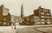
Compare to Poland ( it was a communistic country for some time), our architecture is packed with straight lines and forms and it visibly dominates in large cities. It has a bit of sadness and harshness in a way you approach it and how you feel about it. Amsterdam posses flow of energy that comes and goes . It is a great piece of art in itself and even it is already artistic and feminine it wants to be even more chic by putting f.ex. typography on buildings, graphical images on pathways or even decorating the edges of the houses. It is all to make people’s lives here better to let the energy be felt by people living in here.

Another aspect that attracted my attention a lot is the way buildings from different styles are put together, next to each other. Are they any aesthetic limitations? Is it the way people make art – experimenting in a way, showing the contrast, behaving mad or just enjoying the weirdness of those different styles? Does it has to be clear why something stands next to other object? In my opinion and the best explanation that works for me is simply to intrigue people’s imagination, to let them feel special. What is more this way of building may not fit established rules but by not feeling “ as it should be “ it gives the reason for existence the city needs to posses. To inspire people , to disturb and to let you discover it. This is the purpose an architecture should serve to really strike your mind, excite you and wake up when you, still sleepy, go out to face the world. Just like an art.
* archi – trouble of endless movement of investigation
[by Agnieszka Zimolag]
Glass Windows
 Mercatoplein is one of the Amsterdamse school constructions which developed through out and after the First World War as an architectural movement. Mercatoplein is influenced greatly influenced by Frank LLoyd Wright’s le Corbusier that was a project developing 5 years before the square was completed and is a good example of how a suburban space can be turned into a socio economical center where people gather and shop or eat.
What intrigued me most in the square was the design the of windows, because contrary to their small shape,their frequency of their repetitive pattern reminded me of simplified church stained glass windows.
Patterns were indeed found in the window design of Het Schip by Michel Klerk as the top windows of the backside opened in a shape of semi spiral form could convey to the Fibonacci theory.
Sources: studiokoning, Amsterdamse_School [Wikipedia]
[by Claire Bamplekou]