YELLOW
kraft
kraft
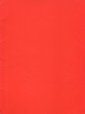
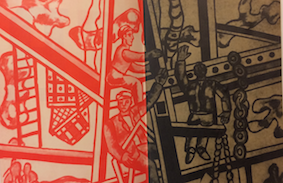
RED
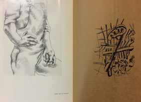
kraft
BLUE
kraft
RED
kraft
kraft
kraft
 eorihgeoirgh
size : 190 x 254
9 jaar stedelijk museum amsterdam
1954 – ’54
voorjaar 1954 tentoonstellingen
stedelijk museum amsterdam van abbe-museum eindhoven
collectie philippe dotremont
cat. 116
stedelijk museum amsterdam 4.7 – 28.9’59
50 jaar verkenningen
in de beeldende kunst
uit de eigen verzameling
en uit bevriende particuliere collecties in nederland
cat.212
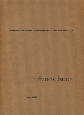
stedelijk museum amsterdam 11 jan. – 18 febr. ’63
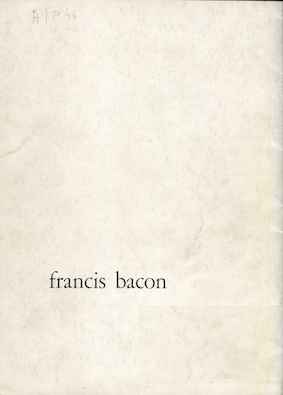
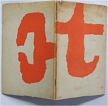
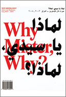
francis bacon
cat. 326
19.10.2017
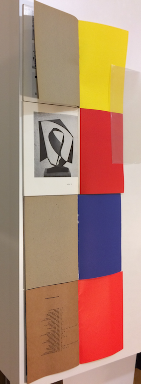
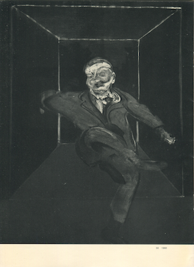
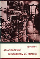
Look what I found, this old and cheap looking dark Bacon catalogue! So small but yet so distinct. 5 pages folded together, with only two staples to bind them into one unified object. Kraft paper next to coated paper. Primary red next to brown. Full page picture on the cover and on the inside. These are combinations that catch my attention. They oddly fit together. The design is so particular, and yet I cannot find the name of a designer on the inside.
Why?
It turned out to be obvious. The catalogue was made at a time that Willem Sandberg was director of the Stedelijk Museum. And almost all the catalogues that were made then were his design.


From 1945 to 1963, Jonkheer Willem Jacob Henri Berend Sandberg, better known as Willem Sandberg, was a Dutch typographer and museum curator, born on the 24.10.1897 and died at 9.04.1984, was the director of the famous Amsterdam modern art museum: the Stedelijk.
Taking over the direction of the museum after World War II, he put all his energy and ingenuity into changing the face of art in the Netherlands, starting by changing the face of the Stedelijk, physically and spiritually. He enabled the museum to a far more prominent place in society. Sandberg was a very resourceful man and faced these changes from many angles: posters, typography, architecture and of course also catalogues; he monitored all of these interfaces to the museum and actively involved in their production, creating by himself all that was linked to it. We can feel the influence of his vision until this very day. Looking at his catalogues today is looking into a life’s work of strong beliefs.
« I think that 328 catalogues were made under my auspices. I assume that around 275 were made by me and the rest by other people. Just guessing. »
Making art accessible to all, was one of Sandberg’s main goals. Envisioned the museum’s infrastructure in a perspective that would make it attractive to all and not only to serious bourgeois on a Sunday afternoon stroll.
« The background to my museum policy has always been that on the one hand I tried to encourage the staff to think of it as their museum, that they participate in it, and that on the other hand I wanted to give young people the feeling that it was their museum. »
One of Sandberg’s biggest aims was to change the relation of people to art institutions, making them more attractive. He even wanted the museum to come to the people, and make them spontaneously relate to the place. To accomplish this he promoted art among young people. Changing the status of art in society should begin by changing the status of art in the young people’s mind.
His work perfectly reflects this wider accessibility. Sandberg liked things to have simple and natural aspect. You could see it by the size of his catalogues, all pretty small and thin.
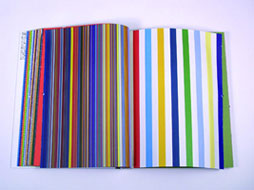
It is also one of the reasons he was drawn to wrapping paper and used kraft paper in much of his work, despite the critics he got about it.
« I could make catalogues the way I wanted. I was subjected to a lot of criticism, because of the packing paper I used in them. I wanted the pictures to be printed on the highest quality paper, but the text could easily be printed on packing paper or on normal newspaper. It didn’t have to be precisely right, just so. I am an anti-perfectionist. »


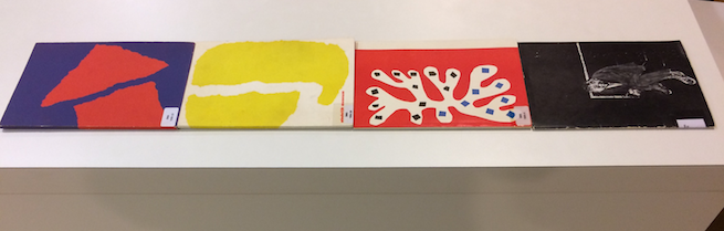
The bright primary colors he used inside of his catalogues, or on covers, mostly with his typography, where a legacy of the Bauhaus, a matter of taste, but also a choice to make the catalogues immediately attractive, their colors being absolutely eye catching.
Specific paper for specific content. The paper brings the content to life, makes it organic. It is what allows ink to exists: it gives birth to informations, narrations, visuals.


The paper’s choice plays with the reader senses. The touch, the looks, the sound, the smell. Surprisingly, as one can see in the Bacon catalogue, Sandberg’s choice of paper didn’t necessarily make the reader’s reading easy. The combination of kraft paper and the small Helvetica font even tend to make reading difficult.
A cover, hard or not, a content, thick paper, sometimes no cover. Content printed on the same paper, or similar paper that doesn’t draw attention to itself with a layout, pictures and colors. That is what readers are used to. I ran along the shelves of my bookcase but could not find any books that had a different choice of papers like Sandberg’s. Or only very few. Even though this choice can be partly understood because Sandberg had to innovate in times with little financial playing room. Therefore in the 40s and 50s this combination of cheap paper for text and coated paper for pictures was more common.
Sandberg’s signature can be found in his choice to make a wide contrast in his composition by putting kraft paper next to bright colours. When you put them together, obvious similarities appear between all of Sandberg’s catalogues. Yet they are all very different in a subtle way. Because of the choice of color, paper, or composition, that permanently changes. Sandberg’s design served the content and the artist that he was promoting. And even though he had his preferences, he would constantly innovate, like in the Léger Catalogue from 1957 where there is nearly no text to be found, but only this wonderful composition of pictures and ink in a well thought juxtaposition of several different kinds of paper.
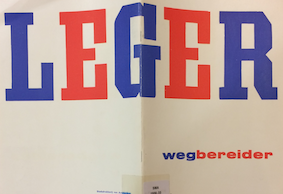
« i believe
in warm printing
and i like vivid colors
in particular red and blue
sometimes yellow
i dislike violet and green
but for violent contrast
i rarely use brown
except
tobacco scrap iron
or wrapping paper »
When we think of books in general, we tend to think more about mind, intellect, and not about their physical presence in the world, with another purpose than to contain and to teach. Still the design of the book makes the difference from a simply nice object to contain with a purpose tending to share or propagate. Sandberg with his signature, made a difference.
Therefore I wish to leave you here with what I was left after diving into Sandberg’s work: the incapacity to unsee his signature, once it was seen.
Sources :
Willem Sandberg Portrait of an artist, Ank Leeuw Marcar, Valiz Amsterdam, Werkplaats Typografie Arnhem
Sandberg graphiste et directeur du Stedelijk Museum, Ad Petersen, Translation to french Daniel Cunin, Institut Néerlandais, Editions Xvier Barral
Rietveld Academie library catalog no: bac 12
 .
.