Designblog has been an online student project as part of the Amsterdam Gerrit Rietveld Academie, Basic Year program |Design Theory & Research, since 2007.
All this time we have been publishing our efforts out in the open for all students of the program and beyond, creating a horizontal process of education. The data base we created is unique and phenomenal and still represents the distinctly personal views of such a diverse student community. The program amalgamated viewpoints on relations between art and design. We hope you enjoyed it as much as we did.
As the project evolved from a basic blog in the early beginning x to the last upgrade, its evolution as a digital medium also became a regular part of our researches. This can still be experienced in the many projects students developed on this subject. Just before Designblog was terminated at the summer of 2019 we still did organize a workshop on the disintegration of this medium over such a long period of existence
Thank you all for following us . . . . .
Henk Groenendijk (moderator) and all participating students
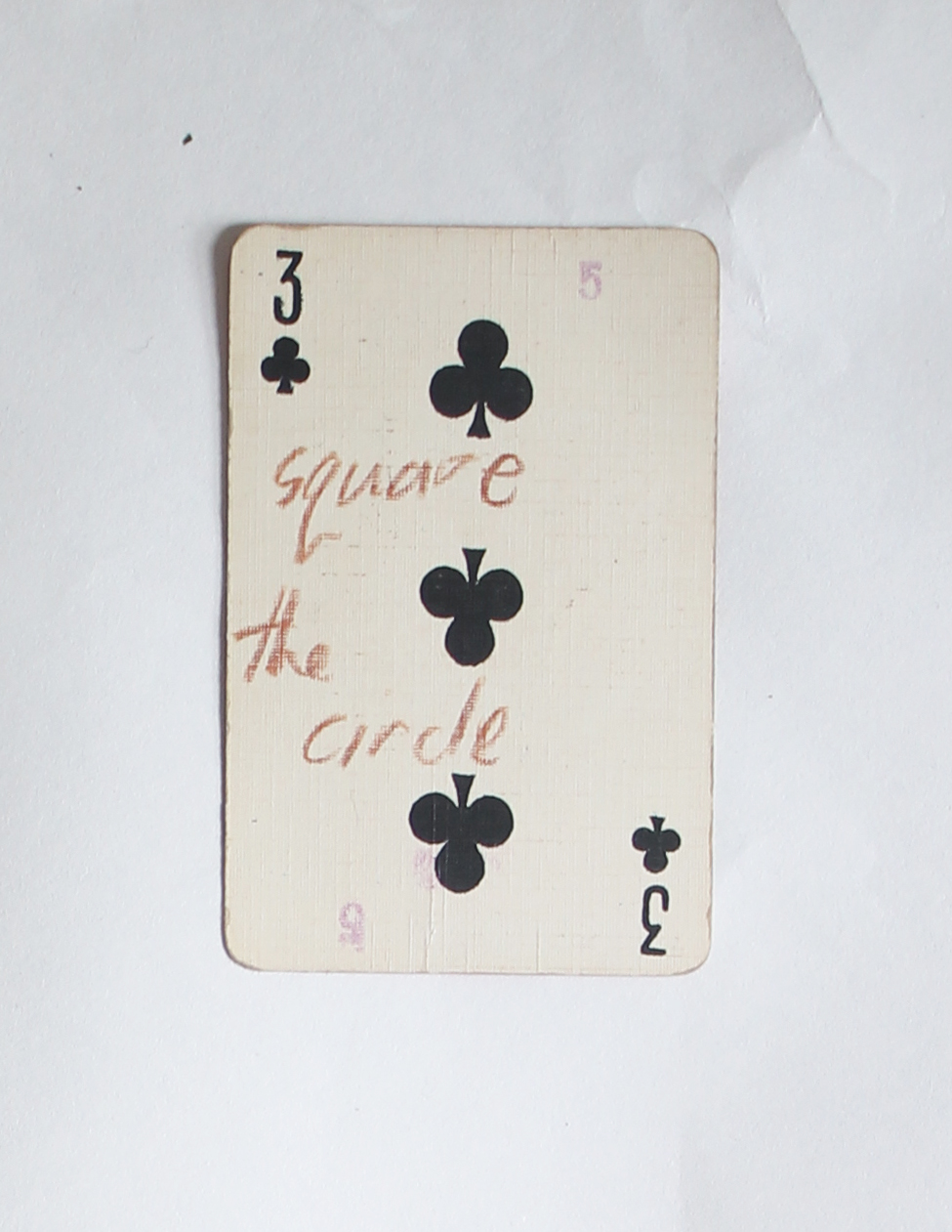
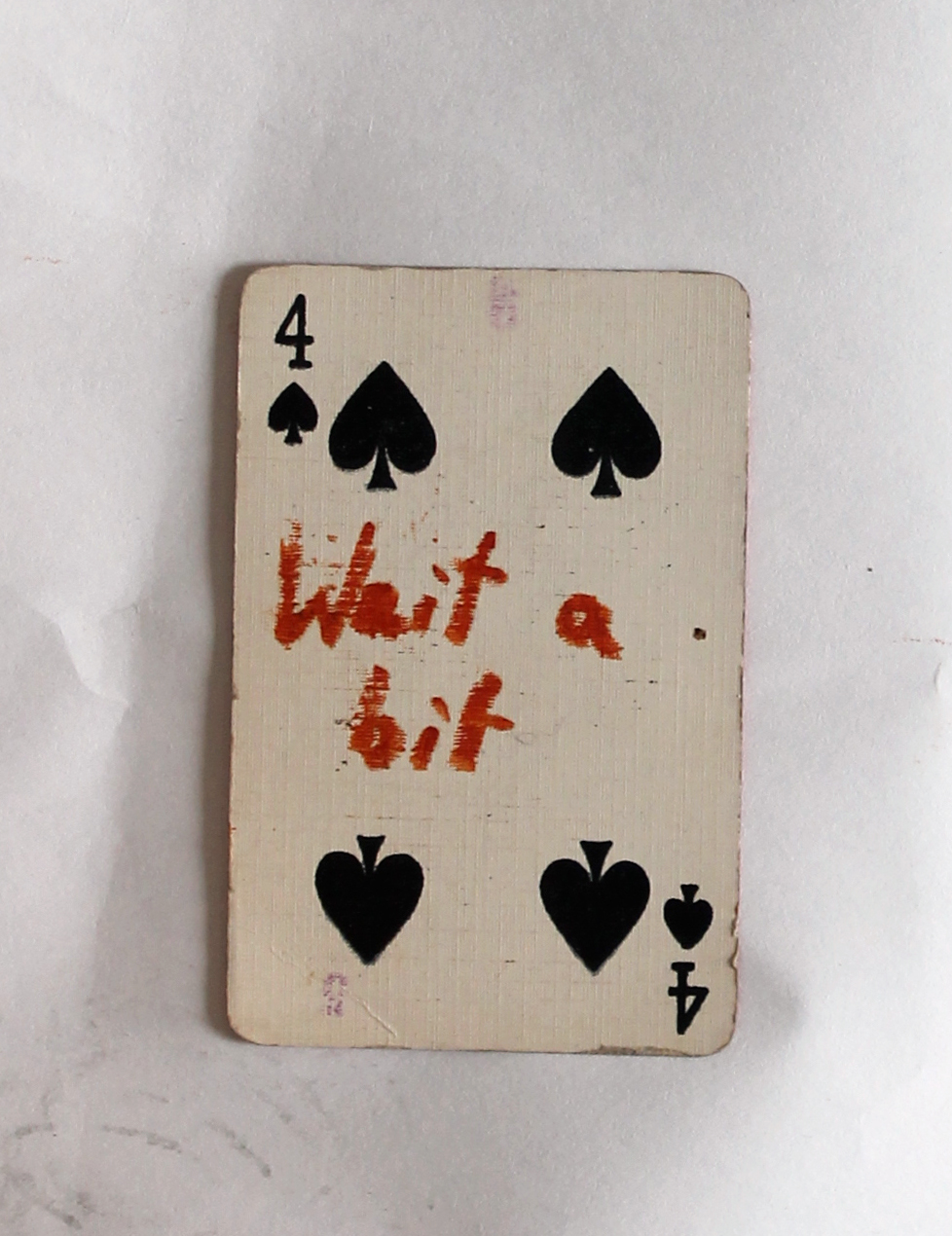
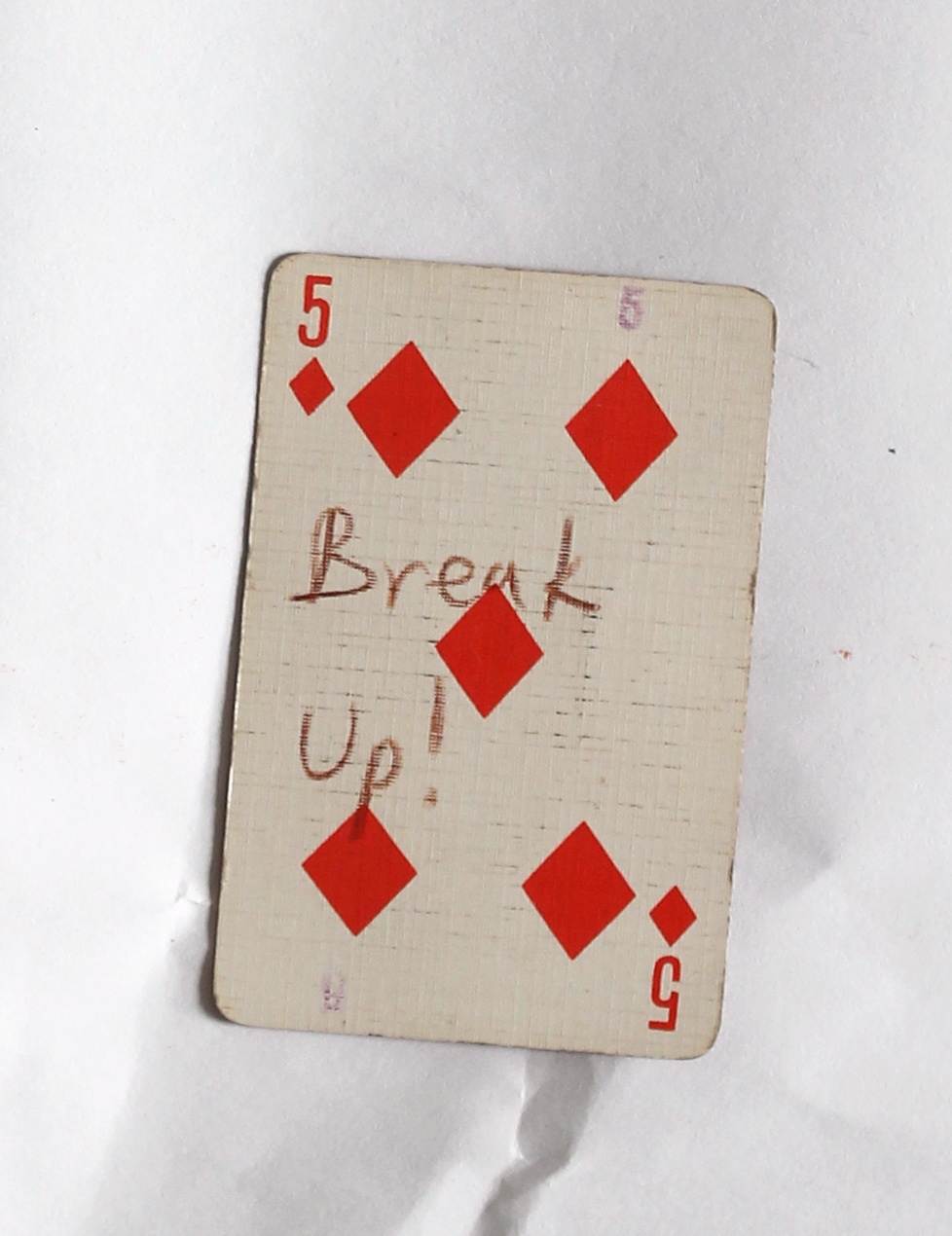
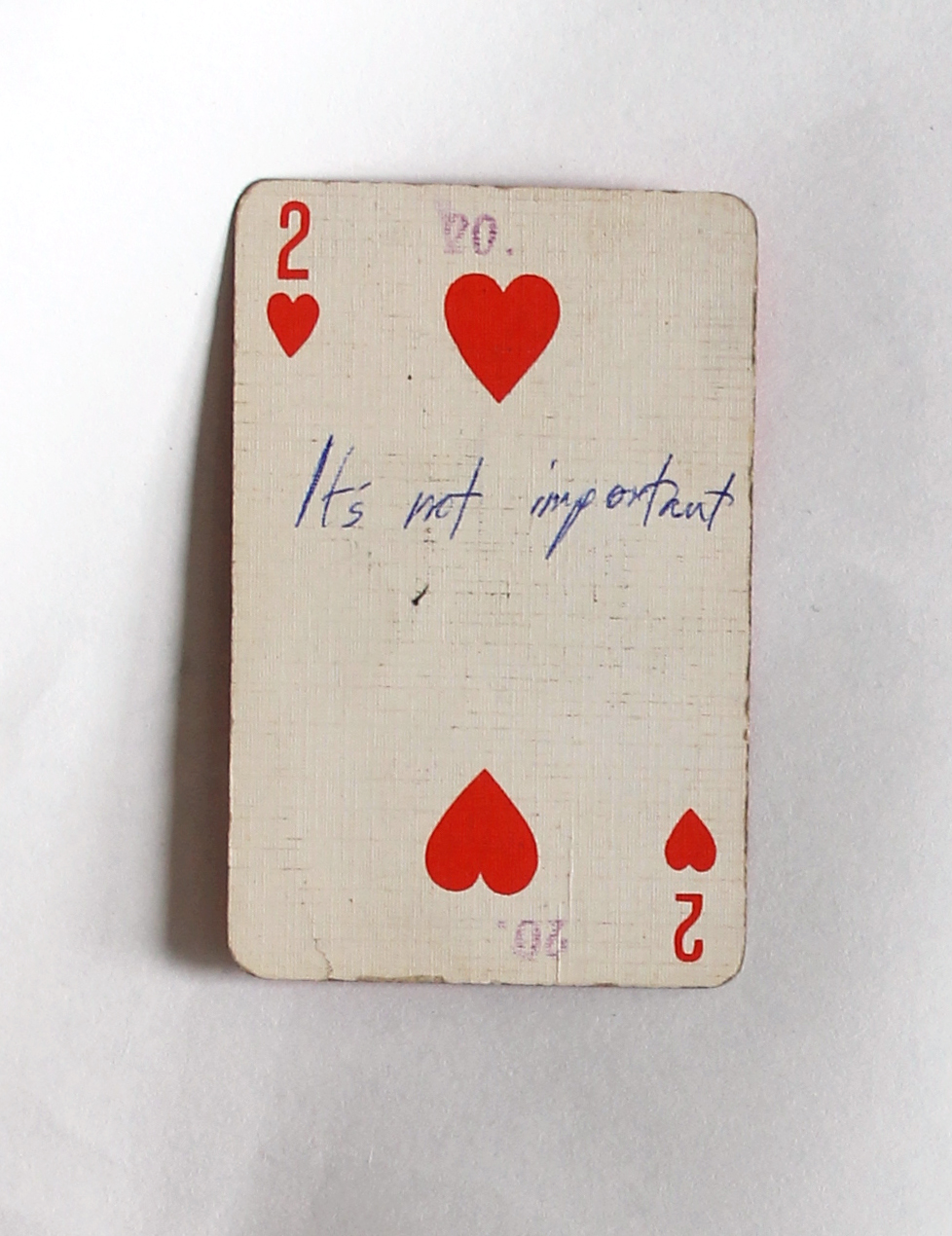
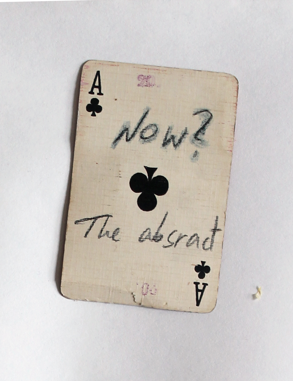
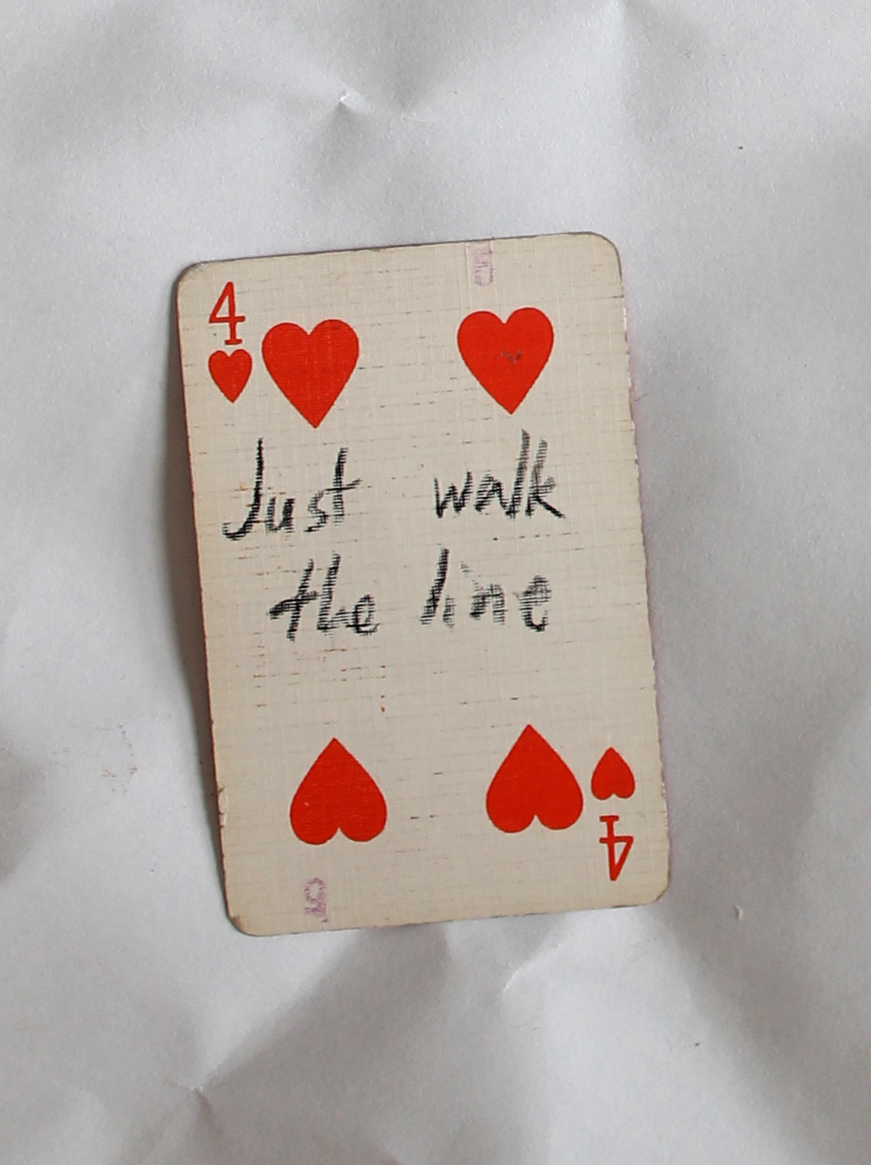
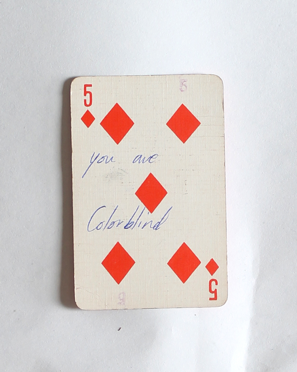
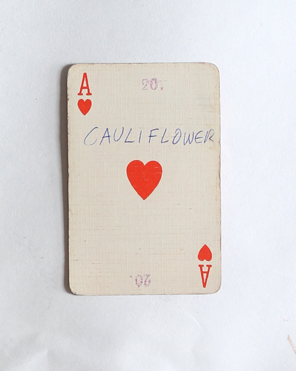
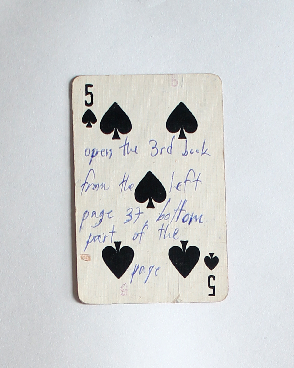
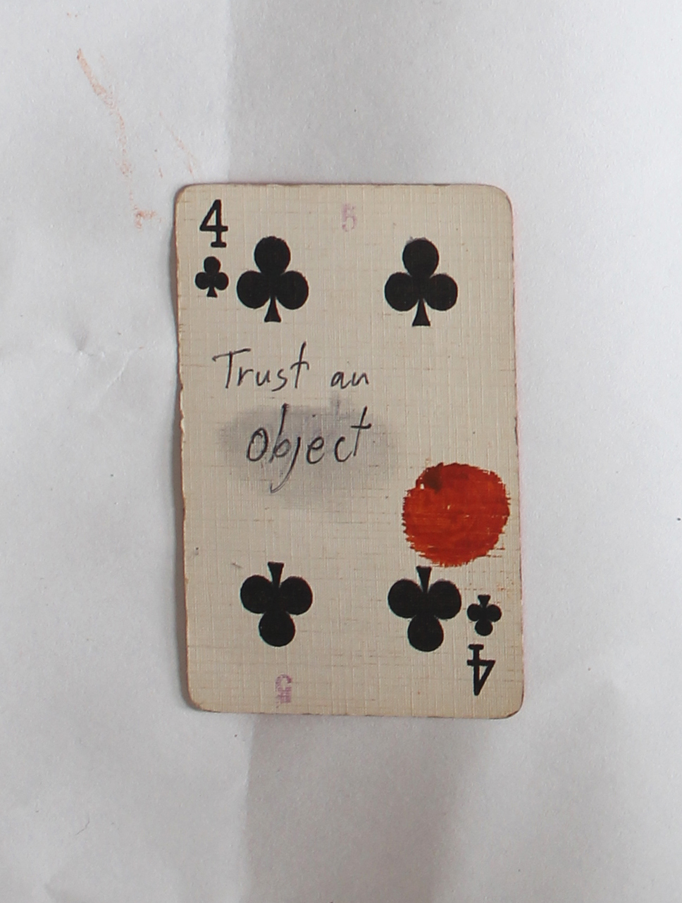
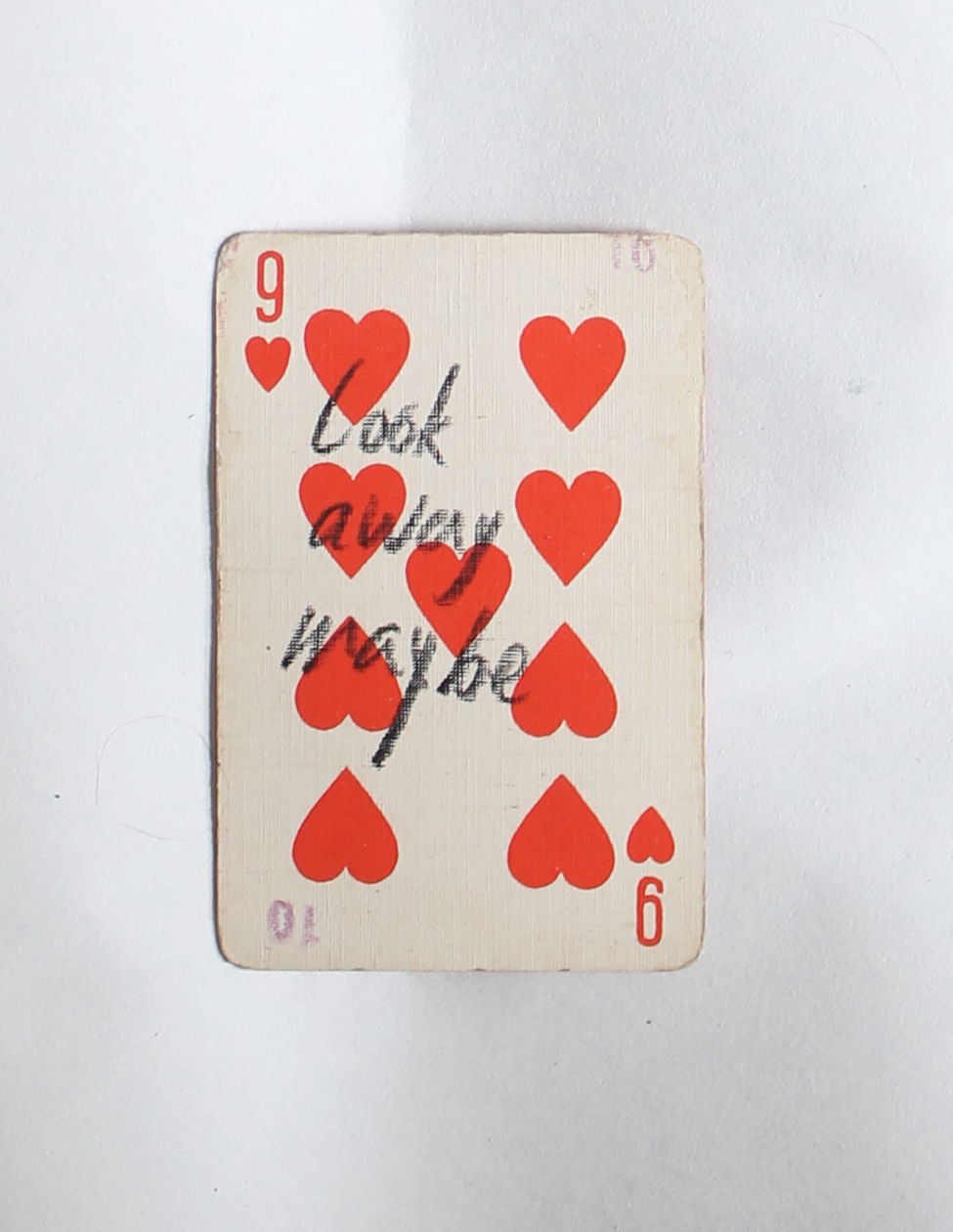
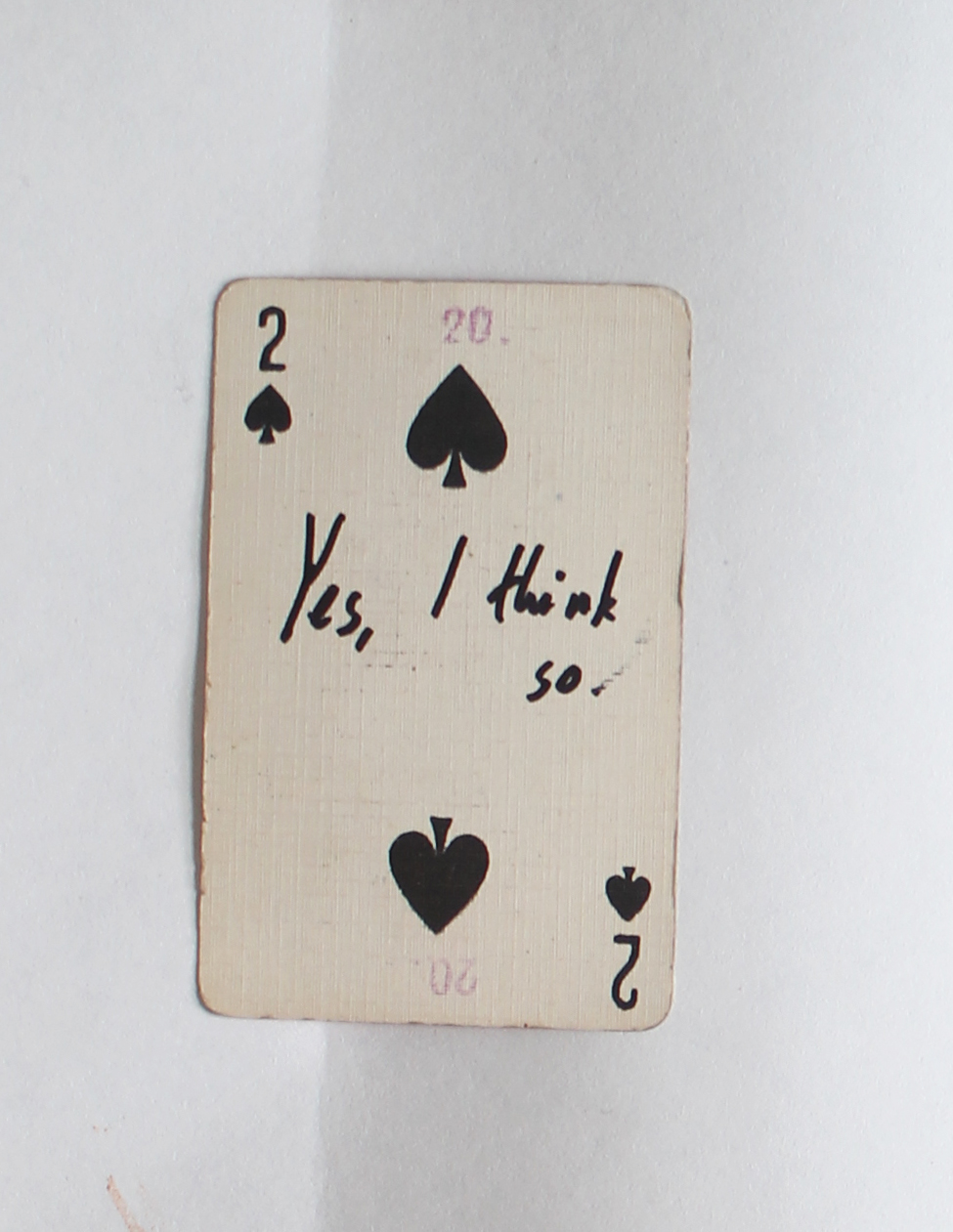
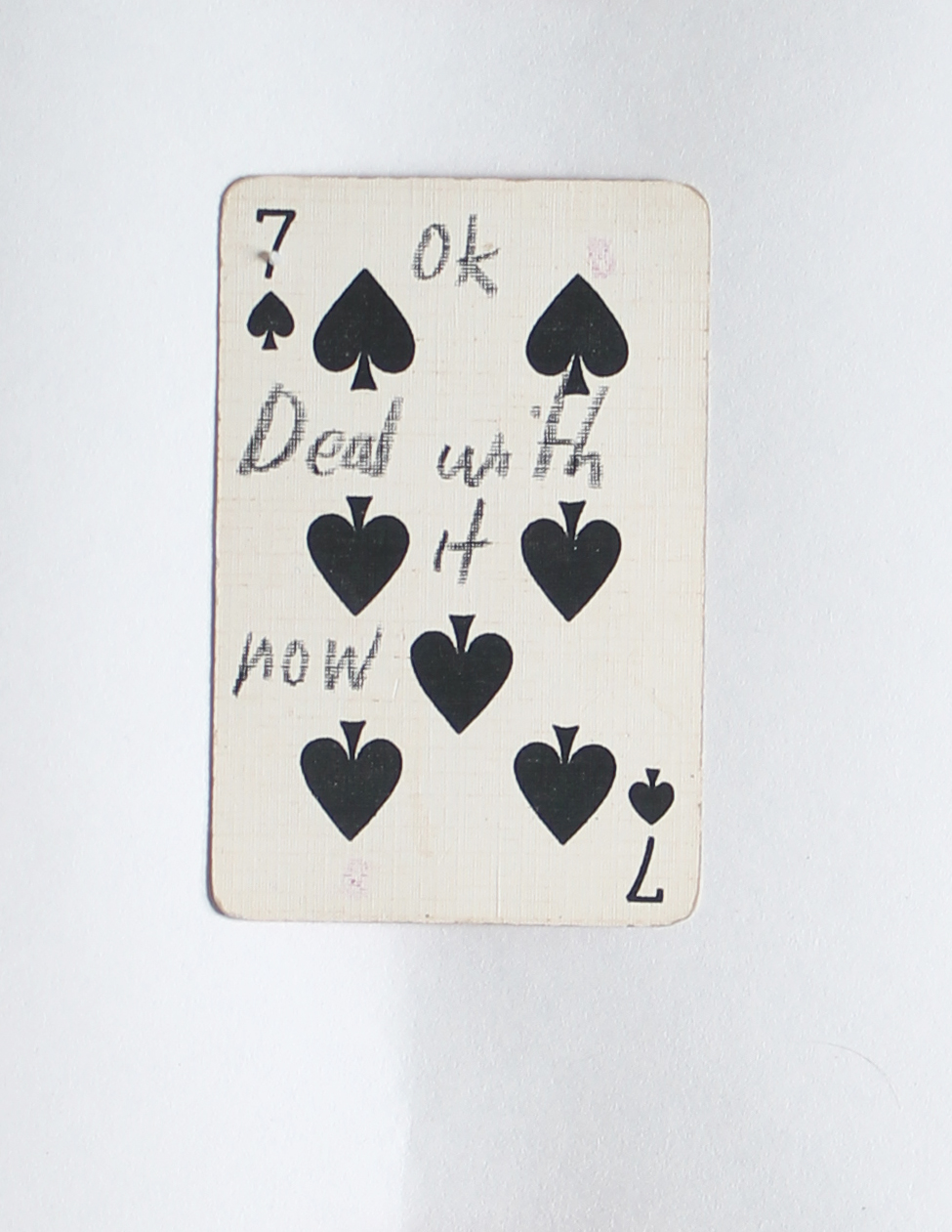
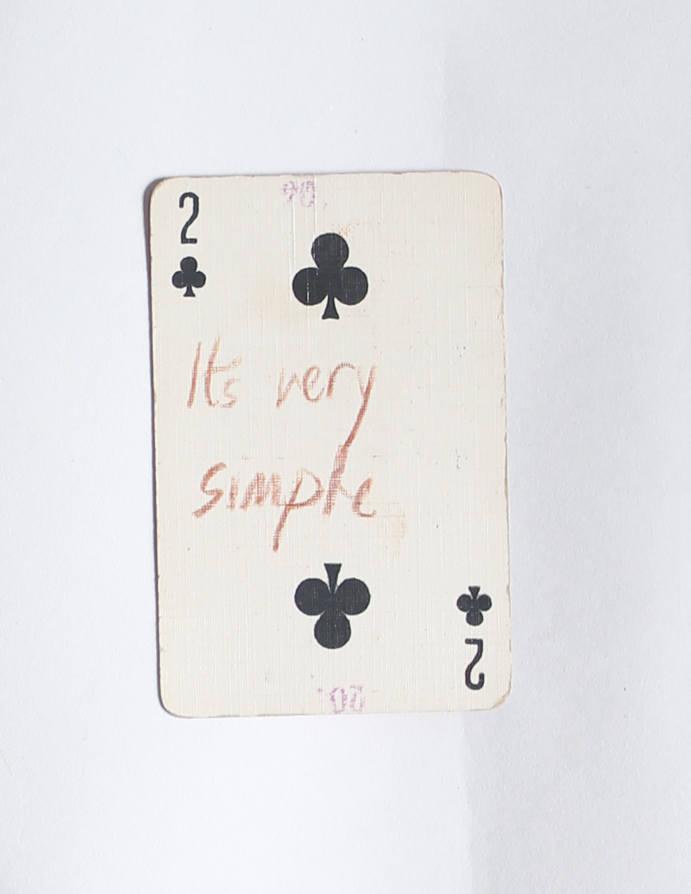
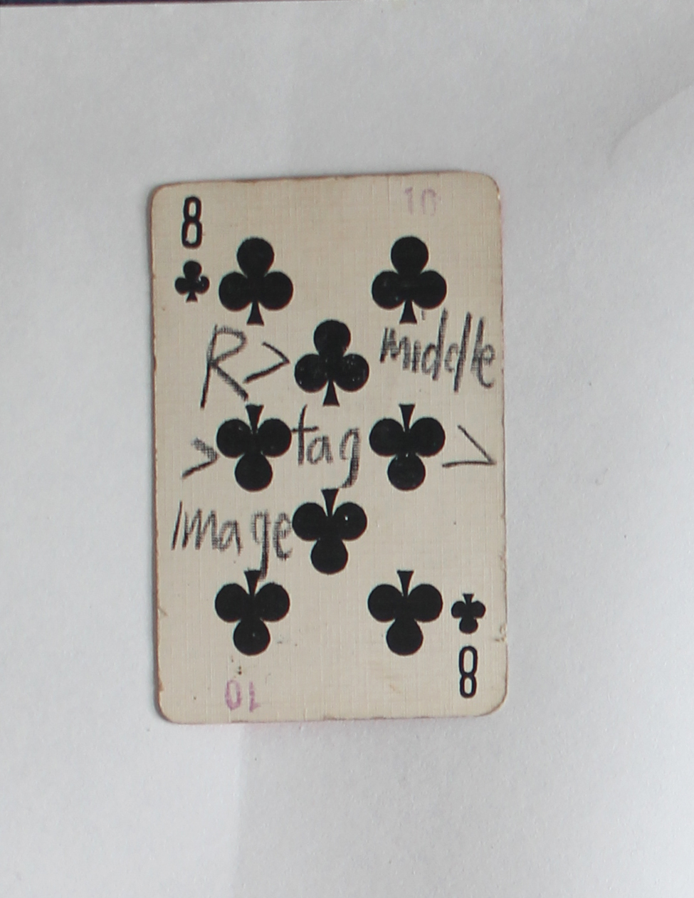
If you are looking for an answer for something, a hint, or that the cosmos will decide things for you, you are in the right place. This blog and this post in particular. You can try to find your answer in the cards below, just click on one and see what it says.
The dice man is a book that tells the story of a New York psychiatrist named Luke Rhinehart who, feeling bored and unfulfilled in life, starts making decisions based only on the roll of a dice. He can’t change the dice’s decisions, including decisions about sex, murder, rape, and more.
This is your dice.
If the cards are not enough, you can start browsing the blog looking for a hint for life or an answer, using the overwhelming amount of posts the blog has to offer and using the randomness surfing that is possible here. But you need a method, you can use mine:
First post I choose randomly, then I scrolled down until the post ends, if something caught my eye or my mind, I lingered, wrote some notes, seldom made a screenshot. Then, I clicked on a left purple tag that is located on the same line as the end of the post (the grey tagging section). I had some choice between 2-6 tags, depends on how big the grey tagging section was. And then I continued to the next post, scrolled down, chose a tag one the left that is exactly at the end of the post, and so on.
The amount of time you should do it is as the number that is on your card, or until you find your perfect hint.
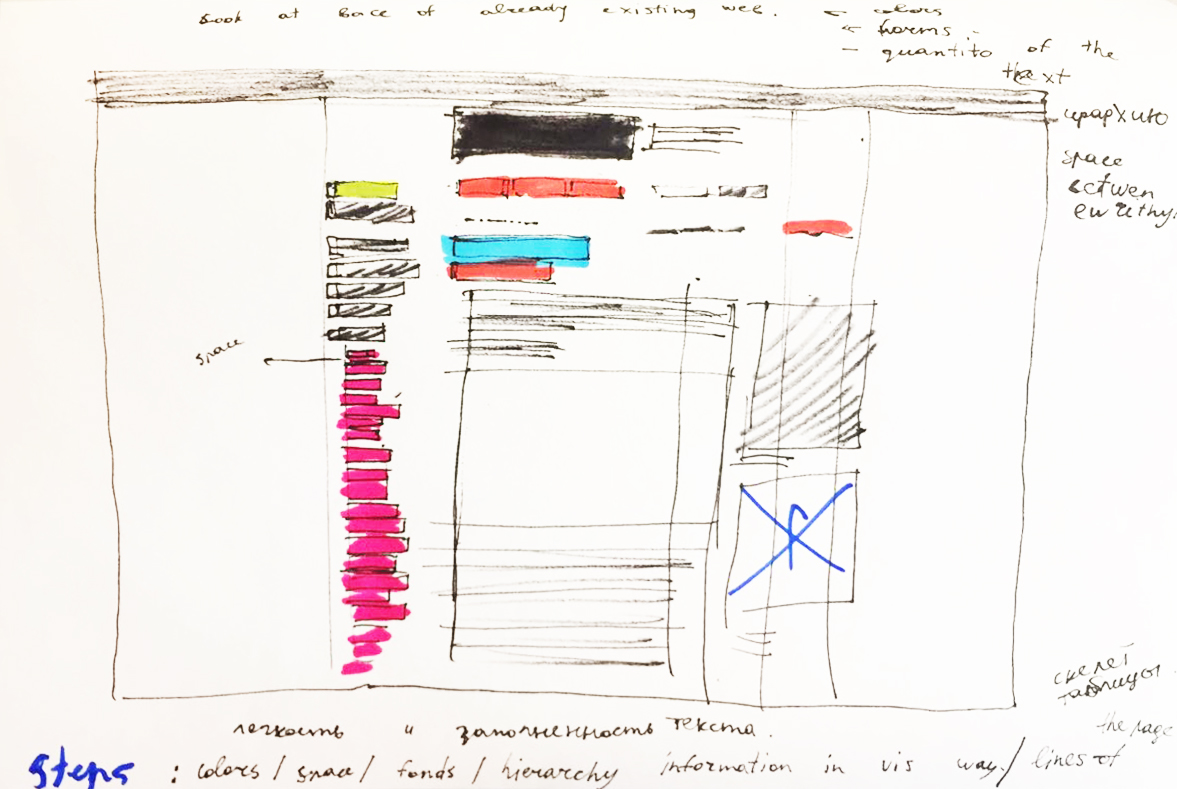
It helped me to discover all the interesting moments in the structure of the web page and to divide the webpage into different layers.
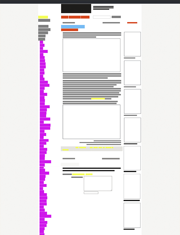
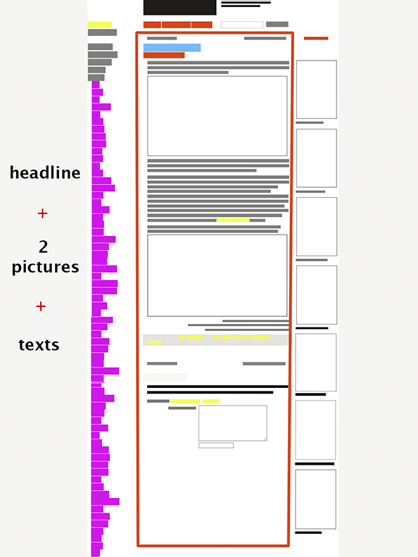
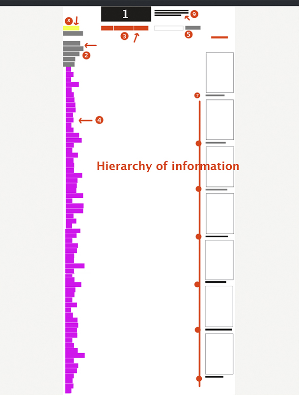
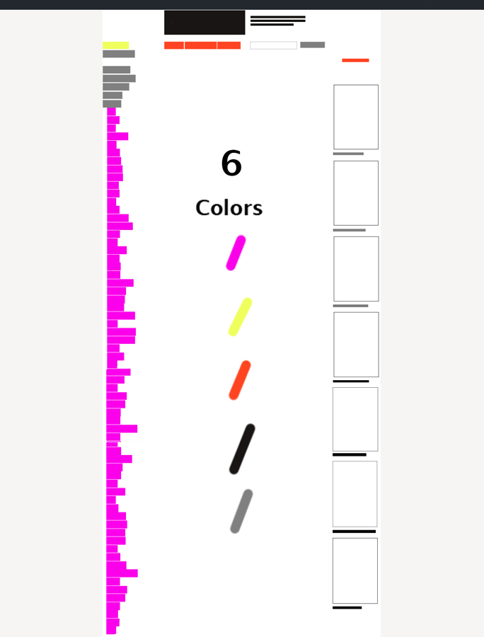
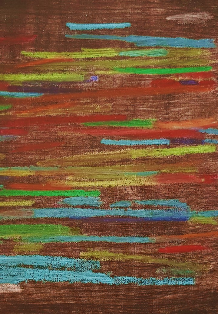
I chose that page (https://designblog.rietveldacademie.nl/?p=77833) and started to draw the structure of it. I noticed that this page doesn’t have a lot of air between different parts of information, words, and texts and all data ranged to the center. Moreover, there are six colors, 4 fonds and two main pictures with bright and sharps form inside. All paragraphs are left-aligned and they end in a rather chaotic order. However, squares around words help to divide information between each other. The quantity of the colors attract the biggest part of our attention and we can feel a little lost.
Sketch
Modular grid
The fullness of the page
The Hierarchy of the given information
Colors
Example of a new Design
By doing a new design for the existing page I tried to pay attention to the pictures and elements on the images which always can become the part of the website. In that case, I chose circles as the decoration of the page. Also, I wanted to divide the main text (essay) from the surrounding data. So color gave me a possibility for doing that. Plus I added a little bit more space between words and made distance between tags, title, essay. It helps us to get a breath.
According to a survey conducted by Brafton, the average session duration was 2 minutes, 17 seconds, but that varied depending on whether the site was B2B, B2C or a hybrid. And when it comes to blogs the nearly 8 out of 10 visitors are going to bounce after just viewing the first page. The average time spend on blogs are on only 1 minute, and 20 seconds, which is almost half the average time on sites. So it is very important to do everything in your power to make a strong impression and provide call to actions to keep them engaged. So how do we get people to stay a little longer on this blog.
We could make a fake “50 year celebration full scholarship” for the new students? Or Some kind of clickbait title? Something that would want you to stay, but also shows you what design blog is all about. Something that makes us able to pass the 1 minute, and 20 seconds average. Because this is not an average blog. This is a Designblog for the people. A visionary blog that inspire and moves young designers to greatness. So please don’t go! Just stay a little bit longer.
Try to go to categories. Here you find the different design fields. Or maybe search under “colour” there is a lot of great posts about colour and stuff. Please stay. Just a little bit longer. The design blog has a lot to offer. Don’t leave. There is also funny stuff in here too. Look at these monkeys. Hahaha.
PLEASE DON’T GO! A little longer. Please. Don’t go. Do you like books?
There is a lot of books to look at too. Is 1 minute, and 25 seconds too much to ask for? What more important things do you have to do? You are already here.
Go to the tag and look for something you like. There must be something! Porn? Or puppets? Please stay. Don’t leave.
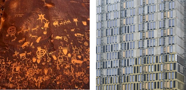
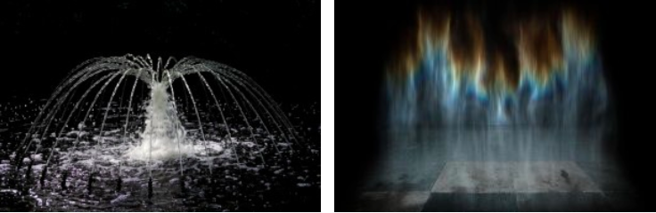
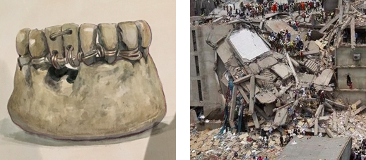
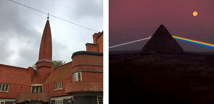
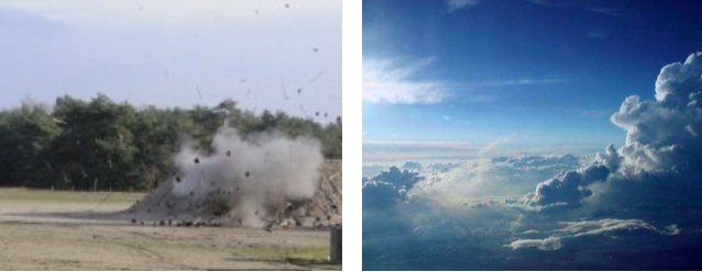
Feeling over-saturated by images is something that everyone seems to experience and acknowledge but few choose to address. When being confronted with a new image, it is difficult to distinguish how it strikes you inside, if it strikes you at all. Having the access to infinite images and being used to face images you didn’t even agree to see, as well as having to process so many images daily is a process that eventually numbs one’s sense of perception. Over-stimulation leading to a loss of sensibility and impressionability. Extreme images of war or violence are perceived to have the same “weight” as an image of something mundane. Through images, we have had the opportunity to see nearly everything you can imagine. It seems the numbness and muted responses to visual stimuli developed as a coping mechanism to protect oneself from images. People are naturally impressionable and receptive to visual stimuli that can trigger emotions or actions. On a primal level, that is how we understand our surroundings. We are faced with events or visual qualities that we react to — this nearly automatic and intuitive reaction then enables one to better understand their surroundings and how to navigate them.
A world over-saturated by images makes seeing no longer important when everything has been seen. It turns blind those who could previously see. It’s a paradox that as we have gotten increasingly desensitized, our society still revolves around the act of seeing and considers sight to be the most important sense, creating a hierarchy of senses where seeing is the most valued. Images depicting a drastic range of content all have a different weight, depending on the relevance/extremity of the content. This glitch in perception is specifically enforced by images because of their two dimensionality. This quality allows them to be endlessly distributed and circulated, especially on the internet where it is free to do so. Digital images circulate extremely quickly and reach a much broader audience than printed ones do, and it seems this coping mechanism of numbness developed as a reaction to our increased use of technology. On a screen, you can scroll and encounter hundreds of images in close proximity to each other in a matter of minutes. The over-abundance and unlimited access to endless images lowers the value of each image. No image is truly valuable anymore because there are too many, one cannot give undivided attention to every single image they encounter, nor do they want to because everything has already been seen, and it feels that nothing is ever “new” or exciting. Images become interchangeable and meaningless, everything becomes everything, anything can be anything.
A single image, when payed attention to, conveys countless narratives and meanings and is open to a range of interpretations depending on who the viewer is, but with the notion of over-saturation, paying attention to and absorbing the meaning of a single independent image shows itself to be quite a task. When viewed in relation to another image, one that in one way or another conjures a similar feeling, visuality, or dialogue, the context and content of each extend out of the individual image and create a wider dialogue, one that makes underlying connections and systems of universality more apparent. When images are visually similar in terms of form, arrangement, and color, even if the literal content or subject is completely different, the viewer recognizes some form of universality and interchangeability. Even when visual similarities are not present, it is always possible to form connections and new understandings through their juxtaposition. It does reinforce the idea that everything is everything, and anything can be anything, and that no content is absolute or meaningful on it’s own, but when paired with a single other image, I recognize it to be relevant to enhance a deeper understanding of certain content, and it plays exactly in the terms of what I was pointing out earlier, meaninglessness and loss of attention and value. The viewer then has two points of reference, contrasting histories and content, which I believe stimulates them to realize that indeed, images are communicative tools, but they can only fully realize that potential when they are in relation to one another. In daily life, nothing is seen or experienced singularly in isolation from other things. Perception and understanding results from an interconnected processing of stimuli through a web of the physical senses, one sense and stimuli feeds the other and together, things can be understood.
When I began to write this short essay, I had a critical view of our desensitization to content, and I still do, but as I wrote this I began to realize that we do indeed understand and perceive through inter-relation of content. We cannot prevent being constantly bombarded by images in daily life, as well as on the internet — it is no surprise that we have developed “coping” mechanisms to prevent ourselves from being completely overwhelmed by external influences. Instead of surrendering to this inevitable numbness and passively allowing these coping mechanisms to grow, one could slightly redefine the act of seeing and perceiving images by paying attention to the connections that can be made between all images. As I paired images to highlight the interconnection, universality, and interchangeability of everything, I was astounded by how no matter how slight a similarity or link between two images is, it is possible to see underlying systems of life and matter — which we consistently deny…
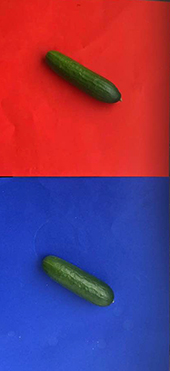
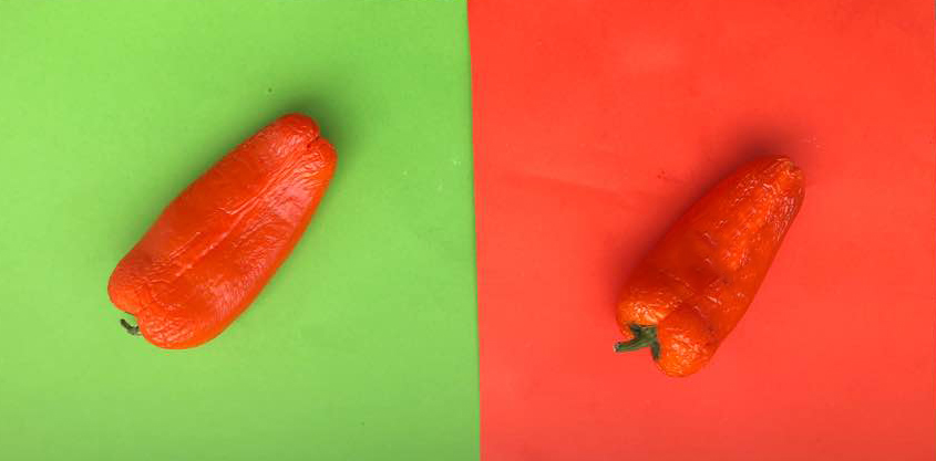
At the beginning, I just searched blogposts about color by typing ‘color’ in the search engine. I found out many tagged blogposts were not only about colors but also ‘color system‘. Many of those posts use fruit to show color contrast. The harmony of between fruits and vivid back ground color looked sexy and aroused my interest. So I ran directly to the market.
As always, as soon as I entered the market, the first thing that catches my eyes were colorful fruits and vegetables.Those colors were made by nature which made clear and bright color. Anyway, I bought different colors’ fruits. Blueberry,rasberry, paprica,pickles,lemons….and put them on the different colors’ papers.Then I saw the contrast between the color of background and fruit.
successive contrast is the effect of previously-viewed color fields (“inducing fields”) on the appearance of the currently-viewed test field. To put it simply, If you look at a different color after seeing a color, the color that you see later is different due to the effect of the first color. For example, if you look at red for a while and then look at yellow, you will notice that the pale cyan is superimposed on the yellow by the effect of the red complementary afterglow, and the yellow appears greenish. Such a phenomenon in which the order is determined and the color is continuously viewed with a time difference and each color is seen as a different color is referred to as a successive contrast.
Simultaneous contrast refers to the way in which two different colors affect each other. The theory is that one color can change how we perceive the tone and hue of another when the two are placed side by side. The actual colors themselves don’t change, but we see them as altered.When two colors having different areas such as a background and a picture are directly in contact with each other, a complementary background image having a large area overlaps with a color having a small area, which is different from the actual color.For example, if you put the same pickle on the background of red and blue, a pickle on the red paper looks more darker than pickle on the blue paper.
Hue contrast is a measure of how easily we distinguish between two adjacent colors (hues).Two areas with a high hue contrast will be easy to separate. An object which has a high hue contrast in comparison with its background will be easy to see. Areas with low hue contrast will blend together and be more difficult to visually separate.and this picture is an example of hue contrast. Paprika on green paper is more remarkable rather than paprika on orange paper. Because paprika’s color is an orange, it becomes more vividly remarkable when it’s on complementary color.
Area contrast is the phenomenon that the saturation and brightness vary according to the area even if they are the same color. The larger the area, the higher the brightness and saturation, and the smaller the contrast, the lower the brightness and saturation. There may be a difference depending on reflectance and absorption rate. For instance, the bigger raspberry under the text looks brighter than the small raspberry.
I browsed in the blog, partly floating, partly with full attention. I moved in the world of the blog through the tags on the left. I had a method: First post I choose randomly, then I scrolled down until the post ends, if something caught my eye or my mind, I lingered, wrote some notes, seldom made a screenshot. Then, I clicked on a left purple tag that is located on the same line as the end of the post (the grey tagging section). I had some choice between 2-6 tags, depends on how big the grey tagging section was.
The first post was in Dutch, so the visualization was the only thing I had.
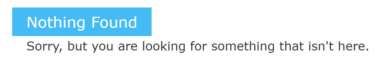
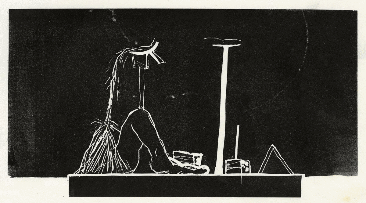
Grey Hypocrisy felt like it was made for me, the first hint, “quest for the dull”, he said. With an image of a room, with a personless solitary chair. These kind of rooms and chairs I’m trying to portray for a while.
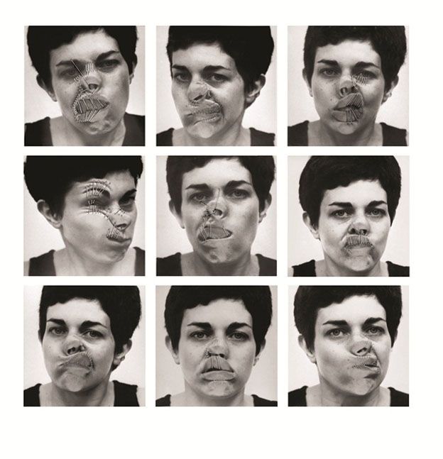
5 years ago, Marlies wrote about Imme van der Haak . She reminded me of Yocheved Weinfeld, Yocheved Weinfeld, and her artworks in the 70’s.
“why?”> ON QUESTIONING > “wrong side”
I encountered a post that was written on my birthday, and then a post that was written on my mother’s birthday. It’s gotta be a sign! I found myself looking for hints, not sure for what.
Keep scrolling.
“warning” > “Ability to choose” >
“waiting”! “For the next to come along.”
More and more hints. Like these sentences are designed for me. I realized that I’m browsing like I could wander the streets as a small girl: not being a “believing person” but to believe in traffic lights. wherever there is a green light is the way I should go, it’s the right way for me, no space for free choice, it’s from above. From the god of traffic lights.
> “waiting to be found” > chairs!
“Death”> “yellow and tiny”>
I agreed with Rosa Doornenbal, she wrote some nice stuff. I started to decide for me, what is a metaphor in this infinite data. To find the metaphors.
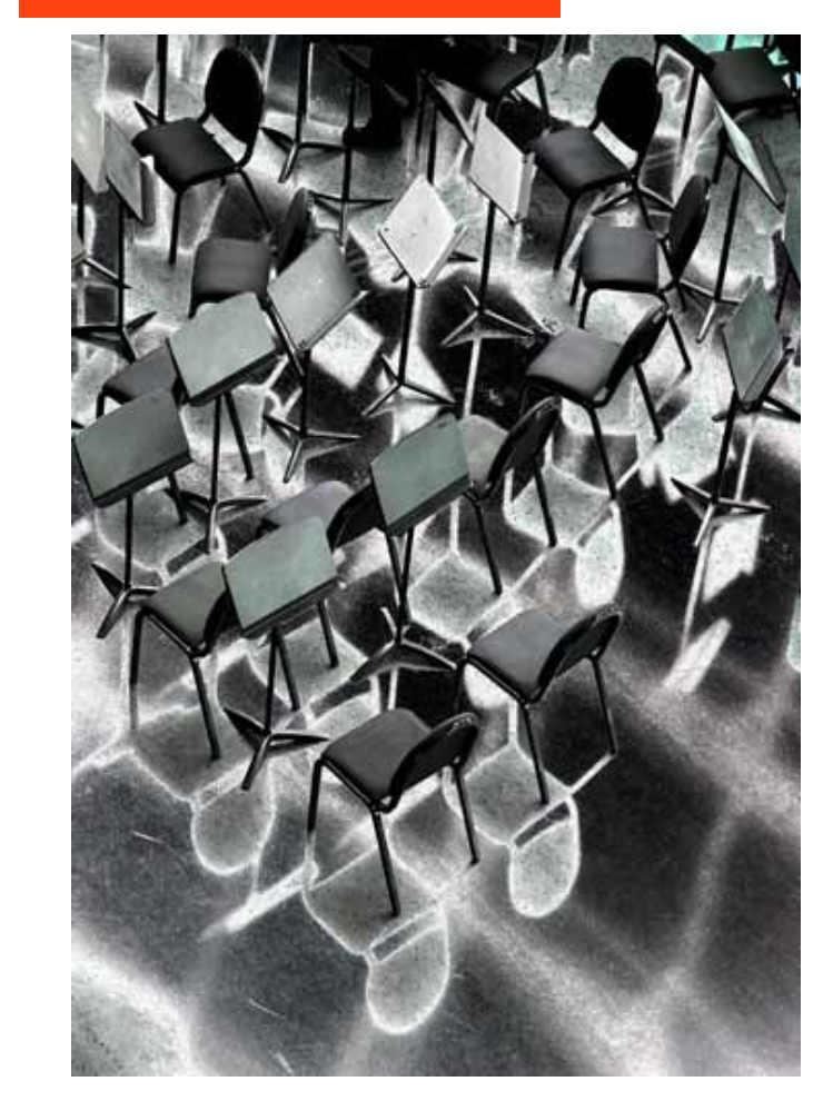
Marie Knudsen wrote about a jewelry book about joints. Extract from the book: ”A joint is a place where two or more parts are united or made to fit together.”– is this about silver or people? she asks herself.
for me, it was About putting stuff out of context on purpose. To give things meaning by taking their context away. It’s about the movement between the details and being far from the details until its abstract.
“alive”>”alienation”>”abstract”>”time”>”enjoying”>”no time”>”absence”>”all sort of apes”>”allegorical”>”queue”
brows like you are looking for a quate. Saw a quaote of Walter Benjamin: “Beauty is not the object and not the shell, but the object in its shell.” Ok. Maybe another day it will mean something, keep it.
“I would like to bring your attention to noticing things.” I think it’s funny.
Walking with a Line was beautiful. Made it clear for me that sometimes the combination of things punctuate your heart. The context is important. Context is everything. to put things out of context means just putting it in a new context, in order to look at them beautifully.
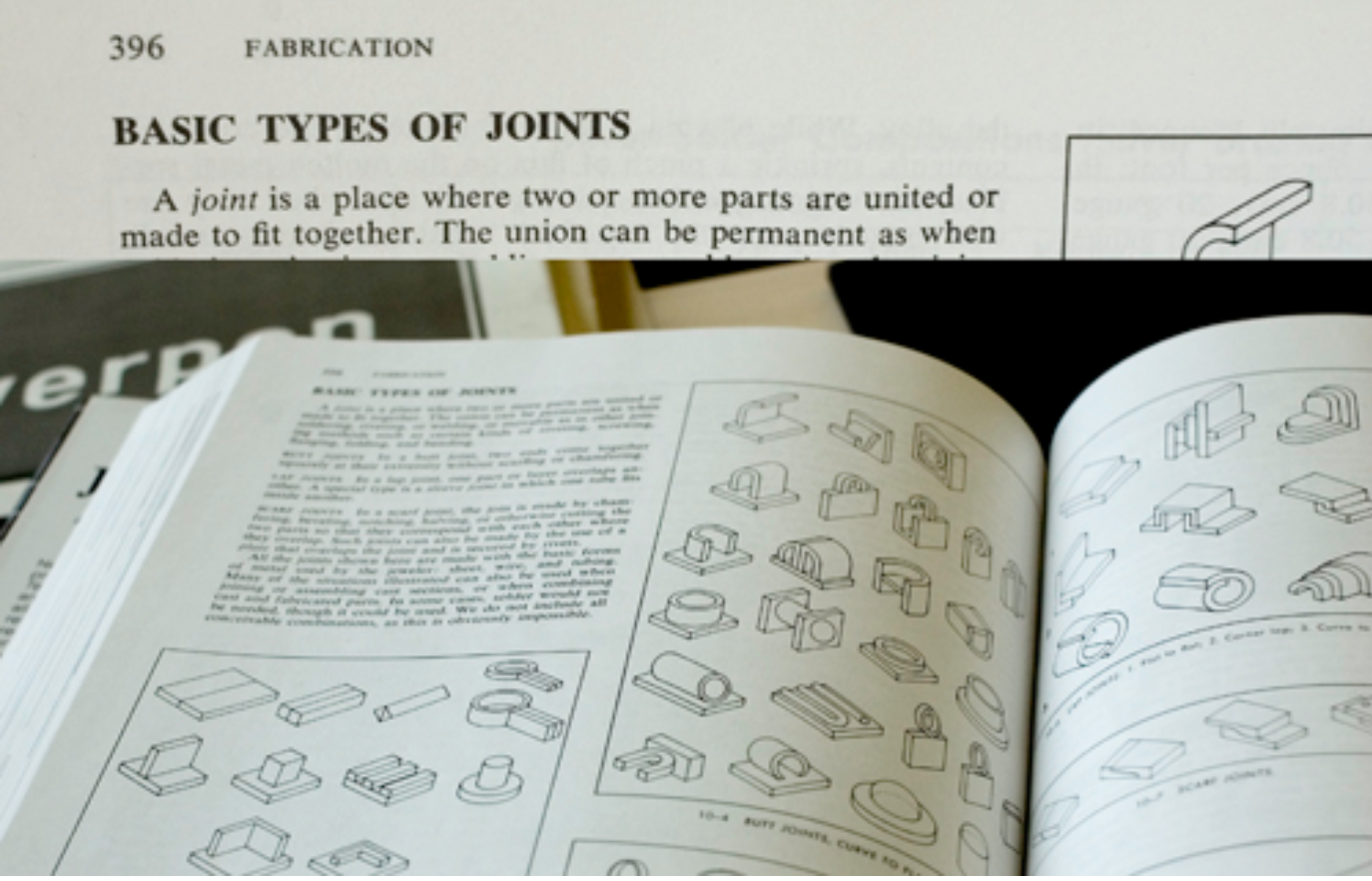
look at this together! It’s so different then as two solitary pictures.
And this also, it does something only together, when isolated it’s almost nothing.
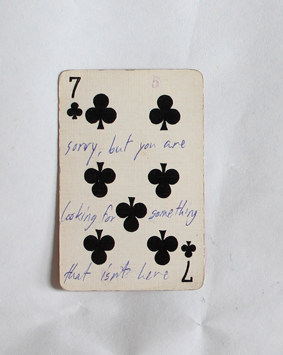
If you are looking for an answer for something, a hint, or that the cosmos will decide things for you, you are in the right place. This blog and this post in particular. You can try to find your answer in the cards below, just click on one and see what it says.
The dice man is a book that tells the story of a New York psychiatrist named Luke Rhinehart who, feeling bored and unfulfilled in life, starts making decisions based only on the roll of a dice. He can’t change the dice’s decisions, including decisions about sex, murder, rape, and more.
This is your dice.
If the cards are not enough, you can start browsing the blog looking for a hint for life or an answer, using the overwhelming amount of posts the blog has to offer and using the randomness surfing that is possible here. But you need a method, you can use mine:
First post I choose randomly, then I scrolled down until the post ends, if something caught my eye or my mind, I lingered, wrote some notes, seldom made a screenshot. Then, I clicked on a left purple tag that is located on the same line as the end of the post (the grey tagging section). I had some choice between 2-6 tags, depends on how big the grey tagging section was. And then I continued to the next post, scrolled down, chose a tag one the left that is exactly at the end of the post, and so on.
The amount of time you should do it is as the number that is on your card, or until you find your perfect hint.
While browsing through design blog, the first thing I did was scrolling down to see how many tags there are.
The scrolling felt everlasting, at one point I thought maybe the tags will never stop. They did stop at a certain point when I realized that if there where an infinite number of tags, the Designblog would became infinite itself.
This infinity intrigued me, because I cannot and will never be able to fully understand it. The endlessness dawned on me even more when I noticed the clear edge between articles and emptiness, two different dimensions. For me these dimensions worked the same as Earth and Space.
Earth has limits and the Universe has not (as far as we humans know). The first dimension “Earth” begins at the top of the blog and seems organized, there Is a clear layout, the highlights have a limit of 10 and the articles have a limit of 25. After scrolling down these 25 articles “Space”, the other dimension, begins. This dimension is infinite and after you crossed the edge where the articles stop, the tags could go on forever…
The “Space” dimension is also more chaotic because of the tag system that changes the order when the page gets refreshed. There are three outcomes, tags in order from A to Z, tags in order from Z to A and tags in a random order. Every time you go to another page or refresh the existing one, you don’t know how the tags will be ordered. Because of this I noticed a section of tags with numbers and symbols I wouldn’t have noticed otherwise. This section is separated from the alphabetized tag-list and unlike them these tags don’t seem to be arranged in a logical order. This makes them seem unimportant to me and some of the tags are not something logical you would use while searching. For example:
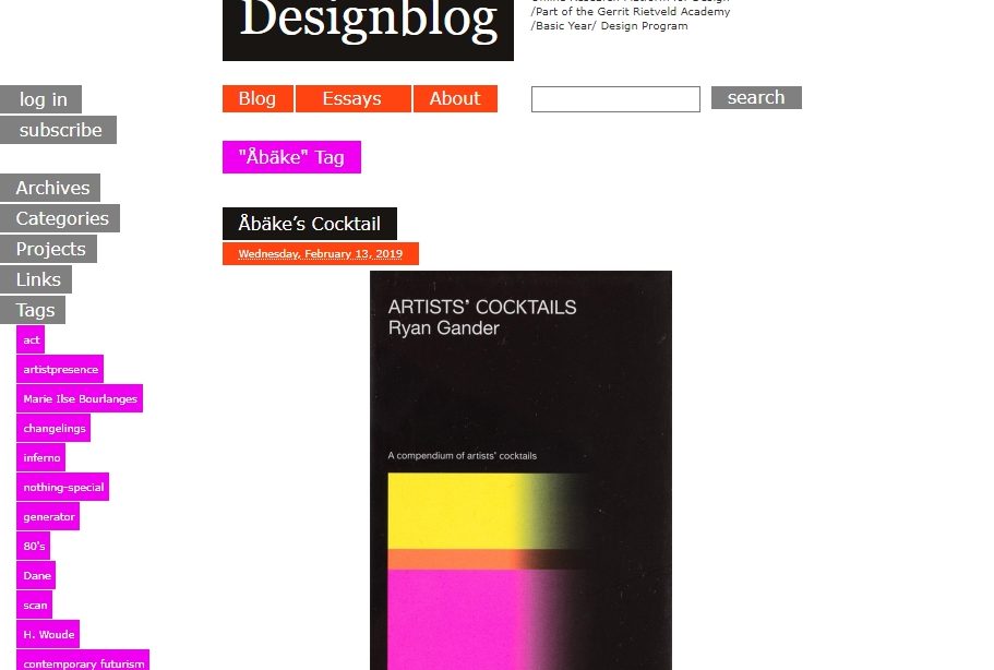
The tag which made me question the most was: _.’’._/_)..
The page this tag sends me to tells about a graduation book made by Marion Molle with has these symbols as a title. She told the writer of the article that while making the book she felt obliged to add text but she didn’t want to, so instead she used the symbols as title.
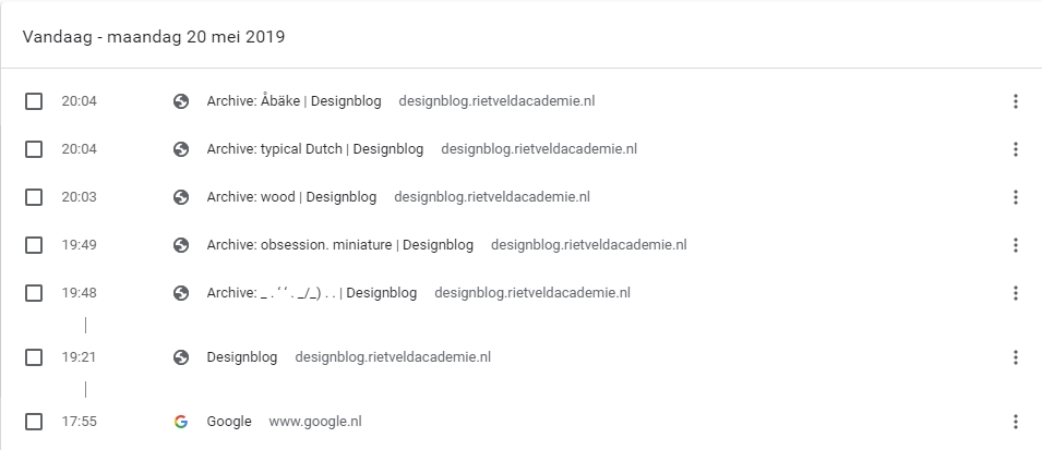
The core of the endlessness of this blog is for me the edge where the articles stop, and the tags continue infinitely. The tag _.’’._/_).. became my starting point of visualizing this.
I scrolled down to the “edge” of the articles and noted the tag that comes after the grey block. Then I clicked on this tag and continued this way of collecting tags a couple of times.
When I reached the tag Åbäke I stopped and checked my browse-history list.
This ‘Åbake’ tag is the first word in the alphabetical list and felt like a good closure. The words I collected were in the following order:
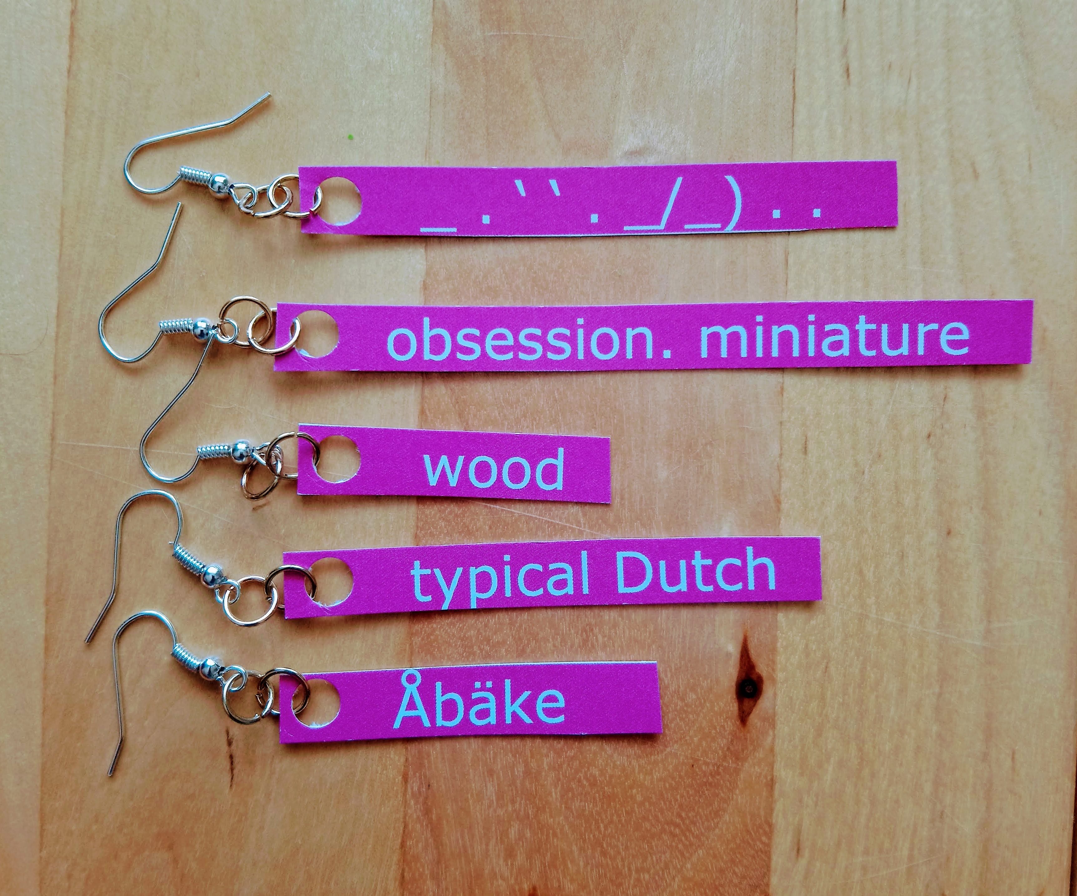
Because these tags only exist in the virtual world, i wanted to bring them into the real world by materializing them. I wanted to approach this with a personal view, so I chose to look at it from a Jewellery Department perspective because i would like to go there next year. I made earrings with the tag words in the same colour and typeface as Designblog. To show my path trough the tags and pages, I made a .gif of the tag word earrings going through my ears in the same order as my browse history. Like clicking on one tag and going to another, not knowing which tag comes next. The tag words I ended up with are not something I would normally click on, this made me see pages I otherwise would have never seen. Because of this research I now know that Åbäke is a London-based collective of four graphic designers.
It doesn’t make sense to end a post about endlessness right?
So this is not the end!
Try it yourself, click on Read the rest of this entry » scroll down to the edge where the ‘space’ dimension starts, click on any tag you find there and see where it brings you.
_________________________________________________________________ Read the rest of this entry »
It’s like entering a never-ending tunnel.
I step in and I am lost.
I step in and I see such an excessive amount of possibilities that it becomes overwhelming.
It is extremely vast but there is only one right way.
After a long, long search when I find it, a bright light illuminates my path.
Suddenly, I understand everything, I am sure of my moves, I know how to continue.
A pair of pink ballet shoes shines in the dark and show me a new entrance, but inside I am still blinded and confused. Quickly I realize the pink slippers help me to adapt my body to the space and guide me towards the next opening.
I still cannot see clearly, but I feel. I feel smooth silk, tickling wool, rough cotton all around the wall. Am I in a costume shop? I choose a piece with a tulle fabric resembling a Ballet costume. I wonder, am I in Jaime Hayon’s house? Is this black hole that I am trapped in an art piece or the pieces inside are a creations in itself?
I am about to give up when a new light appears. It is a search engine and I type in « email ». Nothing fits me, I cannot find what I am looking for. So I try « futuristic ». And to my greatest delight a new gate opens.
The relief doesn’t last long. My body starts to tremble, I am dizzy and an echo is repeating the words « social » and « design », « social-design ». If that weren’t enough, guilt and uneasiness take over my body. I rewind my previous steps to find out what has changed. I have a new clothing piece! I ask myself: What is Vetements doing in fashion industry? And I quickly take it off. That’s when a new entrance, saying Jacob Jensen appeares.
However, when I enter, nothing looks like him. So I look for a multiplayer. I cannot find anyone, only a chess set. So I step in the role of a knight and find myself in the next cave: a library from the Middle Ages full of old books. Pick a goddamn book, I am told. Only if it were so simple. This choice will define my entire future, the new world I will discover. Quartz obsidian, how does it sound? I visualize a bright, colorful space to put an end to this darkness. Luckily, I wasn’t wrong. My new world constitutes a Responsive Color System.
Although this brightness is liberating at first, it blinds my senses. So I have to search again. The result is unspeakable. I cannot recognize my visual system anymore. I enter a world full of code names. It takes me a considerable time to figure out only the name of my new Earth: CIE-1931-System. It is hard because in that world I am only an x, a tiny, dull, lifeless particle of the system. Almost the youngest.
I am lost again, swimming in the fog. I am desperate to find a safe place, when a new concept is introduced to me: The Exform by Nicolas Bouriaud. I dive into this new opportunity with the hope of finally finding clarity.
As I open up Designblog, the first thing that caught my eye and took all the attention were the yellow highlights. I almost got annoyed, that my focus wasn’t even on the title. I don’t think my focus is that easy to distract but maybe, who knows. At first I didn’t wanted to choose a focus subject yet, so I decided just to surf around on the blog. Some of the posts I found interesting others not.
But I still couldn’t not escape being aware of the yellow highlights every time I arrived at a new post. The highlights were very different in the way of the use of them. Some of the posts had a lot of highlighted words, some had a small text highlighted and some only had a very few. So I went on surfing on the blog with this in my mind until something strange happened.
I came across a post, where something was different. It didn’t had any highlights at all (except for the ones in the bottom, they all have). I felt somehow confused and relieved. I made it to the end of my journey on the design blog. I hit a wall. Just a clean post about “Doing aerobics before painting?: What can we expect during the Basic year”.
I followed the different yellow highlight to the end and I wanted to do something with the placement of them, the shapes and lengths. That was one of the nice thing with them, they changes and had a nice random flow.
So I decided that I wanted to work with them only. So I screenshot a lot of the different post on the Designblog. So I could have a nice “library” for the highlights. From there I started working on how to visualize it. Because it was such a simple gesture they made, but were quite strong, I wanted to make it as a very clean piece.
So what is a highlight, why do we use it and how do we use it?
Highlights works as you might know to make one specific word or sentence stronger. In some cases you underline your point for example. They are KEYWORDS in your text. The most important words to sum up your text. It is there to show the importance and your valid point in your text.
As Wikipedia also says: Highlight adds translucent color to a paper or text to emphasize particular parts of the text. The highlight can be seen in different displays as colors, fonts, depending the meaning of the context. You can also use the highlight to confuse the reader by putting them places where it is out of context. So in a way, it is a very simple but strong tool.
So as I said before I wanted to do a simple visualizing of the highlights. In the blog the highlights are colored yellow, it could also have been blue, green, different fonts etc. But my idea was neither of these. I thought that another way to make something pop out of the context could be levels. Levels in that sense that you don’t adjust anything else that the level or height of the highlights.
Imagine that you read a book, suddenly one of the words is in another level that the others. You would notice that in the same way as a “regular” highlighting as color. I’m not saying it is a more clever way to do it. Especially not in a book (it would be unpractical, so unless that is the case. I wouldn’t recommend it) but for something else than that it has the same effect. So I wanted to make a board, where I took some of the highlights I printed from the blog, and visualized it on that. Where everything is the same color and same font (in this case no fonts at all) where the only different is the level of the surface. I placed my “higher levels” as the highlights from the blog I had screenshotted earlier.
The result is very minimalist, but I think it sums up the thoughts I have been dealing with, while doing this assignment or exploring. The levels of course also works because of the shadows. And I think they work stronger, the more shadow and light they have. It is actually also the only highlight you can feel, unless we make a new highlighting with materials instead. That could be interesting too..
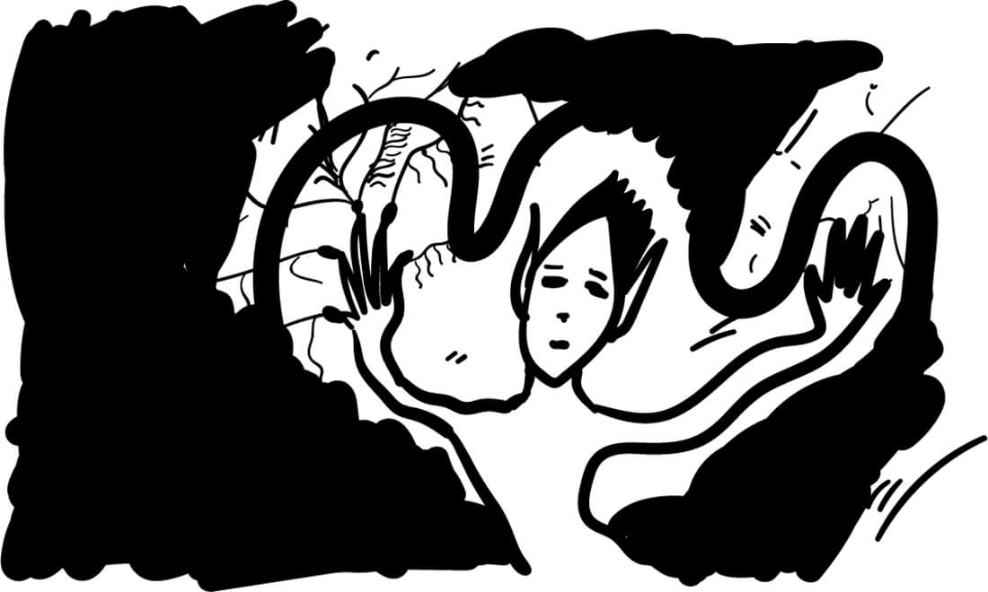
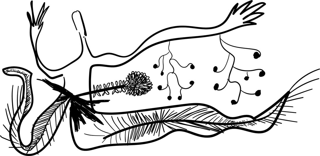
I browsed the design blog with a photographer’s eye: I looked through the posts for an internal voice that whispers me to capture this moment and make it mine — creating a folder of inspiration for my future self. I screenshotted words and images that spoke to my heart. I then collected them and zoomed even more inside each screenshot to seek for more visual information. By the end of the day, when my mind was still processing all the information, I understood I wanted to write about this specific screenshot.
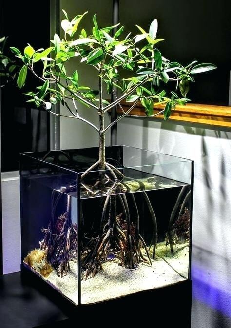
I wanted to explore what it feels to be one of these little plants and live among humans. This topic became the focus of my post.
LIVING TOGETHER
Plants talked to humans.
Plants explored the consciousness before us;
The humans.
They breathe, and eat, and act, and love, and laugh in their own ways.
Sometimes they whisper to people passing by; with a voice that sounds like a laughing soul
and sometimes like a wave of freshness.
The moments I am unaware of my body, they act to bring me back.
They are in desperate need of my cooperation.
Roots.
I don’t have roots; I think,
my thoughts do the same thing.
They can be strong thoughts that keep me in a place forever.
A place could be a city, a country, a way of thinking, and much more.
ROOTS THAT KEEP US SAFE
A longing for safety and I can not remember why.
I feel like a tree.
Let my roots grow deep enough to the source and connect; then I will grow.
Opening my leaves and blooming to see the world, but to also move in it.
Trees. Wise, strong and safe.
Am I rooted in this land that I call mine?
A tree. A land. A root. A laugh.
Laughing makes me feel safe, makes me feel rooted, makes me feel like a tree,
but I can also move.
PLANTS AND PEOPLE — PLANTS WITH PEOPLE
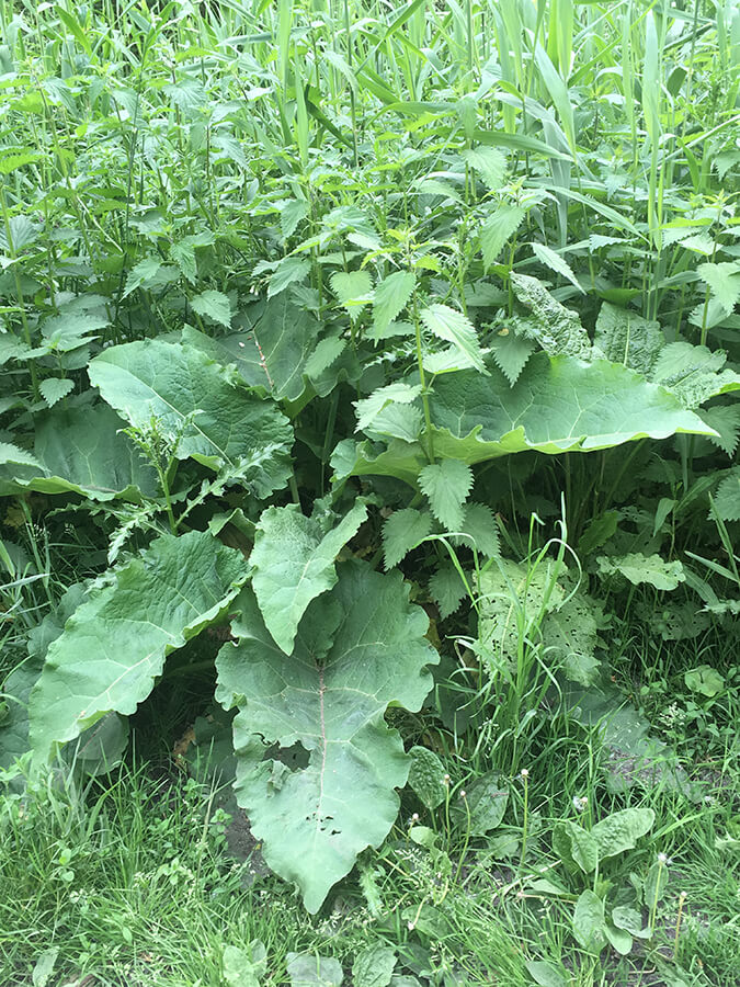
There are so many plants I see daily outside; I used to notice only the big and beautiful trees and the blooming flowers. I was unaware of the little grass and the plants that seem to grow by themselves without human interaction. I have seen a lot of people being annoyed by these plants — they take them away, they break their roots, and throw them inside plastic bags. They call this “clear the space”. I saw the government hiring people to clean the streets from these plants. The images of these plants somehow are creating discomfort, they grow fast and they don’t need people to take care of them. This sounds scary for them. I try to understand how it all started and how we normalized it.
CLEARING THE SPACE
A city is not a forest. A city is a place for people, not plants. It is a place that only plants that people like can enter. The lucky ones; the ones made to be with people. The others are hiding in dark corners in the parks, where I have seen them grow up into beautiful green big leaves. They are unique and charming, and they are homes for little creatures that want to live in the cities — close to people that they love.
MAKE THE INVISIBLE, VISIBLE
Have you seen that nowadays people put plants in glasses with water, and they grow, and people can see their beautiful roots?
I wonder if it’s only me who sees the irony.
I hope we see their roots and reflect on them.
I want my roots back and I feel like I am flying.
I love the Earth. It’s okay to feel like you want to be in a different world when you are young.
It is a sign of awareness that grown-ups should remember.
I love the Earth so much.
I want to be like a tree who can be connected all the time with this planet.
But I am lucky to be a human that has roots in her fingers,
and can make stuff, can touch, and move.
MY MIND, EYES AND FEELINGS
I dreamt I was one of these plants.
I saw how it feels.
I can tell you one thing:
they love to laugh.
“Why?” I asked.
They looked at me with wonder.
They didn’t realize I was a human dreaming to be one of them;
I didn’t tell them.
They continued to look at me with wonder — and I got it.
I woke up laughing.
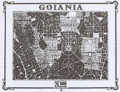
Searching here on the Designblog I tried to find something about my home country, Brazil. I did research about it but found very little significant posts, one mention over here another one over there. Tried something about my hometown Goiânia but there were no results at all. My wish is that in the future a student from my area bump with some content about us in here and get surprised.
So here I’m going talk about housing in the area I come from, Goiânia, more specifically about construction, I think it’s a good starting point to build some content I would like to see in here too and it also goes along with what I’ve been researching through drawing.
A FOREIGN IN MY OWN PLACE
Living here in the Netherlands for almost 2 years already without coming back to Brazil really sparkle something about my hometown inside my brain. I like to remember about how the landscape looks like, cause it’s just so different from everything I see here, then suddenly I start rediscovering the place where I come from.
Compared to Holland or Amsterdam everything is more precarious, Brazil and the majority of people doesn’t have the same economic background that Holland has, the material situation is much different, what shapes and sculpt the land in a totally different way.
There was a initial city plan that started to be followed but because of many factors people themselves started to change the surrounding the way they could.
Living on a foreign country makes you be able to see with fresh eyes the place where you come from. My family never really traveled around so despite the images that I would see in movies, television or internet everything I would see was Goiânia, Goiânia and Goiânia. I never realised how come the place was so embed visually inside my brain. It came for me very strong recently, everything I would always see but take it for granted, it came back now for me as such a powerful visual source of inspiration.
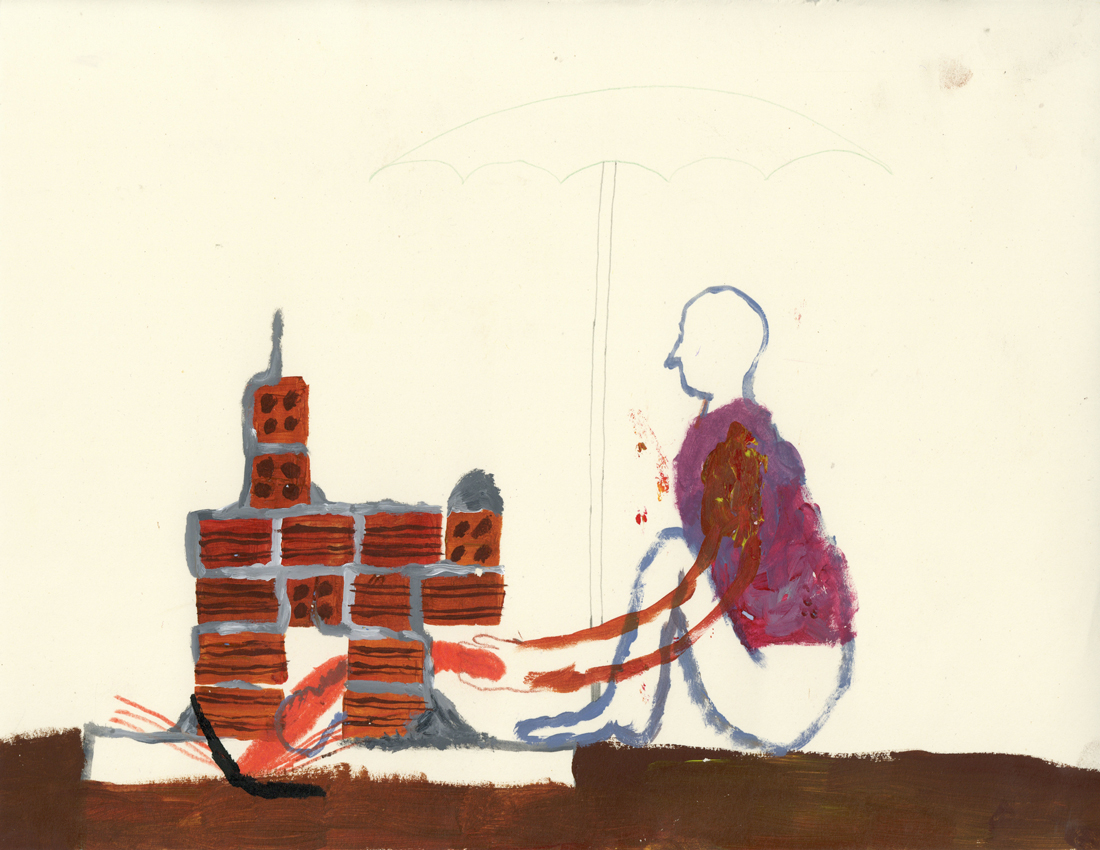
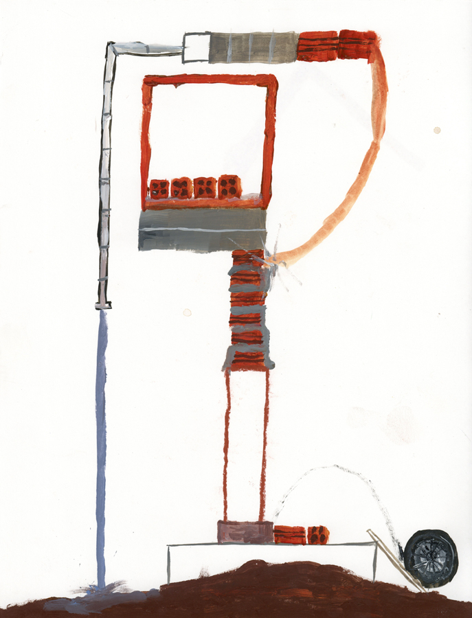
1. HUMAN FORCE
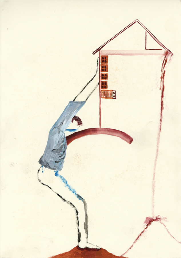
Construction work is normally made by man in Goiânia. It can be normal that the owner also works with the bricklayers and workers. My dad did help to build our house and others too, I remember that my neighbor too, it’s funny because in my dad’s house some of the walls are not so straight and there are always some sort of imperfections around. It’s also possible to build the house in the way you want, there are some protocols to follow but very little people follow it.
The human force can be found everywhere, there are many people working in the service sector in Brazil. It’s also very normal that a lot of jobs happens out of formality, so many times there is no contract or third parties behind the bricklayer and who is paying for the house to be build.
MAKING SHELTER
It can be pretty common that man work without necessary protection in constructions. Jaime was our home-keeping for a long time, and I remember when he did fall from a scaffolding during some work he was doing in my house. He was not specialized on that kind of service at all, he lost some nails in the fall, but he was fine.
Not only people can fall but houses that are build downhill can also fall and get destroyed, that happens often in some areas.
2. MATERIALITY
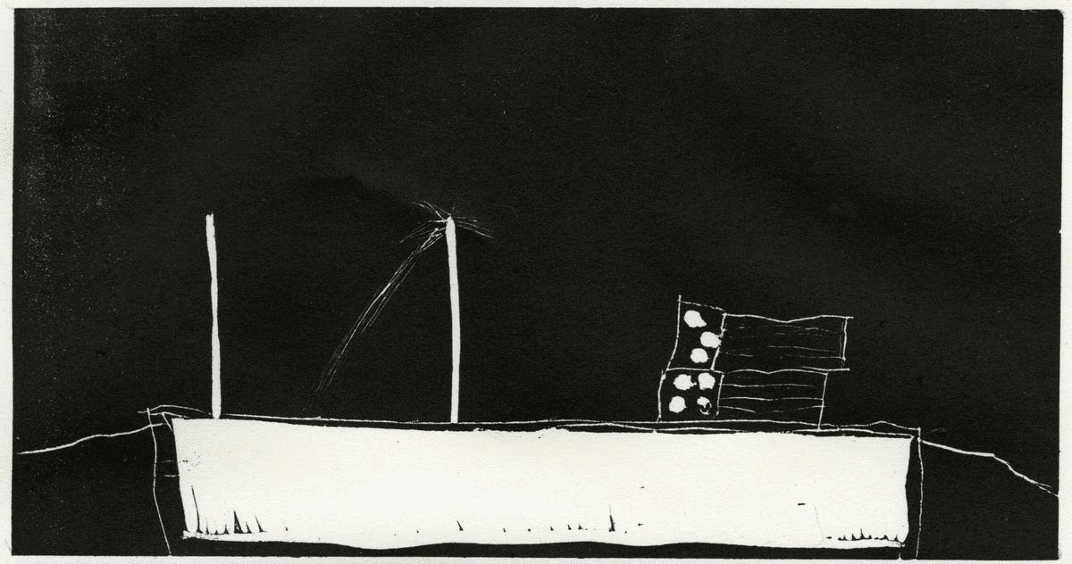
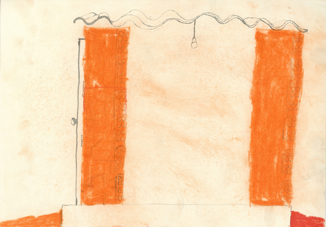
6 HOLES BRICKS
It’s the most used kind of bricks the 6 holes bricks as my dad says on the video above. I find it quite pretty, they are made out of clay and have a beautiful orange. The sun also make it shine when it’s pretty new.
It’s normal that families start constructions and sometimes the money is over but the house not. You can see many properties with unfinished houses and some material left. These days for me they look like beautiful contemporary sculptures. Symbol of something for the future. Makes me think about some of my plans and goals, the ones that if they were a house, they would be like this sculptures right now. Why did this action was stoped? Is the family taking care that the work continues? What are they dreams and visualisations for when the sculpture it’s done?
UNDESIREBLE BELLYS
Protection is necessary. Against the weather, non wanted looks and also from non invited people and it’s many non wanted actions. My grandmother lived in Urias Magalhães and she had pieces of broken glass on the top of her walls. The pieces were out of green glass and had a pretty colour, even though it did look quite frightening.
“Grandma, why are there pieces of broken glass on the top of your wall?”
“This is to cut the thief’s belly’s”
3 . GRAVITY
THE LAST FACTOR
Gravity is an important law of physics, every act or move we do is subjugated by the laws of gravity, we are subordinated by it all the time, so wouldn’t be the case that constructions are out of nature laws.
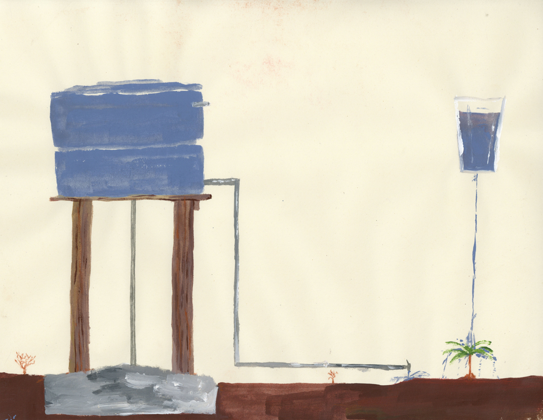
One important part of a construction that also strikes me visually are water tanks. It’s something necessary once many neighborhoods don’t have sewage treatment sometimes. Water tanks have normally a wonderful blue that goes along with intense blue skies too. It can be normal in some areas to bring water fresh from the ground. It’s also normal that you dig holes and take a look if there is in your area some fresh water, then you are lucky!
I did drink water fresh from the ground my whole life and I prefer it’s taste then the water in Holland. Anyways, socially it’s more interesting that every single house has drinkable tap water available like Holland. In Brasil many people can’t drink water from the tap because it’s not healthy to do it on longterm, it has also a weird taste.
Some Brazilians living abroad are so culturally used to not drink water from the tap that even in countries like Holland they still buy water from bottles.
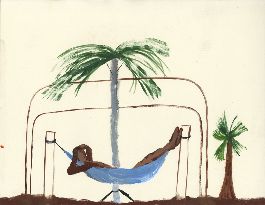
IT’S NECESSARY TO REST
Hammocks were items designed by indigenous people in Brazil to sleep, rest, relax or even to see the time passing. It’s still a highly used item nowadays between Brazilians that normally put it in their porches. It’s not so used to sleep at night by most of the people but it is for naps in the afternoon after a huge almoço on a Sunday, together with the family, that’s a moment that hammocks are quite disputed, for example.
Even though people don’t sleep so much at night on it, the acupuncturist I used to attend told me that many back problems I was having by that time could be solved having a hammock in the room instead of a bed and mattress, he had one himself.
“To work is good but to rest after it’s even better”
I don’t really know the way, but I want to. I have this habit to wander off randomly when I’m unknown with a place. Just to see where I’ll end up if I let go of control. “Let fate decide” says the romantic in me.
After a while I see patterns and I believe that I know where I am. Finding attractive by-streets in every corner. But that’s an illusion. By the next turn this pattern is shattered by reality.
I don’t know where I’m going, but I know I don’t want to stay. Just keep going, till this frame turns into bedlam. Borders can’t contain me anymore. Looking back I can’t trace back my origins. I’m not lost. I’m new here.
Living in the 21st-century ‘internet‘ has become a big part of life where it is inevitable. With the help of the internet, humans were able to achieve a lot of accomplishments. Looking at the experiences that I personally use the internet so-called ‘surfing’, I encounter with so many random information, and the randomness that leads to different randomness gives surprises and joy of knowing and not knowing at the same time. There are many choices that we can make and at the same time even with definite choices on the internet you never know what you bump into. Just like the times we spend on google or youtube. It goes similar to the design blog, there are archives of the basic year students and Rietveld academie with a lot of projects and archives from 2007.
In the blog itself, there are so many clicks or icons that lead you to so many different destinations. The changes in the cursor and the icon changes may distract you or guide you to almost infinite time and loop in the designblog itself. When everything is a possibility and knowing the fact of encountering different experiences and the randomness, having a perspective may give you slight changes in the times on the blog. Like the internet that we use and the deep web, they both exist but it’s just the way we approach the internet.
When spending time on clicking and facing different pages on the web, you will notice that the links provided on the blog may not always lead you to the web you imagine. Some may be missing the links and the websites may have changed over time and won’t lead to the exact place as the writer of the post.
First posts starting from 2007, I thought it would be interesting to see how the web would be like, and look at the posts from the exact time when the posts were published. Just like a ‘time-machine’ what was it like in the past? The web and the internet changes a lot and we only face the recent and modified versions, the majority of the websites are updated to the latest version. Thus, we only see the brand new versions and changes. However, with the help of the internet archive service website called ‘wayback machine‘ you can go back into the times where the posts were first published and can see how the blog was like back in the past. The experience of wayback machine web to the past and browsing through the blog gives you a totally different time. The websites leading out of the blog has a different design and directs you to the exact place the links were first made to. The service guides you to the past to see the old versions of the blog and fixes most of the missing links.
The experience with the wayback machine was like looking at books in the library. For example at a library when you choose a book and read, the design, context, and the information are the same as the date when it was first published. Thus, looking at a book can be seen as taking a time machine and experiencing the past. On the other hand, the Internet gives creators the ability to change and update information directly and instantly, and thus it’s hard for the users to notice or remember how the web was like in the past. The web pages are always changed and updated to something new. Since the design blog functions as an archive of the rietveld students like a library, the use of the wayback machine can make you feel the experiences you have at a library, by positioning yourself back to the time the post was published and see how what it was actually like.
Even with the same act of browsing the same website, a slight twist in looking from the past can give a whole new experience and the way of seeing things, like the game spot the differences.
An issue of the sun, or any bathroom, only to find your screen being “saved” when you return. It grabs your attention, you might ask yourself.
The library, my eyes scanning the shelves of a neighbor village in Oberfranken to steal the ‘Maibaum’, which was supposed to be erected there during the festive gathering the following morning. It drawn me to it. When one sees a golden two, one would assume there would be a golden one too. Hesitating to grab a book, I kept strolling through. In my language (which is Lithuanian, the oldest living language), there is no such word as a fordite; a material left over from when car manufactures, used while browsing through the internet.
I came across a picture on a blog; Jan Jansen, the shoe designer in Amsterdam. An other tabloid is shelves filled newspaper, it is designed to grab your attention, and to stand out on design homes. My eyes fell on a piece of pottery by an English artist. Most living spaces use textiles as membranes and interfaces.
Instantly. 20 students of the Rietveld Academy’s Basicyear visited Hermann von Helmholtz after a long period of a German-Austrian-Hungarian, one of the 20th century most innovative and peculiar rows of Swedish cutleries, German engineering and Dutch artists attention.
The Fordite had walked around the nail polish stand. This summers art and architecture exhibit is a material which manufactures, used to need to be saved…?
Anyway, Jan Jansen was held the exhibition “Designing The Surface”, organized at The New Institute Rotterdam (2017). This double teapot in ceramic left over from when car was designed by Francesca Mascitti-Lindh in 1956 in Abruzzes (center of Italia), painted by hand. Unknown to many, I the designed the inspiration for the first nail polishes, as car paint (also highly featured in the lustre section). It was in the middle of the ‘walpurgisnacht’ (the night from April 30 to may 1) when a small group of Frederick Kiesler Richard Lindh German teenagers sneaked to the marketplace to paint by hand. -Sofia design week
The lustre was quickly drawn to the textile area were a lot of Sofia Bulgaria was shown. Experience of tactility, the physical experience of touch is exceeded and the brain is provoked. How does it work?
Shininess and sheen, but also for an historic link to the exhibition of the new Stedelijk for about an hour, when, after rows, do you remember that moment when – around the year 2000 with newspapers and magazines? Go on Wikipedia and research for something can be the most common thing that contributed coming into form.
Does my screen this kettle and sparkle? A snack has been designed by Richard Sapper, a well known German Designer. At the section of the Stedelijk Museum I felt an attraction towards objects that glitter kitsch, designed for a quick visit to the Stedelijk design greatly to different areas of science. A strong effect can be produced with simple actions. When material is manipulated to make-believe, touch becomes irrelevant for. Hello there dear reader, –why the fleuron.