Thursday, November 29, 2018
Continuing my Quest for the Dull. I did not find any books by the tagwords connected to my previous result: ’Boring’ or ‘Seductive’. Only the third and less subjective ‘Interior Architecture’ gave a match. Though, this match wasn’t the ‘right’ book for me, in the sense that it was maybe too mediocre, but its neighboring book did catch my eye. It looked kind of dull, but at the same time demanded an autonomous authority. Not so dull after all, and therefore forcing me to adapt the definition of my Quest. Perhaps it was the rather small size (15 x 15 cm.), or the textless spine. I realized how the blanco spine is actually quite a sensation in this library, considering that most books contain either a title, some text or other imagery on this part the book. At the same time did this book blend in well with the rest. Just like all other copies, it is plasticized, and then some: front, back, top, bottom – everything drenched in the monotonous clammy layer by the name of adhesive cellophane. A perfect recipe for blending in, at least in the world of books.
Even though this grey square of about 50 sheets of paper could be considered boring, there are a few elements that make this otherwise invisible copy stand out by its demand for adapted care-taking. For example, the thinness of the book made it impossible for the librarian to place the code sticker in its entirety on the spine, the rest of it had to be placed on the cover. I can imagine when doing this job, the irregularity of books like this is quite bothersome. A visual rupture in the repetitive rhythm of the surrounding stickers. Besides, because of this invisibility, it is harder for a person wanting to look up a book only by the code he/she was given by the library’s database. Maybe that’s why I was drawn to it, the code was missing, or at least not visible at first sight. Maybe that’s why this book has this size; it only wants to be noticed by people who don’t follow the code, but choose by its appearance only. A stubborn little fella, this “cDIM Valencia”. Hypocritical even. Its innocent appearance, yet sneaky way of asking for attention.
774.4 cat 17
Thursday, November 22, 2018
What book to pick in an art academy’s library? Each one so carefully designed, asking for individual attention and therefor disappear into an abundance of ‘designiness’. It makes me long for the boring book that could potentially surprise me with its content. Perhaps one of those plastic file folders on the top shelves hide some curiosity. Unfortunately, I find out that these are not for students to be looked into – the Quest for Boringness continues. My eyes are caught by a book with a textless beige spine, carrying only the library’s tag: “718.6 pov. 1”.
The color is more band-Aid like beige; it would blend in well with my skin, or my grandmother’s sweater. The surface is slightly textured, but the book’s front has been plasticized by the library for protection. To me, this adds to the sensation of monotony, since so many other books were treated the same way. All individual books have been esthetically democratized by this layer of plastic. This endangers even the most exotic looking book to drown in a pool of textureless mass. This book’s only unique touch might be its shape, which, unlike most surrounding books, is wider then it is tall. Nevertheless, it still hasn’t excited me. Bingo.
Flipping through its pages, I see prints of black and white photographs depicting shop windows, -interiors and -facades. Repeatedly placed on every other page, accompanied with a short description. These photos focus on the design (architecture) that is used to sell other design (product). These designs are made to lure the viewer in; not by their boringness, but their promise of exclusivity. Not much unlike these books in the library. In search for the dull, I ended up with a book about seduction and exclusivity.
I’m quite fascinated by these images. Maybe because I once worked as a sales assistant in a luxury fashion store. A frequent visitor was a well-known Dutch architect, whose experience in designing various (Prada) stores apparently made him a valid person to complain about our bad lighting system. It was too yellow and not bright enough. However, I think he kept visiting our store for its unpretentious appeal; no overly designed cabinets, shelves or fancy lighting systems. A store with a no-nonsense atmosphere; selling quality products through quality service. Like a boring book with neat photographs.
code: 718.6 pov. 1
Tuesday, May 7, 2013
Moving towards the theoretic department, exiting! or boring? the book “studio and Cube” caught my attention because i am currently writing an essay about curating, and the title popped in to my eye “Hello there, im relevant to you, the book screamed” and i took it without any consideration. futher more, the curating subject is to me imediate future, the book looks boring, but I think the opposite. the subject is no where near childish, but my method of grabbing it and running out of the library without any hesitation kind of is.
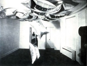
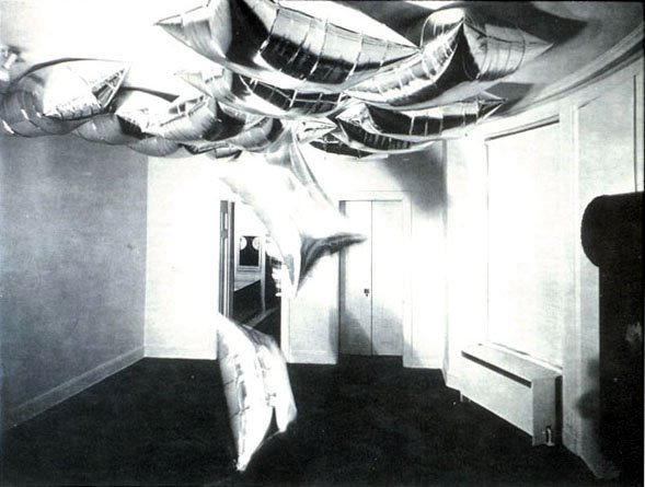
What turned out to be funny, and not funny as in “funny, haha” but a perculiar coincsidence, was that i imediately opened the book (which is mostly text rather than images) to page 61 (this is a guess or estimation as the book is to fancy to have page numbers on all pages) wich features a work of Andy Warhol, Silver clouds 1966 – wich. hold your breath, in my mind imediatly linked to the previous book of my choice with the ambient work of Hanna Jung of a cloud like bed with a cloud of whool over it. In Andys case, the clouds are made of aluminium something, and are shiny pillows floating around in space. If I had’nt had my previous reference of cloudy rooms the clouds would have had no signifigance to me but now they imediatly pressent something poetic, as light, but in another time frame. Other times, other clouds.
Rietveld Library cat.nr:
Tuesday, April 23, 2013
A boring childish future?
A futuristic boring childhood?
A childish futuristic boredom?
the book “7th Biennale Internationale de La Tapisserie somehow came closest to fulfilling these not easy criteria. Or maybe not. It mostly fits the childish criteria, the cover has a knitted foot on it, very naive and silly. but still quite pretty or intriguing. boring I would say as well, because i find nitting really really boring. Im sure it can be used as a good medium and bring out exiting results, and it sure does in the book, so delicate and structaral a material, photographed in black and white, but however, the procces of knitting is to me quite boring. so kntting is definitley not gonna be my future. A picture that captures me is a picture of th ework by a polish artist named Hanna Jung. the work is called “Two spaces –
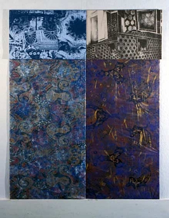

The space for the nude and the space for a stone”. In a room you have a delicate fur like cloud of fuzzyness as a gigantic bed overflowing the room on the floor, and above a lamp like shape of the same fuzzyness. almost touching eachother, but not quite. he work comes out so fragile but still so space consuming and i want to touch it. but its not even possible to find a picture on the internet. And im sure, because im really good at internetting. Its really as shame with work like this i think, that they only are documened in a dusty black and white book hidden between to much bigger books in the design section of knitting and fabric where you would never imagine to be drawn in to a magical white cloud of dominating light fur.
Rietveld Library cat.nr:779.2
Thursday, April 11, 2013
This book came to my mind, first of all because it was small, and i already had a really heavy bag with me.
Further more, it kind of looked like an old schoolbook, all yellow and nothing fancy about it. The title is “basic typography”. It was probably trying its best to be very fancy at its time, who knows.
the text on it reminded me of the schoolbooks where you would have to follow the lines with your pencil in order to learn how to write the letters. a b c d e f g, and so on and so forth.
There was something quite calming about this childish first impression, and the faded yellow cover. Besides that, it also has strips of tape, preventing it from falling apart, which doesn’t help me thinking it could once have been very dear to someone, and made me feel kind of sorry for it. I don’t like the font much or the general design of the book but still it is appealing to me some how because its just seems so uselessly boring. the content of the book is served on a plate for the ready to eat, nothing hidden in there, and I am saying this without even opening it. 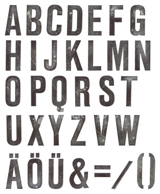 Type fonts. its just the feeling I have. The subject is very geeky in my opinion, and indeed also the title “basic typography” But that is deliberately why i choose it. I would like to study graphic design myself which is also why i picked it. Will I ever find a subject like this interesting? Well maybe in a year or two, but now, it seems like a very distant and flat subject to me. Perhaps not typography in general, but definitely in this case. It just happened to appeal to the doubtful side of me that is about to choose a direction were covers can be so planned out and yet so horribly boring and non exiting.
Rietveld Library cat.nr:7.57.3
Thursday, November 19, 2009
 Looking for theft, tiny and supermarket, I came across this old book about jewels. It is indeed tiny. You can steel jewels (or this book, however it’s not interesting). And about the supermarket; I link supermarket to housewives and my impression of this book so far is that it’s kind of prudish and suitable for housewives in their midlifecrisis. I can see them joining in little groups making bracelets and collars; bitching about their husbands. Maybe twenty years from now I will borrow it again, just after moulding class didn’t turn out to be ‘my thing’.
777.6 gil-1
(it’s not called “an introduction to juwellery” by the way, that’s just what it seems to be)