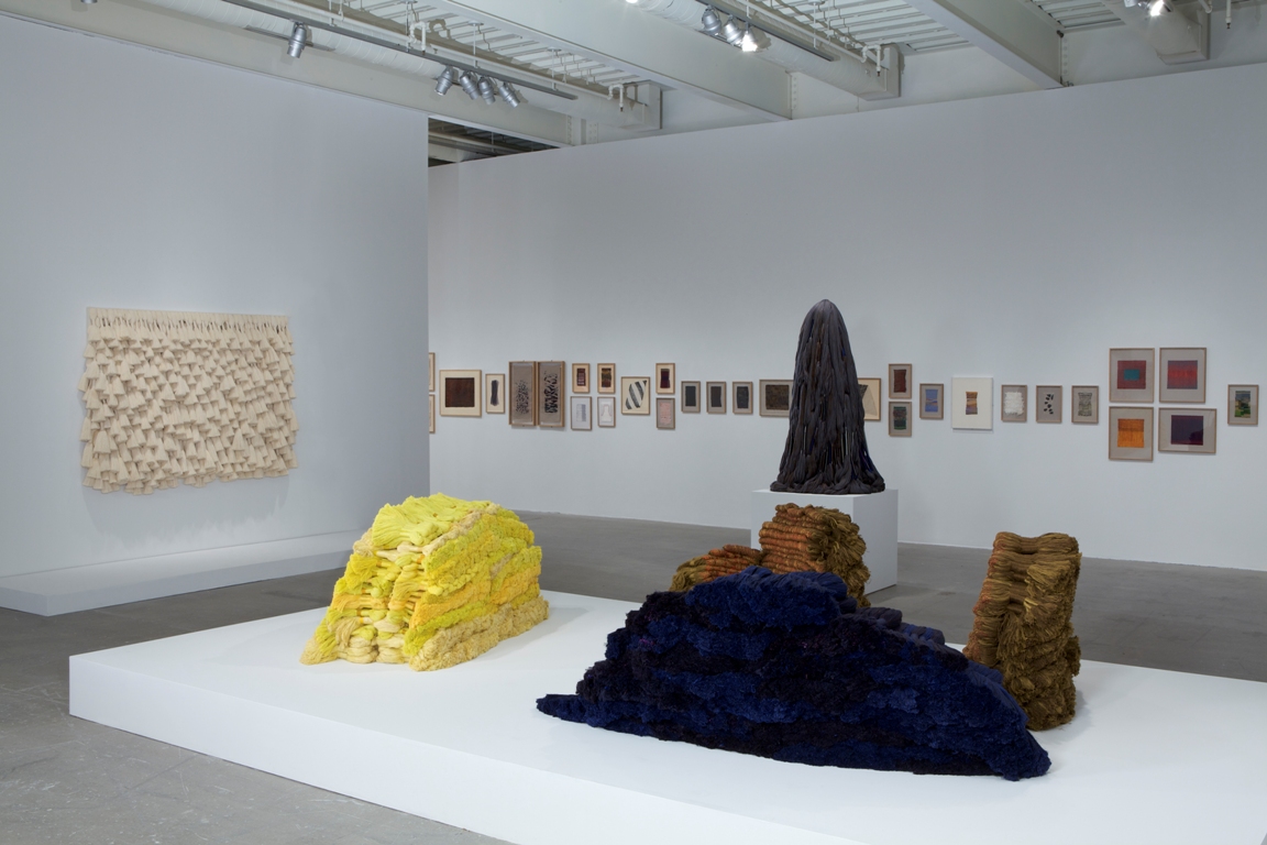
If you walk into the Stedelijk Base exhibition, set up in the basement of the Stedelijk Museum, you will find yourself immersed in a forest of metal walls. Artworks, design objects and furniture are placed next to each other and sorted by theme or movement, rather than after the usual concept of a timeline.
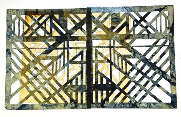
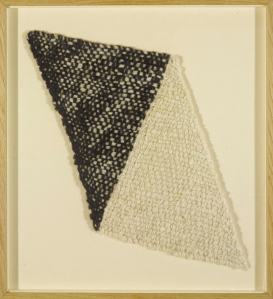
After a turn to the right and a subsequent turn to the left along the metal walls, the visitor (you) will find himself in the Bauhaus area, where you will immediately lay your eyes on a white, light woolen landscape hanging vertically from the walls. The name of this artwork is reliëfkleed, ‘relief rug’ in English, designed by the studio of the Dutch artist Kitty van der Mijll-Dekker.
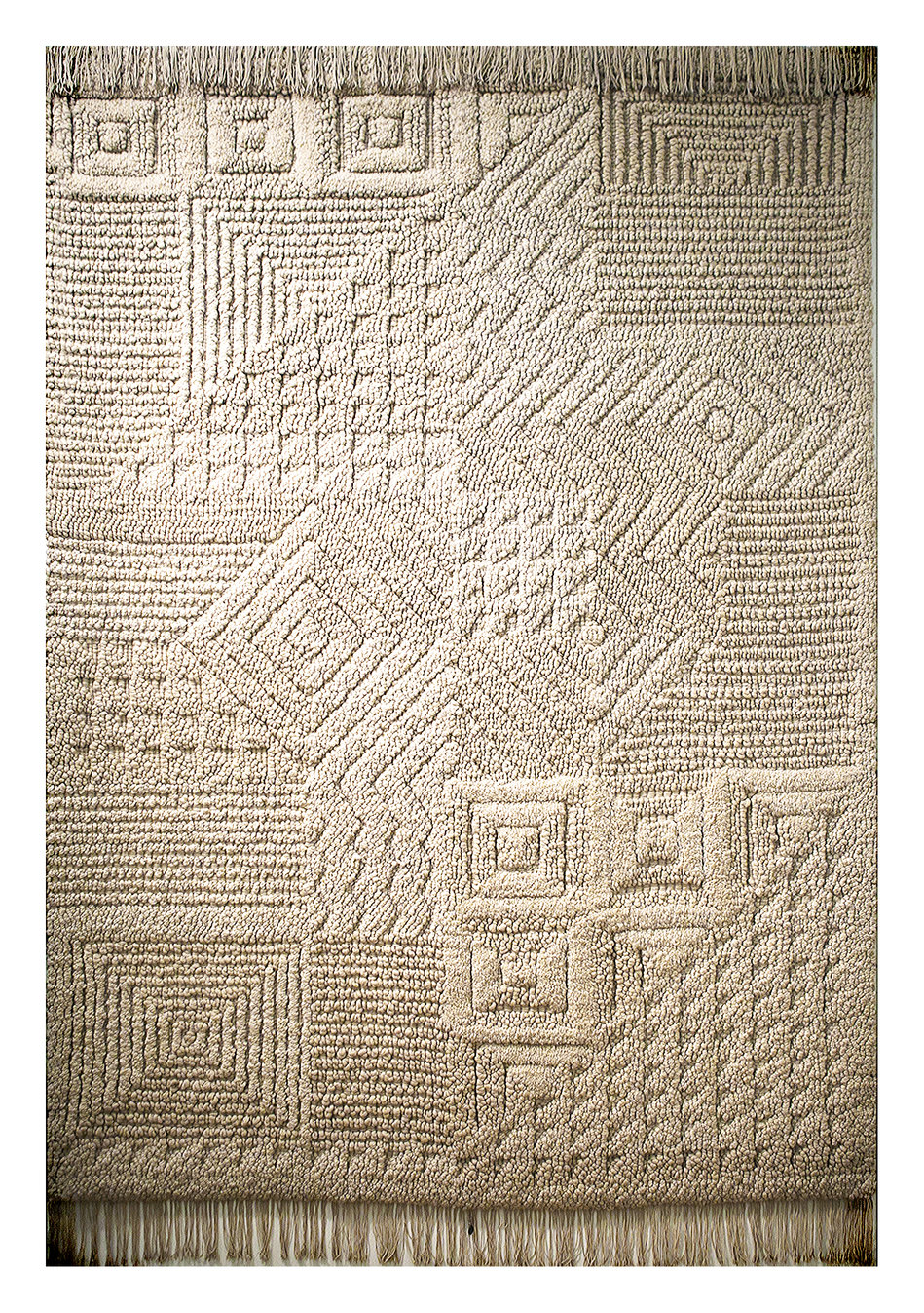
The first thing you will notice is the size of it; a sheer glance couldn’t cover the whole area of the relief rug. Reaching the top of the wall all the way down to the floor, the light beige, almost white color of this reliëfkleed blends wonderfully with the background wall. The rug is made out of differing techniques of weaving and knotting the wool, thus forming intricate geometric patterns.
- The second thing you will notice is related to the name of the relief rug: weaved and knotted, the rug forms an ocean of chunks, blobs and follows an intricate rhythm of geometric pattern.
The relief rug was gifted to the Stedelijk museum in 1936, accompanied by handwritten congratulations of Willem Sandberg. It toured the world exhibitions as part of the Dutch Pavilion in Brussels and Paris, not without receiving several awards. After the success of the relief rug, Kitty van der Mijll Dekker’s studio received invitations from the commissioner of the Queen to design and produce the carpets, wallpaper, bedding and the curtains for the royal provincial house in Maastricht [source].
Even despite her success with the studio, Kitty van der Mijll Dekker and her works are seldom mentioned on the internet. Try googling “relief rug” without attaching her name, you can find hardly any photos.
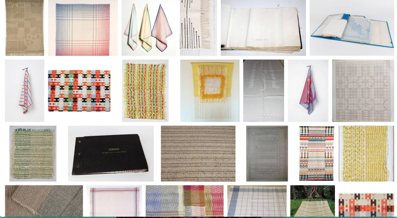
The tea-towels are up to date the most well-known product of Kitty van der Mijll-Dekker's weaving studio
Why is it so? In order to understand why the women of Bauhaus were often under-mentioned and forgotten in history and publications, we will look into the history of Bauhaus:

The Bauhaus school in 1919 in Weimar.
Walter Gropius founded the Bauhaus in 1919 with the idea of a modern, forward-thinking school in mind. For the first time, uniting real artistic practice and craftsmanship under one roof brings back the necessity for the “neue Baukunst” which translates into ‘a new way to construct’. For this purpose, the Hochschule für bildende Künste (focussing on artistic practice) and the Kunstgewerbeschule (focussing on craftsmanship) in Weimar were merged together [read more here].
The formation of Bauhaus fell simultaneously together with the beginning of the Weimar Republic, in which women gained new rights, amongst which being allowed to vote for the first time and also attending university. Women were more than welcome to attend school at Bauhaus, as stated by Walter Gropius in the beginning. However, more women than men applied for Bauhaus once after it was opened, which lead to a drastic change in Bauhaus’ (and Gropius’) statements.
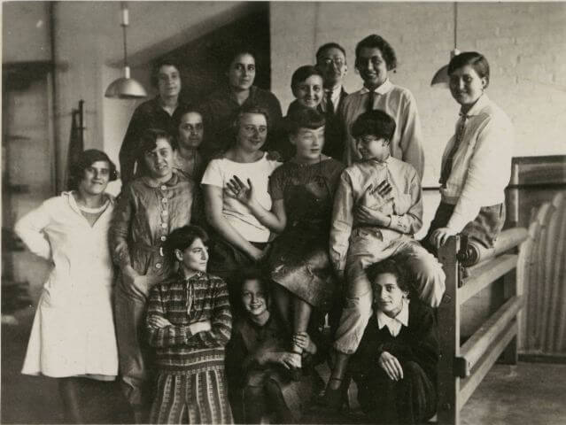
Photograph from Bauhaus Archive, with Gunta Stolzl center left
The large number of women at the Bauhaus attracted many forms of criticisms, including the complaints of the teaching bodies of the workshops, who are not used to have women work physically in their workshops. Traditionally, females are not allowed to be “Gesellen” journeyman, which students or rather workers who have completed an apprenticeship in a workshop are called.
- Second, the image of women as artists at that time has been depicted as decorative and rather less professional, in which female works are rather suited for the household, more crafty and seen less functional. Admitting a large number of women could lead to the chances of critics or society decreasing the serious status and idea behind Walter Gropius’ planned pioneer school
Wanting to set up his Bauhaus as a success, Gropius feared that his school might be denounced as a failure or taken not seriously if admitting so many female students, thus narrowing the admission of female students and setting up an all female class, which merged with the weaving department after a while.

This is a collection of works produced in the weaving department - google term 'Bauhaus textile afdeling'
- Some female artists entered the school before the change in teaching happened, which lead to the above mentioned restrictions in choosing the departments. Others joined the school after László Moholy-Nagy was appointed head of department, replacing Johannes Itten and his restrictive worldviews towards female artists [x]
- is one of the few female artists who succeed in the metal department, succeeding her male classmates.
The weaving department, which also had few male students, was the space in which most female students were sent to after completing the ‘Vorherige Ausbildung’ our Rietveld Basicyear. Although the weaving department supported the school financially the most, it was seen as ‘less relevant’ or serious by the other departments. Other reasons, such as the philosophy of Johannes Itten towards the gender role or the increasing influence of the national socialists in Germany led towards a more backwards-facing behavior of treating female students than intended.
As a result, many female artists from the school of Bauhaus are under-represented or solely left out in literature or online. The solution would be a step-by-step collection of female Bauhaus artists and their works to make it accessible online for a wider audience, for example an open platforms such as wikipedia.
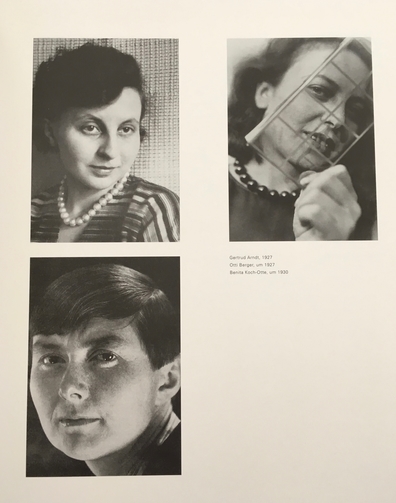
In this photo: Gertrudt Arndt, Otti Berger, Benita Koch-Otte
Biography Kitty van der Mijll Dekker
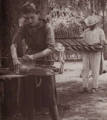
Kitty van der Mijll Dekker, born as Catharina Louise on Djokdjakarta (Java) in 1908, was raised as a child in a wealthy art-interested family of Dutch expats in Indonesia. In 1916 at the age of 8, she and her family moved back to Den Hague in the Netherlands. Growing up, Kitty van der Mijll Dekker enjoyed educational travels to Switzerland and the United States. After studying art history in London from 1925-1927, she received private lessons in architecture by Cor Jarens.
In 1929, she attends the vooropleiding of Bauhaus in Dessau and finishes her ‘Gesellenexamen’ in 1931 at the textile factory in Meschke in Rummelsberg, Germany. After receiving her diploma (nr. 66) on April 12th 1932 from Ludwig Mies van der Rohe and Lilly Reich, she returns back to the Netherlands and sets up the weaving studio ‘De Wipstrik’ with her former co-student Greten Fischer-Kähler and Hermann Fischer in Nunspeet. Greten-Fischer leaves the studio after two years, leading to the formation of the name ‘ Handweverij en Ontwerpatelier K.v.D. Mijll Dekker (Hand weaving and design workshop K.v.D. Mijll Dekker).
From 1967 until 1970, she taught at our school, the Gerrit Rietveld Academie. This would be an opportunity to continue research related to school activities


