Skip to Content Skip to Search Go to Top Navigation Go to Side Menu


"rainbow" Tag


The Pursuit Of Completeness


Sunday, May 6, 2018


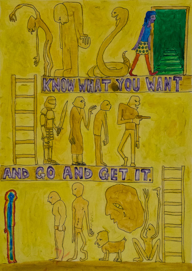
ColourCard-4


Once in a time, lived a young hero who found himself on a quest: the pursuit of completeness. He traveled across the lands, west and east, observing cultures and reading the ancient texts. He discovered so much on his journey, and came across many wise sages who offered him mysterious advice. And yet, the hero found that the more knowledge he gained, the more distant his goal seemed to become. At certain moments the target would completely disappear and he would be left raw and dizzy, lost. In these moments he would cling even more desperately to the words of the wise-men, reading, researching, searching obsessively until his vision would once again appear in the distance. But it was hopeless, it hovered like a mirage on the horizon, never any closer no matter how fast he ran towards it.
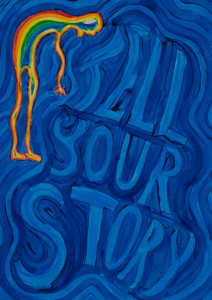
On a particular night, exhausted and alone, stuck but stubbornly holding onto hope, the hero fell into an unexpectedly peaceful sleep. It was as if his body was floating gently on a warm sea, and, in the eye of his dreaming mind, an image appeared: A full rainbow across a grey landscape. It was so dazzlingly crisp and clear, so bright and vivid. The air was still and perfectly silent and in that moment the hero knew that he had received the sign that he had so desperately been needing. He woke up with the new day, crying tears of joy and gratitude. His quest was far from being over, in fact he was certain that the hardest challenges were yet to come but, finally, he had clarity and direction. He would leave his texts behind, all his pointless, distracting knowledge and set out on his own path.

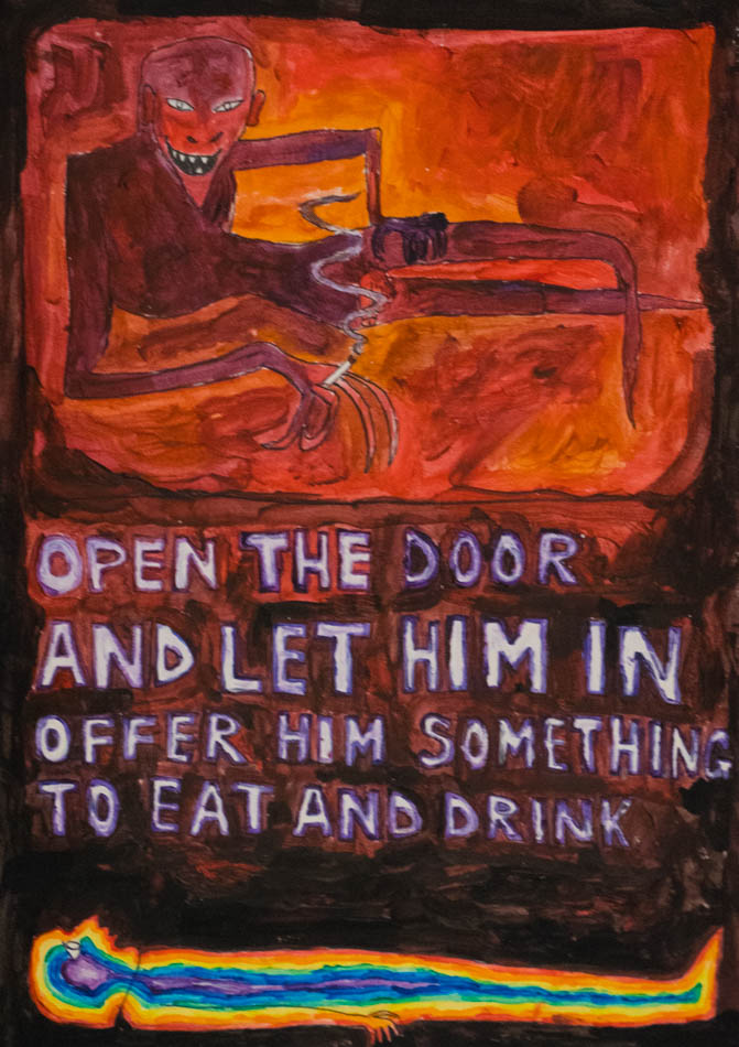
The next night, as the hero was sleeping, he dreamed of the devil and of fear. The dream was bathed in a red glow and the devil knocked on his door. Terrified, the hero resisted but then a calmness came to him. He opened the door and invited the devil in and together they sat down for a meal.

The following night, the hero dreamed of a woman of the night in an orange dress and a fight against yellow men, a dream of guilt and shame but also of an incredible strength and willpower.

The night after that, he dreamed a beautiful dream of the woman he loved. Lost together in the night, in an empty world, they mourned the loss of all those they had once loved but, gazing into each others eyes, saw the eyes of their parents and friends and past lovers and they smiled in their hearts.


ColourCard-1     ColourCard-2     ColourCard-3


The hero could feel it in his body. Finally it had come! Life was guiding him. So strange and peculiar these dreams, so profound the significance of these colours! The full spectrum of life, in the full spectrum of the rainbow. Now he understood red, orange, yellow and green with an understanding beyond words. Oh silly, silly words he laughed. It was all in the colours, it was all in life always. The hero fell asleep that night full of anticipation, but the blue dream did not come. Nor did it come the next night, or any of the nights that week. No blue, indigo or violet dreams. He started to worry, he had made such incredible progress. He was almost there but now he could feel himself slipping away again. Weeks went by and the hero had no dreams. The colours which had once seemed so vivid now seemed dull and meaningless. Life seemed dull and meaningless and the hero mourned the loss of those clear, bright eyes he had once looked through. Weak and confused, he reached again for his books. He was desperate to understand and so desparate to feel that beautiful way once again. But, remembering how certain he had been of their futility, he put them away again.

Gathering up strength, the hero resolved to set himself out into the world to search for the answer. If the colours would not come to him, he would go and pull them out of whatever situations he found himself in! He would do whatever it took. He started with painting the dreams he had had. And then he painted paintings with all the colours of the rainbow, trying to understand what they had meant to him and how they were in relation to each other. He came to some interesting, intuitive understandings. It seemed that the first four colours existed on the foreground plane and the blues and purple in the background plane. The further he explored this, the more obvious it became to him that there was a divide. There was the realm of human emotional experience, of textured and colorful personality, all belonging more to the material world and then there was the realm of the spiritual, the land of the soul which belonged to a mystical, divine world. Yet how to split this mystical world up into blue, indigo and violet, he could not yet work out. He needed some kind of way to access them.
Remembering his earlier dreams, the hero went in search of the devil. Let me find the adventure that will take me through the full spectrum, he thought. He kept his ears and eyes open and wandered the land. After weeks of following symbols and signs he found himself, one dark night, approaching a huge and abandoned church. He heard a terrible, hypnotic chanting inside. He quietly pushed open the door and looked inside. There was a huge crowd of all terrifying, evil beings; men with knives and guns, gangsters and crooks, giants and witches and demons. They did not notice him as he crept inside. He was scared but calm in his determination. He looked to the front of the church and saw, standing by the altar, a man leading the chant. The hero’s ears singled out the man’s voice and he was gripped by an incredible torment. The voice was so

big, powerful and so direct. It felt like it was calling him directly. He was filled with fear and immediately regretted his ever having come here. He wanted to turn and leave but the voice was so beautiful and hypnotic that he could not. He was trapped in indecision but then the calm voice of his red dream came back to him, ‘open the door and let him in, offer him something to eat and drink’. He watched himself as he pushed his way to the front of the crowd to stand in front of the devil. The devil slowly turned his fiery eyes upon the hero and as he did this the hero felt his body fill up and he stood taller and he felt amazing and powerful and he lifted up off the floor and reached out his arms and roared. The crowd of people roared back and he flew up higher and higher spreading himself out more and more until, all of a sudden, he came crashing down to the ground. He felt a sharp sensation in his face, it took him a second to realize what had happened and then he got up and started laughing at himself. Walking back through the crowd, his nose bleeding, he laughed because it seemed so funny how seriously he had been taking it all.
 

ColourCard-5 Tarot7-1


FULL SPECTRUM BOOKSHELF


Tuesday, April 12, 2016


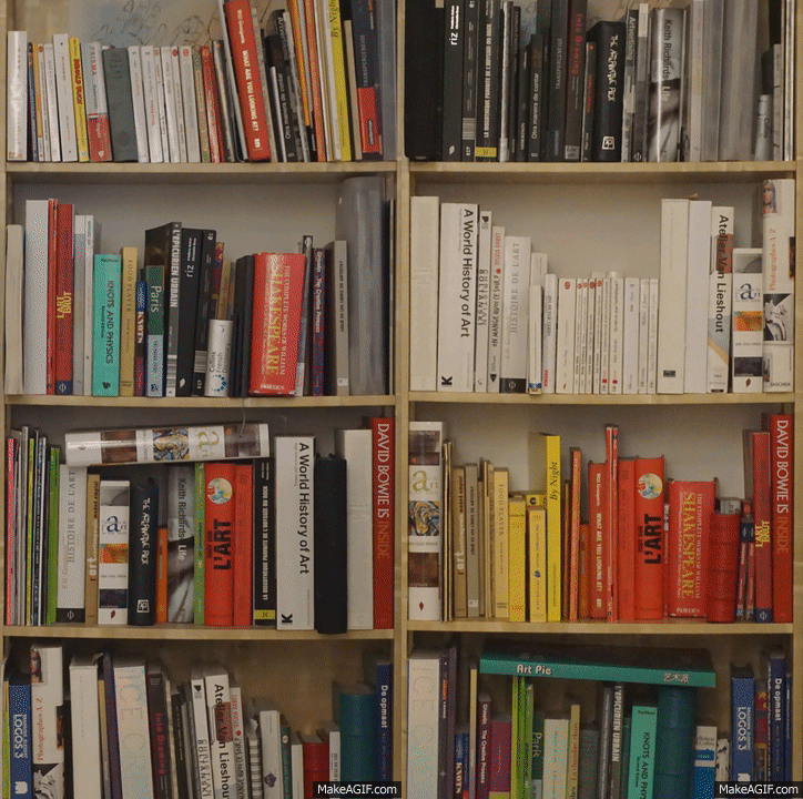
Some find comfort in mess and even manage to bring a certain order and coherence in it. As for me satisfaction comes in organization. By organization I imply functionality as well as visual clarity. When I found myself in front of a very extensive pile of book clarity was what I needed. My own bookshelf is sorted out by size, my clothes rack by color, stretching from black to blue through different shades of green, grey and pink. It brings order in the room. I know where things go and where exactly I can find them. I decided to experiment with my own bookshelf.


Self_organising_bookshelf


From grey to black. One entire shelf for the white ones. Brown, then yellow, red then come all the different colors from the visual spectrum. Although not all the book edges come with a singular color, the writing on it need to taken in account. The typography, its size and its color can completely change the order from one book to another. Organizing a library in such a way is a never-ending game. Taking one book out means it needs to go back in the exact same spot. At any moment the order can be ruined but finding the right former location is the same feeling as fitting the last piece of the puzzle in the whole picture.


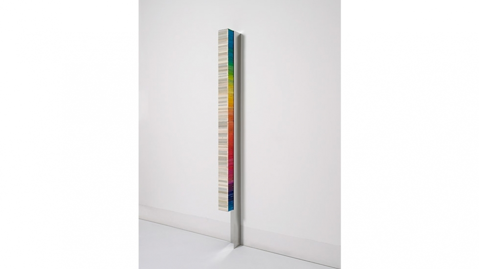
A bookshelf organized by color is not only a piece of furniture filled with books, it becomes an architectural piece. The color coordination makes it a whole with a strong visual character. As the color together convened makes it look pleasing, it forms a new building, a construction in the space. Using books to build up the space is the main material of Fernanda Fragateiro. This Portuguese artist transforms books in “material prima”, which she uses to make her sculptures. What was supposed to be read before now is to be seen. By using books in her works Fernanda Fragateiro creates series of abstract sculptures in which the holder of the content turns into the actual content of the piece. However this content is closed and sealed and so forth silent. She picks the books for their visual property not for the content of it. Sometimes she even makes the books herself in order to get the right colors. This way the book is reduced to its only material quality and its symbolic value.


ff_notreadingrainbowcolors

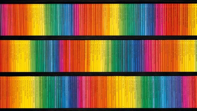
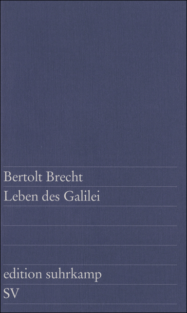
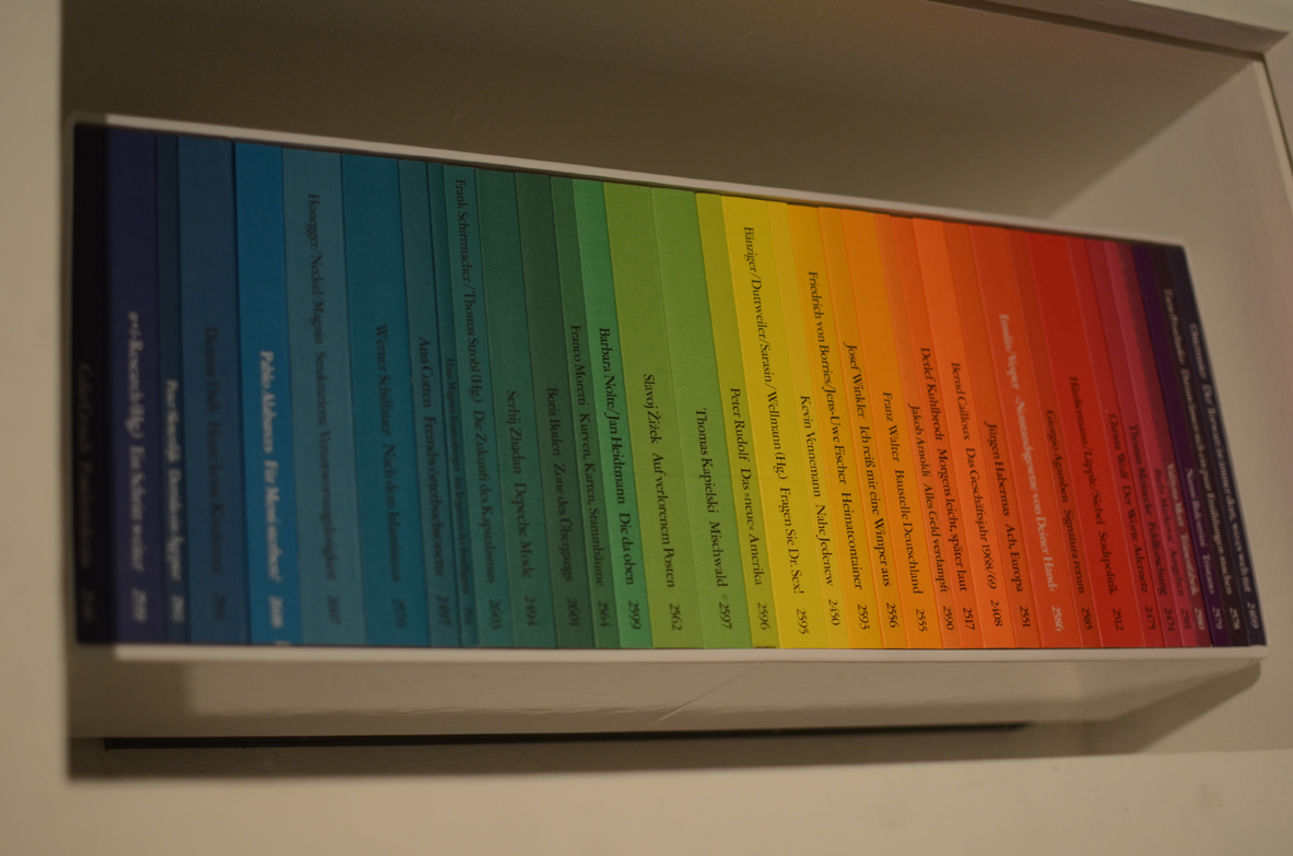
Another example of someone sorting books by color is Willy Fleckhaus who designed the edition Suhrkamp from Suhrkamp Verlag. He created a very specific though simple visual identity consisting in the rainbow colors. He developed a highly ordered layout of evenly spaced rules with a single weight of Garamond for all the text but then gave each of the original 48 covers in the series a separate color, so that when lined up in order their spines formed a perfect graduated rainbow. The result was to make the series instantly collectable.

edition-suhrkamp-540x304


This visual identity is very specific to that edition and is still going on right now. In general a series represents a group of books which visually and thematically accompany one another and that are designated as series titles by the publisher. In a successful series the individual titles interact with one another, frequently presenting different perspectives on similar themes. By recreating a similar color ordered system as Willy Fleckhaus I was aiming towards a unity of the library. Books now relate to each other not through theme or author. They all have the same thing in common that makes them a whole rather than individuals. They stay distinctive in a sense because their content has nothing to do with the order they are placed in.


Some accidental situation can yet be fortuitous. Combinations happen while not expected. I find it most beautiful to randomly pick a book in a library. This organizing system creates the randomness for you and allows you to discover other books and not only the one you were expecting. A library needs to be able to surprise you and give you more than the Internet. Internet cannot give you random. You type in a request knowing already what you want. It then makes connections for you based on words, topics, or dates. That is also something I noticed while reorganizing my bookshelf; I have not be noticing a lot of books before because they were drowning in the whole mess. I put them together and discovered a bunch of them looking for their color. In the end I must have spent a few hours doing that getting caught by some unknown books on my way. I realized I have two volumes of New Perspectives in Drawing from PHAIDON editions: Vitamin D in english and Vitamine D2 in french. I opened both of them and definitely got new perspectives on drawing because doubled.


In this randomness I still find some order. Publishers working together with authors design, decide on how a cover should look like, what the colour should be according to its content. The example that comes almost immediately is the black cover and yellow typeface of most detective novels. Moreover how a book is physically designed, advertised, distributed, not only determines whether it is part of a series, but also who will purchase or read it.

To be an artist, to not be an artist


Wednesday, June 3, 2015

John Baldessari


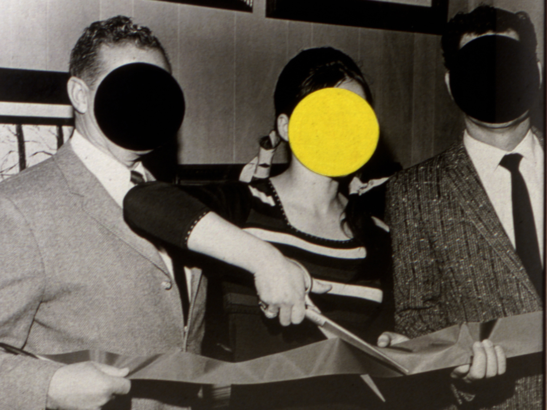
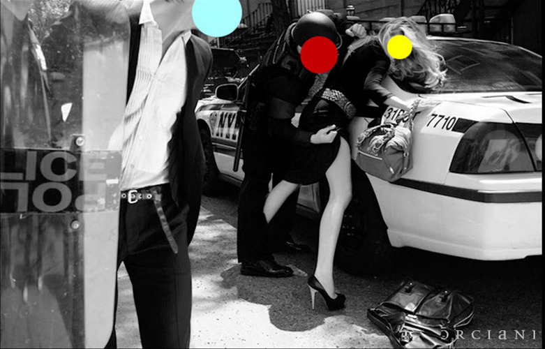
John Baldessari is  known for his dot pictures, pictures in which a dot is used to shift the meaning of the appropriated (for example from a magazine or newspaper) material. This is how he works in general, appropriating existing forms, like pages from magazines, scenes from famous movies, pictures that people take at famous scenery, that mostly relate to mass media or mass culture, then using minimal gestures to change the meaning of this material. One could say his art is visceral since there is no space for hands on work but only of plan executed.

ribbon-cutting21 john-baldessari-dotprint

John Baldessari belongs to a stream of artists that would rise to fame in the seventies, forming the last somewhat coherent group of artist that could be called a movement. This movement is designated the Pictures Generation and group artists like Jack Goldstein, Sherrie Levine, Richard Prince, David Salle, Robert Longo, Louise Lawler, Barbara Kruger, Cindy Sherman. All of these group up in America in a time were tv and mass media were omnipresent, and there art praxis is a reflection of this. Baldessari formed an central figure in this group as was the teacher of a big part of the artists to would grow up and become representatives of this group. Also was he one of the first to gain attention with a type of art that could not find in the categories of former times: Minimal Art, Conceptual Art and Institutional Critique.

Here are some links to a few of his movies:

John Baldessari teaching alphabet to a plant

John Baldessari singing the conceptual art manifesto


Christophe Coppens


I have chosen to work with Christopher Coppens, who is an Belgian accessory designer originally trained as an Theater director now to be Artist.

What’s interesting regarding Christope in the exhibition is that he works in an area between fashion and art, as he puts it himself, though he recently completely stopped his fashion career to make art, though his fashion brand was very successful including clients as Rihanna, the queen of Belgium and so on.

unnamed 
For me it’s meaningless to place his work in any of the boxes, he sure does walk on the line  for instance his hats morphs into human faces, handbags that are shaped like animals, a swan and a lamb to mention a few. Which quickly makes you start thinking in the veins of an artwork.

When he chose to become an artist full time, he shut down his fashion firm and left it in bankruptcy, i think it was to be taken serious as an artist and not to be viewed ”just” as a multidisciplinary craftsman,
It seems to me that CC is a material based craftsman first of all, with a vision for different materials, accessory designer or artist, the title to me does not seem to matter much, maybe it was important in CC steps towards feeling comfortable with his creations.
He felt that the fashion world he surrounded himself with had an unfriendly sphere towards the more artsy, folks were ready to spend money buying from Christophe Coppens: The Mad Hatter’s designs but only the products, the stories and the processes behind each piece did not matter(im sure it did to some).

The first exhibition from Coppens transition from designer to artist.
For the show Coppens destructed by different means most of his belongings, suits, furniture, credit cards and business files, a kind of ritual, which he then turned into different sculptures.
The exhibition consisted of sculptures which Coppens refers to as Mountains, made from ceramics primarily. A ongoing tendency in these pieces is that it seems that the ceramic material is being eaten by fabric, swallowing the shapes. A visual reflection upon his feelings around a conflict he seems to be caught in.


 It is a collection of inanimate objects, s stuffed animals or toys, that are viewed through the windows of a small house. A shop beside the house sells miniature versions of the objects (a method deployed to great profit by artists including Takashi Murakami).


No reference was an installation by CC, in which he questioned the origin of his profession as a accesories designer, going back to point zero without any references, hence the title. The installation consisted of 33 haute couture accesories, that were presented as work in process and during the opening hours he would work on the pieces, invite people to join(if you were handy enough) and invited the public backstage of the ”hectic” fashion world.


Christophe and John

We now turn to the final question, does it make any sense to put Christophe and John together in one room, under the banner of the Abject. This question should be answered negatively, and for many reasons. First of all does John Baldessari’s work not fit to the theme of the abject because his work doesn’t concern the abject, and if his works, taken out of context seems to deal with the abject in a superficial manner it is solely because he deals with the abject how it is represented in mass media. Second of all does Christophe’s work not fit the abject because the term the abject refers to something quite deep, and following the theories from which his notion stems, quite fundamental. To deal with this topic in a design manner changes it so much that we cannot speak of the abject any more in its original sense, it becomes funny, witty and superficial, it is just used as a tactic of Christophe Coppens to give his work some extra artificial layering that makes it appear as “art”.

Lastly to combine the two in one exhibition is quite senseless, they have no relation whatsoever: different background, different views, different approaches, different topics. We can sum it up by saying that the noon of the artists relate to the abject, nor to each other.


                John Baldessari - Teeth (Tanden)  No References (2008)

A Printed Book History 12 : a visual identity


Tuesday, May 22, 2012


the edition Suhrkamp designed by Willy Fleckhaus, 1963

The book I want to write about was actually a series – the edition suhrkamp from Suhrkamp Verlag. Willy Fleckhaus designed it in 1963 and it remained unchanged till 2004. He managed to create a very basic visual identity which consists only of colour and typography.
The covers of the 48 books which are published every year are held each in a different colour of the visual spectrum. No pictures can be found on the covers – in fact it is reduced to the name of author, title and publisher put into a grid of lines in the width of the cover page and at the bottom of it. The books are affordable and therefore popular in literature class in school. For a lot of pupils in Germany a certain title is very strongly connected to a certain colour.


Edition Suhrkamp books were a forum and inspiration for leftist-intellectual discussion in Germany for years, which came apparent as well in reviews written by its protagonists for the edition’s 40 year anniversary. It has published texts from Adorno, Brecht and Barthes. As well as the texts, the daring design stays in the minimalist style of the avant-garde. I see it as a metaphor for the development of the 68-generation that the complete collection can be bought inclusively made-to-fit, white design book shelf for the avant-garde living room. Ideals and individuality are important, but it comes with a surprisingly open attitude towards consumerism and must-haves.
From this text it may seem a rather impersonal approach to my choice of a book from “Printed Matter“, but I am mostly fascinated by the role of edition Suhrkamp as a publisher in society and as one of the most important forums for intellectual discussion in German. Adding to that I like timeless design which became fact here and it is as an example next to for example Otl Aicher‘s pictograms [x] for the 1972 Olympic games. At the same time, because of my impression that all books in “Printed Matter“ stood in a modernist interest of solid, timeless, well-designed books and me being familiar to that 60s rainbow colour design with typo, I chose Willy Fleckhaus‘ series also with a bit of irony.

post by Nicola Arthen


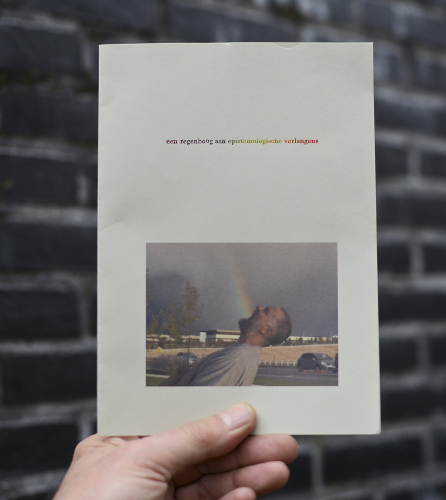
A Printed Book History 6 : Een regenboog aan epistemologische verlangens


Friday, May 18, 2012


the edition Suhrkamp designed by Willy Fleckhaus, 1963

In de collectie viel me op hoe vroeg sommige visuele elementen en experimenten al voorkwamen, hoe secuur en grafisch de encyclopedische tekeningen uit de periode voor het gebruik van fotografie waren, hoe imposant tastbaar en onhandelbaar de grote boeken met hun uitpuilende handgelegde papieren waren. Maar ik heb iets heel simpels gekozen om de overgebleven 300+ woorden aan op te maken:


Een serie boeken die bestaat uit uitgaven in verschillende kleuren waardoor de boeken samen een regenboog vormen. De boeken spraken me ook inhoudelijk aan, bij elkaar vormen ze een collectie waar je behoorlijk cultuur kritisch en radicaal dan wel wijs van zou worden (de collectie bevat een aantal niet canonische filosofen en figuren en leek me daarom des te interessanter). De serie is een selectie die door zijn vormgeving compleet probeert te zijn maar duidelijk niet conventioneel is. Voor mij is deze regenboogcollectie een simpele maar daarom niet minder mooie manier om te appelleren aan het verlangen om een serie boeken te hebben gelezen en ze herkenbaar en toch gedifferentieerd in de kast te hebben staan. Bovendien vormen ze een geheel, zijn ze bij elkaar een ‘compleetheid’, een overzicht. Ze lossen het epistemologische verlangen in van ieder die een boek koopt en daarmee hoopt alles of tenminste alles van iets te weten te zijn gekomen.

Los van elkaar zouden de kaften zomaar een kleur zijn, of zou het je juist op kunnen vallen dat de kleur bijzonder is, een tussenin-kleur, de ene kleur noch de andere. Ook zullen een aantal boeken uit de collectie steeds een ander kleurenpalet vormen. Dat palet ontstaat ondermeer door de voorkeur van iemand voor bepaalde boeken uit de serie. Het heeft ook iets kinderachtigs of oppervlakkigs om boeken op kleur in te delen, op ‘vorm’, niet op ‘inhoud’. Ik denk dat gezien de inhoudelijke zwaarte van de boeken juist de nuance van de verzameling als complete verzameling ?het hele scala wat je ermee te zien en te lezen krijgt? wordt benadrukt.

Wat de tentoonstelling me ondermeer duidelijk maakte is dat er bepaalde dingen bestaan die aantrekkelijk zijn en blijven, en dat het misschien die dingen zijn die grafisch kunnen worden genoemd als je er mee breekt of speelt. Sommige grafische clichés kregen in de tentoonstelling voor mij als het ware hun oprechte bron of context terug. De regenboogcollectie had een dergelijk cliché kunnen worden, maar misschien is het daar te aantrekkelijk en te uniek voor gebleven. Na wat onderzoek op internet kwam ik erachter dat op een paar andere regenboogboekuitgaven en een op kleur geordende boekenwinkel in New York na, vooral juist andere dingen op kleur gesorteerd worden. Vele collecties bestaan uit objecten uitgegeven in alle kleuren (vooral objecten waar je er meer van nodig hebt of kan hebben, zoals glazen, pennen, sokken, groente en fruit etc.) Rangschikking op kleur wordt veel gebruikt om wellicht functionele redenen. Maar ik vind het idee of vermoeden dat een regenboog collectie ook als een poging kan worden beschouwd om compleet te zijn interessanter. Dat idee laat zich ook illustreren door het werk Wonderkamer (2004) van Arnaud van den Heuvel. Vooral de ondertitel maakt de poging om een alomvattend overzicht te geven expliciet.


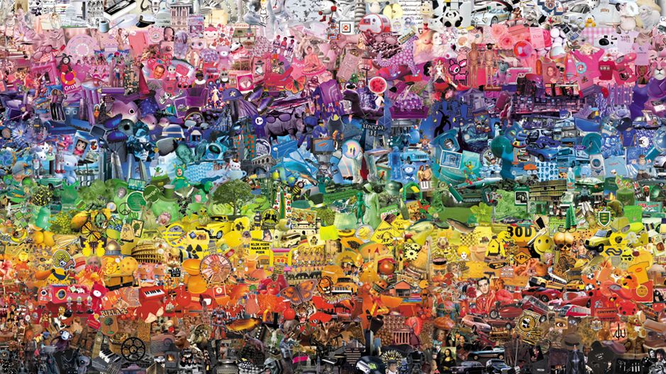
“An installation with all the images of the World in a room, sorted by color”.

concept
Visitors of the Wonderkamer (Miracle Room) enter an image-flow: a collection of thousands of images taken from their original context on the internet and arranged in a coloring scale from black to white.”

post by Victorine van Alphen


Log in
subscribe