Tuesday, April 23, 2013
A boring childish future?
A futuristic boring childhood?
A childish futuristic boredom?
the book “7th Biennale Internationale de La Tapisserie somehow came closest to fulfilling these not easy criteria. Or maybe not. It mostly fits the childish criteria, the cover has a knitted foot on it, very naive and silly. but still quite pretty or intriguing. boring I would say as well, because i find nitting really really boring. Im sure it can be used as a good medium and bring out exiting results, and it sure does in the book, so delicate and structaral a material, photographed in black and white, but however, the procces of knitting is to me quite boring. so kntting is definitley not gonna be my future. A picture that captures me is a picture of th ework by a polish artist named Hanna Jung. the work is called “Two spaces –
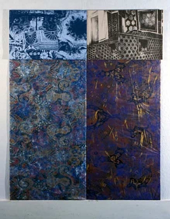

The space for the nude and the space for a stone”. In a room you have a delicate fur like cloud of fuzzyness as a gigantic bed overflowing the room on the floor, and above a lamp like shape of the same fuzzyness. almost touching eachother, but not quite. he work comes out so fragile but still so space consuming and i want to touch it. but its not even possible to find a picture on the internet. And im sure, because im really good at internetting. Its really as shame with work like this i think, that they only are documened in a dusty black and white book hidden between to much bigger books in the design section of knitting and fabric where you would never imagine to be drawn in to a magical white cloud of dominating light fur.
Rietveld Library cat.nr:779.2
Thursday, April 11, 2013
This book came to my mind, first of all because it was small, and i already had a really heavy bag with me.
Further more, it kind of looked like an old schoolbook, all yellow and nothing fancy about it. The title is “basic typography”. It was probably trying its best to be very fancy at its time, who knows.
the text on it reminded me of the schoolbooks where you would have to follow the lines with your pencil in order to learn how to write the letters. a b c d e f g, and so on and so forth.
There was something quite calming about this childish first impression, and the faded yellow cover. Besides that, it also has strips of tape, preventing it from falling apart, which doesn’t help me thinking it could once have been very dear to someone, and made me feel kind of sorry for it. I don’t like the font much or the general design of the book but still it is appealing to me some how because its just seems so uselessly boring. the content of the book is served on a plate for the ready to eat, nothing hidden in there, and I am saying this without even opening it. 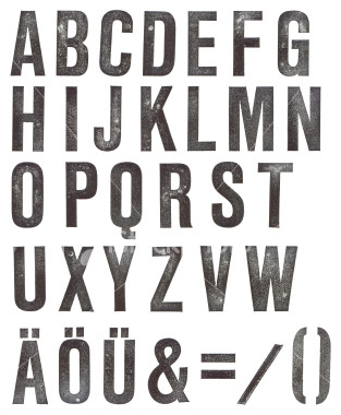 Type fonts. its just the feeling I have. The subject is very geeky in my opinion, and indeed also the title “basic typography” But that is deliberately why i choose it. I would like to study graphic design myself which is also why i picked it. Will I ever find a subject like this interesting? Well maybe in a year or two, but now, it seems like a very distant and flat subject to me. Perhaps not typography in general, but definitely in this case. It just happened to appeal to the doubtful side of me that is about to choose a direction were covers can be so planned out and yet so horribly boring and non exiting.
Rietveld Library cat.nr:7.57.3