Skip to Content Skip to Search Go to Top Navigation Go to Side Menu


"nature" Tag


Problematic relationship between humans and nature


Saturday, May 25, 2019

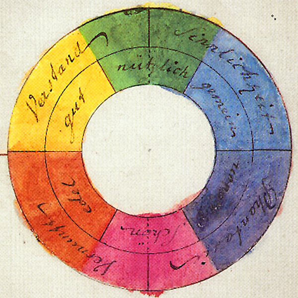
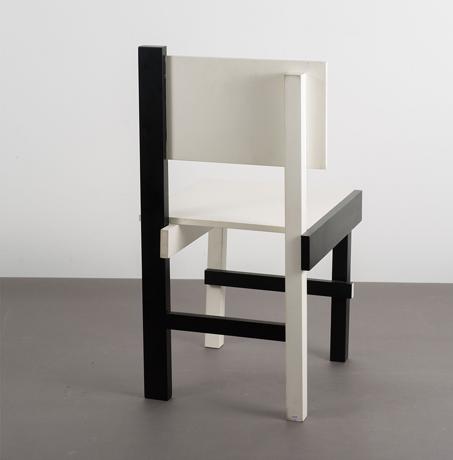
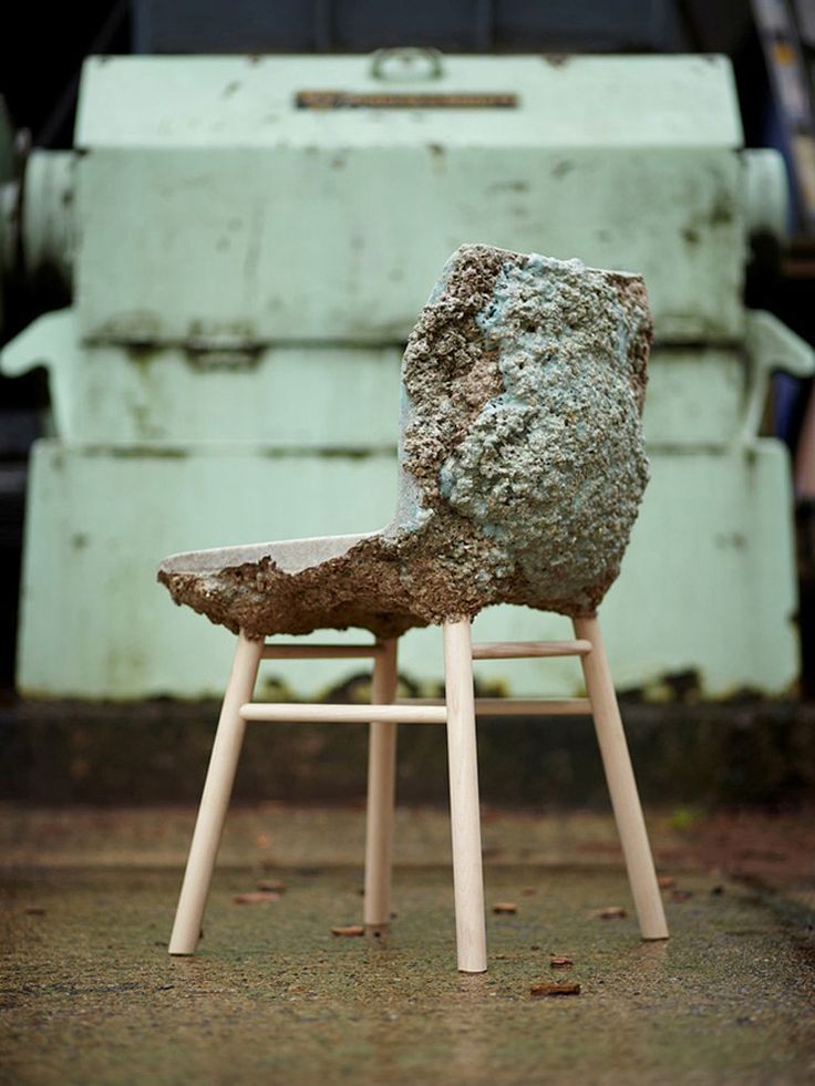
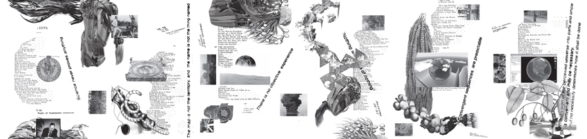
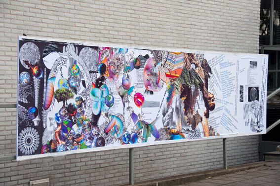
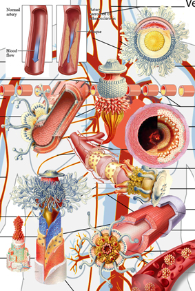
I browsed the design blog with a photographer’s eye: I looked through the posts for an internal voice that whispers me to capture this moment and make it mine — creating a folder of inspiration for my future self. I screenshotted words and images that spoke to my heart. I then collected them and zoomed even more inside each screenshot to seek for more visual information. By the end of the day, when my mind was still processing all the information, I understood I wanted to write about this specific screenshot.


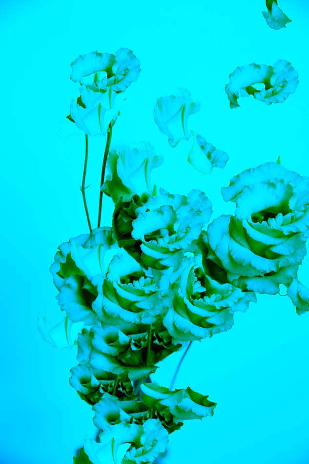
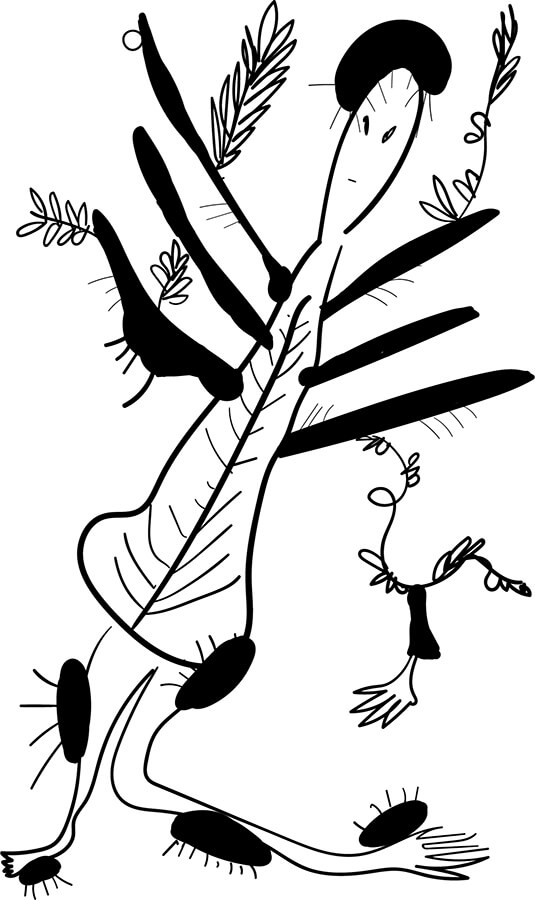
I wanted to explore what it feels to be one of these little plants and live among humans. This topic became the focus of my post.
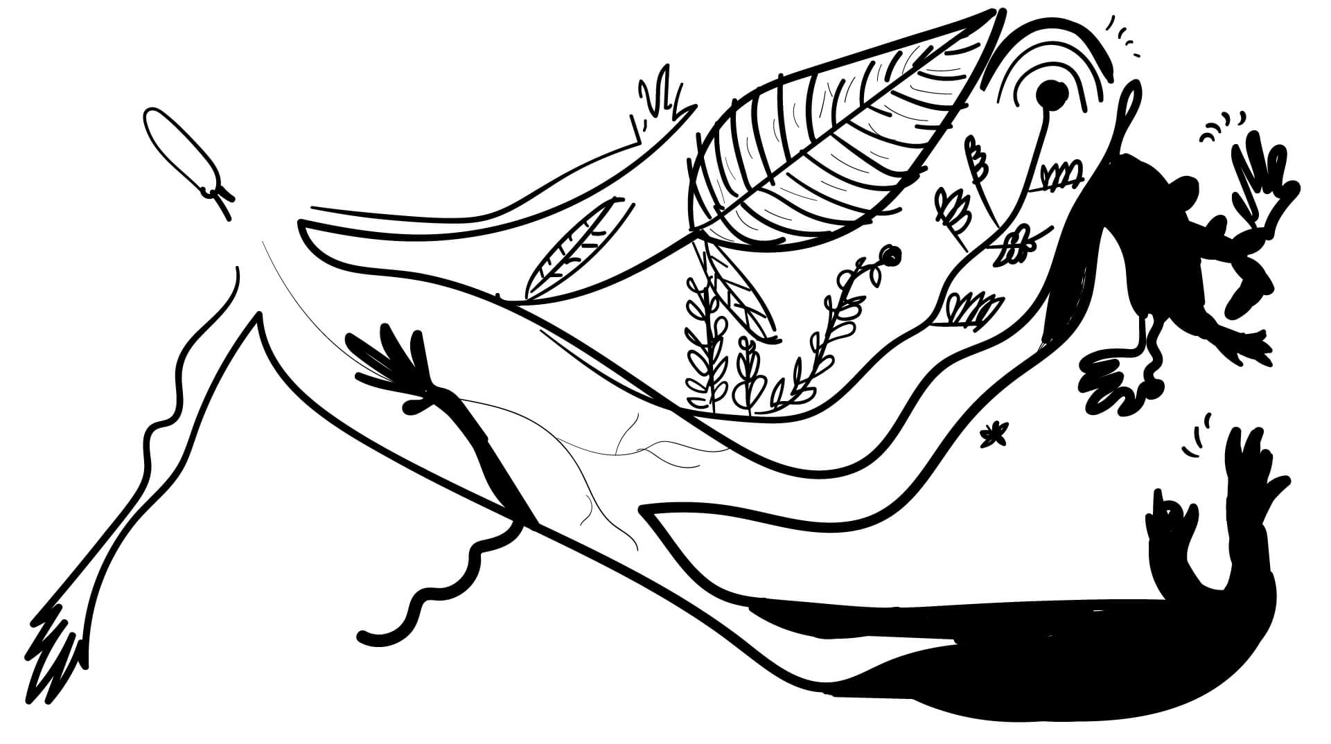
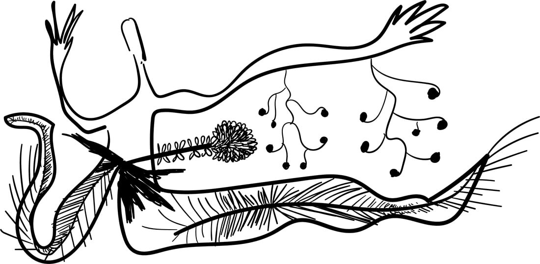
 

LIVING TOGETHER

Plants talked to humans.
Plants explored the consciousness before us;
The humans.
They breathe, and eat, and act, and love, and laugh in their own ways.
Sometimes they whisper to people passing by; with a voice that sounds like a laughing soul
and sometimes like a wave of freshness.
The moments I am unaware of my body, they act to bring me back.
They are in desperate need of my cooperation.
Roots.
I don’t have roots; I think,
my thoughts do the same thing.
They can be strong thoughts that keep me in a place forever.
A place could be a city, a country, a way of thinking, and much more.


ROOTS THAT KEEP US SAFE

A longing for safety and I can not remember why.
I feel like a tree.
Let my roots grow deep enough to the source and connect; then I will grow.
Opening my leaves and blooming to see the world, but to also move in it.
Trees. Wise, strong and safe.
Am I rooted in this land that I call mine?
A tree. A land. A root. A laugh.
Laughing makes me feel safe, makes me feel rooted, makes me feel like a tree,
but I can also move.


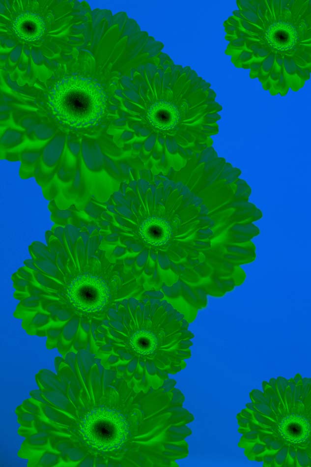
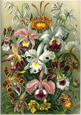
PLANTS AND PEOPLE — PLANTS WITH PEOPLE

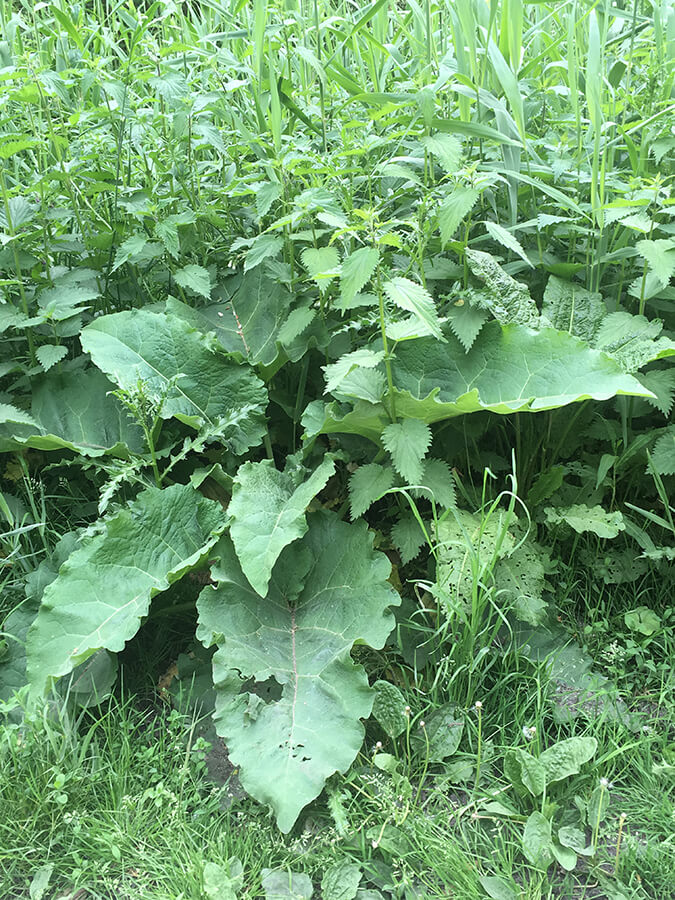
There are so many plants I see daily outside; I used to notice only the big and beautiful trees and the blooming flowers. I was unaware of the little grass and the plants that seem to grow by themselves without human interaction. I have seen a lot of people being annoyed by these plants — they take them away, they break their roots, and throw them inside plastic bags. They call this “clear the space”. I saw the government hiring people to clean the streets from these plants. The images of these plants somehow are creating discomfort, they grow fast and they don’t need people to take care of them. This sounds scary for them. I try to understand how it all started and how we normalized it.


CLEARING THE SPACE

A city is not a forest. A city is a place for people, not plants. It is a place that only plants that people like can enter. The lucky ones; the ones made to be with people. The others are hiding in dark corners in the parks, where I have seen them grow up into beautiful green big leaves. They are unique and charming, and they are homes for little creatures that want to live in the cities — close to people that they love.


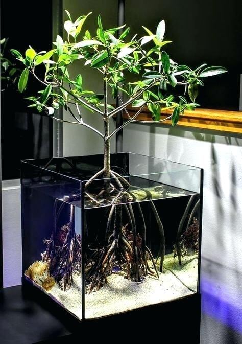
MAKE THE INVISIBLE, VISIBLE

Have you seen that nowadays people put plants in glasses with water, and they grow, and people can see their beautiful roots?
I wonder if it’s only me who sees the irony.
I hope we see their roots and reflect on them.
I want my roots back and I feel like I am flying.
I love the Earth. It’s okay to feel like you want to be in a different world when you are young.
It is a sign of awareness that grown-ups should remember.
I love the Earth so much.
I want to be like a tree who can be connected all the time with this planet.
But I am lucky to be a human that has roots in her fingers,
and can make stuff, can touch, and move.


MY MIND, EYES AND FEELINGS

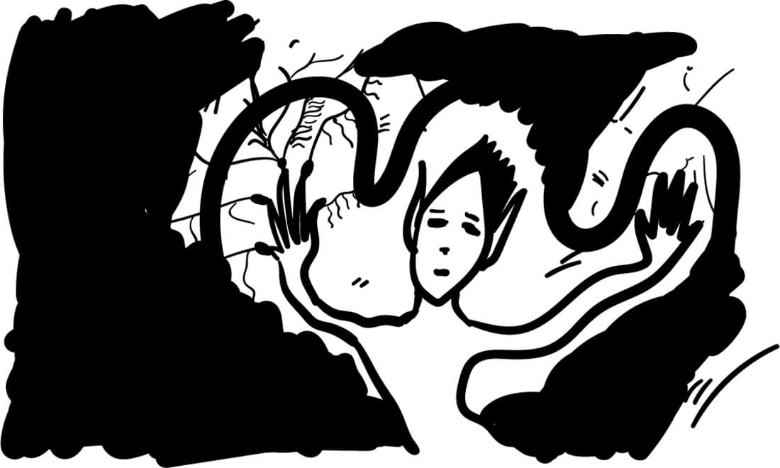
I dreamt I was one of these plants.
I saw how it feels.
I can tell you one thing:
they love to laugh.
“Why?” I asked.
They looked at me with wonder.
They didn’t realize I was a human dreaming to be one of them;
I didn’t tell them.
They continued to look at me with wonder — and I got it.
I woke up laughing.


Can we control our Nature ?


Saturday, February 9, 2019

Front cover of the book Next nature

  Next Nature is a book designed by Mieke Gerritzen and edited by Koert van Mensvoort, Mieke and Michiel Schwarz. it was published in 2005. The design of this book is really interesting, not so much because of the paper chosen, the format of the pages or the functionality, but more because of the choices made on color, as well as the fonts and basically the whole visual identity, that is closely linked to the raised subject. The relation between text and image is really particular and intense with a lot of repetitions for example. This is not the only book by Mieke Gerritzen treated in this way. Her work as a designer and artist is a study of the image culture, in relation to technologies and all kinds of digital medias. She also designed other books such as mobile minded for example, “A booklet about the mobile world of quotes, essays, statistics and factoids, all reflecting the very young state of wireless thinking”, is said on the website, showing that there is still a relation to technologies.


<code.Front/back cover of the book mobile minded

Her website transcribes this idea quite well with a lot of of images, fonts and projects coming to your eyes as you open the page. It even gets you lost a little bit.

Koert Van Mensvoort, artist, philosoph and scientist, and one of the editors of  Next Nature, made a few conferences to talk about what is next nature. At a certain point, he draws a graphic comparing the things that were born and that we control (genetically modified fruits for example), those who were born but that we don’t control (the sun), and then does the same with the things we created : a car is controlled by us but a computer virus not for example.
In the end, he proposes that we think of nature as a nature caused by us : next nature.


4

Image taken from the facebook/instagram page virtual experience : https://www.facebook.com/virtualexperiences.net/

The idea of next nature and the designs, visuals that join it, are present a lot on the internet. On many pages you find a lot of content with a crazy amount of information, different elements mixed together, images repeated or put there without any explanation.  This is something that you find in the book, on the first pages already. When you open the book, the first two pages are heavy repetitions of photographs of dogs and of a font « next nature ».  This kind of designs came, in a way, with the explosion of internet , and of a new digital era, following different artistic domains. For example, codeine/purple trippy visuals or videoclips mostly came with new rapers such as yung lean for example, with his music « ginseng Strip 2002 » . The video came out in 2013, but contains a lot of references to things that were popular in 2002. A lot of music artists consider this video clip as a revolution because of the raping style that is slower, along with the instrumental, but also the visuals for the video clip, and the outfit he’s wearing. For a lot of people, this is at the origin of a whole fashion/music trend that has been really popular the past years. In his videoclip « Hurt », you find a lot of visuals that are old computer/digital styled, often absurd and colorful, really similar to the book’s visuals.


Screenshot from the video clip of Yung Lean - Hurt, on youtube.

The interesting thing is that this book next nature came out in 2005, but in 2005 only 9 % of the world population was using internet while now it’s 55.1 %, knowing that we are also more on earth. So, this kind of visuals were a lot less common in these days. The title next nature was actually more than accurate because it anticipated a lot of things.

As i said earlier, the content of the book is a lot about new technologies and medias, and so is  focused on modern society, in a way : « in this world it is perhaps fitting that we can now – thanks again to our technologies – also manipulate the images of nature ». Most of the images chosen in the book are symbols you find in big cities or famous logos remade with different colors, like the apple logo made as a pear for example. Even the use of pop culture images (Nike P.18 ; Coca cola P. 30) is recurrent.


Images from the book Next Nature

You can see that one of the main topic of the book is the consumer society, something also present on internet with  “memes”, on social medias for example. It is humor, of course, but often about technologies, politics or the actuality, so it’s still an analysis of the modern society, even most of the time a criticism, in it’s own way. In the book, they’re almost using these modern society symbols as a lifestyle, a way to use social medias, to wear clothes, to talk, to write, to listen to music. This kind of designs take the side of accepting and amplifying the fact that we are over exposed to a big quantity of information nowadays. It’s like if they were ironically trying to like this society. For example, P.113, the supermarket is compared to a neighborhood, because it has everything : theater, a club… « The supermarket […] as lifestyle ». This crazy quantity of information is translated by the fact that each page is really different : some fonts or colors come back in the book sometimes but the display of the elements, or backgrounds, is always changing.


front and back cover from Everyone is a designer in the age of social media

Mieke Gerritzen also published a book called : « everyone is a designer in the age of social media ». For me, this goes with the idea that us, the spectators, can now take a major role in the visual identity of objects, ideas and that by sharing it, liking it, we actively chose the way we treat the information we receive and have a role in what our designs look like. It also goes with the idea that nowadays, we, as humans, are designing our nature, the next nature.


https://miekegerritzen.com/books/

https://www.nextnature.net/2006/07/save-our-next-nature-buy-the-pocket/

https://miekegerritzen.com/vision/

https://miekegerritzen.com/exploding-the-world-of-graphic-design/

https://www.facebook.com/virtualexperiences.net/


Koert Mensvoort: Next Nature. design by Mieke Gerritzen, Rietveld library number: 754.2 nex 1

COLORBLIND PHOTOSHOP


Tuesday, April 3, 2018

COLORBLIND PHOTOSHOP

To a lesson of color

from the German Zur Farbenlehre

Goethe focused his notion of colour on the spontaneous sensory experience. His theory is based on how colors are perceived by human brain. He’s not looking for a material definition as Newton did.

He did a lot of experiment, describing phenomena such as coloured shadows, refraction and chromatic aberration.

After some observation, he deducted that Newton’s theory was missing something about colours. He didn’t see darkness as an absence of light but rather at polar to and interacting to the light; colour is a result of interactions between light and darkness.

Goethe’s studies began with the experiments which examined the effects of turbid media such as air, dust, and moisture on the perception of light. He observed that light seen through a turbid medium appears to us yellow. He took the example of the sun seen through the atmosphere: when you look at the sun rising it appears yellow red, the particles there are, the more the sun is red. Otherwise, when we look at the sky we actually look at the darkness of the space. The blue of the space are the particles from the atmosphere reflecting the sunlight, so we have light on obscurity ( more the layer of particles is thin more the sky is dark blue).

From this starting point, Goethe developed his theory on the polarity of colors: real close from the light there is yellow then red, and real close from the darkness there is blue then green. He also concluded that colour is a dynamic process from his experience with a moving prism. He founded a spectra different from Newton, adding: cyan, yellow and magenta.

Goethe also include aesthetic qualities in his colour wheel under the title “allegorical, symbolic, mystic use of colour”:

cercle-chromatique goethe

red is beautiful,orange is noble, violet is unnecessary, yellow is good, green id useful and blue is common. These six qualities were assigned to four categories of human cognition: the rational (red/orange), the intellectual (yellow/green), the sensual (green/blue) and the imagination (red/ violet).

Goethe also made the “rose of temperaments”, an earlier study (1798/99) by him and Schiller, matching twelve colours to human occupations or their character traits (tyrants, heroes, adventurers, hedonists, lovers, poets, public speakers, historians, teachers, philosophers, pedants, rulers), grouped in the four temperaments: melancholic, choleric, sanguine and phlegmatic.

Goethe_Schiller_Die_Temperamentenrose


Should your glance on mornings lovely

Lift to drink the heaven’s blue

Or when sun, veiled by sirocco,

Royal red sinks out of view –

Give to Nature praise and honor.

Blithe of heart and sound of eye,

Knowing for the world of colour

Where its broad foundations lie.

—Goethe

watch this movie about light, darknes and colours


A little story about Daltonism
Early in the 18th century, Isaac Newton discovered color spectrum through his experience with a prism.normal + vison ++

During his experiences, he discovered that human eye is not capable to distinguish the combination of colors: thus at the intersection of a green and a blue light beams, the human eye perceive cyan.
Then in 1801, the doctor and physician, Thomas Young expose his theory of the trichromatic vision: three colors must be enough to recreate all the colors. In addition, when those colors are mixed in the same proportion, it gives white. Thereby he explains human color perception by the action of three retinal nerves which are excited respectively by red, green and purple. Disorders of the colored vision result from the malfunction of one of these nerves. He also shows that accommodation is ensured by the deformation of the crystalline.

This theory is confirmed by the Scottish physicist James Clerk Maxwell (1831-1879). He publishes a series of research on color perception and color blindness.
The scientific name of the anomaly is “dyschromatopsia“, but it is generally known as “Daltonism“, a term created by the physicist Pierre Prévost after the name of its discoverer: the English chemist John Dalton. The latter published the first scientific article on this subject in 1798, “Special Facts About the Vision of Colors” in a communication to the Manchester Literary and Philosophical Society, following the realization of his own disability at perceive colors. He had also noticed that his brother had the same abnormalities, without concluding as to a possible genetic origin. It is only two centuries later, in 1986, that Jeremy Nathans locates the genes responsible for color vision and publishes this discovery in his treatise “Nathans, J., Thomas, D., Hogness, DS Molecular genetics of the human vision of colors: the genes coding for blue, green and red pigments, Science 232: 193-202, 1986 »

dantonisme

Thus humanity with the apparition of electronic devices searched for a color system for screens based on his owm perception of colors. The RGB system appears for electronic devices. Indeed, RGB is a device-dependent color model: different devices detect or reproduce a given RGB value differently, since the color elements (such as phosphors or dyes) and their response to the individual R, G, and B levels vary from manufacturer to manufacturer, or even in the same device over time. But still, even if RGB is based on human perception, computer are not working the same as the human eyes.
From this research, I asked myself: what if Photoshop was colorblind? My starting point for the project was photos of colorful flower, that I modified on Photoshop with different mechanism. I based my project on the six differences types of colorblindness depending on which sensors (cones) red, green or blue is touched by the illness and if it’s missing or just dysfunctional.
Applied to the RVB system, if a cone is missing I deleted all the layer corresponding to the color missing cone on Photoshop and if it was only dysfunctional I was only playing with the value of the layer. As if it was “more or less colorblind”. All the experience was a game with the different RVB layers, showing how different a computer and a brain with a missing or dysfunctional sensor or not going to recreate or perceive the same colors even if RVB is a color system based on human perception. It appears to me that the computer was more powerful in a way because it was capable to make up a lot more of colors than humans with different type of colorblindness.

 originals

 Capture2_1


final works


_V0A6105test3 copie 5 _V0A6074test2 7
_V0A6096 V0B0R100 test 4 _V0A6088 test_1 3
_V0A6079 200V 220B -150R test  2 _V0A6078test 1

Moses Harris’s Natural System of Colours Wherein is displayed the regular and beautiful Order and Arrangement, Arising from the Three Primitives, Red, Blue, and Yellow, The manner in which each Colour is formed, and its Composition, The Dependence they have on each other, and by their Harmonious Connections Are produced the Teints, or Colours, of every Object in the Creation, And those Teints, tho’ so numerous as 660, are all comprised in Thirty Three Terms


Friday, March 16, 2018

Moses Harris, who lived from 15 April 1730 until 1788 in England, was a fanatic entomologist (this is someone who studies insects). As the first photograph had yet to be taken, it was common to use engravings to use as imagery to support your research. Moses did not outsource the making of these engravings, he made them himself. As the difference between two insect species is sometimes very subtle, the colours of Moses’s engravings needed to be very precise in order to be able to determine a species correctly. Thus grew his interest in colour.
 
Moses Harris engraving
 
In Moses’s quest to record insects as best as he could, he needed a new colour system that could help him when he was making the engravings of the insects. He decided to create his own colour system by using a  source that he as an entomologist was very familiar with, nature. He claims that blue, red and yellow are the prime colours, because those are the colours to be found back the most in non-domesticated flowers, thus nature must like them the most. He called them the prismatic colours, because those are the colours that are reflected by the prism. Which is quite remarkable, as his whole research is about colour in pigment and not in light like in the prism. The colours green, orange and purple he calls the compound colours, as they are made up from the prismatic colours. As Moses thinks that nature divides the prismatic colours and the compound colours, he decided to also separate them into two different colour wheels that together make his colour system. It is said that Moses is the inventor of the colour wheel.
He finished his colour system somewhere between 1769 and 1776 with a lot of enthusiasm. A bit too much enthusiasm maybe, as he named his colour system:
“Moses Harris’s Natural System of Colours Wherein is displayed the regular and beautiful Order and Arrangement, Arising from the Three Primitives, Red, Blue, and Yellow, The manner in which each Colour is formed, and its Composition, The Dependence they have on each other, and by their Harmonious Connections Are produced the Teints, or Colours, of every Object in the Creation, And those Teints, tho’ so numerous as 660, are all comprised in Thirty Three Terms”

Now this was a bit too long to go on the book cover of his publication about his newly realized colour system thus they shortened it to: “Moses Harris’s Natural System of Colours

If you’re interested to read more about Moses Harris’s Natural System of Colours, you can read more about it here on another designblogpost. 

moses-harris-prismatic-rca-mr_340 [x] Moses Harris's compound colour wheel

Where order is born is born wellbeing.


Tuesday, February 20, 2018

Alvar Aalto, one of Finland’s most famous people who reshaped architecture and furniture of public buildings on the basis of functionality and organic relationship between man, nature and buildings, is now called the “Father of Modernism” in Scandinavian countries.


He was born Hugo Alvar Henrik Aalto, on February 3, 1898, in Kuortane, Finland (at that time Finland was part of Russian Empire). He was the first of three children. His father, J. H. Aalto, was a government surveyor. His mother, Selma Hackestedt, was of Swedish ancestry, she died in 1903.

Hence, Hugo Alvar Henrik Aalto was educated a lot by his grandfathers. His grandfathers were both very close to nature, one of them was a forest guard. Alvar Aalto has a child use to play a lot in the forest. It was obviously through him that the outdoor world, particularly the forest became so important in Aalto work. The forest with his towering tree trunks and his various rock shapes is a world a constant changing forms which inspired Aalto a lot. Aalto probably found in nature the basic geometrics patterns for his architecture and furnitures.  The forest thought him also that nature is a sensitive ecological system in which men must find his place.

Aalto’s relationship is pretty clear according to the paintings he did as a child. He hesitated few years either to become a painter or an architect. According to his saying, he decided at the age of nine that he wanted to become an architect.

Aalto has been educated in the idea of National Romanticism, the Finnish version of Art Nouveau. Aalto rejected it, such as pretty much his whole generation. However he took one important feature from his predecessors : the idea that his creation should perfectly fit into nature.

Around 1920 a softer version of the strict modernist aesthetic emerged in Scandinavia, characterized by the use of (curved) wood in combination with shapes, colours, and decorations inspired by nature. The resulting furniture arose from the ambition that design should offer both beauty and functionality, and be affordable to everyone.

Aalto rejected a lot of furnitures of his time, he wanted to find a material that makes chairs pleasant to sit in. A lot of Aalto’s furnitures were also inspired by the shapes of nature. He often solved practical problems with abstract experimentation of forms with wood. Aalto experimented with bending a bunch of wood to create chairs.

Through experimentation with wood Aalto discovers specific properties which could be useful of men. For instance, in the interior of the Viipuri Library Aalto created rooms inspired by nature which specific functions. Such architectural solutions as a sunken reading-well, free-flowing ceilings and cylindrical skylights, first tested in Viipuri, would regularly appear in Aalto’s works. Aalto differed from the first generation of modernist architects (such as Walter Gropius and Le Corbusier) in his predilection for natural materials: in this design, « wood was first introduced into an otherwise modernist setting of concrete, white stucco, glass, and steel ».

Aalto’s work with wood, was obviously influenced by early Scandinavian architects; however, his experiments and departure from the norm brought attention to his ability to make wood do things not previously done. He was one of the first architect/designer to be able to find a way to bent wood in order to create theses beautiful organic shapes. Aalto studied architecture at Helsinki University of Technology, however during a large part of his career Aalto created a lot of furniture. Like Le Corbusier, Aalto considered that furnitures and architecture should be a collective and cohesive ensemble that creates order. His experimental method has been influenced by his meetings with various members of the Bauhaus design school.

After traveling through Europe, he was exposed to International Style and soon adopted the natural materials and organic forms of this approach into his aesthetic.

PEOPLE NEXT DOOR


Monday, October 5, 2015

The design derby took place in the Boijmans museum. It is about the confrontation of Belgian and Dutch design objects from 1815 till today. The collection covered all kinds of design; from glass and ceramics, prints, furniture, fashion, even up to cars. The exhibition was ordered chronologically and all the items from each country were presented next to each other into two big lines.

Does this make sense and do you really find out more about Dutch and Belgian design by looking at it like that? This is an attempt to find out as much as possible through two chosen objects from the exhibition.


table carion OLYMPUS DIGITAL CAMERA

Francois Carion table [x] and lamp [x]

Firstly, a small round table by the Belgian designer François Carion. He built this table between 1925 and 1930, the materials he used for it are iron and pink glass. The wrought iron is one of the key symbols of his work and he used it for a lot of other designs as well.


ravesteyn chair ravesteyn

Ravensteyn chair presented at the "Exposition des Arts Décoratifs et Industriels Modernes in Paris 1925 [x]

The second is this chair by the dutch designer Sybold van Ravesteyn, who was born in 1889 in Rotterdam. Van Ravesteyn is a nationally famous architect who designed some quite important projects in Holland, for example the central station in Rotterdam [x] (shutdown in 2007) and also various residences and furniture [x]. The presented chair was designed in 1925. It is made out of wood and painted in geometrical shapes in black and white, designed specially for mister Rademacher-Schoers bedroom with the matching nightstand for his house in Utrecht.

To find out more about the artists it is important to understand the circumstances of life and therefore their inspirations.
First of all, after the first World War progressive designers took advantage of the knowledge of material and techniques they had gained during war. That’s why for example it was also a big topic to design the first cantilever chair out of tubular steel which was used by famous designers like Mart Stam, Marcel Breuer and Mies van der Rohe.

Moreover some big art movements were going on in this time; from 1890 until around 1910 Art Nouveau was a big influence mainly inspired by natural forms and shapes and therefore you can find many dynamic flowing lines and mainly asymmetrical shapes. Art Nouveau was seen as a harmonization between nature and design, and also a way of life. In the same time the Arts and Crafts movement was going on, which was an big influence from Great Britain; the movement was mainly about the combination of work and art. From France came the important Art Deco movement. Art Deco was defined by stylized and two dimensional representation of floral and organic designs. The industrial production and lack of shadows and natural elements was the new sign for modernity and the overtake of Art Nouveau. The absolute climax of Art Deco was the Exposition Internationales des Arts Décoratifs et industriels modernes 1925 in Paris, which defined the movements name.

Another movement was De Stijl in Holland. Famous contributors included painter Piet Mondriaan and of course architect Gerrit Rietveld. Their work is mainly known as plastic art which is a pure abstraction in form and colour. It is about the reduction to the essentials by only using primary colors (among black and white) and the limitation to use almost only vertical and horizontal directions. The most famous example is the Red and Blue Chair by Rietveld in 1917 which can be also seen as a three dimensional painting of Mondrian.This chair was also invented for mass production which expresses the mood of time in Holland at that moment.

Also because in most middle class houses in Holland and with the higher class in Belgium it became common to use a gas stoves instead of a big oven in the kitchen,  people didn’t gathered only in their kitchens anymore as nice and cozy place to stay but in their whole houses. There were other heated rooms, even central heating, as well and furniture became much more important in general.

I choose these two items mainly because of their difference, despite being designed and produced at almost the same time. This shows how many different influences the countries and artist themselves had during the time, which makes the derby more interesting, it is nice that you can find several elements of the ongoing movements in these two pieces.

arts and crafts   william morris niebelungenlied

Art Deco Jug • Charles Robert Ashbee (1904) [x

Art Deco Interior • William Morris Niebelungenlied (1860) [x]  

In Carions table for example I can find lots of flowing formed shapes and the motive of nature a characteristic of Art Nouveau and the Arts and Crafts movement which is coming mainly from Britain. I wanted to give another example for this movement because there are so many similarities to Carions work  in C.R. Ashbees work  (1863-1942) who was a British major designer for the arts and crafts movement. You can find simply the same elements and materials as Carion used in his works. In Interior Design wood was also a big thing  you can see that in the Red House from William Morris, who is actually seen as the founder of this movement and his friend Philip Wood. They designed this house in England together and until now it is a well known example for the Arts and Crafts movement.

18_designparade_jt130711   Bar Aubette

Art Nouveau Interior • Sybold van Ravesteyn room of Villa Noailles [x]

De Stijl Interieur • Theo van Doesburg Aubette (1928) [x]

Ravesteyn’s work which in this period consists of only geometrical shapes and very limited colours shows influences from the Dutch de Stijl movement, which is very much connected to Rietvelds work, who was also designing for private houses . But also artists such as Theo van Doesburg in whose Maison-Atelier de Theo van Doesburg de Meudon in Paris where he lived himself with his wife. It is quite obvious that both artists have similar inspirations and approaches in their work. In the picture you can see “Aubette” a collaboration between Hans Arp and van Doesburg for a cinema in Strasbourg which is very loyal to the de Stijl rules.

All in all from this exhibition as an example we can see the impact and influences countries get from other countries. As here seen in Holland which is more orientated on the East with Germany and the Bauhaus movement as there were also many refugees coming from there and they choose Holland as neutral country. In contrast to Belgium which was more focused on France and even Britain so therefore the south and west.

Moreover it is an interesting fact that people lived next to each other, but also very different, because there was a border between them. This has changed so much today where there is internet and it is so much easier to to cross borders to find inspiration online and not having to depend on the values and movements being part of the countries itself.

Made Trough Material Research


Sunday, March 29, 2015

I was thinking, writing about a chair can be really interesting but for me it had to be more than only writing about a chair.

Waste, material, life, renovation, structure, experimenting, design.

A few of the words that were coming up in my mind when I saw and started to research this chair, so I thought this will be a perfect chair and designer to write about. To find out how deep this designer can go into material research, waste and renewable energy. Marjan Van Aubel is one of the designers who stimulates this.

table-17


Marjan van Aubel is a designer that makes everyday objects in new innovative ways. She is trying to make people aware of the fact that renewable energy is everywhere. Normally there will be a waste of 50/80% during normal manufacture.  Van Aubel and James Shaw found a way how to use and incorporate that wastage during the manufacture.

When I saw “the well-proven chair” for the first time it looked like a normal chair because of the simple legs of the chair but when you see the back it becomes a object. For me it was hard to understand the material. I didn’t know where the chair was made of. The nice structure camouflages the fact that it is actually made out of  shavings and sawdust.The sitting part is beautiful and smooth, making this chair nice to sit on and really nice to look at. It’s good that the legs are simple so the focus stays on the sit area. With her designs she try’s to combine design and technology. She strives for a more renewable life

Well-proven chairJamesShaw+MarjanvanAubel

For me this was a really interesting topic because i didn’t know a lot about this kind of experimenting with material. There are so designers working with this way of designing. They are busy with making new materials to make life more renewable. I think these new materials are needed because our resources are running out.

As an artist/designer Marjan van Aubel always was interested in how things are made, a reason why i feel related to her. I always want to figure out how ‘it’ is put together.

She was also intrigued by solar panels and why they are so ugly and why they can ruin the face of a building. Why are the panels not integrated in the tiles? I really agree with her. That is why she started at her collage time a research about energy. Now not only design was important also science. She graduated with “The Energy Collections” a set of solar glassware that discharges through a matching bookshelf, which serves as a rather large battery. This kind of thinking can make our life a lot more easy an conscious. Like I said we are running out of material so this kind of design thinking can improve this.

I have a lot of interest in nature.  For me that makes her work really interesting, because she interacts nature with design. I have a few works i made a few years a go which are also related to this.
I investigated how nature and mathematics have a lot of comparisons. Like the golden ratio and Fibonacci. You can see it in a lot of plants, a lot of leaves  grow in a spiral around the branch to get enough sunlight and rain. It is also in our human body. For me structure in  nature is an important way for making a work. It is really nice that nature can help us to make products. I think it’s also good that new young designers/artists also use this opportunity to invent new products and make use of our nature. Like her latest project  “The Current Table‘ which was also able to generate energy. This project she made in response to “the energy collection”.


Current-Table

The market for these well made products is getting bigger and bigger.  People are more concerned with a healthy and a conscious way of life and designers will react on that.

This movie from 2012 shows how a lot of designers are busy with the meaning of material.

https://www.youtube.com/watch?v=9-GofyAQK6Y


It’s fascinates me a lot how this young designer are making al these new innovative products. I found a movie on this page and it shows how scientists are combining non-living chemicals to create materials with the properties of living organisms.

Now you can see how new materials, new invented but also already existing materials but used in an other way will blow your mind. For me their is still a lot to discover about al this material researches and the meaning of material. This research showed me a lot new ways of seeing waste and make new material with it. So we al can be more conscious and re-use waste to make something new.


Links:

http://www.marjanvanaubel.com/

http://wellprovenchair.com/

http://www.dezeen.com/

http://www.rennyramakers.com/


Curves


Tuesday, May 6, 2014

Golden_Ratio_4

curved_archtecture_redu

Capture d’écran 2014-06-04 à 14.38.24


If I tell you architecture, you’ll tell me SQUARE

If I tell you nature, you’ll tell me ROUND

We obviously link architecture to geometry, structure, squares, etc… and nature to organic features and therefore curves and irregularity.

Therefore what is interesting is the notion of curve in architecture.

We started seing curving architectures at the same time as the introduction of movement in art (cubism, kinetic art, futurism, chrono-photography, mobiles, etc….)

Beyond the fact that it’s aesthetically seducing, and beyond the fact that it is bringing movement, curves are attracting more attention from your brain.

Psychologist Oshin Vartanian made researches on what was going on in people’s brains as they viewed two rooms — one with rounded features, the other more rectangular. First of all, the ones that were confronted to the curvy one were more likely to define it as “beautiful”. They also displayed more activity in a part of the brain called the anterior cingulate cortex that, among other functions, is linked to the brain’s ability to regulate and process emotions.

Curved buildings can point to nature, whereas angular buildings contrast with it. Straight lines and angular shapes are disconnecting a building from nature, and humans natural state. It is reducing everything into a harsh and boxy aspect, which we naturally don’t identify in so much.

I observe (on a very personal level) that in the end my attraction goes to buildings balancing the angle and the curve. The final reconciliation between “organic” and “organized”. People like Frank Gehry, Herzog et de Meuron, Oscar Niemeyer, Zaha Hadid, Rudi Ricciotti and many others are/have been working on it and succeeded quite well so far, to bring new rules and esthetics to modern architecture, inspired from the so called international style and reconciled with more organic references, as well with new materials that are more environmental friendly.

I am starting for this occasion a tumblr “Curves” where I will be developing this idea through posts and references, grasping a lot of elements orbiting around this, and that is starting from this thesis that I invite you to read on Orthogonal Allegory in Architecture by Anton Stuckhardt [graduation essay [x].


Ecosophical Roadmap


Friday, August 30, 2013

intro

Haeckel_Orchidae

“The drawings in Kunstformen Der Natur express Haeckel’s fascination and devotion to the study of nature. Haeckel himself described his fascination for the world he was investigating, mostly referring to his main discovery, the Radiolarius [x], a single cell organism discovered in the depth of the ocean.
“It’s hard to believe that these creatures are single cells, some are like grids, broken nets or stems, others like tiny balls, helmets or bells when others appear to us like tender houses, windmills, fantastic towers.”

These words reflect on how much the artistic impulse of Haeckel seemed to have taken over his wish to be perfectly accurate and neutral as a scientist. His drawings are projections of real observations but they are as much projections of the inner interpretation of the artist’s vision of reality. Kunstformen der Natur was a way for him to unite these two projections in a single work. He by doing so “began to see not only the outer forms but also the inner content, the nature and the history of things”. He’s been trying to see nature as a “single unfolded work of art” by trying to understand the sequences allowing the Radiolarius to be present in such a multitude of forms. By doing so he achieved an astonishing body of work that can be seen as a suspended moment in time, a witness of this wish to leave space enough for observations and fantasy in a single picture. Following Goethe’s attempt to present nature in its diversity and trying to find unity in it at the same time, Ernst Haeckel created hybrid specimens that reflected on his subjective way to create the marvelous and the poetic in order to try to decode the genesis and the evolutionary systems of nature. That lead him to coin the word “ecology” itself.”

Excerpt from “The Curious, the Marvelous and the Particular”
(thesis by Rudy Guedj can be downloaded as pdf at the end of the article)


roadmap

By exploring the potentialities of ecological worldviews, old and new, through theory and art, WHERE ARE WE GOING, WALT WHITMAN? seeked, to accelerate, accumulate, animate and activate our poetical and political understanding of the world. (Introduction of the Studium Generale 2012-2013 “Where are we going, Walt Whitman? An ecosophical roadmap for artists and other futurists”)

The visual campaign for the Studium Generale — designed in collaboration with Sophie Rogg, Olya Troitskaya and Martin Huger –all graduates from the Graphic Design department in 2013— revealed itself progressively. It was trying to both map knowledge acquired during the past lectures, and project on a fictional level thanks to a visual pollution which was growing exponentially on all the mediums we used.

billboard1

The first layer of the campaign, the map, was created before the Conference-Festival as a simple topology arranging references into a single spacial representation. Day after day, the basic map, as all the different supports we used to communicate with, was taken over by a visual infection.

DSC_0030

The creation of each of the collages has been realized as a reaction to the existing publication Kunstformen der Natur (Ernst Haeckel, 1899-1904). These bold interventions on top of the existing drawings shaped a fictional journey throughout the campaign and provided endless interpretations of the very broad topic of ecology today.

Collage_Orchidae calabi-yau-2 poster_3 Haeckel_Kunstformen_Page_065_2
< illustrations Rudy Guedj, Sophie Rogg, Olya Troitskaya and Martin Huger >

“A welcome pendant to the overload of terms and theory is the online Ecosophical Roadmap: an ongoing encyclopedic exercise accumulating (visual) footage that inspired the speakers. (Ecosophical Roadmap) I dare say this experiment is the only contribution to the Studium Generale that practices what it preaches: it actually embodies our way of interacting with the material world, mediated through technology and immaterial digits.”
From : Metropolis M (online reviews)

DSC_0110 DSC_0127
< Studium Generale poster, physical translation Roadmap >

The online roadmap was a way for us to respond to the immediate and ephemeral format of the lecture by gathering notes and other references mentioned during the discussions. It functions today as a remaining archive, an attempt to visualize the many connections that were progressively built up and to emphasize on the important role that plays serendipity in our daily use of technological medias.

text by Rudy Guedj [graduate student department of Graphic Design]

thesis


Pdf-icon Download my thesis: ”The Curious, the Marvelous and the Particular“


Nature at Home


Thursday, May 22, 2008

porseleinebordThe Alfred Meakin plates I own, are like most of my belongings, second hand. I got these plates because the over organic and curly pattern looked beautiful and at the same time so fake and corny to me. I always enjoy this friction in things I own

These plates, like most Meakins are inspired, by nature not just in its patterns but also in the shape. They were not made anymore after 1937 and still, all modern Meakin plates, and also most porcelain, are in a nature theme. I find it interesting that throughout history one thing has not changed and that is the urge to recreate nature, even out of something as lifeless as porcelain, while at the same time bending real nature to our desires. Creating things that have a beauty like nature and that are at the same time cold and fake. This friction that works both ways is what really grabs me.
http://www.terhitolvanen.com/html/woodland12.html
http://nl.youtube.com/watch?v=XL1aCkKR0h4


Log in
subscribe