Monday, March 11, 2013
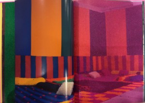
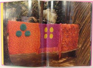
Fransje Killaars is a Dutch artist who graduated from the Rijksakademie in 1984. She started with a lot of paintings, but is now well known for her installations of brightly colored textiles. Both the paintings and textiles share the importance of use of color. She is fascinated by the power of color, the relationship between people and textiles and the way textiles are bound up with daily life. Her artwork is characterized by her use of fields of bright colors placed next to or on top of each other. The colors hardly ever blend together.
The book was put together by Nikki Gonnissen and Thomas Widdershoven. It is composed of pictures and different pieces of bright textile. When Fransje went to India and visited the different textile workplaces the bright colors inspired her and convinced her to work more with textile. Her trip there directly lead to this work, where she filled an attic space with bright hand woven carpets.
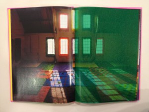
I picked this book because I was attracted by the bright colors. The format of the book brings out Fransje Killaars’ style very well. By adding a page of colored fabric in between pictures of her installations it gives the audience a sense of the touch and the brightness of the carpets in the room. The pictures in the book are also pictures of the textiles in more every day environments rather than a lot of the pictures which you see when you Google the artist. I find the pictures in a more natural environment far more interesting than in a gallery space, which I believe brings more justice to her work because she is interested in the way textiles are bound up in daily life.
I personally love the physical use of color for example in everyday objects, clothing or textiles, especially bright, hard colors more than pale or pastels. I am also very attracted to the contrast between the colors, which Fransje Killaars also uses in her work. As you can see the bright shades are placed next to each other, striped or polka dotted. This emphasizes the difference and variety of the colors, rather than blending them together. This in combination with texture is even more appealing to me. Being able to hold the color and attach the sense of touch to it, moving them around and placing them next to new colors I find very exciting and this is exactly what Fransje seems to be doing in her textile works.
Tuesday, December 8, 2009
 The Second Design Book I choose to read and write about is one I picked out because of its beautiful side containing the text “eternally yours.” Also on the cover picture you see a couple kissing caught my eyes. When opening this book you see more photos of couples in love. Also this book is a sort of edited version because its full of marks made by former readers. This gives me the feeling that the book is very interesting, without even reading it. In my last posting I wrote about my questioning about the Why? Now I found out what the most important reason is to pick one book over the others. It’s not about the texts cause I can hardly find the effort to read it. It’s about my unconscious mind. For people who are interested in this book and not in my personal bullshit you can find this book about visions on product endurance in the library of the Gerrit Rietveld Academy under the number 770,6 hin 11
Sunday, November 23, 2008
“Beeldtaal, een design of logo probeert je altijd wat te vertellen” – Jeroen Bruijn, Designer van Design bureau Thonik
——————————

————————–
Jeroen Bruijn heeft het logo en de tentoonstelling voor het droog event 2 URBAN PLAY ontworpen. Het logo verwijst naar straten en zebrapaden wat wel duidelijk is. Het verwijst naar straten omdat de tentoonstelling ging over straat interventie, kunst in steden op straat.
Het leuke van de logo is dat het vrij kenmerkend is voor de stijl van Thonik en voornamelijk Jeroen de Bruijn. Een stijl die gemakkelijk te herkennen is (er word veel met strepen gewerkt, herhaling en zware letters) en uitnodigt om ernaar te blijven kijken. *


De tentoonstelling is opgebouwd uit dozen met het logo erop in het midden van de zaal, met het idee van een stad. Tussen die dozen waren kleine tv’s geplaatst met daarop video’s van de artiest en een poster met informatie ernaast. De bedoeling was dat je ging zoeken naar de kunst in “de stad”. De keuze voor kartonnen dozen heeft hij gemaakt met het idee dat karton net als de kunst op vaak makkelijk beïnvloedbaar is door zijn omstandigheden. (Jeroen Bruijn zei zelf dat hij naderhand gemerkt heeft dat de tentoonstelling een vochtige ruimte is en dat dit ook effect had op het karton.)
Ik vond de tentoonstelling er leuk uitzien en opgezet, alleen voor mij was de bedoeling niet helemaal duidelijk. Ik vond het best verwarrend om daar tussen die dozen te staan en ik kwam pas later in het gesprek erachter dat het een stad moest zijn. Ik vind het niet erg dat ik er geen stad in kon vinden, maar wat me wel wat dwars zat is dat ik me nogal verloren voelde tussen die dozen en naar mijn opzicht het geheel chaotisch overkwam.
Maar het kan ook zijn dat hij het juist zó bedoeld had, en dat het gevoel van verlorenheid en juist de chaos die daarbij aansluit overeenkomt met de siuatie waarin je de kunst op straat normaal aan zou treffen.
posting by Annelot Meines


