Thursday, September 16, 2010


When we were at the Irma Boom: Biography in Books exhibit, my eyes caught this inconspicuous book. First I walked passed it, I did see the book but didn’t really noticed it. After a while I came back to see it and I found it really interesting. The book is really thin and also not big but not to small too. The book was opened so I couldn’t see the cover of it. I only saw it was an orange cover. It was opened at a page with a constructivistic drawing of a boat, on the other page you saw three lines of text and another drawing that is hard to describe. It looked really graphical, something I really liked! It was so minimalistic and that was what got my attention. I didn’t really wanted to know what it was about. But I found out it is a poem book. Maybe that broke the mystery of the book a little bit. I’m still thinking about putting the poems in a translatormachine.
The book also has a really interesting index on the right side of the pages. Every page has it’s own little logo with some Russian word above it, it’s probably about the subject of the poem, but still I don’t get the little logo’s. All these little mysteries made the book so interesting to me
Thursday, September 9, 2010
In media res. Irma Boom. Can’t believe she worked on a book for 4 years. 4 years. That’s a lot of time, a lot of energy. A lot of passion. I guess one can easily sense the passion and effort that she puts in the books she makes. I admire her.
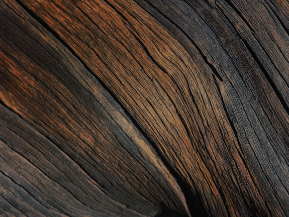
But then, there, amongst the passion and well-trimmed books, I find a piece of wood. The book seems hard on the surface. It’s like you can count the growth rings in it. Hard and mushy at the same time. A paradox. It has a story to tell. Kinda like this old grandpa full of wisdom, full of mystery, full of everything you can imagine. Yet it kind of reminds me of those big pieces of cheese. They have also wholes in them, as the book has scratches and bruises here and there. And I guess they, too, have some sorta history. A cheese history, I guess.
I find myself deadly curious about that book. It is enormeous. I wonder how thick the papers are, I wonder how many hands have touched it. I wonder how large the typography is, I wonder how it smells. I wonder if it’s one long story. Oh my, it sure is mysterious. I find myself wondering if it really has pages in it. Or maybe it’s one of those fake-books with a whole inside. No. It is a real book. A modest book. A proud book. A book with a story. I guess that’s kind of ‘meta’. A story that has a story.
The end.
Thursday, September 9, 2010
I have to admit, that this was the first time I’ve heard of Irma Boom, although I have already seen a few of the books she has designed before.
Her way of thinking and working has always seemed to me kinda normal/typical for a good graphic designer – passionate, curious, perfectionist and stubborn.
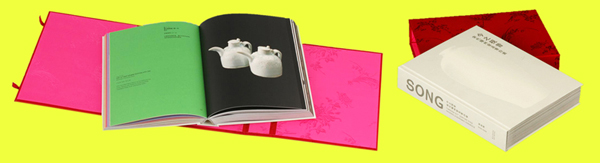
I have chosen the Song book, because it seemed to me like an example of a well designed book. What I liked the most about the book is, that (like Irma says in the description) the colors of the pages are based on traditional Chinese color schemes. This detail made the book special/different than a normal book/ to me. It is something I don’t understand. I don’t know about those color schemes, but this made me want to know more.
At first, what caught my eye was the red silk foldable chinese box covered with red silk from the outside, bright pink inside. The book is about two different chinese ceramics styles – that’s why it’s all white, with a blind-stamped vase on the matte porcelain looking cover. The pages paper is yellowish, about 90gr thick, makes a feel of silk again. I can clearly see, how the paper color works together with the print. It feels exactly like it should- expensive and exclusive. Most of the book’s contents are images, but the text is written in both english and chinese.
Thursday, September 9, 2010
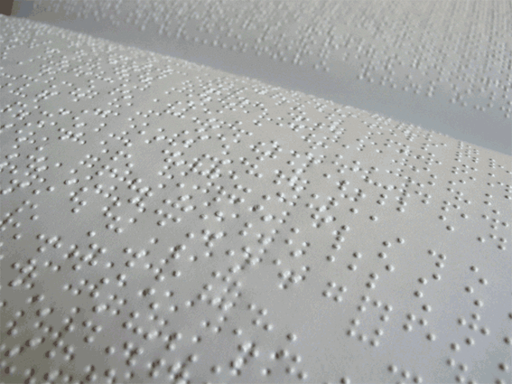
Hurry Up. Pick a magnifying glass before you miss it. Before you flip your page and the dust on the left corner falls off. Deeper in that letter. Deeper in the ink there is a whole other story to be told. A story that might or might not explain why these tiny books aren’t bond for the human eyes. It’s something to make you question. Raises up curiosity. Something to make you intrigued to dig deeper for results. You start to question why she wants you to believe that from these tiny dots a new creative perspective can be born. You can almost see yourself behind a microscope. Ready to believe that there is a tiny living organism in the “E” that spells Essence. The essence of what you have been missing with your eyes. It makes you want to wish that Alice’s potion existed.
It makes you want to be your  fingertips. It makes you want to slip right through the glass box. A glass box filled with tiny dots and endless possibilities. Just laying there. Ignorant of your presence. Not for you consumption. While you still look through the lens of the microscope. You can almost imagine that there’s these tiny species living together. Compromising with the closeness of each other. Zooming in, you can see why she wants you to make an effort and research. By discovering this you’ll look back and give credit to what you can’t read with your naked eyes.

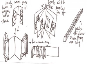
Wednesday, September 8, 2010
The SHV Thinkbook was the book that catched my eye, because of the passionate story Henk told us and also because of the vitrine that showed some try out versions of the book, experimented with paper, way of binding, the cover size. It made me look up to the wall and back to the vitrine all the time, to try to find out the story of the book and to try to see the problems she met and the way she solved them.
I think it was important to me get get to know the book in some way before liking it. I see books as object were you don’t only look at, you want to feel the weight, you want to feel the structure of the paper went you turn the page, you want to have a close up to see how the ink is printed on the paper, you want to smell the book you might even want to make a little loving fold in the corner of a page you want to remember.
The only think that i had in the back of my head all the time when i looked at the SHV Thinkbook, was this sentence that i read or heard which was the instruction Irma Boom got for making this book and that was; ‘Look for the unusual’
Maybe in settled book, and publishers land this is a very unusual book, but in my perspective books can be way more unusual.
Some thoughts about books being an object that store information, in a handy, clear, protected and unusual way…
Wednesday, September 8, 2010
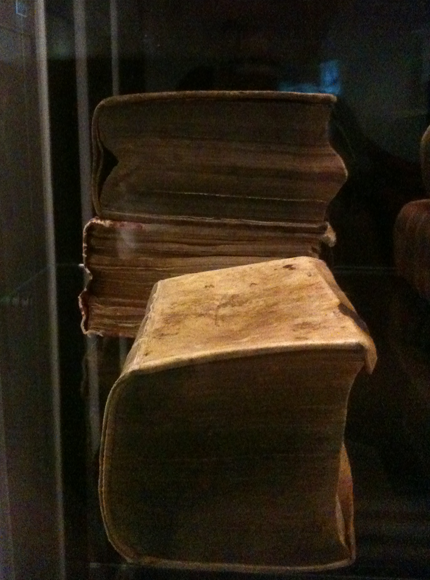
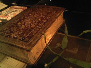
There’s always something in old books that attracts me. I think it is the way that an old book already can tell you a story without even open it. There is a history going on in that book, many hands touched it, carried it, let them tears drop on the pages, all of that and the leather cover with the gold embellished patterns and the painted flowers on the sides are telling me that this book was special, actually Albert Magnus, a main Dutch bookbinder, gave this book to his bride for their wedding in 1664. I’m curious what will be inside, but I cannot reach it because of the thick glass that’s protecting it from the world outside. Maybe I don’t want to open it, because now I can dream of beautiful bedtime stories and fairytales that can be in the book. I can already see the big curled detailed first letter that asks you to take some time to read the lines without putting the book aside for a while. Well, in this century grooms usually don’t give their brides gifts like this, so for now I can only dream of living in the century when they did…
Wednesday, September 8, 2010

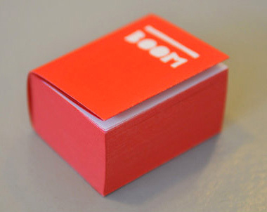
When I was looking for some really nice book to look deeply, this thin white line peeler design caught my sight. Also this small black book was in between two big books-It was grey cover with big white letters and two book that can see back and front side-white cover with big black letters and front side, there is blue colour picture). That is why I can see it right away at that moment.
This really thick and nicely painted black colour book is attractive for me who really like simple design with only black and white colour. And drawing of peeler with thin white line on the black colour cover was so amazing, because that peeler seems making me peel-off the page by page and discover new pages afterwards. I have to peel-off one design if I want to see next design. Like I am looking for something through page by page. Even I feel the first page is the oldest one and last one is the latest one.
Also at the side of the book, not the book cover, there is big and thick white letter which interested, too. It can be simple white letters on the black background, but it looks not that simple if I see little bit closer. Because of the paper inside, black background is not same black as book cover. Also when I look at it little bit more closer and closer, I can see there is other colours, not just white and black. It was very funny that I discovered something I don’t really want to discover from that black and white book.
Wednesday, September 8, 2010
One of the first things that strikes Me is the enormous amount of love and energy Irma Boom manage to include within her books. The endless dummy samples to find the right presentation format, the anti-commercial printing and binding methods and the endless corrections are all part of it. It almost feels like the books of Irma Boom are from another planet.
For that reason I found it hard to pick out one particular book, so I asked myself the question; what is for Me the most important part of a good book, the reason to just grab the book and get lost in it. For Me a book is really about a good cover at the first place, one that strikes my attention by being unusual or reminds my of something else I’m interested in, so after I realised what is important I picked the CAR GIRLS book by Jacqueline Hassink
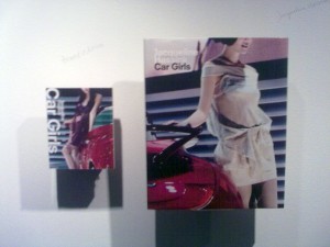
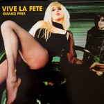
That particular book immediately reminded me of the LP “Grand Prix” by the Belgian band Vive La Fête.The cover (and also the cover of the LP) gives me a kind of exciting feeling, the idea that it’s really cool to drive really fast ( I don’t even have a car) and to have a sexy “Car Girl” like girlfriend behind the steering-wheel.
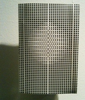
Wednesday, September 8, 2010
Als je langs de rijen loopt, wat een geweld.
Een boekomslag die je bij de lurven pakt, een boekomslag die je verwonderd, eentje die je doet reageren. Des te groter de reactie, des te intenser het exterieur bij je aankomt.
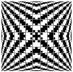
Ik was niet zozeer opzoek naar het wow-effect, maar simpelweg naar een boek waarbij ik me comfortabel bij voelde. Een middenweg van gevoelens van nieuwsgierigheid en het vertrouwde. Ik vond ik dit bij het boek ‘OMA 2008’. Ik ervoer dit boek als onherroepelijk direct maar niet schreeuwend om aandacht, het evenwicht ervan beviel me. Zonder te weten waar de inhoud over gaat .(Dit is onmogelijk te raden, de voorflap bevat geen text)
Het ontwerp straalt een bepaald soort anonimiteit en helderheid uit die mij niet alleen aanspreekt, maar die mij misschien zelfs fascineerd. Misschien ben ik jaloers op bepaalde kwaliteiten die ze bezit, haar orde en gekristalliseerde duidelijkheid. Misschien word er met me gespot, Zij die pronkt met haar krachtige lijnen en wiskundige precisie.
‘Ah but don’t you know not ever to judge a book by its cover?’

Het boek laat een duidelijk contrast zien. Zowel letterlijk als figuurlijk. Naast het vanzelfsprekende contrast van het patroon aan de buitenkant, is er ook nog een contrast in het opzicht dat het boek een zelfverzekerdheid uitstraalt en wilt opvallen maar tegelijkertijd alles verzwijgt over de inhoud, wat we noemen een ‘tease’.
Langs de rijen…Ik moest stoppen. Maar te lang kijken is ook niet aangenaam. Alweer haar Geweld.
Wednesday, September 8, 2010
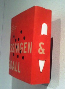
I was so touched by one book named “ SHOT ‘’, published on 2009 ( I didn’t find the name of the writer ) and it is about hurting pages transforming from green to red and hunting. Men aiming their guns towards the flying birds.. carrying chickens ..these are the pictures that symbolizes the passion of human. And the transformation of green to red symbolizes life and death. The voice in writer’s work is speech that passes through us, that comes from another times and place and whose destination is unclear even while its tone is often insistent, perhaps violent
I think the book is very seriously written against the animal killing. I questioned, why don’t they just shoot the clay instead of the real animals? Is it a social or biological passion? I really found that human beings are continuously being away from the line of humanity. What a nightmare !
The cover is red in color ( symbolizes the blood ) with ten holes with some big writing on it and I felt the holes are the eyes of the animals and looks very sad and are pleading human for help. If you look the holes continuously, you can feel the environment of fear, grief amd tears. The book looks like a closed box. Its opening is not like the normal book as we have to open the lock first. And the right side of the book ( from where you starts turning ), is locked by one iron like metal tool in the shape of an arrow. I think this has very special meaning as arrow always kills. The semi round side symbolizes the expansion of the life and the point part, end.

It was a great moment to be the part of an book exhibition of known artist Irma Boon in Amsterdam.
Wednesday, September 8, 2010
Adults are used to collecting big toys like cars or antique furniture.
Kids are used to collecting small toys like puppets, useless crystal balls or colorful stickers.
When I was a kid I also collected small postcards and teddy bears.
They lived in an old candy box that I got from my grandma.
Now there is something lying in may hands that reminds me of those dearest small things that are so valuable for every adult.
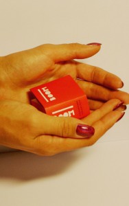 These fragile memories from the past childhood help grown ups to keep a child in their souls.
Otherwise if a pure and cold rational view of the world dominates it’s going to kill that sparkle.
I think that Irma Boom with her tiny books reminds adults of the small child that still lives in their souls.
Even when it’s buried somewhere deep inside.
Just holding this tiny book in someones hands inevitably brings a childlike smile to their face.
I find these moments very important in someones life.
Even if that book is about Ferrari engines or the latest research in nanotechnology.
My best friend lives in Russia. She is an artist and a photographer.
She sends me these “children’s” gifts that she has made herself.
 Take care of your childhood.
Tuesday, September 7, 2010
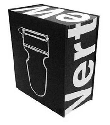
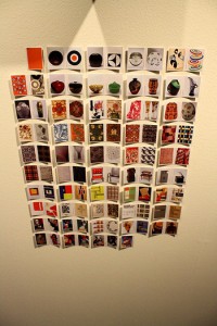
Every Thing Design is a book by Hatje Cantz which presents a large number (more than 700) of design works from the collection of Zurich Gestaltung Museum. It mainly shows prints and posters, but includes also a wide range of other objects from many famous designers. The book is, among books designed by Irma Boom (and some of her own library), on display at the Bijzondere Collecties Gallery, in Amsterdam.
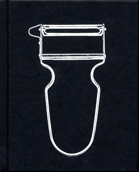
First of all the cover: it’s all black, with a white cheap potato peeler; visually it makes concrete what the title say: everything is design! Design is for everybody! The layout of the book presents the objects making interesting comparisons and associating them in couples which have a sort of connection. What’s interesting, in this couples, is that they do respond to a logic that can be less obvious than expected, as a time, place or artist order, but very explicit. Mainly, they are similar objects and visuals from very different periods and uses but with the same strength, the same conceptual value, the same way to visualize the zeitgeist of the period. So the cover of issue one of the magazine “Neue Grafik” (1958) showing the text perfectly insert into a square grid, is associated to a typeface from the early 20s’, the “new graphic” of the time. Two more recent comparison: the first shows the (famous) poster from Obey’s art for the electoral campaign of Obama in 2008 and the (as much) well known poster of Bob Dylan drawn during the 60’s by Milton Glaser, while the second present the famous Levi’s commercial with the Michelangelo’s David dressed up with Levi’s jeans short, with a more recent HnM’s poster of a beautiful and sensual girl wearing a tiny bikini. In the first couple is explicit the high moral value of the person represented, with the “Che Guevara alike” glance of Obama in the “hand-crafted”, old school appearance of the poster, and the streamy colorful hair of an outlined-comic looking Bob Dylan which transforms the pacifist songwriter into an icon. In the second there also is an iconic value which is a bit “debunk”, and while 30 years ago this value was embodied by a masterpiece of art, nowadays it is just the body of the women to be sold.
What i liked the most is the comparison that offers, which i think it’s a fundamental way of thinking in art and design, and the general look that encourages, contributing to shape better the word “design”, depicting the spirit of the time and taking it away from the idea of a competition between world known designers to create the most posh version of a lemon squeezer, and giving it the role of a discipline which applies to many levels and fields, a way to better resolve mankind problems. Design must be everything for everybody!
Tuesday, September 7, 2010
When going inside the exhibition of Irma Boom I decided to look for the one book that made me want to grab it, huddle in a big fluffy chair and disappear behind it.
The SHV Thinkbook attracted me because it is plain black on the outside, like in the past many books were. Some of these ancient books also being on display (part of the private collection), I can see where she might have got her inspiration from.
Books to me are objects I love being around. They often bring back sentimental memories of a snug warm house and evenings spent divulging my favourite books again and again. And so does this book designed by Irma Boom.
I always thought there is something fascinating about books that are plain on the outside. They hardly reveal any of its mysteries at first glance and thus makes me curious about its contents. When you open it a whole world opens up before you. I wasn’t disappointed now. When you open the SHV Thinkbook you find colourful page after beautiful colourful cotton page, 2.136 pages of them! Within the letters of the title are hidden. Also, on the edge of the pages you can read a poem by Gerrit Achterberg.

Irma Boom wanted the book to be a voyage. For me the voyage already starts with goggling at its cover. Alas, that is as far as I am going to get, since it wasn’t allowed to touch any of the books.
All I can say is: it is a mighty shame I wasn’t allowed to take it home with me and discover its many secrets.

Tuesday, September 7, 2010
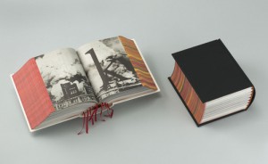
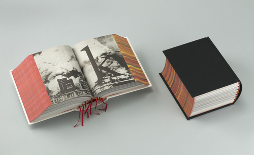
I have chosen the book called SHV Thinkbook designed by Irma Boom.
This one caught the most my attention, although it is one of the most simple: black, thick, without any title, it is kind of brutal. It looks like a simple dictionary. But we can discover the originality of the designer, because this book really doesn´t looks like another one. Because, it doesn´t has any title, only black without any symbol and when you look at the profile we can see the colorful side of the pages which contrast with the deep black of the front. It has something mysterious and unusual.
It has been designed in a way that you can´t guess what is inside (only maybe a strange geometric form white and red can symbolize
something). The cover of this book really makes me wondering about the content .
There is a details in this book that I found really beautiful, there are some few deep red bookmarks which go out between the pages. I like this three main colors (red, white and black).
Moreover , the story that Henk told us about this book makes it even more mysterious.
For the same reasons I found the book called Dutch Stampbook well designed. The same black, anything on the front page shows us the content, only a white peeler is appearing used as a kind of image of design (subject of the book).