I have chosen the book called SHV Thinkbook designed by Irma Boom.
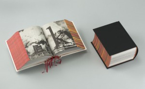
This one caught the most my attention, although it is one of the most simple: black, thick, without any title, it is kind of brutal. It looks like a simple dictionary. But we can discover the originality of the designer, because this book really doesn´t looks like another one. Because, it doesn´t has any title, only black without any symbol and when you look at the profile we can see the colorful side of the pages which contrast with the deep black of the front. It has something mysterious and unusual.
It has been designed in a way that you can´t guess what is inside (only maybe a strange geometric form white and red can symbolize
something). The cover of this book really makes me wondering about the content .
There is a details in this book that I found really beautiful, there are some few deep red bookmarks which go out between the pages. I like this three main colors (red, white and black).
Moreover , the story that Henk told us about this book makes it even more mysterious.
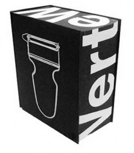
For the same reasons I found the book called Dutch Stampbook well designed. The same black, anything on the front page shows us the content, only a white peeler is appearing used as a kind of image of design (subject of the book).
