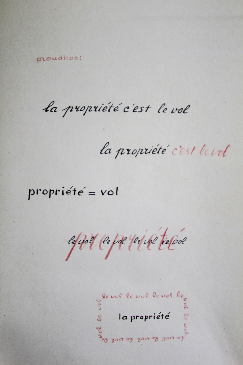
The picture shows a manuscript called ‘Lectura sub aqua’, part of the series ‘Experimenta Typographica’ from 1943 by Willem Sandberg.
Sandberg, a Dutch graphic designer, typographer and long term director of the Stedelijk Museum Amsterdam was forced to hide when the German occupation authorities discovered that he was involved in the resistance. While concealed on different farms, Sandberg produced graphic works out of the materials he found there – utilizing collected quotations – that correspond with his view of the world.
The chosen manuscripts states: ‘La propriété c’est le vol’ – property is theft. The slogan is a quote from the French anarchist Pierre-Joseph Proudon, taken from his book from 1840 ‘What is property?’. Proudon was a French politician, largely considered to be the ‘father of anarchism’.
I find Sandberg’s manuscript an interesting starting point to ponder the relation between content and form. The repetition and graphical variations that he applies on the inherently strong political statement seem to point out the link between the visual appearance of the statement and its content. Moreover, I find it an compelling artistic choice to break down the phrase into a simplistic formula, eliminating all parts of the syntax apart from ‘propriété’ and ‘vol’, making the phrase into an undiluted juxtaposition of two nouns. I feel that the two words not only strengthen each other, but also get the message on a high conceptual level.
Sandberg’s work reminds me of some of the text works of Lawrence Weiner. Weiner started this conceptual artistic practice in the 1960’s/70’s utilizing brief phrases, statements or words combined in formulas put up on walls. I see quite strong analogies between the ways that the two creators employ typography as their medium, in spite of coming from different eras and creative practices. In the 1960’s and 70’s, when Weiner evolved as a conceptual artist, his work was considered extremely avantgarde. Looking at Sandberg’s work from 1943 gives me a new perspective on Weiner’s wall pieces.
As many of his statements manifest, Weiner is an artist strongly rooted in the present. At the event of the opening of his current solo show ‘Written on the wind’ at the Stedelijk Museum in Amsterdam, Weiner stated: ‘Time is looking at the sky and realizing that it moves.’ I always enjoy making connections between art works from different eras or fields. Discovering references between Weiner and Sandberg was nice, because it points out once more that there is no inherent difference between ‘applied art’ and the so-called ‘fine art’ that Weiner would belong to, if you would obey those categories. I don’t know where that difference would lay. I find it intriguing that once one decides to devote time and attention to art, it becomes inevitable to realize that similar tendencies have been and are present throughout art history, also crossing between fine arts and applied arts. Artists and designers work on certain ideas and develop certain styles that keep influencing each other, while those ideas keep gaining visual, symbolic and historical meaning with every new era they enter.
One could say that Sandberg and Weiner share the way that they use language and – more specifically – typography as their medium. For some years, I have had a huge interest in the relation between the content and the form of an art work. To me, Walter Benjamin genuinely sums it up: ‘Beauty is not the object and not the shell, but the object in its shell.‘ The relation of the object and the shell is a very relevant question for myself and my own artistic works. If I was asked to chose one source of inspiration for the rest of my life, it would be this one.
The reason why I have chosen to compare the works from Sandberg and Weiner is my interest in the question how phrases change when their visual appearance is changed. What I like about conceptual art is its power lying in the mere thought. In 1968, Weiner manifested some view points on conceptual art in his ‘Declaration of Intent’: ‘The work need not be built.’ I can just agree with that. I can say that I find the relation between Sandberg and Weiner interesting with regard to the different fields they come from (applied art versus fine art), the different times and the different working methods. Both of the artists’ works inspire me to think about the relation of the content and the form. It furthers the understanding of Weiner’s work to hear him talk about it – e.g. the fact that he considers language sculptural. Weiner also states that his works are to be understood as gestures – which are immediately understandable, so they become language, too.
Weiner and Sandberg are interesting examples, because both of them chose for the immediacy of the language, while at the same time playing around with different colours and graphic variations. Also, by using language as a tool or medium, they put a concrete thought out there, which comes off as quite forcing compared to other media like painting or sculpture, while at the same time it leaves a large space for personal interpretations and associations. I like the directness of working with language, but also the openness.
Weiner always works with the same typeface – a very simple mono-space font designed by himself. As he states in this 2008 video: „I don’t like Helvetica, because (…) I find it a clumsy typeface. I don’t know if I find it clumsy because of its association or just aesthetically clumsy, but I try to avoid it.“ By creating his own font, Weiner avoids standardized visual appearances. His wall statements seem to get carried on to another level of visual meaning through the font they’re set in and to gain additional meaning by the way they are molded by their appearance. But even this typeface seems to be perishable, as the artist reveals: „It seems to be functioning for a while and I guess, one morning, I will wake up and it will have entered into the culture in such a way that I’ll try to find another typeface.“