Since I have grown up I have been exposed to more and more designs and designers. During my research of Wim Crouwel, I was introduced to Swiss Graphic Design and Joshep Müller-Brockman in particular, as this designer was a big inspiration for him. Müller-Brockman was one of the great pioneers in the New Graphic Design movement, (also known as Swiss Graphic Design), educator and writer who helped define the movement within the 50’s. It represented what designers would consider cleanliness, readability, objectivity and structure. For me, the simplistic color schemes and structure within the design really speaks to me.
Müller-Brockmann began his career as an illustrator, but it was not until his turn to graphic design that he found his true calling. He is perhaps best-known for creating mathematical grid style to provide an overall orderly and unified structure.[x]
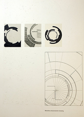
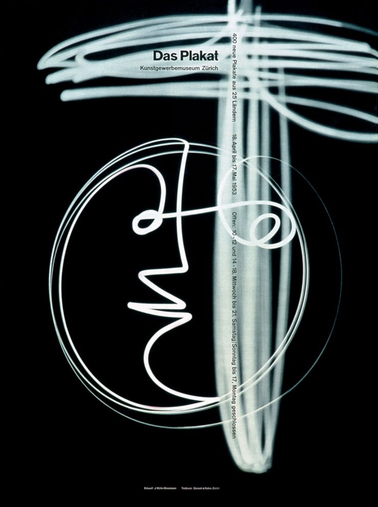
Müller Brockmann’s wide-range passions, interests, and commitments enable one to approach his work from several points of view, and his influence in graphic design extends well beyond his familiar poster work. He also was an accomplished photographer, often integrating experimental photography, photomontages, and light paintings into his design work. He loved music and over the course on many years made the now famous poster designs for the Zurich Tonhalle (Concert Hall), which were highly influenced by the “feeling” aroused by music. Josef Müller-Brockmann’s ideas are mostly related to abstract concepts, seen in many of his Zurich Tonhalle Concert posters. He argued that music is an abstract art therefore should be “interpreted abstractly,” and based strictly upon the established rules of typography and a grid.[x]
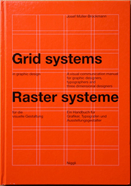
Nevertheless, all his works were built upon a grid system and in Müller-Brockmann’s book Grid Systems in Graphic Design he describes his process of using the grid and specifically reinforces the purpose and importance of its use and simplicity. Labeling it “constructive design,” Brockmann describes the Swiss style as economic and rational, and it is interesting that even those designs that appeared free of structure were rigidly organized beneath the surface.
What I like about the series of posters for the Zürich Ton Hallen, designed in 1960, is the angular look on structure and alignment within the text and within the shapes and space. The two tone color scheme also helps it to visually stand out. These posters were one of the revolutionary turning points in contemporary graphics. And it was not just another transitory style- it defined a contemporary graphic environment worldwide.