Skip to Content Skip to Search Go to Top Navigation Go to Side Menu


"“readable-or-legible”" Project


TYPOGRAPHIC MATCHMAKING [IN THE CITY]


Thursday, April 14, 2011

My first discoveries
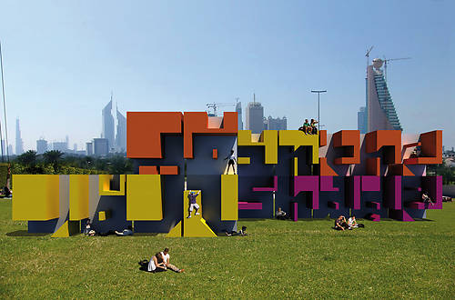
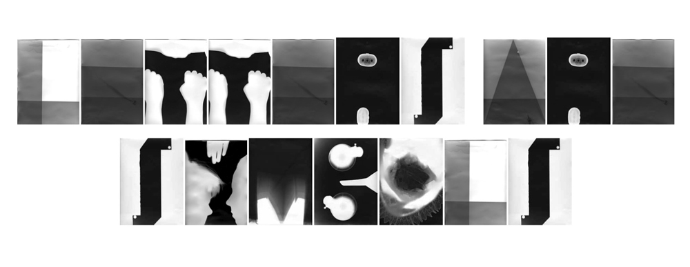
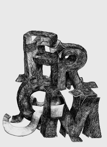
One of the first impressions I got of the Typographic Matchmaking, was an image of a huge three-dimensional shape with letters that I did not manage to read. However, I could sense meanings and my curiosity grew to decrypt this ‘unknown language’. The shape proved to be a mixture of both Latin and Arabic words, translating each other and forming a common text. As a matter of fact, it was a construction of the type font StoryLine, and one of the outcomes of the Typographic Matchmaking 2.0:

khtt.net
Naturally, I had discovered The Khatt Foundation – Center for Arabic Typography. Founded by Huda Smijtshuizen AbiFarès in 2004, this online platform offers a space for projects which develop Arabic typography and design, and deal with its relation to the Western society.

The project
The first initiative to the Typographic Matchmaking took place in 2005-07, the second in 2008-10. There is a lot to say about the project. The Typographic Matchmaking 1.0 deals with the typographic needs of contemporary design in the Arab world, specifically for publications and new-media. The Typographic Matchmaking 2.0 / in the City stretches the research into the urban space. Here, the focus is to bring the marriage between Arabic and Latin writing cultures to the three-dimensional city.

Huda Smijtshuizen AbiFarès introduces 15 professionals from Europe and the Middle East to collaborate in 5 teams. Each team consists of one Arab and one Dutch type/graphic designer and one architect or industrial designer. Each team also deals with a different subject. It is inspiring to me that they immediately move away from the original classical type and experiment with both language types, starting from scratch. The participants then visit respectively each other’s countries, and the cities of Amsterdam, Beirut and Dubai.

Backgrounds
I find it interesting to mention, that one of the reasons argued for the Typographic Matchmaking is, that because of the poor matches between the Arabic and Latin fonts, most bilingual design projects in the Middle East start in English before getting translated. Too often, the street sign you meet in the Middle East are written in a way that forces the Arabic language to adjust to the Latin language. The basic idea is thus to create new fonts that work both in Latin and Arabic, and especially to find types that create harmony between the different language structures. The aim of the project in the City, is also to bring back the sense of belonging to fast growing multicultural cities in the Arabic environment. One of the big challenges here, is how to deal with a visually already overcharged space. New alternative spaces within the contemporary, shopping dependent, urban structure may engage inhabitants on many levels and create a more emotional relationship with the direct environment and the larger world.
Another important reason is the demand for Arabic identity in the West. I could very well imagine that even people who do not speak Arabic, can connect to their roots through the presence of Arabic script.

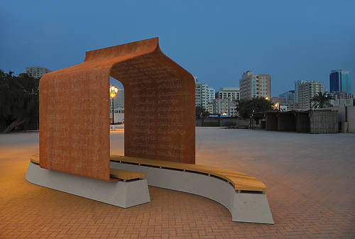
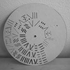
Nuqat-folly, with poetry on its walls in the type font Nuqat:

Yielding outcomes
The Typographic Matchmaking is a merging of two cultures, where both adaptation and play are central. I was curious to see how two totally different kinds of languages can translate each other and at the same time meet each other’s ‘needs’.

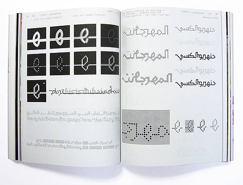
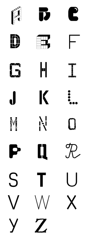
The font named Nuqat is developed with a grid. The text is created out of dots in both language structures. The system of the grid has here the capacity of making a text where the letters are – or disconnected, or linked to each other. I find this font interesting for its apparent multiple possibilities. I also like to see how it could suit in different public spaces.

Here is a link to see some examples of the Nuqat used in several ways:

(more…)

Letters


Thursday, April 14, 2011


inspired by 'words about words...' from s. themerson's semantic poetry

New & Newer Alphabets.


Tuesday, April 12, 2011

My research is about a Czech graphic designer named Radim Pesko who, along with contributing to various magazines, is running an Amsterdam based type-foundry (RP; a digital type-foundry established by himself in 2009). Occasionally he does curatorial practise and teaches in the graphic design department at the Gerrit Rietveld Academy Amsterdam.
In this text, I will focus on a collaboration Pesko did along with French graphic designer colleague Karl Nawrot in 2010 and compare it to Wim Crouwel’s “New Alphabet” from 1967.

Pesko and Nawrot made a family of four rather unique and aesthetically compelling type-faces; The Lÿon Family. This family is named up after Nawrot’s hometown Lyon, and the designer himself claims that the umlauts in his and Pesko’s ÿ were added to make it appear more personal and playful. The Lÿon font family was introduced to the public as a booklet supplement called “Newer Alphabets” to the “Typefaces Issue” of GRAPHIC (16th edition); a design magazine created by another colleague and friend of theirs, S-Korean Na Kim.

At the launch of Na Kim’s 17th edition of GRAPHIC (“When Design Becomes Attitudes”), both Pesko and Nawrot were there in person to have a talk about their collaboration on the Lÿon project. Lucky for me, since I happened to be in the audience.

I must mention that prior to this, I had made an attempt to interview Pesko via e-mail, but I found the talk at the magazine launch to be more fruitful for my research; basically all my questions were answered without me even having to ask them. The (funny and to some extent rivaling) dynamic between the two collaborators was also obviously easier to catch, and it helped me develop a more wholesome image of both their process and final outcome. But first a little more about the members of the Lÿon family; the Lÿon’s are Jean (after artist Jean Arp), Stan (after director and photographer Stanley Kubrick), Ulys (after Franco-Japanese animation series Ulysses 31) and Walt (after founder of Disney Pictures Walt Disney).

These brother type-faces are creatively based on a feeling or the essence of the characters they’ve been named after, as well as the fact that they have formal approaches to their subject qualities. This is also stated shortly by James Langdon in the “Newer Aphabet” booklet “…they are open and various and their spirit is this: to resist normative tendencies and to reject the idea of definitive form”, but as the booklet basically focuses on presenting the different family members and suggests various juxtapositions of their letters, it was quite helpful to hear the designers explain their work furthermore. Amongst other details, they mentioned how the different “Lÿon brothers” are created with the intention of being able to mix with each other; a feature I personally appreciate a lot because it encourages their potential users to be creative and exploring by being allowed to play around with them.

(more…)

Letters


Wednesday, March 30, 2011

Emigre


Monday, March 14, 2011

Not so long time ago the Museum of Modern Art in New York has acquired

23 digital typefaces for their design and architecture collection.

Included are five Emigre font families:

Jeffery Keedy’s Keedy Sans                

Jonathan Barnbrook’s Mason Serif        

Barry Deck’s Template Gothic                 

Zuzana Licko’s Oakland                        

P. Scott Makela’s Dead History                  

This acquisition marks the beginning of MoMA’s effort to built a collection of typefaces documenting designs covering the twentieth century. These fonts are synonymous with the early days of the digital era. In their designs they exhibit the experimental variety and technical challenges and opportunities brought to type design as a result of the introduction of the Macintosh computer. No type collection is complete without them.

In 1984 Rudy VanderLans and Zuzana Licko

launched a type company named Emigre, based in Northern California, making it the first contemporary type foundry to sell original fonts made on and created for the computer. In addition to designing and licensing over 300 typefaces by a wide range of designers, Emigre also published a magazine for 21 years that published criticism and essays on  graphic design while providing a beautiful showcase for Emigre’s fonts.

right: over of first Emigre magazine

Founded in these years, coinciding with the birth of the Macintosh, Emigre was one of the first independent type foundries to establish itself centered on personal computer technology. Must to say that Zuzana Licko was among the first to create typefaces made of pixels and composed of dots on a grid to be printed on early dot-matrix printers- From the beginning Zuzana Licko who is responsible for many of the beautiful and most popular typefaces in the Emigre library started to create fonts digitally because as left-handed she couldn’t be the best calligraphist and draw it by hand. She was using Fontographer- an application for designing fonts and exporting various font file formats As excellent designer Rudy VanderLans was also a good photographer- but the most I liked his Historia Type Specimen. He put different typefaces in one. It’s really amazing how he could do it without contradictions of fonts! Each “layer” is specific but together they creating good composition and looks very nice! He believed that any font can be successfully combined with any other font. It’s not so much a matter of which font combinations to pick, it’s a matter of how you use the fonts in combination. Size, color, tracking, contrast, layout and overall purpose determine how fonts can be combined successfully.

Emigre tried to be every time on the edge, they designed type faces, wrote articles, made their magazine like fresh air to designers and organize their exhibition as well! When one journalist asked them to look back what the did and their plans they answered they haven’t retired. They are still full of energy and looking into the future, and days are filled with new, exciting projects and creative challenges of all kinds. I think it’s the best way to be your own and never stop, only look forward and never regret about some failure. Emigre is not a company is just a group of people who are interesting in what they are doing! It the secret of any success!

http://www.emigre.com

Letters


Monday, March 14, 2011

Letters


Thursday, March 10, 2011

Little Scratch


Tuesday, March 8, 2011

Gra-fi-ti [gruh-fee-tee]: markings, as initials, slogans, or drawings, written, spray-painted, or sketched on a sidewalk, wall of a building or public restroom.
This is the definition of graffiti in the dictionary. Everybody knows it. A tricky topic to work with I thought immediately. How was I going to tell you something new about this?
I started my research by defining what graffiti actually is. Soon I found out that the word graffiti means ‘little scratch’. I thought this was a detail of quite some importance as I assume most people think graffiti is mainly related to spray paint. But for thousands of years graffiti was made by scratching a layer away, revealing the layer beneath it. The first graffiti dates back 30.000 BC.

But also in ancient ‘scratched’ graffiti there is a big difference. For a long time graffiti was in the form of prehistoric cave paintings that were often placed in ceremonial and sacred locations inside of the caves. And we all know the Egyptian wall decorations and that only because of those we know the history of ancient Egypt. Unlike modern graffiti these inscriptions were not made to make a public statement but to visualize their religion or traditions for example. The First ‘modern style’ graffiti survives in the ancient Greek city of Ephesus (in modern-day Turkey). Local guides say it is an advertisement for prostitution. Located near a mosaic and stone walkway, the graffiti shows a hand print that vaguely resembles a heart, along with a footprint and a number. This is believed to indicate that a brothel was nearby, with the hand print symbolizing payment.
Still there was no political or social ideals displayed back in the times. graffiti consisted of Latin curses, magic spells, declarations of love, alphabets, political slogans and famous literary quotes, providing insight into ancient street life.
One inscription gives the address of a woman named Novellia Primigenia of Nuceria, a prostitute, apparently of great beauty, whose services were much in demand.

or a nice example of love ache:

Quisquis amat. veniat. Veneri volo frangere costas
fustibus et lumbos debilitare deae.
Si potest illa mihi tenerum pertundere pectus
quit ego non possim caput illae frangere fuste?

Whoever loves, go to hell. I want to break Venus’s ribs
with a club and deform her hips.
If she can break my tender heart
why can’t I hit her over the head?

-CIL IV, 1284.

When we think of the phenomenon graffiti nowadays, I assume people either think of individual expression (spraying names, political ideals etc on public spaces), or a form of art. Type in the word graffiti in Google and the masterpieces from Banksy immediately pop up. Although people never stopped making graffiti the way they did it in ancient times. we still carve our name and from the one we love in trees, doors and tables.
if we look at graffiti purely as a technique, this was originally scratching. taking a layer away to reveal another layer beneath it. this technique was in the first place used by potters who would glaze their wares and then scratch a design into it.
scratching is even more permanent than our modern graffiti is. spray paint can be removed although it’s quite a intense job, but something that is taken ‘scratched’ away is impossible to recover. A scratched work will stay there forever.

A modern artist using the scratch technique is the young Portuguese Alexandre Farto. He makes huge wall murals by scratching faces out of the surface. he doesn’t only use the surface as a material to work on, he integrates the whole wall, building and even surrounding into his work.

So finally, as a conclusion to this all we could say that the term graffiti actually doesn’t stand for our modern way of making graffiti. Or at least that it’s a different way of approaching it. It is a phenomenon that over the time lost a lot of it’s original characteristics.
A little heart scratched into a tree comes closer to graffiti than a mural from Banksy does..

LINETO


Monday, March 7, 2011

Since the start of our Design Theory/Research course about typedesign, graphic design, foundries, fonts, typefaces etc. we have had a look into a, for me unknown but, very interesting world.

This research will be about Lineto which is a foundry that these days sells there Lineto fonts, like replica, via their website and they have type-designers who publish their own fonts through Lineto. We will further explore the similarities between type design, graphic design and art.

My research question will start us out with some history to get a grip on all the different terms that are used to find out what Lineto actually does. For me starting out as a rookie I’m trying to grasp the meaning of this all. This is an interesting step that can also help you in understanding this world on its own. After that we will dive further into the question what the similarities are between type design, graphic design and art.

A type-foundry is a company that designs typefaces. Typefoundries used to sell their typefaces made out of wood or metal and matrices that were used for line-casting machines like Linotype and Monotype. This is such a time consuming and expensive process that when the computer started to be used it was replaced by digital type which is mostly used today.

Now to first get some terms straightened out. The term typeface is often mistaken or used for font. The two terms had more clear meanings before the start of desktop publishing but faded. What the difference between font and typeface is is that a font points out a specific member of a type family like roman or boldface, while typeface shows a consistent visual style which can be a family.

Back to Lineto, Lineto sprung up into existence in 1993 right at the time when the computer started to get used extensively in people’s daily lives. The foundries in this computer age where called digital type foundries which accumulate and distribute typefaces as digitized fonts created by type-designers.

Typefoundries always had used catalogues that were updated every year but since the digital type came in to the scene it was almost impossible for a foundry to make a catalogue looking at the amount of types that were created and distributed.

This way of working was embraced by Lineto and five years after starting their business Cornel Windlin and Stephan Müller the founders of Lineto jointly set up Lineto.com to distribute their own typefaces through the internet. They also invited a number of other designers to publish their fonts alongside theirs.

If you look at the fonts on Lineto.com you start to wonder what the difference is between type design, graphic design and art. There are differences between the three but there is also a very strong cohering similarity which you can’t deny and this I find an interesting discovery.

Starting out with describing graphic design you see that it is a creative process which involves a client who provides the work and then there is a producer, printer, programmer or signmaker of some sort. At the end of the process the result is used to bring across a specific message to the viewer.

In art you see that it is also very much a creative process which brings across a specific message but usually addressing different issues but the principle is most definitely the same.

For a type designer it is the art of designing typefaces. Where the typeface is one or more fonts designed with a certain unity. The function that their end product is used for is also about getting a message across to an audience, a better description of it is that it is a tool for bringing across a message to the viewer.
So everyone of the professions that are described above is about visualizing an idea concept or bringing across an idea or thought or a tool for doing so. Type is so rooted in our system and culture that we cannot escape from its grip, there are always fundamental links rooted at the core of it all. Looking at it in this way I think can open up your mind to look at type in a new and different way as an artist.

NORM formulating new dimensions in design


Monday, March 7, 2011

Dimity Bruni and Manuel Krebs,two graphic designers from Switzerland. Both born in 1970 and met in art school, in Biel. They founded NORM in 1999 and created their own typographic language by ignoring existing conventions. NORM is now based in Zurich. They’re well known for their typeface «Simple» which first got used in their book The Things. Later, Ruedi Baur of Integral, Paris, asked them to redesign the typeface for use in the new corporate design of the Cologne-Bonn Airport – this version is named Simple-Airport.

Bruni and Krebs developed their own typographical brand. They invented their own way of putting the world into categories and they formulated two rules: — the world is divided into two groups:  3d things and 2d things. — anything invisible is not of our concern.

3d things:  3d things consists of physical things that are of material existence. These items should be solid and visible, though not necessarily visible with the eye.

2d things:  the 2d category can be put into four different groups based on dimensions. group 1, those which represent something pertaining to a three-dimensional space group 2, those which represent something not pertaining to a three-dimensional space group 3, those which represent nothing group 4, those which are as yet unknown to us

group 1 represents the physical spacial things. It is bound to its own being because we recognize 3d things through its build, size  and materiality. When speaking in 2d matter, things lose their necessity of being a certain size, light, color. This is quite a wide range of objects, so NORM has categorized group 1 in sizes, — smaller than human beings, but large enough to be seen with the eye — roughly as large as human beings — bigger than human beings, but also small enough to be seen

group 2 represents the non-spacious, nonphysical things. Things that come down to numbers and letters and abstract ideas like sounds. Letters are the most easy to understand. Letters can also be read as signs. They have a double function, we write them and read them. Letters define their own meaning in a very clear way; while sounds are more difficult to represent, read, and understand. Letters have principles, we have a certain way of making letters and this is why they are so recognizable. Letters are principles. Still, there is much room for playing and sculpting in this field. — when designing a new system of writing, signs should be simple. they should be simple, because it makes them easier to remember, to recognize, and reproduce. — also the signs should be in a small quantity, because it makes them easier to learn — no sign should resemble another, because it will create confusion. so each sign should appear no more than once — it should be possible to align the signs in straight rows. always on a horizontal/vertical grid. this is so we can recognize a text, even when the script is unknown to us. — the characters should be simple graphic forms, recognized, and written easily as possible.

group 3 These things represent nothing. the things indescribable and invisible, so no concern

group 4

(more…)

sans Comic Sans


Monday, March 7, 2011

Annual design awards is an event which is announced almost by every design magazine/ company/ institution, whether it is the influential “Wallpaper” or just a blog of a random fashion lover. The best is picked out of everything, “from beds to breakfasts through jeans to genes”. However, when all the winners are praised, the time comes to remember those who weren’t lucky enough to fit on the pedestal. Being nominated as the worst is rather a dishonor for every designer or design company no matter if it’s a car or a pair of shoes.

Nevertheless, sometimes ‘bad’ is not enough to describe public opinion about a design piece. ‘The worst of the worst’ may sound dramatic, but this is a title used talking about… typography.

It is difficult to find a font or, frankly speaking, any piece of design which would be accepted more controversially than Comic Sans MS. Its naive, innocent and childlike appearance makes it so attractive for primary teachers and prayer groups of local churches. Yet it is also immature, juvenile and silly as if written by a 6-year-old, yelling ‘bad taste’ at everything where it pops out.

If some well-known logos were replaced with Comic Sans, it would look rather homely, warm, inoffensive and simply unsuitable. But when it comes to real examples, a restaurant menu presented in this font looks more like a kindergarden canteen while a warning sign loses its all respect immediately and seems to be rather an April Fool’s joke…

As if it was not enough, this font proves to be contagious. Ever since it’s first appearance in 1995, Comic Sans is now everywhere, even on the sides of ambulances or gravestones.

No wonder that such a vast misuse of a font has caused a big anti-Comic Sans campaign: various websites offers hilarious photostreams of Comic Sans spotted everywhere in the world; one can also email a comical educational pamphlet for a friend who is suspected to be a comic sans criminal. As if it was not enough, the hate campaign has it’s own website where special Ban Comic Sans T-shirts or coffee mugs can be purchased. Even more, visitors can donate for creating a documentary called Comic Sans Or The Most Hated Font In The World. The greatest haters can also download a special Safari extension which changes Comic Sans websites into Helvetica!

‘Every time you use Comic Sans, Faye will punch this adorable little bunny’, is written on a picture with a worried girl, holding a small white rabbit, crying ‘but I don’t want to punch the bunny’. The scale of hate sometimes seems to be taken to extreme or even absurd: “Misuse of the font is analogous to showing up for a black tie event in a clown costume”, claims the creators of the hate campaign.

It is interesting to know that originally Comic Sans wasn’t designed for wide use. It was actually created for Microsoft Bob, a software program included in Windows 95. A little dog which was used as a help character ‘talked’ in Times New Roman, a font which was a bit boring, not warm and helpful-looking at all. That’s when Vincent Connare, a typographer who worked for Microsoft, was asked to create a special font for the program.

Apparently Connare was a big fan of comics. Inspired by “Watchmen”, a popular graphic novel, trying mimic its handwritten letters in speech bubbles, he ended up with now inglorious Comic Sans.

What was the secret of it’s enormous popularity? When Microsoft included the font in Word of Windows 95, Comic Sans suddenly bursted like a virus. It was something new, unseen and fun-looking. Connare explains it simply: “because it is sometimes better than Times New Roman”.

Letters


Monday, March 7, 2011

GRANDMASTER FLASH OF DUTCH DESIGN


Monday, March 7, 2011

This description appeared in my research on the Amsterdam residential graphic designer/teacher Karel Martens.

His name was stored in my memory, but I didn’t know anything about him, probably because I’m Danish and just moved here. I guess every Dutch person would or should know him or at least his works, in fact even touched them. He designed coins, stamps, phone cards and signs.

€ 5 (Queen) Beatrix and Vincent (van Gogh) coins

His style is very clean I would say; clear colours overlapping each other and forming a new colour. But what I really found interesting about his works is his way of translating a language or information into form or grid; his own new language.

proposal for a festive sheet of good-will stamps. The design was never executed

A good example of that is the façade he did of the philharmonic in Haarlem. It is situated in front of the big old church St. Bavo. I found some pictures on the Internet, but they didn’t give me the right impression, so I went to Haarlem to see it in real life.

The philharmonic building itself is very old, but as part of its recent restauration he designed this modern glass façade around the entrance and on a piece of wall high in the air.

Philharmonie in Haarlem

l: the view of the glass facade from the church / r: glass facade entrance

(more…)

Letters


Monday, March 7, 2011

Karl Nawrot, fascination for the In-Between


Monday, March 7, 2011

Typefaces always seem to be facing the wind, two feet on the sheet of paper, unmovable. Like a silent army, arranged according to there ranking, there are ready to take a new formation. This traditional and almost absolute arrangement tends to make us forget how those typefaces got there, what is there personal journey, what and even who shaped them like that.

Karl Nawrot seems to be privileging this particular journey i am talking about. So to say, his typefaces carriers are far from being all traced beforehand. Moreover, he seems to be having even more fun in creating devices and means to form those letters than in the final presentation.

By using tools he creates himself, he lets the door ajar to imagination, not exhibiting the letter as a final assertion but as a possibility. Stamps, enigmatic stencil disks, collages celebrate as much the process as the result.

Thereby the designer does not hesitate to present those tools, such as the stencils disks, also through a series of posters, respecting somehow the presentation of typefaces. By creating a parallel in the presentation, he builds up a clear bridge between the making and the result, putting them on the same level of importance.
Through this interstice he offers us, one can let his imagination grow about what could be the final arrangement.

But is it not the definition of children games ?Making use of the possibility of the material and playing around it more than gathering all the forces to the final result. Indeed he does not only create his own tool, he also documents the process by making use of stop-motion movies.
Once again the use of this device to present his work makes it really fun. The videos or clip-arts that can be found on his website, www.voidwreck.com , are, according to me, by no means instructions for the proper use of those tools but once again a celebration of its inner-possibilities.
Thereby, in a interview he gave to the blog Manystuff.com in January 2011, he gives his definition of what a good design is. He declares : ’’A good design gives you the feeling of a piece stuck between past & future.’’

Playfulness is definitely the word I would use to describe the work of Karl Nawrot. However focusing on this aspect would maybe undermine the importance of geometry in his creations. Indeed if there is space for game and ‘’abruptness’’ in the realization, there is a clear rigor in the fabrication of the tool. On the one hand the Stamps Box conceived in 2005 and 2006 has a clear connection to childhood but on the other hand the rubber stamps consist of drawn geometrical patterns of the same size. Even if Nawrot limits himself to four simple geometrical shapes (rectangle, line, triangle and circle), he succeeds in generating 150 different stamps : the result of an intense research in exhausting the possibilities and combinations of shapes.

Still Karl Nawrot is not only experiencing with typography, he is also an illustrator but those two interests tend to meet again through the approach he uses.

Indeed the letters he draws seem to peel themselves off, falling into pieces. But the movement could also be interpreted in a reverse manner : the letter getting slowly their final shape under our eyes. Once again Karl Nawrot creates the ambiguity, describing physically this in-between he invokes below, ‘’between past and future’’.

Background :

Karl Nawrot attended the graphic design school Emil Cohl in Lyon, France. He was accepted at the Werkplaats Typographie in 2006. He is now established as a graphic designer and typographer in Amsterdam where he lives.

Letters


Monday, March 7, 2011

Turned to the grid


Monday, March 7, 2011

#####Turned to the grid#####

(Wim Crouwel)

When walking through the main entrance of the Stedelijk Museum Amsterdam towards the coatroom one quickly notices the array of poster prints papered to the subwalls of the main stairs to the second level. These prints are from past exhibitions and many are made by the functionalist designer Wim Crouwel. When Willem Sandberg (director of the SM and did most graphic work) retired in 1962 Crouwel took the job and designed many from ’64 until 1984.


Stedelijk Museum Amsterdam, Wim Crouwel Shapes of Colour exhibition
c Jean Pierre Jans Photography poster 1966, Contemporary Art museum poster 1971

Mondriaan or Miro 1958 (Letterpress), Vormgevers in SM, Hiroshima 1957

Wim Crouwel (Groningen, 1928) studied Visual Arts at the Academie Minerva in Groningen from 1946 until 1949. There he became acquainted with ‘The Ploeg’ artist collective that was established in 1918. His father was a block maker and perhaps this made the transition towards typeface design very logical. He Continued as an abstract painter with the ‘Creatie’ (Creation group) he joined the Amsterdam School of Art and Design evening courses and the Liga Nieuw Beelden (1954, co-created the Manifesto in 1955). The Liga was a group of urban designers making demonstrative exhibitions.

(more…)

Letters


Monday, March 7, 2011

Research David Keshavjee & Julien Tavelli


Sunday, March 6, 2011

David Keshavjee (born 1985) and Julien Tavelli (born 1984) are two Swiss graphic designers/typographers, they both studied at Ecole Cantonale d’Art de Lausanne (ECAL) They where one of the winners of the Swiss Federal Design Award with their graduating project, ‘Using Tool,’ in 2009. They just made a pedagogic booklet at the Federal Office of Culture in New York, Acid Test. In collaboration with Körner Union and Tatiana Rihs they made offset cmyk experiments. Later they printed a reproduction of that handmade booklet, “Les impressions magiques“. They are part of Maximage Société Suisse, an exploration in the field of emotion and technology.

Their Using Tool project is, I think, the most interesting thing to discover about them, it explains a lot about how they work and how their poster series for music concerts where build up. The posters where published in Wallpaper and in the book ‘Typeface as Program,’ witch was published by Ecole Cantonale d’Art de Lausanne (ECAL) Especially the last one is very related to their process and what they are designing. They also explain in this book how Keshavjee and Tavelli approached their works by using half digital half manual tools during the process.

They started in their design process of the posters by first programming a script, inspired by a workshop of Frederik Berlaen on ECAL, that could automatically create a system of characters by using the already by Keshavjee and Tavelli designed ‘o’ and ‘n.’ Those two are the essence of the typeface, so with this characters the script is able to create the other characters of the alphabet. Keshavjee and Tavelli like to keep the random and uncertain factor in this system and in their font by giving the computer the control of the typeface. I think the script also helps them to design the first layer of the poster, the digital printed part, the black thin lines. When their computer created the characters they use a machine next to the computer that cut the letters out of a 2mm thin wooden plate what is still very raw then, but they do the final touch by hand. After they manufactured the wooden characters they cut pieces wood all the same size to glue the 2mm thin wooden characters on it. After they did this crucial step, they can think and work with the spacing of the letters, and build up the composition. The last step for them is to combine the background layer and the composition of the typography, the wooden characters into the final poster.

I think with the combination of manual and digital processes that are repeated at each step, from the production and application of the typography until in the composition and final print, Keshavjee and Tavelli create a refreshing and inspiring result of the raw woodcut with the smooth digital print. They work according to the principle that the means influence the form and that new forms of expression in graphic design can be created by combining different tools. These ideas are applied to the poster series as well, it’s the essence of their project. The posters are also published together with the thoughts about this series and an interview where they explain more in the book, ‘Typeface as Program.‘ There is also an interesting article on boston.com about the swiss designer thoughts of typography by Cate McQuaid.

For me they work a bit like typographic engineers I would say. They really are working with developing scripts and systems to help them approach typography in another way, not very usual and practical way, but an interesting one. You could think if you read about how controlled they work in a way, that they are probably to much controlling their work. But their prints are very open for unexpected accidents within its system, there is a lot that can go wrong, all trough this process the accidents are creating new opportunities in the creative process of their typographic experiments, that’s a good value of their work I think. They also always start projects by experiments. It could be interesting to learn and see more of the projects of David Keshavjee and Julian Tavelli, and see how they treat their project during the process of designing typography.

Letters


Sunday, March 6, 2011

Hansje van Halem


Sunday, March 6, 2011

De computer heeft gezorgd voor drastische wijzigingen in de manier waarop lettertypes worden ontworpen en gebruikt. Het lag voor de hand dat grafische ontwerpers zouden reageren op de ontwikkelingen die hun traditionele manier van werken bedreigden. Ze ontwikkelden andere, soms ook traditionele, oplossingen voor de nieuwe weg naar de toekomst. Dit deden ze omdat ze bang waren dat mechanisatie tot een verdwijning van standaarden en gevestigde typografische regels zou leidden.

Tegenwoordig integreren veel belangrijke grafisch ontwerpers typografie, belettering en beeldproductie, waardoor ze meer opschuiven in de richting van de beeldende kunst dan in die van de vormgeving. Microsoft kwam in 1996 met het “Core fonts for the Web-project”. Microsoft wilde hiermee een standard set lettertypes gratis verspreiden. Deze lettertypes moesten goed leesbaar zijn op het sherm, verschillende stijlen bieden en ook geschikt zijn voor internationaal gebruik. Uiteindelijk zijn de volgende lettertypen hiervoor gekozen: Andale Mono, Arial, Comic Sans MS, Courier New, Georgia, Impact, Times New Roman, Trebuchet MS, Verdana en Webdings.

Dit zijn nog steeds de meest gebruikte fonts op het web. Bovengenoemde lettertypes zijn natuurlijk ontworpen om een tekst makkelijk leesbaar te maken, zodat je als lezer snel informatie kunt opnemen. Maar niet alleen handige fonts worden ontworpen. Er is namelijk ook behoefte aan sierletters, of aan letters die interesse wekken en waarnaar je aandacht getrokken wordt. Deze letters kunnen goed gebruikt worden op bijvoorbeeld posters.

Een voorbeeld van een ontwerper van sierlijke letters is Hansje van Halem. Zij is afgestudeerd aan de Rietveld Academie afdeling grafisch ontwerpen met een vorm van typografie in het jaar 2003.  Ondertussen heeft ze nog een aantal letters ontworpen, maar ze richt zich tegenwoordig vooral op het vormgeven van boeken en ontwerpen van patronen.

Sommige van haar ontworpen letters zijn ontstaan in opdrachtverband, of tijdens het tekenen van hun plek binnen een andere opdracht. Het afstudeerproject is een alfabet, opgebouwd uit een x-aantal lagen geschetste letters. Ze nam het frame van de letters van een al bestaand lettertype en tekende vervolgens deze letter daarin op de computer. Door een aantal lagen te kiezen is het mogelijk om heel precies te zijn met de dikte van de letter. Dit maakt het erg interessant, want zo kan het er telkens weer uniek uitzien door te spelen met de aantal lagen. Dit font is de enige die ze als totaal alfabet heeft ontworpen.

Verder heeft ze eigen ontworpen letters gebruikt voor posters of boeken, maar hiervoor alleen de letters getekend die ze nodig had. In deze voorbeelden komt ook meer haar algemene stijl naar voren dan bij haar afstudeerproject. Bij het zien van haar werk, is het duidelijk dat ze onder andere inspiratie bij ouderwetse technieken vind, zoals breien en kantklossen. In haar ontwerpen werkt ze niet zo zeer aan de vorm van de letter, maar meer met de invulling. Ze gebruikt bestaande letters en “tast” die vervolgens aan door middel van een systeem of regels die ze zelf bedenkt. Hansje van Halem gebruikt voornamelijk lijnen in haar werk. Dit doet ze, omdat ze op deze manier makkelijk met zwart en wit grijswaarden kan bepalen. Er is een constante spanning tussen dikte, schaal, structuur en handschrift. Door de computer is het mogelijk om met haar systemen ervoor te zorgen dat er geen onregelmatigheden ontstaan, maar juist dat vind ze erg interessant. Hierom gebruikt ze vaak kleine tekens van oneffenheden, verloop, zichtbare vermoeidheid en ontwikkeling en zorgt ervoor dat het nog een extra laag krijgt, wat de aandacht van de lezer langer vasthoudt.

Naast haar interessante afstudeerproject heeft ze onder andere ook het ontwerp gemaakt voor de Nederlandse postzegels van 44 cent en 88 cent. Bij de zegel van 88 cent heeft ze de cijfers zelf ontworpen en de tekst in het lettertype “Spectrum” erbij gezet. De ronde vormen van de achten komen terug in de kleine tekst eronder. Bij de postzegel van vierenveertig cent is het lettertype “Johnston” gebruikt. Het patroon op de achtergrond van beide zegels heeft ze ook zelf ontworpen. Deze zorgen ervoor dat de speelse, schijnbaar met de hand getekende cijfers toch een zakelijk/serieus uiterlijk hebben. Later heeft ze ook de aanpassingen gemaakt naar de nieuwe 1 en 2 zegel. Vooral de toegevoegde kleuren vallen daar in op

De letters van Hansje van Halem zijn sierlijk en interessant. Kleine krabbeltjes maken een letter gedetailleerd, maar storen de eesbaarheid niet. Soms is het zaak een moment te focussen om te ontdekken hoe de letter werkt, hoe het is opgebouwd, anderen laten duidelijk een systeem zien. In ieder geval is de concentratie en een passie voor ontwerpen in elk ontwerp terug te vinden.

Meer voorbeelden van het werk van Hansje van Halem en ook de periodieke tentoonstellingen die ze organiseerd met mede kunstenaars en

ontwerpers in haar huiskamer SCHRANK8 kun je bekijken op haar site

monospaced


Saturday, March 5, 2011

Monospaced Fonts.

The horizontal space that a letter occupies in a monospaced font is the same for every letter.

Meaning that wider letters are cramped into a smaller space, and thinner letters have more white space around them, so they will all fit in the same box.

Monospacing first occurred when the typewriter was invented, because the typewriter had to use the same space for every letter, a good example can be found  in WordPad on Windows the standard font is still monospaced.

When looking at the shapes of letters it’s not hard to see that some letters need more horizontal space because they are more complicated  in their shape, compare for instance the letter ‘m’ to the ‘i’ it seems obvious that the letter ‘m’ needs more space because it has  3 vertical lines opposed to one  in the ‘i’, when these two letters need to be fitted  into the same width then the ’m’ has to be cramped  and the ‘I’ stretched, or the white space around it needs to be wider.

Is monospacing more easy and clear then variable-width fonts?

When seeing a monospaced font it immediately reminds me of old fashioned computers or typewriters, and it does not have any ‘flow’.

Most people will assume that the subject of the text corresponds with the typeface, making a text that is written monospaced  unattractive for many people. Writing monospaced does give a certain structure to a text , although I doubt if it would become more clear, because it does more justice to the personality of a letter to give it the space that it needs and deserves, then to force it into a pre-defined  space.

Using a monospaced font can serve some particular purposes, for instance when a text on a  sign needs to be changed it is easier to work with when it’s possible to predict if a sentence fits when all letters have the same width, the same goes for some type of documents and other formal writings.

Concerning monospaced fonts it seems that technological reasons are more important than readability, although in bringing across a quick message they could work well.

Monospaced fonts can be  strong when communicating short messages, but because it doesn’t ‘flow’ as nice as variable spaced fonts it can be more tiring to read long tekst written in monospace, because the words don’t become words but remain more separate letters.

What is important for readability of text is how letters form words when they are combined and here the white space in between is as crucial as the individual letter, monospaced fonts eliminate these characteristics and therefore it can take more effort to read  a long text in a monospaced font.

In a monospaced font the letters have equal space, but why would an I or J or L need the same space as letters like W and M ?

If letters get the amount of space that they need instead of the amount that a technology allows them to have they can function more strong because they keep their own

characteristics, this way words can function as words instead of a combination of letters.

Why use monospaced fonts? I found out is mainly because of technological limitations, and in some cases to make it easier to know whether a text fits into a frame, although it seems there are more reasons to not use monospaced fonts but instead variable width fonts, because the main reason of text is communication and readability and  they are stronger in variable width fonts.

Bob Vos

references:

http://www.lowing.org/fonts/

list of monospaced fonts and a description.

http://www.fontsquirrel.com/fonts/list/style/Monospaced

this website contains many examples of monospaced fonts.

http://www.quora.com/Why-is-it-important-to-have-a-monospace-font-in-a-text-editor

text explanation  about why monospaced fonts are used.

Letters


Saturday, March 5, 2011

New eyes


Friday, March 4, 2011

Looking back in time, trying to remember how I’ve learned to write and read, no memories appears. At least no memories that create a clear image of the learning process.

In elementary school we learned the letters. We learned how they look like, how they sound, how to write them and connect them into words. This process took quite long time I think and it’s difficult to be described in retrospect. In these classes, we all had to study on writing the same letters, but we all created different handwriting. Some could do it beautifully, some ugly to unreadable. How a handwriting can be unreadable?

Now, reading a ‘small’ book from a ‘big’ man – Gerrit Noordzij, helps me to realize why and how I can do this today. A book written even before I was born answers the question as simple as ‘the space’ and with writing especially the ‘white space’.

In our current time we see hundreds of images every day. Some we remember for a reason, some we forget immediately. How does our human brain read those images? What helps it in this process?

The “boom” of a new ways to process images started in the second half of the 19th century, when people started creating more spaces for museums and galleries. Later on with the use of architectural deconstructions, making them fairly big and “clean”, with the only purpose to contain some of those special images for us.

The use of space is very common in modern art. In some cases we actually perceive the space as a piece of the art. For example, if a work of art is placed in surrounding A, which is empty, it will be processed in your mind differently than in surrounding B, which is full with other objects.

In modern art we refer to surrounding A as the ‘White cube’, with its square or oblong shape, white walls and a light usually coming from the ceiling. A book from Brian O’Doherty (Inside the white cube – 1976), in which he confronted the modernist obsession with the white cube arguing that every object became almost sacred inside it, making the reading of art problematic.

As surrounding B was more standard in the few centuries before that. Then the exhibition space was the salon, a dark space so filled with works that it was difficult to see the beautiful, detailed paintings.

surrounding A

surrounding B

The importance of space can be found in different forms. Also in writing it plays a crucial roll in getting the message across, in other words: reading. In his book ‘ The stroke of the pen’ Gerrit Noordzij emphasise how the space in and around letters can make or brake the word and therefore the text.This space has to be put in rhythm. He writes: “The rhythmic connection of the white shapes in the word is the condition of the rhythm of the black shapes and vice versa.”

So this rhythm can be seen only in combination of letters. If a letter and subsequently a word doesn’t have its own space in and around it, then the white cube that belongs to the letter is impaired. As a result the word becomes just like an image hanging in saloon from 18 century.

Trying to understand this theory is like learning to read and write all over again. That opens a new perception on all written letters and words, how are they made and how they come across. Always look around and you’ll might see things in a new way…

Letters


Friday, March 4, 2011

We love geometry


Wednesday, March 2, 2011

Geometry appeals to us. When I was very young, I remember playing with wooden squares, circles and triangles, trying to find the right hole for them. Apparently, we learn to recognize geometry’s basic shapes from an early age. Not only is it one of the oldest mathematical sciences, it provides practical knowledge to interpret size, volume and relative position of figures in all kinds of situations. Through the axioms of geometry, measurements can be reduced to a simple set of lines, making our world a very synoptic place and providing us with a feeling of – why not – security and intelligent understanding.

(more…)

Letters


Wednesday, March 2, 2011


Log in