Skip to Content Skip to Search Go to Top Navigation Go to Side Menu


"simple" Tag


I’m new here


Friday, May 24, 2019

.

*****

I don’t really know the way, but I want to. I have this habit to wander off randomly when I’m unknown with a place. Just to see where I’ll end up if I let go of control. “Let fate decide” says the romantic in me.

After a while I see patterns and I believe that I know where I am. Finding attractive by-streets in every corner. But that’s an illusion. By the next turn this pattern is shattered by reality.

I don’t know where I’m going, but I know I don’t want to stay. Just keep going, till this frame turns into bedlam. Borders can’t contain me anymore. Looking back I can’t trace back my origins. I’m not lost. I’m new here.

I am chaos.

.

NEW BOOK NEW ME


Monday, December 3, 2018

Is incomprehensiveness  my biggest criteria when I chose a book? I tend to always go for the books with a cover that leaves you clueless. I guess that summarizes what I find interesting in life ( especially art) very well.  Preferably a title you cannot really read. The last book I chose had a title which you after a while could read; “BART VAN DER LECK”. The typo of the title kind of reminded me of braille, which was something I liked about the other book I chose last time. The idea of incorporating braille as a typo for those who can see really intrigued me eastaticly, and I guess that affected me when I chose this book.


Compared to the previous books I have chosen, this one actually has a few geometric figures of colors on its cover (wow?). I am currently in a state of mind when I question the aesthetics I usually opt for, which affects my choice of clothes, music and in this case books. The book is still very simple and black and white, but the few colors makes it stand out a bit to the other books I have chosen so far. I guess I am taking small steps at the time in order to explore the new me. To be continued…The small geometric shapes reminds me of playful blocks, which gives a naive, yet sophisticated and graphic impression. I feel delighted when I look at the cover, but not too delighted. A perfect in the middle for someone like me.

Anonymity was extra present in the cover of this book. It didn’t really say so much about the man Bart Van Der Leck. Usually I think that anonymity and mysteriousity can tell me more about something than when you make a clear statement, but this time the anonymity just made me feel blank. I’m not really sure why since the book look very much alike my previous choices. Maybe my current confusing state of mind just feel tired of all this mysteriousity I have surrounded myself with.

Leck 5


INCOMPREHENSIVE TITEL


Thursday, November 29, 2018

I had difficulties reading the title, which made me pick up the book in the first place. Different kinds of black letters which reminded me of the graphic bauhaus logo. Since I am a pretentious, yet troublesome, art kid I had listened to some bauhaus earlier that day, which might have affected my interest in trying to read the title. Though it was impossible to read the title without knowing what was actually written. Thankfully the title was also written with bold letters in the bottom of the left corner; “JURRIAAN SCHROFER (1926 – 90) Restless typographer”.


This intrigued me to know more about this Jurriaan Schrofer. Why would someone choose a typo for the cover of a book, which you cannot read in the first place and in what way is this man restless?


I tried to get some more information about this book by looking at the backside, where you usually see some information, or a short summary about the book. But it was just the same incomprehensive letters, but this time reversed. A cool way of dealing with the backspace of a book, respect! Not being able to fully understand what the book really was about intrigued me even more to choose it, I wanted to know what it was all about.


I liked the binding of the book, a japanese binding, which you very rarely see in a bookstore or library. The pages are put together with a special way of stitching, which I find very aesthetically pleasing to look at. It looks homemade yet professional at the same time. I want to learn how to bind books that way. The japanese binding of the binding also gives the impression of a exclusive and a bit luxurious, like “this is not an ordinary book you are holding in your hand”. And just like everyone else I want to feel special every now and then.


757.3 sch

So you like patterns?


Sunday, November 26, 2017

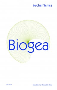
The book I choose to research is called ‘Biogea’ and was written by Michael Serres, and designed by Jason Wagner. Published in 2012 by Univocal Publishing, which Jason Wagner co-created with Drew Burk.
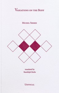
From the design of this book and from other books that Jason Wagner has designed I can see hints of his personality if not that then definitely his direction of interest. The way all the patterns are so precise and clean cut gives me the impression that he has a methodological nature and an obvious love of patterns both simple and complicated, while enjoying a subtle use of colour. As seen in another book designed by Jason Wagner ‘Variations on the Body’, which is also written by Michel Serres.

Variations -Cover

The fact that Jason Wagner is a part of the Univocal means that a critical look at the company can give an insight on the designer and ultimately the design itself.

Univocal Publishing was founded in 2011 as an independent publishing house specializing in small-scale editions and translations of texts spanning the areas of cultural theory, continental philosophy, aesthetics, anthropology and more. Univocal’s books including Biogea combine traditional printmaking techniques with the create evolutions of the digital age and feature letterpress covers designed by Jason Wagner, who demonstrates the technique in a video.

https://youtu.be/qwQSNhor1EQhttp://

Using techniques similar to this the publishing company oversaw the printing and binding of books from 2012 to May 2017, in which it ceased operations and merged with another company. This could seem to fall down to Jason Wagner who is stated to be moving on to pursue other projects.

But why did I choose this book? I decided on this book for a variety of reasons. I enjoyed its’ simple yet complex design containing a neat revolving spiral-like pattern which is placed in the middle of the book and looks pleasing to the eye. The pattern it self drew my gaze as I found it really intriguing as it resonated with my own interest in complex and unique patterns which I like to create.

The plain colours and easygoing layout of the book for me made it feel more approachable. The design it self didn’t take anything away from the content, for sometimes I feel that the cover of a book can sometimes give you false expectations of what it contains. Being misled into buying something based on its looks. This book however balances this nicely I think by not taking anything away from the content but instead relating and highlighting the themes within.

Biogea

The Typography is placed on top of the design and relates to and supports it nicely. Accentuating its colours and giving the book a clean and natural feel. The pattern initially drew my attention to the book, but as I took a closer look I found that the texture around the design on the cover felt good to the hand and gave it a thicker and more solid feel. This impacted on my decision as the pattern and texture subtly blend their delicate qualities together to create a book that i found aesthetically pleasing. While the design since imprinted on a thicker material felt noticeably different making it stand out from other designs and books.

The almost scientific complexity of the simple and delicate design also relates well to the content of the book for it’s a mixture of poetry and science. While also presenting a philosophy that merges the humanities with all creation. This has made Michel Serres “one of the most intriguing thinkers of his age”, and I believe is a reason why Univocal publishing has design and printed most of his books. Because of the authors philosophical and poetic inquiry sings praise of earth and life, and what Michel Serres names singularly as ‘Biogea’. The design relates well to the content as it mixes light fresh colours with an intricate pattern, which gives a natural clean aesthetic relating to some of the topics within the book. Some of the obvious examples being the use of blue in the typography which links with text within. “ Today we have other neighbours, constituents of the Biogea; the sea, my lover; our mother, the Earth, becomes our daughter; this beautiful breeze which inspires the spirit, a spiritual mistress; our light friends, the fresh and flowing waters.

Even though the design itself is quite precise it has a sense of movement to it and gives the book a poetic feel to it, this also relates to the content, as it’s a mixture of poetic statements revolving around natural themes. “In these times when species are disappearing, when catastrophic events such as earthquakes and tsunamis impale the earth” the author wonders if anyone “worries about the death pangs of the rivers”.

The author asks the same question of philosophy “as the humanities increasingly find themselves in need of defenders. Today, all living organisms discover themselves part of the Biogea”. Knowing the content of the book also ends up shaping my view on the design of the cover as the series of lines almost create a shield like swirl or sea creature, protected by the bold strong title Biogea.
 

Biogea, designer: Jason Wagner, Rietveld Library Cat. no: 157.3 ser 3

Reading with my mood


Monday, May 8, 2017

What effect does our mood have on what we read? If we read something, for example on DesignBlog, does our mood have something to do with it?

Your brain consists of two systems. Your system 1 is fast, automatic and requires little or no effort and you cannot control it. System 2 gives conscious attention to mental effort, is rational, takes care of your self-control and keeps track of the impulses of system 1 to suppress them if necessary. System 2 (almost) always has the last word.

Take a pencil and clamp it between your teeth, with the eraser to the right and the point to the left. Now put the pencil in your mouth with the point to the front and the eraser between your lips. You probably were not aware of anything when you did this, but with the pencil horizontally you got a smile on your face and with the pencil point to the front you had a little frown. In an investigation, students had to watch cartoons while they were having a pencil in their mouth, the students with the pencil horizontally (smile) found the cartoons to be funnier than those with the pencil point to the front (frown). The people with the pencil point to the front were shown photos of starving children, arguing people and victims of accidents, their reaction was way more emotional.

This shows that your mood definitely affects your ability and the way in which you process things. For example, research was conducted in which respondents were brought into a good mood or into a sad mood. The respondents who were brought into a good mood became more accurate and the respondents who were brought into a sad mood were unable to perform the intuitive task properly. Our mood affects the functioning of system 1. If we feel comfortable or sad, we lose contact with our intuition (system 1). According to Herbert Simon [x], you can see your intuition as a recognition. It’s like this: a situation gives a clue, this clue gives access to information in your memory and this information leads you to the answer. This makes clear that sadness affects your intuition and thus your knowledge.

So, it turns out that you become more accurate when you are happy while processing information. Well, I’m very forgetful and I’m wondering if I am more aware when I make myself extremely happy.


Get the Flash Player to see this content.


It will surprise you, but I can guarantee you that the list of words is always more than I would have written if I did not have laughed.


To sit like a swan


Monday, December 1, 2014

unfolded

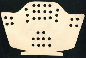
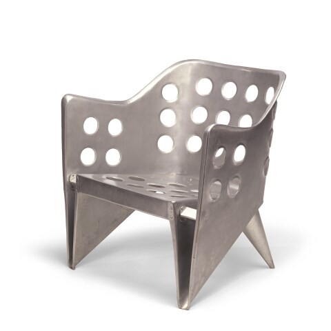
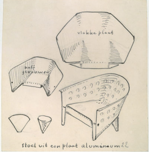
The object in this picture is a model of ‘aluminiumstoel’ by Gerrit Rietveld. It is simply a piece of paper cut in a way that when you fold it, it turns into a miniature model of the aluminum chair. The simplicity of this design is admirable, even though the final result in steel does not really give the same feeling of organic harmony. However, this model could not represent the creator’s idea better.


folded<a

Aluminium stoel model[x]

href=”https://designblog.rietveldacademie.nl/wp-content/uploads/2014/11/aluminum.jpeg”>aluminum

Aluminium stoel[x]


Rietveld made this chair in his attempt to create a furniture using one piece of material, or more specifically, one sheet of it. In this case, he used a sheet of metal for the chair we see in the picture and it is easy to understand how he handled the material to display the result in this, since we have at our disposal inside information of the designer’s process of thought, namely; this beautifully cut and pierced piece of paper. Rietveld also experimented with plywood to achieve an immediate connection of an idea with the act of making. When only one piece of material is needed to make an idea come to life, and when that material is so flexible that handling it seems as easy as drawing on a paper with a pen, then there’s a new type of harmony introduced to the design process; that of an immediate, fast action resulting in a beautiful and easy product.


Screen Shot 2015-04-17 at 12.58.59 PM

Sketch of Aluminiumstoel; notice how the designer uses method of folding as a starting point for his research[x]


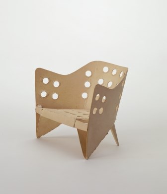
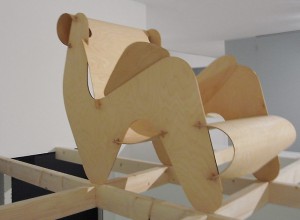
Rietveld and his contemporaries believed in a new world order, supported through their designs. In that world, one of the essential and necessary virtues would be the one of the minimum dwelling (das existenzminimum). For that to be achieved, all heavy labour would be replaced by machines, giving that way the man the freedom to use his leisure time in whatever way he thinks is best. In that world beauty and simplicity are the main gears of development. This is why in many Rietveld designs, in the model of the aluminiumstoel as well, we see a coexistance in harmony of these two and a lack of complexity which implies that the process of making of that object won’t result in valuing more than the object itself. For me, this is a reason why most of his chairs seem really uncomfortable; he wouldn’t want the owner of the chair to dwell in it for hours. There are examples of designs that embody perfectly Rietveld’s ideology, but were sadly never realised by him, like this chair of assembled plywood, designed in 1927.


plywood rietveld

Plywood prototype, 1958[x]


What I first thought when I saw the paper model – and what everyone probably thinks – is the old Japanese art of origami, the art of folding paper. The idea of folding a piece of paper in a certain way so that it creates a clear shape of something seemed really appealing when applied to interior design. More importantly, it seemed perfect for what Rietveld was aiming for; an oblect made of one sheet of material and whose existance would be a clear statement for an easy, free living of minimum dwelling.
Origami art has influenced many design-based branches, such as architecture, fashion and interior design. Its basic principles have even recently been proved to be beneficial for science when it comes to manufacturing. Assembled Additive Manufacturing is a new process of fabricating developed by researchers, which has origami principles as its base, as it treats 3D objects as multiple layers of 2D sheets.
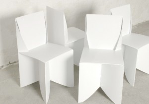
I was surprised, however, to see that most origami-influenced designs were really static and superficial; meaning that none of them took the idea one step further, none handled the art of origami as a general principle that could be the base of something bigger, or even as a statement. Designer Stefan Schöning came up with a design for a ‘folder chair’, where all that’s needed for its creation is a sheet of polypropelene.


folded chair

Origami folding chairs[x]

This example is really similar to what Rietveld was aspiring to do. Many similar designs have been realised, however it seems to me that they mainly aim at impressing the viewer, at making them admit that “that’s a witty design”, without committing a vision in it, nor giving the viewer and the world a tool for a better living, which will, in its turn, become a reason for contemplation.


A Printed Book History 16 : Modern methods of book composition


Wednesday, May 30, 2012

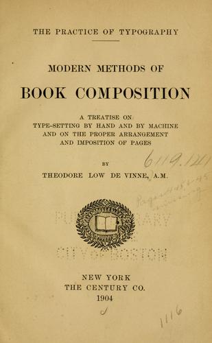
Practice of Typography: Modern Methods of Book Composition

A treatise on type-setting by hand and by machine and on the proper arrangement and imposition of pages.

by Theodoor De Vinne [1904]

The form of the book itself is somewhat flat and stale.
The cover is made with a bleak brown, the color of mud that is unpleasant to see.
One thing on the other hand, is that it is combined with beautiful golden linings and an old fashion design of type letters,
which also is one of the only things inviting of this book cover. A bit ironic, knowing that the book is based on design of type letters and typography which tell us absolutely nothing about the book from the outside.

only tiny detailed letters sown and marked in the book.

What interests me about the book was its content and a brief clarification of
typography and the history behind it. The simplicity and detailed work of type
design, arranging type in order to make language visible. It gives you some
understanding of the detailed design letter types and the needed guidelines on
how to make these various designs in your work.
Examples of equipments to use during this process. for example different kind “stands” (open framework of pinewood to support the cases of type) measurements, thickness of the fonts, and how much gaps should be placed, and so on…
basically it is an ideal book for “how to” to authors, giving specific rules and certain explanation of type design in the early 20th century.
Now off course that is different, type design has progressed in different area’s of art and literature making more creative and appealing for the readers.

For me, it is an important element in the wide field of the arts especially for design and graphic design.
Typography and Type design is is the core process of the work from beginning to the end, and the key element of it all.
Its an easy decision but hard work, from authors deciding on the letter type, writing an email for your mother, or designing a poster for the next party. With Typography and Type design we are our most oblivious, and lacking an active conscious of what really is letter type and where does it come from.

anyway, i just think this is good start on learning of typography,especially if you’re in graphic design, to understand how they managed in the early years from the first equipments to now.

post by Pri Lalcé


A Printed Book History 7 : Außen – Innen : was ist drinnen?


Sunday, May 20, 2012

When it comes to the background of my choice, I pick something that is organized, especially when I pass the day which is quite unfocussed. What I mean ‘Organized’ in this context is, something simple, straight, and propagating a messages well whatever it is. On the way to the exhibition place, many different things on the street were distracting me a lot. Also the fact that i need to see many things at the place, made me think about only rest. Fortunately, a scale of the exhibition was not that large, besides the thing that i wanted to see was very clear. Although there were tons of texts that had enough power to give me a positive impression, I was looking for a book which had a story or visual language as simple as it can be.

In the last part of the exhibit place, I found the image that i was looking for.
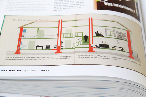
It was a book with a simple Isotype image with few colors but very skilled way of drawing. The image was telling a story very well. The only pity was, that the full text was written in German, which I can not understand. However, the Isotype-styled image was intriguing enough for me to look at. Even though it was based on a spontaneous choice, I liked it quite a lot. Because of a connection between the motive of my choice and the memory from my childhood, imagining the time, I was drawing a number of sketches for my dream house and played a game about building a house and making a story out of people living in that house. I enjoyed telling a story with a basic image, which gives a hint to what kind of upcoming story will be expected. The memory of mine and the image from the book in front of me were connected very well. That is why I felt interested and considered this book to be my favorite among other books. Maybe the Isotype drawing was simply nice. It was a simple thing but made me feel happy on that occasion.
The book I found was:’Außen – Inne’ : was ist drinnen? ( what’s inside? ) by Marie Neurath Vienna 1956.

Marie Neurath (1898-1986 and husband Otto worked according the “Vienna Method”. which was later renamed Isotype: International System of typographic Picture Education.

post by Boyon Kang

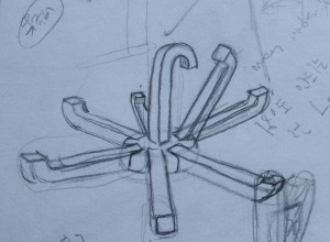
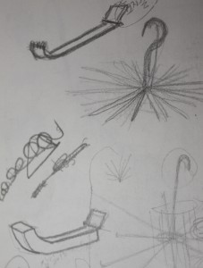
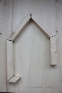
backscratcher


Thursday, March 4, 2010
 I could feel home and it reminds me some old memories.
decided to make simple designed product.
home feeling backscratcher.

spin spun spun


Wednesday, March 3, 2010

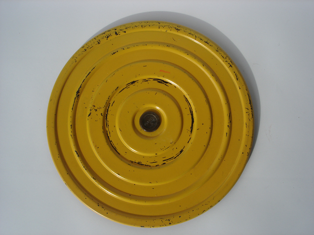
Form did not follow function.

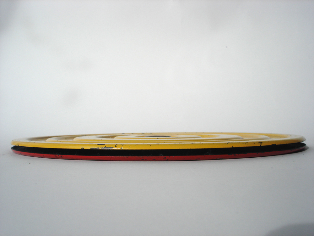
This exercise device that is designed to keep your waist in fantastic condition is visually something that could be an illustration or of decorative means in its most minimal way by being almost two-dimensional.

Its rounded corners on the edges and the repetitive voluminous circular lines add a wavy aspect to the object and give it air and continuity.

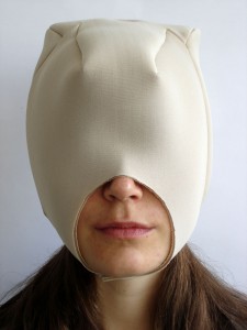
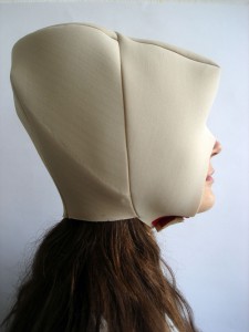
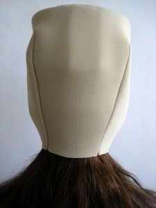
Taking the two above mentioned aspects and consequently use these principles as a departure point, designing headgear seemed utterly natural. The sort of headgear that would follow the shape and size of the head, but eventually alter its original state.

Sound in simplicity.


Tuesday, March 2, 2010

Sound.

Heads turn.

What arrives?

What passes by?

Research.

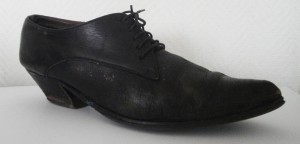
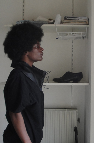
Male tango shoes.

Makes sense.

Quite feminine, though.

Androgynous.

Turkish shoemaker fixed them.

20 euro’s.

Cheap.

“Beautiful, around thirty years old.”

Leather, black, a hint of wood.

Ten little holes.

Thin black laces.

Simplicity.


Simplicity.

Starting point.

Sound transformed into visuals.

Black.

Second hand leather.

Ten small holes.

Covering skin.

New necklace.

New scarf.


Be familiar with


Friday, November 27, 2009

Some things are simple for us. You don’t have to think, you just Know things. Some answers don’t offer brainwork. How many answers are lying on our tong constantly? Easy how to build questions but not always easy how to create the answers.

The title of my book is ‘60+40 is probably 100’. We know the answer of the question of my book without thinking. It’s nothing to be proud of. It is simple. Everything can be simple or complicated.

We are familiar with everything we ever saw, smell, heard or felt. It’s not that we create an opinion immediately (maybe also not in the future), but it ‘flipped’ true our mind. It would be nice if we had a screen wich decides for us what we want to experience or not.

14168

De staart van de kat


Friday, November 27, 2009

Fauna, a word which brings sweet and fluffy images to my mind. Horrible. Especially because it’s always linked to the other half; Flora. The combination of those two words is a summary of almost all the things we see in our free time. (watching birds, taking a walk…). So for me it was quite easy to search for a book which was linked to my tag.

Although the intentions of my original tags were more general, I now ended up with a book named ‘The cat’s tail’ (De staart van de kat). Just a nice title made of simple words. Not too heavy or philosophic. The title and the cover fit well together. The book is white, small and empty. There are no images on the cover. It’s quite the opposite of images that sneaks into my mind when I think of fauna.

758.1

CAT

CAT

tail

Between denim


Wednesday, November 4, 2009

The white spot in the middle of the book immediately grabbed my attention. It’s the only element you see on the book. The rest is covered with denim. Strange actually because the book contains information about the Japanese architecture. And denim is typical ´West´. But for me strange is not that negative, I think it is quite interesting.

Actually I don’t know anything about Japanese architecture. But I was thinking about it, because the last two years I learnt a lot about the Japanese environment. I wondered if you could see the Japanese flora and fauna back into their architecture (which it does).

While flipping the pages you only see black and white photographs which show the simplicity of their architecture. It shows a lot of buildings with interesting spaces, lines and basic elements. I really recognize ‘Japan’ in it.

It’s a squared book fit in one color which I like. Not too big, not to small and it really wanted to tell me something about buildings created with natural elements of Japan.

09769
7/3.3

Shoin

Shoin

reserved space


Tuesday, November 3, 2009

“subjective library” images and flickr tag-cloud

Read the reflections of A and C group’s journey into the Rietveld Library’s Design and Art section. This journey to investigate, made our fascinations, preconceptions and hidden desires manifest. How does a subjective book choice create a personal mirror and leaves traces of tags, connecting Design to Art, exposing autonomy in both.

Read about the subjective, open and intiutive first book choice from the Design section of our library. Wonder about the tags connected to those accounts. Follow the continuing story as a second book is selected based on those tags created. Witness the third posting in which those sets of tags lead us from Design to Art. A move that forces us to reflect upon the connection between them both.

Follow the continuing accounts of the three succeeding investigating postings by clicking on the yellow link. Experience the total list of tags created during this “Subjective Library” Project.

LIST OF TAGS:

3289 days, A4, cover, funky colors, television, unatractive, film photography : fauna, flora, interesting, lines, strange, fluffy, simple, horrible, brainwork, complicated, proud, “to know” : disorder, game, grid, systematization, “One Minute Sculpture” : library, swindler, breaking news, library loser, extraordinary, talented : space, absence-presence, framework, surrounding, returning : abnormal, rediscover, choice, plain, others : 1000, 754., direction, signs, city, direction, traffic, political, posters : blue Pinocchio, screaming, spine of book, blue, Pinocchio, blue fairy, eyecandy, contemporary, folk, mentality : not getting there, unknown, judging by covers, content, connection, strangers, subject : supermarket, theft, housewife, tiny, midlife crisis, multilingual : logic, question, reason, consciousness, interest, remarks, impossible, mathematical, perspective : attraction, strange, swissfolk, art, death, life, love, Maurizio Cattelan : cover, old book, unique, obsession, miniature : Anita, eyes, portrait, dominant, name, color, film : Wiener Werkstätte, characteristic, hand work, mass fabrication, original, process, realization, detail, photography, the nude : cheap fashion, funny, random, tattoo, tribe, weird, mysterious, tribe : attraction, new texture, action, quick, warning, a priori, new, amusement, choices, eye-catching, eyes, random : escape reality, library, overflow of impulses, fruitless reality, jostling time, absorbing force, déjà-vu : arrange, industrial, library, architecture, museum, self-made, Andreas Gursky, index : city, nomadic, reality, funky, colors, interiors : contrast, fat, texture, typography, culture, nudity : conceptional, distance, no image, steps, thinking space, braille : cat, compulsive, font, chaos, subjective, illustration, objective, random, Tadao Ando : airplane, airport, choice, structure, worldmap, 756, 80’s, human, machines, unique, flying : dot, jewelry, shapes & forms, yellow, children, fun, paint, playful, all colors, blue, green, theory : extraordinary, life, normal, objects, absurd : 80’s, desire, fashion, party, techno, desire, fabrics, orgasmatic : alchemy, identical, methaphysics, mysticism, mythology, Arabic, identical, inaccurate, ladies, naked, orient, sculptures, stereotypes : Canada, Indian symbols, kitsch, raven, Indian art, Mexico, Jeff Koons, porn : attraction, gold, meeting an old lover, recognition, cheap, irresistibility, not psychology, wrong, beauty, compare, contrast, couple, same, similarity, together, two books, ugliness : connection, embroidery, hundred years, death, funerals, general terms, invisible, object, spirit, visible : color, feeling, personal story, feminism, graphic : first sight, mystery, old-fashioned, bloody, mad, rituals, revelatory, Yin : oblivion, automatic lives, bottom shelve, eat, mantra, story-making, colorful, dogs, double-take, eat sleep, vases, vegetables : attracted, nothing, black, disturbing.

still curious read the books involved at the Gerrit Rietveld Library, (catalogue numbers are included).
Log in
subscribe