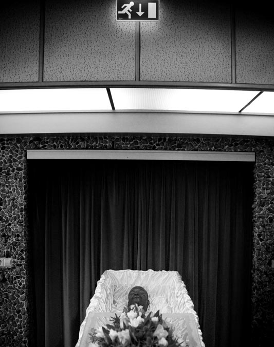
Dying is something we all have to face one day. When it finally happens, we trust on the people closest to us to give our remains a place to rest, playing the right music at our funerals and keeping us from being forgotten, by remembering us, and telling stories about us to our grand kids. But what if a person dies who doesn’t have any close ones to remember them… Who doesn’t have friends or family to attend their funeral.. In Amsterdam it happens multiple times a year.
The Pool of Death
Drug addicts, drunks or abusers rejected by friends and family…
Illegal migrants, wanderers and hobo’s without papers, permits and names…
Rejects and the misunderstood, whose mental disorder kept them living in seclusion… Recluses who cut off all social contacts or lost everyone that was ever dear to them… Elderly who outlived every last relative… Youth, abandoned and unable to survive on their own…
The pool of death is a group of poets, who honour the lonely deceased.
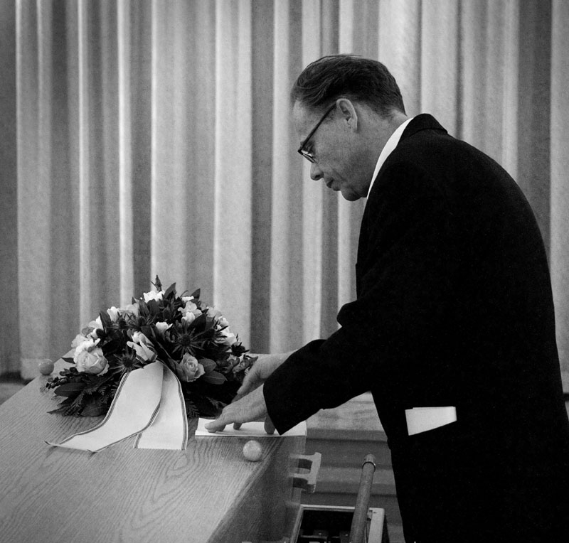
As the sole attendant of a lonely funeral they accompany the lifeless remains to the grave where they recite a specially written poem.
To write about someone, and give their story to the world, a poet needs to learn as much as they can. Like a detective, they look for clues. They visit the homes of those lost, talk to their neighbours, and search through city archives gathering as much information as they can to form a sense of the person that was.
The same week i received the assignment (to meet up with someone that inspired me), I attended a funeral, my second of the past two years. This very present sense of death and mortality made me think of the Pool of Death and the Foundation of Lonely Funerals, a project by artist/poet F. Starik.
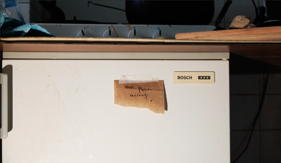
I had met Starik once before, about a year ago, when he was clearing out his workspace. He was leaving his current atelier to work from home, and couldn’t bring all the things that had come to fill that space. I got a tip from someone very close to me who was helping him sort out what he would take with him from what he would sell, that the rest would be thrown out.
Amongst all the things, I found this big box. Inside it, were all these wooden crosses. They were old crucifixes that all seemed to be missing their christ figures, leaving them to look like movie props for an old Hammer production starring Christopher Lee. When I asked him why he had so many of them, and what happened to their prophets, he addressed me in the solemn but raspy voice of a chain-smoking reverend:
“Well my son, I have dedicated a great part of my life to freeing Jesus from the cross…he’d been hanging there long enough!”
When I later continued my look around, I found an army of Jesus dolls lying carefully displayed on the ground, as if they were all out sunbathing on the beach.
Along with the crosses, I left with some old photo works. Most of them were collages made on old canvas frames, all black and white.
The Detective
On an early Sunday afternoon I went to my appointment with Starik at his house.
Next to his writing table stood an enormous plant and above his couch hung a note saying: “we are decent and normal”. Some of his work’s consist of a note or message, handwritten on a painter’s canvas. I really like these works. They might seem simple but they work really well.
I was curious about the proces of writing a poem for a person that just died, in total solitude. Somebody you’ve never met: how do you learn about them? Are you allowed to visit their homes and search for clues like a detective?
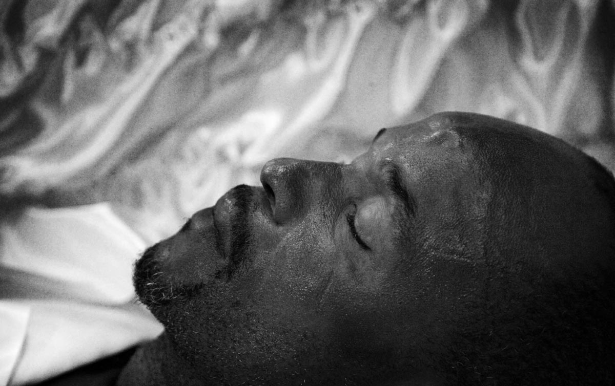
He told me that sometimes it was very difficult, depending on the situation. He was allowed to go into their homes, but a lot of times these were in total chaos. The anonymous deaths are often discovered when the neighbours call the police to complain about the smell. It can be weeks before they are found, and by then, the bodies are in a state of decay. But sometimes you can find something that can be of use. He confirmed my suspicion and said it was very much like being a homicide detective. He always makes a talk with the neighbours, and if the person still has some long lost family members, searching the city archives can be a big help.
Sometimes people have a strange relationship with public workers, relationships that in a way replace the lack of closeness with anyone else in their lives.
He told me of the anonymous death of an autistic man, who had a special relationship with his plumber. Being extremely parsimonious, he was particularly stingy about his water-heater, and feared spending even a single cent too much. Every day he would blow the flame out, fearing it was burning away a lot of unused gas. Sadly he was never able to reignite the flame, so every day, when he needed hot water, he would call the plumber to reignite it. Because the plumber understood the man’s condition, and knowing this system would actually cost him significantly more than he was trying to save, they worked out a deal. Each day he called, he paid only 10 euros. This was still significantly more than he would pay if he simply kept the water heater running..
He also told me about another man who fabricated the whole of his own history. Among the stories he told people is one about him as an important war hero with the resistance. His long lost family members however, said he had actually been working for the Germans. He kept on with these stories for so long that he came to believe them, and lived on in his own fantasy, in his own fabricated biographies. In the poem Starik wrote for him, he kept those fabricated stories alive and didn’t kill them off.
The Design
After you die, you sort of live on in marks you’ve left behind..in handwritten letters and notebooks…in old grocery lists…in doodles and scribbles… because handwriting is really someones second voice. Handwriting is personal, has a character that speaks for itself: a voice that is read instead of heard. Reading a person’s script, you can almost hear a person’s voice talking.
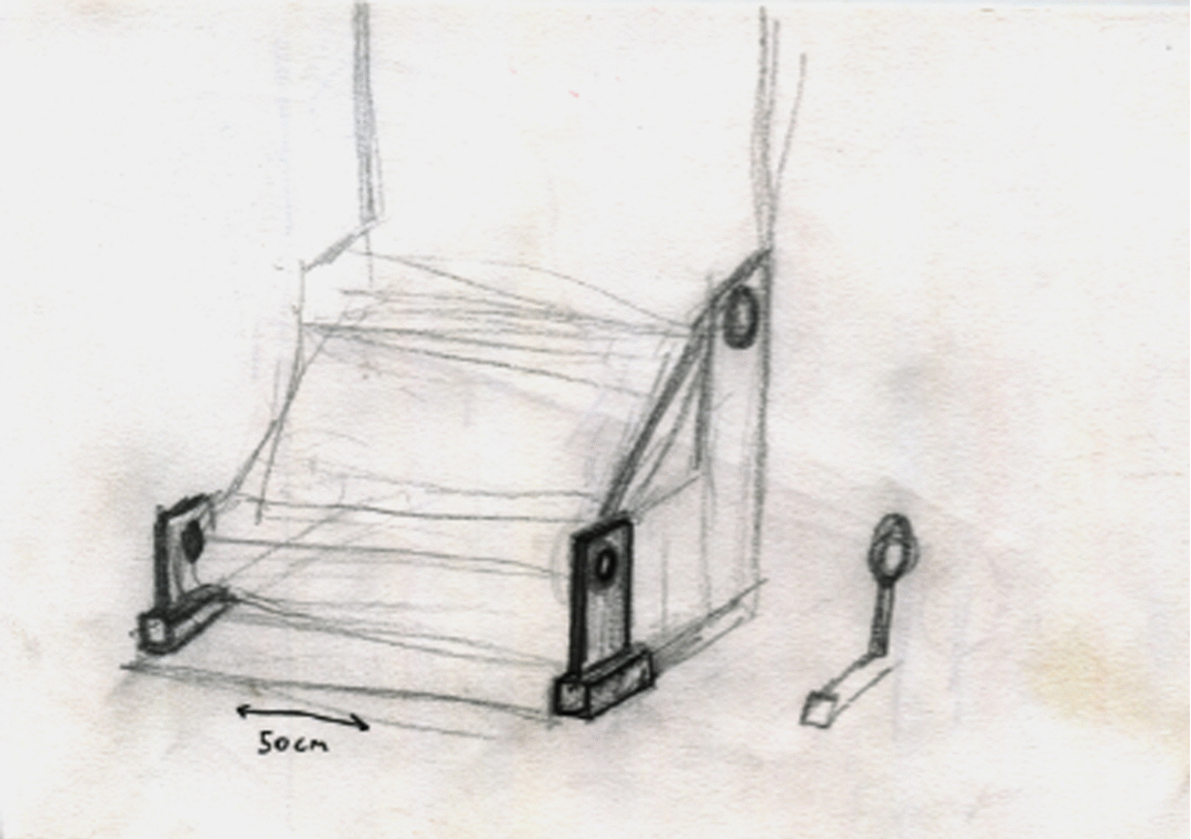
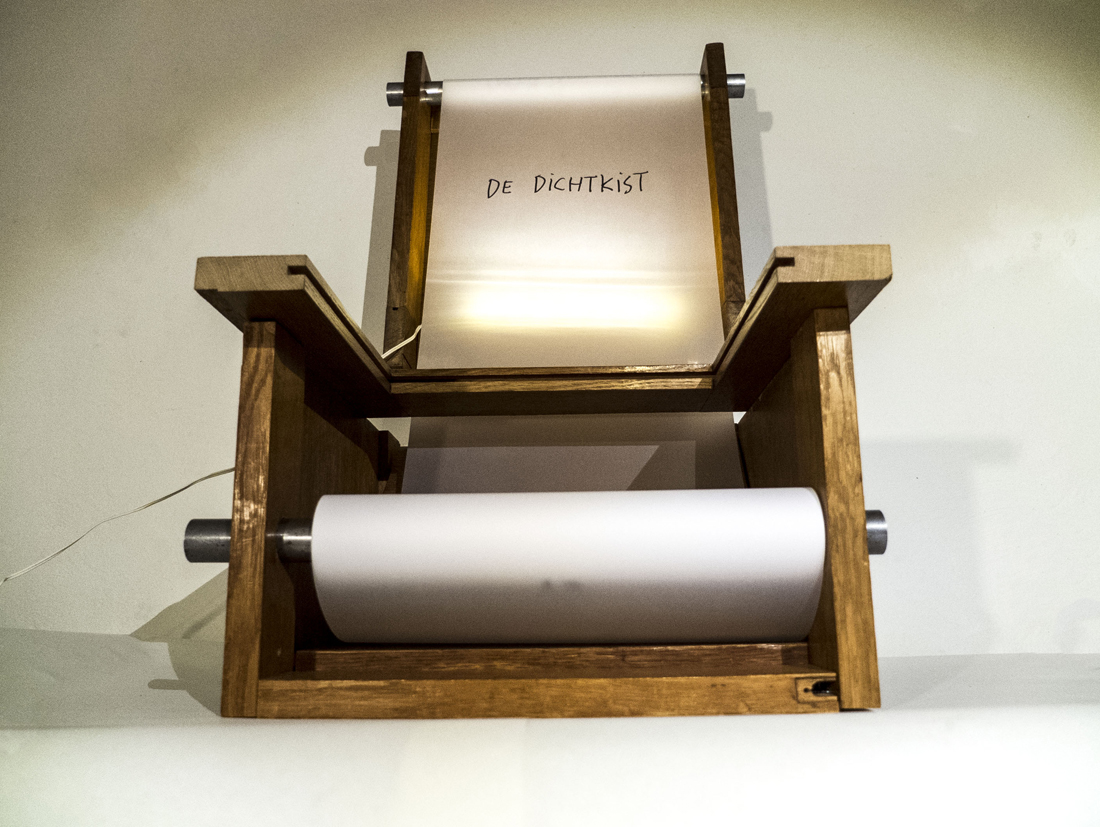
I wanted to make a sort of vending machine, containing unopened letters written by somebody that passed, so that the living could receive letters from the dead.
This transformed into the big turning of the wheels, and then to the transfer turning of a scroll from the bottom to the top. Inspired by Starik’s written canvasses, it became a sort of alter, displaying a composition of words. De Dichtkist (translates into “sealedburial box with poems“) is a tribute: a coffin for handwriting, an open casket, a single space for the second voice and all of its marks to collect, and with a bit of turning, display. As it fills up, that turning can lead to a sort of conversation. The second voice can speak with itself. Built from the wood of century old doors, de Dichtkist houses the marked memory of lives that will some day, come to end.
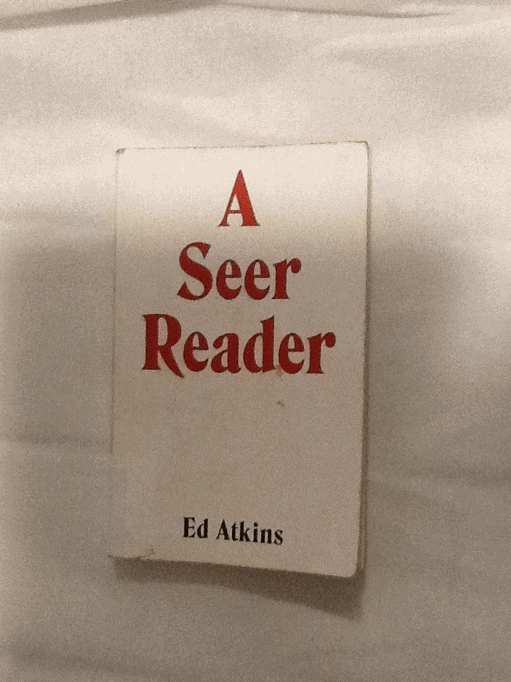
I was trying to find a book in the library with a design which excited me; something I’d like to write about. I chose to pick up A Seer Reader for the assertive, bold cover design it boasted. By using red, white and black, the colour contrast is stark, the combination connoting power. The font type replicates typical, 70’s typography, with its sweeping thickness and curvy motion; it asserts a confidence. A shallow indent delicately engraves ‘A Seer Reader’, indicating the importance of the books title, over the authors name. The ‘A’ starting the title, leads a triangular shape centering attention to the middle of the page. Every element to the cover designed by Zack Group, makes for an eye-catching, attention-grabbing book. The cover enticed me to open the book, and discover what inspired me to chose A Seer Reader for my investigation on design. Surprisingly my analysis wasn’t the result of my initial drawing to the cover, (and therefore comes without credit to the books designer,) but moreover to the author, Ed Atkins.
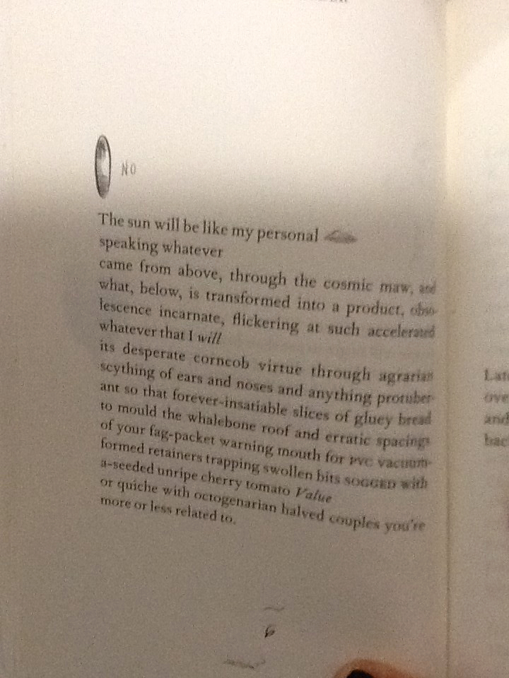
I discovered that every page of the A Seer Reader was adorned with dancing doodles; playful, printed, pen-style drawings dangle from the words, interrupt the verses and sulk in the far corners of the pages. There are tiny squiggles, illustrations, and symbols referencing or resembling punctuation. The doodles appeared to me, to specifically elude each poem with unique visual imagery. I decided I’d like to discover why they were designed in the way they are. I’ll investigate the context the book is published within, and therefore the content of A Seer Reader. Focusing on the style of the font used for the doodles, their arrangement on the page, and the choice of imagery, I’ll analyze specific examples from the book in attempt to explain why the doodles are designed in this way.
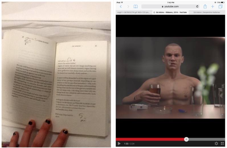
A Seer Reader was published for Ed Aitkin’s solo exhibition in Serpentine Gallery during 2014. Working predominantly with video and language, Ed Atkin’s visual art is inspired by the poetry he wrote for A Seer Reader. Ed atkin’s solo at Serpentine consisting of sound works, text instillation and images revolves around a multi-screen video instillation named Ribbons, where Atkins attempts to emphasise questions concerning the relationship between real life and virtual concepts, objects and environments. He explains that his videos are a ‘…kind of poetry of their own’.’ ‘…interested in previously literary-theoretical concerns about seeing and reading, interpretation of metaphor, figuration and literality.’ He uses CGI to literalise what was once only possible in metaphor.
In Ribbons he creates a surrogate character resembling his own physical appearance in a haunting online replication of a life. Atkins intends to ‘re embody’ himself as a possibility of what we may become in an paradoxical way of spreading a message that we need to focus on developing a more powerful mortal life. Through this high tech HD animation he ironically uses his medium to do exactly the opposite by creating a virtual world.
The character developed by Atkins is a young white male, wearing a bald
head and an action man body adorned with tattoos, he has a habit for drinking alcohol and smoking cigarettes. His appearance and his humanly habits reflect somebody stereotypically disapproved of, in today’s society. Atkin’s concern for the world we exist within, is evident in the design of the tattoos enscribed on the skin of his surrogate, Dave. Desperate phrases like ‘love please’ and ‘bankrupt’ are scrawled onto his skin to illustrate his story of conflict. They physically demonstrate the feelings Dave would have as a human, but as a virtual delegate, his being is absent from. On his skin; they’re positioned outside the human nervous system. I think this indicates a detachment from the animations human intimacy with himself.
After studying the videos Atkins produced for his solo exhibition, I noticed similarities in style between the doodles illustrating A Seer Reader, and the tattoo’s scrawled on Dave’s skin. It now became evident to me, that considering the importance of what the drawings suggest in his video work, the way they are designed in A Seer Reader will also have a special significance to the ideas Atkins questions in his work.
I’m curious as to why the doodles appear in the font style they do. They are printed on the paper in a scrawly handwriting in a biro or sometimes with a bold marker
The independent, physical and primally instinctive movement of writing with a pen in ones hand, is raw and natural to the intellectual human being society knows today. Atkin’s uses the soon disappearing practice of writing by hand, to convey the humanly emotions of himself, or anybody in our society today, onto the virtual future we face (the skin of Dave). Therefore the font design that distinguishes the poetry in A Seer Reader, from the handwriting doodles can be compared to the contrast between Daves cgi skin and his tattoos.
The poetry is written in a serif font type, commonly used in literature of today, its appropriate for clear messages to encourage the reader to focus on the content of text. It may be used to help develop the trust of the modern target audience, which is important if they are to value Atkins’ poems as high literature. By choosing a serif font which was developed digitally, Atkins paradoxically hints at what the digital world has already done to change the way our brains work, to raise questions regarding our future and technology. There is a confident, official level of professionalism created by digitally produced font, totally un-emotionless and un-personal for the reader of today. Its in these respects that the I relate the choice of serif font to Atkins virtual surrogate replica of a human. Both the poetry in sensible, digital serif font and the pinky rendered skin of the CGI Dave is tormented whilst illustrated by a real humans handwriting scribbles. The choice for handwriting therefore poses a conflict between some of the characteristic, fundamental elements of human development regarding language in the mortal world, (a practice at threat of,) the human’s of our virtual future; a product of our current society.
By using handwriting the design of the doodles appears uniquely personal; autobiographical. Atkins uses his own style of taking notes to project his personal concerns with society onto his surrogate; he plays with his ego, flipping himself into his virtual identity blanketed by his naked, surplus and mortal emotions Through his CGI in Ribbons. In A Seer Reader the intimacy created between the reader and Atkins, through his use of highly personal handwriting, implies the doodles are like entries to a diary, personal thoughts belonging to the artist. The doodles style in handwriting therefore allows us to understand Atkin’s truly distressed feelings towards our existence in the future he insights, in the mostly raw, open and honest way.
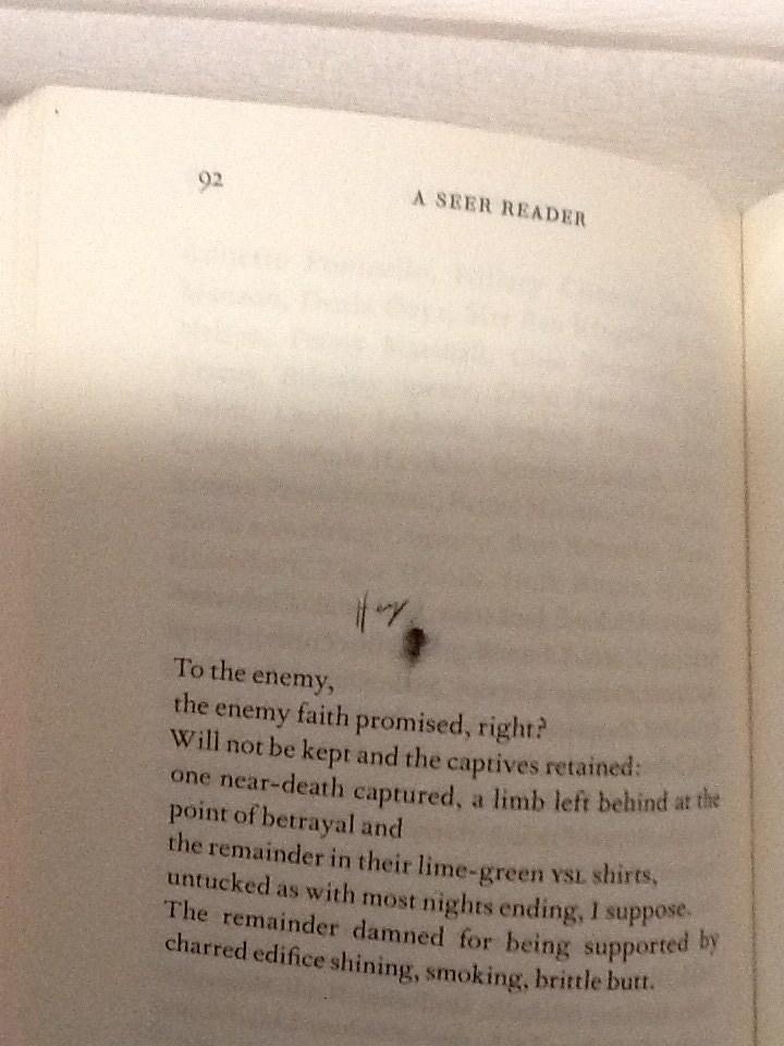
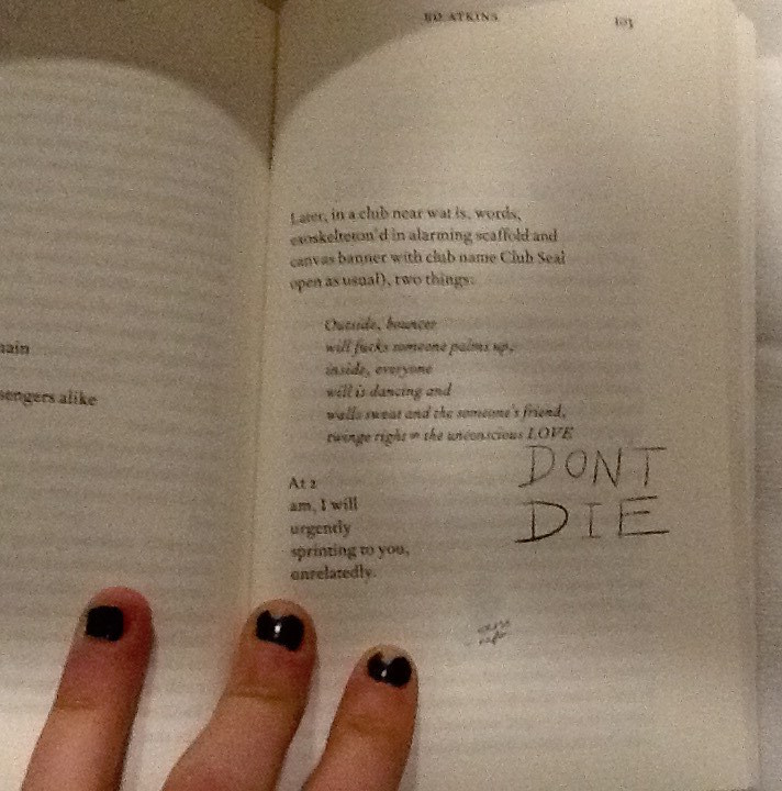
A consolidation thoughts form from Atkin’s head; the handwriting translates a universal language of emotion, in how each word is formed from the authors hand to the paper. The handwriting helps to illustrate Atkin’s feelings as he writes, and emotionally connects with each specific word. For example on page 92 of A Seer Reader, Atkins poem stabs at capitalism and using a current slang, (another characteristic typical to a human of our time,) he makes a metaphor for our choking industries; ‘butthole’.
He illustrates with a pencil sketch of a butthole, labelled with more slang; ‘hey’. He adopts a loose, scrawly joined up handwriting to do so. It feels fluid, creating a casual, relaxed visual effect which allows the readers feel comfortable to laugh, as he playfully mocks the sincerity behind his poetry. By contrast the choice in design regarding capital letters, a larger size font to the majority of the doodles and sharp points determining the end of letters, suggest aesthetics which relate to an irrational state of urgent, abrasive, human panic.
Page 103 in the handwriting ‘DONT DIE.’
Capital letters accentuate importance, taught in the grammar of the languages in our society, showing Atkin’s thoughts which should shout from the page. These features of the handwriting style show how Ed Atkin’s conveys different emotions through the doodles design, he plays with his readers to elude how he feels as the artist.
The design regarding the placement of the illustrations on each page and they’re relationship with the text arrangement is also of interest to me. The doodles are very specifically positioned, creating a new design and rendering a unique layout on each page. The notes are cheerful, their haphazardness and impermanence in position creates a youthful energy of its own. Many harass the text, dangling from the words, interrupting them like a vandalised high school text book decorated by an excited teenage rule-breaker. Upon flicking through the book I think Atkins creates a chaotic feel with the arrangement of the doodles. Maybe he does this in an attempt to question the power which our mortal life (represented by the emotive tattoos / doodles he writes by hand,) has, over the possibility of a virtual future (what his poetry represents). An issue presently discussed within his poetry, as well as what he represents with his surrogate Dave in Ribbons. Chaos raises concern to me, and suggests Atkins might be trying to raise awareness of his issues with the future and society today, through fear.
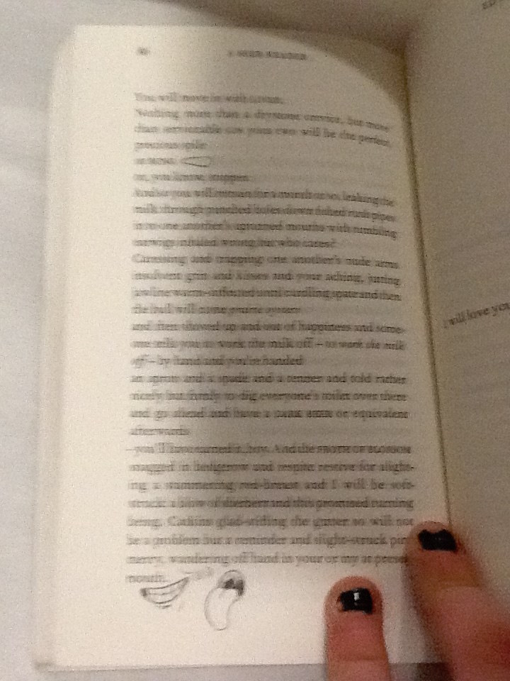
On some pages it appears the design regarding the placement of doodles serves purely for illustrational purposes. For example on page 86 a smiley mouth and a big floppy tongue curve and grin around the word ‘mouth.’
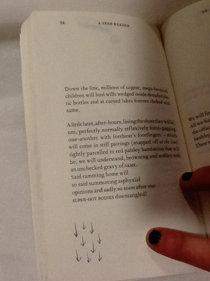
The positioning of the doodle presents a clear visual anecdote of the text, as its placed directly next to the words, the reader sees them together creating imagery. The poem on page 94 begins with ‘down the line.’ Directly beneath at the end of the poem and the lowest point on the page is an illustration of 9 arrows pointing downwards.
Again this provides a clear illustration of the text, but it also speaks of itself and the symbol is close to the bottom of the page, it feels they are going down as well as ‘being’ ‘down’.
I’m curious to understand if there is a relationship between the way the doodles are used for illustrational purposes which seem therefore to be in harmony with the poetry, and the concepts which lie behind Atkins exhibition at serpentine which A Seer Reader was published for. Despite the chaos of the doodles, and the lively energy they carry as they appear in different places for each poem, they do help the reader take their imagination further in their illustrative quality. If the handwriting doodles refer to issues regarding mortal life, and the poetry talks on the concern for the virtual future, then Atkins could be showing the bond between the illustrations of his thoughts, and his poetry. As one where he symbolizes how mortal life still has power to change the effect of the virtual world or what is to be of the future, as the illustrations aid the text.
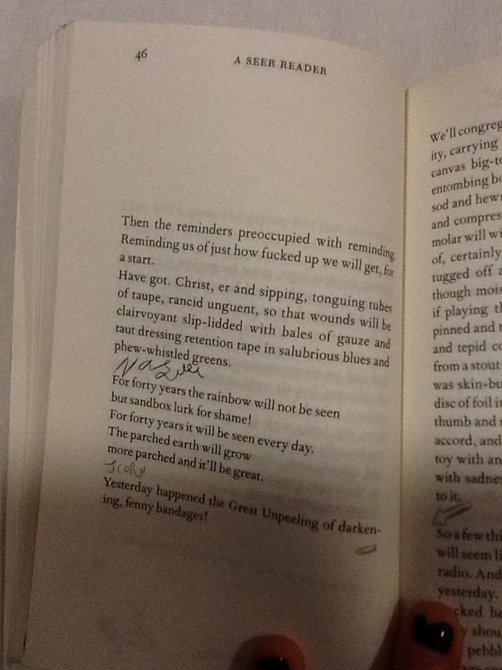
The discourse structure (involving the positioning of illustrations with relation to the poetry,) may be designed as it is in A Seer Reader to give stage directions to the reader. It creates a similar discourse structure within the poem to that of a script. On page 46 Atkins places the handwriting scribble ‘nausea,’ in a new verse, in line with the direction the poem would be read in.
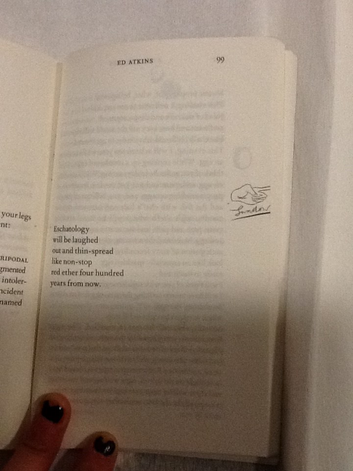
Atkins allows these direct assertions of feelings to stand as lines by theirselves. They appear significant and with a different font (in scrawny pen,) they contrast to the rest of the poem, they work as powerful instructions. With their own space they order the reader to feel something. They also give relief to the poetry; a breath between verses to give time for the reader to reflect, to feel, before continuing to read. When looking at page 99 a short, six line poem is centred to the left of the page, so the text lays closest the core of the book.
A poem which torments human’s obsession with eschatology, with disregard and humour. A slap-stick illustration of a hand, labelled ‘swallow,’ underneath, sits directly in line with the verses on the opposite side of the page. Aligned with the poem on a vertical axis, its clear the text and illustration are to be read one after the other; they have a connection, although they are separate because they imply a direction; a change of action. The illustration is cut right to the edge of the paper, giving the impression there is something to reveal on the next page. Its likely that after reading this grave poem, which makes dark humour about the possibilities of our future, the space allows the text and the reader to breathe. I think Atkins wants the reader to digest the words of this poem, look to the right and ‘move on,’ indicated by the encouraging instruction of a pointing finger to turn the page. In this case the positioning of the doodles may be used as a order to feel an emotion like a stage direction, or to initiate a direction.
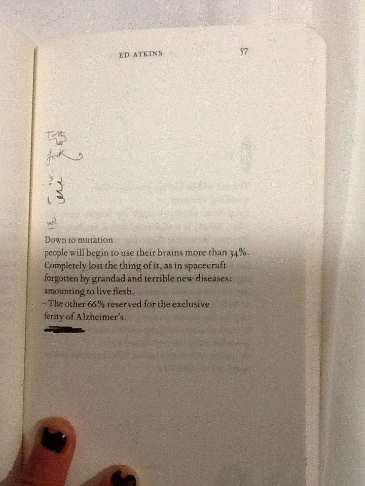
Some doodles intimately relate to words in the poems. On page 57 a bold marker is used to underline the final verse in the poem, this draws attention to it and marks the line with importance.
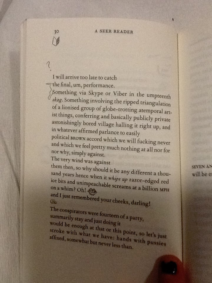
On page 30, the two opening words, which start verses following each other, are connected with a squiggle.
When joined they spell the phrase ‘the something.’ Making a new verse within the poem. This statement also exists on the page now without relation to its context in the poem without the joining squiggle. This draws emphasis to the phrase and creates layers within the poetry.
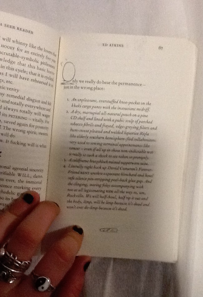
In some cases the positioning of the handwriting squiggles make them a part of the poem, although they contribute letters in a different style to the rest of the poetry in its serif font. On page 67 the poem begins using letters O the handwriting style, to begin the first words of following verses.
The size of the squiggly letter is obese to the rest of the text, it helps to compose a bold and grand opening word. This is a common design in a lot of literature, Atkins makes a reference to it in his own style in an impish attempt to add intellectual value to his poetry through his page design. The choice to have these in the doodle style instead of the serif font refers to the power the doodles have over the poetry on the page, as they refer to the dying practice of handwriting as a symbol signature of our mortal lives in society today.
I’d like to find out why Atkins chose to use this specific imagery, for his doodles. Many of the symbols he uses look similar to punctuation, commas, full stops, brackets. His choice to use marks in A Seer Reader and for the tattoos in his video, which are similar to punctuation, gives a further clue that not only the handwriting is being used as a symbol of our mortal life today. There are other reoccurring themes within his imagery, including hands, eyes, penis’ and delicately sketched vaginas. All parts of the human body. Atkins decision to design his illustrations using this imagery, again, references mortal
life and current society which he discusses along with his thoughts about the future in his poetry.
By investigating Ed Atkins process as an artist, focussing primarily on his exhibition at Serpentine Gallery 2014, and more specifically the video work Ribbons, I have come to various conclusions about why the doodles which intrigued me into investigating the design of A Seer Reader, are designed in the way they are. The handwriting style the doodles are written in, connotes natural human thought patterns, unstable emotions and ultimately the questions the author presents. Handwriting also serves as a symbol for language and writing in which could represent the typical medium used and developed throughout our human age. It therefore creates a tension with the computer generated font type used for the poetry, which might suggest the virtual future which Atkins discusses, as a running theme to his work. The doodles appear in totally different positions throughout the book, on each page. I therefore discovered various different reasons for the design of their arrangement. They can be placed intimately within contact of the poems, to draw attention to specific words or phrases, or to illustrate an idea directly which shows how human knowledge can still be useful for bettering the future, when considering the broader context of his practice. They can be placed in a location on the page which will give a direction to read in or indicate that one should stop reading to feel something. The placement of the doodles when they create letters which integrate directly with the poem, connate high literature as Atkins desires his writings to be read with sincerity as he discusses deep issues surrounding our society and regarding the future. Finally the chaotic feel created by the different placement of doodles on each page questions the urgency of the issues the handwriting stands for; the mortal world and its conflict with the virtual world of the future. To end my investigation I discovered that the imagery Atkins uses in the design of his doodles references English punctuation, and the human body. Again it links directly with his exhibition and his proposal of questions regarding our existence in the society we live in today, and its relation with the virtual future.