Skip to Content Skip to Search Go to Top Navigation Go to Side Menu


"holland design" Tag


Element, Fifteen


Saturday, November 28, 2015

15-elements_cover2 15-elements_side 15-elements

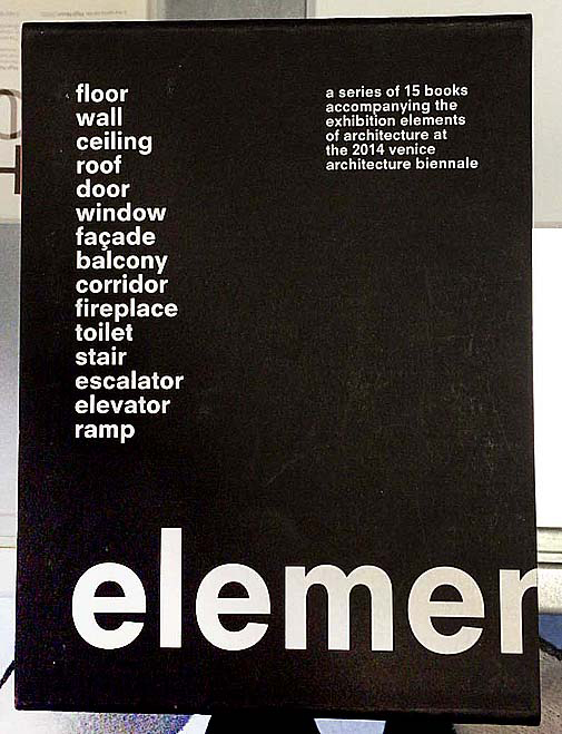
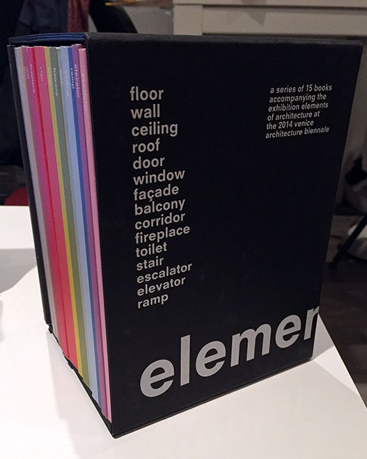
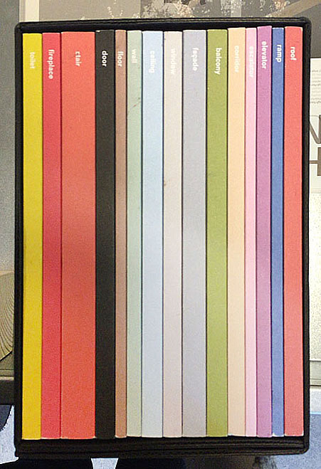
front of box • side • 15 elements

When I first saw this book..
I thought that books always have similar size and shape before I see this book. For example, a book is made of one piece and has only one cover. When I saw this book at first, I do not know the series are a book that has one package. Also, I liked different colours in a black package and these books have diverse design and layouts. And I discovered that she used only small letters on the package and covers. I guessed small letters mean elements than capital letters. Moreover, when you open the book, you can see two pagination on the top and  under the page. I am not sure that I guessed a number on the top of a page is a pagination of one element(a book of series) and another under the page means a pagination of all elements(15 series). This is because second number start to 100 and finish to1500.  Actually, this book’s contents are very difficult and boring to reader since it deal with the history of architectural elements, the technical and social developments where they come from but this book design helps to vent. In addition, I could see really different layouts each book because these books have very diverse compositions to almost pages. So, it seems like I read a book but it is not a book.

elements-of-architecture

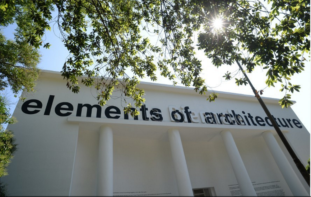
Venice Architecture Biennial

Design of this book..
Title of the book is ‘ elements’ designed by Irma Boom. This book is a series about architecture and the series is consisted of 15 books about 15 elements of architecture. It means this book is not one but it becomes the one as a black package. You can know what is the elements as seeing the 15 book’s titles. Also, you can find how did she show the ‘elements’ in design because it has 15 different titles, colours, books and contents. It is really interesting to me since she gave how to use the book’s title and concept as design. I realised that dividing a book is really effective for showing a small title. The book has 16 titles that is one big title and 15 small titles and you can see 15 elements before open the book ; floor, wall, ceiling,roof, door, window, facade, balcony, corridor, fireplace, toilet, stair, escalator, elevator, ramp. This book was made for the Venice Architecture Biennale by Rem Koolhaas.

Who is Irma Boom..
Irma boom is a Dutch graphic designer and she makes a book more special. This is her website. She has made over 300 books and her books are exhibited in New York City(MoMA). She is very famous designer internationally and she has lectured at Yale University in the USA. Also, she has been awarded a lot and worked as a critic. This is her website.

How does she make a book..
I was wondering when she make a book, how to approach, get a concept and develop. This means process of making a book. I was looking for some interviews(1, 2) for knowing her and her books. She said “Everything revolves around the development of a good idea; everything else – buying paper, production – are skills that one might or might not have, but the concept is what makes a project succeed or fail.” And she does not approach books like a product designer does. She said “I really approach books for what they are, as books, turning the pages. The object. Sometimes I see books, and I think it could have been a PDF. The regular book is not alive anymore. You can put it on a PDF on the internet, or on a Kindle or iPad, and it’s the same. But my books are something else. They have to be this three-dimensional object. Somebody once said that I’m building books. I really like that expression very much. ”

To sum up, I could realise that a book can evoke a lot of interests by design because I have saw books that made to similar size, techniques and feelings. I agree her opinion that her books are remained as three-dimensional objects because her books are truly special. For example, ‘Biography in Books’ is immensely small and thick. When you see the book in the internet or iPad, you can not feel this shape. Although this book is tiny, it gave very strong feeling to me when I saw. In addition, this is another example. Sheila Hicks: Weaving as Metaphor. This book on the work of textile designer Sheila Hicks. You can see different feelings when you touch the book even surface of the book. This means she just did not use the photos in the book and she made to feel real. So, she won the Gold Medal for the “Most Beautiful Book in the World” Prize given at the Leipzig Book Fair through this book. She does not apply the same style in everything when she makes a book. Moreover, searching about Irma Boom was really interesting since her books had very diverse design. I thought books will be able to disappear at one time except some specific books and be produced a small quantity. There were some intriguing points to me in her interview because Irma Boom and interviewers talked about digital books in her some interviews.
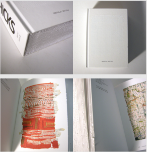
Sheila Hicks

Book number(Rietveld library) _ 710.4 bien 14 lll

Design Holland and Belgium


Wednesday, October 14, 2015

The composition of the ceramic vases Belgian artist Rogier Vandeweghe and vases Dutch artist Jan de Rooden.

subscription

Firstly, I’d love to explain why I’ve chosen ceramic vases for this essay. I imagine how the fingers are buried in soft brown slimy mass when I am thinking about creating a vase. I remember a few stories associated with clay from childhood. I grew up in a village. I loved poking around in the mud, but I had a special passion for the mud formed after rain on the roadway. Vehicles in the village – trucks, and the land under the wheels was pressed carefully because of heavy machine. As a soft mass, it was very pleasant to touch. Mud was becoming really strong as soon as it started to dry. I loved to do the round cakes of this manure. A day after i used to threw them on the floor and watch them breaking into pieces. This is the first thing I imagine when I’m thinking about ceramics. It seems to me very important to understand people, what events have affected them, how their personalities formed. An artwork produced by the artist containes all the information about his life, sensibility, condition. That’s why I’d love to highlight some events in the biography of Rogier Vanderwede and Jan de Rooden.

Born in 1923, he was the youngest son in the family. They moved a few years later to Beernem. From 17 to 23 years old, he studied at the Art Academy in Ghenthe. In the year of 1974 he was followed by a short internship at Joost Maréchal. In 1948 Rogier formed a business with his elder brother on the basis of fathers larger company. Their studio was named ‘Perignem (Latin for “through the fire”). In 1954 he married in the Church of St.Anne in Bruges on Maryanna Pyck (the collection vase that i chose called: Rogier Vandeweghe en Maryanna Pyck). Maryanna worked since 1952 as a ceramics painter at Perignem. As soon as regular production was established, Rogier decided to change direction towards a more modern product. The cautious, rather conservative attitude of Laurent and especially of Cecile Roets, which is in complete contrast with the radical and total renewal sought by Rogier, are the direct cause of the rupture between the two brothers in the summer of 1956. In 1957, Rogier Vandeweghe didn’t pay much attention to make his first ceramic production. In some cases, his wife Myranna Pyck painted the initials “RVDW”, eventually adding “Sint Andries”, with cold enamel after the firing. Soon however, Rogier adds this mark with glaze. In 1960, the workshop is named “AMPHORA».

Jan de Rooden Born in Nijmegen in 1931. When he was 5 years old his mother died. From 6 to 14 years old, he was admitted to Elementary School of the Heilig Landstichting. The landscape around us formed a beautiful country to grow up in. “In November 1944 I left home for the Passionist monastery in Mook September 1952 I became novice in the Passionist monastery in Pey, but after nine months I left the novitiate forever. Ultimately I could not reconcile myself with life in a monastery. I found that life too cut off, too safe and too well-provided for. ” As autodidact he started working in the studio of ceramist Lucie Q. Bakker in Amsterdam in 1956, and in 1958 started his own studio with Johnny Rolf with whom he later married.

Rogier was studying in artistic school and Jan at theological collage. But the story of the two artists is like when they meet their women and begin to follow their way.

I feel a similar sense when i am looking at the vase, I find something natural in that. Vases Jan de Rooden remind me about the forest, the surface of the vase is like a bark of a tree overgrown with moss and seabed, shells overgrown with silt. Vases Rogier Vandeweghe remind me of the mycelium, or forest spirits, or rocks. I like that he used black clay, I’ve got a association with caves and coal mining. From vases is completely different. Jan de Rooden used a simple sealed form. It gives a sense of confidence and stability, which in combination with glazing, creates the effect of natural stone. Rogier Vandeweghe several vases connects one composition and shape of these vases is like a bottle, but shorter, with a thin neck and a narrowing nizu.eta composition looks like a beehive. The Rogier Vandeweghe vase can be used rather only as an object, and the Jan vase may well accommodate some flowers.

In conclusion I would say that the facilities are beautiful.

Marshall Moderism


Wednesday, October 14, 2015

IMG_0377_2

The Design Derby exhibition at Boijmans Museum in Rotterdam compares what was happening in design in the Netherlands and Belgium from 1815 to present day. Pieces were picked as representative of the era of design in both countries, which allowed you to make comparisons of the objects for design and aesthetic value, but also by being displayed chronologically, you are able to see where on the timeline they place and thus allowed you to to understand the context in which they were designed and the preceding works/ inspiration. I picked two pieces from the 1950’s produced during the post war reconstruction period; a fascinating time for the reestablishment of design as a social, economical and cultural actuality.

I chose two pieces with very similar aesthetic qualities and obvious connections visually/materially, produced a year apart they are from exactly the same period so can be perceived from a single point in European history despite different national situations.
The first piece is a bookshelf designed by D.Dekker for Tomado – Dordrecht in 1958, The shelves are a genius design, with simple brackets on either side and tin trays which can be slotted in at any level, there’s a variety of combinations/arrangements of the unit so they adapt easily to any room.

Tomado Bookcase

The second is desk and chair by Jacques Seeuwes, designed for the architecture department of the University of Ghent in 1959. The only colour used is a bright blue Formica on the table, which compliments the soft dark tones of the oak seat and foot rest.  Its a vivid primary colour which is fitting with the modernity that was being practiced in the design at the time, when the chair is tucked under the table, there is brilliant flow of the basic forms, and the subtleties in angles of the chair suggest a certain spring to it by highlighting the ergonomics which contrast to the stubborn rigidity of the black tubular frame, they both exhibit a neo-plastic approach to design. This is collection of research i made in order to further understand the situation of each country after the war and how design fit into their society at the time. What were the inspirations/ defining influences in the Netherlands and Belgium which concluded in two very similar pieces of furniture.

Jacques Seeuwes Desk


De Stijl introduced an important merging of art an design by promoting an Utopian philosophical approach to aesthetics. The goal was to catch timeless beauty in spare precision, De Stijl movement was a reaction against the excessive decoration of the Art nouveau that preceded. It was an attempt at a universal language in design and aesthetic, that applied rules which erased all subjectivity to the artist because the individual was loosing its significance, ideals of the period shift from visually heavy to visually light and ‘de Stijl could be seen as social redemption.

During the post war reconstruction period, Tomado thrived because its products represented the incoming modern Dutch household; cheap, affordable, functional furniture. The core of Tomado string furniture was formed by pragmatism, before the war there was a demand of bits and bobs and comfort in clutter, but in the aftermath, there was a desire for a fresh functional way of living to maximize efficient recovery and thus wanted to be surrounded by practical and rational possessions. Tomado’s minimalist airy structures symbolized the modern age, and these bookshelves in particular were commonly present in households around the country, just like IKEA is nowadays.

tomado bij charlie ikea


The Dutch government returned to the Netherlands from its exile in London in 1945. The government, while in London, had created plans which would speed up the country’s challenging industrial and economic reconstruction, there was no conflict between industry and the arts, because the Netherlands has a trading history and sourced its cultural input from its colonies in Asia. This meant that recognizing the need for mass production to furnish homes wasn’t politically opposed and the dutch produced functional furniture for the masses with talented designers appointed to every sector, Marshall Aid investment into the Netherlands accelerated industrialization and by 1950, 38% of the population was working in manufacturing or some form of industry.

In Belgium, there is a rich history of the arts and crafts from their own country because they had no interest in their colonies in Africa. This meant that high level professional craftsmen worked hard to produce and design quality products, and then after the war they were fighting against the industrial takeover. However there were a lot of poor factory workers and thus mass production was a cheap necessity, people weren’t as encouraged by the government to pursue design careers whereas in the Netherlands every state company had a designer.

Marshall Aid played a large role in the modernization of Europe, with the investment to rebuild its financial economical and industrial systems, and along with the money came the intention to inject a new ‘spirit of productivity’.

e4436177fef81c8674471797ff6828ba f_10547351_1

In Belgium they funded the Belgium Office for Increasing Productivity (BDOP), which supported The Design Centre. Design in Belgium was struggling to find its place in society, The Design Centre aimed to broaden the understanding of design as a social, economical and cultural phenomenon, however, the BDOP demanded a definition of design which was appropriate to the contribution towards the economic efficiency, it was struggling to leave behind the origins of design promotion, dominated by national export interest and be recognized for its social and cultural value by the Belgian government, this was frustrating because of course they believed that design is the most visible and pervasive cultural manifestation of a country at any time.

Industrial design was redefined in Belgium  in the 1950’s, and planted foundations in 1954 under the reign of the first social-liberal government.
Industrial design is a creative activity whose aim is to determine the formal qualities of objects produced by industry. These formal qualities are not only the external features but are principally those structural and functional relationships which convert a system to a coherent unity both from the point of view of the producer and the user. Industrial design extends to embrace all the aspects of human environment which are conditioned by industrial production.

With this definition you can understand how the values of De Stijl integrated easily with this new wave of industrialization. Design was being viewed as a practical notion where productivity and efficiency is key, with such a mechanical demographic, it makes sense that the prevailing approach to design in Belgium was that of De Stijl – the international modern style, and easy to replicate in industry.

After WW2 De Stijl became known as the International Modern Style. However without Theo van Doesburg to lead the way and enforce the ideals and definitions of the movement, the strict pre-war rules were broken. The post-war reconstruction forcing society to depict a new way through complete disarray towards the future, efficiency was key and maintenance of artistic values weren’t withheld so preciously. Broader structural design properties of industrial materials could be worked with more easily in mass production too and the extreme ideals of De Stijl were not practical anymore.

To conclude, the unifying desperation of each country to rebuild after the upheaval of the war and the catastrophic state in which the Nazi’s left, meant the productivity objectives that accompanied the Marshall aid from U.S, persisted to define the countries’ reform and thus profitability and potency heavily determined design of the post war era.


Log in
subscribe