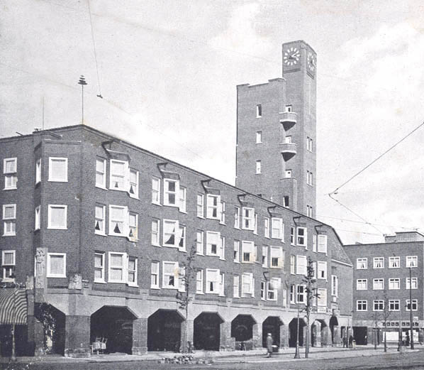
'Municipal Inferno', uitgave nº 6 van De Enschedese School.
The freedom of control.
What really fascinated me about our talk with Frans Oosterhof, was his way of talking about the freedom of control. When everything is made by hand, you lose control. Every item gets unique.
I think that is the reason, when I go down in the basement at school, I feel like going to heaven. When I enter the basement, I lose all control and works from a great passion in silkscreen and letterpress. I let stuff happen.
I love the physicality and the diversity in every work. You may have one starting point, one stencil, but end up with 10 individual works.
I am a control freak but love the freedom of control.
[by Kristine Andersen]
from basics
This “primitive” design when no computers were in use took me to the beginnings of poster design that plays such a huge role in modern world . As to understand what is happening now it is good to have a look in the past. I took myself to the very beginning of polish poster design as this country is very famous for.
I picked one of the most known poster designer Tadeusz Gronowski that reminded me of the words said by Frans Oosterhof that skills play large part of self development and can lead you to the unexpected results. It is also a way to explore new fields of creating that may affect your work later on.So, i chose him as an example to show that innovation , new skills and experimenting resulted in posters with new light and fresh background for innovative design.
“Instead of merely adapting his painterly style to the poster format, he sees in it the opportunity to create something new, indeed a new form of artistic expression. He is one of the first artists to consciously integrate the typography with the illustration and instead of choosing the obvious he offers the viewer a different look into the subject, often displaying a disposition for the light and the humorous which endeared him to the viewers.”
For more examples of early poster designs

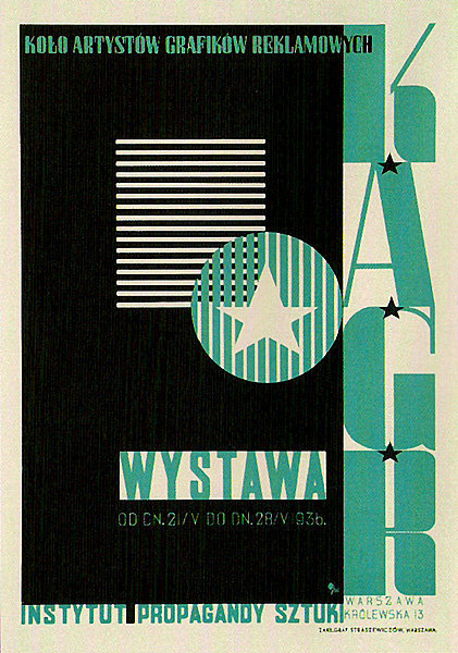
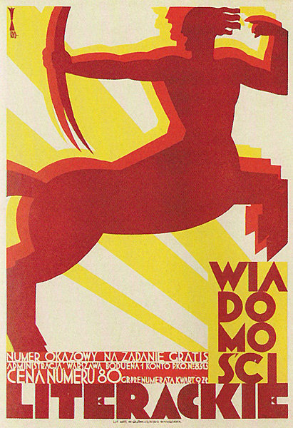

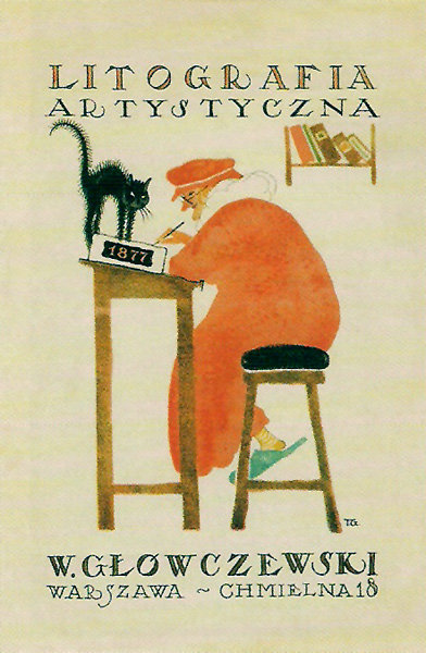
[by Agnieszka Zimolag]
The secrets of the Basic Year
Frans Oosterhof is not only the key figure behind the Enschedese school, but also behind us: the basic year. So what are the secrets of the fist year study of Rietveld?
The year is there to tease us, to turn things upside down, so that at one point, after being troubled, we notice that actually it works, we can do it! We have confidence and means!
Also the January project is already a tradition to shake the dust of the christmas holidays back home from our shoulders. I was amazed by the stories of knocking down all the walls of the third floor and people from one class flying naked in the sealing of the school.
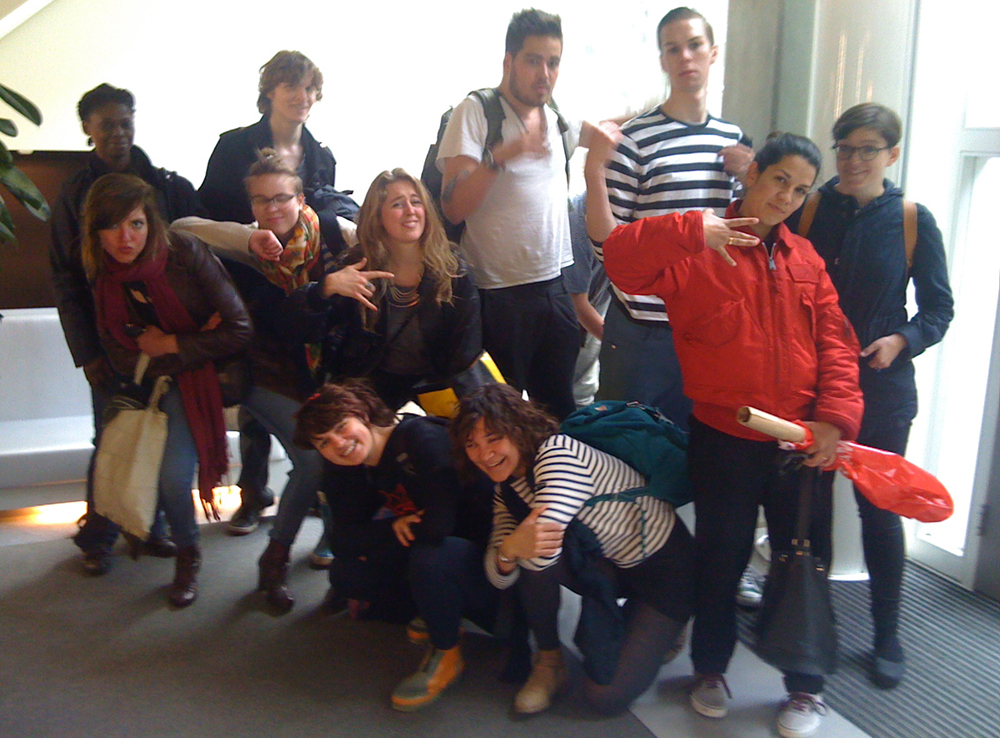
The groups are made with intuition, but carefully thought. First thing, to get the biggest possible mix of age, gender and nationality together. We also heard they look at our pictures, what attitude the face signals, how do the names sound together. It’s all part of the big plan!
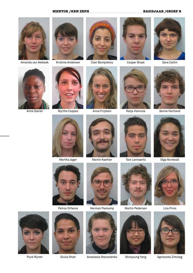
Group-B Basic year 2010/11
How did we all get together? It is not a coincidence!
(by Katja Hannula)
Enschedese School
ft Renaldo and The Loaf
Enschedese School could be considered as a movement that’s similar to Fluxus, Dada, and the Nul-beweging, but according to Frans Oosterhof it’s not considerable as something that we should describe as a recognizable style.
According to the music that Frans Oosterhof played, and the things that he did reminded me of a band called: Renaldo and The Loaf. The band made lyrics that we could describe as: disorientating, hilarious, ungraspable, and ´it´ does not mock certain things and is also not considered as anarchistic, but maybe more nihilistic by denying that:
A. There is no style connected to them
B. Playing around creates a fundamental or essential work
C. Experimental, and considerable as avantgarde
Most strong connection to this non-movement [Enschedese School] is Fluxus:
A. It is not a movement or a style
B. Intermedia
George brecht considered it as ‘the smallest unit of a situation’ and i could also conclude that some fluxus-art-works could be overlooked as a art work [Duchamp’s Fountain, Manzoni’s feces etc.]
Conclusion is:
it was no movement + it did had characteristic qualities of other movements = a statement without belonging to something.
(by Petros Orfanos)
Personal Strength
On Thursday we met Frans Oosterf, a retired teacher of Rietveld Academie and a former founder of the Enschedese School. Within a couple of hours he explained to us how the movement emerged in the late 1970’s in the small town of Enschedese where some art students denied to specialize and decided to make a second foundation year to experiment more with their creative ideas using a variety of media that they chose for themselves. It wasn’t until the next year where the same people decided to move all together in a communal studio space, working in a collective way with their teachers and publishing magazines and vinyl’s of their songs and artworks. The Enschedese school lasted for several years as an independent art movement using reproducing techniques managed to send their Art by post to their subscriber within using comical elements and repetitive patterns.
Personally I admire truly their revolutionary spirit and I wish that I would one day find myself in the position of doing something similar.
(by Claire Bamplekou)
Is it possible to be ‘style less’
Frans Oosterhof said that he once promised to be and remain style less.
Don’t get me wrong I was amazed and very much inspired by this man, but still I wonder if it is possible to avoid a certain style.
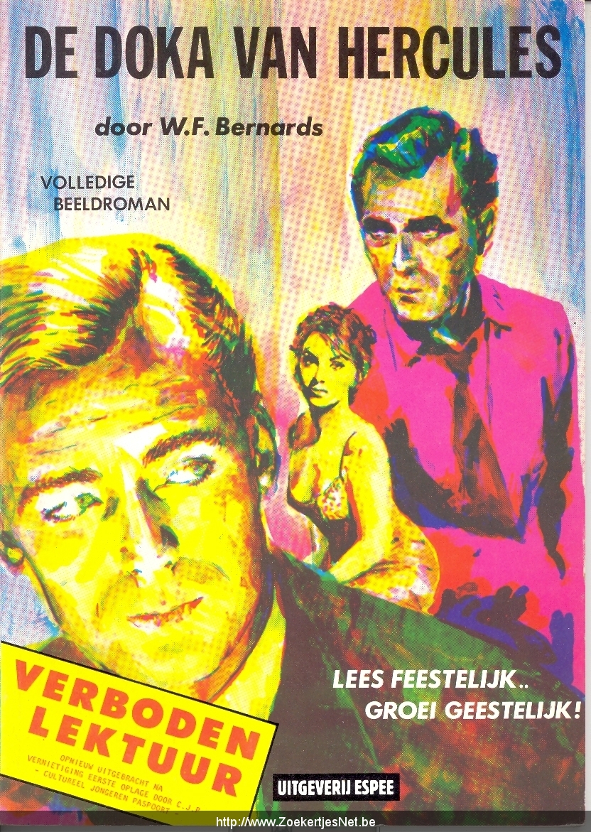
I do understand that he meant that he and the other members of the Enschedese School didn’t choose one medium to reveal their thoughts, but still it made me think of how and if it is possible, to escape from any style at all. When I looked at the work of the Enschedese School I still detected a certain overall style, I do not already want to say that that’s a bad thing. If we see for example the song ‘van Agt Casanova‘ and the ‘fake stamps‘ and the strip of ‘de Doka van Hercules’ but also in the painted crockery I sense the same kind of spirit, the same kind of style. Al these works mock certain settled persons or phenomenons in society.
Actually now that I’m thinking about it more and more, I do not think that an artist should be style less at all. Of course he or she should try a lot of different media and should not be bound to certain usages. But every time an artist expresses his or her ‘obsession*’ derived from the outside world and every time it is an obsession of the same person (or group), that is creating an overall ‘style’. Besides this (visual)artists have a strong visual intuition, I don’t think we (maybe this sounds arrogant) are able to escape from that! Of course we can make it as wide as possible, but making it to wide would also implicate a kind of indifference, a complete commonplace for an artist.
What I mean by an obsession is a kind of affection or unease about something in the outside world that inspires to make a work of art. The way such an obsession comes to us, how we interpret them or express them is I think quite personal (groups only arise from sympathizers, by whom this personal process works quite a bit the same, it’s not likely that you’ll find yourself in a group with people whose thinking process you don’t understand at all.)
(by Liza Prins)
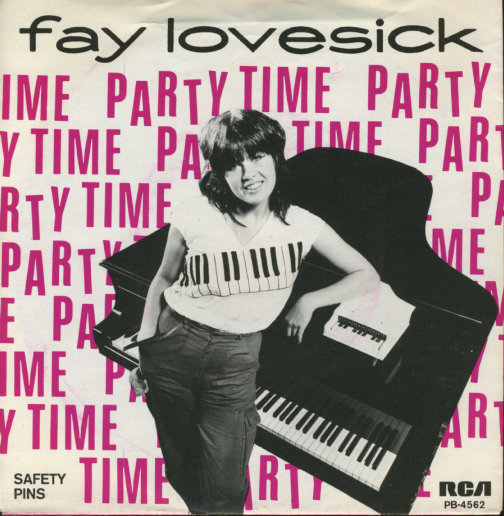
Loving it to Death
On the cover of an EP a girl stands in front of a piano. She is wearing a t-shirt with piano keys on it. Standing on the piano is a tiny piano. On the back cover there is a little biography explaining in a very joyless and matter-of-fact way that this girl likes playing piano and makes songs. There’s a certain insanity subtly presented here that’s hard to grasp and easy to miss. Even though the creations done by Frans Oosterhof and the rest of the Enschedesche School were too sharp-witted to simply call them parodies, they certainly expose the apparent clumsiness of popular media in the Netherlands of the seventies. The media and objects created by the Enschedesche School seem to, in a subdued kind of way, reflect the madness of the world that surrounded them. I believe the Enschedesche School were cynically honouring these stupid media by loving it’s form to death.Personally, the meeting with Frans Oosterhof reminded me of the joy and excitement of creating things/media/objects/situations/ART according to one’s own vision and of the significance of Doing It Yourself.
Besides “Van Agt Casanova” it is difficult to find any music by Enschedesche School’s 1000 Idioten label online. However here’s the chords of one of their releases so you can play it yourself!
[by Senne Hartland]
maybe I’m in time!
Without being pretentious, last Friday gave me the impression to understand a bit of my contemporary time. Frans Oosterhof told about his studies in art academy and his years in the Enschedese School movement in the 70s/80s’. The Gerrit Rietveld Academie follows the same way of thinking, revolutionary at the time and strongly contemporary nowadays. Frans also reorganized the Rietveld’s Basic Year, which he did several times going against the idea of taking a specific direction in a department. To hear the foundations of the Foundation was revealing and encouraging: the Enschedese School is just one of the influences that stays at the bottom of a contemporary way of teaching and learning. Frans says that in others academies “art” is not possible to explain, they teach every technique, but not how to be an artist because they don’t know what is the magic potion for that. He believes that art or not we should understand nothing around us, without right and wrong and stupid school critics, we need to surprise ourselves. We don’t need to choose a direction because we should say what we want, how we want and again swimming in millions of possibility. No prejudices about media and contents ,of course, and feel the education as moment of tryout and living together.
I felt part of something bigger, also if I’m not supposed to understand and only living making art accidentally etc… I had the real intuition to be part of a cultural machine working to produce a precise thought. I know we will write the history of today in the future, but I felt perfectly in time to perceive by intuition the reason to stay exactly where I am.
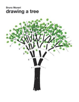
Drawing a tree, by Bruno Munari
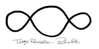
the Third Paradise, by Michelangelo Pistoletto
[by Sara Cattin]
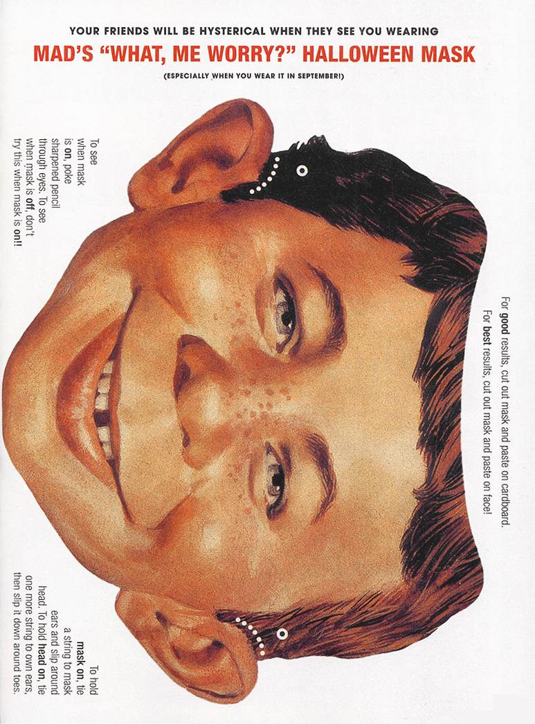
MAD = BAD = BETTER
Taking part of some of the treasures of the Enschedese School’s vast production; I started thinking about MAD. I always loved the magazine when I was a kid, and my parents had some really old ones at home. When I saw all the printed media and witty designs in combination with mind-bending but tempting objects, it felt like the MAD Magazine had entered another sphere and all of Harvey Kurtzman’s old drawings and perverted fantasies came to life, walking and talking just as lifelike as Oosterhof in front of me. At one point I got really attached to the little brush-bird (the one made with pencils and grey wings), and I was sure I’d seen it before as a sketch. Searching my mind and especially old MAD archives, I couldn’t find the original source I was looking for. But it was satisfying enough, because playing around with it confirmed to me that if you put your mind to it, visions/dreams/unhealthy fantasies can come true. Even if it doesn’t make any sense at all to yourself or your audience. (If you print this and wear it at school I’ll give you an ice cream.)
[by Olga Nordwall]
De kopjes van Frans Oosterhof

Frans Oosterhof heeft tijdens zijn verblijf aan de Enschedese-school een groot project gehad met al bestaand ziekenhuis kopjes. deze vijfhonderd kopjes en schotels verfde hij subtiel met kleine verf spatjes en druipers.
Wat ik kon zien bij de kopjes die hij mee had genomen, leek het vaak op de kring, die je krijgt als je koffie morst, maar dan gekleurd. Dit was zo subtiel gedaan dat de schoonmaakster van Frans een paar jaar geleden een deel van deze kopjes die hij nog bezat heeft weggegooid. de schoonmaakster dacht namelijk dat het mengbekertjes waren die niet meer schoon te krijgen waren. Zelf zag ik ook eerst niet wat er zo bijzonder was aan deze kopjes, maar juist omdat het zo subtiel gedaan is, zijn de kop en schotel het project van Frans Oosterhof dat mij het meest bij gebleven is.
[by Casper Braat]


