Remembering names is impossible for me – it has always been and probably always will be. That is why I was so thrilled about the poster-design for an exhibition about Edward Kienholz.
poster design by Wim Crouwel / art work by Florian Maurersberger
When I was walking through the rooms of the Stedelijk-Museum I was overwhelmed and not in a positive way. In There was such a similarity for me in everything that my eyes were jumping from one design to the next and they couldn’t rest because it was so simple that there was nothing I could get a grip on. That was the moment when I got my first doubts about the concept of Crouwel’s design. I wasn’t really sure if his minimized way of design is enough to translate to people what the text or exhibition is about.
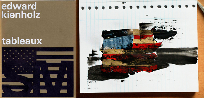
But then I stood in front of the poster for Edward Kienholz. The name didn’t ring a bell in my head. Maybe there was a light glimmer that I heard this name before. But through the way Crouwel designed the poster I realized that I knew the artist. I went to an exhibition about his work in a Gallery in Berlin in 2009. A lot of his works are dealing about different social issues during the time that he was living in(1927-1991) but he also worked with problems that are still current for example the superficiality of the metropolitan society. What impressed me the most about him was how he emphasized his critical point of view just by showing different situations from your every-day-life and without pointing out the problem too obvious.
After seeing this poster from Wim Crouwel I had to admit that sometimes it just needs a dark colored scale and a very clear positioned American flag to give an impression what the artist is about.
So I had to let go of some of my doubts about his way of design.