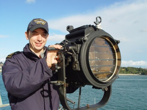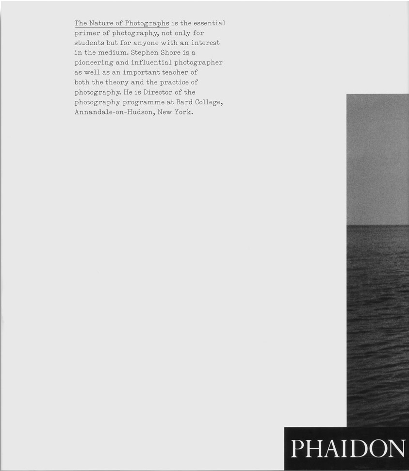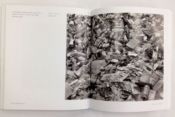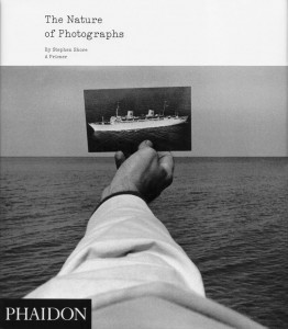
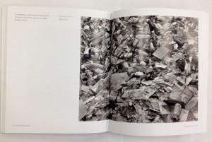
I choose this book because I like how the front cover looks. In the upper left corner, there are small letters saying ‘The Nature of Photographs’, but the main part is the picture: one of the pictures described in the book.
It shows a man’s hand, firmly holding one photo against the horizon. It’s a photo of a white ferry, slowly proceeding on black waves. The man’s sleeve is also white, and you can see rough wrinkles on it.
The sea is covered with wavelets, and light from them is diffused into the sky. The sky is of a lighter tone than the ocean itself, and there is a belt of white on top of everything …as if responding to the dark colors below. It creates a comfortable rhythm of black, gray and white.
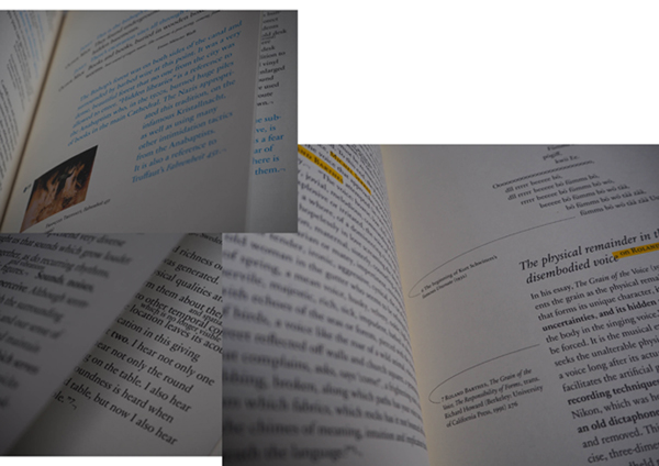
One characteristic of this book is that the cover does not just place the picture of a hand among other elements composing it (to have a glimpse of what is inside the book, as most of pages are mainly occupied by photographs). Instead, the designer uses the photo as a base of his design: a black square of “PHAIDON” comes in lower- left corner, in response to the ferry-picture. Title, same as all of the text inside, is written in a ‘typewriter’ font. In this way the text becomes very subtle, like a transparent brook running through all the pages, sometimes long but sometimes as short as 3 lines.
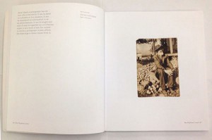
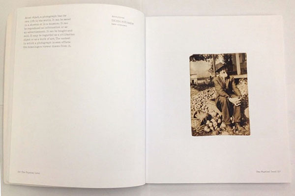
"Old man with apples", a small, anonymously taken picture is accompanied by a text concentrated in upper-left corner, while huge pictures with a lot of details often have very little text
All of this indicates that the designer tries to show the pictures in balanced way with the text.
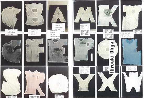
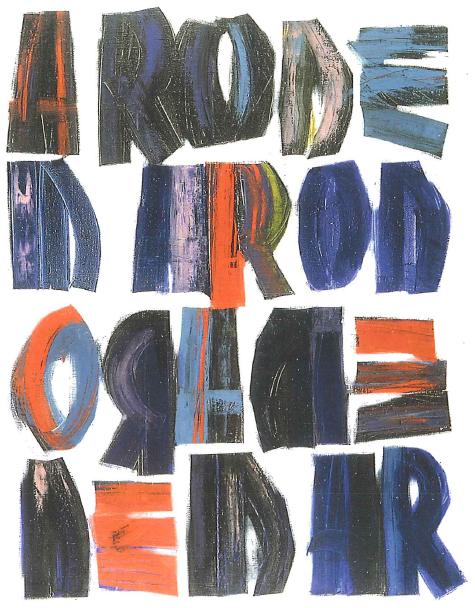
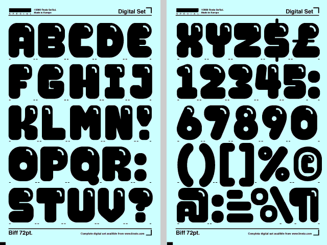
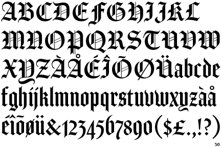
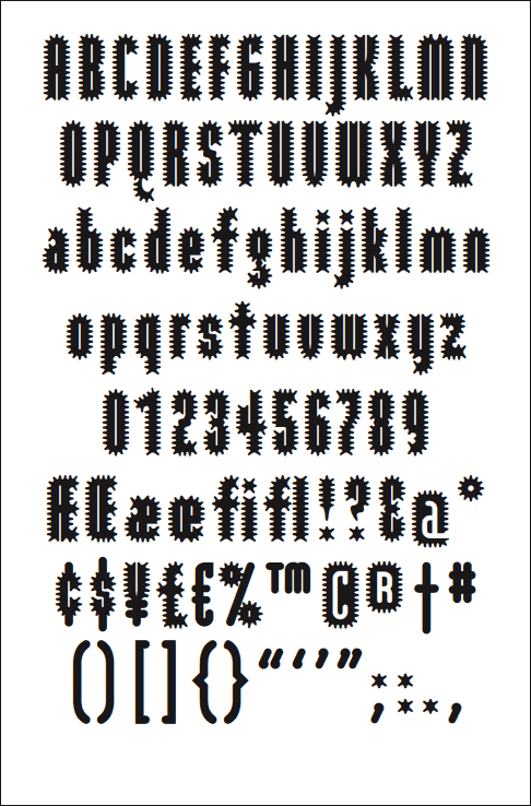
1. Importance of font-design
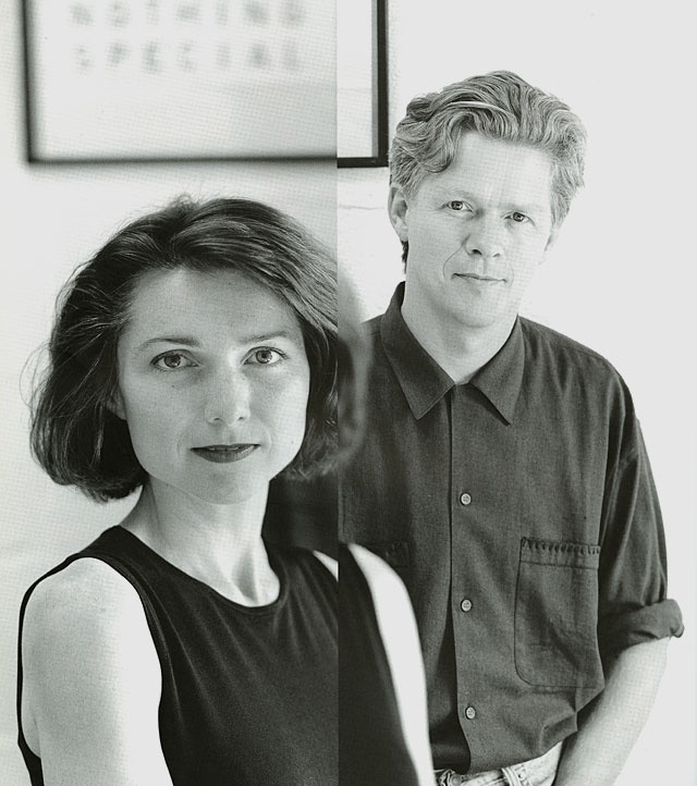
The names of designers of the book are Henrik Kubel and Scott Williams. The two established a London-based design studio A2/SW/HK in the year 2000, two years after meeting each others as post-graduate students at the Royal College of Art, London. A2/SW/HK is now a member of ‘Alliance Graphique Internationale’, AGI, which consists of 440 influential graphic designers.
In 2010, they launched A2-Type, a new type foundry with a selection of 15 fonts specially created for print, screen and environment. It releases and distributes over a decade’s worth of specially crafted typefaces, ranging from serifs and sans serifs to handwritten types, angular types and ornaments.
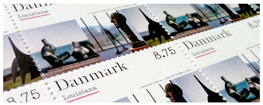
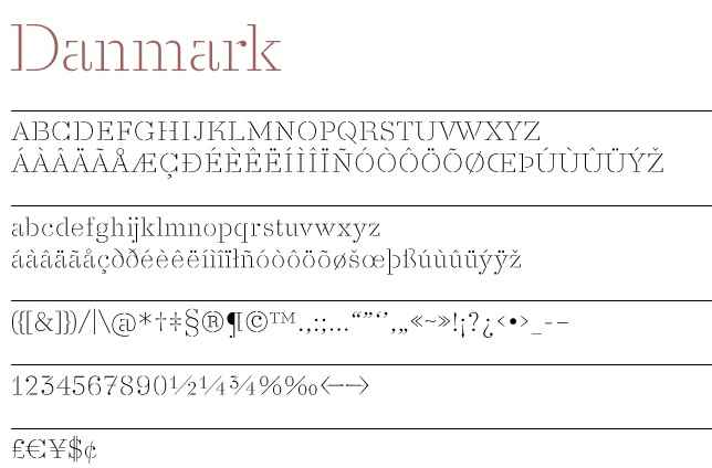
The two designers have a rule to create a new typeface for each of their new works, whether it is a book-cover, a brand identity or a signage for an exhibition. For example, a thin font that reminds you of cutting-lines of stamps, because its lines are hardly attached to each other, is called “Danmark”: it was used for a set of stamps designed by the duo.
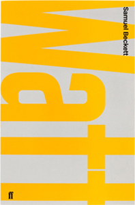
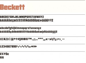
Another example is “Beckett”, which was made for series of books by Samuel Beckett, an Irish avant-garde novelist, poet, and theatre-director.
2. How do they work?
A2/SW/HK have a conceptual approach. Their design ranges across various media including print, screen and interiors. (here, on their website, you can see a huge portfolio consisting of almost 50 works.)
From an interview with ‘Eye‘, an international magazine on graphic design, we can get an idea of their way of working on projects.
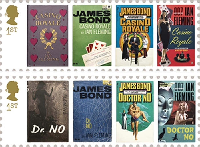
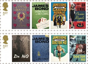
As eye magazine declares, their attention for the materials, process and artifacts becomes clear as soon as you enter A2’s studio, located on the third floor of an old textile warehouse in Hoxton, London,. In case of stamp series for the first of James Bond books Casino Royale, it took the designers 2 months to research and retrieve every single edition that was published over last 50 years.
It is interesting to see how the style of illustration changes in accordance to the visual cultiure of the time.
3. Metro
The process of creating a font includes testing various typefaces and weights with one another, applying them across point sizes, and making sure it “looks right”, as Scott Williams mentioned in an interview with Aperture.
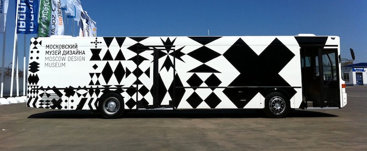
A project that shows up on top of their current website is “Moscow Sans” – a font designed exclusively for Moscow Department of Transport, DOT. The duo art-directed and designed the font in collaboration with Margaret Calvert, type and pictogram consultant, and Ilya Ruderman concerning design of Cyrillic script. The system of a custom typeface in 4 different weights, along with unique pictograms, is being applied to all the stations of Moscow Metro within this year. Compared to the gorgeous interiors of Moscow Metro, the signs look very bright and have a lot of difference in style from the station building. However, there is nothing wrong in the most important piece of information standing out from its context, and thinking of a rush in metro, I think A2 solved the complicated metro-system in a clear way. A straightforward, bold font, but at the same time round and warm, is easy to read; the station’s sign is written both in Russian and English, with one number and one color that has been assigned to all the 12 stations of Moscow Metro.
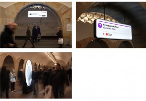
Moscow is a capital city, and they say Moscow Metro is world’s 6th longest and the most crowded metro outside Asia. When there are more people and the lines are more complicated, it is essential to see what you really need in a short time: what station is it, which line. Therefore, I think design by Henrik & Scott is very user-friendly, displaying information in a plane, sensible way.
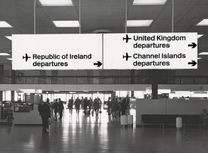
4. New Rail Alphabet
Another typeface which was designed by Henrik Kubel is New Rail Alphabet, which is a revision of the British Rail alphabet, used in UK’s National Health Hospitals, rail stations of Denmark and Britain, and BAA airports. Margaret Calvert, designer of the original alphabet, used to teach Hendrik in his younger days, and therefore, when adjusting it for digitalization, Kubel was able to link the font to handwriting of Margaret Calvert. Two points were altered in the original: one is its height, which used to be taller before, as slim tall fonts were considered to be fashionable when it became first in use in the 60s.
5. A thought-through book
The more I read about the two designers, the more I understood that the large part of the body of their work is font-design. Sometimes they only have a name of a certain brand, so they find the best way to communicate with those letters that they have.
Returning to the book, (about which I haven’t talked so much .. its font is indeed designed also specially for this book, but as photographs are playing main role in it, text becomes more airy – different from letters in logos, that have a lot of visual layers.)
I think each photograph is shown, or “exhibited”, in a very thought-through way. Reading through it, I feel like it is a photographic gallery, where not only a picture itself, but the white space around it and size are taken into consideration. It is hard to find pages where pictures are placed in the same way.
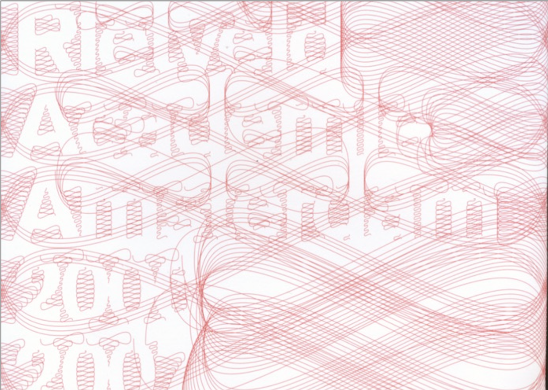
Rietveld library catalog no : shor 2
 * Book no. 757.3-fri-1