As a part of a research I focused on the design of a magazine. How a layout can interfere with a certain content ? and how a layout could be a good understanding of the content itself ? I started my research by choosing a magazine. A magazine which inspired me at the first look. Thought a mere book wasn’t interesting me. I chose to work on an edition magazine. I focused on the Flash art magazine issue 312.
At first, what’s Flash art magazine and why it is created ?
A little bit history about flash art magazine:
Flash Art is a bimonthly magazine focused on contemporary art. It was founded in Rome in 1967 by Italian publisher and art critic Giancarlo Politi. The magazine has been described as “the confident, international journal of European and North American contemporary art ». It is a magazine and publishing platform dedicated to thinking about contemporary art, exploring the evolving cultural landscape through the work of leading artists, writers, curators and others.
The next question following was why I chose this magazine? Why not an other one ?
—> Basic description and first look. How it’s look like ?

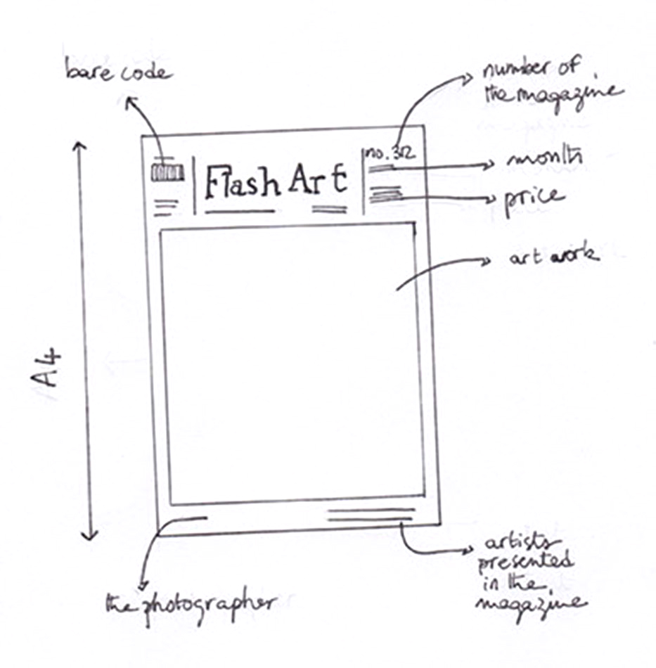
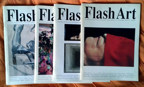
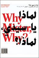
At first I chose this magazine for its cover. It attracted me by the colours of the artwork put in the middle of the page but also by the white square surrounding it. At first sight, the magazine looked minimal with a straight and regular layout. In the first pages of the magazine you have art and luxury adverts. After those pages you find a summary.
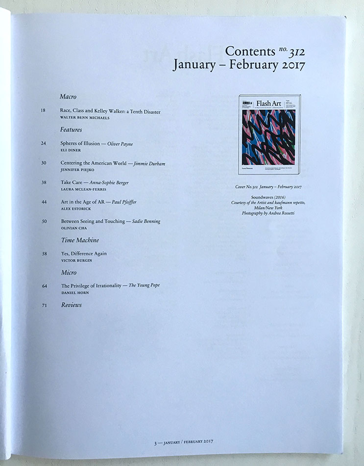
The magazine is separated in five parts : – Macro, – Features, -Time machine, -Micro and -Reviews. In those parts you have different topics, artworks and interviews presented.
In the middle of the magazine you can find different advertising and publicity about museums and artworks.
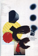
Concerning the layout, it is presented like one page of text, one image.
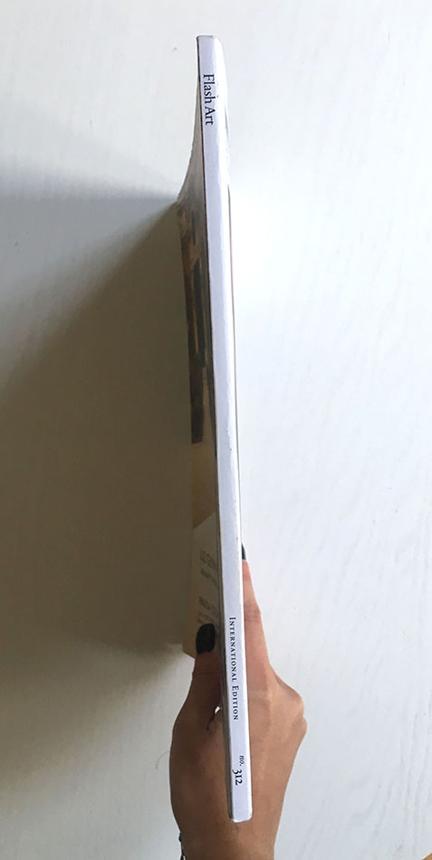
The text are laid out in columns. Often with three columns. The font is the same in all the magazine but the size changes for titles and subtitles. They used newspaper paper for the hole magazine. The cover is smooth, with a title in front and on the top, then an image of an artwork all over the page. On the right side you have the number of the magazine, the month of it’s publication and the price in the different countries.The binding is basic, a glued square which keeps the pages together.
After the description part of the design, let’s talk about the interference of it with the content:
First thing to say. I focused on the design of the magazine and not on the content.
We know the magazine is an art international magazine. The content then speaks of art and explains artworks. As I explained previously, the layout is quite simple and straight forward.That is why the design gave place to a good understanding of the content because it is clear. The texts are clear and the images printed big. Different layout for images and texts takes place in the magazine which differs depending on the content of the article. A question came to me about this straight and basic layout. Is it the same for all the number of the magazine ? Is it a choice to work with the same layout ?
By conducting my research, I saw that flash art have several designers for different number of the magazine. In one of the numbers that I chose, the designer Samuele Angellotti, has his proper label : Hansel Grotesque. A website was created since 2015 but nothing is online yet: http://www.hansel-grotesque.it/. His work is about identity and graphic design. It is really different compared to the layout in Flash art. I put the link of his personal blog:http://www.samueleanzellotti.it/ . It shows that Samuele Angellotti works with difference brands, for example Jin Jin Island. He was the art director and the graphic designer in 2015. The layout of his website is interesting and interactive for the viewer. The projects are well understood, represent by that ‘gif’ logo of the project on the black background.
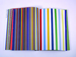
Let’s see if I can say more about the layout and designers in different number of the magazine. I’ve made the choice to focus on three different numbers. In all of the three, the summary changes. They are more or less different categories, it obviously refers to the content itself. I noticed similarities in the layout.The advertising at the beginning in the magazine are the same, the font and the size of the text is the same. The review part is not changing. Indeed, in one magazine the layout change by adding different papers. In one we have scans of newspapers. A glossy paper is here to explain a project of an artist. The text has a different layout : a grey square surrounded the text.
For each artist presentation and article the design changes with colour of the square surrounding the text and the quality of the paper. In an other number, we have different colours of paper : light blue, light pink and light yellow. Two columns of text and the same font again. Sometimes the colour of the text changes to emphasize the content. The designer is again not the same than the two other. In this issue the graphic designer is Lilia Di Bella, who works as a graphic designer for the platform “Archive Books”. It is a platform for debates and cultural research located in Berlin. They are engaged on difference activities about publishing and exhibition making. http://www.archivebooks.org/. The design of the website is clear and clean. It shows artists publications. It is different compare the website of Flash art magazine:https://www.flashartonline.com/ which are more commercial and linear. In the principal page, artists projects are presented. It is possible to see the magazine of the month. Also find the previous number of the magazine and buy the current magazine.
I tried to search for an older version of flash art magazine to see if the layout was the same and if not what were the most important changes. I find one of 2006 and just on the cover we saw differences . I imagine the layout was different inside of the magazine.
After investigating about the layout of this magazine, I think that it was the cover of the magazine that attracted me more than the layout itself. The flash art magazine use the same graphic rhythm to have an entity and his own identity next to other popular magazines. The layouts are clear, I think the content is the most important thing. It is a straight pattern which is repeated monthly in these magazines. They wanted to achieve a universal identity with international content for an open reader.
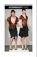
Flash Art, designed by Samuele Angellotti, Rietveld Library Catalog no: magazine