Skip to Content Skip to Search Go to Top Navigation Go to Side Menu


"political" Tag


Bauhaus Tea


Wednesday, October 24, 2018

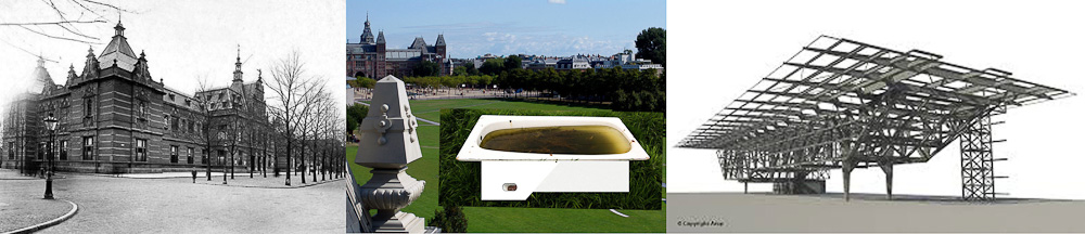
When I visited the Stedelijk Base, I looked at a very diverse range of objects. From colorful Kirchner paintings to the well-known Eams chair, but Christian Dell’s tea infuser from the Bauhaus collection particularly drew my attention for its small size and simplistic appearance. It is made from silver-plated brass and the part where you hold the object, the varnish is slightly worn off and damaged which gives it a precious look.

While I was looking for other objects to potentially  base my research on, I started noticing that while people walked around, the tea infuser was overlooked a lot by everyone, so I decided to stick with the object.

Christian Dell (1893 - 1974) tea infuser
Christian Dell (1893 - 1974) tea infuser (1924) at Stedelijk Base

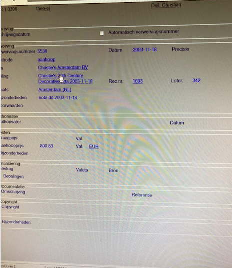
I started by doing some initial research while I was still at the Stedelijk Museum. At the library archive I asked if they could tell me when and where the tea infuser was purchased by the museum, I found out it was purchased from Christie’s Amsterdam in 2003.

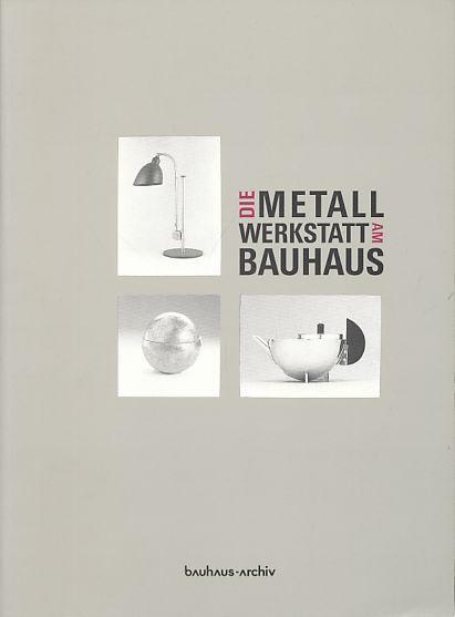
In their archive they also had a book called Metallwerkstatt und Bauhaus edited by Klaus Weber, published by Bauhaus-Archiv Berlin. A 332 page book that is specifically about the history of the metal workshop from the Bauhaus. Unfortunately it was in German, so I could not use any information this book was providing.

When I got to the Rietveld library I found several books regarding Bauhaus. The metal workshop was only mentioned in the bigger and general editions. But I did not find any specific information about this tea infuser nor was there much information about Christian Dell himself. So I started my research online.

Initially a lot of auction websites appeared where I could buy the tea infuser myself, but when I changed and added other keywords in my search I finally found a lot more information about Christian Dell.

Christian Dell worked as a foreman of the metal workshop at the Bauhaus in Weimar between 1922 to 1925. He was hired after Willy Schabbon and Alfred Kopka, who lasted there for a short time. When Christian Dell was hired, the metal workshop gained some needed stability. Still, not much is known about Christian Dell.  Only that Christian Dell was a very experienced silversmith and a skilled teacher.

Prior to the War he was at the Wiener Werkstätte in Vienna, producing metal tableware in an avant-garde and geometric style. At the Bauhaus metal workshop Dell’s work was completely absent of decoration and concentrated on the innovative use of geometric forms. He was mostly known for his highly innovative designs of lamps. So the tea infuser made me wonder how it came about that Christian Dell was the one who designed it. I fantasized about that his idea and goal were to give another light to the transparency of water.  But when I thought of the principles of Bauhaus I realized it probably meant much more than that.

Christian Dell, tea infuser at MoMa Christian Dell, tea infuser at MoMa

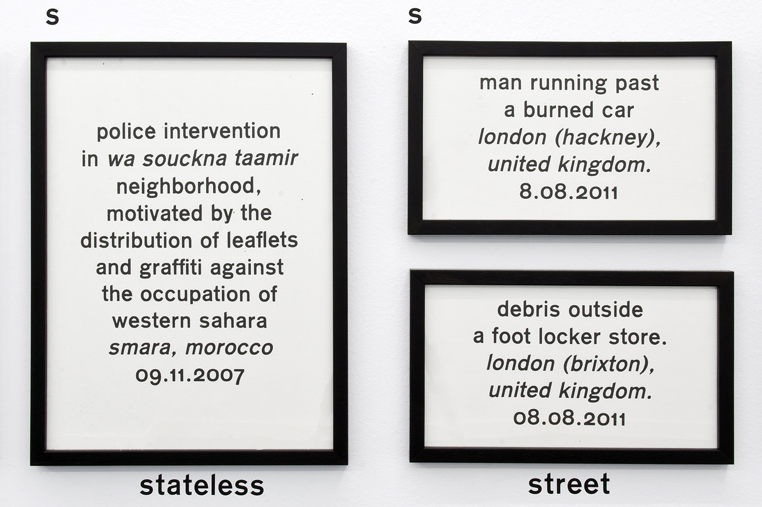
Many questions began to flood my head. At first, I contemplated about the fact that tea was normally something for aristocrats in the times of colonialism when it was imported and which resulted in it being partially westernized. The fact that it was meant for the upper class made me aware of the obvious contradiction with the Bauhaus ideals. Besides that, I also found it very interesting how this small tea infuser brought me to think of big historic moments and political affairs. Maybe more so than the paintings shown by Piet Mondriaan and such. This partially because it is so self-evident and quite easy to integrate the object into your own life. Unlike a painting where you are immediately confronted with aesthetic issues and has no real  useful function in daily life.
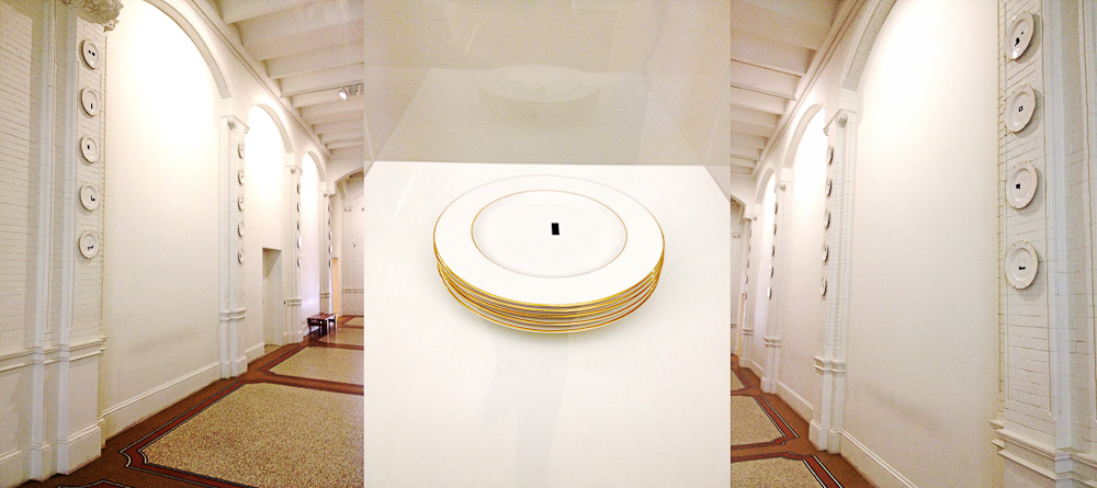
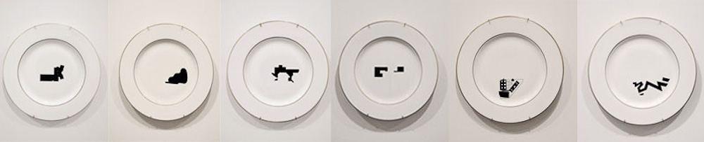
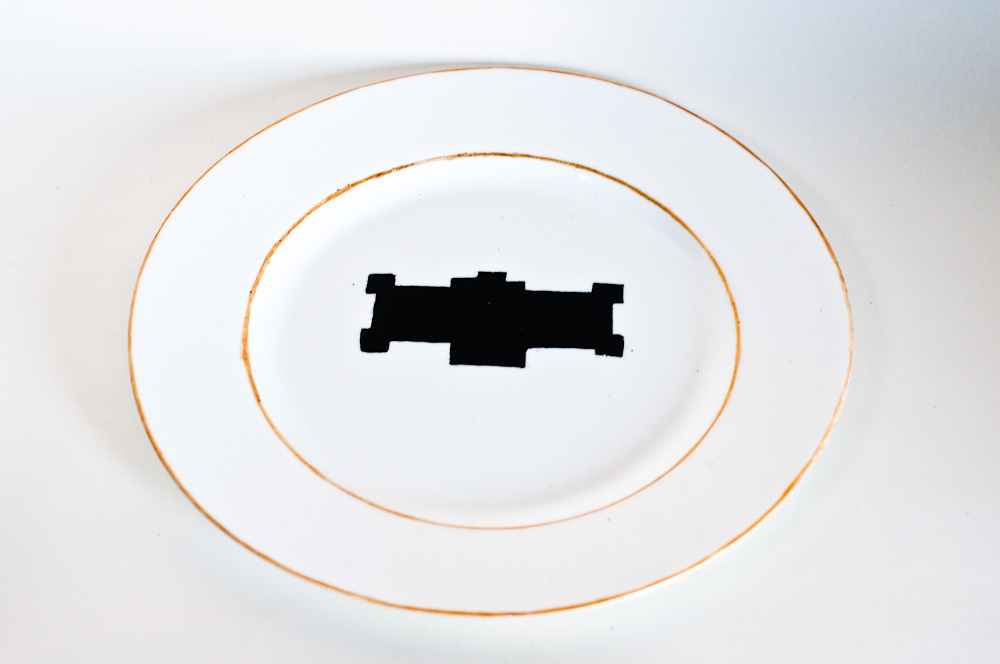
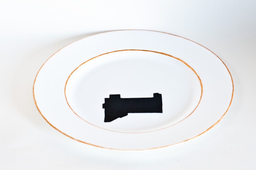
(more…)

A Photograph Revolution


Sunday, October 19, 2014


Among all of the recent books in the Rietveld Academie library, Boy Politics particularly appealed to me for its very peculiar aspect and design. It is a bit damaged and looks very breakable which gives it a feeling of preciousness, emphasized by the fact that it is a unique copy. At first I had decided to go see what it looked like because the title was very evocative to me and seemed like a topic I would want to read about. I am interested in the theme of gender and particularly male domination in different cultures and have often questioned it in my work last year in my art school in France. The boy figure, what is expected from a boy and how deeply these expectations and behaviors are attached to a culture and collective unconsciousness.

This book was my first glimpse of the tip of the iceberg that are Marc Roig Blesa and Rogier Delfos’ collaborative projects.


BoyPolitics_h900

Boy Politics, Marc Roig Blesa and Rogier Delfos


Marc Roig Blesa and Rogier Delfos are two former students of the Gerrit Rietveld Academie. Both graduated in 2009 ; Blesa from VAV and Delfos from graphic design. They have been working together ever since between Barcelona and Amsterdam. From 14/05/13 to 07/06/13 they held an exhibition at Rietveld library where they exposed a selection of Blesa’s secondhand books in a window display, opened at a certain page. It was a mute and powerful visual essay of the figure of the boy throughout images from the 1920’s to the 1990’s. Later on, two other former students of the Academie (Anton Stuckhard and Andrea Sergio) designed Boy Politics, a book that archives this exhibition in a very efficient manner that, to my opinion, is really coherent to the way Blesa and Delfos work. Without any fuss, they encapsulated the spirit of what was the starting point of a larger project that Blesa and Delfos have been working on ever since : « Werker ».


Boypolitics1


Werker magazine is a long term project and concept that asks many questions and got more and more complex over time. There are 8 different werker projects but usually more than one edition by project.

The artists define them as « contextual publications about photography and labor that inquire into the possibility of formulating a contemporary representation of work » They are all mute analysis of a situation that they try to depict in a most objective manner as possible. They are often the following or addition to an event (exhibition, lecture…) like for Boy Politics. Werker 2, for example, was realized for the exhibition « 1979, A Monument to Radical Instants » in the Virrena Centre de la Imatge of Barcelona (2011), dealing with the issues of daily life in crisis of working class young men. Knowing that photography is the medium that communicates best the essence of a situation, Blesa and Delfos have realized a very accurate observation of several situations.


werker2_h1000


An example of that accuracy is the « Cinema Diary » edition of Werker 6 (that you can find in San Serriffe book store, along with other Werker issues. It is « a collection of photo diaries that reflect on the current working conditions of the youth through self-representation and amateur photography. » It is the summary of a young artist’s (Matthijs Diederiks) side job at a Pathé cinema. In this small book (x) from which the cover is handwritten by Diederiks, you can find an extract of his working contract and meaningfulness in the lost time of a very boring job.


Werker is the story of how graphic design and art meet through photography (amateur photography, secondhand books images, internet pictures…) aiming to deliver a message : Images have power and that power is into the wrong hands, the people must take it back. Blesa and Delfos are indeed strongly politically engaged with revolutionary ambitions.
Let’s focus on « Werker 7 : the language of revolution ». This exhibition followed by an edition of newspaper (once with and once without image) was inspired by the words of Ariella Azoulay in a lecture she gave at the museu d’art contemporani de Barcelona in 2011 in which she did an analysis of Egypt’s revolution through images from the internet (you can find her lecture here : x). Werker 7 questions the revolutionary image, the revolutionary language, the role of mass-media in all this and the function carried out by photography in construction of a global revolutionary language. All the images chosen for that project were found on the internet.


Werker7_index_w1500

Werker7_index_zoom1_w1500


Werker takes its name from the « Worker Photography Movement » :  a group of amateur photographers that appeared in Germany in the 1920’s, following the steps of the first socialist photography experiences in the USSR which extended into the rest of Europe, the USA and Japan. The first group of amateur photographers to use the camera as a tool to fight class-struggle. When I found out about this origin, the work of Blesa and Delfos came clear to me to its full extent. Werker 3 is a « political kitchen calendar » developed within the « grand domestic revolution – user’s manual », a long term living research initiated by casco office for art, design and theory in Utrecht. it is a call for students, artists, domestic workers (and so on) to contribute to the collective gathering of materials. A call for amateur photography as an observation of domestic space. The assignment was « Think politically of your domestic space and contribute to Werker 3 ».


Werker-3_h900


Finally, I found in the « Cinema Diary » an extract from the book Der Arbeiter-Fotograf from Willi Münzenberg (1931) that I thought was very relevant to Delfos and Blesa’s approach, aims and tasks.

« Photography has become an indispensable and outstanding means of propaganda in the revolutionary class struggle. (…) For an illustrated book is easier to read (…) than the lead article of a political daily. Photography works on the human eye (…) the bourgeoisie caters for the mental laziness of the masses and also makes a lot of money. (…) Much more important is the political effect (…) a skillful editor can falsify every photograph into its opposite and can influence the politically naive reader. (…) The revolutionary workers of all countries have to realize these facts very clearly. They have to fight the class enemy with all means. Just as the workers of the Soviet Union have learned to make their own machine-tools (…) the proletarian amateur photographers have to learn to master the camera and to use it correctly in the international class struggle. »

Delfos and Blesa’s aim and ambition : an anti-propaganda revolution guided by photography.

Rietveld library catalog no : roi 1

Massa


Wednesday, April 2, 2014

The meaning of political issues in modern society is overwhelming, and the policy influences on Art as it has never done before. As far as we are able to refer our reality, that we have now, to the images of the past, we can clearly understand our society’s statement. De Stijl by 1.1928.8 “Wendingen Beeldstatistiek / Sociologische Grafiek” depicts a lot of political and sociological drawings mostly based on issues of the beginning of the 20th century. Supposedly, trying to fight everything old and well-established. The in that issue well-presented artists, show without hesitation a wide range of problems, by using sociology and statistics as a way of inspiration.

What i like the most about them is their honesty to themselves and the impudent way of story-telling. Also the graphics themselves are impressive a lot more than modern one’s as i think they creates their own value. Everything what i mentioned we can fully see in Franz Wilhelm Seiwert work “Massa” . Of course something will be still missing, and that’s why i like it the most, because being truly political, it stays neutral in a certain way. The word “massa” basically means “crowd” and what we see in the picture it is a crowd, but what is crowd seen as a political issue? 1922~Masse_(Franz_W_Seiwert) Massa becomes more than just a synonym, it gives it much deeper meaning, you don’t need leaders, bombs etc. to show the initial blind and violent power in the world, when people become pixels, being strong and weak at the same time. It is also amazing example how title can develop the whole idea.

I think everything that makes it so simple and scary strikes me the most, and of course in that case it works extremely well, but I also can not help but notice the value of the other pictures in that exact issue and most of them being drawn by different artists from different countries somehow relate to each other, and that is amazing as well. have a look…

Wendingen 11-9 1930 Rijksacademie Amsterdam

the “ B A T H T U B ”


Tuesday, October 29, 2013

John Knight - Autotypes

Walking through the high white corridors in the Stedelijk Museum, you notice the colorful museum Posters on the left wall. On the opposite wall, there are four rows of five plates. Because of the white background, they do not pop out, but blend in to the surrounding. Next to a vitrine with a stack of five of the plates inside, a sign explains the artwork and the artist. The black graphical forms on the plates, with a gold-trim, are parts of blueprints. These blueprints are the recent additions to Modern and Contemporary Art Museums around the world.

The work, acquired in 2011, is titled Autotypes. The title stands for the desire to expand and to create, which fits the underlying criticism of the artist John Knight (LA, 1945) and his work. With the by mass-production created set of porcelain plates he creates an opening for a critical discussion of the changing role of the museum. Which includes serving a marketing tool for city branding within the ever-expanding spectacle of mass tourism. Because the plan of the original, historic structure are omitted, the blueprints of the additions are isolated, showing the uniformity of museum architecture.

John Knight Autotypes

The moment I looked up at the plates I was intrigued. The gold on the white ceramics looked sophisticated and slightly kitsch, but the black graphic made it modern. Which is just the way I like it, slightly kitsch with a modern touch. Before I read the text about the work, I thought about the forms. ‘What do these forms stand for? Do they tell a story? About a growth? Expansion? Are there any recognizable forms? Is there a specific order?’

So when I read in the information that they are parts of blue prints and that this is part of a debate on the additions to museums now a days, it made me think. I was standing in one of these museums that had expanded. Why did the Stedelijk change? And why did it take so long?

By asking myself these questions, I realized that John Knight had pulled me into the debate. A clever man, that John Knight.

Mysteryman

After seeing this question-raising artwork, I wanted answers. So, what is this debate John Knight is referring to really about, what role does the Stedelijk play in it and WHO is this man I have never heard of? I could not find any images of the man in question, so John Knight’s appearance remains a mystery. I do find out that he has been around in the art circuit for quite some time and that it is not easy to lay a finger on him.

He has been producing art since the late 1960s, early 70s, using existing forms and communication to reconsider the social structures and value systems that support the exchange of ideas and merchandise. He takes the art establishment as his subject of investigation. his practice unpacks conventions and codes that give art its value, using art as a platform to reflect upon larger political and economic systems. Working “in situ,” each project is based on analysis and intervention specific to the venue at hand; its aesthetic logic takes its cues from the structure of that of the gallery, museum, or other exhibition space.

Another stack of plates

I also discovered that Autotypes is a follow up work from Museotypes from 1983: sixty glazed ceramic plates with gold trim. Like he did with Autotypes, he did not represented the particular museum building by its familiar, literal image. Instead, he ironically chose the abstract configuration of the floor plan that on the plate serves as a ready-made code or symbol. In Museotypes John Knight fuses various visual but specifically non-art traditions in order to questions and revalidate contemporary art. He presents the plates as collectable items and reduces them to commercially available, limited-edition souvenirs. The museums are literally put on display, and as the artist explained, the work as a whole becomes “a representation of the museum and its role in culture”.

Bathing in art

In the last several years it has become necessary for museums to expand not simply to house their ever-growing collections, but also to stake their claim in a global tourist trade characterized by spectacle and speculation alike. But, why did the Stedelijk Museum change?

Old Stedelijk museum - Nickname Stedelijk museum - New building Stedelijk Museum

The original Stedelijk Museum was designed by A.W. Weissman in 1895 to house modern art and contemporary art. It was built in a Neo-Renaissance style
but in 2003 firemen made the museum shut down temporarily for a renovation. It lasted until September 2012 to re-open in its full glory. A new all white and glass part was added to the existing building by Benthem Crouwel Architekten. A few major changes were made with the renovation: it had created enough space to house the permanent collection in the main building and temporary exhibitions in the new part. Because of its remarkable appearance, it didn’t take long for the museum wing to get nicknamed the Bathtub. To get back to John Knight, the Stedelijk museum closed, not because of too little space for artwork, nor too little space for the public, but because of safety issues. However, in the end the expansion took care of both.


John Knight inspiredJohn Knight inspired

Put it on a plate

I wanted to do something with the information I had gathered. Firstly, the fact that Autotypes is a work that is visually as interesting as the idea behind it. Secondly, the fact that John Knight chose this medium, ceramics, to make a point. Thirdly, the fact that the work Autotypes is the extended version of Museotypes. And lastly, the fact that the Stedelijk did not really need to expand, but during the time it was closed slowly took part in Knights discussion. That is why I expanded John Knights work with three more plates. On one of the plates I drew the old floor plan of the Stedelijk museum. On another I drew the floor plan of the Stedelijk museums extension from 2012 and on one plate I did my own take: the nickname of the Stedelijk Museum. I think it is a very interesting subject, nicknames. I think in the case of John Knight, it doesn’t get deeper into the discussion. But, I do think it goes deeper in to the subject. Knights discussion talks art and tourists, but it doesn’t say anything on the people of the city where the museum expanded. A nickname would then be a symbolic gesture to the reaction and or emotions of the people living in the area.

But then again, maybe it is just me. I am an ‘Amsterdammer in heart and kidneys’ and when this huge white thing was added to the Museum square, near to where I went to school for six years, I had to process this. Apparently in this research, I started with trying to be a participant in an interesting discussion on museums and their expansions and ended up in ceramic therapy.

John Knight inspired


1000 Contemporary political posters


Monday, December 7, 2009

For this last posting I wanted to find a book wich I could connect to my other two postings. In the search system of the library I searched on the tagword ‘754.‘. Out of the hole list of search results one title popped out as ‘could be interesting’. The book was in the design category and had the title: ‘Prop Art over 1000 contemporary political posters’ . So on the cover of this book you could already find two tags of my previous posts (1000 and 754.). Political posters always try to convince you of something that the party who spread them stands for. In that way this book is also connectable to the tagwords direction and signs.

The book itself is filled with pictures of political posters, some of them in color. Most of the posters have something to do with war, or the remembrance of a war. But next to them are also posters shown about ecological movement and the women’s liberation.

754.1 -YAN-


Log in
subscribe