Skip to Content Skip to Search Go to Top Navigation Go to Side Menu


"graphic design" Tag


For those who dislike graphic design


Sunday, January 29, 2017

For those who dislike graphic design


1

December 2016, I’m at the school library. Our society is individualistic, so we take ourselves too seriously. The graphic design in here reflects that; everything should be minimalistic, aesthetic and decent all the time. There is no space for an ugly colour scheme or a freakishly curly title anymore. It’s pleasant to look at for sure, I think, but it doesn’t fascinate me. I mean, what stories do those smooth columns tell?

Today, the sky is grey and my energy is gone. Art makes me sigh because I’m so moody and I long for my bed. Unfortunately, I can’t go home and sleep, because I received a long list of books, of which I should choose one to research its design.

With a crotchety gaze, I witness a mountain of books slowly emerging on top of the reading table. I see the diligent hands of my classmates searching for a nice design, while I hear “ooh!” and “ah!”, but in my mind, I only hear “boo”. I conclude that I truly hate graphic design and try to find an acceptable book.

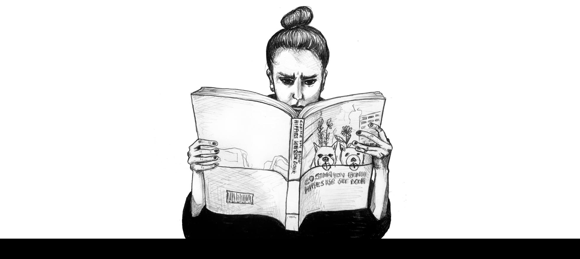
After a couple of sighs and an attempt to sleep on the ground, I find something that satisfies me; a book with self-mockery. It’s called Cosima von Bonin hippies use side door. The moment its colourful cover smiles at me from the pile of bitter looking books, I admit I don’t really hate graphic design after all. Apparently, there are still books in this library that are a little less tight.


2

January 2017, I’m in my room. Choosing a book was easy, but researching it is not. Somewhere in the back of my mind there is the fading knowledge that this assignment is important, because it’s very useful to learn about graphic design. But the rest of my mind is stuffed with other things, so I’m very much distracted.

At a certain point, my thoughts drift away to my website. I type the address in my browser and then watch it with a frown, concluding that I should make my own design, instead of using a template. With confidence, I open Photoshop, to make a visual plan of what my website should look like. But my confidence doesn’t last long. Those damned fonts! None of them seems to work! And then the background… White looks so bald, but all my alternatives look distracting. I just want my website to look cool and exciting, but that turns out to be much more complicated than I thought.

I ask Google desperately what to do, and although I find answers that make sense, it doesn’t help me get much further. Then, I realize there’s a better way to learn; I should analyse existing designs. Hey, wait… Wasn’t that the assignment for the book? I try to clear my mind of distracting thoughts and finally place the book in front of myself. Let’s see what I can learn.


cosima-von-bonin-hippies-use-side-door-49


3

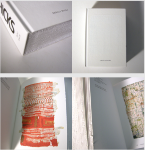
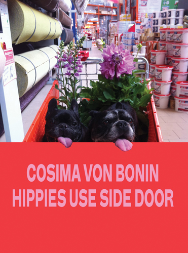
The book asks for attention by the way a big colourful photo is printed on its cover. I see a stuffed shopping cart in a lumberyard, in which two little black dogs cheerfully look at the camera lens, with their pink tongues hanging from their mouths. The image stops where the wrapper begins, except for the dogs’ tongues; they’re printed on the bright orange wrapper as well. This little graphic wink breaks the ice; it gives the book an approachable feeling. Besides that, the awfully bright colours and the simple font make the book look modern and careless.

I start to leaf through the book. The paper is thick and matte, so the pages make a pleasant, crackling sound, as they slip along my thumb. I see big photos printed in colour, big white spaces and small amounts of text. Once in a while, I get a glance of something odd, repeated through the book but always looking the same; it’s a photo on a different paper size, that looks a bit alien amongst the other pages. The frivolous artworks that are being presented and the royal use of unprinted paper make the book look even more careless. Still, the book is attractive, because of the large amount of images in comparison to the text.

From the text, I conclude the book is a catalogue, showing the latest exposition of Cosima von Bonin’s work. The book itself is designed by Yvonne Quirmbach, a graphic designer from Berlin.


4

 One of the things Google told me when I was looking for the secrets of graphic design, was how a graphic design is comparable to an outfit. Just like fashion, graphic design is a language that is being used to tell a clear message. Like google said, you wear a bathing suit to the beach and a suit to a job interview, not the other way around. But there’s more to clothing choices than that; if you want to show off at the beach, you might put on your fancy sunglasses and if your job requires that you’re humoristic, you might wear your Simpsons-socks at the interview. It’s the same with books; within the lines of the function of a book, the designer has the freedom to tell a lot more.

And that’s clearly visible in the book I chose. Quirmbach’s design adds to the carelessness that can also be found in Von Bonin’s works, so the design and the content are at the same level.


5

Now, I discovered something important; I was wrong about graphic design. It does tell a story. So, if I translate that to my own attempt to make a web design; the design shouldn’t look cool and exciting, instead it should tell the viewer that my work is cool and exciting. But… Wait, is that what I want it to tell? And if I do, how am I going to translate that into a lay-out?

The design struggles clearly haven’t decreased, but fortunately, I gained some respect for graphic designers. Next time I enter the library, I’ll do it with a humble bow, instead of a moody face.


Akademie X : lessons in art + life /Rietveld library catalogue no : 700.8 mor 1

Element, Fifteen


Saturday, November 28, 2015

15-elements_cover2 15-elements_side 15-elements

front of box • side • 15 elements

When I first saw this book..
I thought that books always have similar size and shape before I see this book. For example, a book is made of one piece and has only one cover. When I saw this book at first, I do not know the series are a book that has one package. Also, I liked different colours in a black package and these books have diverse design and layouts. And I discovered that she used only small letters on the package and covers. I guessed small letters mean elements than capital letters. Moreover, when you open the book, you can see two pagination on the top and  under the page. I am not sure that I guessed a number on the top of a page is a pagination of one element(a book of series) and another under the page means a pagination of all elements(15 series). This is because second number start to 100 and finish to1500.  Actually, this book’s contents are very difficult and boring to reader since it deal with the history of architectural elements, the technical and social developments where they come from but this book design helps to vent. In addition, I could see really different layouts each book because these books have very diverse compositions to almost pages. So, it seems like I read a book but it is not a book.

elements-of-architecture

Venice Architecture Biennial

Design of this book..
Title of the book is ‘ elements’ designed by Irma Boom. This book is a series about architecture and the series is consisted of 15 books about 15 elements of architecture. It means this book is not one but it becomes the one as a black package. You can know what is the elements as seeing the 15 book’s titles. Also, you can find how did she show the ‘elements’ in design because it has 15 different titles, colours, books and contents. It is really interesting to me since she gave how to use the book’s title and concept as design. I realised that dividing a book is really effective for showing a small title. The book has 16 titles that is one big title and 15 small titles and you can see 15 elements before open the book ; floor, wall, ceiling,roof, door, window, facade, balcony, corridor, fireplace, toilet, stair, escalator, elevator, ramp. This book was made for the Venice Architecture Biennale by Rem Koolhaas.

Who is Irma Boom..
Irma boom is a Dutch graphic designer and she makes a book more special. This is her website. She has made over 300 books and her books are exhibited in New York City(MoMA). She is very famous designer internationally and she has lectured at Yale University in the USA. Also, she has been awarded a lot and worked as a critic. This is her website.

How does she make a book..
I was wondering when she make a book, how to approach, get a concept and develop. This means process of making a book. I was looking for some interviews(1, 2) for knowing her and her books. She said “Everything revolves around the development of a good idea; everything else – buying paper, production – are skills that one might or might not have, but the concept is what makes a project succeed or fail.” And she does not approach books like a product designer does. She said “I really approach books for what they are, as books, turning the pages. The object. Sometimes I see books, and I think it could have been a PDF. The regular book is not alive anymore. You can put it on a PDF on the internet, or on a Kindle or iPad, and it’s the same. But my books are something else. They have to be this three-dimensional object. Somebody once said that I’m building books. I really like that expression very much. ”

To sum up, I could realise that a book can evoke a lot of interests by design because I have saw books that made to similar size, techniques and feelings. I agree her opinion that her books are remained as three-dimensional objects because her books are truly special. For example, ‘Biography in Books’ is immensely small and thick. When you see the book in the internet or iPad, you can not feel this shape. Although this book is tiny, it gave very strong feeling to me when I saw. In addition, this is another example. Sheila Hicks: Weaving as Metaphor. This book on the work of textile designer Sheila Hicks. You can see different feelings when you touch the book even surface of the book. This means she just did not use the photos in the book and she made to feel real. So, she won the Gold Medal for the “Most Beautiful Book in the World” Prize given at the Leipzig Book Fair through this book. She does not apply the same style in everything when she makes a book. Moreover, searching about Irma Boom was really interesting since her books had very diverse design. I thought books will be able to disappear at one time except some specific books and be produced a small quantity. There were some intriguing points to me in her interview because Irma Boom and interviewers talked about digital books in her some interviews.

Sheila Hicks

Book number(Rietveld library) _ 710.4 bien 14 lll

The Indefinable Nature of Graphic Design


Wednesday, October 29, 2014

Book cover


In the following essay, an almost complete series of books will be discussed in comparison to each other, regarding the design, layout, and publishing choices that the respected artists/designers or publishers had to face. The books in question (both written and designed by) are: Talks About Money by John Barclay, I Heard They Ripped It Off by Robin Ekemark & Brita Lindvall, 37 Assignments by Indrek Sirkel, Can I Make Everybody Happy? by Dag Brandsæter & Noa Segal, and Our Daily Debates by Nina Støttrup Larsen.
The books in this series enquire into the different fields of graphic design, where the basic understanding of what graphic design actually is seems equivocal. They investigate this lack of definition in the different fields as a means to contribute to an otherwise arbitrary profession. The focus will be on Can I Make Everybody Happy?, which will be used as a base for comparison with the other books of the series.

All books share a similar front cover, namely a white background, with a black stripe of thick spray-paint horizontally across, that sometimes covers the title. If you place the whole series next to each other, you will see that the lines join up, and it looks like one fat line of spray-paint on a white, clean surface. The title is written in a specific font that is used throughout each book differently, including fonts such as Comic Sans for Talks About Money or Courier New for 37 Assignments also seen below. In I Heard They Ripped It Off, Robin Ekemark and Brita Lindvall created a new font for themselves in “an attempt to tell a story from the closest point of a source”.


talks-about-money-1


Can I Make Everybody Happy? designers Dag Brandsæter and Noa Segal had decided to compose the book of emails that had been sent back and forth between colleagues that mostly disagree on plans concerning the graphic design of specific, unknown projects. Ironically however, is that the blurb on the back describes how confrontations by e-mail are prone to make people aggressive and defensive, and that matters are best discussed face to face. This ironic addition to the production of the work coincides with the theme of the series, namely to investigate the miscommunication in the graphic design world.

In comparison to Can I Make Everybody Happy?, the layout in Talks about Money is a similar type of communication. Dialogue is displayed in speech-bubble format, discussing how much graphic designers can sell their work for. There are, like every other book in the series, chapters, which in this case are divided into a logical structure of explanation. Unlike Can I Make Everybody Happy?, the content is a constructive discussion, where graphic designers ask themselves how much they are worth, further accentuation the lack of definition within graphic design. Below is a picture to get an idea.

P1311_5220c3bf4f83a-580x387

In I Heard They Ripped It Off, the chapters are a lot less distinguishable. There are no chapters, as this is a retelling of a story about a specific project, the “Experimental Jetset”. There are divisions sometimes, to make the reader pause for effect, with a blank page. I heard They Ripped It Off seems like a personal encounter with the graphic design choices that have to take place during a project. The retelling of the story in the book feels more personal with this custom scribbled font. 37 Assignments focuses on the variety in 37/100 chosen graphic design assignments over the course of 2002 – 2007 at the Gerrit Rietveld Academy, to investigate potential patterns with the projects. To preserve the voice of the teachers, the texts are edited as little as possible: only specific dates are removed to make the assignments timeless and universal. All Assignments are presented anonymously, in an attempt to stress the entire approach of the department not simply the individual assignments. In a way, this book differs from all of the previously discussed, and dives into an almost scientific way of investigating graphic design.

Our Daily Debates is another new approach to investigating the indefinable nature of graphic design. The book is structured like a script, between Nina, Sirkel, and some other colleagues. They joined together to debate about graphic design, their future profession. In a way, this book is similar to I Hear They Ripped It Off, as the wall between reader and writer is once again broken down by the layout choices of the book.

IHEARDTHEYRIPPEDITOFF_853


IHEARDTHEYRIPPEDITOFF12_853-1

Subsequently, the series contains a variety of books that each contains their own specific design and content layout, sometimes seeming totally unrelated. However, the indefinable nature of graphic design is thoroughly reflected and investigated upon in these books, due to their contrast in content, difference in font choice, or disparity of the choices made to display the content. Therefore, the series works successfully together as a whole to provide a tangible examination of an indefinable, arbitrary, profession.


Can I make everybody happy?: Rietveld library catalog no : 750.1 bra1

I Heard They Ripped It Off: Rietveld library catalog no : 750.1 eke1

Our Daily Debates: Rietveld library catalog no : 750.1 stö 1

37 Assignments: Rietveld library catalog no : 750.1 sir 1

Talks about Money: Rietveld library catalog no : 750.1 bar 1


Log in
subscribe