Skip to Content Skip to Search Go to Top Navigation Go to Side Menu


"Anton Beeke" Tag


This should not be shown!


Monday, November 14, 2011

“In zijn affiches zit alles samengebald. Een poster moet een voorbijganger die met twee volle boodschappentassen op weg is naar een sissende bus, in een fractie van een seconde raken, naar binnen trekken of bespringen als een kale dwerg”. Dick Okker, het Parool, 5 februari 2011

Anthon Beeke is en was een graficus met een sterke wil om nieuwe dingen te maken en barstte altijd van ideeën. Hij was met zijn werk, en dan met name in zijn posters, erg op de grens bezig van wat mensen nog konden aanvaarden en niet. Hij hield zich er bezig mee hoe mensen op iets reageerden. Sommige posters riepen veel reacties op. Ze werden van de muur afgetrokken, beklad of kapot gemaakt. De affiches die hij maakte moesten op je afkomen als je er voorbij loopt. Dus die reactie van mensen was precies wat hij wilde.
In 1970 zei hij dat hij het grafisch ontwerpen niet wilde gebruiken om dingen mooi te maken, zoals in die tijd veel werd gedaan, maar dat hij de mensen bewust wilde betrekken bij de situatie waarin ze verkeerden. Het moest een soort confrontatie zijn. “Een affiche moet shockeren”, was een van zijn uitspraken.


Toen ik deze laatste opmerking las, begon ik me wat af te vragen: Hoe zou ik deze posters beleven? Voel ik dit ook als een confrontatie? Wat voor reactie roepen ze bij me op?

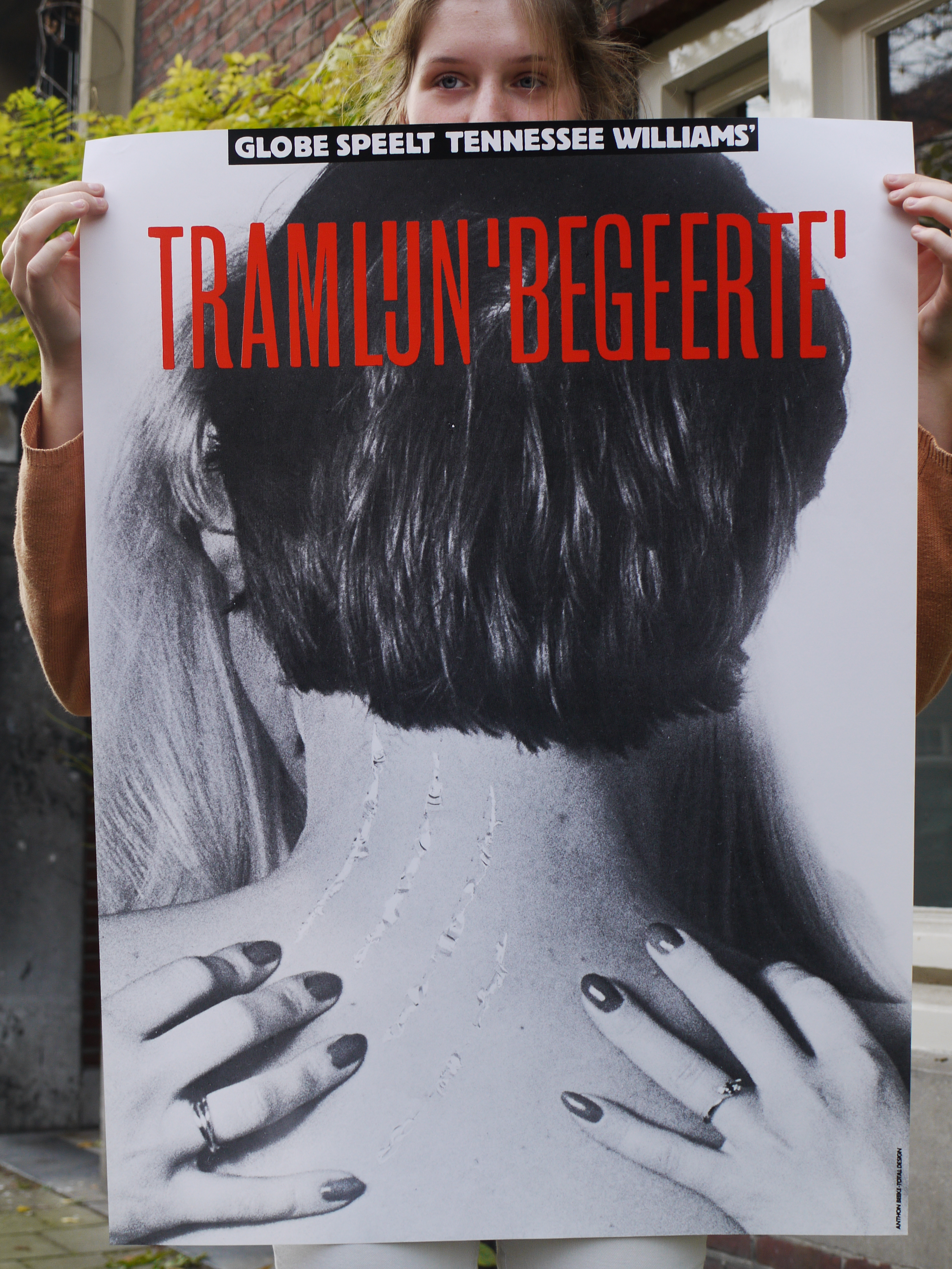
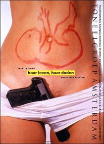
Ik had ze natuurlijk op internet al vlug langs mijn ogen laten schieten, al scrollend, op zoek naar informatie. Maar ik had de affiches nog nooit in het echt gezien. Toen ik ze dus voor het eerst ‘real life’ zag, kwamen ze echt binnen. Ze waren heel anders dan dat ik ze op internet had gezien. Intrigerend, precies wat de bedoeling was van de posters. “Dit gevoel wat ik heb, is natuurlijk precies wat ie wilde bereiken”, dacht ik.  Ze zijn ook zo simpel. Alleen een foto en een titel. Op de foto’s zie ik lichamen of delen van lichamen die de poster bedekken. Dat is het eerst wat opvalt, daarna de titel. Alsof de titel ondergeschikt is aan de foto. Pijnlijk, dood, donker, maar ook passie en seks is wat ik zie. Wat een lef moet die man hebben gehad! Het zijn beelden die je pakken. Anthon Beeke maakte deze beelden gewoon!

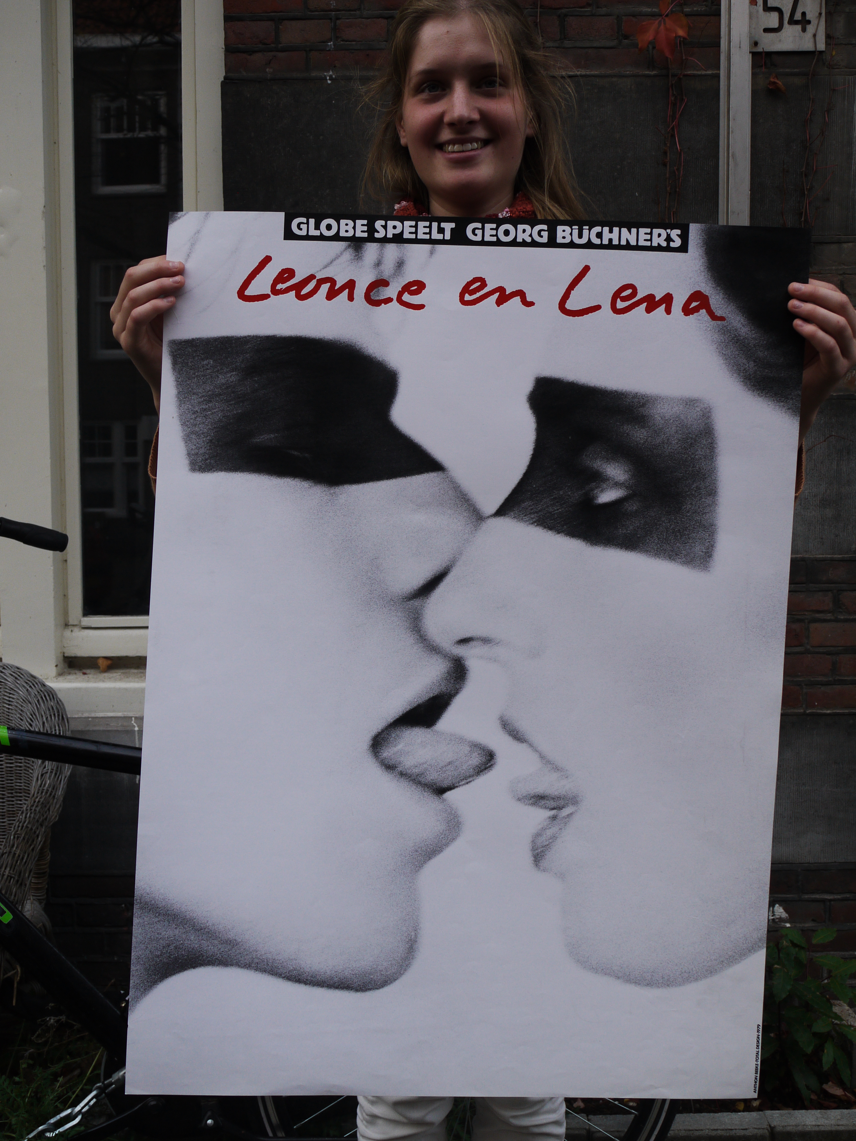
De suggestie van seks blijft hangen na dat ik de posters had gezien. Als voorbeeld neem ik de drie posters hierboven. Ik vind het raar om ernaar te kijken. Ik voel me op een of andere manier betrapt. Terwijl ik gewoon naar een poster sta te kijken. Sta ik nou zonder dat ik er voor heb gekozen naar een seksueel beeld te kijken? Of maak ik dat er zelf van in mijn hoofd? Want bij de poster van Leonce en Lena is de suggestie van seks veel groter dan dat er werkelijk seks wordt afgebeeld.

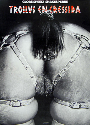
De poster van de voorstelling van Troilus en Cressida valt ook erg op. Hoewel ik deze nooit in het echt heb gezien, dus alleen op internet, blijft hij toch in mijn gedachten hangen. Ik weet waar ik naar kijk, maar op een of andere manier is het ook een vervreemd beeld. Er klopt iets niet. “Wat was het idee om het zo op een poster te zetten?”, gaat het door mijn hoofd.

In dit affiche verbeeldt het lichaam van de vrouw letterlijk het paard van Troje, in het verhaal een houten paard, waarmee Romeinse soldaten Troje binnen vielen. De oorlog in Troje was ook daadwerkelijk bij het schaken van een vrouw begonnen. Bovendien was het motto van Gerardjan Rijnders voor zijn voorstelling: “Seks is oorlog”. Dit wilde Anthon Beeke in zijn affiche voor de voorstelling ook uitdrukken. Hij fotografeerde daarom een naakte, met olie ingesmeerde vrouw die voorover gebukt staat, met op haar rug een leren paardentuigje. Hij noemde zijn poster een feministisch statement.


De posters werden destijds gewoon op aanplakborden geplakt. Maar daarna bekrast, betekend of er gewoon afgetrokken. De vrouwenbeweging protesteerde fel tegen sommige posters van Beeke, en dan met name de poster van Troilus en Cressida. Sommige theaterdirecteuren durfden de posters zelfs niet de presenteren in hun theater. En hielden ze op bepaalde momenten bedekt.

Hoe reageren mensen nu op dit soort beelden. Op beelden met naakt die de suggestie van seks oproepen?  Bij de tentoonstelling begin dit jaar in het Museum Jan van der Togt in Amstelveen werden veel van Beeke’s posters getoond, maar er werd getwijfeld op de beroemde, omstreden poster van Troilus en Cressida voor toneelgroep Globe wel getoond moest worden. De poster was misschien te pervers om te tonen aan het publiek. Waarom nu niet en toen wel?

Is naakt of (de suggestie van) seks dan nu echt nog zo’n groot probleem? Je zou denken dat we wel wat gewend zijn bijvoorbeeld met de reclamecampagnes tegenwoordig van Diesel of de American Apparel. Blijkbaar wel. Om een voorbeeld te noemen, kwam er in januari dit jaar een kalender uit van de Italiaanse fotograaf Oliviero Toscani. Op elke pagina, bij iedere maand staat een close-up van het vrouwelijk geslachtsdeel. In Italië is er veel ophef over ontstaan. De feministen zijn boos en vinden de foto’s een belediging voor de vrouwelijke waardigheid. De kalenders mogen nu ook niet verder uitgegeven worden.


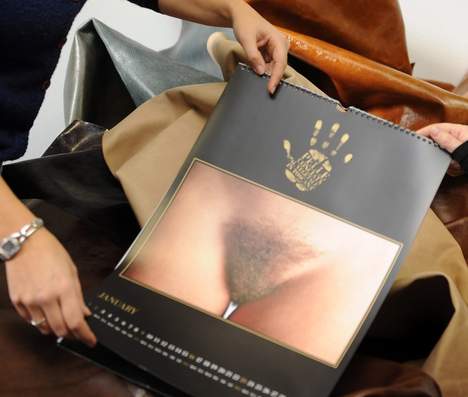
Volgens de vrouwen op de foto en de fotograaf zelf, zijn de foto’s een symbool van “untamed feminine beauty”. Volgens Toscani is zijn werk gericht tegen de standaard modefoto’s waar vrouwen mooi opgemaakt zijn en mooie kleren dragen. Hier wil hij juist de puurheid van de vrouw laten zien.

Met zijn vagina-kalender is hij in een bepaald opzicht met hetzelfde bezig wat Anthon Beeke deed. Hij zit ook erg op de grens van wat mensen nog kunnen aanvaarden en wat niet. Mensen voelen zich geconfronteerd met iets wat ze liever niet willen zien en kunnen het niet snappen.
Ik zou daarom willen afsluiten met een quote van Anthon Beeke zelf:

‘Tolerantie moet je steeds weer bewijzen en dat kan alleen door het te tarten.’

FunctionalVsEngagé


Thursday, May 28, 2009

In my first post about two of the most important and influential dutch graphic designers, Wim Crouwel and Anthon Beeke (pdf), i tried to compare them by their different approach. Especially the way Beeke designed, really intrigued me.
It was provocating and controversial which made him one of the leading conceptual engaged designers.
On the other side, Wim Crouwel is known as a more functional designer, which means less conceptual.

But is it really that easy to divide and are all this categorizations correctly made?

Especially in the case of Wim Crouwel i doubt it. His design of the new alphabet was based on the begin of computer technology, in a time were blogs, facebook and internet in general didn’t exist. Coming up with a font type based on this new technology combines in a perfect way a clear, functional and computer like approach. Computer like is also the keyword for, in my opinion, a highly conceptual design.
With the awareness that this technology will change they way we communicate, document, the way we are. His style is timeless (even if it also relates to the early 70s) and applicable still nowadays.

Beeke’s Human alphabet, using the aesthetics (look at the swedish film makers Ingmar Bergman and Vilgot Sjöman) and social and political topics like sexuality, seems more related to that specific time.

So Aesthetics is next to conceptualism and functionalism a really important aspect, what makes Crouwel’s design less depend on a certain time period.

Never the less, Anthon Beeke’s radical and shocking way, even if it is not so applicable in our times anymore, was responsible for breaking through the conservatism of (Graphic design) and is so a mirror of other important political and social openings in this time period, and even if his aesthetics are not so up to date, his conceptual engagement is.

link: The Human Alphabet as a visual brand

link: Anton Beeke exhibit at Centre for Visual Arts Zeeland

Nothing Is What It Seems


Sunday, May 10, 2009

Anton Beeke’s poster for the theatrical play “Bloed van de Hongerlijders” (Blood of the starving ones) is a complex, yet at the same time striking “in your face” like work. Attempting to create an image that contains a deeper psychological meaning, Beeke executed the work while making use of different techniques. First of all there is the photograph, depicting a man in probably his early fifties. Furthermore present are yet two other photos. Where the first photo seems ordinary in the way it is presented (one recognizes a portrait that is, consistent with the convention, merely showing the face of the person depicted and partially the neck), the two other photos are peculiar. They are both cut-outs from other photos, pasted on the first picture. All the more strange it seems that also these two photos differ from each other. Although they both fit on the man’s face (from which they seem to be copies), they physically don’t match. Whereas one might assume that the right picture is a genuine copy of the original, the left photo shows spots and irregularities that could be associated with sickness. What could be going on here? Are we dealing with a Janus-like figure, perhaps a schizophrenic madman? Or was Beeke only pointing out an ambiguity with which we would be confronted with while attending the play? Presumably the answer behind these questions lies hidden within the layers of this work. Until we see it, we can only speculate. And exactly this curiosity is what a poster should revoke!

WHEN THE FACE BECOMES A MASK

What has happened to this man? Are we dealing with a Janus-like figure, perhaps a schizophrenic madman? And what could the artist’s intention be? Might Beeke have been pointing out an ambiguity with which we would be confronted with while attending the play? Presumably the answer behind these questions lies hidden within the layers of this work….read more about his poster in the linked pdf

Buckle up, and Slap me in the face..


Friday, May 8, 2009

My father once said to me that a good piece of art should slap you in the face.
Even though I disagree with him sometimes, I liked that a lot and I like to be slapped in the face.. It is not often that you are struck by something in such a manner that it stay’s in the mind and overgrows everything that mattered less.
Of course the blow can come from different angles (beauty, shock, alienation, directness, physical impact) but looking at this poster from Anthon Beeke I immediately experienced the ‘slap in the face’ again.
A lot of my fellow students thought the thing horrid and filthy and I can totally understand that. This image illustrates some of the associations we make between for instance : women, horses and sexuality. I think that feeling of repulsion comes from the hidden knowledge we have about our own beastly behavior and the gender specific features that come with that. Moreover it touches upon the similarities between humans and animals.
A while ago one of my friends said she had seen two horses mate and that it had horrified her, why?, because the aggressiveness with which the stallion had moved reminded her vaguely of her ex-husband.
We can find the truth within language; do we not refer to certain men with the word ‘stud’? And do we not aim for a specific type of woman using the term broodmare?
Some displays in this exhibition made me curious, some designs were funny or even beautiful, I marveled over the poster designs from Jan Toorop and Jan Tschichold, However…; appreciating something is not the same as being hit by something. Anthon Beeke really struck, with this beautiful, raw and direct image.
This poster was made for a tragedy written by Shakespeare, I will never forget that play now, and I every time I saddle my horse for a ride I will think about Troilus and Cressida.

LUST DOES NOT MAKE ME HOT
Why is it that some works of art stay with you, and others do not?
When you go through an exhibition, an art fair or an Art book there are only very few things you remember, that stay with you, the rest ….. will be continued in this linked pdf

BeekeVsCrouwel


Wednesday, May 6, 2009

The most intriguing aspect of  ‘100 years graphic design in the Netherlands’, out of all the graphics, fonts, posters and publications I saw there, was in my opinion the contrast between two different forms of an Alphabet.
These alphabets, or better Font types, were created by the dutch Graphic Designers Wim Crouwel and Anthon Beeke.
The computerlike and clean structure of Crouwel’s ‘New Alphabet’ and the unconventional and quite controversial looking letter type, made out from naked girls, of Beeke on the other side.
For me Beeke’s style visualizes the spirit of the time when this font was created. It let me think of the sexual revolution, the feministic movement and a general break out of traditional and conventional norms of these times.
But also Crouwel, with his mathmatical looking font, hits for me a certain actuality of the late 60ties and 70ties, as that was the begin of the development of the computer age.

Wim Crouwel vs Anton Beeke

for more on functional versus engagé, read part 2

The Honesty of Anton Beeke: Troilus & Cressida


Wednesday, May 6, 2009

As a student at the Gerrit Rietveld Academy, I went to the Graphic Design Museum in Breda, together with my class. Their collection included pieces from a decade of graphic design. Next to some posters, you could hear interviews with the designer. Sitting down at the table next to the posters, you could see a built-in television with the images of the interview. This was also the case with the poster that took my attention, namely the poster made by Anton Beeke. He made the poster for a relatively obscure play by Shakespeare named “Troilus and Cressida”. The poster intrigued me, because it showed a recognizable human bodypart yet was still somewhat indefinable. This combination added to the mystery of the poster. Using the information table, I found out a lot of backgroundinformation about this seemingly controversial poster. For more posters link to the Affiche museum

When I was sitting at the table in Breda, I was listening to an interview with Anton Beeke. He introduced himself and I discovered that he was a graphic designer with a lot of experience. He made a wide variety of designs for posters, advertisements, books, magazines, stamps and packaging material. The specific subject of the interview were two posters hanging above the information table. Anton Beeke designed them both for the play “Troilus and Cressida”. The picture was very provocative, because it showed the backside of a naked lady who was bending over, only wearing a horse strap. “Troilus and Cressida” is one of the less famous plays by William Shakespeare. It is a sad story about the love between Troilus and Cressida during the Trojan war. Troilus saw that Cressida was behaving all too affectionately with a Greek called Diomedes. That’s when Troilus reckoned she surely was a prostitute. Anton Beeke tells during his interview that being honest is one of the most important principles for him. He saw the play as tragic and sexist and thought he should show just that on his poster. Unfortunately this point wasn’t clear for some. Especially the so called Dolle Mina’s, a feminist movement during the 1960’s, were protesting against the poster.

Links: Trojan War, Anton Beeke[image], Troilus and Cressida[image], Dolle Mina[image]


Log in
subscribe