Skip to Content Skip to Search Go to Top Navigation Go to Side Menu


"black" Tag


Reality Machine


Thursday, December 6, 2018

  When I saw Eliasson’s book in the library, I was really surprised by how emotional I still get just by looking at the name of him. The feeling of vomiting when I saw his exhibition last time in Beijing came back to me quietly yet so familiarly.
  And on the way back carrying this book to upstairs, I met a few friends smoking at the gate, they asked:“Oh, do you like his work?” I laughed and said “I kind of vomit last time at his exhibition, but yet I chose him to write an essay, I really can’t answer this question so frivolously now. 

  Maybe that’s exactly why I chose his book, I want to discuss this complicated emotion in the form of language. Yes, language, by creating another kind of “reality” on the base of concept to connect with the “reality” he tries to present in his work.

  What can I remember about his last work? I remember the crowded crowd in the orange light which made them look like pale zombie , and everyone was either taking picture or standing there for minutes without moving — taking selfies. Kids were jumping and shouting, having so much wild fun. And the air conditioner is working so good, maybe too good, maybe that’s part of reason I wanted to vomit, my stomach always react really strongly to cold air. 

  Why? I could’t stop asking myself at the exhibition, why I (and so many people) spent at least an hour on cars —it was a quite remote museum, to come here, to experience this kind of, what he called “Reality”. When we can see the real rain, the real sunset, is this kind of imitation “reality” of the nature, somehow touches us more than the real “reality”?

  It is very beautiful, I was thinking, it’s almost like the beauty like when I see the real rainbow, then I thought about isn’t the vulnerable and unpredictable character makes rainbow so strikingly impressive? Then what is this ? You drive an hour and paid something like 20 euros, to go into this huge artificial box, which is so cold that makes you wanna vomit in the hot summer, and in this totally dark space when outside is so sun shining , you saw the beauty of nature, and you praised, “Ah, what a sublime scene of this blue planet that we call home.”


Book Info ?Olafur Eliasson Reality Machine

eila 11

Dries Van Noten


Thursday, November 22, 2018

“My eternal soul,

Observe your vow

In spite of the night

And the day on fire.”

-Arthur Rimbaud, A Season In Hell


The big gazing eyes on the cover of the book grabbed my attention at the first sight,It reminded me of this poem from the French poet Rimbaud.


I also like it in black and white.It is not that I don’t like color. On the contrary, I think I like color too much to tolerant it being abused in a wrong way. And I don’t always have enough time to find the right color or the right combination of colors, so to keep everything minimal, I developed this obsession for black.


I also like it because the whole book is very thin, I like the artists who keep things minimal.I believe they spent more time in choosing behind the work, to only keep the best things.


When I opened the book, the vogue and zoomed-in images, it’s almost becoming some kind of abstract painting.I can only see the back of the models in the most of pictures, that also makes me feel attracted, the mystery in the movement go their body. They come and go at ease, at their own pace. They are very independent while I felt invited, but there is no pressure that I have to either.


I also really like the casual and comfortable feeling when they are in those clothes, they can run and dance at ease.It is them who is wearing the clothes, but not only as a living hanger to present those clothes.I think fashion design for me, in the end will come back to the point of how it actually makes you feel when you wear it.Do you feel comfortable in it? Do you feel restricted ?Does this clothes make you feel more of being yourself or somebody else?If it is somebody else, is it a better person or a worse person?


Information about the book:

Dries Van Noten   Women’s Collection Summer 1998

907.8

RiCB-D/TRftBL


Monday, November 30, 2015

– https://www.youtube.com/watch?v=KmwZNivC4r0 

1

Rammstein in Contemporary Book-Design


Daniel van der Velden, the man, the genius, the mystery… in terms of designing a series of publications collecting highly
eloquent essays on uprising tendencies and phenomena in contemporary culture, what can you expect from a man giving you this look:


Daniel_van_der_Velden_1000


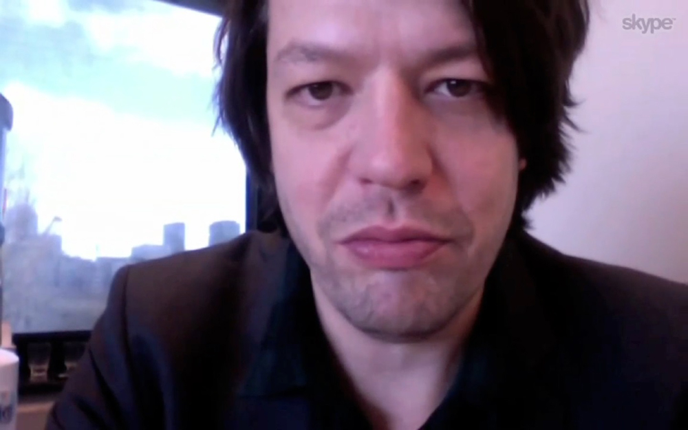
as he plays the song “Du Hast” by the German band Rammstein on his iPhone 6 to introduce himself prior to a lecture on his work – A whole lot in my opinion.


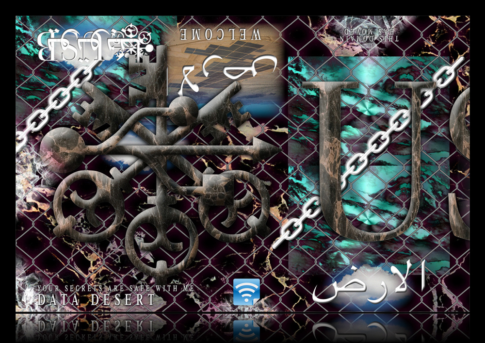
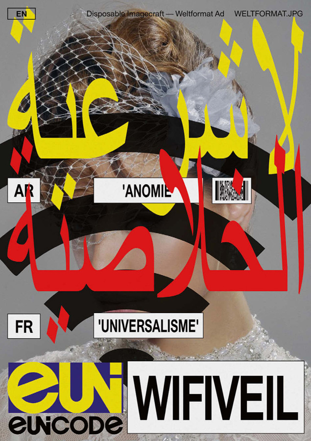
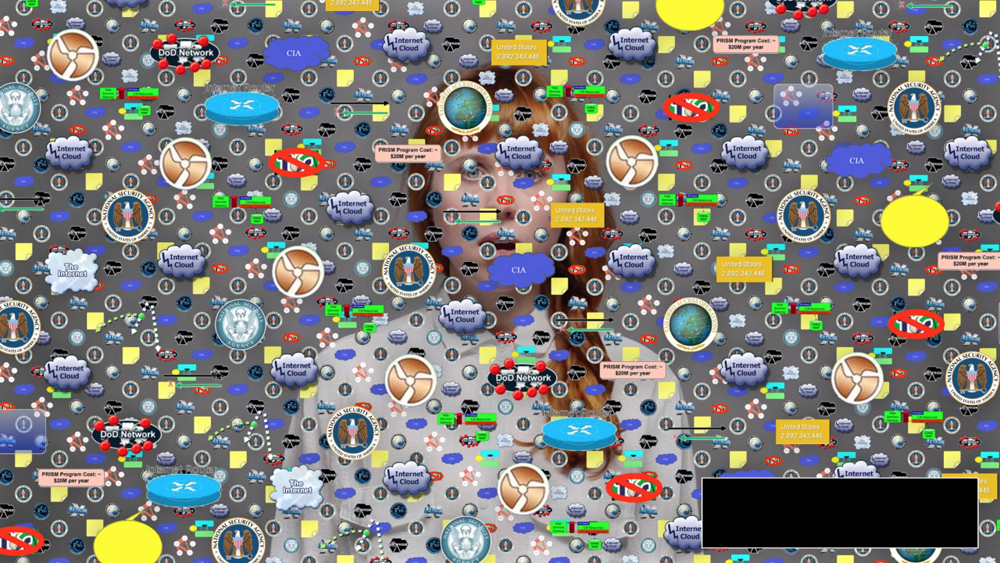
My research is dealing with a book that was designed by this very man – the mastermind behind Metahaven, an Amsterdam based design and research studio whose work in a way couldn’t be more contemporary. A typical Metahaven design usually even exceeds the expectations of contemporary in its extroverted way of layering and heavy usage of political and economical iconography. The result often is a somewhat futuristic, hardly readable, almost autonomous graphic. A work of art in which a mysterious overflow of visual content makes the purpose of providing information seem of secondary interest. There is a feeling of playfulness to a lot of Daniel’s graphic designs that on first sight does not leave the impression of being the product of a structured research and design process.


You will agree when looking at a few examples…


tumblr_n3khhuX4xS1qeg0aeo1_1000

032c_doppelseiten_032c_26.indd tumblr_myc2z1trxy1qeg0aeo1_900

tumblr_nc0fy1QUF81qeg0aeo1_1000


1.1

My personal analysis: the literal overflow of visual information is to be understood as a representation or comment on the way we perceive information through new mediums in the digital age. In our globalized day and age one is confronted with an overwhelming amount of text and images simultaneously, overwhelming to such an extent that the core of the singular information often gets lost before being processed and saved by its recipient. In that way it makes sense to think of Metahaven’s design as a ‘political instrument’, a term used by the studio itself, emphasizing the important role spreading information digitally has played in recent political uprisings and hinting at the potential the field of design has as a means of communication.


2

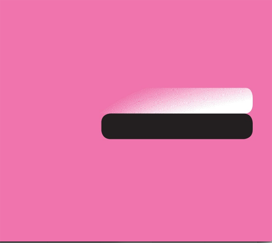
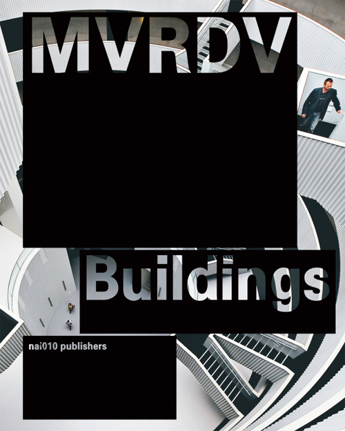
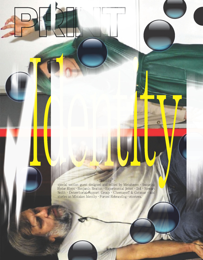
A Reason for the Black Label


backcover-1cover


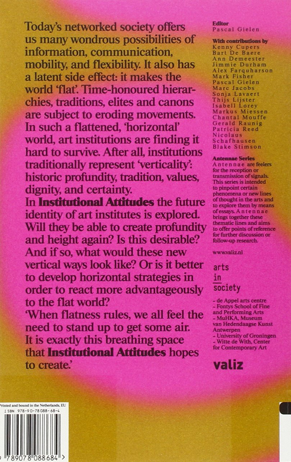
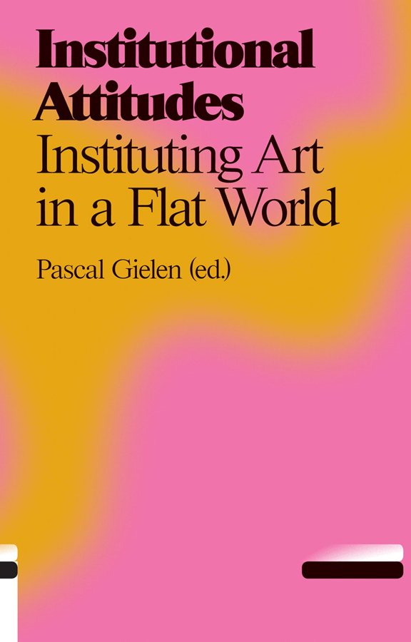
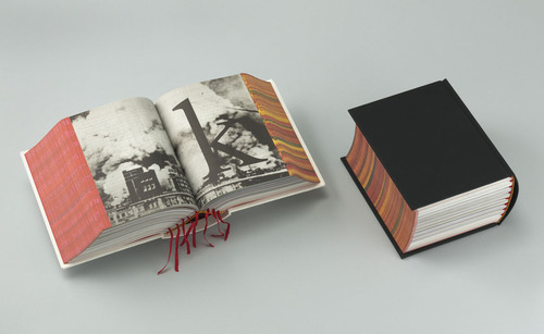
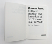
The design of the publication I chose to do my research on doesn’t make use of this ‘visual overflow’-technique at all and is therefore hardly recognizable to be designed by Metahaven – this makes the preceding introduction more or less unnecessary. Instead of multi-layering of various typefaces there is “only” one layer of text in a font that at first sight seems to be Times New Roman – just one layer of black text in a traditional lay out giving only the basic information of the title of the book and its author on a relatively neutral background. One would normally not call this blurry smudge of pink and orange ‘relatively neutral’ but we are talking about Metahaven here and in this context, metaphorically speaking, the design feels a bit like going to church

church-building-clipart-FaithChurch

.

In search of the chaotic element, the signature of Metahaven on the cover page of the book, I stumbled upon this obscurity…
Screen Shot 2015-12-05 at 15.58.27


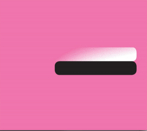
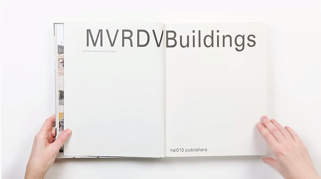
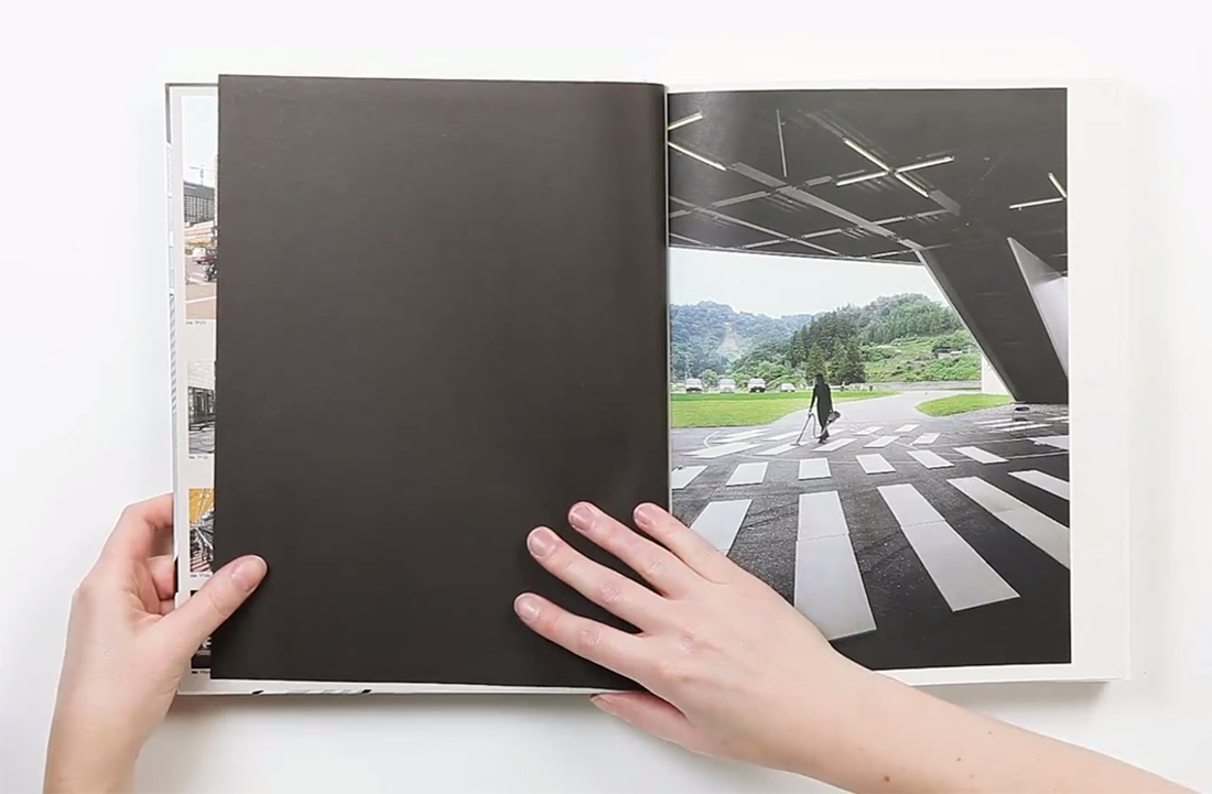
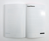
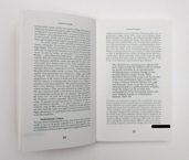
There it was – the definitive reason for my choice. At last a sign, a seemingly random element – The black label. A bar-like shape on the bottom right corner framing the front page of the publication adding a sense of mystery to the picture. When finally opening the book I felt confirmed of my selfishly made up theory that every Metahaven design was constructed, following an illogical master plan based on a very personal philosophy that is escaping a conventional approach of communicating by introducing the ungraspable – communication through exclusion. As a matter of fact the black label can be found on every single page of the book except for the back cover.
28738-Web_IMG_0588 25472-Web_IMG_0586 28573-Web_IMG_0582


2.1

Imagine going to a concert of one of your musical icons. After having lost a bit of distance and respect due to the mediocrity of the concert experience you feel brave enough to approach the artist himself and ask him about the essence of his work. In the following case this mediocrity was actually more a product of bad preparation and incredibly flat interviewing rather than a bad performance of the man himself – but you should always make best use of your more self-confident moments.

When approaching Daniel after a lecture on Metahaven’s new publication ‘Black Transparency’ I wasn’t too sure about what kind of answers I could expect from this larger than life character and if he was even in the mood of explaining the artistic decisions he made in the process of designing ‘institutional Attitudes’. (By the way the book is part of a series of publications, which is why I consciously decided not to speak about the content in this essay.) After a while of awkwardly standing next to him while he was signing all the publications people had bought I found the moment to ask him my three definite questions:

1.

Times New Roman? Really?

2.

Why the psychedelic smudge of color?

3.

What is the reason for this?

Screen Shot 2015-12-05 at 15.58.27


2.1.1

There is something relieving but tragic about the moment you find out your romanticized idols are actually rational people who have solid reasons for what they do and how they do it.

1.

The font used for the Antennae Series is a rare variation of the Times used to set a fitting stage for the serious approach the series has to the subject of recognizing contemporary tendencies in art, culture and politics.

2.

The Aesthetics of the background images are the result of researching images from thermo-graphic cameras, which are directly related to the subject of the Antennae. In this case Antennas are understood as objects that search and recognize information in their environment.

3.

The Black Label is nothing but a library label, a combining element of the series to make the single publications more recognizable.  🙁
http://survincity.com/wp-content/uploads/images/546500-e1338395736644.jpg

Rietveld library catalog no : 700.4 gie 2


MVRDV Buildings


Tuesday, October 28, 2014

9789462080126_mvrdv_buildings_500

The reason why I chose this specific book was its colour and image placed next and on top of each other. It has caught my eye and wanted me to read and analyze its content. Page after page I began to realize there was a type of system that the designer, Joost Grootens carried out.

MVRDV Buildings, published by 010 Publishers, is a complete overview of MVRDV’s architectural practice over a total of 20 years. To me, this has been a positive discovery while analyzing the book. It was a very good surprise. I am very much interested in architecture. The way I have understood it was that the designer has deliberately chosen and created a way of method to display and present this portfolio of this architect firm. My impression was that this “method” is a way of telling a nice story or even a nice joke. A way to share important information with people. (click on the title page image and browse the 11 consecutive images)

Screen Shot 2014-10-06 at 21.51.42 Screen Shot 2014-10-06 at 21.51.33 MVRDV Buildings Screen Shot 2014-10-06 at 21.52.11 Screen Shot 2014-10-06 at 21.52.16 Screen Shot 2014-10-06 at 21.52.24 Screen Shot 2014-10-06 at 21.52.30 Screen Shot 2014-10-06 at 21.52.38 Screen Shot 2014-10-06 at 21.52.41 Screen Shot 2014-10-06 at 21.53.14 Screen Shot 2014-10-06 at 21.53.59  Screen Shot 2014-10-06 at 21.54.32


Another consequence was that I got to explore Joost Grootens own book. The book called I swear I use no art all, has been written by the designer and summarizes 100 books, 18788 pages of his book designs throughout 10 years in that field. The interesting part is to see how, the originally architectural-designer became a graphic information-designer. The book describes his relation to publishers, supporters, authors, collaborators, printers, workplaces and studios. A very personal way to present the changes and development that his own working field. It has made me realize how nice it is to make a summary of your own development. Even though I can not yet make a summary and create a descriptive portfolio of the last 10 years of my work-field I have already imagined creating the mapping of my family or origin.

(click on the cover and browse the 2 consecutive images)

I-Swear_bookcover

I-Swear_spread2 I-Swear_spread1

A part which describes the beginning in a overview, showing how one project led to another by encounters or collaborations and led into a new project, caught my interest. The designer has focused on presenting how non-book projects evolved into book projects. This made me think about my own encounters I had in my life that has influenced some decisions made later. Furthermore, allowed me to think in a non project based way. It also made me think of the origin and allow me to imagine the beginning.

As a personal mapping I was first interested in looking online for my origin in order to see routes and possibilities to reach Santiago, the origin of my father, and Budapest, the origin of my mother. I have also looked for the distance between Amsterdam and Budapest. Nowadays, it is very easy to travel between my hometown and Amsterdam which is the city I have chosen and encountered on my own. I had first visited and met this country at the age of 16 and already new that one day it would be my home. Due to the fact that I can not connect to my origin nor to my parents because of their divorce I currently have to focus on the present and the decisions I have to make every day. Choosing to study but first of all choosing to apply to the Gerrit Rietveld Academie has happened by chance. Through the Academy I have also encountered the Design Academy in Eindhoven. These two Academies are important in this case because interestingly Joost Grootens who graduated from the Gerrit Rietveld Academie is now a teacher in the Design Academy.

At this point I have immediately remembered my past with both academy’s. At one point in the last two years I have met students in Eindhoven who have shared a lot about their work process and further information of their studies. This also made me consider to apply to that school. Although I have never succeeded to enter the Design Academy I have, as a result, got to know the Rietveld more.
Once again, choosing >MVRDV Buildings< still proves how interested I am in design, how fascinated I am about architecture.

I knew I had a good feeling about the book’s black cover.

(click on the map and browse the 2 consecutive images)

Screen Shot 2014-10-28 at 20.02.39

Screen Shot 2014-10-28 at 20.02.53 Screen Shot 2014-10-28 at 20.05.11

To conclude; black to me is a colour. It is a comfort zone and also a strong feeling I have towards it. Black to me is the house I wanted to have and the friends I wanted to play with as a child. Black is also the material I preferably wear during my daily life and it is the ink I like to draw with. Black will never leave me and will always be part of my decisions in the future.

Talks about Money: Rietveld library catalog no : 716.9 rub 1

Irma Boom Book


Tuesday, September 7, 2010

I have chosen the book called SHV Thinkbook designed by Irma Boom.

This one caught the most my attention, although it is one of the most simple: black, thick, without any title, it is kind of brutal.  It looks like a simple dictionary. But we can discover the originality of the designer, because this book really doesn´t looks like another one. Because, it doesn´t has any title, only black without any symbol and when you look at the profile we can see the colorful side of the pages which contrast with the deep black of the front. It has something mysterious and unusual.

It has been designed in a way that you can´t guess what is inside (only maybe a strange geometric form white and red can symbolize

something). The cover of this book really makes me wondering  about  the content .

There is a details in this book that I found really beautiful, there are some few deep red bookmarks which go out between the pages. I like this three main colors (red, white and black).

Moreover , the story that Henk told us about this book makes it even more mysterious.

For the same reasons I found the book called Dutch Stampbook well designed. The same black, anything on the front page shows us the content, only a white peeler is appearing used as a kind of image of design (subject of the book).

Sound in simplicity.


Tuesday, March 2, 2010

Sound.

Heads turn.

What arrives?

What passes by?

Research.

Male tango shoes.

Makes sense.

Quite feminine, though.

Androgynous.

Turkish shoemaker fixed them.

20 euro’s.

Cheap.

“Beautiful, around thirty years old.”

Leather, black, a hint of wood.

Ten little holes.

Thin black laces.

Simplicity.


Simplicity.

Starting point.

Sound transformed into visuals.

Black.

Second hand leather.

Ten small holes.

Covering skin.

New necklace.

New scarf.


Nothing to understand


Saturday, November 14, 2009

Walking in the library. Looking for something who is nothing, at the same time. All the covers of the books are staring at me, they are all something. Then I find…

This book, black.

This book, German language.

Attracted, white lines on the cover.

The lines going to the nothingness of the black. I want to walk in the cover to see and feel the nothingness around me. Like standing somewhere on a field in the middle off the night.

This book, I can’t read because the language.

This book, with a very disturbing content.

Attracted, understand what I dont understand.

Let me know, I whisper. Let me know…

Rietveld Library code: 774.4


Log in
subscribe