Skip to Content Skip to Search Go to Top Navigation Go to Side Menu


"Church" Tag


VISION


Saturday, April 22, 2017

background designblog copy

I always felt this inner urge for adventure and to built crazy machines like airplanes. I never thought I would ever be capable of doing so, so I never tried to realize these dreams. Until I found out about Joost Conijn. He’s an artist that builds his own airplanes, cars and other vehicles. I tried to contact him. This ended up into an email contact drama. Then I tried to meet with two other, but with no result.

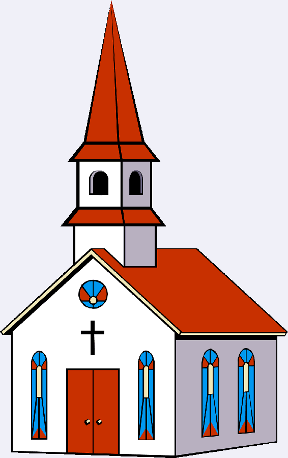
Eventually, I thought it to more challenging to go to a specific place in which people exist. For me it was important to spontaneously meet a person and not having an email contact introduction. I went to a church. Religion, or in this case Christianity, is such an undiscovered way of perceiving the world for me. It feels so distant and isolated from what I think is the ‘truth’. The main idea was to talk to a person in a confession booth to talk about my ‘rage’ that nobody cared to meet me or help me with my project.

The day I went the church was closed and the confession booths were out of use, but a small chapel was open. Two ladies opened the door and one of them guided me to the chapel.

Screen Shot 2017-05-11 at 22.44.11

A confession-booth with a sign that says 'afwezig',
meaning absent in dutch.

She told me about what her relation was to religion,  about the future of religion and the people that come there. She said that religion resembles the inner truth to existence. People who believe, are people that have felt a lot of pain in there life or people are simple raised that way. Pain brings people back to the ground, it makes people see the light and realize what’s really important. She says that people nowadays also have to much distractions, people shroud themselves with fun and give importance to things that really differ from what she says is important in life.

Our conversation was so honest. I realized that if I were to talk in a confession booth about certain things, it would almost feel like I’m mocking the people that actually go to a church. Talking to this woman, made me realize that there was far more than just believing, it was an undiscovered world.

I thought the element of pain was something to work further with and for me after the talk religion in a modern society also became an interesting subject. What makes people nowadays believe and how is religion holding up. The interior of the chapel was very modern and recently renovated with unnatural white lighting. One lamp was broken and blinked the whole time, for me that felt like a metaphor for religion in a modern society. Also the whole ritual churches have of lighting a candle for good fortune inspired me. Especially because wax is also known as a material with healing abillities, it made me think of the people in pain that decide to devote their lives to Christianity.

Click ->

4 5 7 8 2 3

9 10 1 11 13 12

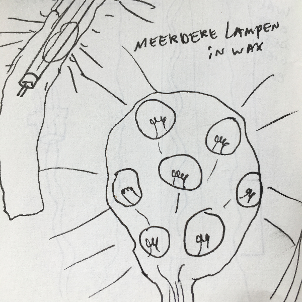
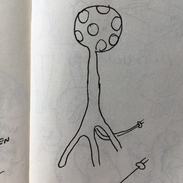
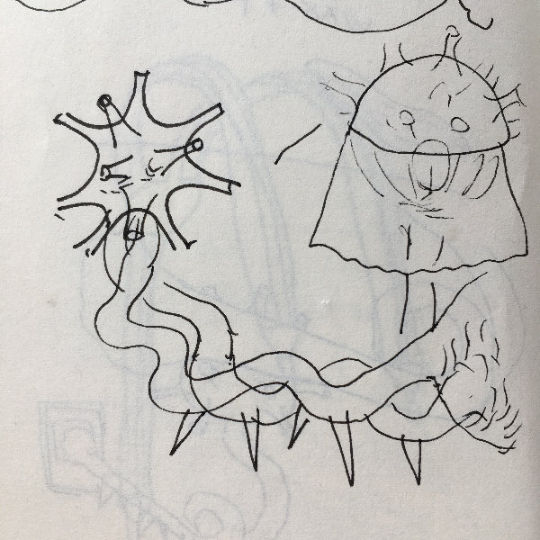
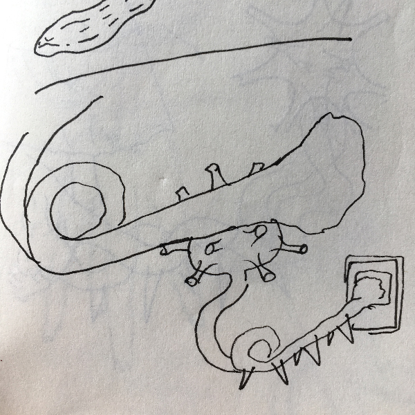
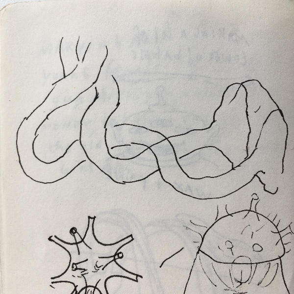
My first ideas how to translate my experiences into matter. Candle-like drawings with lightbulbs.

For me it felt obvious to make a lamp. My first idea was to make a lamp out of wax in the shape of a candle. After some feedback I realized that I wasn’t using the wax in a way that I could fully explore the material. I had an idea to make a lamp and using wax was just to live up to certain aesthetics I imagined in my mind. So making a lamp was to limiting.

IMG_4423

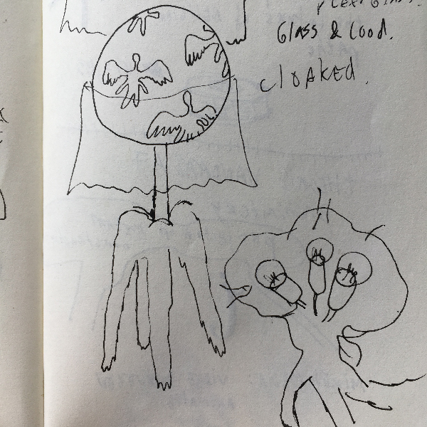
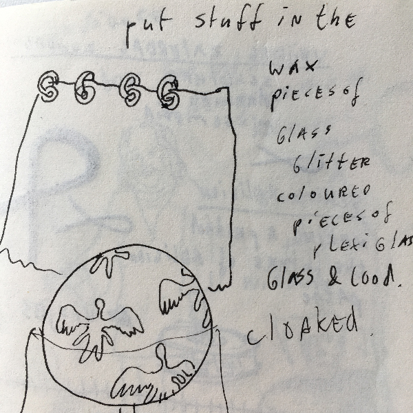
A construction for a 'candlelamp'. The idea was to pour liquid hot wax over it so the construction wouldn't be visible, but it would look like a candle with a lightbulb instead of a flame.

——————

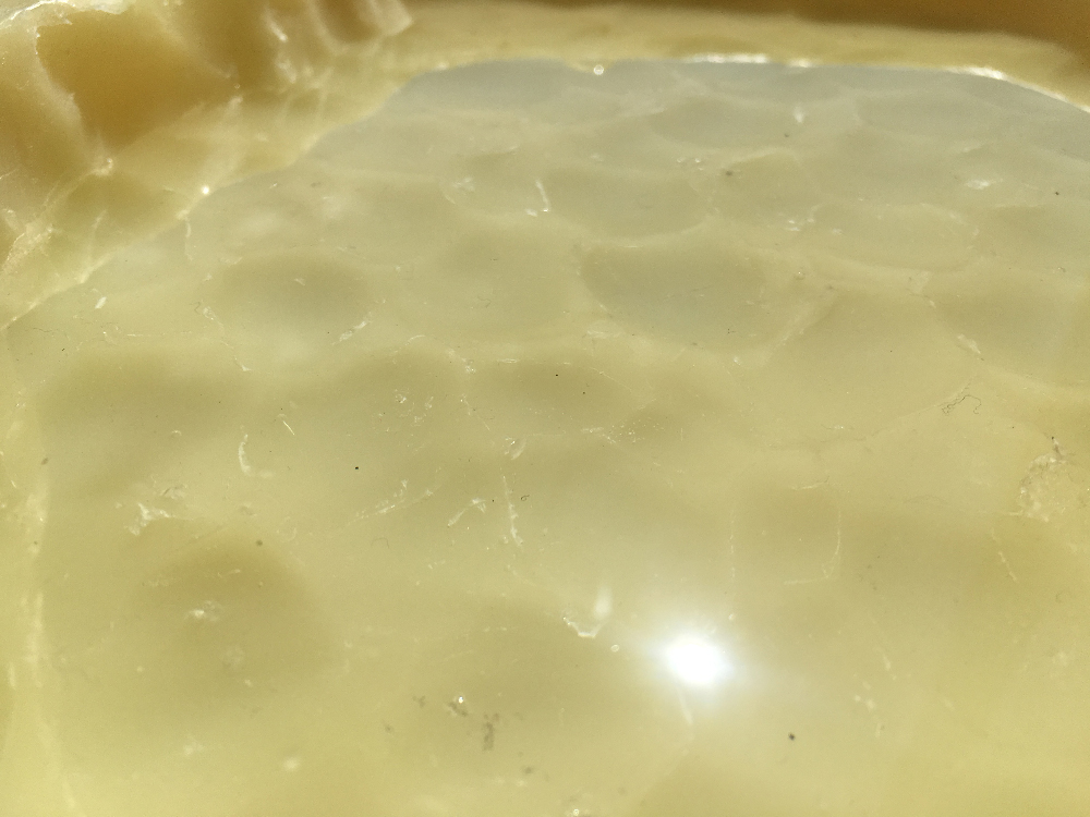
I started rethinking what my experiences were going to the church. Looking back the aspect of suffering and this isolated community of people that kind of live outside of society were the strongest memories. I started working with a big chunck of wax and started carving into it with a spoon, it felt saying a prayer over and over again, a road of suffering… Eventually this weird religious object came out of it, looking like a plate. After this I started making objects that resembled a kind of ritual, but in a way that I used very recognisable objects and used the wax to melt them together and creating a totally new function.

IMG_4984  IMG_4886

IMG_4875  IMG_4876

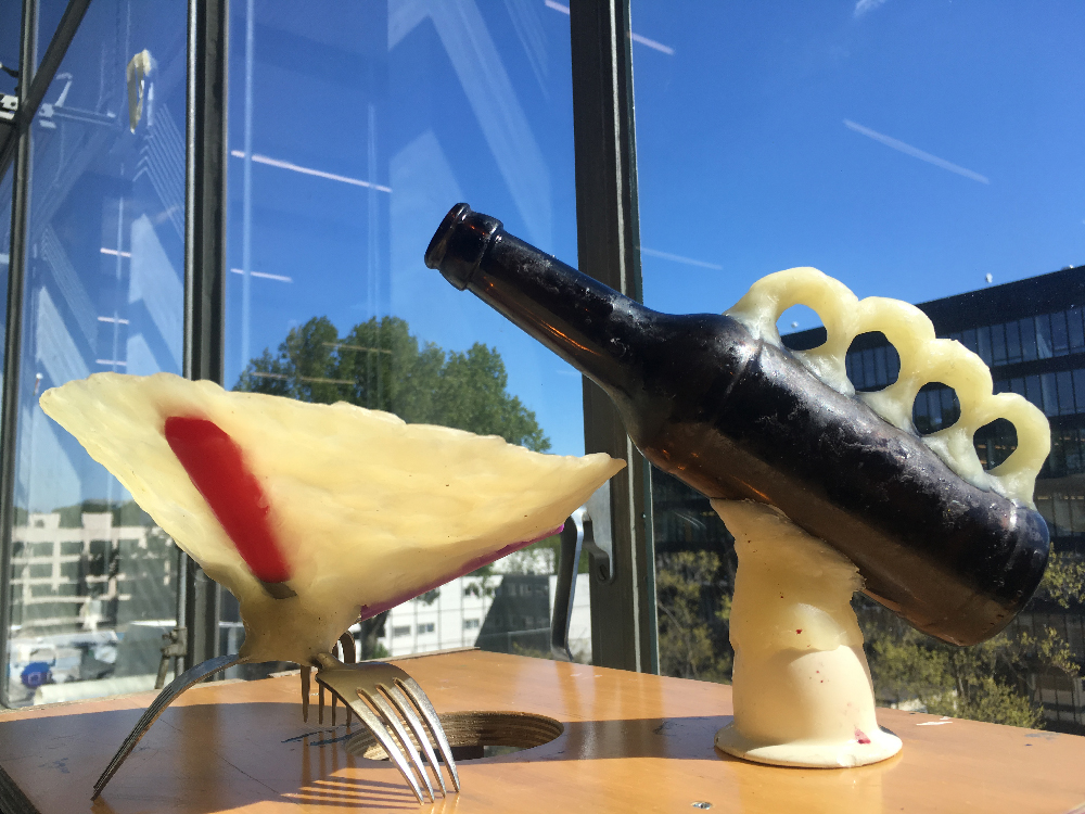
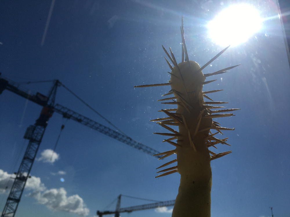
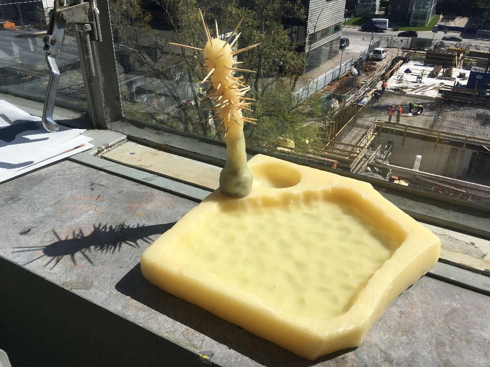
These are three of the eventual religious objects I made; a cup together with a leaning carafe and a square plate with it's inside carved out with a spoon and with an object that fits in it that holds coctail picks to display small foods.

Then came the idea to go back to my startingpoint, church, to make my objects interact with what made me make them. The voices in the video are recordings of collective praying by the people (just ladies) in the chapel. It is said that jesus is present in this chapel, they were singing directly to jesus.

—————————————


Get the Flash Player to see this content.


RiCB-D/TRftBL


Monday, November 30, 2015

– https://www.youtube.com/watch?v=KmwZNivC4r0 

1

Rammstein in Contemporary Book-Design


Daniel van der Velden, the man, the genius, the mystery… in terms of designing a series of publications collecting highly
eloquent essays on uprising tendencies and phenomena in contemporary culture, what can you expect from a man giving you this look:


Daniel_van_der_Velden_1000


as he plays the song “Du Hast” by the German band Rammstein on his iPhone 6 to introduce himself prior to a lecture on his work – A whole lot in my opinion.


My research is dealing with a book that was designed by this very man – the mastermind behind Metahaven, an Amsterdam based design and research studio whose work in a way couldn’t be more contemporary. A typical Metahaven design usually even exceeds the expectations of contemporary in its extroverted way of layering and heavy usage of political and economical iconography. The result often is a somewhat futuristic, hardly readable, almost autonomous graphic. A work of art in which a mysterious overflow of visual content makes the purpose of providing information seem of secondary interest. There is a feeling of playfulness to a lot of Daniel’s graphic designs that on first sight does not leave the impression of being the product of a structured research and design process.


You will agree when looking at a few examples…


tumblr_n3khhuX4xS1qeg0aeo1_1000

032c_doppelseiten_032c_26.indd tumblr_myc2z1trxy1qeg0aeo1_900

tumblr_nc0fy1QUF81qeg0aeo1_1000


1.1

My personal analysis: the literal overflow of visual information is to be understood as a representation or comment on the way we perceive information through new mediums in the digital age. In our globalized day and age one is confronted with an overwhelming amount of text and images simultaneously, overwhelming to such an extent that the core of the singular information often gets lost before being processed and saved by its recipient. In that way it makes sense to think of Metahaven’s design as a ‘political instrument’, a term used by the studio itself, emphasizing the important role spreading information digitally has played in recent political uprisings and hinting at the potential the field of design has as a means of communication.


2

A Reason for the Black Label


backcover-1cover


The design of the publication I chose to do my research on doesn’t make use of this ‘visual overflow’-technique at all and is therefore hardly recognizable to be designed by Metahaven – this makes the preceding introduction more or less unnecessary. Instead of multi-layering of various typefaces there is “only” one layer of text in a font that at first sight seems to be Times New Roman – just one layer of black text in a traditional lay out giving only the basic information of the title of the book and its author on a relatively neutral background. One would normally not call this blurry smudge of pink and orange ‘relatively neutral’ but we are talking about Metahaven here and in this context, metaphorically speaking, the design feels a bit like going to church

church-building-clipart-FaithChurch

.

In search of the chaotic element, the signature of Metahaven on the cover page of the book, I stumbled upon this obscurity…
Screen Shot 2015-12-05 at 15.58.27


There it was – the definitive reason for my choice. At last a sign, a seemingly random element – The black label. A bar-like shape on the bottom right corner framing the front page of the publication adding a sense of mystery to the picture. When finally opening the book I felt confirmed of my selfishly made up theory that every Metahaven design was constructed, following an illogical master plan based on a very personal philosophy that is escaping a conventional approach of communicating by introducing the ungraspable – communication through exclusion. As a matter of fact the black label can be found on every single page of the book except for the back cover.
28738-Web_IMG_0588 25472-Web_IMG_0586 28573-Web_IMG_0582


2.1

Imagine going to a concert of one of your musical icons. After having lost a bit of distance and respect due to the mediocrity of the concert experience you feel brave enough to approach the artist himself and ask him about the essence of his work. In the following case this mediocrity was actually more a product of bad preparation and incredibly flat interviewing rather than a bad performance of the man himself – but you should always make best use of your more self-confident moments.

When approaching Daniel after a lecture on Metahaven’s new publication ‘Black Transparency’ I wasn’t too sure about what kind of answers I could expect from this larger than life character and if he was even in the mood of explaining the artistic decisions he made in the process of designing ‘institutional Attitudes’. (By the way the book is part of a series of publications, which is why I consciously decided not to speak about the content in this essay.) After a while of awkwardly standing next to him while he was signing all the publications people had bought I found the moment to ask him my three definite questions:

1.

Times New Roman? Really?

2.

Why the psychedelic smudge of color?

3.

What is the reason for this?

Screen Shot 2015-12-05 at 15.58.27


2.1.1

There is something relieving but tragic about the moment you find out your romanticized idols are actually rational people who have solid reasons for what they do and how they do it.

1.

The font used for the Antennae Series is a rare variation of the Times used to set a fitting stage for the serious approach the series has to the subject of recognizing contemporary tendencies in art, culture and politics.

2.

The Aesthetics of the background images are the result of researching images from thermo-graphic cameras, which are directly related to the subject of the Antennae. In this case Antennas are understood as objects that search and recognize information in their environment.

3.

The Black Label is nothing but a library label, a combining element of the series to make the single publications more recognizable.  🙁
http://survincity.com/wp-content/uploads/images/546500-e1338395736644.jpg

Rietveld library catalog no : 700.4 gie 2


Log in
subscribe