The Nord Express was a poster designed by Adolphe Mouron Cassandre in 1927 promoting the railway line that ran between Paris and St Petersburg. Although the Nord Express rail line was already thirty years old by the time A.M.Cassandre’s poster was printed, the creation of this glamorous advertisement did not just re-promote the long existing rail line, but expressed and symbolised the excitement, glamor and extravaganse of the art-deco age in which the creator A.M.Cassandre was living.
Adolphe Marie Mouron Cassandre was born in the Ukraine on the 24th of January 1901. As a young man he traveled to Paris where he studied art at Beaux- art. He was extremely talented and shortly after graduating from Art school he was taken in by a printing company and set to work creating his first advertisements posters. Unsatisfied he, along with several other print makers, soon went on to create their own printing company Alliance Graphique. Here Cassandre really shone. He was accredited with creating innovative new graphic techniques, which drew inspiration from contemporary art movements including surrealism, cubism and above all Art Deco.
"Sur la portes de la lumiere" text by Blaisse Cendras /Bifur typeface /Poster for "Chemin du Fer Nord"
The Nord Express, which hangs in the Stadelijk museum in Amsterdam, was a celebration of the age in which Cassandre was living. In its portrayal it brought style and glamour once again to rail travel. Passengers were not just stepping into any mode of transport, they were entering one that was new and thrilling. It was adventurous, a chance to escape to go to places never before dreamed of by the every day man and woman. The composition of the poster was vital to the impression, and Cassandre, influenced by the likes of Pablo Picaso and Max Ernst, handled and executed this very simply. The track is at eye level giving the impression of the train towering over the viewer, perhaps echoing the designs of groundbreaking high-rise buildings that belonged to the same art deco age. As a viewer you get the sense of the giant locomotive speeding towards you, it is frightening and yet thrilling at the same time, the vivid, vibrant. Colours jump out of the poster giving the image a somehow realistic and exciting feel, echoing the artists genius. Cassandra was well known for his inovative portrayal of moving vehicles and there is no better example of this than in the Nord Express. Sharply angled non-parallel lines disappearing into the distance gives the illusion of great speed, viewers could imagine them selves travelling across countries in only a matter of hours, journeys that may previously have taken weeks. Another version of the Nord Express also hangs in the Stadelijk, it is in my opinion no where near as emotive or as well laid out as the one I have focused on. Cassandre carried on producing posters until the world war two, during which he joined the French Army. Although he carried on producing posters after the war, even dabbling in theatre and costume design, his passion was never the same as it had been in the golden years of the 20’s and 30’s and after struggling with depression he committed suicide in 1968. His most famous works include amongst others the Yves-saint Laurent logo and the ingenious new typeface Peignot.
How ever much of a genius A M Cassandre is, much of the posters appeal for me is the style and the time it was done in makes this poster stand out. It was designed during a time of great hope and prosperity. After the great war people began once again to rebuild there lives which would become bigger and better, more accomplished. Art Deco is the embodiment of these ideals. It promotes the eclectic form associated with elegance, style and modernism. It takes its inspiration from mathematics and geometry, perhaps a representative of people trying to rebuild for a better future. It is this that is so evocative not just in the Nord express but also in many of A M Cassandre’s works, they demonstrate a great feeling of hope, excitement even glamour. People of the time really had a vision of how the future might look like, it was a time of huge invention of enterprise. Art Deco was representative of elegance, functionality and modernity all of which are embodied by A M Cassandre’s Nord Express.
Another version of the Nord Express poster which hangs opposite the original in the Stedelijk museum;
“In zijn affiches zit alles samengebald. Een poster moet een voorbijganger die met twee volle boodschappentassen op weg is naar een sissende bus, in een fractie van een seconde raken, naar binnen trekken of bespringen als een kale dwerg”. Dick Okker, het Parool, 5 februari 2011
Anthon Beeke is en was een graficus met een sterke wil om nieuwe dingen te maken en barstte altijd van ideeën. Hij was met zijn werk, en dan met name in zijn posters, erg op de grens bezig van wat mensen nog konden aanvaarden en niet. Hij hield zich er bezig mee hoe mensen op iets reageerden. Sommige posters riepen veel reacties op. Ze werden van de muur afgetrokken, beklad of kapot gemaakt. De affiches die hij maakte moesten op je afkomen als je er voorbij loopt. Dus die reactie van mensen was precies wat hij wilde.
In 1970 zei hij dat hij het grafisch ontwerpen niet wilde gebruiken om dingen mooi te maken, zoals in die tijd veel werd gedaan, maar dat hij de mensen bewust wilde betrekken bij de situatie waarin ze verkeerden. Het moest een soort confrontatie zijn. “Een affiche moet shockeren”, was een van zijn uitspraken.
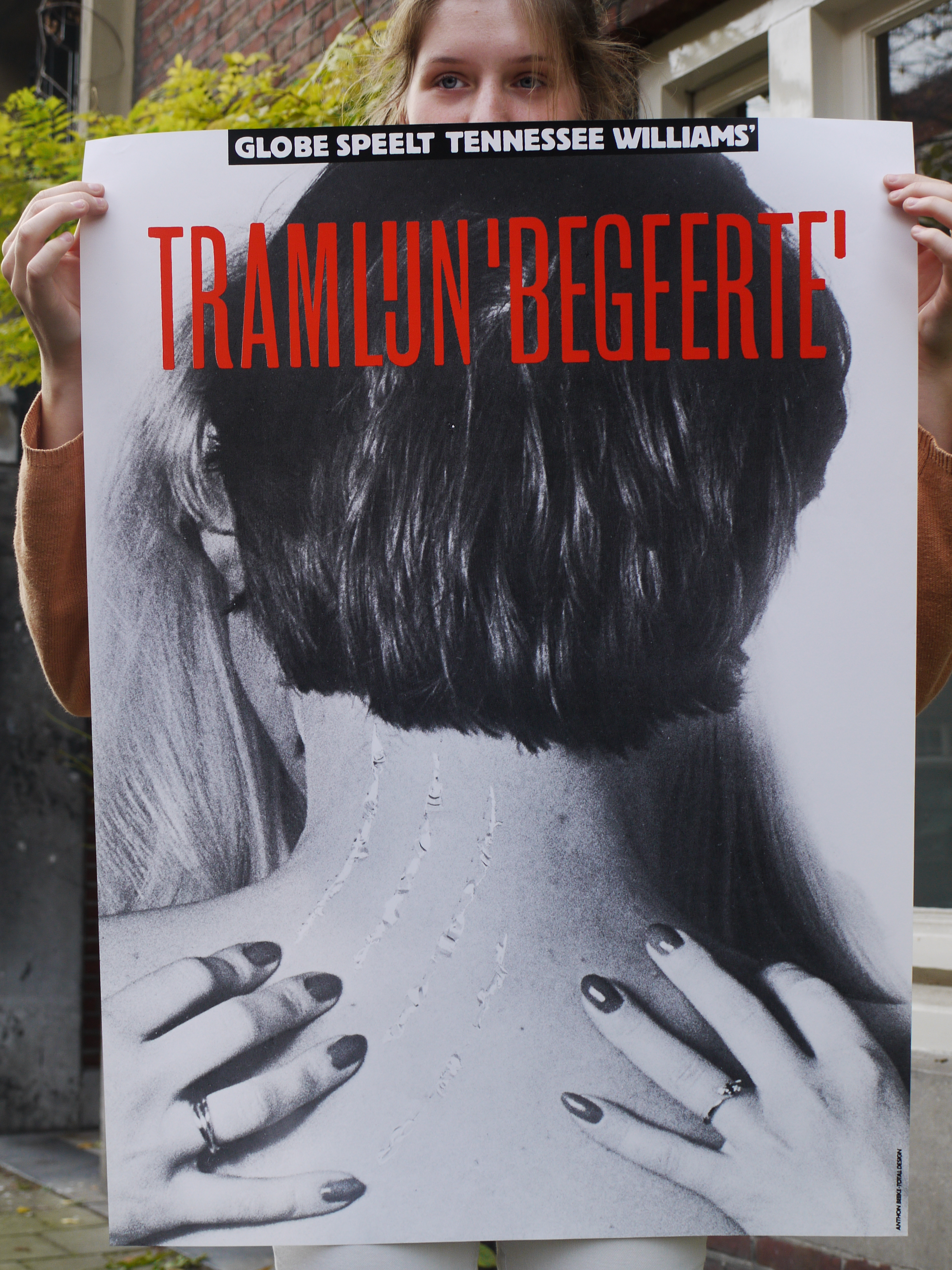
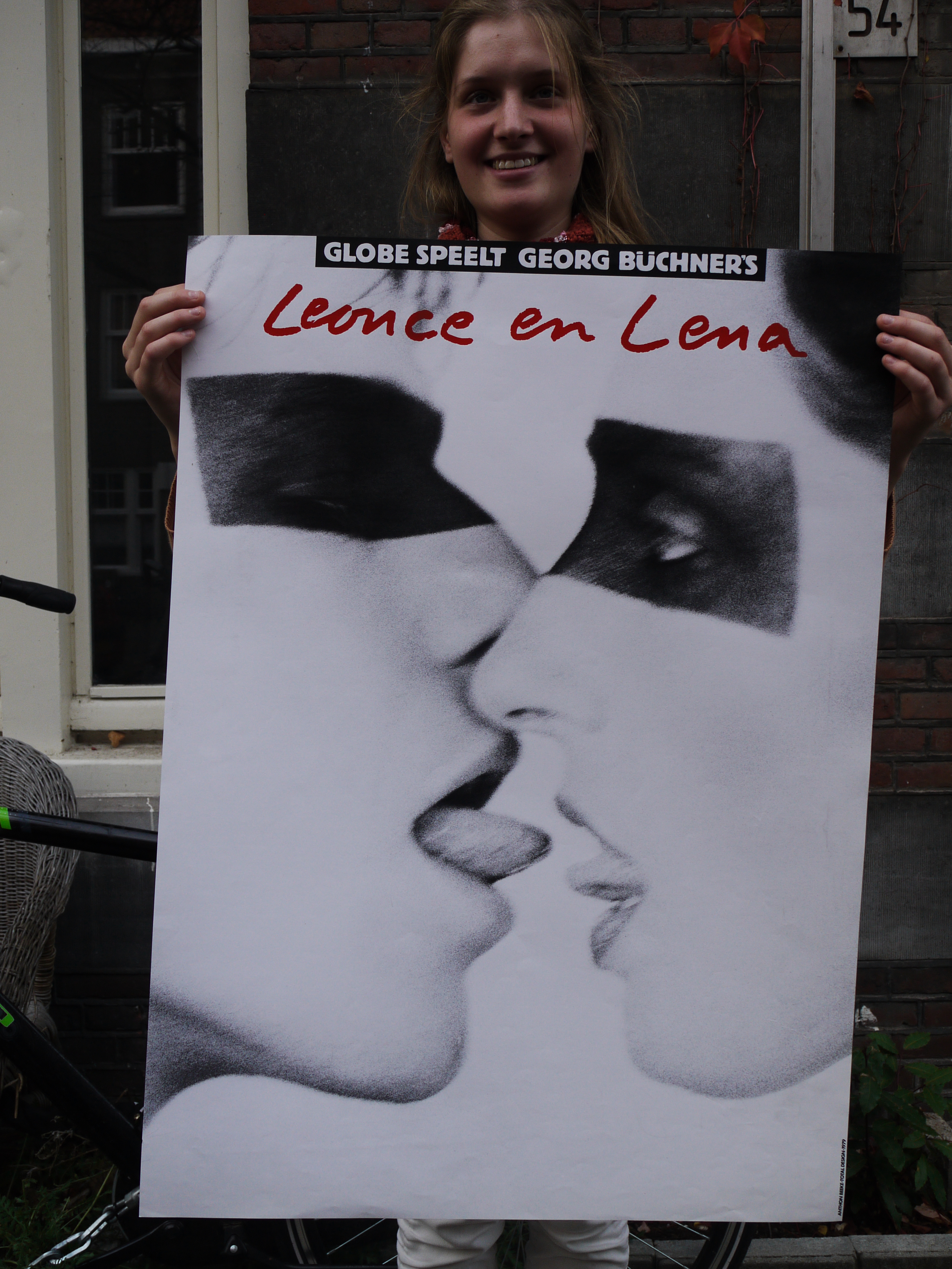
Toen ik deze laatste opmerking las, begon ik me wat af te vragen: Hoe zou ik deze posters beleven? Voel ik dit ook als een confrontatie? Wat voor reactie roepen ze bij me op?
Ik had ze natuurlijk op internet al vlug langs mijn ogen laten schieten, al scrollend, op zoek naar informatie. Maar ik had de affiches nog nooit in het echt gezien. Toen ik ze dus voor het eerst ‘real life’ zag, kwamen ze echt binnen. Ze waren heel anders dan dat ik ze op internet had gezien. Intrigerend, precies wat de bedoeling was van de posters. “Dit gevoel wat ik heb, is natuurlijk precies wat ie wilde bereiken”, dacht ik. Ze zijn ook zo simpel. Alleen een foto en een titel. Op de foto’s zie ik lichamen of delen van lichamen die de poster bedekken. Dat is het eerst wat opvalt, daarna de titel. Alsof de titel ondergeschikt is aan de foto. Pijnlijk, dood, donker, maar ook passie en seks is wat ik zie. Wat een lef moet die man hebben gehad! Het zijn beelden die je pakken. Anthon Beeke maakte deze beelden gewoon!
De suggestie van seks blijft hangen na dat ik de posters had gezien. Als voorbeeld neem ik de drie posters hierboven. Ik vind het raar om ernaar te kijken. Ik voel me op een of andere manier betrapt. Terwijl ik gewoon naar een poster sta te kijken. Sta ik nou zonder dat ik er voor heb gekozen naar een seksueel beeld te kijken? Of maak ik dat er zelf van in mijn hoofd? Want bij de poster van Leonce en Lena is de suggestie van seks veel groter dan dat er werkelijk seks wordt afgebeeld.
De poster van de voorstelling van Troilus en Cressida valt ook erg op. Hoewel ik deze nooit in het echt heb gezien, dus alleen op internet, blijft hij toch in mijn gedachten hangen. Ik weet waar ik naar kijk, maar op een of andere manier is het ook een vervreemd beeld. Er klopt iets niet. “Wat was het idee om het zo op een poster te zetten?”, gaat het door mijn hoofd.
In dit affiche verbeeldt het lichaam van de vrouw letterlijk het paard van Troje, in het verhaal een houten paard, waarmee Romeinse soldaten Troje binnen vielen. De oorlog in Troje was ook daadwerkelijk bij het schaken van een vrouw begonnen. Bovendien was het motto van Gerardjan Rijnders voor zijn voorstelling: “Seks is oorlog”. Dit wilde Anthon Beeke in zijn affiche voor de voorstelling ook uitdrukken. Hij fotografeerde daarom een naakte, met olie ingesmeerde vrouw die voorover gebukt staat, met op haar rug een leren paardentuigje. Hij noemde zijn poster een feministisch statement.
De posters werden destijds gewoon op aanplakborden geplakt. Maar daarna bekrast, betekend of er gewoon afgetrokken. De vrouwenbeweging protesteerde fel tegen sommige posters van Beeke, en dan met name de poster van Troilus en Cressida. Sommige theaterdirecteuren durfden de posters zelfs niet de presenteren in hun theater. En hielden ze op bepaalde momenten bedekt.
Hoe reageren mensen nu op dit soort beelden. Op beelden met naakt die de suggestie van seks oproepen? Bij de tentoonstelling begin dit jaar in het Museum Jan van der Togt in Amstelveen werden veel van Beeke’s posters getoond, maar er werd getwijfeld op de beroemde, omstreden poster van Troilus en Cressida voor toneelgroep Globe wel getoond moest worden. De poster was misschien te pervers om te tonen aan het publiek. Waarom nu niet en toen wel?
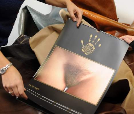
Is naakt of (de suggestie van) seks dan nu echt nog zo’n groot probleem? Je zou denken dat we wel wat gewend zijn bijvoorbeeld met de reclamecampagnes tegenwoordig van Diesel of de American Apparel. Blijkbaar wel. Om een voorbeeld te noemen, kwam er in januari dit jaar een kalender uit van de Italiaanse fotograaf Oliviero Toscani. Op elke pagina, bij iedere maand staat een close-up van het vrouwelijk geslachtsdeel. In Italië is er veel ophef over ontstaan. De feministen zijn boos en vinden de foto’s een belediging voor de vrouwelijke waardigheid. De kalenders mogen nu ook niet verder uitgegeven worden.
Volgens de vrouwen op de foto en de fotograaf zelf, zijn de foto’s een symbool van “untamed feminine beauty”. Volgens Toscani is zijn werk gericht tegen de standaard modefoto’s waar vrouwen mooi opgemaakt zijn en mooie kleren dragen. Hier wil hij juist de puurheid van de vrouw laten zien.
Met zijn vagina-kalender is hij in een bepaald opzicht met hetzelfde bezig wat Anthon Beeke deed. Hij zit ook erg op de grens van wat mensen nog kunnen aanvaarden en wat niet. Mensen voelen zich geconfronteerd met iets wat ze liever niet willen zien en kunnen het niet snappen.
Ik zou daarom willen afsluiten met een quote van Anthon Beeke zelf:
‘Tolerantie moet je steeds weer bewijzen en dat kan alleen door het te tarten.’
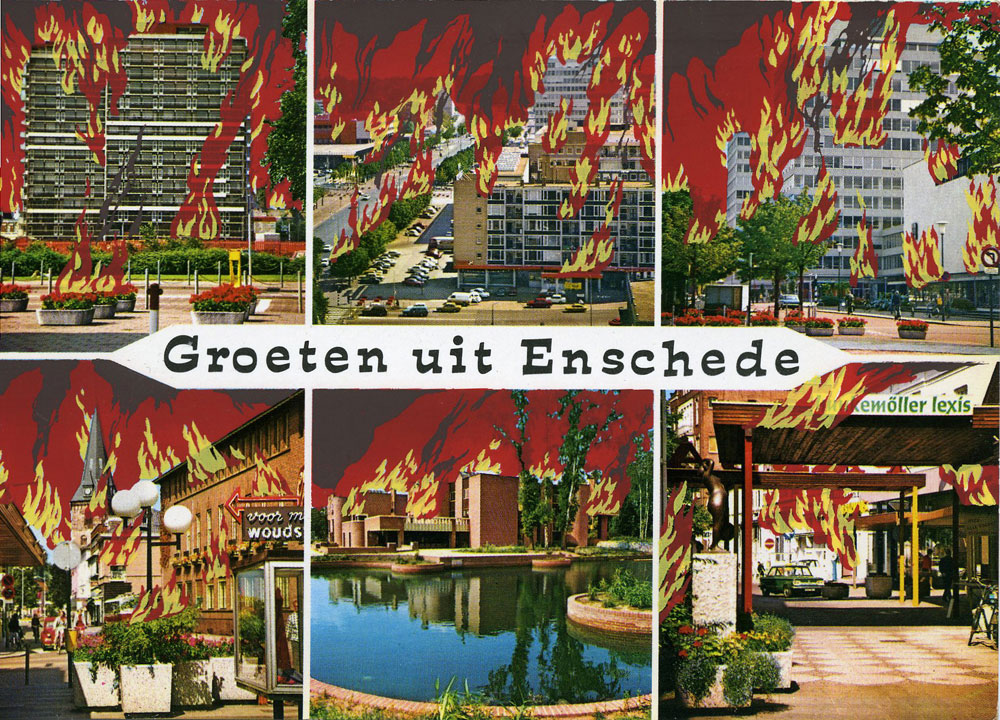
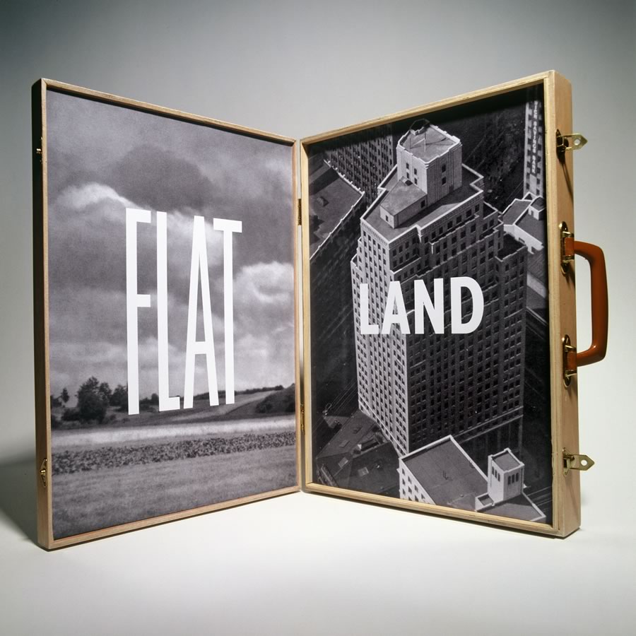
'Municipal Inferno', uitgave nº 6 van De Enschedese School.
The freedom of control.
What really fascinated me about our talk with Frans Oosterhof, was his way of talking about the freedom of control. When everything is made by hand, you lose control. Every item gets unique.
I think that is the reason, when I go down in the basement at school, I feel like going to heaven. When I enter the basement, I lose all control and works from a great passion in silkscreen and letterpress. I let stuff happen.
I love the physicality and the diversity in every work. You may have one starting point, one stencil, but end up with 10 individual works.
I am a control freak but love the freedom of control.
[by Kristine Andersen]
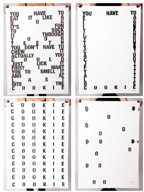
from basics
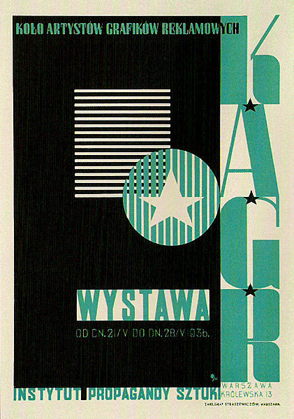
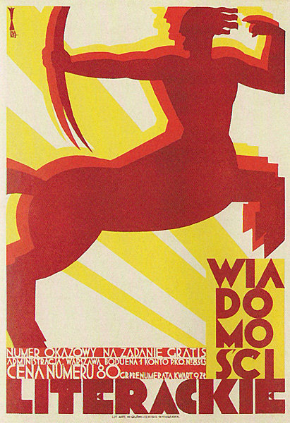
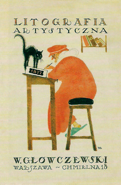
This “primitive” design when no computers were in use took me to the beginnings of poster design that plays such a huge role in modern world . As to understand what is happening now it is good to have a look in the past. I took myself to the very beginning of polish poster design as this country is very famous for.
I picked one of the most known poster designer Tadeusz Gronowski that reminded me of the words said by Frans Oosterhof that skills play large part of self development and can lead you to the unexpected results. It is also a way to explore new fields of creating that may affect your work later on.So, i chose him as an example to show that innovation , new skills and experimenting resulted in posters with new light and fresh background for innovative design.
“Instead of merely adapting his painterly style to the poster format, he sees in it the opportunity to create something new, indeed a new form of artistic expression. He is one of the first artists to consciously integrate the typography with the illustration and instead of choosing the obvious he offers the viewer a different look into the subject, often displaying a disposition for the light and the humorous which endeared him to the viewers.”
Frans Oosterhof is not only the key figure behind the Enschedese school, but also behind us: the basic year. So what are the secrets of the fist year study of Rietveld?
The year is there to tease us, to turn things upside down, so that at one point, after being troubled, we notice that actually it works, we can do it! We have confidence and means!
Also the January project is already a tradition to shake the dust of the christmas holidays back home from our shoulders. I was amazed by the stories of knocking down all the walls of the third floor and people from one class flying naked in the sealing of the school.
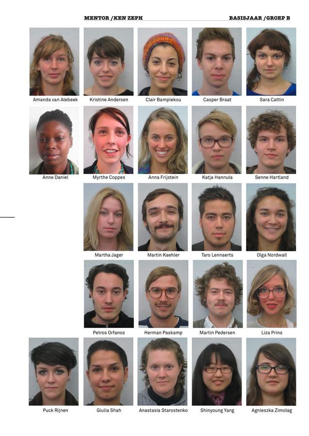
The groups are made with intuition, but carefully thought. First thing, to get the biggest possible mix of age, gender and nationality together. We also heard they look at our pictures, what attitude the face signals, how do the names sound together. It’s all part of the big plan!
Group-B Basic year 2010/11
How did we all get together? It is not a coincidence!
(by Katja Hannula)
Enschedese School
ft Renaldo and The Loaf
Enschedese School could be considered as a movement that’s similar to Fluxus, Dada, and the Nul-beweging, but according to Frans Oosterhof it’s not considerable as something that we should describe as a recognizable style.
According to the music that Frans Oosterhof played, and the things that he did reminded me of a band called: Renaldo and The Loaf. The band made lyrics that we could describe as: disorientating, hilarious, ungraspable, and ´it´ does not mock certain things and is also not considered as anarchistic, but maybe more nihilistic by denying that:
A. There is no style connected to them
B. Playing around creates a fundamental or essential work
C. Experimental, and considerable as avantgarde
Most strong connection to this non-movement [Enschedese School] is Fluxus:
A. It is not a movement or a style
B. Intermedia
George brecht considered it as ‘the smallest unit of a situation’ and i could also conclude that some fluxus-art-works could be overlooked as a art work [Duchamp’s Fountain, Manzoni’s feces etc.]
Conclusion is:
it was no movement + it did had characteristic qualities of other movements = a statement without belonging to something.
(by Petros Orfanos)
Personal Strength
On Thursday we met Frans Oosterf, a retired teacher of Rietveld Academie and a former founder of the Enschedese School. Within a couple of hours he explained to us how the movement emerged in the late 1970’s in the small town of Enschedese where some art students denied to specialize and decided to make a second foundation year to experiment more with their creative ideas using a variety of media that they chose for themselves. It wasn’t until the next year where the same people decided to move all together in a communal studio space, working in a collective way with their teachers and publishing magazines and vinyl’s of their songs and artworks. The Enschedese school lasted for several years as an independent art movement using reproducing techniques managed to send their Art by post to their subscriber within using comical elements and repetitive patterns.
Personally I admire truly their revolutionary spirit and I wish that I would one day find myself in the position of doing something similar.
(by Claire Bamplekou)
Is it possible to be ‘style less’
Frans Oosterhof said that he once promised to be and remain style less.
Don’t get me wrong I was amazed and very much inspired by this man, but still I wonder if it is possible to avoid a certain style.
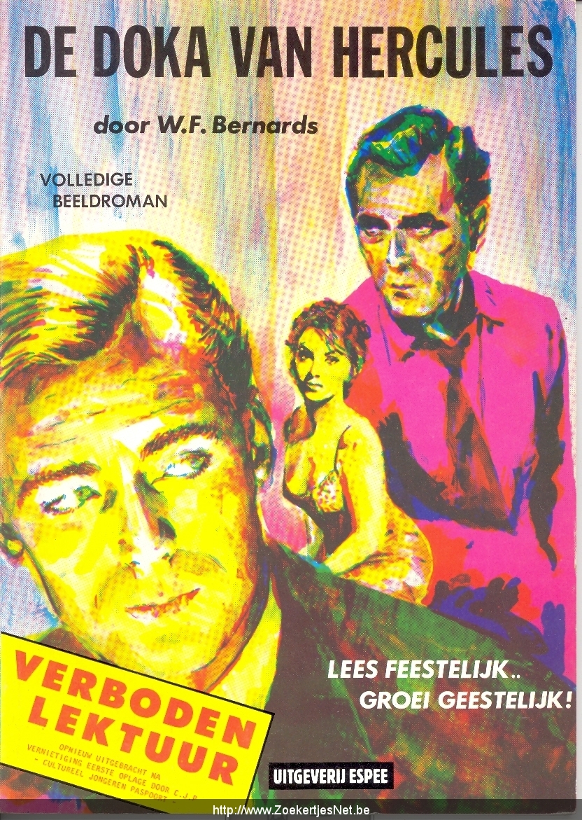
I do understand that he meant that he and the other members of the Enschedese School didn’t choose one medium to reveal their thoughts, but still it made me think of how and if it is possible, to escape from any style at all. When I looked at the work of the Enschedese School I still detected a certain overall style, I do not already want to say that that’s a bad thing. If we see for example the song ‘van Agt Casanova‘ and the ‘fake stamps‘ and the strip of ‘de Doka van Hercules’ but also in the painted crockery I sense the same kind of spirit, the same kind of style. Al these works mock certain settled persons or phenomenons in society.
Actually now that I’m thinking about it more and more, I do not think that an artist should be style less at all. Of course he or she should try a lot of different media and should not be bound to certain usages. But every time an artist expresses his or her ‘obsession*’ derived from the outside world and every time it is an obsession of the same person (or group), that is creating an overall ‘style’. Besides this (visual)artists have a strong visual intuition, I don’t think we (maybe this sounds arrogant) are able to escape from that! Of course we can make it as wide as possible, but making it to wide would also implicate a kind of indifference, a complete commonplace for an artist. What I mean by an obsession is a kind of affection or unease about something in the outside world that inspires to make a work of art. The way such an obsession comes to us, how we interpret them or express them is I think quite personal (groups only arise from sympathizers, by whom this personal process works quite a bit the same, it’s not likely that you’ll find yourself in a group with people whose thinking process you don’t understand at all.)
(by Liza Prins)
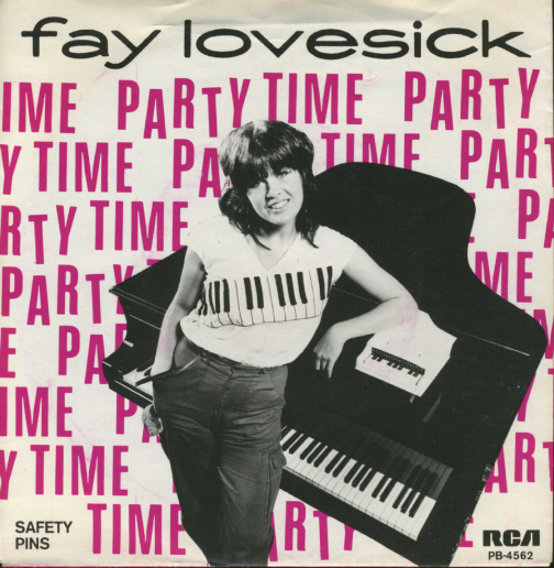
Loving it to Death
On the cover of an EP a girl stands in front of a piano. She is wearing a t-shirt with piano keys on it. Standing on the piano is a tiny piano. On the back cover there is a little biography explaining in a very joyless and matter-of-fact way that this girl likes playing piano and makes songs. There’s a certain insanity subtly presented here that’s hard to grasp and easy to miss. Even though the creations done by Frans Oosterhof and the rest of the Enschedesche School were too sharp-witted to simply call them parodies, they certainly expose the apparent clumsiness of popular media in the Netherlands of the seventies. The media and objects created by the Enschedesche School seem to, in a subdued kind of way, reflect the madness of the world that surrounded them. I believe the Enschedesche School were cynically honouring these stupid media by loving it’s form to death.Personally, the meeting with Frans Oosterhof reminded me of the joy and excitement of creating things/media/objects/situations/ART according to one’s own vision and of the significance of Doing It Yourself.
Without being pretentious, last Friday gave me the impression to understand a bit of my contemporary time. Frans Oosterhof told about his studies in art academy and his years in the Enschedese School movement in the 70s/80s’. The Gerrit Rietveld Academie follows the same way of thinking, revolutionary at the time and strongly contemporary nowadays. Frans also reorganized the Rietveld’s Basic Year, which he did several times going against the idea of taking a specific direction in a department. To hear the foundations of the Foundation was revealing and encouraging: the Enschedese School is just one of the influences that stays at the bottom of a contemporary way of teaching and learning. Frans says that in others academies “art” is not possible to explain, they teach every technique, but not how to be an artist because they don’t know what is the magic potion for that. He believes that art or not we should understand nothing around us, without right and wrong and stupid school critics, we need to surprise ourselves. We don’t need to choose a direction because we should say what we want, how we want and again swimming in millions of possibility. No prejudices about media and contents ,of course, and feel the education as moment of tryout and living together.
I felt part of something bigger, also if I’m not supposed to understand and only living making art accidentally etc… I had the real intuition to be part of a cultural machine working to produce a precise thought. I know we will write the history of today in the future, but I felt perfectly in time to perceive by intuition the reason to stay exactly where I am.
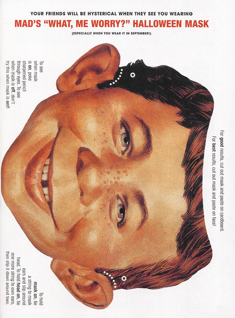
Taking part of some of the treasures of the Enschedese School’s vast production; I started thinking about MAD. I always loved the magazine when I was a kid, and my parents had some really old ones at home. When I saw all the printed media and witty designs in combination with mind-bending but tempting objects, it felt like the MAD Magazine had entered another sphere and all of Harvey Kurtzman’s old drawings and perverted fantasies came to life, walking and talking just as lifelike as Oosterhof in front of me. At one point I got really attached to the little brush-bird (the one made with pencils and grey wings), and I was sure I’d seen it before as a sketch. Searching my mind and especially old MAD archives, I couldn’t find the original source I was looking for. But it was satisfying enough, because playing around with it confirmed to me that if you put your mind to it, visions/dreams/unhealthy fantasies can come true. Even if it doesn’t make any sense at all to yourself or your audience. (If you print this and wear it at school I’ll give you an ice cream.)
[by Olga Nordwall]
De kopjes van Frans Oosterhof
Frans Oosterhof heeft tijdens zijn verblijf aan de Enschedese-school een groot project gehad met al bestaand ziekenhuis kopjes. deze vijfhonderd kopjes en schotels verfde hij subtiel met kleine verf spatjes en druipers.
Wat ik kon zien bij de kopjes die hij mee had genomen, leek het vaak op de kring, die je krijgt als je koffie morst, maar dan gekleurd. Dit was zo subtiel gedaan dat de schoonmaakster van Frans een paar jaar geleden een deel van deze kopjes die hij nog bezat heeft weggegooid. de schoonmaakster dacht namelijk dat het mengbekertjes waren die niet meer schoon te krijgen waren. Zelf zag ik ook eerst niet wat er zo bijzonder was aan deze kopjes, maar juist omdat het zo subtiel gedaan is, zijn de kop en schotel het project van Frans Oosterhof dat mij het meest bij gebleven is.
For this last posting I wanted to find a book wich I could connect to my other two postings. In the search system of the library I searched on the tagword ‘754.‘. Out of the hole list of search results one title popped out as ‘could be interesting’. The book was in the design category and had the title: ‘Prop Art over 1000 contemporary political posters’ . So on the cover of this book you could already find two tags of my previous posts (1000 and 754.). Political posters always try to convince you of something that the party who spread them stands for. In that way this book is also connectable to the tagwords direction and signs.
The book itself is filled with pictures of political posters, some of them in color. Most of the posters have something to do with war, or the remembrance of a war. But next to them are also posters shown about ecological movement and the women’s liberation.
I didn’t know what to expect when we went to the Graphic Design museum in Breda. But when I started at the exhibition about Jan Tschichold I was happily surprised! Actually I liked almost all his work that was shown, the beautiful compositions of form and colour. The work is simple and complex at the same time.
The posters were handmade; you could see the sketches of them and little mistakes or changes in the original version.
I loved that, because it was to me more a painting than a graphic design. You could see the playing of the artist with these forms and colours.
I chose for the poster “Die Frau Ohne Namen” as my favourite one, because it is a beautiful combination of film stills, shapes, line and colour. The triangle of the hat of the woman comes back several times; you see the movement of the train, as it comes out of a tunnel, which gives also the idea of a movie, which is projected. The addition of the colour red makes the image powerful and clear. To me it is a much better film poster than you see today, considering that it is an autonomous artwork.
So shortly said a very strong and beautiful film poster!
Tschichold’s posters interest me the most of his whole oeuvre, so I made a little research about his pictorial posters which you can read in this linked pdf “Jan Tschichold and his pictorial posters“.
Excavating the library, looking for pyramids, lead me to a late 60´s representation of posters by the graphic design artist Milton Glaser. The choice for this book is solely based on the cover graphics and has no other connection to the first book selected, though it seems that the fascination for pyramids and their monumental quality are shared by many designers regardless of the time or design field.
The size of this book (A3) is in my opinion very well adapted for displaying these incredible hand drawn posters. Every page is a poster and the more you look into them the more you see.
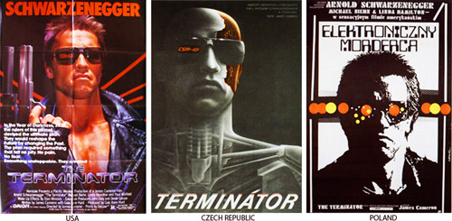
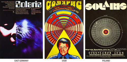
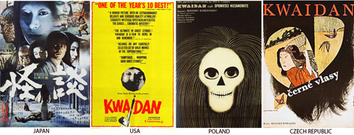
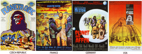
This letter I want to attach to my last message about national identity present in a street signs in different cultures. For the second time I’m using this book, which you can also take in a library. This time I’ve made a selection of posters made in different countries, but for the same movies. My thought was about the possibility of existance of different schools of postering. This posters, that you can find below, were made in the time when there were no internet for sending files with information and a designer or an artist had to improvise making a new masterpiece for the public. But this problem had made movie presentation even more interesting in different countries. Each country had added something special, non cliche. So, enjoy!
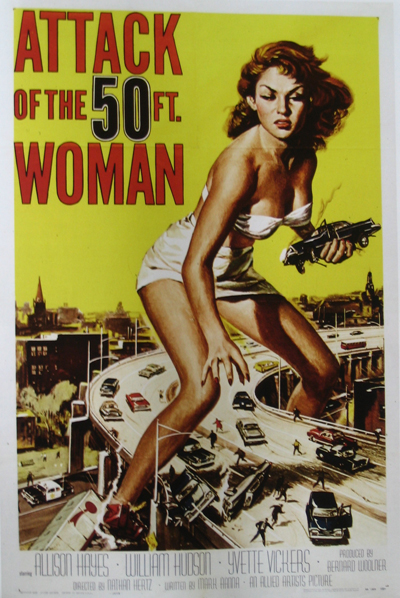
This book shows movie posters from the last 60 years. Just like rock music posters they are trying to give you an idea of the atmosphere of the movie. Most times you will already get an answer on the question: Is it an action movie? Romantic movie? Comedy? Action movies posters have a black background with a guy with a gun on it. Romantic movie posters have a white background. Horror movie posters are hysterical.
Interesting about the book is the way they ordered the book, by country. You can really see the difference between for instance east European film posters and France film posters.
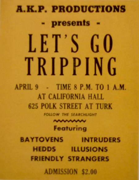
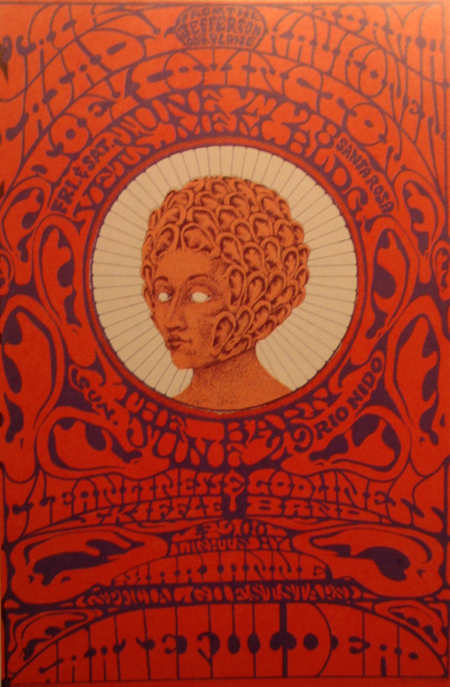
The book ‘The Art of Rock’ is about rock posters from 1955 until 1987, ‘From Presley to Punk’ stands on the cover.
I think. Only if you want a clear image of the atmosphere that these poster want to give you, you should not look at them closely. You should just brose through the book. Then you will find out that the atmosphere is mostly about drugs, endless summers and music. I like that. It takes me back to a few years ago when there were these cosy Friday and Saturday evenings with friends and no parents in the house when we just wanted to get as fucked as possible.
Another reason to not look to close at the posters is because most of them are not that good. When you do look good at them and look true all the tricks you will see there is a lot of graphic design creativity, which can work inspiring.
cat. nr: 754.1GRU