Skip to Content Skip to Search Go to Top Navigation Go to Side Menu


"experience" Tag


DOES GREY EXIST?


Wednesday, February 13, 2019

Grey is everywhere. Grey is the sky, the concrete of buildings, the street and its tiles, the walls of the room I am now sitting in, steel linings of windows, many pieces of clothing, the hairs of aging people –

There are many shades of grey, colder and warmer ones. Grey can be defined as the colour between black and white. It can also be seen in a slightly more abstract way as colorlessness, being undefined, without character.

Several definitions of the word grey are:

  • Without interest or character; dull or nondescript
  • Not accounted for in official statistics
  • (of a person’s face) pale, as through tiredness, age or illness
  • (of the weather) cloudy and dull[1]

What all these definitions have in common is that they, in some sense, refer to an absence. It is the absence of color, of character, of definition – it is a lack of capacity to be interesting.

So why would anyone ever choose the color grey for something they made? Would this then be for the object to go as unnoticed as possible? Would it be to suggest neutrality?

THE BOOK

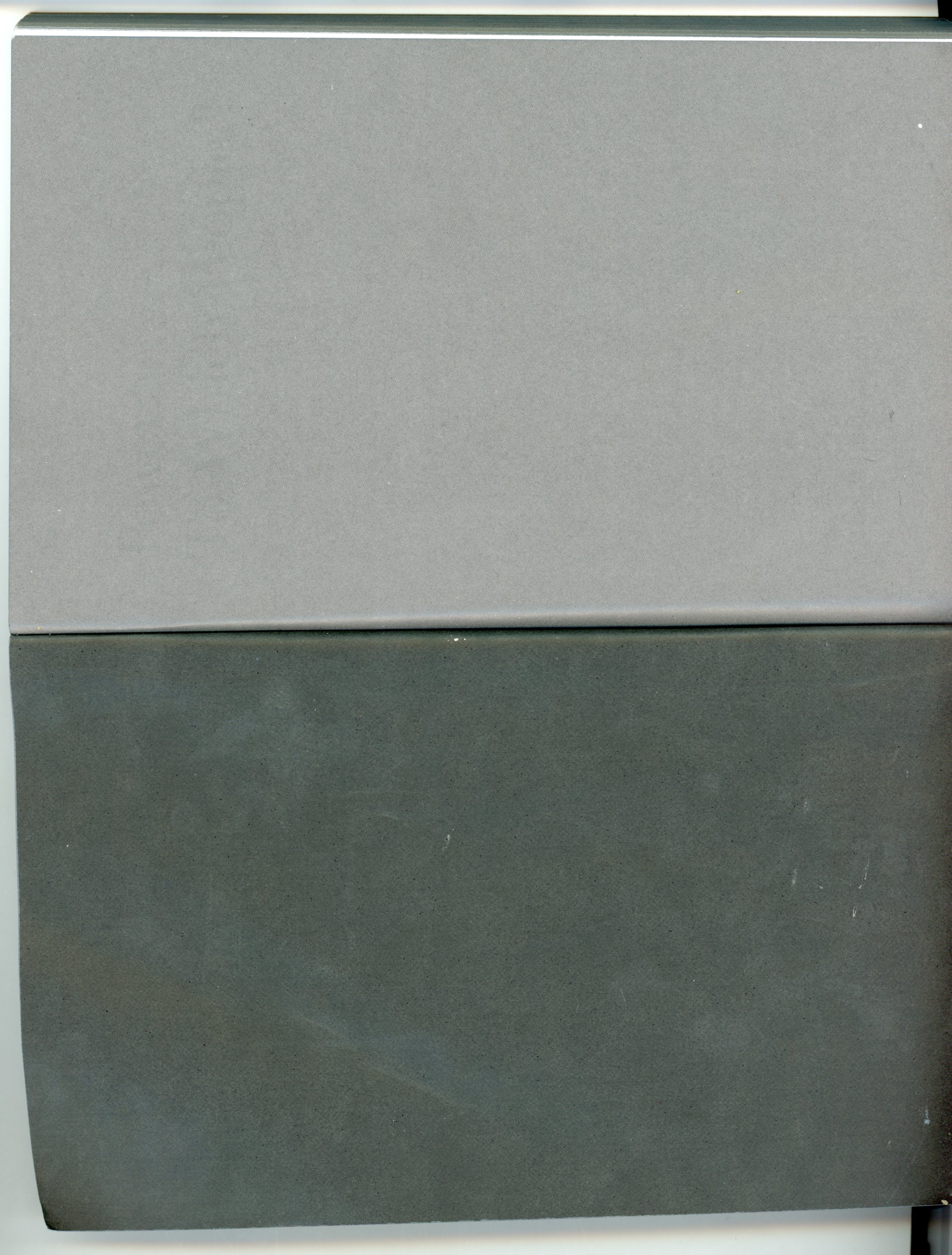
I found a book in the library that was completely covered in grey. The grey enfolded the text and the images that were inside, also filled the empty pages in between. The sides of the pages were grey, as was the cover, so that the book looked like a tile.

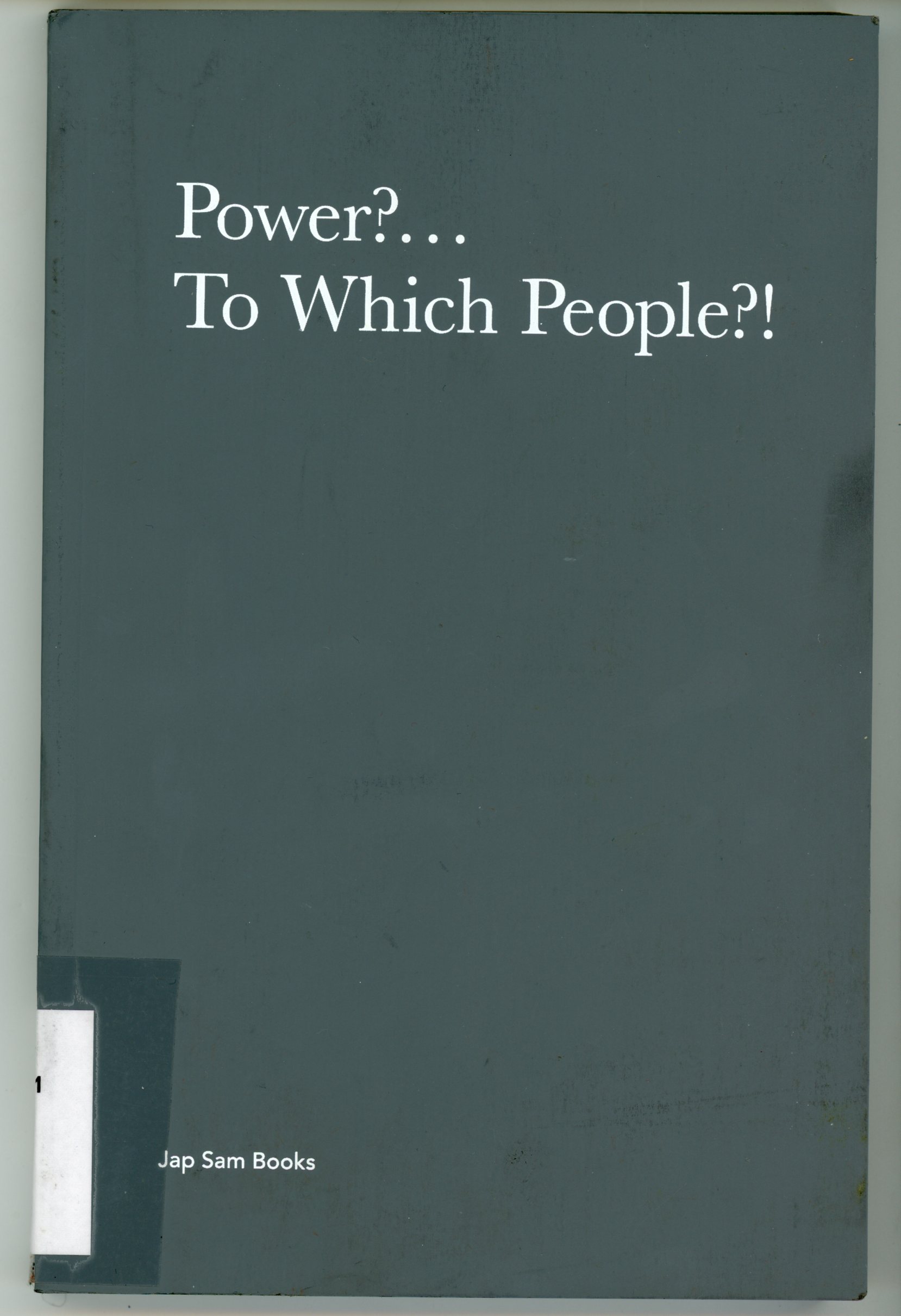
It was called “Power?… To which people?!”. It was a book about the Dutch artist Jonas Staal and contained a collection of essays and images related to the work of this artist. The graphic designer was called Laura d’Ors.

The greyness of the book was so dominant that I could not get past it. Although the content seemed interesting and I was somehow

tempted to read some pages and look into the images in detail, I mostly kept turning it around, covering my eyes in the grey that was all over.

I think the grey put a kind of silence around the book that made it into a very solid object. It was such a big visual decision that it forced me to relate to it

before relating to the book itself .

I found myself just flipping the pages in search for more grey, tracing the surfaces that I found with my fingers. I found the colour was also very present in some images in the book. Because of their connection with the cover that had struck me, these images stood out to me more than the other images that were in the book.

It took me a while to realize that the text was written in the same grey. Contrasting with the white background, it looked somewhat darker. I only realised its greyness when there was a big symbol placed next to it in the same colour.

THIS GREY

So what was the grey of this book exactly like?

I think a picture will never show the colour right as I saw it. It was a cold tone, with some hints of blue in it. It reminded me of the Rietveld grey, the colour that is used to paint the walls of the academy. It had the same natural and deep, yet cold quality.

Still, it was different from the Rietveld grey. It seemed less accessible. It was not a colour you could walk into. It was not a colour you would put on a wall. I think it was less green than the Rietveld grey. It was a bit darker as well.

WHY?

To come back to the question I posed earlier: why would anyone ever choose grey for something they made?

In the case of the book there are two aspects of the choice. The first one has to do with the excessive use of the colour. If another colour, for example green, would have been used in the same way that now grey was used, this would have equally caught my attention.

Now, let’s imagine it was green; what would this then result in? I think I would have thought that it would be a book about nature. Or imagine it was red; what kind of associations would that give? It could be about violence, love, blood…

The encapsulating of a book in one colour the way it was done here, immediately results in questions from the reader: why is it like this?

So why then did the designer choose grey? This is a hard question to answer, because associations with grey very often relate to backgrounds, such as walls and skies. Seeing it in such a prominent position where it is taking a lot of attention, is confusing.

Maybe that’s exactly the reason why she chose this colour – it is an anti-colour; like I said, a kind of absence. It puts the book into a background and by that enfolds it in the greyness of the world. It becomes part of the sky, the concrete and steel. It doesn’t have a colour to speak, it has a colour to be. To be a thing.

[1]Oxford dictionary

Jonas Staal: Power?… To Which People?!. design by Laura d’Ors, Rietveld library number: staa 1

Back to intimacy


Monday, February 19, 2018

When visiting a museum, it is often hard for me to decide what to find more intriguing: The exhibited artworks or the visitors walking carefully among them, observing them. Hardly ever do they physically touch, or if it happens, then in shyly hidden ways. Especially when it comes to everyday design objects, there seems to be a big gap in between the visitors and the exhibited pieces, which are locked away from their original function: to be touched and used. During my last visit at the Stedelijk Museum there was for instance a person standing for quite a long while infront of a vitrine where, in between other objects, Kaj Francks „Kilta Services“ was being exhibited.

Franck was one of the designers who developed the „Iittala philosophy“: creating design that is both beautiful and functional, and lasts a lifetime. „Does not ‘beautiful’ ultimately mean necessary, functional, justified, right?“ (Kaj Franck, 1978)

In the center: service „Kilta“, glazed ceramics, production in 1953 – 1975, designed by Kaj Franck

In the center: service „Kilta“, glazed ceramics, production in 1953 – 1975, designed by Kaj Franck

The person looked at the plates and cups inside, slightly leaning against the glass that was separating him from the objects. Why was he so attentively watching them? The longer I observed the visitor observing the tableware and the distant space between them, the more I started to think the glass vitrine away and imagined him having a real physical experience with one of the cups instead: the two being naturally rejoined, exchanging what is deep inside.

‘He holds the cup that is filled with tea, leads it towards his mouth and drinks from it. The content flows in one direction which is his interior. Luxoriously he sucks the liquid inside and the cup seems to be very willing to feed him.

“The cup is the drone of the ceramics world, perhaps the hardest working of vessels and the least appreciated. In the grandest of tea or coffee services, the cup is usually the most underdesigned object, playing the role of subservient pawn to the teapot’s queen.“ (Garth Clark, „The Book of Cups, Abbeville Publishing Group, New York, 1990, p. 17)

He drinks everything of it until it is empty. But it still contains the warmth of the hot drink, as he inserts his finger he can feel it. For a short moment they contain the same warmth, the cup and him: he contains the warm tea and the cup the rest of warmth of the tea.

„Close space! Close the kangaroo’s pouch! It’s warm in there.“ (Le Temps de la poésie, G.L.M. July 1948, p.32)

cup, Service "Kilta", designed by Kaj Franck

Service “Kilta”, designed by Kaj Franck

He shouts into the cup and holds it close to his ear: he hears a distant echo. The echo vibrates a few times and is gone. He holds it close to his breast and feels that it is vibrating synchronously to his heartbeat.

„When we evaluate everyday objects, we should place more emphasis than we usually do on ergonomic quality and tactile sensibility“ (Kaj Franck, 1978)

He fills it with tea, looks at it and it is roundly opened as if it was calling him. He lifts it towards his mouth and his lips connect to the cup. They softly touch and his tongue reaches the wet content. Then the kiss becomes wild.

„Many a slip twixt cup and lip“ (Garth Clark, „The Book of Cups“, Abbeville Publishing Group, New York, 1990)

service „Kilta“, designed by Kaj Franck

Service „Kilta“, designed by Kaj Franck

After finishing he cleans the cup. The cup is very deep, so it is hard for him to reach the ground. He cleans and dries it with care and attention, outside and inside. That makes the cup shine and renews its promissing interior.

„A house that shines from the care it receives appears to have been rebuilt from the inside.“ (Gaston Bachelard, „The Poetics of Space“, Beacon Press, Boston, 1994, p.68)

Afterward him and the cup are cold and empty. He looks around and decides to continue drinking from it: what comes out is sweet. He feels a strange feeling that is increasing and expanding inside of him. It tickles him in an unknown place and he bursts into tears.

„Moreover the cup does not have any immediate sense of drama (…). But that does not mean the drama is absent, rather that we need to examine the cup a little more closely and consciously to discover its sense of domestic theater“ (The Book of Cups, Abbeville Publishing Group, New York, 1990 p. 19)

     "Venus von Willendorf", 1963, by Otto Piene, oil and soot on canvas

“Venus von Willendorf”, 1963, by Otto Piene, oil and soot on canvas

His tears keep on falling inside the cup. It takes more or less three seconds for the first teardrop to reach the ground, the noise sounds far. When the cup is filled with tears he is still crying. He looks inside and sees his face inbetween reflections of light.

„My cup runneth over“ („The Bible“, Psalm 23:, Ezekiel 34:11-24; John 10:1-21)

Suddenly he grabs the cup and throws it against the wall…’

service „Kilta"

service „Kilta”

„A kind of cosmic anguish precedes the storm. Then the wind starts to howl at the top of its lungs. Soon the entire menagerie of the hurricane lifts its voice.“ (Gaston Bachelard, „The Poetics of Space“, Beacon Press, Boston, 1994, p. 44)

As I awake from my daydream, the visitor of the Stedelijk Museum is gone, leaving no trace of evidence for what in different circumstances might have happened between him and Kaj Francks „Kilta Services“.


Wimble click crumblechaw beloo


Thursday, September 15, 2016

650-ANDREEA_PETERFI_ANNELAKEMAN

Umberto Eco in his Six Walks in The Fictional Woods is referring to the idea of an optical illusion, for explaining how we are perceiving the fictional novels. Throughout his essay we are being shown, several illustrations with which he is visualizing the concept behind his es- say. Although it is not a children’s book, he is adding the illustration for the means of having a common understanding on the topic he is referring to and the concepts he is presenting.
While in children’s books, unfortunately, the freedom of the child using his fantasy is taken away, by – and thus imposing the fantasy of – one or more grownups, directing them in what they must see and understand as to have a common memory. I will come back on this subject later.
In Eco’s book though it is necessary to have the same understanding of the concept he is proposing. He is pointing his finger, saying “this is what I mean and not other”. Being able to maintain a certain common understanding, while using words, either in speech or writing is very difficult, as De Certeau is pointing it out in The Practice of Everyday Life:

“The readable transforms itself into the memorable: Barthes reads Proust in Stendhal’s text; the viewer reads the landscape of his childhood in the evening news.”


650-ANDREEA_PETERFI_ANNELAKEMAN-2

Simply because we have agreed that, say: cup is a cup it does not mean that we are talking about the same subject/object. Each of us are having a specific memory of the word, being related to either the time we have learned it first, space, surrounding, atmosphere, mate- rial, color, size or form, are additions to the experience we are relating the word to.
When we say the word cup we refer to all the cups from everyone’s memory, and to the only one cup we relate to personally, all the cups we have happened to see, and even the ones we do not yet know about.
Here I will make a short parenthesis for coming back to what I have said above, about the common memory of the children, whom have shared the same book in the past. Clearly there are a few objects in each generation (related to time) or cultures (related to place) we can think of, that are bringing a sudden nostalgia. Referring to one of these objects from our common memory, has the power to affirm and acknowledge the ground where one that stands facing the others. Thus sharing a specific memory of a specific object can be decisive for taking or not part of the group.

650-ANDREEA_PETERFI_ANNELAKEMAN-3

Once this idea is settled there is no need for other words to explain ourselves. We now can trust each others understanding on a number of other discussions, that we do have similar experiences.
Let’s take the 90’s generation as example. We might have experienced objects as Tamaqotchi, Nokia Querty, Pokemon and Dexter’s laboratory even though we come from all different countries and cultures. Recently I have participated in a some similar talks in a few different settings about Tamaqochi. It seems that somehow the memory of this object, keeps reoccurring. There are exactly a few specific answers to the question: “Oh! And do you remember Tamagotchi?!” that represent the object at it’s best and everyone understand their meaning.With or without the additional –
annoyed : “Oooh! Noooo, please….(it was such a stupid game, it would always die during the class)” .
and the enthusiastic : “Yes Yes! (I actually had a few)!”.
Whether one remembers more the annoyance or the pleasure, in the end both sides know exactly what it all meant or felt like. Thus trough sharing a common reference point they are becoming ‘a group’. They can now feel closer by the fact that they have shared a common/similar experience. Trough sharing a common experience the ‘other’ becomes ‘we’. While the ones that did not share the experience have a harder time to relate to the word and the meaning it carries with it.
This of course is a simplistic example and as such I am here not discussing the importance of sharing the idea of the Tamagotchi persé as an object/name, or as an experience, but replace it with something of a bigger importance – and that is where we, although having developed language to be able to transmit thoughts, can not get over the struggles of truthfully understanding their meaning and in some cases we overlook their importance by not being able to relate to other people’s experiences only trough words.


Cover_shaded download this thesis by Andreea Peterfi
all rights to this thesis are property of the author © 2016


Through the stages of chewing gum.


Saturday, May 16, 2015


                                              oO.oO

                                       .oO.oO.oO.oO.oO

                                    .oO.oO.oO.oO.oO.oO

                                       .oO.oO.oO.oO.oO

                                             .oO.oO


.oO  STAGE 1 : Culinary World
[audio:https://designblog.rietveldacademie.nl/wp-content/uploads/2015/05/STAGE-1.mp3|titles=stage 1]

.oO  STAGE 2 : Roel Oostrom
[audio:https://designblog.rietveldacademie.nl/wp-content/uploads/2015/05/STAGE-2.mp3|titles=stage 2]

.oO  STAGE 3 : First Sketch 
[audio:https://designblog.rietveldacademie.nl/wp-content/uploads/2015/05/STAGE-3.mp3|titles=stage 3]

.oO  STAGE 4 : GUM!
[audio:https://designblog.rietveldacademie.nl/wp-content/uploads/2015/05/STAGE-4.mp3|titles=stage 4]

.oO  STAGE 5 : Maizena Experiments
[audio:https://designblog.rietveldacademie.nl/wp-content/uploads/2015/05/STAGE-5.mp3|titles=stage 5]

.oO  STAGE 6 : Chewing
[audio:https://designblog.rietveldacademie.nl/wp-content/uploads/2015/05/STAGE-6.mp3|titles=stage 6]

.oO  STAGE 7 : Hunting For Material
[audio:https://designblog.rietveldacademie.nl/wp-content/uploads/2015/05/STAGE-7.mp3|titles=stage 7]

.oO  STAGE 8 : Perfect Wrapping
[audio:https://designblog.rietveldacademie.nl/wp-content/uploads/2015/05/STAGE-8.mp3|titles=stage 8]

.oO  STAGE 9 : Experience Of Chewing
[audio:https://designblog.rietveldacademie.nl/wp-content/uploads/2015/05/STAGE-9.mp3|titles=stage 9]


.oO THE GUM                                              .oO THE DIP 

SONY DSC    SONY DSC

.oO THE PACKAGE

SONY DSC


Sitting in Red and Blue or Zigzag ?


Sunday, March 29, 2015

First time I encountered him, it was at theory class;

The second time I encountered him, was at a museum exhibition;

The last time I encounter him, was at a teacher house.


MoMa_RedBlue23

original Rietveld Red and Blue chair 1923 from MoMa collection • chair at seen at exhibition


Bright color surface, complex structuration. I was deeply attracted to him, the Red and Blue Chair, one of the most famous chair made by Gerrit Rietveld.


Red and Blue Chair is an important example of the three-dimensional works of De Stijl. One typically relates the chair to De Stijl, or concept of design in general, rather than to utility. The unstable outward appearance and the height of the chair raise questions about its comfort.


One can imagine the importance of comfort in the design of a chair. There are well-established criteria for the ergonomic evaluation of chairs to prevent user discomfort and injury. The main ergonomic considerations for chairs in the workplace are the following: comfort, safety, adaptability, practicality, durability, and suitability for the job. Luckily, I had a chance to sit in an original (1958 Groenekan) Red and Blue Chair at my teacher’s studio. Before I conclude the chair is actually comfortable, I would like to summarize a few points from my experience sitting in it.

1
at teachers home 

First of all, as an armchair, the sitting angle is relaxed. The chair has armrests at the appropriate height and of the suitable length. The most essential part of chair was the back. The back is long which gives support to the lumbar region and the shoulders. For people who aren’t too tall, they could relax their head against the back of the chair. What’s more? Since the production of materials is wood, cut boxy neither polished round. So sturdy texture reduces the comfort of the chair.  However, it creates a better sitting situation, combining the chair with cushion. The chair with its logical construction could easily be made much comfortable with the help of some cushions.


The most fundamental question is adaptability: the chair’s dimensions and control features cannot meet the ergonomic characteristics of at least 60% of the potential users, due to the low seat. In fact, present standards would not define it as a suitably ergonomic chair. However, it wasn’t Rietveld’s original intention to design a chair for people to sit on for hours on end. His famous words are sitting (in Dutch “zitten”) is a verb (verb in Dutch translates into “werkwoord” a combination of the words “werk”= work and “woord” = word), meaning ; “sitting is an active pastime“.
Compared to today’s concern about ergonomics, the culture of sitting has experienced a great change from the past, according to the Australian engineer and designer Albert Linschutz in 1928.


Chair comfort level and the user’s body position are inextricably linked. This network survey shows that most is known as a comfortable chair, the way the vast majority of the user’s apply are lying down, compared to sitting, lying down, of course is more comfortable.


chair-Ergonomics_1100


A Short Interview with André Klein.Foto-André1


Question:
What do you think of red & blue chair by Rietveld?
André:
" Hmmmm, it was never my favorites.
It seems uncomfortable but I must admitted when you sit, its not so bad. But after 20 minutes for me its maximum.
And I like Zig-Zag chair much more as a design."


The Zig-Zag Chair is another chair designed by Gerrit Rietveld from 1934. It is a minimalistic design without legs, made by four flat wooden tiles that are merged in a Z-shape using joints.
cassina-zig-zag-2822-5525_z1Rietveld_ZigZag

Zig-Zag chair by Cassiba • original copy 1934 from the MoMa collection

Besides the superior Z-shaped appearance, the flat seat and vertical backrest are joined by a system of dovetail joints. Coupled with the unique shape, the straight back of chair is perfectly matched with user’s back, which creates a better comfort situation. Sufficient height of the chair seat becomes much more practical and ergonomic for the user. One does not need to exert much energy or rely on an armrest to be able to stand easily, which is a feature the Red and Blue Chair cannot achieve due to its low seat.  What’s more? Since school still keeping the original zigzag chairs made by Rietveld, I also got chance to sit on it. For my own perspective, the specific design angle could correct user’s sitting position and it becomes much pleasant sitting experience due to the ergonomic principle.

zigzag

at school's student office


Zig-Zag Chair as a designer chair was one of Rietveld’s most economic designs. Cassina S.p.A, an Italian manufacturing company, is still producing the replicas of the Zig-Zag Chair up until this day.

The chair is in fact quite sturdy, yet comfortable. With or without the addition of cushions, the chairs have proved be very efficient and have served their owner over many years.


By comparing the two different styles of chairs made by Rietveld, the importance of user comfort within design is put into question. As design students, we must understand the concept of design within many parameters. For instance, when we design a chair, considering appearance and functionality, at the same time, we cannot avoid considering comfort. We take user’s sitting preference, or changing the material or shape as factors or direction to achieve the demanding of comfort. A good design will often require meeting several standards. I believe that this concept is applicable to all design.


Design is to change the life, so that people can enjoy and sustain life more.


ON MATERIALIZING EXPERIENCE


Tuesday, April 1, 2014


Pierre Niviere and Lisa van der Breggen* talking together on the subject of materializing experience

'Think Inside My Box' movie


Each project that students initiate, makes them into temporary experts on given topics. Art & Design schools then become knowledge hubs where different expertise cross fertilize. By looking at what types of research students engage in, Designresearch and UnBornLab organized a 'workshop' to investigate design matters from a students' perspective.

Through a series of short video's students from both the Foundation Year and the DesignLab department share ideas, focusing on the temporary expertise gained as part of their projects, rather than the outcome. The workshop was articulated around one of their given assignments. Students were asked to develop a specific object or context to help focus or explain content.

The format is clear: two persons, discussions, filmed from above.
the space is : two stools and a table.

* Foundation Year


I >Am< >Here< In This Space >With< You


Monday, January 27, 2014

Have you ever had different impressions than in the past or than other people in the same space? I can give two examples;

image1_Hanna Lee

There is a place where I always pass by with my bike. Today, I decide to walk along that same space. I stroll in this space. I ramble through every corner and small alley. My feet lead me to the scenes which were always there but very new to me; an ivy-covered wall, small scribbles of children probably who lives in this neighborhoods, tiny bike tricycle lying on someone‘s front garden and windowsill-piece with nice touch. I enjoyed these scenes while walking through the same place where I pass by regularly. I always thought I knew this place very well, but today I was only started to become conscious of these new and everyday-life scenes.

My friend and I passed through the narrow alley and came to a small door. When we opened the door we were able to enter a space. It was deep and narrow. The width was not enough for us to stand side by side. The side walls are high and ceiling was open towards a nice blue sky. I could see a bird flying and hear the wind. Space was quite dark, but I felt very comfortable and fresh. But my friend had left the room already, later she explained why; she felt almost choking so left the space early.

This might be a daily experience which we encounter often, but if it occurs too often we might not put any extra attention to it. I had a curiosity for this event, and wondered why there are such differences according time and person. I am sure that many readers had the same experience like this and wondered about it.

image2_Hanna Lee

Metaphorically speaking, space is ‘vessel’ that contains food, and this food can be defined as ‘happenings (or events)’ in the space. This ‘vessel’ gains its meaning only when it is used and it meaning will be even enlightened if the ‘food’ is delicious. On the other hand, the shape of ‘vessel’ differs according to its containing food; bowl, plates or cups. Every food has is matching vessels, if it is not matched well; simply, the food loses its merits. And of course this same food in same vessel can be tasted differently to every people depending on their preference or their body conditions. This ‘taste’ can be also, metaphorically, defined as ‘spatial-experience’. I want to explore these factors that create different taste which can be said as ‘recipe’- The secret of tastes. And I presume this factors-recipe- is ‘Experience’.

I "Am" "Here" In This Space "With" You : read or download my thesis below


It appears you don’t have a PDF plugin for this browser.
No biggie… you can click here to
download the PDF file.

This essay initiated my graduation project “A Scenic Contemplation” presented at the grounds around the Rietveld academy as part of the 2013 graduation show.

650-_MG_0721_Hannalee_V

– A Korean Philosophy about window and surrounding says: “ Window is a frame that can hold scenery.
This philosophy about the window is called “borrowed scenery”. The borrowed scenery method reflects the exterior landscape into the inner spaces, forming new scenery.
This method does not destroy environment. It just borrows the environment. If you follow this philosophy you can live with a breathing landscape painting. When you borrow a landscape via the window, the architecture can breathe thought the window. The borrowed senery method make your senses soft.
I was impressed with this philosophy, especially with the attitude and the way how they treat the environment. They did not use the environment only for their own sake, but they borrowed the scenery and lived along with it.

It is a humble way to live with the environment.

text by Hanna Lee [graduate student department of inter-Architecture 2013]

Screen shot 2014-01-27 at 12.59.03 PM Download the publication ”A Scenic Contemplation“


Log in
subscribe