Skip to Content Skip to Search Go to Top Navigation Go to Side Menu


Archive for October, 2013


the “ B A T H T U B ”


Tuesday, October 29, 2013

John Knight - Autotypes

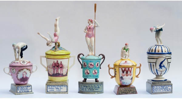
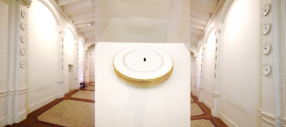
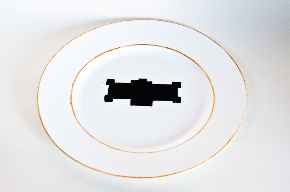
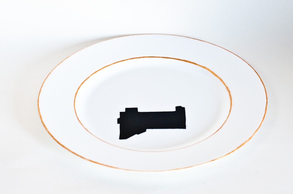
Walking through the high white corridors in the Stedelijk Museum, you notice the colorful museum Posters on the left wall. On the opposite wall, there are four rows of five plates. Because of the white background, they do not pop out, but blend in to the surrounding. Next to a vitrine with a stack of five of the plates inside, a sign explains the artwork and the artist. The black graphical forms on the plates, with a gold-trim, are parts of blueprints. These blueprints are the recent additions to Modern and Contemporary Art Museums around the world.

The work, acquired in 2011, is titled Autotypes. The title stands for the desire to expand and to create, which fits the underlying criticism of the artist John Knight (LA, 1945) and his work. With the by mass-production created set of porcelain plates he creates an opening for a critical discussion of the changing role of the museum. Which includes serving a marketing tool for city branding within the ever-expanding spectacle of mass tourism. Because the plan of the original, historic structure are omitted, the blueprints of the additions are isolated, showing the uniformity of museum architecture.

John Knight Autotypes

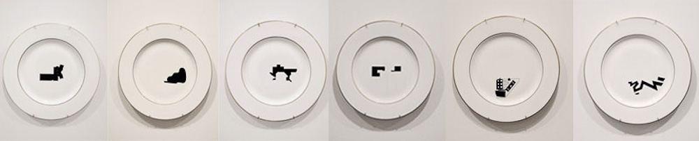
The moment I looked up at the plates I was intrigued. The gold on the white ceramics looked sophisticated and slightly kitsch, but the black graphic made it modern. Which is just the way I like it, slightly kitsch with a modern touch. Before I read the text about the work, I thought about the forms. ‘What do these forms stand for? Do they tell a story? About a growth? Expansion? Are there any recognizable forms? Is there a specific order?’

So when I read in the information that they are parts of blue prints and that this is part of a debate on the additions to museums now a days, it made me think. I was standing in one of these museums that had expanded. Why did the Stedelijk change? And why did it take so long?

By asking myself these questions, I realized that John Knight had pulled me into the debate. A clever man, that John Knight.

Mysteryman

After seeing this question-raising artwork, I wanted answers. So, what is this debate John Knight is referring to really about, what role does the Stedelijk play in it and WHO is this man I have never heard of? I could not find any images of the man in question, so John Knight’s appearance remains a mystery. I do find out that he has been around in the art circuit for quite some time and that it is not easy to lay a finger on him.

He has been producing art since the late 1960s, early 70s, using existing forms and communication to reconsider the social structures and value systems that support the exchange of ideas and merchandise. He takes the art establishment as his subject of investigation. his practice unpacks conventions and codes that give art its value, using art as a platform to reflect upon larger political and economic systems. Working “in situ,” each project is based on analysis and intervention specific to the venue at hand; its aesthetic logic takes its cues from the structure of that of the gallery, museum, or other exhibition space.

Another stack of plates

I also discovered that Autotypes is a follow up work from Museotypes from 1983: sixty glazed ceramic plates with gold trim. Like he did with Autotypes, he did not represented the particular museum building by its familiar, literal image. Instead, he ironically chose the abstract configuration of the floor plan that on the plate serves as a ready-made code or symbol. In Museotypes John Knight fuses various visual but specifically non-art traditions in order to questions and revalidate contemporary art. He presents the plates as collectable items and reduces them to commercially available, limited-edition souvenirs. The museums are literally put on display, and as the artist explained, the work as a whole becomes “a representation of the museum and its role in culture”.

Bathing in art

In the last several years it has become necessary for museums to expand not simply to house their ever-growing collections, but also to stake their claim in a global tourist trade characterized by spectacle and speculation alike. But, why did the Stedelijk Museum change?

Old Stedelijk museum - Nickname Stedelijk museum - New building Stedelijk Museum

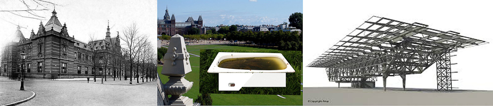
The original Stedelijk Museum was designed by A.W. Weissman in 1895 to house modern art and contemporary art. It was built in a Neo-Renaissance style
but in 2003 firemen made the museum shut down temporarily for a renovation. It lasted until September 2012 to re-open in its full glory. A new all white and glass part was added to the existing building by Benthem Crouwel Architekten. A few major changes were made with the renovation: it had created enough space to house the permanent collection in the main building and temporary exhibitions in the new part. Because of its remarkable appearance, it didn’t take long for the museum wing to get nicknamed the Bathtub. To get back to John Knight, the Stedelijk museum closed, not because of too little space for artwork, nor too little space for the public, but because of safety issues. However, in the end the expansion took care of both.


John Knight inspiredJohn Knight inspired

Put it on a plate

I wanted to do something with the information I had gathered. Firstly, the fact that Autotypes is a work that is visually as interesting as the idea behind it. Secondly, the fact that John Knight chose this medium, ceramics, to make a point. Thirdly, the fact that the work Autotypes is the extended version of Museotypes. And lastly, the fact that the Stedelijk did not really need to expand, but during the time it was closed slowly took part in Knights discussion. That is why I expanded John Knights work with three more plates. On one of the plates I drew the old floor plan of the Stedelijk museum. On another I drew the floor plan of the Stedelijk museums extension from 2012 and on one plate I did my own take: the nickname of the Stedelijk Museum. I think it is a very interesting subject, nicknames. I think in the case of John Knight, it doesn’t get deeper into the discussion. But, I do think it goes deeper in to the subject. Knights discussion talks art and tourists, but it doesn’t say anything on the people of the city where the museum expanded. A nickname would then be a symbolic gesture to the reaction and or emotions of the people living in the area.

But then again, maybe it is just me. I am an ‘Amsterdammer in heart and kidneys’ and when this huge white thing was added to the Museum square, near to where I went to school for six years, I had to process this. Apparently in this research, I started with trying to be a participant in an interesting discussion on museums and their expansions and ended up in ceramic therapy.

John Knight inspired


Moving Forward


Monday, October 28, 2013

Daan Roosegaarde has been one of my favorite modern Dutch artists since I saw him once in the TV show De Wereld Draait Door, where he discussed his work Crystal, Marbles and Dune. This is because his way of thinking and working; he combines art with technology and tries to improve the world. Especially the first work, Crystal, caught my attention right away: thousand and one light rocks that interact with people: the lights functions as a ‘digital campfire’, each crystal contains an LED light charged via a power mat. People can move them, add them and even take them with them, once they are moved the basic breathing of the crystals changes. The lighting behavior of crystals moves from ‘excited’ to ‘bored’, keeping visitors curious. The lights become social and people can share their stories about the lights. He said himself: you can share or steal them and sharing is the new having. I think this is a good point because in light of the economic crisis and the earths resources running out we have to change the way we life now and make a new world and I think sharing is a good way to solve a lot of problems.

Crystal

His side-specific art installation Dune is also one of my favorites and is the work I have chosen from the Stedelijk Museum. A landscape of ‘Wuivend Koren/Waving Wheat’, which interact with human behavior; your motion and sounds. To watch, walk and interact. The work is made of large amounts of fibers with lights in it that brighten according to the sounds and motion of passing visitors. A new way of making a futuristic nature in relation with urban space. Nature and technology together. I saw this work on videos before I saw it in real life in the Stedelijk and that is a world of differences. By interacting yourself with the art work it makes you feel part of it and that gave me a really good feeling. The sight, the sounds, the lights, the change of it made it really special for me and is the reason why I really like it. The work was shown in museums in Amsterdam, Rotterdam, London, Tokyo and Hong Kong.
The specifications are: modular system of length 100 cm, width 50 cm, variable heights. Hundreds of fibers, LEDs, sensors, speakers, interactive software and electronics; variable up to 400 meters.

Dune

The last couple of years Daan Roosegaarde had a lot of publicity, his works has become more known, he was a regular guest on Dutch television on shows like De Wereld Draait Door, has won this year Danish Index award, which is regarded as the most important design price, for his work Smart Highway, he has his own studio called Studio Roosegaarde with establishments in the Netherlands and Shanghai. Last summer 2013 he was a guest of the Dutch talk show ‘Zomergasten‘ which was really nice. This episode of ‘Zomergasten is the reason I became a big fan of him and his work, because that was a good way to really get to know him and his ideas. ‘Zomergasten‘ is a Dutch television program broadcast every summer, in which about ten known people, writers, artist, politicians, scientist are invited. They are allowed to show videos or fragments of videos of things that are important for them, inspiration wise, learning wise or which they have found intriguing there whole life, and talk about with the host of the show.
After watching the episode I was really happy, because what he showed and talked about where things I am also interested in and it made me think and philosophize about. I have made some links of some of the things he showed because I though was really interesting:

(Mobiel Bellen 1999)
An interview of Frans Bomet about the use of mobile phones in 1999. It’s in Dutch and no subtitles. What funny is about this video that it shows how fast the world can change, almost 15 years ago not all people had a mobile phone and didn’t even want it and look at the current situation everybody has a phone and more important the way it’s used now, a lot of people can’t life without it.

(Solar Sinter)
A video of the work Solar Sinter by Markus Kayser. He made some kind of machine, a bit like a 3D printer, which absorbs the sun light which then goes through a magnifying-glass and then gets sprayed on sand which becomes hard because it crystalize. So you can make sculptures with only sun and sand, so imagine the possibilities, maybe in the future it can make houses in the desert.

(Ameisen, die heimliche Weltmacht)
This is maybe the most intriguing nature documentary I’ve ever seen: Ameisen, die heimliche Weltmacht (2004). In the Zomergasten episode they only showed fragments but this is worth to watch completely. I had already seen it on a BBC nature documentary and watch it again after the Zomergasten episode. For me this show how much we as humans still can learn from nature and other animals, the way the ants work together, it looks like their ‘city’ is built by one designer, one mind, but of course it’s made by a million ants.

I think the reason why I feel attracted to Daan Roosegaarde is because his way of thinking, most of the time his works are ideologies to change the way we, as people, are living now. He really tries to change the world. I think that that is very important in this time. There are so many problems and in many ways you can say we are destroying the world, and I think that art is a good platform to change the point of view of people, and make people aware of problems in the world. Daan Roosegaarde is one of those artists, he is an innovator.
Are we moving forward, are we evolving as people or have we stopped evolving and are we becoming more human or machine? We got to raise our angle of view, to learn, to grow and make the world a better place. Human and inventions have lived for years together and I think it becomes one (humans and technology), because if you look back in history, humans always have tried to improve themselves and improve life, like fire or the wheel; those are inventions, improvements of life. Technology is part of human’s evolution. We got to work together as one collective.

Grayson Perry


Monday, October 28, 2013

From the big design collection of the Stedelijk museum, I could point out a few pieces which I like a lot. Still, by having the limitation of choosing just one, I had no trouble remembering this one big pot I’d seen on my way. Not that I especially like ceramics, (nor shiny pots I would say) but for some reason this specific one got all of my attention in a completely positive way.

Strangely familiar was the name. From Grayson Perry. I thought: never heard of it, but in fact it looks strangely familiar to me. These drawings on it were telling a lot, making sense.

IMG_66581

After this first innocent impression, the investigation process started. First of all, as I cannot deny, I googled it – images. An amazing work collection appeared. I was happy already with my selection. I found out very quickly that apart from ceramics Grayson Perry also makes tapestries. Also it was easy to understand he likes dressing up as a woman.

Research went on for long, and still I know nothing of him. He has his name on a few book covers, is active on discussions about art, culture, education… Made a 3-episodes documentary for channel 4 in which he introduces 6 tapestries and discusses the idea of taste held by the different social classes in the United Kingdom. It was very successful, and won the turner prize in 2013. In 2002, Stedelijk made a solo exhibition with Perry´s work.

I went through one of his books: Grayson Perry, portrait of the artist as a young girl, a biography written by Wendy Jones. I found a lot of interest on his childhood, full of fantasy. He tells about his parents and sister, how they got married and divorced thanks to the affair of his mother with the milkman. His father left the family, which he takes as the event with biggest impact on him and his life; his stepfather violence or his teddy bear, which he sees a bit as a God.
Later on he studied in London, had lot’s of fun and lived in squats.

Grayson Perry has an alter ego, Claire. She is the kind of woman who eats ready-made meals and can barely sew a button. He likes to dress up like a girl since seven. Nothing ever made him stop. But Perry says that he is not pretending to be a woman; he is just a man in a dress. He is married and with a daughter born in 1992.

One of the reasons that made me identify this much with his work is that he likes to make things that he finds beautiful. Not with a big idea behind it, just in a spontaneous way. I think as well that sometimes is nice just to enjoy art, with no interpretation or understanding.
Grayson Perry thinks it is sad that in contemporary art the craft work is getting a bit lost. Like as if the concept is all. On this I agree with him, if it is all about concept, than why is it art and not philosophy? This way most philosophers are doing great works of art every time they use an object to explain their idea. I like to look at an art piece, and together with the concept to see something personal of the artist, that he actually did himself. Perry finds it very interesting about Duchamp and his urinal and all, but that is quite old now. It was new to point at a random object and to say it is art, but not anymore. Also that the question is not about what art is, because we’ve seen already everything can be art. This way the question becomes ‘’what is the good art?’’. For him a good concept is not enough. He compares it with a film that has this great subject but not good visuals and sounds. It might make it a good film, but not a good work of art.

In the end I think the reason why he is so famous is that he provokes other artists and people in general, somehow in a conservative way; but very cleverly, it is hard to criticize or contradict. Also he always speaks his personal opinion, but at the same time he justifies it very well, as if he is praying to people for some new art religion of esthetics and craft work, easy and accessible. He is going back to the old way of looking at art, the beauty of shapes and colours, and the feeling it gives to people. Instead of giving confusion which is after explained with the concept. I see it as the difference of drawing and illustrating. Before works of art were like a drawing, which tells the story by itself. Now it became like illustration, of a concept which should most of the times be told together so that you get the complete picture. Then again it is all a matter of what each identifies with or to find a good balance.

He will give lectures about the state of art on the 21st century on Reith Lectures from BBC radio 4, October or November 2013. I give everyone the advise of taking a look at his work and the things he wrote and says. Enjoy!

I am telling Grayson Perry’s opinion based on this interviews:


Scattered Matter


Sunday, October 27, 2013


ES Sandberg1


The picture shows a manuscript called ‘Lectura sub aqua’, part of the series ‘Experimenta Typographica’ from 1943 by Willem Sandberg.

Sandberg, a Dutch graphic designer, typographer and long term director of the Stedelijk Museum Amsterdam was forced to hide when the German occupation authorities discovered that he was involved in the resistance. While concealed on different farms, Sandberg produced graphic works out of the materials he found there – utilizing collected quotations – that correspond with his view of the world.

The chosen manuscripts states: ‘La propriété c’est le vol’ – property is theft. The slogan is a quote from the French anarchist Pierre-Joseph Proudon, taken from his book from 1840 ‘What is property?’. Proudon was a French politician, largely considered to be the ‘father of anarchism’.

I find Sandberg’s manuscript an interesting starting point to ponder the relation between content and form. The repetition and graphical variations that he applies on the inherently strong political statement seem to point out the link between the visual appearance of the statement and its content. Moreover, I find it an compelling artistic choice to break down the phrase into a simplistic formula, eliminating all parts of the syntax apart from ‘propriété’ and ‘vol’, making the phrase into an undiluted juxtaposition of two nouns. I feel that the two words not only strengthen each other, but also get the message on a high conceptual level.

Sandberg’s work reminds me of some of the text works of Lawrence Weiner. Weiner started this conceptual artistic practice in the 1960’s/70’s utilizing brief phrases, statements or words combined in formulas put up on walls. I see quite strong analogies between the ways that the two creators employ typography as their medium, in spite of coming from different eras and creative practices. In the 1960’s and 70’s, when Weiner evolved as a conceptual artist, his work was considered extremely avantgarde. Looking at Sandberg’s work from 1943 gives me a new perspective on Weiner’s wall pieces.

ES Lawrence Weiner

As many of his statements manifest, Weiner is an artist strongly rooted in the present. At the event of the opening of his current solo show ‘Written on the wind’ at the Stedelijk Museum in Amsterdam, Weiner stated: ‘Time is looking at the sky and realizing that it moves.’ I always enjoy making connections between art works from different eras or fields. Discovering references between Weiner and Sandberg was nice, because it points out once more that there is no inherent difference between ‘applied art’ and the so-called ‘fine art’ that Weiner would belong to, if you would obey those categories. I don’t know where that difference would lay. I find it intriguing that once one decides to devote time and attention to art, it becomes inevitable to realize that similar tendencies have been and are present throughout art history, also crossing between fine arts and applied arts. Artists and designers work on certain ideas and develop certain styles that keep influencing each other, while those ideas keep gaining visual, symbolic and historical meaning with every new era they enter.

One could say that Sandberg and Weiner share the way that they use language and – more specifically – typography as their medium. For some years, I have had a huge interest in the relation between the content and the form of an art work. To me, Walter Benjamin genuinely sums it up: ‘Beauty is not the object and not the shell, but the object in its shell.‘ The relation of the object and the shell is a very relevant question for myself and my own artistic works. If I was asked to chose one source of inspiration for the rest of my life, it would be this one.

The reason why I have chosen to compare the works from Sandberg and Weiner is my interest in the question how phrases change when their visual appearance is changed. What I like about conceptual art is its power lying in the mere thought. In 1968, Weiner manifested some view points on conceptual art in his ‘Declaration of Intent’: ‘The work need not be built.’ I can just agree with that. I can say that I find the relation between Sandberg and Weiner interesting with regard to the different fields they come from (applied art versus fine art), the different times and the different working methods. Both of the artists’ works inspire me to think about the relation of the content and the form. It furthers the understanding of Weiner’s work to hear him talk about it – e.g. the fact that he considers language sculptural. Weiner also states that his works are to be understood as gestures – which are immediately understandable, so they become language, too.

Weiner and Sandberg are interesting examples, because both of them chose for the immediacy of the language, while at the same time playing around with different colours and graphic variations. Also, by using language as a tool or medium, they put a concrete thought out there, which comes off as quite forcing compared to other media like painting or sculpture, while at the same time it leaves a large space for personal interpretations and associations. I like the directness of working with language, but also the openness.

Weiner always works with the same typeface – a very simple mono-space font designed by himself. As he states in this 2008 video: „I don’t like Helvetica, because (…) I find it a clumsy typeface. I don’t know if I find it clumsy because of its association or just aesthetically clumsy, but I try to avoid it.“ By creating his own font, Weiner avoids standardized visual appearances. His wall statements seem to get carried on to another level of visual meaning through the font they’re set in and to gain additional meaning by the way they are molded by their appearance. But even this typeface seems to be perishable, as the artist reveals: „It seems to be functioning for a while and I guess, one morning, I will wake up and it will have entered into the culture in such a way that I’ll try to find another typeface.

Irony, puns, provocations


Saturday, October 26, 2013

ashoka Ettore Sottsass (1917-2007) was a vivid rebel, a child with grown mans needs. He was disrupted by rules and clear ways, why do we (have to) live by rules? He wanted to play so he started a game of his own: The Memphis Group. A group of designers from around the world to fight against traditional functionalism with a postmodern touch and only one rule, there is no rule.

They really did create something new, a new kind of playground and standards for being creative and getting rid off limits and good taste. Memphis was colours, forms, lot of different materials. It was an attitude. Easy but radical ways to get close and referred by Ettore Sottsass himself as a strong drug what you should never take too much.
They were active in the 1980s. The artists tought Memphis as a trend wich would die like in fashion.

The Ashoka table lamp(1981, Ettore Sottsass) has a major status in the Memphis Collection. For me it looks like an altarpiece, a sculpture full of life, light. It has five corners and it turns out by the symmetry as a statue.

It really wants the attention. An ad/hd kid who is only positive and wants to show you that there is a smile around us, it makes me smile.

Ashoka was an Indian emperor who was a peace ambassador, a leader who knew how to make a change and that the change is in need. A great example of positive change in history, kind of like Memphis itself.

He wasn’t trying to create a utopia or a better world but he wanted to get his voice up and make a comment for the whole industry. I think he saw the bitter and wanted to add some sweetness, a lot of sweetness in the world.

techniek die samensmelt met de omgeving


Saturday, October 26, 2013

http://roosegaarde.blogspot.nl/

Trophy Cups


Sunday, October 6, 2013

6916281473_cc98cbc543_z-1
Trophy Cups by Vika Mitrichenka

Vika Mitrichenka (1972), is originally from Minsk but she moved to Amsterdam on a tourist visa in 2000, because she was fascinated by the Golden Age painters from Holland, like Johannes Vermeer and Pieter Hoogh. This fascination with old things, is still visible in her works today.

She got accepted into the Gerrit Rietveld Academie, and after that she studied at the Rijksacademie.

This work is dedicated to her father and consists of five small trophies made of porcelain painted in blue, yellow and pink, with some golden details. On each trophy cup there is a small text, and a little sports person is posing on the lid. On the pink one, with a little swimmer kneeling at the top it says:

‘For trying to educate his mother-in-law in understanding art till her last days.’

I like the work, because I think what Mitrichenka is trying to do, is give some credit to the little everyday good deed, that means a lot but rarely gets rewarded. Usually trophies are a symbol of achieving something extraordinary, like running really fast, jumping very high or kicking a ball to the goal. Mitrichenkas trophies are small and detailed, not very flashy but very pretty and knickknacky. They look like something you could find on a shelf at your grandmothers house.

The trophies stand out from a lot of the other things at the exhibition, because they are so over-the-top and shiny. Designers like Rietveld, and Poul Henningsen, work with handy, functional, simple furniture with no decoration. In the exhibition you see a lot of wood, metal, plastic and other strong, long lasting materials. The colors are only black and white or blue, red and yellow.

The trophy cups are multicolored, decorated and detailed. They are made of porcelain, and they are difficult and expensive to produce. Still they are made to reward the normal simple person. 

In 2005, the Frozen Fountain, a design store in Amsterdam gave Mitrichenka an artistic assignment to make a tea service. When she had finished it one of them were immediately purchased by the Stedelijk museum.

I went to the Frozen Fountain to look at some more of Mitrichenkas’ work. One of the first thing I noticed when I got there was the tea set called “Victoria” that she made in 2005. It is a set of 15 pieces, made especially for the Frozen Fountain. 


Grandmothers treasures


At first, the tea set looks like it is made from old pieces of Chinese porcelain, that has been glued together in kind of a clumsy way. Different styles and colors gets mixed up, and sharp edges appear where the pieces has been put together. But when you look closer the set actually looks like it would be nice to use at a tea party. The sugar bowl is made from two different cups, one has a fish printed on it and one with little flowers. The lid is light blue with a colorful pattern, and with a head of an angry, pink gorilla on top of it.


tea cup and saucer with a perch and some parrots


What inspired Mitrichenka to make the tea set was her Russian grandmothers’ Chinese porcelain, which she would never throw away, not even if it was broken. The work is very nostalgic, and it reminds me of my own grandmother, who also used to collect different porcelain tea cups. I remember that I used to take them out of her cabinet and look at them all together. The nice thing about them was that they were all different, and had a little story of their own. One was bought on a holiday in Italy, one was inherited by my great grandmother and another one was from some small flea market in Birkerød where she lives. The porcelain cups would never have given me the same feeling if they all looked the same.

When I walked further into the shop I found some more trophy cups! I was happy! I didn’t know that she had made so many of them! And some of them I thought were even more cute and funny, than the ones in the Stedelijk. They were displayed in a showcase in the back of the store, and most of them looked a bit like try outs, but somehow they seemed more personal, than the ones I had seen before.


"For having said please forgive me if I ever hurt you"

For having said please forgive me if I ever hurt you


"For giving lectures on the history of art to his bedside neighbors in the hospital during his rehabilitation after a heart attack"

"For giving lectures on the history of art to his bedside neighbours in the hospital during his rehabilitation after a heart attack"

This day I already felt a little emotional, so the texts on the cups almost brought a little tear to my eye.

Not all of these trophy cups have a sportsman/woman posing on the lid, but instead a glazed, white roman sculpture. They are put together from a square bottom with the text on, something from a Chinese porcelain set and a little sculpture posing at the top. I like this kind of clumsy way that they are put together. It is not at all ‘tasteful’ or in a stylish design. The texts are not at all pretensions, but very honest and down to earth. One of them had the caption: “For looking in the distance and doing noting”. The theme of the cups is for me again about the intimate memories of home, about the stuff that happens in the everyday life, that is actually really important, but we never really take the time to think about.


Log in
subscribe