Skip to Content Skip to Search Go to Top Navigation Go to Side Menu


"book design" Tag


I’m new here


Friday, May 24, 2019

.

*****

I don’t really know the way, but I want to. I have this habit to wander off randomly when I’m unknown with a place. Just to see where I’ll end up if I let go of control. “Let fate decide” says the romantic in me.

After a while I see patterns and I believe that I know where I am. Finding attractive by-streets in every corner. But that’s an illusion. By the next turn this pattern is shattered by reality.

I don’t know where I’m going, but I know I don’t want to stay. Just keep going, till this frame turns into bedlam. Borders can’t contain me anymore. Looking back I can’t trace back my origins. I’m not lost. I’m new here.

I am chaos.

.

So you like patterns?


Sunday, November 26, 2017

The book I choose to research is called ‘Biogea’ and was written by Michael Serres, and designed by Jason Wagner. Published in 2012 by Univocal Publishing, which Jason Wagner co-created with Drew Burk.
From the design of this book and from other books that Jason Wagner has designed I can see hints of his personality if not that then definitely his direction of interest. The way all the patterns are so precise and clean cut gives me the impression that he has a methodological nature and an obvious love of patterns both simple and complicated, while enjoying a subtle use of colour. As seen in another book designed by Jason Wagner ‘Variations on the Body’, which is also written by Michel Serres.

Variations -Cover

The fact that Jason Wagner is a part of the Univocal means that a critical look at the company can give an insight on the designer and ultimately the design itself.

Univocal Publishing was founded in 2011 as an independent publishing house specializing in small-scale editions and translations of texts spanning the areas of cultural theory, continental philosophy, aesthetics, anthropology and more. Univocal’s books including Biogea combine traditional printmaking techniques with the create evolutions of the digital age and feature letterpress covers designed by Jason Wagner, who demonstrates the technique in a video.

https://youtu.be/qwQSNhor1EQhttp://

Using techniques similar to this the publishing company oversaw the printing and binding of books from 2012 to May 2017, in which it ceased operations and merged with another company. This could seem to fall down to Jason Wagner who is stated to be moving on to pursue other projects.

But why did I choose this book? I decided on this book for a variety of reasons. I enjoyed its’ simple yet complex design containing a neat revolving spiral-like pattern which is placed in the middle of the book and looks pleasing to the eye. The pattern it self drew my gaze as I found it really intriguing as it resonated with my own interest in complex and unique patterns which I like to create.

The plain colours and easygoing layout of the book for me made it feel more approachable. The design it self didn’t take anything away from the content, for sometimes I feel that the cover of a book can sometimes give you false expectations of what it contains. Being misled into buying something based on its looks. This book however balances this nicely I think by not taking anything away from the content but instead relating and highlighting the themes within.

Biogea

The Typography is placed on top of the design and relates to and supports it nicely. Accentuating its colours and giving the book a clean and natural feel. The pattern initially drew my attention to the book, but as I took a closer look I found that the texture around the design on the cover felt good to the hand and gave it a thicker and more solid feel. This impacted on my decision as the pattern and texture subtly blend their delicate qualities together to create a book that i found aesthetically pleasing. While the design since imprinted on a thicker material felt noticeably different making it stand out from other designs and books.

The almost scientific complexity of the simple and delicate design also relates well to the content of the book for it’s a mixture of poetry and science. While also presenting a philosophy that merges the humanities with all creation. This has made Michel Serres “one of the most intriguing thinkers of his age”, and I believe is a reason why Univocal publishing has design and printed most of his books. Because of the authors philosophical and poetic inquiry sings praise of earth and life, and what Michel Serres names singularly as ‘Biogea’. The design relates well to the content as it mixes light fresh colours with an intricate pattern, which gives a natural clean aesthetic relating to some of the topics within the book. Some of the obvious examples being the use of blue in the typography which links with text within. “ Today we have other neighbours, constituents of the Biogea; the sea, my lover; our mother, the Earth, becomes our daughter; this beautiful breeze which inspires the spirit, a spiritual mistress; our light friends, the fresh and flowing waters.

Even though the design itself is quite precise it has a sense of movement to it and gives the book a poetic feel to it, this also relates to the content, as it’s a mixture of poetic statements revolving around natural themes. “In these times when species are disappearing, when catastrophic events such as earthquakes and tsunamis impale the earth” the author wonders if anyone “worries about the death pangs of the rivers”.

The author asks the same question of philosophy “as the humanities increasingly find themselves in need of defenders. Today, all living organisms discover themselves part of the Biogea”. Knowing the content of the book also ends up shaping my view on the design of the cover as the series of lines almost create a shield like swirl or sea creature, protected by the bold strong title Biogea.
 

Biogea, designer: Jason Wagner, Rietveld Library Cat. no: 157.3 ser 3

The YellowPress Periodical #3


Friday, November 24, 2017


The Sun and The YPP3


the sun hockney1

An issue of the Sun, or any other tabloid newspaper, is designed to grab your attention, and to stand out on shelves filled with newspapers and magazines. The tabloid newspaper uses bright colors, large bold typography, and shocking headlines next to eye-catching suggestive photos. The cover of the YellowPress periodical #3 does not share many of these features, and it does not use any of these visual tools in the same way, but the publication’s bright red cover with it’s abstract black shapes still managed to grab my attention. Sitting on the shelf in the library it was the first item that caught my eye, and it intrigued me enough to pick it up and have a further look.

book003_1

The name YellowPress refers to yellow journalism or yellow press, a term used to describe what is more commonly known as tabloid or sensationalist newspapers, publications that focus on the amount of newspapers it can sell and not on actual journalism. The type of newspapers that will annoy you when you unintentionally encounter them in a shop or on a table in the hospital waiting room. Cheap, unprofessional and frequently unethical printed content. The YellowPress periodical is by contrast a publication platform for artistic research, based in the St Lucas School of arts in Antwerp, where the designer of the book (periodical) also teaches. The name is an allusion to this trivial form of journalism, that graphic designer Ward Heirwegh also refers to in the design of the publication.

book026

When it comes to the front page, the only immediately recognizable feature shared by a tabloid newspaper and the YellowPress periodical #3 is the use of color. The use of red on the cover could be a reference to tabloid newspapers, as their titles are often surrounded by the vibrant color known to evoke emotion. The red on the dust jacket has an eye-grabbing effect, but it’s also used inside the book with one full red page introducing each of the four chapters. On the lightweight almost newspaperthin pages the color has a different effect. The reflection of the full red pages on the white paper create the illusion that some pages are pink and the back of the red printed page appear to have a light pink tint. The last chapter of the book enhances this confusion by altering between red, pink and black text. The overall effect this has on the book is a soft glow of light red and pink throughout, creating continuous variation through an indirect use of the colors.

book0201

The bright red dust jacket embracing the white cover of the book features the YellowPress Periodical logo – an outline of the letters YP – as well as four elements referencing the content of the book. A black rectangle, a line with black dots reminiscent of a map drawing, a row of three digit numbers, and a set of horizontal and vertical lines with one line covered in three black ovals make up the design of the front cover. The graphic elements are distinctively individual, but they also work together as one illustration due to their differences in form and their similarity in color. Already on the cover a play between the content and design becomes apparent, and shows that this is an unusual book with a very specific design language. Ward Heirwegh (the designer) mainly works within the cultural and creative field, and besides teaching graphic design conducts research into alternative means of distributing information (and takes photos of his work on wooden floors).

book012

The shapes are in fact abstractions of the issue’s contents. And they are all repeated continuously throughout their respective chapters. Calling the divisions in content chapters is perhaps not accurate enough as the YellowPress is a non-hierarchical publication where the contents are not arranged after importance or in the same way chapters would be arranged in a conventional publication, or how content is categorized in a tabloid newspaper. The black squares referenced on the cover are featured alongside typography pages that are an addition to first text, both by artists An Onghena and Hanne Van Dyck.

The use of graphic artworks is a major contrast to the tabloid newspapers use of offensive caricature drawings, but on a stripped down level they are in both cases illustrations supporting the written content. The black vertical line featured on the back cover under the dust jacket marks the margin for the pages, and is present throughout the book either alongside text or behind illustrations. It’s even there when it isn’t, as the text follows the same margin even when the line is not printed. In the second chapter the vertical line is replaced by a horizontal one, that separates text from illustration or other text.

book015

The layout is so far removed from the commercially driven newspaper layout that attempting to compare the two does not make a lot of sense. The same can be said of the design and the content of this magazine, so integrated that I’m hesitant to describe them as singular elements. The experimental nature of the design and the publication itself is pushing boundaries and exploring the limits of publication design. The challenge of integrating artworks, texts and illustrations from different contributors has been solved in such a way that the design becomes the content.

Elements like the vertical line are one of many elements that are played with, and this playfulness of the design is probably the most attractive element to me. The book constantly presents rules and systems that it, after establishing them,  chooses to go beyond or disregard. A sense of humor is present in the references to yellow press for instance in the use of a serious and not so modern looking typeface or in the ironic nature of the publications name, when the YellowPress’ content is so far removed from that of the yellow press. While tabloid newspapers today are a major contributor to an unstable political situation, the YellowPress is a tool for academics and artistic researchers to inform and educate their readers. The YellowPress Periodical #3 uses some of the same tools as a yellow press newspaper, but by altering their intention – using them to inform and not to sell, to educate and not to frighten – the visual language changes from noisy and disturbing to something beautiful.


The YellowPress Periodical #3, designer: Ward Heirwegh, Rietveld Library Cat. no: magazine

Element, Fifteen


Saturday, November 28, 2015

15-elements_cover2 15-elements_side 15-elements

front of box • side • 15 elements

When I first saw this book..
I thought that books always have similar size and shape before I see this book. For example, a book is made of one piece and has only one cover. When I saw this book at first, I do not know the series are a book that has one package. Also, I liked different colours in a black package and these books have diverse design and layouts. And I discovered that she used only small letters on the package and covers. I guessed small letters mean elements than capital letters. Moreover, when you open the book, you can see two pagination on the top and  under the page. I am not sure that I guessed a number on the top of a page is a pagination of one element(a book of series) and another under the page means a pagination of all elements(15 series). This is because second number start to 100 and finish to1500.  Actually, this book’s contents are very difficult and boring to reader since it deal with the history of architectural elements, the technical and social developments where they come from but this book design helps to vent. In addition, I could see really different layouts each book because these books have very diverse compositions to almost pages. So, it seems like I read a book but it is not a book.

elements-of-architecture

Venice Architecture Biennial

Design of this book..
Title of the book is ‘ elements’ designed by Irma Boom. This book is a series about architecture and the series is consisted of 15 books about 15 elements of architecture. It means this book is not one but it becomes the one as a black package. You can know what is the elements as seeing the 15 book’s titles. Also, you can find how did she show the ‘elements’ in design because it has 15 different titles, colours, books and contents. It is really interesting to me since she gave how to use the book’s title and concept as design. I realised that dividing a book is really effective for showing a small title. The book has 16 titles that is one big title and 15 small titles and you can see 15 elements before open the book ; floor, wall, ceiling,roof, door, window, facade, balcony, corridor, fireplace, toilet, stair, escalator, elevator, ramp. This book was made for the Venice Architecture Biennale by Rem Koolhaas.

Who is Irma Boom..
Irma boom is a Dutch graphic designer and she makes a book more special. This is her website. She has made over 300 books and her books are exhibited in New York City(MoMA). She is very famous designer internationally and she has lectured at Yale University in the USA. Also, she has been awarded a lot and worked as a critic. This is her website.

How does she make a book..
I was wondering when she make a book, how to approach, get a concept and develop. This means process of making a book. I was looking for some interviews(1, 2) for knowing her and her books. She said “Everything revolves around the development of a good idea; everything else – buying paper, production – are skills that one might or might not have, but the concept is what makes a project succeed or fail.” And she does not approach books like a product designer does. She said “I really approach books for what they are, as books, turning the pages. The object. Sometimes I see books, and I think it could have been a PDF. The regular book is not alive anymore. You can put it on a PDF on the internet, or on a Kindle or iPad, and it’s the same. But my books are something else. They have to be this three-dimensional object. Somebody once said that I’m building books. I really like that expression very much. ”

To sum up, I could realise that a book can evoke a lot of interests by design because I have saw books that made to similar size, techniques and feelings. I agree her opinion that her books are remained as three-dimensional objects because her books are truly special. For example, ‘Biography in Books’ is immensely small and thick. When you see the book in the internet or iPad, you can not feel this shape. Although this book is tiny, it gave very strong feeling to me when I saw. In addition, this is another example. Sheila Hicks: Weaving as Metaphor. This book on the work of textile designer Sheila Hicks. You can see different feelings when you touch the book even surface of the book. This means she just did not use the photos in the book and she made to feel real. So, she won the Gold Medal for the “Most Beautiful Book in the World” Prize given at the Leipzig Book Fair through this book. She does not apply the same style in everything when she makes a book. Moreover, searching about Irma Boom was really interesting since her books had very diverse design. I thought books will be able to disappear at one time except some specific books and be produced a small quantity. There were some intriguing points to me in her interview because Irma Boom and interviewers talked about digital books in her some interviews.

Sheila Hicks

Book number(Rietveld library) _ 710.4 bien 14 lll

pearl and sophia bible


Monday, October 5, 2015

This article aims to compare two bibles, Sophia bible from Holland and  The Mother of Pearl bible from Belgium, both found at the Design Derby Exhibition at the Boijmans van Beuningen museum in Rotterdam.

b8eef0808b9ba6c571c9db492c59d6f9-256x300

The ‘Sophia bible’ was made by Dutch publishers ‘Uitgeverij van Goor’, a family run business who specialized in Children’s literature.                                           It was made for Queen Sophia and the Dutch King Willem III in 1855.  It was called the Sophia bible, after King Willem’s wife Sophia of Württemberg. It was for public sale, but two very ornamental copies were reserved for the Royalty.

2d22868db9545eb3f67b7743278292b7

The bible is bound with calf’s skin and velvet,  decorated with wooden graphics and golden clasps. Sophia bible is illustrated, suggesting that it’s function was more ornamental than informative.

(Taking it’s style from Art Nouveau, )

The 19th century was a time of civil unrest in the Netherlands, as there was much conflict between the Protestant and Catholic churches. In 1853, King Willem gave permission for the Roman Catholic bishop hood to be restored. Although the Royalty remained favorable to the Protestant Church, this elaborately decorated bible could have been an attempt for the King to neutralize the differences between the two sides, as it’s ornamental design refers far more to Roman Catholicism, than to the more humble, Protestant style.

173d5793d5c188ad286e461e737ffc09

The Mother of Pearl bible, published by the Belgian publishers ‘Brepols‘ in 1882 is a small, silver bible made from Mother of Pearl, gold leaf and copper. It’s Art Deco Style owes to the geometrical triangles, it has a small clasp and is made to be kept close at hand. This may be because the popularity of Christianity was declining in the late 19th century, meaning people wanted to protect and prove their faith. A pocket sized bible would mean people could read from it on the streets, either preaching from it, or using it to prove a Christian identity. In 1882, Belgium was Roman Catholic, so the pearl bible was too. The Belgian publisher ‘Brepols’ was a family run business, who coincidentally also specialized in children’s literature.

The two bibles are vastly different, firstly and most notably, in size, sophia bible is very big compare to the pearl bible .They came from two different ideas of how to practice Christianity. The Sophia bible is purely ornamental, the desire to look inside is great, but the idea of using it as book for Christian practice seems less so. The Belgian Pearl bible is used for reading every day and following faith. It’s hard exterior prevents it from damage, so it is designed to be portable.

Secondly, the design styles. The Belgian bible follows Art Deco, somewhat unlike the rest of Belgian design in the 19th century. It’s symmetrical triangles, it’s ornamental pearl cover and the small copper clasp  make the bible elaborately shiny, but also visually very simple. The Dutch Sophia bible was made in the Style of Art Nouveau. It’s design follows Neo-Classicism and Baroque revival design which was popular in Holland in the 1800’s. It’s ornate wooden floral patterns, it’s huge golden clasp and it’s royal red binding make the bible decorative, fitting well with the rest of Dutch design from that period.

Lastly, there is a difference in the Status of the bibles. The Sophia bible was made for Royalty, already this calls for intricate and decorative design. Before the second half of the twentieth century, there seemed to be an unspoken rule that design for Royalty must be elaborate and ornate and just because of this, it creates a huge bias in the design of this bible. The pearl bible is vastly different as it was made for upper middle class Roman Catholics. It was designed far more simply, you would not recognize it as a bible unless you looked inside, whereas the Sophia bible gives it away with the ornate effigy of Christ on its cover.


In conclusion, these bibles are vastly different. Although both using expensive, decorative materials, one is over-designed looking at it from a 21st century eye, whereas the other is far more simplistic. The pearl bible’s Art Deco design is more modern than the Sophia bible, which screams Art Nouveau. They were used for different purposes, I imagine the pearl bible more actively so than the Sophia bible, owing to it’s sheer size and weight. The Sophia bible is probably more fragile than the pearl one, as it has many thin, decorative wooden features which may not survive a fall from table height. The bibles are 30 years apart which was enough time for design styles to change quickly, especially in the second half of the 19th century.

Written Colaboratively with Freja Björnberg

2 Sheets, 1 Elastic


Thursday, December 12, 2013

During my visit to the Art book shop “San Serriffe” I didn’t know where to look because of all the attractive books.
Between all the “shouting” book-covers I saw a serie of small (A5) books bounded by elastics. Curious I grabbed a random book out of the shelf, I saw that the cover was filled with text, even the backside of the book was covered with a big (± 24 pt.) san serif font.

Weg is weg nr. 5
Letters op gebouwen
van Gerrit Rietveld

foto’s uit het archief van Gerrit Oorthuys / digitalisering Frank Oorthuys
ontwerp Klaartje van Eijk en Marianne Elbers / druk robstok ® / © 2012

The subdued radiation and technical simple way of bounding was quite nice, according to my oppinion, and made me even more curious about how the inside of the book would look like.

Besides that I am interested in typography and I want to know some more about Gerrit Rietveld since I study at an institute named after him.

After I opened the book I saw that the inside of the cover also was filled with text, and the elastic is keeping a sheet of paper in position. This sheet only contains black-and-white photos, no text and is unfoldable to an (A2) poster, demountable because of the elastic.

At that moment the question “Is this a book?” came to my mind.
It consists out of one A4 sheet of thick white paper, folded to A5 size,
one A2 poster, thin paper, also folded to A5 size and an elastic.
The elastic seems quite practical because now the book can be decomposed.

I, deffinitely, call this a book.
It is readable like a usual book, but it has a lot more opportunities, while it is a real simple system.

Design’s Delight by Jan van Toorn


Sunday, December 8, 2013

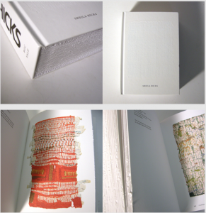
Design’s delight is a book of which as well the content as the design are by Jan van Toorn, a dutch graphic designer. The aim of his book is to question and to comment the way designers work now. You can tell this by both the content and the way it is designed.

cover

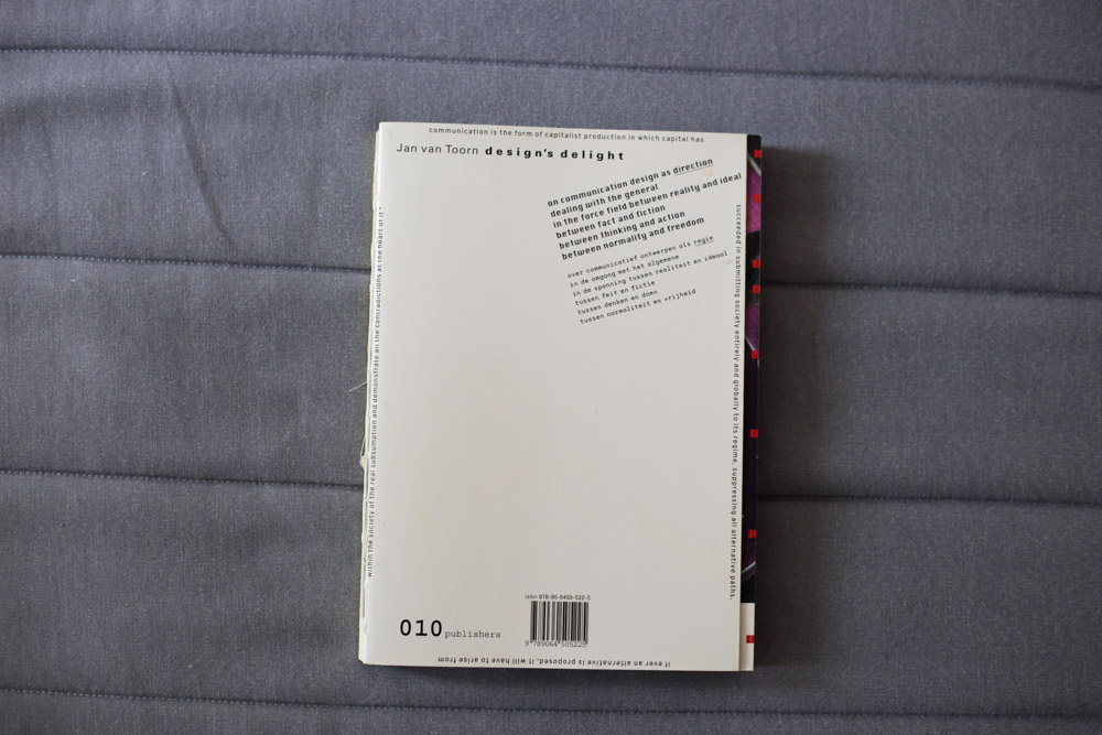
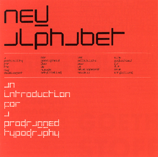
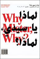
The cover of the book is rather simple, but shows already some of the characteristics of the graphic designs of Jan van Toorn. Various thicknesses of letters have been used, to make distinctions between different sorts of text, the text in the top right corner, for example, is shown as well in English as in Dutch, but to divide these two the English part has been set in bold type.

Another characteristic of Jan van Toorns design is making a text that should incite the reader to “active reading”. He does this by putting the text on a page in different directions, you can see this at the bottom of the cover, where the text has been put upside down, but also at the sides of the cover, where the text has been turned. This stimulates the reader to read the book in an active way, by having to turn it around to read everything it says.

idea ideea

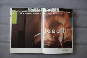
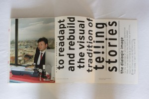
The first pages of the book are used to offer an introduction to the further part of the book. Different pages has been used to write the sentence “design is a good idea desperately seeking images and other forms of truth”, which actually is the core idea behind the book. By spreading the sentence over a few pages, more attention of the reader is asked to figure out exactly which point is made. With every page, a new word is added. Again the text is shown in both English and Dutch, and these two are again divided by setting them in different thickness and types.

essay essaycollage

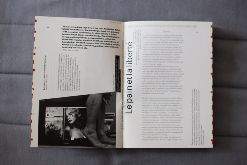
After the introducing pages the book continues with an essay on ‘thinking the visual’, placed on the page in a simple, clear way, again both in English and Dutch in different typefaces. Still, in the essay, van Toorn keeps adding sentences that have been turned around in the middle of the pages, and the pages after the essay are filled with little pieces of text that have been placed in an almost collage-like way, spread out and turned around over the pages, sometimes even combined with images, encouraging the reader to turn the book around and play with the book in order to read what it says.

afbeldingen

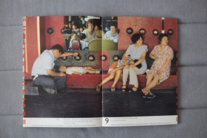
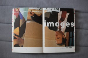
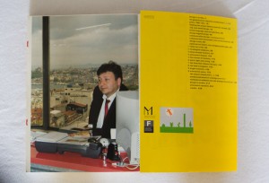
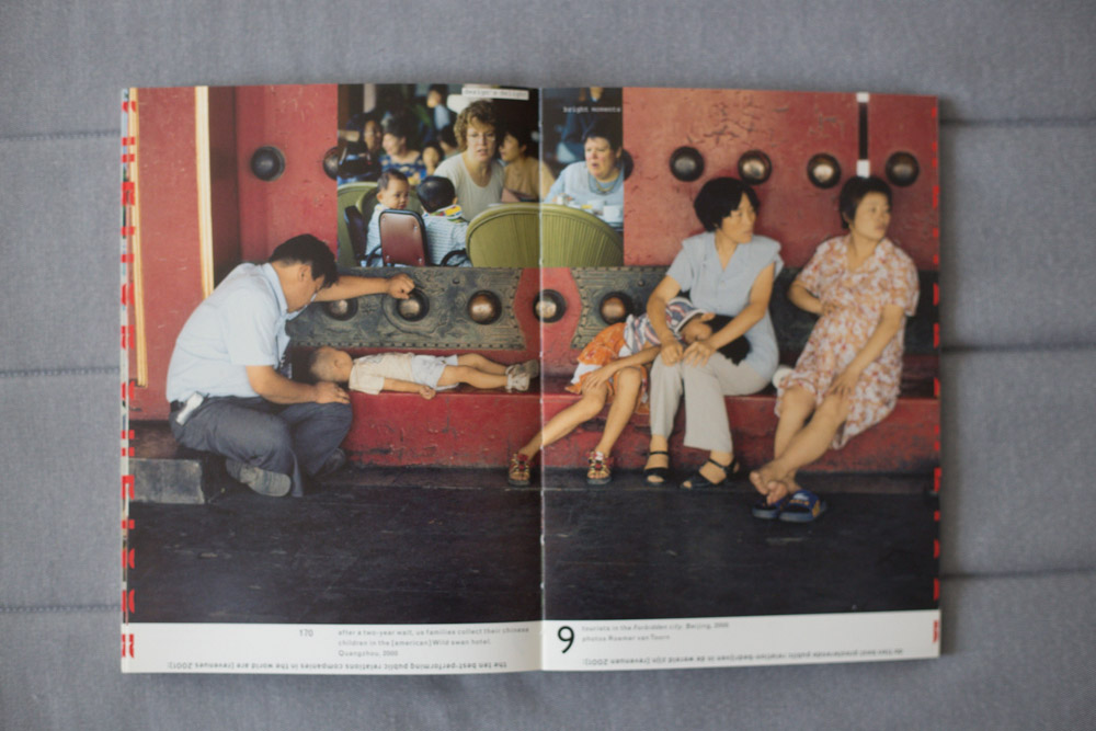
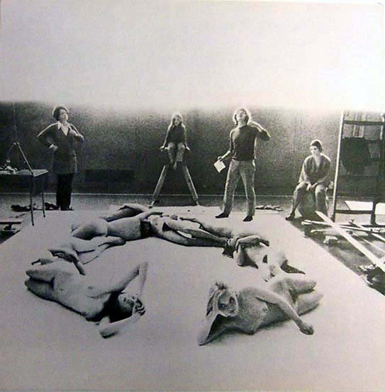
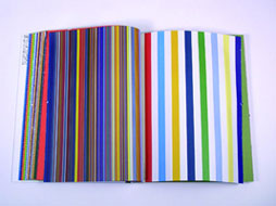
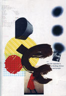
After this part, the biggest text part of the book, van Toorn starts working out the main idea of his book, showing it in a lot of pages filled with different images that have been taking from media like newspapers, television, magazines and various advertisements. Every single thing that is shown in these media has been given a form by a designer. The book is on the role of this designer, and the influence a designer has on the way information is given. In these pages, the most important part of the book, Jan van Toorn explores the opportunities of the role of a designer. He makes various juxtapositions of images from different media, and by doing this he adds a different meaning to them, encouraging the reader to think about these different meanings, and, indirectly, the role of the designer who puts these images together.

afbeeldignen

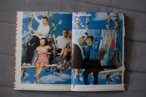
Most of the pages exist of one big image, shown as a spread, only leaving some white space at the bottom of the pages, where text is shown. Across most of the images other images have been places, but the design changes a lot, sometimes only 1 images are shown or images are placed next to each other in a row. The text below the images, again, has been placed upside down and turned around. Because the text is below the image you make, as a reader, a connection between the two, as if the text is a description of the image shown above. Which often is not the case, but the texts mostly illustrates the meaning of the juxtaposition of the images shown in the pages.

Also a number is shown in this white space, indicating the current chapter you are in, and the title of this chapter is always shown in the top left corner of the right page. At every first page of a new chapter the title of the chapter is also shown in handwritten letters, next to the number of the chapter. Because of this continuous showing of the chapter you are in, there is something that you can hold on to during the reading of the book, because of the chaos of the combination of all the different images, in which a lot happens and which contain a lot of colors, you would otherwise easily lose grip of what you’re reading.

eenalaatste

The next part of the book is again a small text part, on the method and means of dialogic practice. It is designed in a similar way as the essay at the beginning on the book, but now the English and Dutch part are not divided in two columns on the same page, but one page is filled with English and the other with Dutch. The same typefaces are used again to make the separation.

always failing

After this text part different pages are used to write one sentence, just as in the beginning of the book. The design is very similar, only the sentence and the images behind it are different, but as a reader you understand directly that it refers to the start of the book.

nawoord

The last part of the book is the afterword, which is designed the same as the preceding text part.

rug

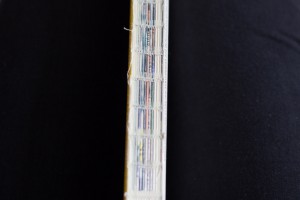
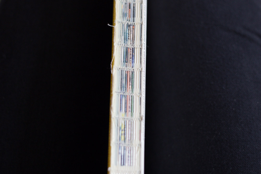
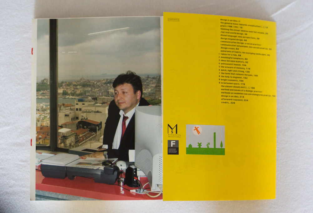
The book has a glue binding, and because the book contains a lot of images the spine of the book has a blend of all different kinds of colors, which kind of reminds you of newspapers and magazines, and it might as well be a reference to these media, where the images in the book are coming from. You can unfold a part of the back of the cover, which at the inside shows a poster-like design of a text in different sizes. At the outside of this part, the part that is the last page of the book when it isn’t unfold, the colophon and the contents of the book are shown.

achterflapdicht achterflap

All in all, I think the design of the book serves it’s content very well. The combinations of the images and text are very well done, they complement each other on every page. The basic design is very continuous throughout the book, which works very well because the chaos of the images keeps changing. Design’s delight by Jan van Toorn was an intriguing book to research, because of both its content as its design.


private collection

New girls and boys by Anthon Beeke


Sunday, December 8, 2013

This post is dedicated to the design approach, names, some interesting facts of project “Body Type” by Anthon Beeke.
The book, which I want to consider was published in August 2011, but looking into it, it become clear that this box/book is the second time this project of this talented graphic designer is published. For me, it is important to say that these two publications are based on an idea of an alphabet made up of ‘Beautiful girls’ created originally in 1969. In past, this alphabet was based on naked female bodies, which posed (where constructed) like letters and punctuation marks. Beeke made this alphabet as ‘a tongue cheek’ response to Wim Crouwel’s famous New Alphabet published a year before in the same series “Kwadraat bladen/Quadrat Magazine”[x]

_1114605983

Project ‘Beautiful girls’  in process in a GYM of Gerrit Rietveld Academie

photographer: Ed van der Elsken


This alphabet as an experimentation was a sensation for late of 60’s, nobody has done something like that before.

Considering the second publication it is extremely essential that a lot of famous designers as Wim CrouwelRene Knip worked together and organised every aspect of the book.Well, I can say that this book is as a result of cooperation of several designers. That means that this project was mulled over  from different points of view and all design decisions were discussed in a professional surrounding and this fact automatically  increases its quality.

images


The ‘Body Type’ book was made as a box,which is a really attractive ,in my opinion, because of a size, image on a cover and, of course, colours. Despite on a fact, that book is based on a quite old idea, it looks contemporary and a cause of it is that Anthon Beeke decided to make it in colour. The whole publication saves a tendency of 3 main colours: redwhite and black. Thats is why it looks bright, new and interesting. A content of the box consists of 3 parts. In the first part you can find an introduction ,which was written by Wim Crouwel ,who also was a designer of the main font for a book.Text is provided in Dutch and in English, and following a purpose to create a fast visual difference between these two languages and to make it easier to read,separating one from another , Dutch text is in black colour, English in red.

wimcrouwel

The second part of a book is a ‘body alphabet’ itself.In this part Beeke also decided to add something new (compering with a previous publication), there are letters from not only women, but and from black men, what shows an expression of time ,which we live now. The third part consists of printed letters , so you can tear out and string up to bring this alphabet to life in words and texts that means that now a benefit from a book is not only to read it and enjoy its design ,but and use it for whatever you like.


This video shortly shows how photos for letters were made.Enjoy!


Rietveld library catalog no: 757.3 bee 1 (N.U.)

Tongue


Wednesday, November 11, 2009

Intriguing?

I want a big book. Not the biggest of them all.
But it should at least be heavy enough to keep reminding me it’s there when carrying it around in my bag.

I am (sort of) looking at books in the front, but have already decided to favor the ones in the back. Am I trying to look intellectually engaged or am I actually being polite to a bunch of books?

First I take out two books from each shelve as a test sample. One at about 25% of each shelve and one at 75%. This doesn’t feel like the way to go. I’d rather maintain control and make a more conscious decision.

There it is. Big and black. On the cover there’s a mouth sticking out it’s tongue and below that a picture of an iron, the kind you use on clothes. In the middle the title: SENSATION. I’m intrigued, even when I don’t make the connection right away. Maybe I did unconsciously. I allow myself only a few seconds to decide on the estimated level of enjoyment. A hard cover. Lots of big color pictures, lots of text. It passed the test.

707-8 cat 105, 12141, Thames and Hudson

A group’s researched book-concepts


Monday, March 10, 2008

TM-City SMCS Warhol_Index TM-City SMCS

After many month we finally present the research results into 25 selected books from the “Collections Groenendijk”. During a one-hour event every student was presented with the opportunity to start-up a research into the manifest art or design concepts presented in these unique book designs. Designers Julia Born and Will Holder were presented through an interview-DVD made by the graduate program of the “Werkplaats Typografie Arnhem” for the Chaumont festival workshop 2005. Others projects, by Richard Niessen or Andy Warhol, were presented at an visit to the Stedelijk CS, where their books were displayed in context. Coralie Vogelaar (a Sandberg Master) came to visit us in person to give insight in her work and ideas and lecture on the concept behind her latest publication “Masters of Rietveld: design in the 21st Century” published recently by the Sandberg Insitute /Design [above: Niessen TM-City / Warhol Index-Book

A New Art World
Caetano de Carvalho on “A New Art World” by Richard Niessen + Ad de Jong

Research material was edited down to A4 sized guided tours into these subjects. All subjects presented in this list are also available as hard copy prints at the Research Folders at the library. The investigation focussed on the following book titles: Ed van der Elsken’s “Love Story in St Germain“, Irma Boom’s Grafisch Nederland 2005 on Color, “Start A New Art World”(published above), the acclaimed cooperation between photographer Geert van Kesteren and designer Linda van Deursen “Why Mister Why“, “Hhalo” by Julia Born and Rebecca Stephany’s “Archiving Today”project. Last 3 ladies all teaching at graphic design department.

SpoerrieThe ThingThe Thing Norm design Swiss TypeS M L XL

Daniel Spoerrie “An Anecdoted Topography of Chance“(extra info), Dieter Roth’s “Dieter Roth Band 10“, “S M L XL“by Koolhaas, Sandbergs “Experimenta Typographica“: Mens Sana in Corpore Sano and “Counterprint” by Karel Martens. “The Thing” by Norm designstudio, Andy Warhols classic 1967 “Index-Book”, Will Holder’s “Catalogue“: starring Gijs Muller, Edward Ruscha’s “Colored Peolple”, Richard Niessen’s piece de résistance TM-City.

Why Mister Why GN2005:Color

Sandberg Institute Master: Coralie Vogelaar with “The Photoshop” and “De Hedendaagse Ontwerper”, Gerald van der Kaap’s original ” HoverHover” and the monumental cooperation between Jonathan Barnbrook and Damien Hirst “I want to spend the rest of my life everywhere, with everyone, one to one, always, forever, now”.

Dot Dot Dot X Hester Permanent Food 15

Finaly some highly conceptual magazine concepts like, the 1980’s I-D magazine 2, Jop van Bennekom with Re-magazine: ‘Hester‘, Permanent Food or Stuart Bailey’s “Dot Dot Dot” magazine.


Log in
subscribe