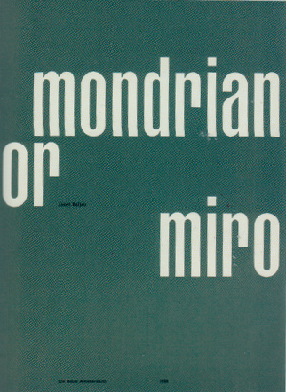
The subject I write about is a design, which is presented in the book of Anthon Beeke ”Body Type”, despite on this fact I would like to start with a small history part, following by highlighting key points of the book or would I rather say box
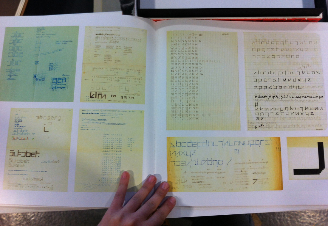
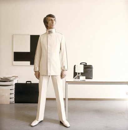
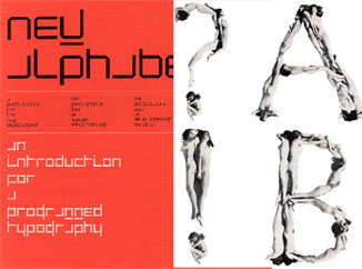
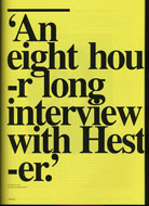
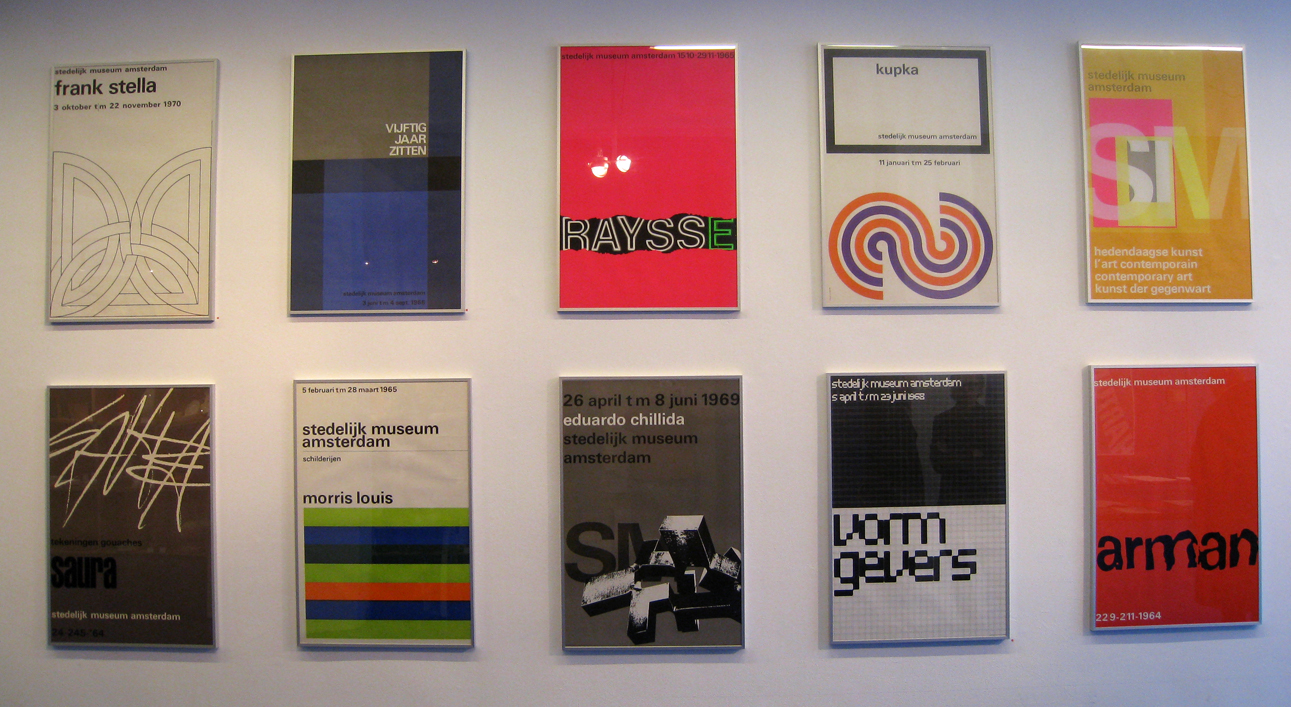
Let’s go back to the sixties.Wim Crouwel, who was born in 1928, is a graphic designer, who was influenced by digital developments of that time, saw an opportunity for an interesting experiment. Early computer screens rendered images in fairly large pixels, making traditional curvilinear letterforms difficult to reconstruct, and so Crouwel set out to redesign the alphabet using only horizontal lines. The ‘New Alphabet’ was published in 1967 in Kwadraat-Bladen: A series of graphic experiments (1955-1974).
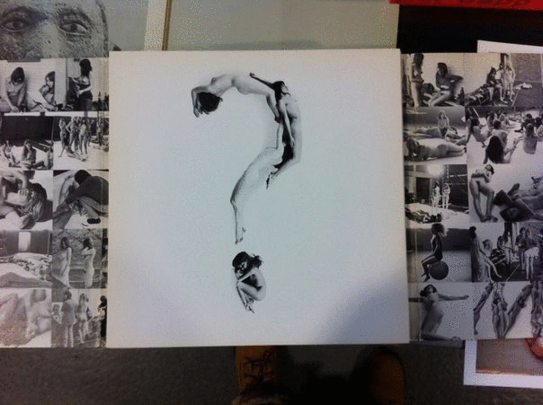
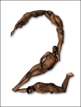
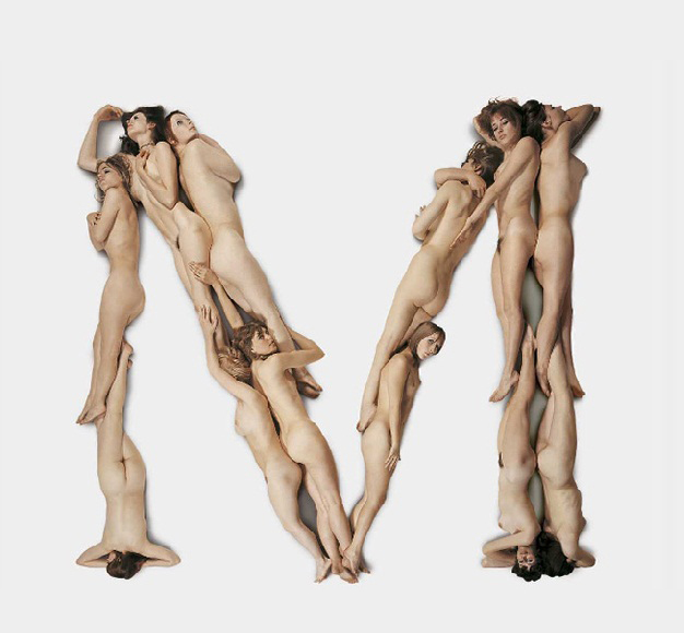
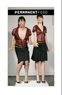
One other key figure of Dutch graphic design is Anthon Beeke (1940), who found his inspiration in the spirit of 60’s, a spirit of freedom which relates to politics and besides refers to the topic of feminism. In 1969 he created an othe Kwadraat -Blad ”Beautiful girls Alphabet”, in which you can also notice presence of ideas of feminism. This publication is based on type, which is spelled with the bodies of naked women. ”Beautiful girls” was published in 1969 (it’s two years later then ”New Alphabet”) in the same series as an answer to the one of Wim Crouwel
Considering these two famous and important publications, (because nobody did something similar before) you can see two opposite approaches in design modernist/functional by Wim Crouwel and content based by Anthon Beeke.
Now I can boldly return to the book.
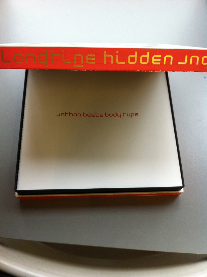
The ”Body Type” was published in August 2011 and despite that fact (in the past they have been opposites) for this publication they worked together. Two completely different, I can say loud events of Dutch graphic design, have merged into a single edition. Just like ”Beautiful girls” in the past this book is based on an alphabet with naked bodies but all text of the book is written in New Alphabet by Wim Crouwel. Also one more graphic designer Rene Knip (1963) is included in the work and designed the looks of the publication. With this I mean a book-box, which I will try to describe in details.
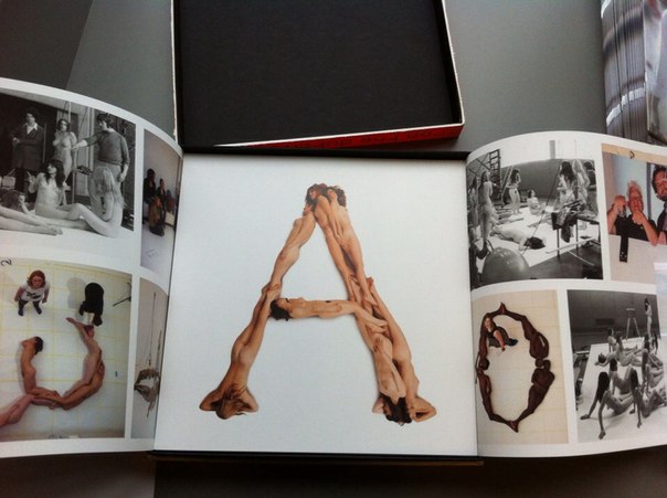
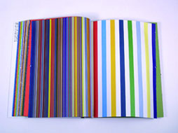
The box follows the tendency of square form (the tendency of Kwadraat-Bladen), front edges are white with a representation of the type ( B O D Y – T Y P E ) and lateral edges are in red with golden text in Crouwels New Alphabet. Inside this colorful box I found one more simple black interior box ,which separates a cover-box with a content of the book with the same color palette and, in my opinion, with the black line this construction attracts much more attention to itself. Besides, opening a box, I’ve noticed a red silk tape, which helps to remove the book from the box easily.
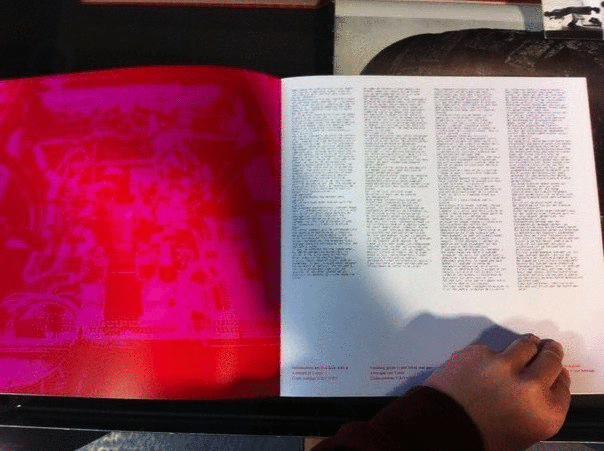
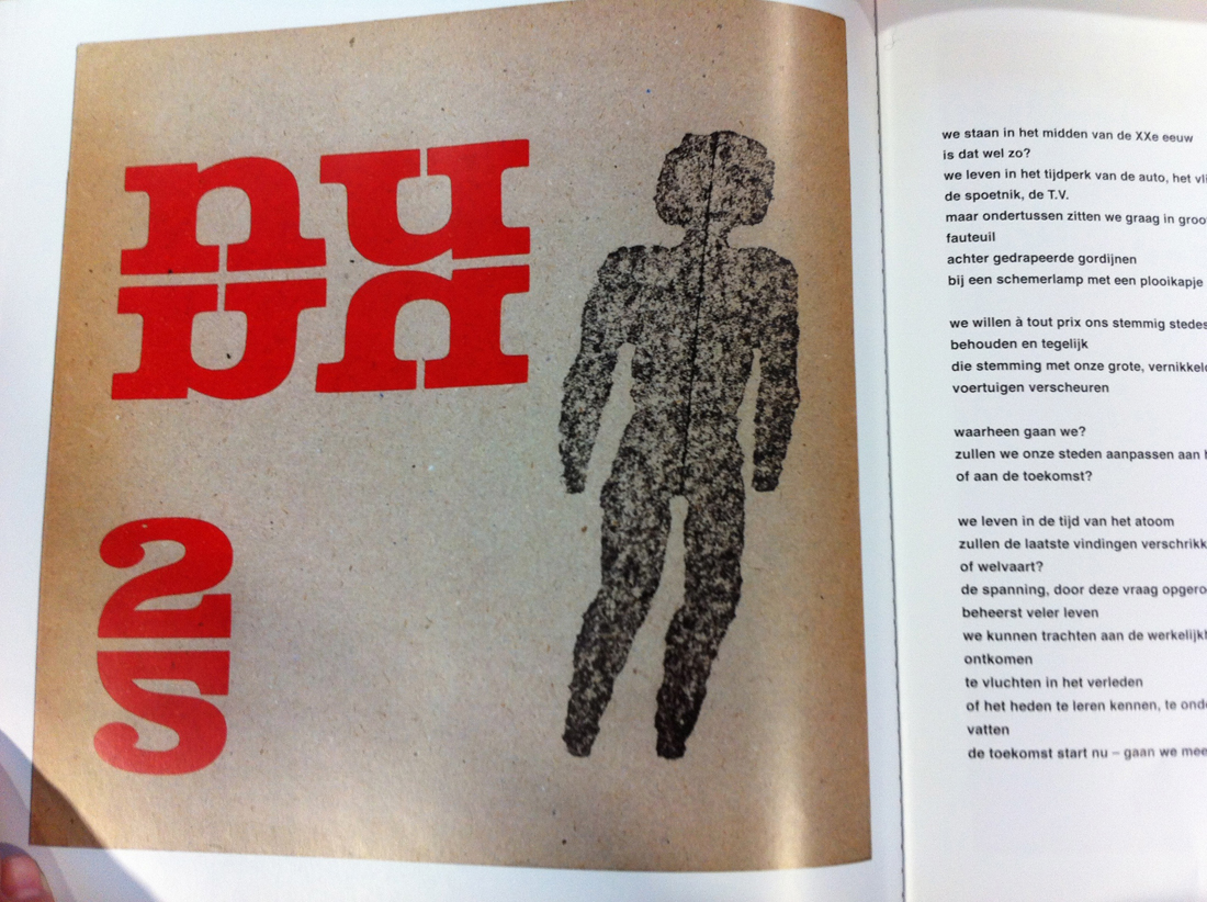
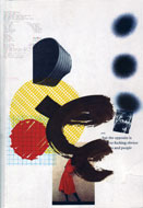
The content of the book is separated in three parts.In the first part you can find an introduction, which was written by Wim Crouwel and a text with images that is related to the publication, to the past and to the roots of the alphabets of both Crouwel and Beeke.
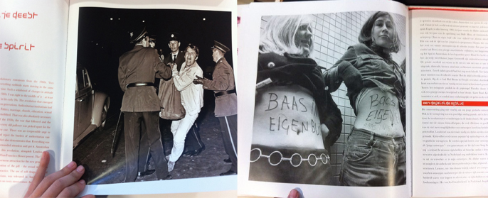
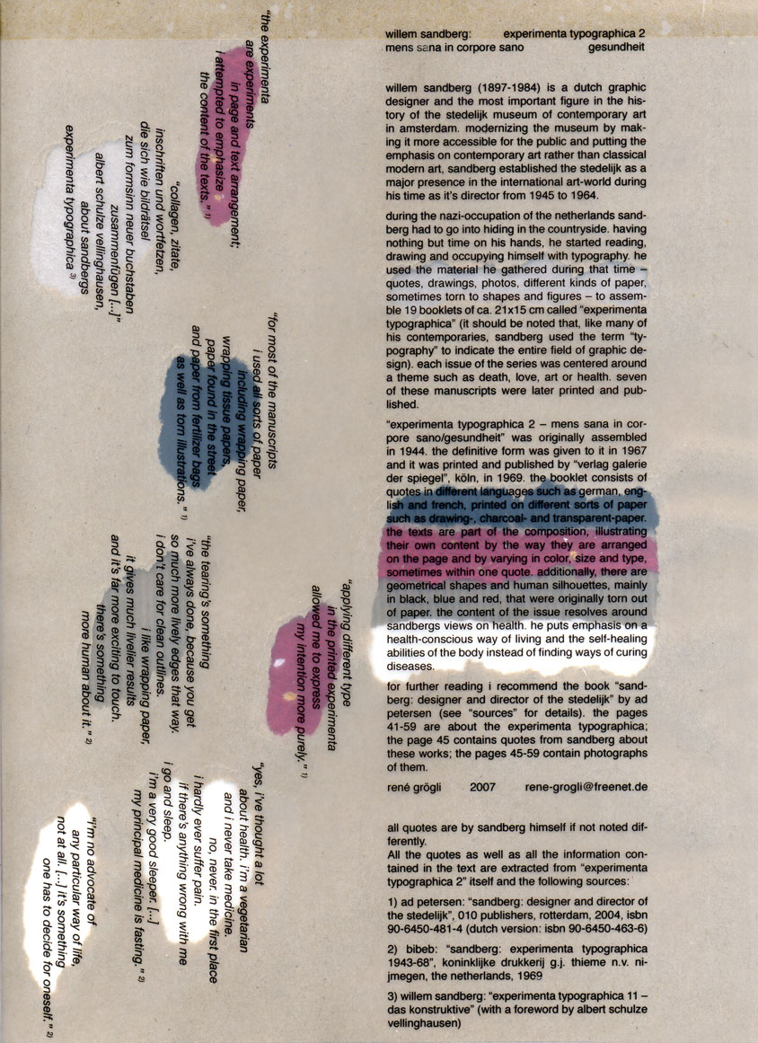
Flipping through the pages of the first part of a book you can find other examples of typography with images of another famous Dutch typographer and museum curator Sandberg (1897–1984)
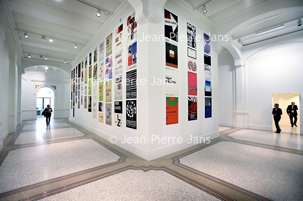
”Body Type” combined in itself works/ styles /approaches of 3 different famous Dutch graphic designers of 3 different generations,in other words this book contains an experience of key figures of graphic design. That is why this publication is not only a book but more like a monument.
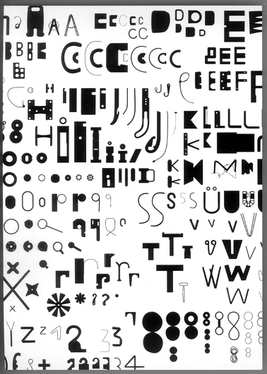
The second part of “Body Type” is the alphabet itself. All letters, number of the Latin alphabet are separated from each other. Every single letter placed on a single square paper sheet on a white background. Everything is printed on a quality and a bit glossy paper. In contrast to “Beautiful girls” letters of the alphabet are spelled from not only naked women but naked black black men as well adding a new controversy. By virtue of choice of color and paper this publication looks fresh, interesting and makes us curious to explore its content.
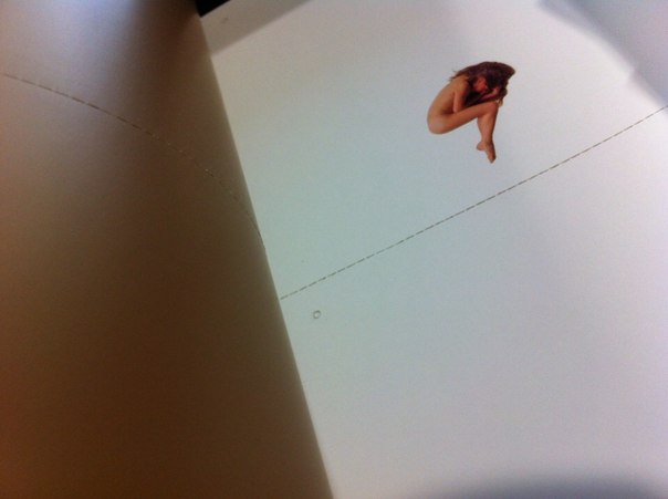
In the third part you can find a set of letters and punctuation marks, so you can tear them out and string them up to bring this alphabet to life in words and texts. There are four similar letters/punctuation marks placed on each page so you can cut it, one from another, using a dotted perforated line.
In the end I would like to add a couple of words about the name of the book.
To be honest, I was looking through a list in a library and the name “Body Type” was the first, which I paid attention too. I was trying to look for it more then 30 minutes, but I couldn’t find it. Then I tried to find another book but this name was in my mind and kept me interested. Finally the librarian of Rietveld Library told me that this book is special and it is located in a safe place and I remember that I though “I have made such a lucky choice”. I was thinking how to name the post and I have decided to save the original name.


