I don’t really know the way, but I want to. I have this habit to wander off randomly when I’m unknown with a place. Just to see where I’ll end up if I let go of control. “Let fate decide” says the romantic in me.
After a while I see patterns and I believe that I know where I am. Finding attractive by-streets in every corner. But that’s an illusion. By the next turn this pattern is shattered by reality.
I don’t know where I’m going, but I know I don’t want to stay. Just keep going, till this frame turns into bedlam. Borders can’t contain me anymore. Looking back I can’t trace back my origins. I’m not lost. I’m new here.
Alvar Aalto, one of Finland’s most famous people who reshaped architecture and furniture of public buildings on the basis of functionality and organic relationship between man, nature and buildings, is now called the “Father of Modernism” in Scandinavian countries.
He was born Hugo Alvar Henrik Aalto, on February 3, 1898, in Kuortane, Finland (at that time Finland was part of Russian Empire). He was the first of three children. His father, J. H. Aalto, was a government surveyor. His mother, Selma Hackestedt, was of Swedish ancestry, she died in 1903.
Hence, Hugo Alvar Henrik Aalto was educated a lot by his grandfathers. His grandfathers were both very close to nature, one of them was a forest guard. Alvar Aalto has a child use to play a lot in the forest. It was obviously through him that the outdoor world, particularly the forest became so important in Aalto work. The forest with his towering tree trunks and his various rock shapes is a world a constant changing forms which inspired Aalto a lot. Aalto probably found in nature the basic geometrics patterns for his architecture and furnitures. The forest thought him also that nature is a sensitive ecological system in which men must find his place.
Aalto’s relationship is pretty clear according to the paintings he did as a child. He hesitated few years either to become a painter or an architect. According to his saying, he decided at the age of nine that he wanted to become an architect.
Aalto has been educated in the idea of National Romanticism, the Finnish version of Art Nouveau. Aalto rejected it, such as pretty much his whole generation. However he took one important feature from his predecessors : the idea that his creation should perfectly fit into nature.
Around 1920 a softer version of the strict modernist aesthetic emerged in Scandinavia, characterized by the use of (curved) wood in combination with shapes, colours, and decorations inspired by nature. The resulting furniture arose from the ambition that design should offer both beauty and functionality, and be affordable to everyone.
Aalto rejected a lot of furnitures of his time, he wanted to find a material that makes chairs pleasant to sit in. A lot of Aalto’s furnitures were also inspired by the shapes of nature. He often solved practical problems with abstract experimentation of forms with wood. Aalto experimented with bending a bunch of wood to create chairs.
Through experimentation with wood Aalto discovers specific properties which could be useful of men. For instance, in the interior of the Viipuri Library Aalto created rooms inspired by nature which specific functions. Such architectural solutions as a sunken reading-well, free-flowing ceilings and cylindrical skylights, first tested in Viipuri, would regularly appear in Aalto’s works. Aalto differed from the first generation of modernist architects (such as Walter Gropius and Le Corbusier) in his predilection for natural materials: in this design, « wood was first introduced into an otherwise modernist setting of concrete, white stucco, glass, and steel ».
Aalto’s work with wood, was obviously influenced by early Scandinavian architects; however, his experiments and departure from the norm brought attention to his ability to make wood do things not previously done. He was one of the first architect/designer to be able to find a way to bent wood in order to create theses beautiful organic shapes. Aalto studied architecture at Helsinki University of Technology, however during a large part of his career Aalto created a lot of furniture. Like Le Corbusier, Aalto considered that furnitures and architecture should be a collective and cohesive ensemble that creates order. His experimental method has been influenced by his meetings with various members of the Bauhaus design school.
After traveling through Europe, he was exposed to International Style and soon adopted the natural materials and organic forms of this approach into his aesthetic.
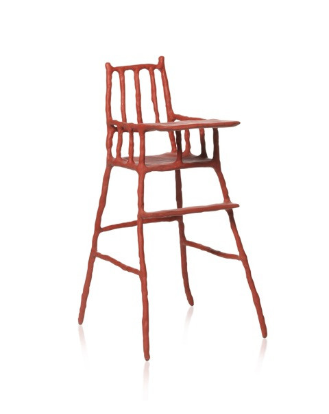
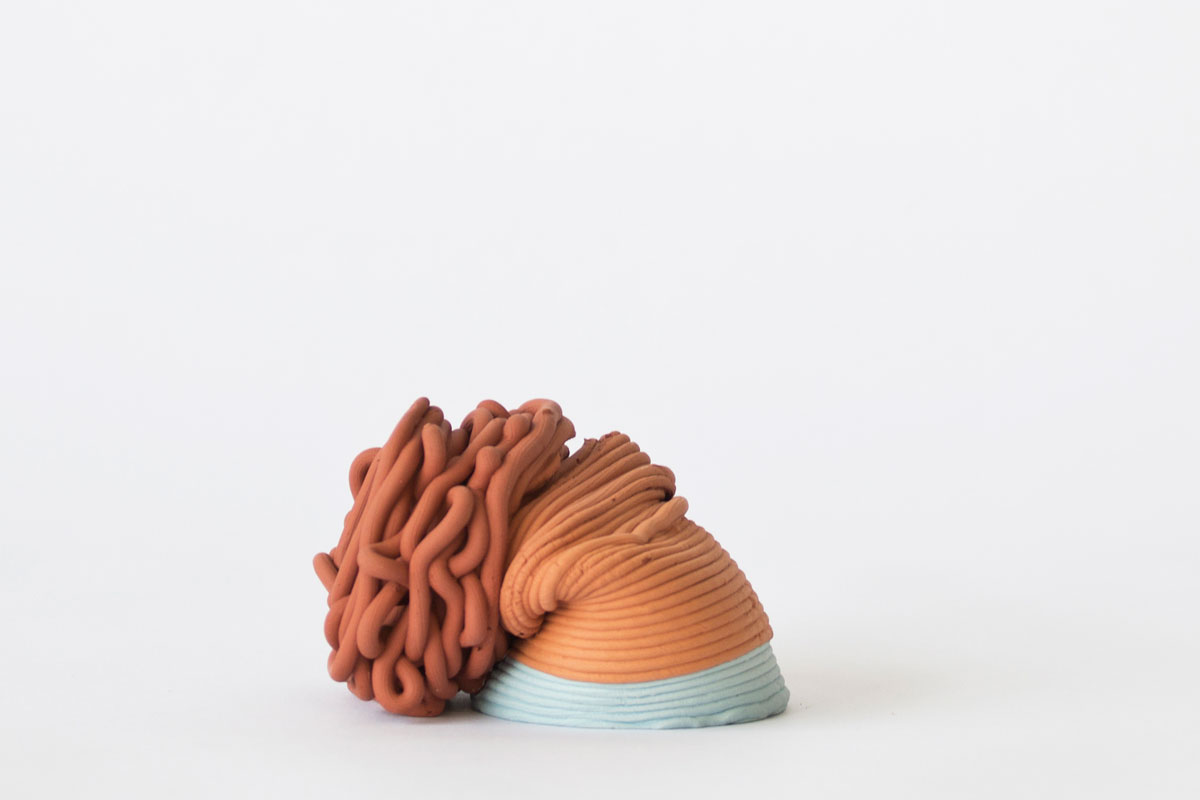
Clay furniture is a set of eight pieces of furniture presented at the Stedelijk museum : chairs, a bookshelf and a table by dutch designer Maarten Baas. He describes his pieces as “part of a set design, a decor ” and how he “always go from a story that (he) wants to tell instead of starting with materials.
This aspect of the work, its appearance of a movie prop probably is why I was drawn to it.
The pieces are functional but they also have a pleasing aspect and unconventional colours, crafted in steel and clay – by hand, without using a mold. I enjoy the fact that they are not shy about showing how they were made.
While I went to the museum I had the lecture given by Fiona Candling in the context of the Stadium Generale at Rietveld about how people touch art in museums in mind.
When I stood before this piece I couldn’t resist the urge to feel it. I looked around if anyone was watching and touched the baby highchair. It felt great. If felt like the object wanted it and asked to be touched.
Touching it confirmed and completed the visual aspect of the piece, the human of it that I sometimes miss in design object. It reminded me of the sensual experience of working with clay, somewhere between the realms of childhood and adulthood and between spontaneous and control.
The different pieces were arranged on platforms, seemed to be floating and occupied a whole wall. Somehow, the objects themselves clashed with the the seriousness of their own arrangement. It’s always bizarre to look at furniture in the context of a museum where they’re dissociated from their primary function.
You look at the chair. The chair teases you. You wish you could sit on it. But you’re not allowed. It’s not a piece of furniture anymore, it’s the manifestation of your unmet desire to sit.
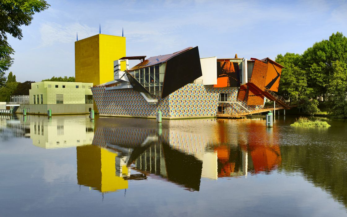
My friend Dasha coincidentally also chose to write on this clay furniture. We looked for a place where we could touch it with no shame, as long as we wanted. On Valentine’s day, we were on our way to the Mendini Restaurant in Groningen. Decorated in 2014 by Marteen Baas, containing some of his chairs, lamps & a mirror. But before our lunch date, we visit the Groningen museum attached to the restaurant.
Outside, the textures, colours & shapes of the building clashed. The whole building seems to have been built by artists who didn’t consult each other before merging all the (unmatching) pieces together.
It was in fact designed and completed in 1994 by three different architects, Philippe Starck, Alessandro Mendini, Coop Himmelb(l)au. American artist Frank Stella was also approached for this project but he wanted his structure completely out of Teflon, which was too expensive and he was replaced.
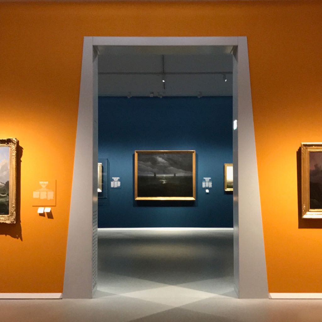
Inside, after the multicolored mosaic covered stairs is the entry to the main show. The bright couches and walls clash with the solemnity of the paintings from the “Romanticism in the North” exhibition.
Dasha doesn’t like old paintings. I do. Romantic painters have a dramatic way of depicting the gravity of ultraviolent emotions that I strongly relate to.
I find my date bored, sitting on a bench and recognize Baas’s sketch-like, improvised signature look. The object is long and its legs merge with the visitor’s legs resembling a clay centipede. Remembering how the furniture pieces seemed out of context at the Stedelijk, I’m relieved to see the bench so comfortable and fitting in this mismatching room where, in all its playfulness, it truly belongs.
A little later, in another room we walk past the the Pleyel Smoke piano, one of the artist’s earlier works which is part of his series Smoke Furniture. The instrument was charcoaled with a blow torch, preserved in a clear epoxy resin, which makes it usable again. In contrary to the clay pieces, this one doesn’t fell like it’s inviting you to touch it, it has already been touched- by fire.
Visually, it’s very cinematographic and a little alarming, bringing you somewhere uncanny between the ruins of a abandoned manor and a piano playing a gloomy melody by itself. (for more info read Maud Paul’s research on his smoke furniture )
It’s 4 o’clock, the untranslatable french heure du goûter or time to sit in a room containing 165k worth of chairs made out of clay. I don’t know how often visitors travel specifically in order to touch the furniture of the restaurant but for me, putting all this effort into that built up a lot of suspense and anticipation.
Maybe I expected too much, but I somehow wanted the whole room to be out of clay.
More than seeing the pieces in flesh and touching them, what was very pleasurable was to sit on them. I had previously only seen them displayed in galleries, elevated to the status of the out of reach art/ design object. Now, returning to their true function the chairs were what they were. They seemed more approachable, straightforward and practical – maybe we could even be friends.
Fitting for the occasion, I ordered a romantic pastry.
On the way back, on the top floor of a bus driving into the night, I kept thinking about all the chairs I’ve ever sat on without considering them. I don’t mean to break anyone’s hearts. I just didn’t know.
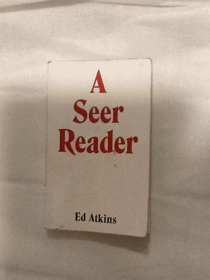
I was trying to find a book in the library with a design which excited me; something I’d like to write about. I chose to pick up A Seer Reader for the assertive, bold cover design it boasted. By using red, white and black, the colour contrast is stark, the combination connoting power. The font type replicates typical, 70’s typography, with its sweeping thickness and curvy motion; it asserts a confidence. A shallow indent delicately engraves ‘A Seer Reader’, indicating the importance of the books title, over the authors name. The ‘A’ starting the title, leads a triangular shape centering attention to the middle of the page. Every element to the cover designed by Zack Group, makes for an eye-catching, attention-grabbing book. The cover enticed me to open the book, and discover what inspired me to chose A Seer Reader for my investigation on design. Surprisingly my analysis wasn’t the result of my initial drawing to the cover, (and therefore comes without credit to the books designer,) but moreover to the author, Ed Atkins.
I discovered that every page of the A Seer Reader was adorned with dancing doodles; playful, printed, pen-style drawings dangle from the words, interrupt the verses and sulk in the far corners of the pages. There are tiny squiggles, illustrations, and symbols referencing or resembling punctuation. The doodles appeared to me, to specifically elude each poem with unique visual imagery. I decided I’d like to discover why they were designed in the way they are. I’ll investigate the context the book is published within, and therefore the content of A Seer Reader. Focusing on the style of the font used for the doodles, their arrangement on the page, and the choice of imagery, I’ll analyze specific examples from the book in attempt to explain why the doodles are designed in this way.
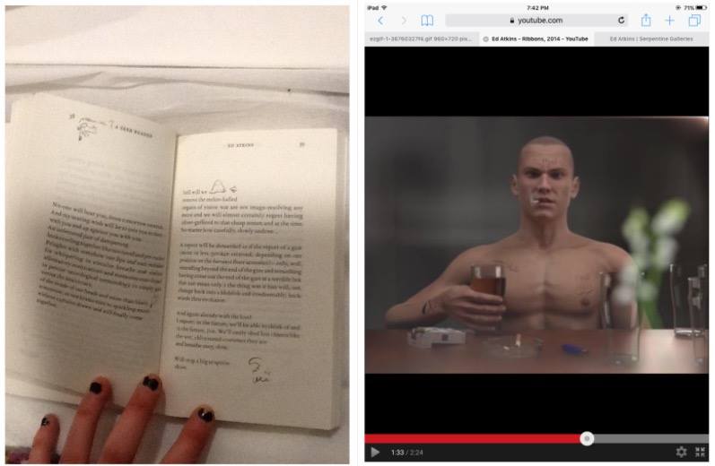
A Seer Reader was published for Ed Aitkin’s solo exhibition in Serpentine Gallery during 2014. Working predominantly with video and language, Ed Atkin’s visual art is inspired by the poetry he wrote for A Seer Reader. Ed atkin’s solo at Serpentine consisting of sound works, text instillation and images revolves around a multi-screen video instillation named Ribbons, where Atkins attempts to emphasise questions concerning the relationship between real life and virtual concepts, objects and environments. He explains that his videos are a ‘…kind of poetry of their own’.’ ‘…interested in previously literary-theoretical concerns about seeing and reading, interpretation of metaphor, figuration and literality.’ He uses CGI to literalise what was once only possible in metaphor.
In Ribbons he creates a surrogate character resembling his own physical appearance in a haunting online replication of a life. Atkins intends to ‘re embody’ himself as a possibility of what we may become in an paradoxical way of spreading a message that we need to focus on developing a more powerful mortal life. Through this high tech HD animation he ironically uses his medium to do exactly the opposite by creating a virtual world.
The character developed by Atkins is a young white male, wearing a bald
head and an action man body adorned with tattoos, he has a habit for drinking alcohol and smoking cigarettes. His appearance and his humanly habits reflect somebody stereotypically disapproved of, in today’s society. Atkin’s concern for the world we exist within, is evident in the design of the tattoos enscribed on the skin of his surrogate, Dave. Desperate phrases like ‘love please’ and ‘bankrupt’ are scrawled onto his skin to illustrate his story of conflict. They physically demonstrate the feelings Dave would have as a human, but as a virtual delegate, his being is absent from. On his skin; they’re positioned outside the human nervous system. I think this indicates a detachment from the animations human intimacy with himself.
After studying the videos Atkins produced for his solo exhibition, I noticed similarities in style between the doodles illustrating A Seer Reader, and the tattoo’s scrawled on Dave’s skin. It now became evident to me, that considering the importance of what the drawings suggest in his video work, the way they are designed in A Seer Reader will also have a special significance to the ideas Atkins questions in his work.
I’m curious as to why the doodles appear in the font style they do. They are printed on the paper in a scrawly handwriting in a biro or sometimes with a bold marker
The independent, physical and primally instinctive movement of writing with a pen in ones hand, is raw and natural to the intellectual human being society knows today. Atkin’s uses the soon disappearing practice of writing by hand, to convey the humanly emotions of himself, or anybody in our society today, onto the virtual future we face (the skin of Dave). Therefore the font design that distinguishes the poetry in A Seer Reader, from the handwriting doodles can be compared to the contrast between Daves cgi skin and his tattoos.
The poetry is written in a serif font type, commonly used in literature of today, its appropriate for clear messages to encourage the reader to focus on the content of text. It may be used to help develop the trust of the modern target audience, which is important if they are to value Atkins’ poems as high literature. By choosing a serif font which was developed digitally, Atkins paradoxically hints at what the digital world has already done to change the way our brains work, to raise questions regarding our future and technology. There is a confident, official level of professionalism created by digitally produced font, totally un-emotionless and un-personal for the reader of today. Its in these respects that the I relate the choice of serif font to Atkins virtual surrogate replica of a human. Both the poetry in sensible, digital serif font and the pinky rendered skin of the CGI Dave is tormented whilst illustrated by a real humans handwriting scribbles. The choice for handwriting therefore poses a conflict between some of the characteristic, fundamental elements of human development regarding language in the mortal world, (a practice at threat of,) the human’s of our virtual future; a product of our current society.
By using handwriting the design of the doodles appears uniquely personal; autobiographical. Atkins uses his own style of taking notes to project his personal concerns with society onto his surrogate; he plays with his ego, flipping himself into his virtual identity blanketed by his naked, surplus and mortal emotions Through his CGI in Ribbons. In A Seer Reader the intimacy created between the reader and Atkins, through his use of highly personal handwriting, implies the doodles are like entries to a diary, personal thoughts belonging to the artist. The doodles style in handwriting therefore allows us to understand Atkin’s truly distressed feelings towards our existence in the future he insights, in the mostly raw, open and honest way.
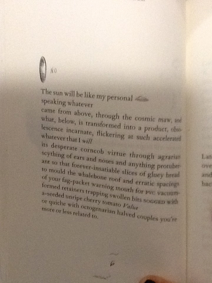
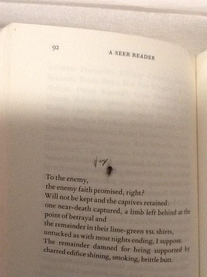
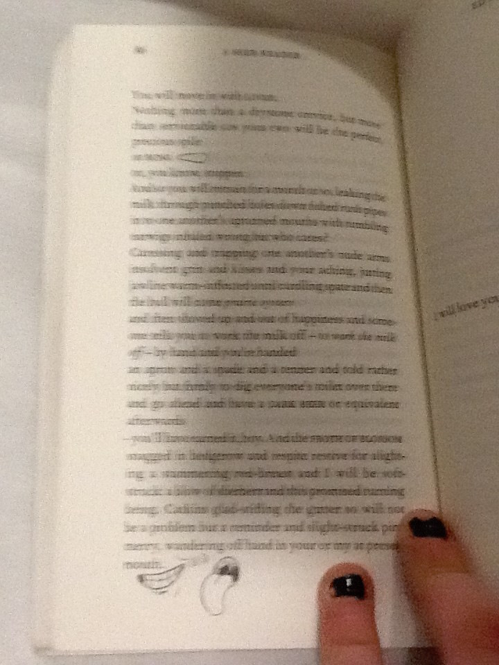
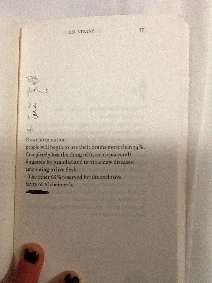
A consolidation thoughts form from Atkin’s head; the handwriting translates a universal language of emotion, in how each word is formed from the authors hand to the paper. The handwriting helps to illustrate Atkin’s feelings as he writes, and emotionally connects with each specific word. For example on page 92 of A Seer Reader, Atkins poem stabs at capitalism and using a current slang, (another characteristic typical to a human of our time,) he makes a metaphor for our choking industries; ‘butthole’.
He illustrates with a pencil sketch of a butthole, labelled with more slang; ‘hey’. He adopts a loose, scrawly joined up handwriting to do so. It feels fluid, creating a casual, relaxed visual effect which allows the readers feel comfortable to laugh, as he playfully mocks the sincerity behind his poetry. By contrast the choice in design regarding capital letters, a larger size font to the majority of the doodles and sharp points determining the end of letters, suggest aesthetics which relate to an irrational state of urgent, abrasive, human panic.
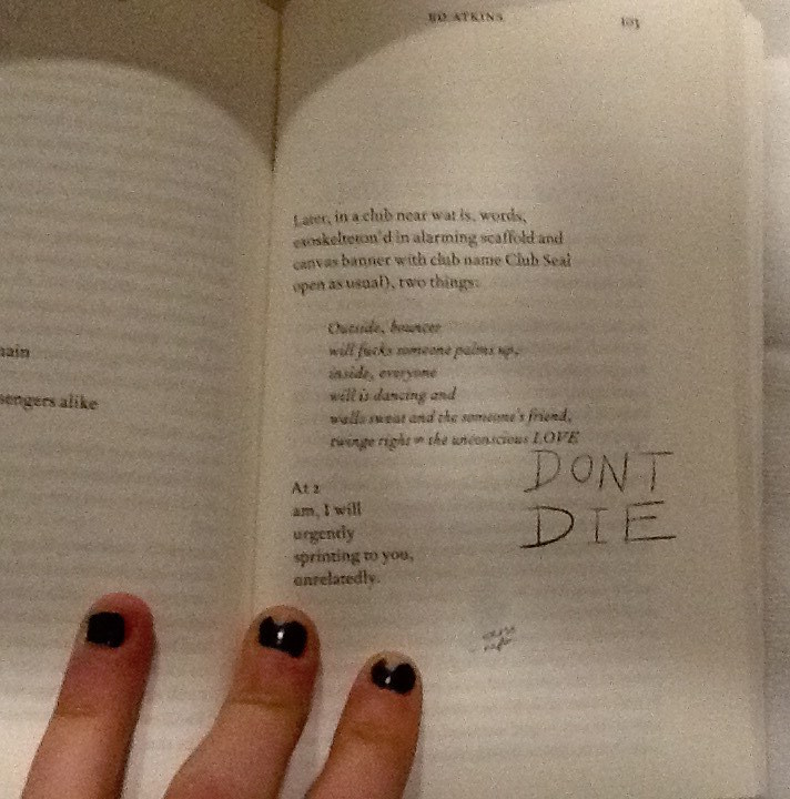
Page 103 in the handwriting ‘DONT DIE.’
Capital letters accentuate importance, taught in the grammar of the languages in our society, showing Atkin’s thoughts which should shout from the page. These features of the handwriting style show how Ed Atkin’s conveys different emotions through the doodles design, he plays with his readers to elude how he feels as the artist.
The design regarding the placement of the illustrations on each page and they’re relationship with the text arrangement is also of interest to me. The doodles are very specifically positioned, creating a new design and rendering a unique layout on each page. The notes are cheerful, their haphazardness and impermanence in position creates a youthful energy of its own. Many harass the text, dangling from the words, interrupting them like a vandalised high school text book decorated by an excited teenage rule-breaker. Upon flicking through the book I think Atkins creates a chaotic feel with the arrangement of the doodles. Maybe he does this in an attempt to question the power which our mortal life (represented by the emotive tattoos / doodles he writes by hand,) has, over the possibility of a virtual future (what his poetry represents). An issue presently discussed within his poetry, as well as what he represents with his surrogate Dave in Ribbons. Chaos raises concern to me, and suggests Atkins might be trying to raise awareness of his issues with the future and society today, through fear.
On some pages it appears the design regarding the placement of doodles serves purely for illustrational purposes. For example on page 86 a smiley mouth and a big floppy tongue curve and grin around the word ‘mouth.’
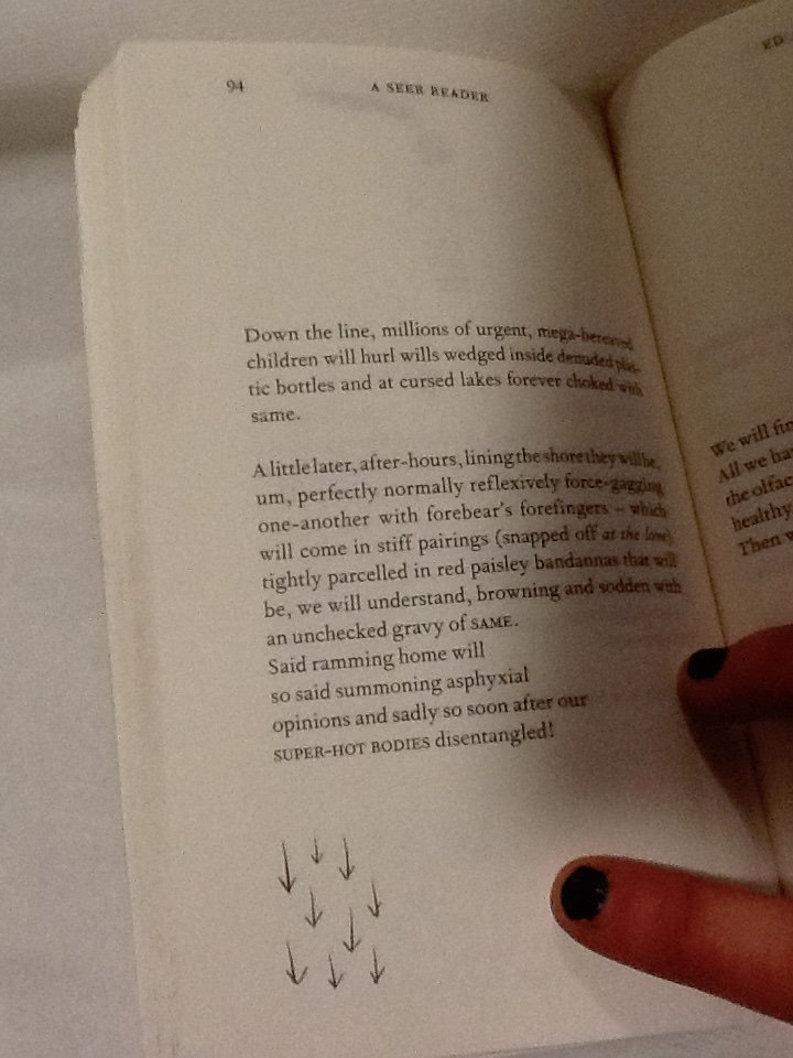
The positioning of the doodle presents a clear visual anecdote of the text, as its placed directly next to the words, the reader sees them together creating imagery. The poem on page 94 begins with ‘down the line.’ Directly beneath at the end of the poem and the lowest point on the page is an illustration of 9 arrows pointing downwards.
Again this provides a clear illustration of the text, but it also speaks of itself and the symbol is close to the bottom of the page, it feels they are going down as well as ‘being’ ‘down’.
I’m curious to understand if there is a relationship between the way the doodles are used for illustrational purposes which seem therefore to be in harmony with the poetry, and the concepts which lie behind Atkins exhibition at serpentine which A Seer Reader was published for. Despite the chaos of the doodles, and the lively energy they carry as they appear in different places for each poem, they do help the reader take their imagination further in their illustrative quality. If the handwriting doodles refer to issues regarding mortal life, and the poetry talks on the concern for the virtual future, then Atkins could be showing the bond between the illustrations of his thoughts, and his poetry. As one where he symbolizes how mortal life still has power to change the effect of the virtual world or what is to be of the future, as the illustrations aid the text.
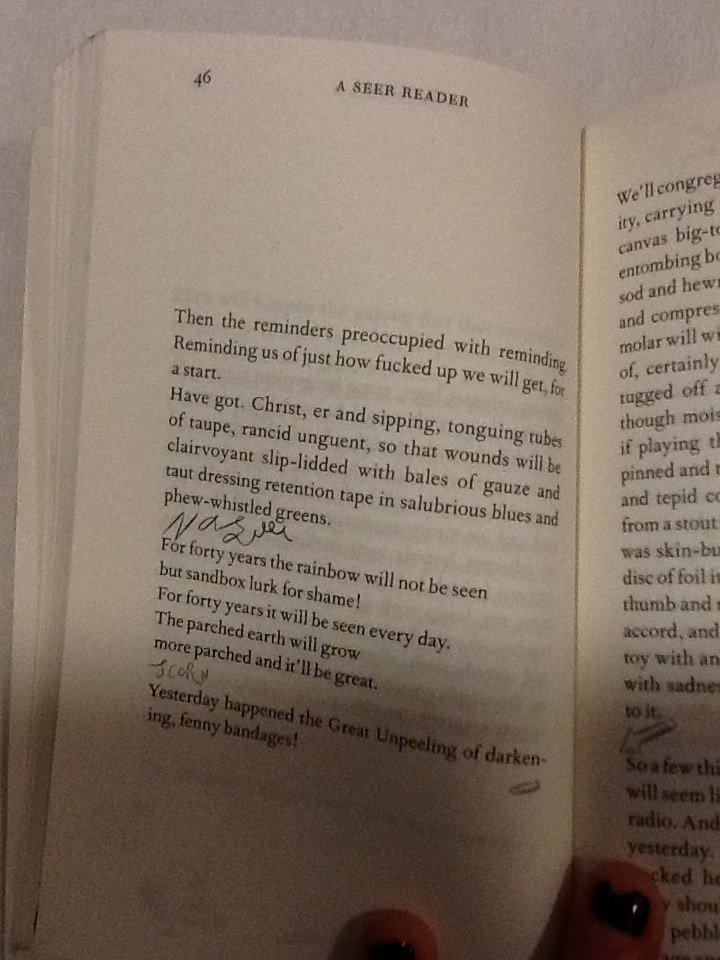
The discourse structure (involving the positioning of illustrations with relation to the poetry,) may be designed as it is in A Seer Reader to give stage directions to the reader. It creates a similar discourse structure within the poem to that of a script. On page 46 Atkins places the handwriting scribble ‘nausea,’ in a new verse, in line with the direction the poem would be read in.
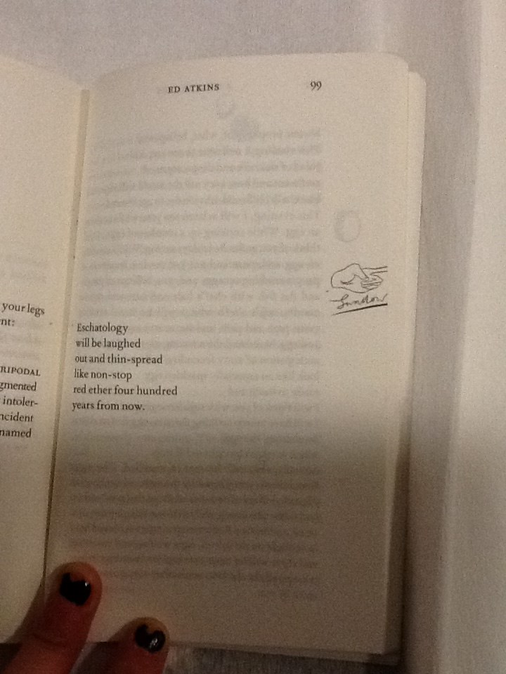
Atkins allows these direct assertions of feelings to stand as lines by theirselves. They appear significant and with a different font (in scrawny pen,) they contrast to the rest of the poem, they work as powerful instructions. With their own space they order the reader to feel something. They also give relief to the poetry; a breath between verses to give time for the reader to reflect, to feel, before continuing to read. When looking at page 99 a short, six line poem is centred to the left of the page, so the text lays closest the core of the book.
A poem which torments human’s obsession with eschatology, with disregard and humour. A slap-stick illustration of a hand, labelled ‘swallow,’ underneath, sits directly in line with the verses on the opposite side of the page. Aligned with the poem on a vertical axis, its clear the text and illustration are to be read one after the other; they have a connection, although they are separate because they imply a direction; a change of action. The illustration is cut right to the edge of the paper, giving the impression there is something to reveal on the next page. Its likely that after reading this grave poem, which makes dark humour about the possibilities of our future, the space allows the text and the reader to breathe. I think Atkins wants the reader to digest the words of this poem, look to the right and ‘move on,’ indicated by the encouraging instruction of a pointing finger to turn the page. In this case the positioning of the doodles may be used as a order to feel an emotion like a stage direction, or to initiate a direction.
Some doodles intimately relate to words in the poems. On page 57 a bold marker is used to underline the final verse in the poem, this draws attention to it and marks the line with importance.
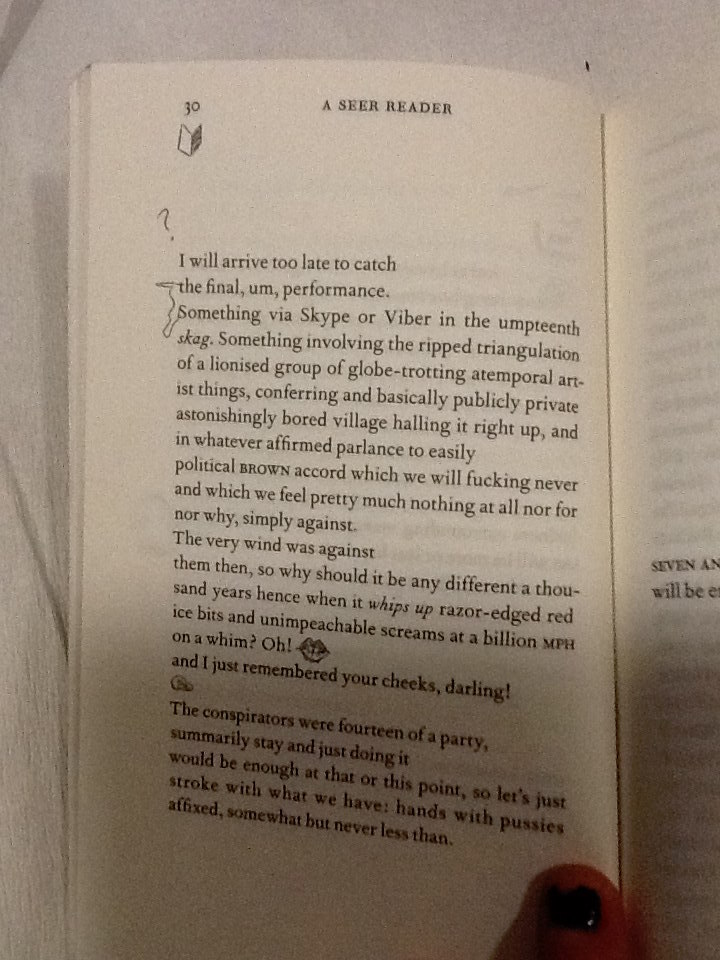
On page 30, the two opening words, which start verses following each other, are connected with a squiggle.
When joined they spell the phrase ‘the something.’ Making a new verse within the poem. This statement also exists on the page now without relation to its context in the poem without the joining squiggle. This draws emphasis to the phrase and creates layers within the poetry.
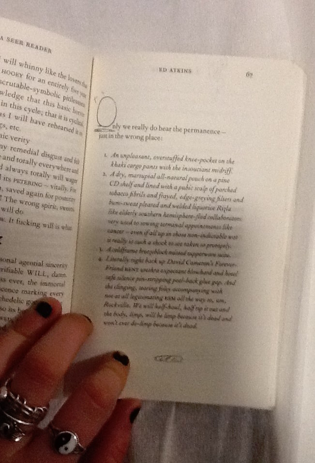
In some cases the positioning of the handwriting squiggles make them a part of the poem, although they contribute letters in a different style to the rest of the poetry in its serif font. On page 67 the poem begins using letters O the handwriting style, to begin the first words of following verses.
The size of the squiggly letter is obese to the rest of the text, it helps to compose a bold and grand opening word. This is a common design in a lot of literature, Atkins makes a reference to it in his own style in an impish attempt to add intellectual value to his poetry through his page design. The choice to have these in the doodle style instead of the serif font refers to the power the doodles have over the poetry on the page, as they refer to the dying practice of handwriting as a symbol signature of our mortal lives in society today.
I’d like to find out why Atkins chose to use this specific imagery, for his doodles. Many of the symbols he uses look similar to punctuation, commas, full stops, brackets. His choice to use marks in A Seer Reader and for the tattoos in his video, which are similar to punctuation, gives a further clue that not only the handwriting is being used as a symbol of our mortal life today. There are other reoccurring themes within his imagery, including hands, eyes, penis’ and delicately sketched vaginas. All parts of the human body. Atkins decision to design his illustrations using this imagery, again, references mortal
life and current society which he discusses along with his thoughts about the future in his poetry.
By investigating Ed Atkins process as an artist, focussing primarily on his exhibition at Serpentine Gallery 2014, and more specifically the video work Ribbons, I have come to various conclusions about why the doodles which intrigued me into investigating the design of A Seer Reader, are designed in the way they are. The handwriting style the doodles are written in, connotes natural human thought patterns, unstable emotions and ultimately the questions the author presents. Handwriting also serves as a symbol for language and writing in which could represent the typical medium used and developed throughout our human age. It therefore creates a tension with the computer generated font type used for the poetry, which might suggest the virtual future which Atkins discusses, as a running theme to his work. The doodles appear in totally different positions throughout the book, on each page. I therefore discovered various different reasons for the design of their arrangement. They can be placed intimately within contact of the poems, to draw attention to specific words or phrases, or to illustrate an idea directly which shows how human knowledge can still be useful for bettering the future, when considering the broader context of his practice. They can be placed in a location on the page which will give a direction to read in or indicate that one should stop reading to feel something. The placement of the doodles when they create letters which integrate directly with the poem, connate high literature as Atkins desires his writings to be read with sincerity as he discusses deep issues surrounding our society and regarding the future. Finally the chaotic feel created by the different placement of doodles on each page questions the urgency of the issues the handwriting stands for; the mortal world and its conflict with the virtual world of the future. To end my investigation I discovered that the imagery Atkins uses in the design of his doodles references English punctuation, and the human body. Again it links directly with his exhibition and his proposal of questions regarding our existence in the society we live in today, and its relation with the virtual future.
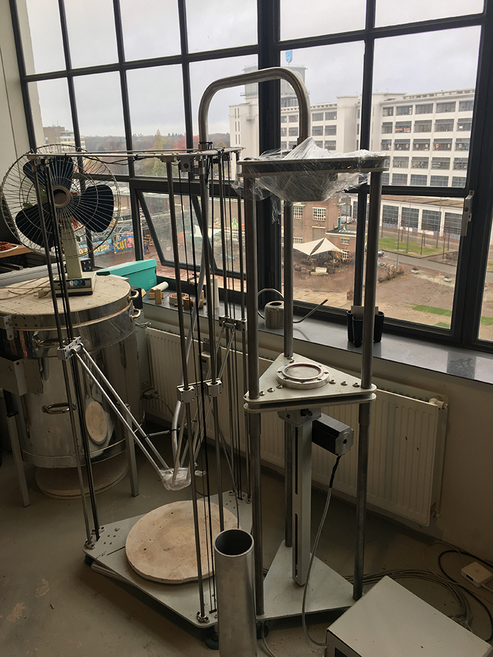
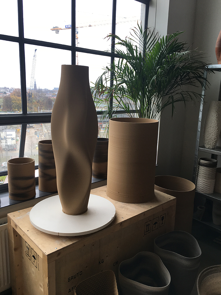
Olivier van Herpt is young Dutch designer from Eindhoven, he graduated in 2014 form the Eindhoven design academy. We discovered his work at the “Dream Out Loud” exhibition in the Stedelijk. Both of us were strongly attracted by the 3D world and process in the show. Therefor van Herpt’s work seemed like the most instructing of all regarding his process but also due to the final objects themselves. The other aspect that catches our eye was the combination of brand new technology and crafts, (3D printing/ceramics, weaving). Van Herpt’s work consists in making ceramic shapes (vase looking shapes) with 3d printing machine that he engineered for it. We were therefor even more fascinated not only by the shapes but even more by how he got there. We had the opportunity of meeting him in his studio and ask him more about his work and work process.
The conversation immediately focused on his work process.
It all started when he was still a student at the academy, he was already interested in 3D printing and was taking ceramics as minor. He also mentioned that he had always been interested in the technical part. But was quickly limited by the technical possibilities of the machines at the academy, size wise, material wise and so on. This is when he started thinking about making his own. His approach was also mainly to combine different techniques. He therefor though about a machine that would combine man action and machine made. He wanted to have an interaction with the machine. That combination also takes place in the process of designing the object and making the object. Van Herpt had some help from student friends at the beginning but not from manufacturing industries. He started with a small machine and they got bigger with time. He designed and engineered the machines himself and learned the technical part while in the process of creating them. Also as a designer, unlike an engineer, he already had an idea about what the machine had to look like from the start. That give it a different approach but of course he had to adapt to technical issues and the machine had to adapt on what he wants to make. « It’s a parallel process between the object and the machine. »
After graduation he focused on experimenting with the machine with different techniques all about randomly approach « dripping » with different materials, such as wax, and bee wax. At the time he was experimenting with soft clay by softening it with water but had quickly explored all the possibilities with it so he then decided to focus on ceramics, dive deeper into it and use hard clay for which he had to build a new machine. Again we can see the close relation between the process of making the machine and the object, how one is to the other, and the constant need to develop a machine that is adapted to the material (hard clay).
The second machine he made for the hard clay is basically like a pomp, he described it as an ‘extruder’, the innovative aspect to it is its openness and the possibility to interact with the machine that works with any kind of hard materials : « the machine is really like a tool » that he uses to make objects with. He explained that there were two ways of working with the machine. You can decided to interact with it or not. The most basic shapes are hand made. Some of the shapes are design then put into the computer and then when a machine prints it then it is machine made, or you can shape it yourself on to the machine because the machine is not closed.
This is it’s way of renewing an very old craft (ceramics). It is a human versus machine collaboration. The shapes of the products are all unique you cannot make one twice. Because of the use of clay it is also fast to make and always reusable until you cook it. It is then possible to make a lot of different try-outs and and shaped it until you are satisfied with it. Meaning that there are endless combination of shapes possible to explore. He also sees it only as the beginning and very much as an on going process of experimentation.
«It is only the beginning » as he said « it can be really random but also really controlled » which gives a bigger range of possibilities, also with the use of different colored clay, creating very different kind of shapes. He also told us that he recently started to experiment with new materials such as porcelain.
He is in process of creating a new machine, even bigger, to have the possibly of making bigger shapes and objects. Having the possibility now of collaborating with different fields, which was his idea in combining techniques, he is enthusiast in working not only with designers but also with artists, architects, interior designers and even industries. for example industries ordered his machines for other purposes.
This research project by Daria Nakov and Raphaelle Hugues is based on the "Dreaming Out Load" design exhibition curated by the Stedelijk Museum Amsterdam
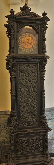
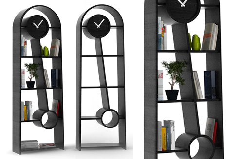
When I first heard about the task of choosing a pair of compared design objects in the Boymans van Beuningen exhibition “Design Derby” –where Dutch design is being compared to Belgium design– I thought it was going to be a long and painful process since I have never been interested in design. Especially not in furniture design which I know nothing about. It was a relief when I found out that the exhibition was well organized and the objects presented were described in an understandable manner. At first I had to take several strolls through the exhibition before I realized what my choice should be, and it was no other then the Grandfather clocks. Seeing them made the choice so easy that I even didn’t think about how hard it would be to compare them. That turned out to be difficult, since only later I realized I know nothing about the styles of design and even the point of owning one is completely unclear to me.
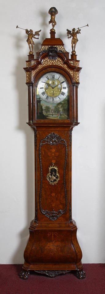
So these are the clocks that I ended up choosing, The one on the left is Designed by a Belgium artists Georges Hobe and architect Antoine Pompe in 1902 while the other clock at the right is designed by a Dutch designer Christiaan Wegerif also in 1902. You can see that both of the clocks are made at the same time, yet they are completely different. The Dutch designed clock is much more masculine and solid, also it has more detail and decor in general. The Belgium clock meanwhile is famine and is more about the function, It hasn’t been overly decorated and is just as complicated as it needs to be in order to serve its function. To have a general idea of what similar types of clocks look like and how they are the same or different you can visit this link that sells german grandfather clocks or this that sells grandfather clocks in general and has some background info as well.
So after the exhibition I thought to my self what the reason was of making this, (now seemingly) foolish choice that seemed so easy and clear at the moment I made it. Suddenly it clicked to me; my grandmother, she used to have several Grandfather clocks, and only now I started understanding how sad it is that I never paid attention to them. I never had the chance of asking her why does still keep them. My grand mother was very old and as I noticed, the clocks just became closer to her with time, after she got moved to an old people home, she took only few belongings with her, few pictures, bottle of cognac and one of the grandfather clocks. I guess there it served as a reminder of past and the overall importance of time.
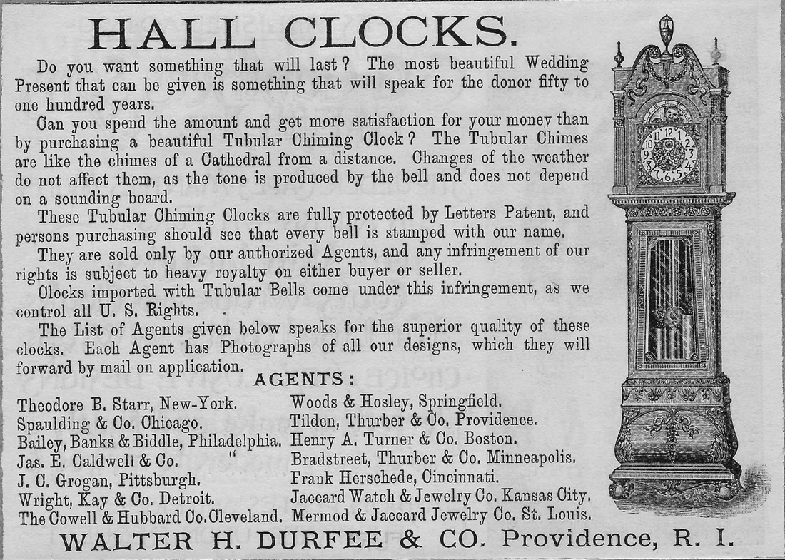
So due to the lack of information on the specific Grandfathers clock’s of my choice I decided to do a general research and the first thing that was unclear to me was the origin of the name “Grandfather clock” why not Grandmother clock or just Tall clock? Once again it all comes down to pop music, its named after a song “My Grandfather’s Clock” performed by an American songwriter named Henry Work [x], who wrote a song about a clock which stopped working the same minute of the day when the last surviving owner died and happened to be a grandfather, you might think that this is a made up myth but let me surprise you that the chances of this actually happening are pretty high since the less expensive clocks at that time needed to be wound every day or they just stopped working. The Grandfather clock is usually 1.8 – 2.4 meters tall and is a weight driven pendulum mechanism that is located in the tower or the waist of the body, this kind of clock was first developed in 1670 by an English clockwork William Clement.
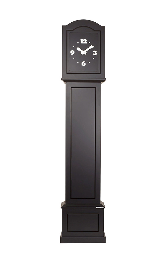
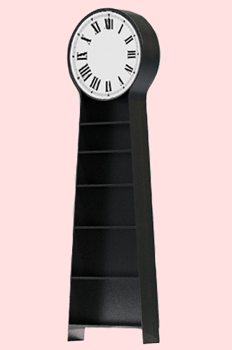
Until early 20th century these were the most accurate time keeping technologies so they were often kept by huge businesses and rich households. Now they only serve as decorative objects since it needs a lot more maintenance then a everyday wrist watch and most people now don’t have the TIME for that. Since I have a very limited interest and knowledge of history I decided to take a look at some modern day grandfather clocks, and I was rather sad to find out that with few exceptions they are not made by hand anymore and they have all become electronic. So I found very few companies that still make handcrafted clocks but only this Kauffman’s company offers to make a clock costum made just for you and how ever you want it so it has a much higher value and can relate to a specific family which in this case I think is very important. Though I must admit that the clocks made by hand then and now are not pleasing to my taste, and I find the modern ones more aesthetic and visually appealing for example this black and simple clock.
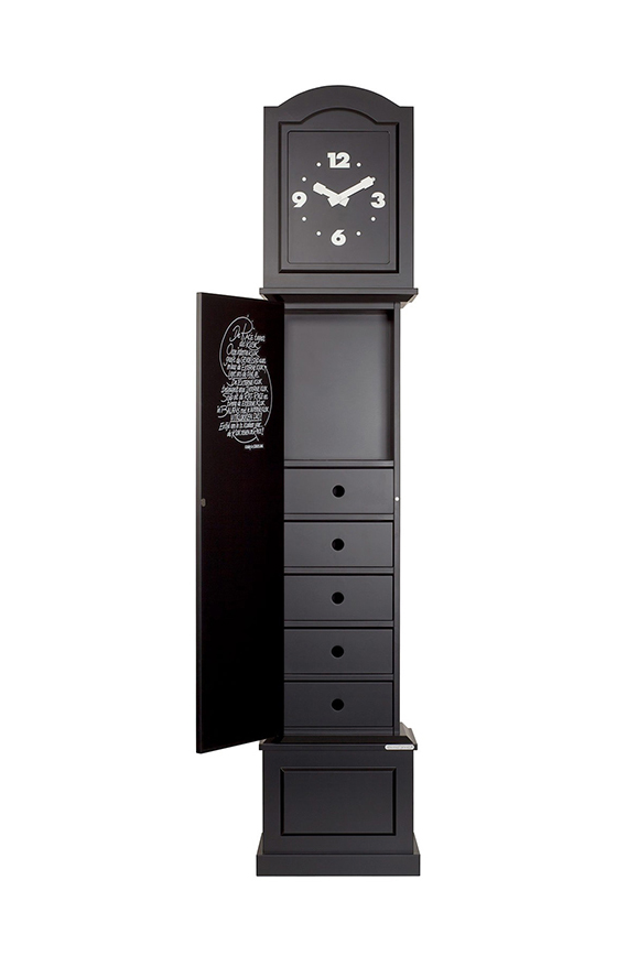
At the same time by loosing the need of a huge item that serves only the purpose of showing time they now serve new purposes that previously just couldn’t fit in the same casing with a pendulum mechanism. They can have built in drawers or be used as book shelves a and probably many other new purposes could be thought of. Here you can see the same clock as previously but opened and instead of the pendulums you have a set of drawers, that could be used perhaps for your dirty underwear that you wish to hide from the public eye.
Another great function but a rather ugly outcome.
I think the shape of clocks should not be forgotten, they just need to be redesigned to serve more purposes then showing time or they can just as well turn in to art pieces since they have such a strong image and meaning as a thing on it’s own, for example artist Maarten Baas has done few works that relate to grandfather clock directly or to time in genera. Most related to this subject would be his work “Real time” where instead of the usual clock face there is an LCD screen within the clock that shows a human inside the clock drawing the time on the clock face. Read about three contemporary artists that explore the general concept of time.
I personally don’t like clocks at all since they just keep reminding me of the amounts of time I have wasted on useless activities. So I would need a grandfather clock that goes backward and is constantly fooling me or doesn’t show time at all. Something like this…
Choice, Cover, Sound. What can I find? Books, Visual, Design Why should I choose this one? Well. It wasn’t easy at all. But it was at the same time. operating 6 different words, which are never combining on the same title but can be easily associated with one single cover.
That was the idea. That was the choice. That was the start and finish point at the same time.
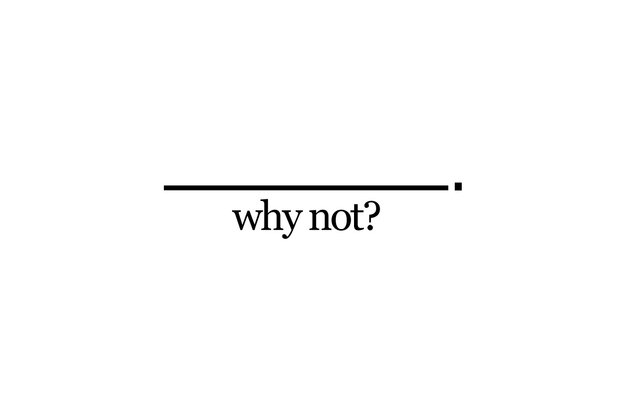
“Why not?” – that is the title for the third book I took from the library. The name that matches all of three chosen tags. If you start to Google it with "why not.." you will immediately have few options Why not design, Why not associates? Why not" and "why not both".
You will also find website called WhyNot which propose "How to Use Everyday Ingenuity to Solve Problems Big and Small" or Why Not Eat Insects? Or Why not build more Schools Without Walls?” Why not take up knitting again?
Sex and intimacy after 60: Why not both?

Why not kill two birds with one stone and send IRS to Gitmo?

Dogs on trains? Well, why not?

Why not be a naive?

Why not to swipe your girlfriend's skincare?

SO when I was googling in the library by hand, touching, looking for something special, taking, putting back to the shelf, searching and exploring and when I saw the perfect book for that

I had no more doubts – that was the right one.

That is funny, you don’t care actually what you will read about. Just simple choice of a book, as a subject, as a thing, as a piece.

Ask “Why?”, think “Why Not”? And take it!
As for information from the Wiki difficulties have been recognized in finding an adequate definition of synesthesia, as many different phenomena have been covered by this term and in many cases the term synesthesia (“union of senses”) seems to be a misnomer. A more accurate term for the phenomenon may be ideasthesia.
According to Richard Cytowic, sound ? color synesthesia, or chromesthesia is “something like fireworks”: voice, music, and assorted environmental sounds such as clattering dishes or dog barks trigger color and firework shapes that arise, move around, and then fade when the sound ends. For some, the stimulus type is limited (e.g., music only, or even just a specific musical key); for others, a wide variety of sounds triggers synesthesia. I’d like to have it. How is it to feel the sound with the color, or drawing with the sound?
Sound often changes the perceived hue, brightness, scintillation, and directional movement. Someone can see music on a “screen” in front of his face. Deni Simon, for whom music produces waving lines “like oscilloscope configurations – lines moving in color, often metallic with height, width and, most importantly, depth. My favorite music has lines that extend horizontally beyond the ‘screen’ area.”
I pretended being an synesthet while I was touching hundreds of books on the library’s shelves. I would like to see in all of this pictures a sound. To feel that the title of the book I chose is not a trick, and design made by machines is truly loud and 3-dimensional. Is it?
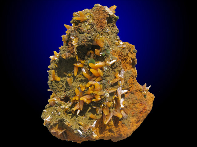
When searching for ‘mineral art’, Google suggests I look for ‘minimal art’. When searching for ‘mineral design’, the first hit I find is a website from someone who collects minerals and sells them as design. The first question that arose in my mind was inevitably: is there such a thing as mineral design? Sabine Amory, the woman who ‘seeks the most beautiful minerals she can find for her own collection and for her customers’, simply calls her website “mineraldesignshop.com”, but can you call it design when someone merely finds something beautiful of which Mother Nature is the only maker, and labels it design? I say no. In the art world you can put a ready-made in a museum, and then call it art. But the whole idea of design, is that you design something. You use your brain and your hands to create something new. Or is it old-fashioned of me to think like that? Am I condemning Sabine without a good reason? I decided to ask her, along with two other companies that call themselves ‘Mineral Design’ (mineraldesign.com.br and mineral-design.com). My question was: could you please give me your opinion on minerals as a material in contemporary design? It’s been two weeks now, and I don’t count on a reply anymore. Maybe Sabine doesn’t see herself as a designer after all.
On my way to the library I didn’t really know according to what I am going to pick a book. I was confused. But the minute I stood in front of the library I saw in the corner of my eye a small, old and weird looking book that looks a bit hand made with metal binding and a distinct old brownish color. It was just lying there, alongside the brand new and fancy art books.
When I reached for the book I noticed that it’s even in worse shape then what I imagined, I looked at the book cover and I saw it’s a book about design and research. Then I flipped a few pages and discovered that some pages are a bit torn and with many pockets and inner plastic pages with plans of some sort.
I lent the book and started thinking – Why did I pick this book? Was it there for a reason?
I have never seen anything like it before. I am fascinated by my new discovery. Maybe we really should judge a book by its cover?
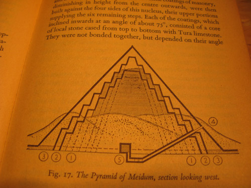
A book I found interresting is about pyramid design in ancient Egypt. The quality of the designs created by the ancients can be very inspiring tough it may seem a bit qliché, the mystery around the monumental pyramids as a timeless form are still facinating.
The book is an old and worn pocketsized relic it self. Its plastic wrapping that is protecting the cover almost falls off as you open it. It contains lots of illustrations and groundplan sketches of pyramidstructures, materials used, design methods and tools.