Skip to Content Skip to Search Go to Top Navigation Go to Side Menu


"craft" Category


Piet Zwart Dolls


Tuesday, April 23, 2019

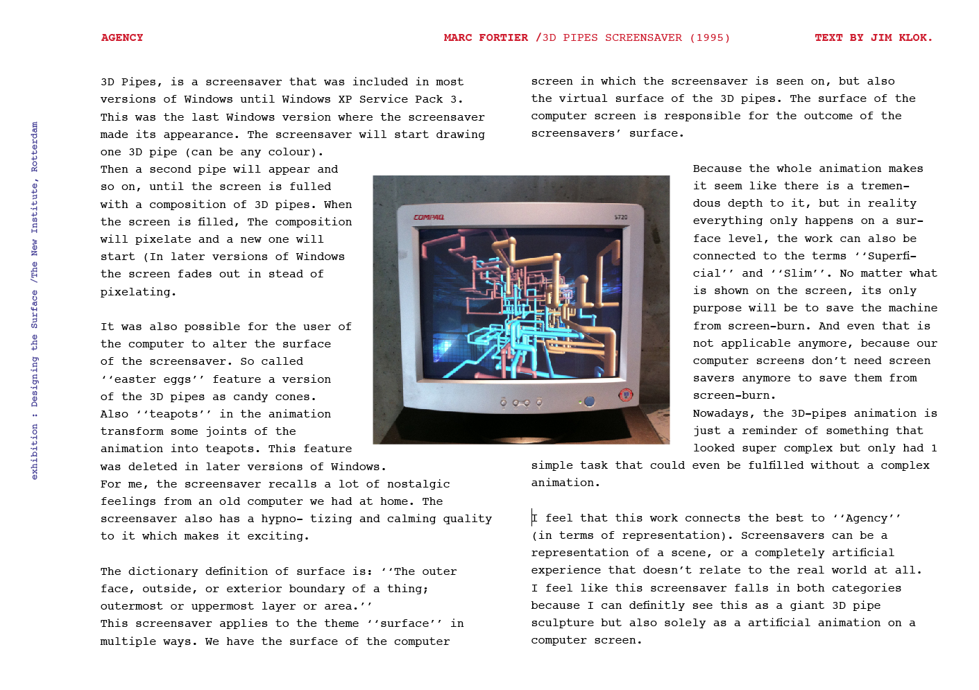
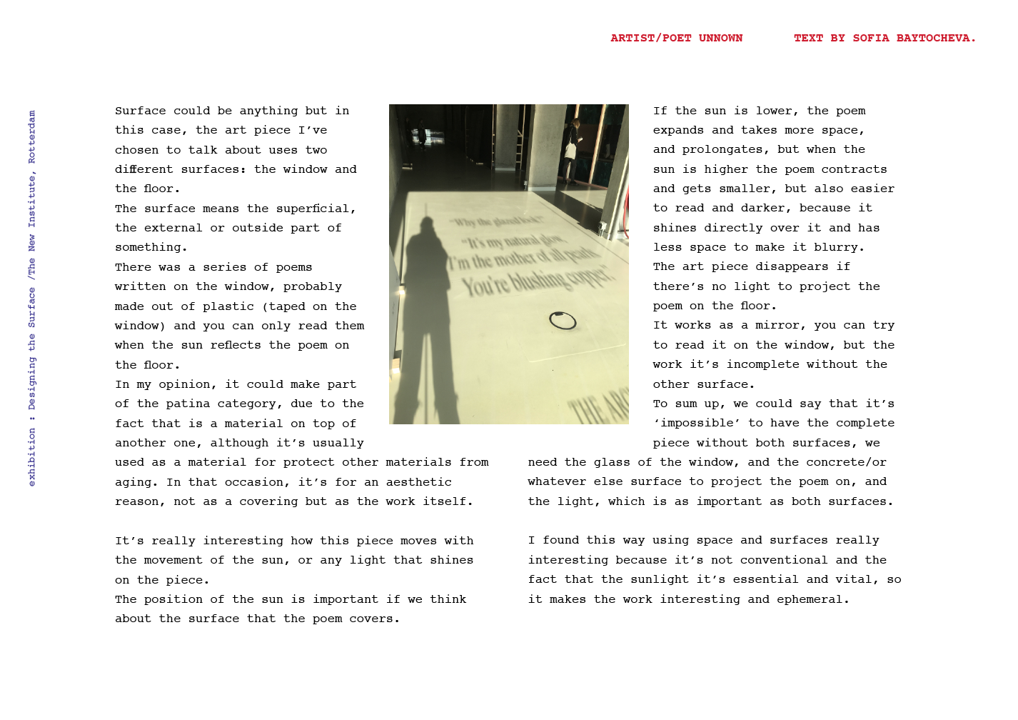
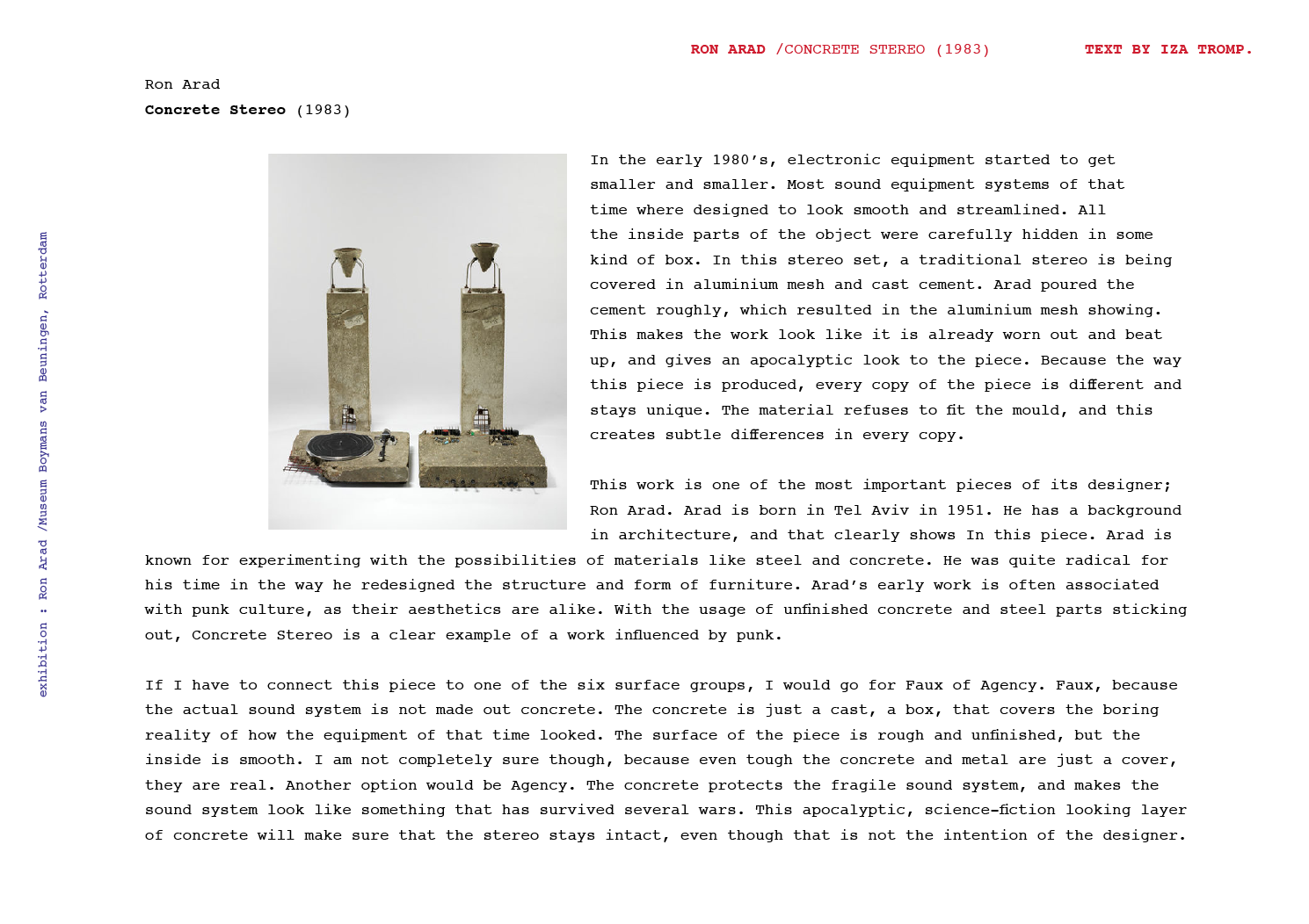
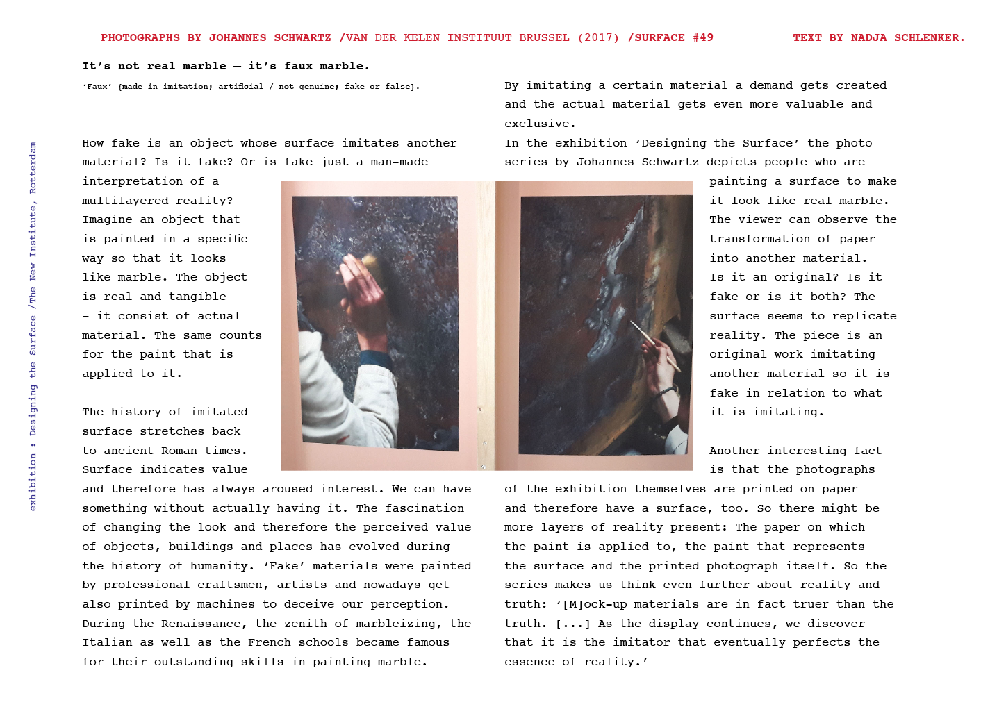
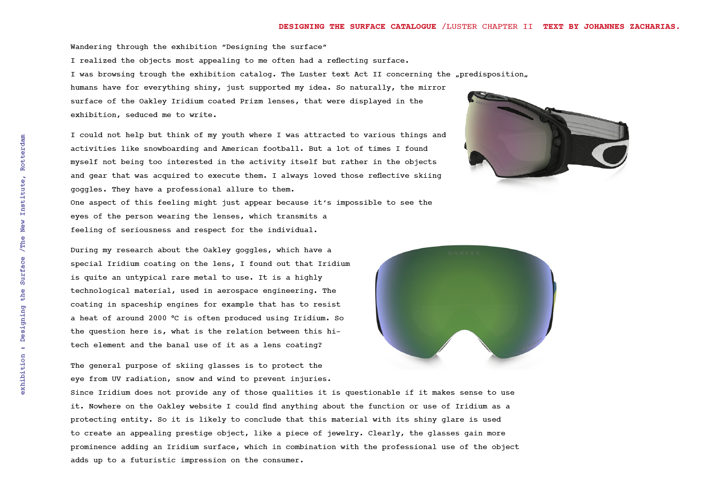
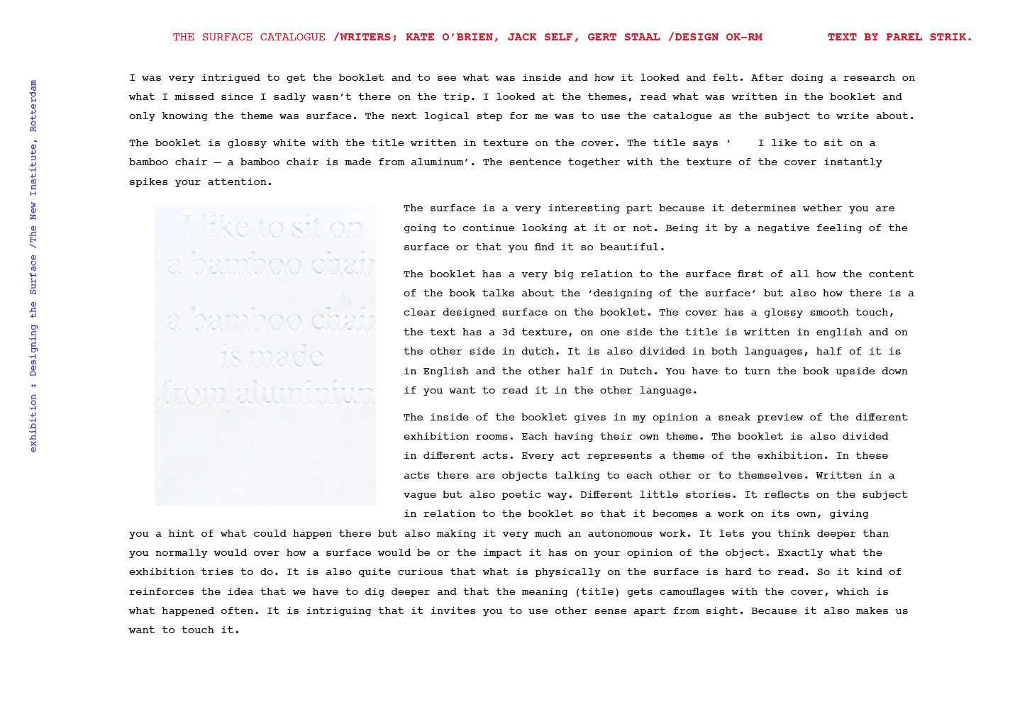
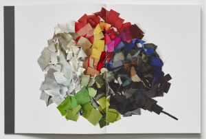
The bauhaus might be quite interesting and new for some, but looking at the collection it only makes me realise how many works of theirs I see in daily life, without being aware of their background.

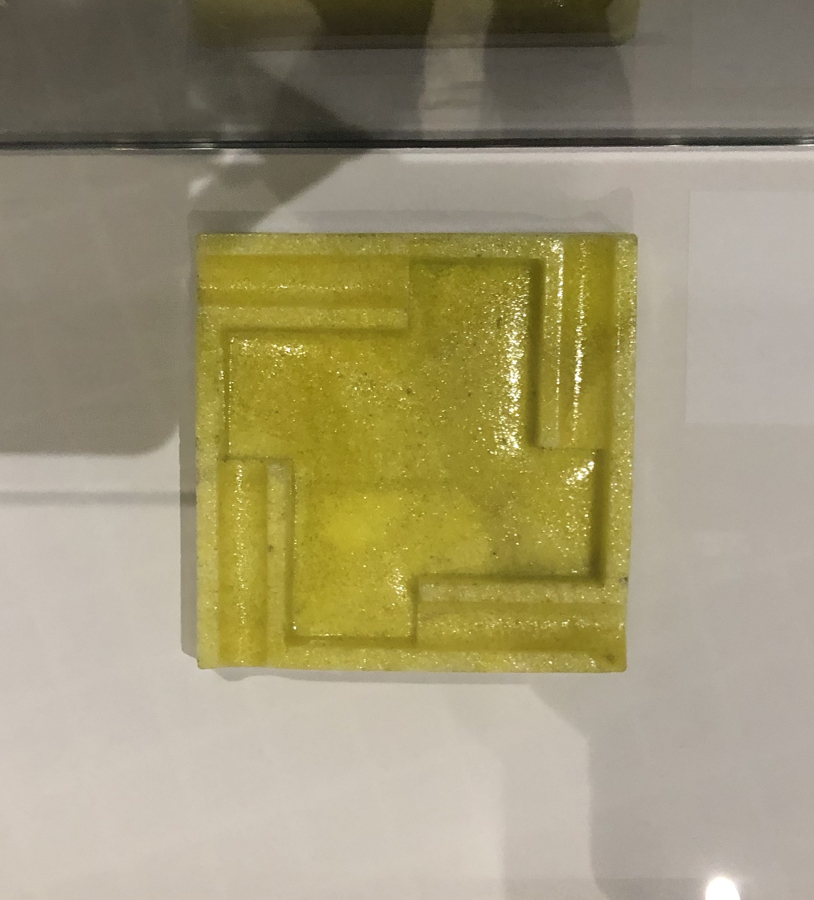
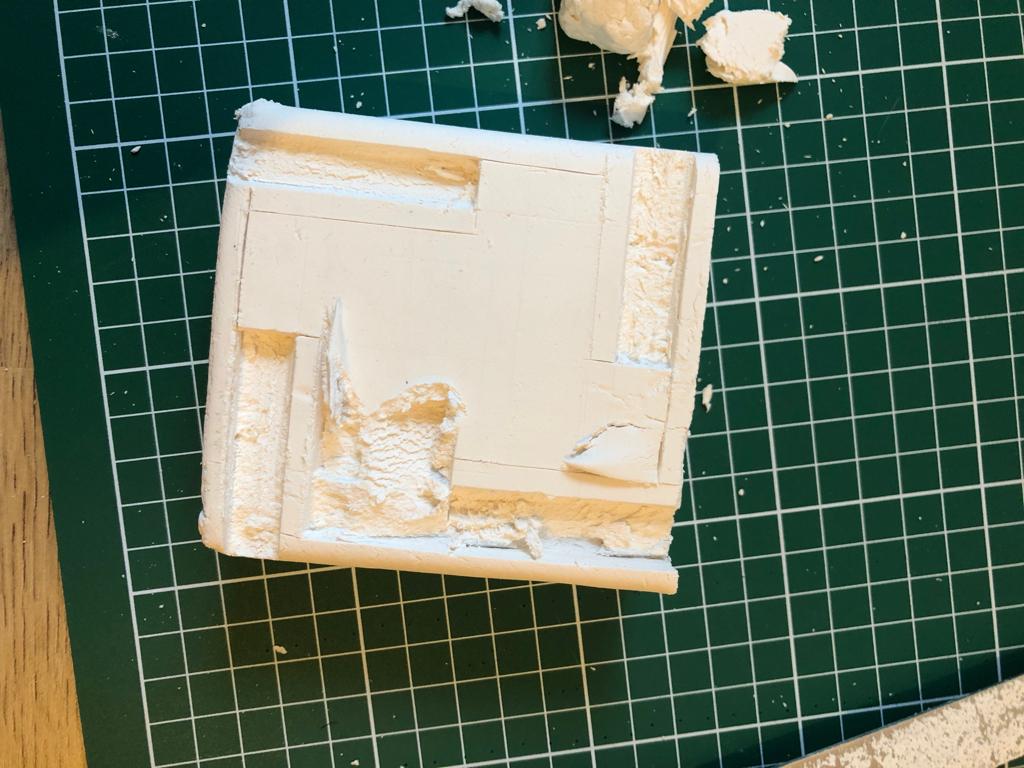
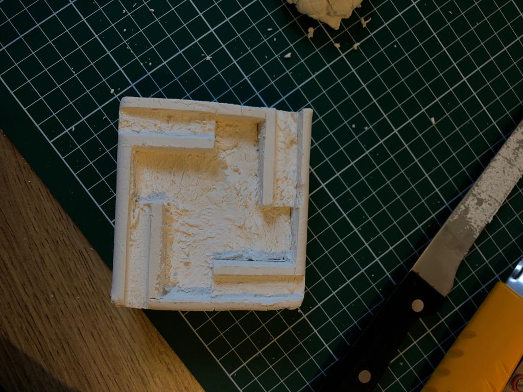
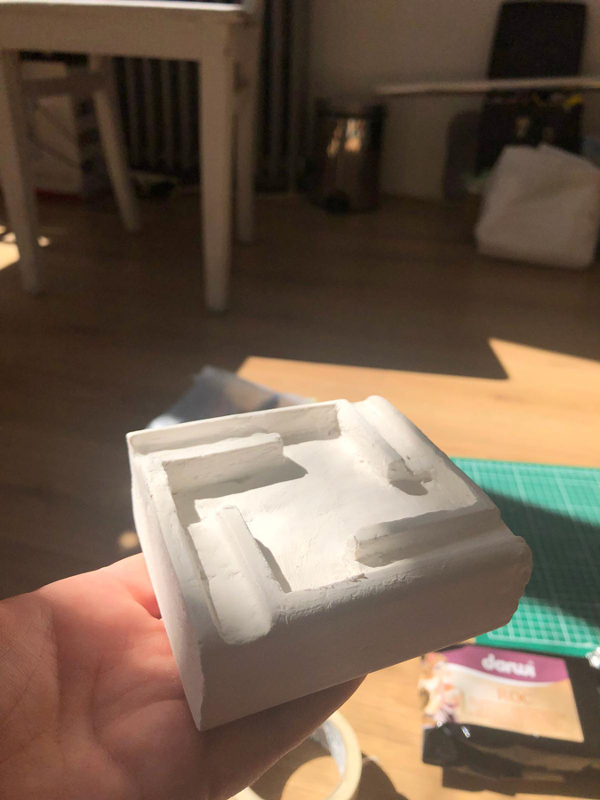
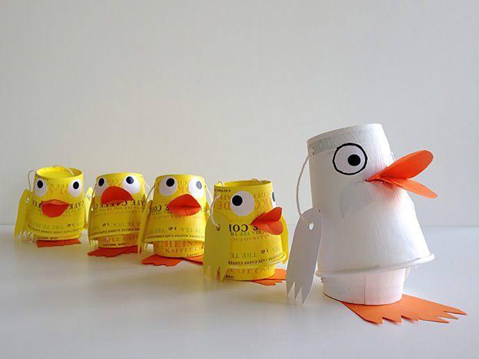
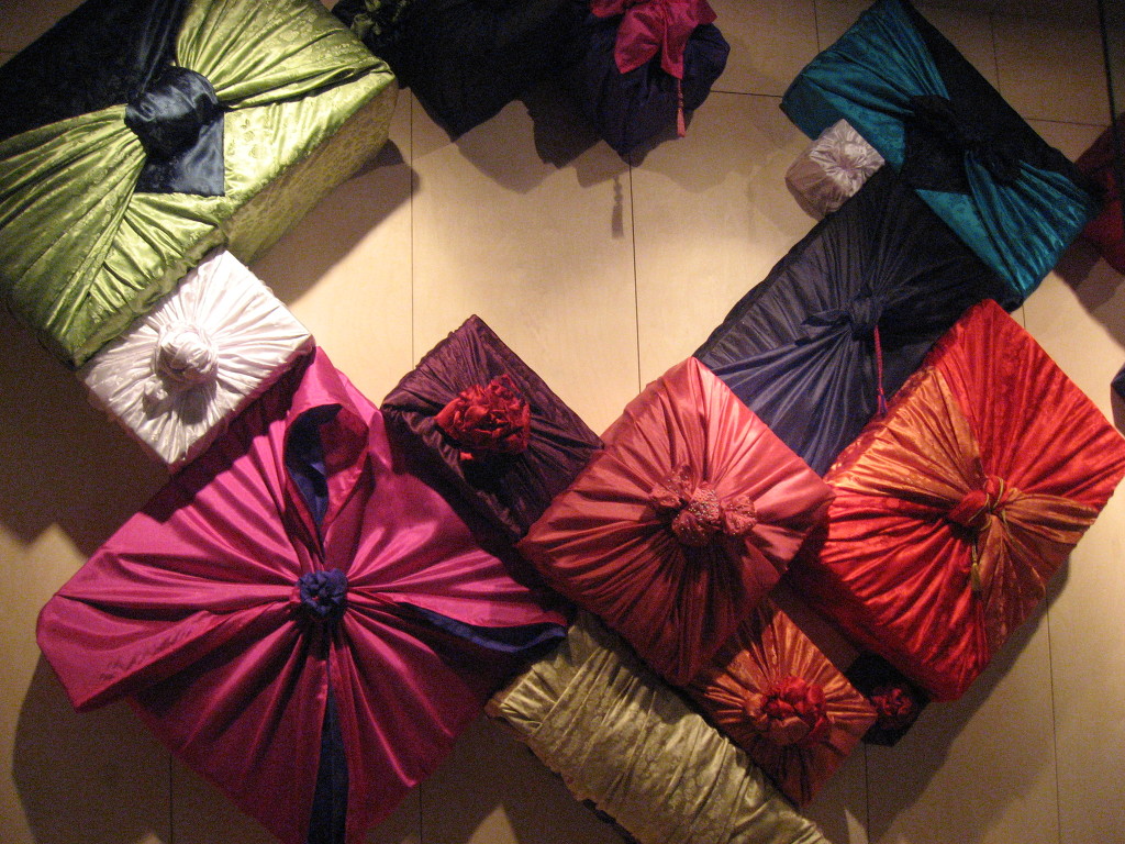
In the midst of it all there was one piece by Piet Zwart that caught my attention, the postal office dolls . The reason why his work interested me the most was not because of its material or colours but its size. Other works in the Bauhaus were on such a big scale, or photos of bigger works, that these small dolls made them even more noticeable for me.


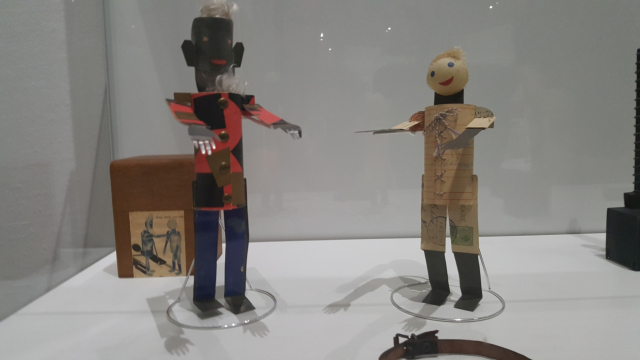
Piet Zwart Postel Dolls


Afterwards I did some research at home on Piet Zwart and his other works by looking at a documentary on him called ‘Everything Must Change’, by Sherman De Jesus, 2012[x]. What I found out during my research was that, he wanted to design his own identity, he wanted to see what Piet Zwart looked like. Writing doctrines, manifestos, mantras and disciplines, of various forms of the avant-garde, and knowing them well, was his first step in breaking the conventions. Three of his biggest influences were Russian constructivism, Dada and the De Stijl movement [x].

He studied a diverse range of art related subjects including painting and architecture, and he was introduced to the principles of the English Arts and Crafts movement. From 1908 he started teaching at an industrial and domestic school for girls. In 1913 he returned to study, attending the University of technology in Delft for a year. From 1919 while continuing to work as an independent designer, he began teaching at the Rotterdam Academy of Visual Arts, now known as the Willem de Kooning Academy. He was dismissed in 1933 because of what were considered his radical ideas on education. His ideas were too similar to those of the Bauhaus art school in Germany, where he gave some guest lectures as well in 1929.

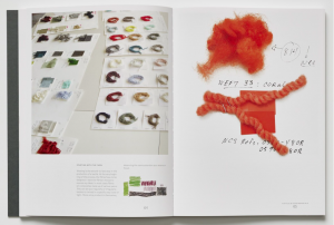
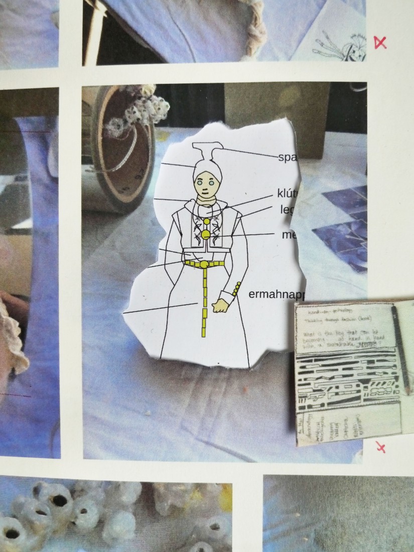
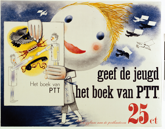
In 1930 he was asked to design ‘The Book of PTT’. This book was made to teach school children how to use the Dutch postal service. It was full of bright colors and it was meant to be exciting. He created two main characters for the book: ‘The Post’ and ‘J Self’ [See Dolls 1] They were paper doll cut-outs that he photographed and then touched up with chalk, ink, and color pencil. Additionally, he used many different fonts of varying sizes and thicknesses. He was assisted in illustrating the book by Dick Elffers. The book was finally published in 1938.


the 'Piet Zwart PTT book'


I studied him up to this point because it seemed to me like his later works would be irrelevant to how I relate to the dolls. So after the research of his earlier years and how he worked on The Book of PTT, I finally found a connection. As a child I used to make a lot of dolls out of a wide variety of materials for example; clay, paper, trash, etc. I made their clothes and homes, I created a separate world for them. And I would link those to a story in my head or on paper. The reason I felt connected with his dolls was because it gave me a nostalgic feeling of how I used to play and the way I produced the dolls and linked them to my stories felt similar to Piet Zwart’s dolls and The Book of PTT.

Even though I might find them very similar, at the same time, to me they are totally different. For example the way he executes his stories in his book he uses a very precise and fixed style that doesn’t change throughout the book whereas in my case I was still a child, I did not have a fixed style; my drawings were childishly disorganized.

Another difference is his typography, not only the way he writes but the way he uses words and letters. It seems like he’s playing with them, something I could’ve only dreamed of as a child. I wasn’t really the smooth talker, I often stuttered and could never get my words across.

As for his writing of course it can’t be compared to that of a child’s handwriting even if it is made for children. Even now writing is not really one of my strong suits, a reason why I came to the Rietveld, to improve my writing skills in order to get my stories across. That’s why my stories were told mostly by images instead of text.

I hope to have to opportunity of honing my writing skills at the Rietveld Academy so that I can explore and find my own new way of writing. That would clarify the meaning of the stories I have yet to tell.


Sources:

-Piet Zwart en Het boek van PTT, [x] Een commentaar, Paul Hefting, 1982
or have a look at the boek itself [x]

-Pioneers of Modern Typography, Herbert Spencer, London, 1983


I Tried To Make An Ashtray


Tuesday, April 23, 2019

I TRIED TO MAKE AN ASHTRAY
At the Bauhaus exhibition in the Boijmanns Museum many interesting objects and images were exhibited. I started taking pictures of all the things that  struck at first and thus interested me. After the exhibition I was still undecided what subject or object i wanted to lay my focus on. I was interested in many parts of the exhibition but didn’t really know how to connect it to myself or to my current situation at the Rietveld academy.

Every now and then I went back and looked through the pictures I took from the exhibition and  the catalog of the exhibition. I noticed that I had taken quite an amount of pictures mainly of the different ashtrays that where exhibited. I then asked myself where my “unconscious” focus on the ashtrays was coming from.

Some of the initial pictures of ashtrays that I took in the Boijmanns exhibition:

When I initially thought about trying out a new material and design I was instantly reminded about  me being in a similar situation back in highschool. We had a copper driving course. We were allowed to choose a simple form with which to start with. I choose a spherical piece of copper and it ended up becoming a round shaped ashtray. Through this previous experience I thought that I can relate myself more to a Bauhaus student by putting myself in the same position trough remaking the ashtray. Basically trying to comprehend the previous process trough the attempt of reproducing the same object.

In my opinion it makes sense to start with something small and not too complicated, that requires a small amount of skills and abilities, and that can be done trough, child like intuitive experimenting with material and form, for example a vase, a teacup or an ashtray.

I then tried to think about the students in the „Vorlehre“ of the Bauhaus school and imagined that they may also started out trying a new material by making simple objects like ashtrays. An ashtray is a decorative object that is often located in the middle of a room easy accessible  for everyone and at the same time functions as a design statement.

The ashtray depicted below is the one I choose from the exhibition

It was a design by Nicolaas Petrus de Koo, I choose this ashtray in particular because I felt like the time in which it was produced was really well represented in the design and color. It took the art and design language of that time ( clear forms, practicality ) and translated it into an every day object and at the same time it really represented the motive „form follows function“.

Form follows function was a principle associated with 20th-century modernist architecture and industrial design which meant that the shape of a building or object should primarily relate to its intended function or purpose. I think that is a really logical and sensual approach to not focus on all the „ornaments“ around but to rather set the focus on the pureness and the beauty of the function. I imagined to be part of the zeitgeist of that time to experience the process of reproducing an exact and polished design.

So I went and  bought some clay and started carving it and forming it. While doing that i noticed that it is going to be hard to make it look as precise as the original version.

I tried to imagine the process of an Bauhaus school student. Before they created an end product they must have made several steps and try outs to come to an end result that looked finished and not crafted.

First I stated meassuring and marking the form. For this propose I just used a ruler and a stanly knife. I made my own measurements because i didn’t have the original ones.

Then I started to ruffly carve the shape into the object, trying to build the middle part deeper and to ( kind of ) even the surface.

In the end I used a water rub on the survace to make it as even as possible even though it was still clearly visible that hands where involved in this process trough the numerous fingerprints.

Here are both finished versions (dried and baked) without paint on them. (Left : self hardening clay, right : Fimo)

I think that the Rietveld Academy education and the Bauhaus school education really differ from each other.

At the Bauhaus school one received a quite specific education that would provide you with skills to produce design objects and images. The education started with a different approach, where you first learn how to produce an object, carpet, form etc. and on the ground of these tools developing a design language.

At the Rietveld Academy on the other hand it seems the way to achieve your goals is more about thinking and reflecting and being aware of yourself and what is happening in the process. If you want to learn skills and abilities, go for it.

Everything is One: Building


Sunday, April 21, 2019

The Bauhaus manifesto published in 1919 outlines basic traits of the school. Headed with the Lyonel Feininger Cathedral (Kathedrale), the reader faces three stars shining above the turrets of the fictional basilica.

Lionel Feininger, Kathedrale, 1919, Cover of the Bauhaus Manifesto.
Programme of the Bauhaus. 

The three stars are said to represent the main three elements of painting, architecture and sculpture. All of which fall under the main concept of ‘building’. The Bauhaus was dreamt up upon a basis of creatives coming together, in alliance. To build work in an evolving space, a cathedral of mucky boldness, master among student, declaring craftsmanship and building as the basis of all learning.

Bauhaus itself is a blend of the word ‘to build’ and ‘house’. It takes semantic place as a ‘building house’. Now we can see the offspring of the school stretching from Berlin to Chicago, Pittsburgh and the Netherlands. Amsterdam is home to the Gerrit Rietveld Academie, which too was birthed from the wave of Bauhausian teachers and students left itching to scatter and inform after the original disbanded.

The school, mostly founded on modernist[1] design still has it’s reverberations. Is it just names that live on? Is the branding of Gerrit Rietveld, the only thing that links us to it’s educational model origins? Or is there still a cry of modernist education professing ‘building and making’ over all students?

It occurs that in the postmodern[2] world, the act of ‘building’ is seemingly scattered. Questioned theoretically. Few are painters, sculptors or architects now. Monogamous artists are perhaps becoming a thing of the past, steadily becoming toast along with craft in art. Perhaps we aren’t building physical practices anymore – emerging in the form of degree courses like ‘Autonomous Sculpture’ surfacing at the Rietveld, a subject so loose – almost transient. The focus here is on concept, as opposed to physicality.

The original Bauhaus manifesto is not something that presents a package of transience, but one of definitive action – “Architects, sculptors, painters—we must all turn to the crafts. … The artist is an exalted artisan.” The stress is on doing. Less on thinking.

The question I would like to pose is ‘what really happened during this rework?’ In the move from modernity to postmodernity, the focus has changed. Does this mean compromise? The change has happened in many forms, yet using the policy and attitudes towards ‘building’ in the two schools, we can evaluate them on a level playing field.

In my personal day to day experiences of the school, I have never been encouraged to ‘build something’. However, I have been encouraged to think reflectively, as if constructing something from thought. Within Itten’s original preliminary base course structure, the idea of elementarization[3] of basic artistic means plays a large part. I question wether this is still relevant with postmodernity. Elementarization was a method of finding the core of things. That could be related to shape, colour, and formal elements much better than thoughts, concept or theories. Deconstruction of colour, according to Itten’s book ‘The Elements of Colour’, allows you to provide “general rules and laws of colour, yet also relate it to subjective opinion”. Elementarization is a bid to find the root of something, the truth in which the experience lies. However, within a postmodern (Rietveld) structure, ‘truth’ itself is something shied away from. Instead of trying to find ‘the truth about colour (or making)’, we are left trying to find ‘the truth about thinking’, left ‘thinking about thinking’.

It is important to mention that even just through the existence of the Basic Year, and the formation of classes, teachers and subjects, it is apparent that the Rietveld does honour the idea of a ‘good education’, over a ‘bad one’. They have, after all  applied this structure to the course based on reason and pedagogy[4] study (or so I would assume). Thus, the structure must be based on certain means that deem it useful or good to us as students. This leads me to believe that there is indeed a right and a wrong way to educate young artists. In other words, there is a true art education to be obtained. In the Gropius manifesto of 1919, ‘What is Architecture’, this truth lies in “architecture, painting and sculpture”. But the world today demands a wider spectrum of conversation. I personally think that it is more than okay to dedicate oneself to finding a real trade, or becoming the master of something, as opposed to a jack of all trades.

I can see both sides of the story in so much that The Rietveld has to keep up to date with the process’ of the current art world, but coming from a somewhat dated model. When beginning this essay, I was under the impression that the school was undergoing some kind of identity crisis. Attempting to link themselves to their withering ancestral roots in Bauhaus. I would argue that the link is indeed withering. That can be seen in their policies on ‘making’. It is perhaps more of a historical connection now. In truth, if I wanted to become a master woodworker, I could. But it wouldn’t line up with the philosophy of the school. I have personally received criticism for dedicating myself towards attempting to become a kind of master in one material.

In conclusion, Gropius himself would suggest that the Rietveld needs a re-work if we are to base our education on a Bauhausian model. I think he would suggest that there are no ‘master craftspeople’ being raised up.

The Rietveld Academie has not explicitly chosen to follow the Bauhaus manifesto like some kind of Bible, so, from the perspective of a student studying here now, the school is allowed to deviate from the original blueprints due to societal changes. I personally think it’s great that we aren’t all sold into unpaid labour making zig-zag chairs. Yet, the school should probably analyse its withering links to the past. Just like inevitably a grandson will probably have different interests to his Grandfather. The Rietveld is not in an identity crisis, but slowly developing the ability to keep proud the family name, yet not live in the shadow of it’s ancestry. There will probably be a time, when the Rietveld’s education model will bear no similarity at all with that of the Bauhaus.


[1] Modernism(ism) – Modernism refers to a global movement in society and culture that from the early decades of the twentieth century sought a new alignment with the experience and values of modern industrial life. These were often utopian, and modernism was in general associated with ideal visions of human life and society and a belief in progress.

[2] Postmodern(ism) -Postmodernism was a reaction against modernism. While modernism was based on idealism and reason, postmodernism was born of scepticism and a suspicion of reason. It challenged the notion that there are universal certainties or truths.

[3] Elementarization – The reduction of artistic elements to their most basic or original form.

[4] Pedagogy – The method and practice of teaching, especially as an academic subject or theoretical concept.

  1. Johannes Itten, The Elements of Color, John Wiley and Sons Inc, Hoboken, 1970
  2. CityLab. (2019). Western Pennsylvania’s Bauhaus Town. [online] Available at: https://www.citylab.com/design/2019/03/bauhaus-pennsylvania-gropius-breuer-aluminum-city-terrace/584485/ [Accessed 20 May 2019].
  3. Moss, C. (2019). 100 years of Bauhaus: Berlin and beyond. [online] the Guardian. Available at: https://www.theguardian.com/travel/2019/mar/16/100-years-bauhaus-germany-berlin-weimar-dessau [Accessed 20 May 2019].
  4. The New Bauhaus. (2019). The New Bauhaus. [online] Available at: https://www.thenewbauhaus.com/ [Accessed 20 May 2019].
  5. Gropius, W. (1919). Walter Gropius, Bauhaus Manifesto (1919). [online] Adepratt.weebly.com. Available at: https://adepratt.weebly.com/uploads/3/7/7/1/37716215/bauhaus_-_manifesto__program_statement.pdf [Accessed 20 May 2019]
  6. Bauhaus-imaginista.org. (2019). The Bauhaus Manifesto – Articles – bauhaus imaginista. [online] Available at: http://www.bauhaus-imaginista.org/articles/1771/bauhaus-manifesto-re-cap [Accessed 21 Apr. 2019]
  7. Danchev, D., 2011. 100 Artists’ Manifestos: From the Futurists to the Stuckists. (s.n.). p159-p161 (M33 Walter Gropius – What is Architecture? 1919)
  8. Gerrit Rietveld Academie. (2019). Home. [online] Available at: https://rietveldacademie.nl/ [Accessed 20 May 2019]
Nicholas van Pelt

The Tribal World


Wednesday, November 21, 2018

Thursday, November 22, 2018
The book „Tribal Tattoo Design“ is a little yellow book with silver printed shiny letters on the cover that spell the tittle. It is a square small soft covered book around 15cm x 15cm. The color is very vibrant and stands out. Not necessarily a kind of yellow I very much like but neither I mind. A lemon little toxic looking yellow. Next to the tittle is a sketch in outlines only, showing a human body from behind with tribal looking tattoos on the arms, pine and legs.

The first time I saw this book it attracted my attention in the hands of a classmate of mine. The book was open so the images inside attracted me in the first place. Simple outlines only sketched body with traditional tribal tattoo art from different regions in the world. I immediately wanted to look through the book because I’m very interested in diverse tribal history, body art and tattoo art for a longer time now.

The book looks vey simple. If I would have seen it just on the shelf the cover would not attract me at all and blend into the surroundings. On the inside of the book the most oft it are pictures so it attracts to look through. Around the images is a lot of space it attracts the eye with a lot of space and just tattoo and human body doodles. It is easy and fun to look through. The book gives you an eutectic feeling and brings some inspiration as information that you can simply absorb with your eyes. A nice little handy book for some illustrative inspiration for people who are interested in tribal culture and a look on beauty outside of the western world. A nice looking book on the inside and not spectacularly designed from the outside. A very simple little like-able book.

Book number 908.9 din 1

Naked Dog


Wednesday, November 21, 2018

Thursday, November 22, 2018
Last week we had to look for a book for our design project. I had to look for a book related to design, but here was the catch. I was not allowed to look at the information in the book just its exterior, i had to find a book that attracted ore displeased me only on subjective grounds.

While I was walking through the brand-new library of the Rietveld academy I was primarily buzzy with looking at the library itself. The nice plants they put to the sides and how well put and nice the place looked. In my head a school library is supposed to look old fashioned and dusty not a nice looking clean place like this. Then again, I did not have that much experience with library’s. This was not because I do not enjoy reading. On the contrary I enjoy it to much, so much so that every book I end up liking I want to have as my one. This is why you will not find me in a library but more in a bookstore.

While my head was wandering about like that my eyes fell upon a rather shabby looking book in compere’s ant to all the other rather fancy looking books in the shelfs, the book did not have a title and instead had a cover of what seemed a group of friends siting tighter naked with a dog. The picture did not shook me or anything instead it made me instantly curios what it could be about. For me (someone who is very new to the concept of design) this seemed like a very odd picture to put on the front of a design book. But then again, my idea of design is much more of that of a very clean and tight looking piece than what I was holding. Halve confused and curios I went to the man behind the desk who was the head of the library and asked if this book was also part of the design departed ant and to my surprise it was. This book that seemed to be hand bind with the group of naked friends on the cover of witch in my eyes it looked more like a fine arts project was an actual design book, well…. That made it clear I had made a decision
book 779 -won- 1

A Research about research


Friday, October 26, 2018

Taking the Work “Relief Rug” from Dutch Artist Kitty van der Mijll Dekker, made in 1934 as a leading example, the following text will try to surround and highlight analogies as well as differences in researching online or in printed matter.
The following articles give additional information about the Artwork itself, the Artist as well as the Bauhaus.
Designblog Rietveld Academie

Stedelijk Amsterdam, Relief Rug by Kitty van der Mijll Dekker

History of Bauhaus in Dessau


1st Inscription; "Relief Rug" by Kitty van der Mijll Dekker


2nd Inscription; "Bauhaus" Stedelijk Museum Amsterdam


Starting with the inscription next to the piece as the first information the audience can get (which definitely is printed information as well), the text doesn’t say anything but the basic information we expect from such source. Juxtaposed with other objects, artworks and artifacts from the same period and art-movement, another inscription announces some facts about the Bauhaus, the educational institute van der Mijll Dekker attended. Therefore the very first appearance of printed information just adds little more as what a viewer could be expected to have as background knowledge.

Printed documentation from and about Bauhaus highlight the emphasis Walter Gropius, founder of the Bauhaus, put on the concern of equality between women and men inside the institution. The Bauhaus was one of the few institutions, where not only men but also women were allowed to attend. What seams ahead of time, quickly turned out as not very long lasting and supportive to the persons concerned. Here, the most significant gaps from printed matter to online material can be pointed out. While printed matter talks about a topic and somehow provides information, online publications and writings mostly start with questioning facts which are already researched and published. Some of them come with an outspoken opinion as well as a contemporary context and  as a reaction to other publications.

The disconnection from general information about the Bauhaus to the issue that female artists and their part of the Bauhaus legacy are barely mentioned in publications, that can be traced back to the difference of “providing information” with printed matter and “reacting on information” in online publication.

Frieze; Women in Bauhaus

Emma; Women in Bauhaus

Artsy; Women in Bauhaus

If assumed, a book or documentary publication is preserving information about its content, and not too much voicing an opinion, unless it is a critique, the reader gets broader information which needs to be classified afterwards by the reader itself. Going through the listened publications underneath, the attempt to sum up or conclude seams to be more present than putting forward a subjective perception or even including a critical position.


“The Worlds Greatest Art – Bauhaus“ by Andrew Kennedy, 2006 • “Das Bauhaus“ by Hans M. Wingler, 1962


“Bauhaus“ by Magdalena Droste, 1990 • “Human – Space – Machine. Stage Experiments at the Bauhaus“ Eds.: Torsten Blume, Christian Hiller, Bauhaus Dessau Foundation, 2014


Simply spoken, these books come with a quality of objectivity that allows the reader to bring further a general knowledge. It builds up kind of a base where more specific ideas or concerns start to unfold.

Research in literature may appear more challenging, since the linking to connected subjects is not provided and has to be done by the researcher. Google (or any kind of search engine) supports with its algorithm and referring proposals. Although this two faced matter, the advantage of high rated recommendations is considerable. It enables the user to quickly collect a lot of information from many different sources, processing the subject in different contexts. Whereas, as mentioned above, research based on printed matter asks the user itself to fulfill the role of Google’s algorithm. To later on distinguish the quality of information or confirming sources stays an important part of putting research forward to a conclusion. At the same time the internet’s bottomless quality leads to many dead-ends, what creates an alarming but ironical analogy with the lack of importance that was payed to refer female artists to the Bauhaus history.

Heading to a provisional end, the following experience works as an example of applied research.

“Looking for work about v.d. Mijll Dekker I first went to the library of the Rietveld Academie in Amsterdam. But I was not able to find any literature dealing with her or her work. But knowing that the artist was a part of the Bauhaus Dessau, I started looking through the English and German literature the library had to offer about the whole Bauhaus movement. Unfortunately, even looking through the register of them all, I wasn’t able to find anything about her specifically. So I tried finding out more about the women who were part of the Bauhaus. I started researching information about different influential women who were part of the movement. That turned out as quite a challenge. After this I went to the library of the Stedelijk museum in Amsterdam. But also there I could only find few new information on Mijll Dekker and her work.“ progress report, field researcher L.P., Amsterdam October 2018


Text by Luca Putz & Jonas Morgenthaler, GRA 2018

400 a day


Tuesday, December 12, 2017


My_Stop_Motion_Movie

everywhere in our school you can see this small weird objects just lying around.  on the sink, on the table, in the hands of a sleepy student, paper cups took over our school.  inexpensive to produce paper cups are the easiest way to carry the precious liquids but is it good for the environment?  more and more people are becoming conscious about how much trash we produce and how to turn it the other way around.  as basicyear people we know how many different things you can find in the trash or how many things you can make out of it.

lets start up easy – re-using our cute little paper cups.
look at some examples of art made out of cuppies

url 3

make some toys for your kids/cats/boyfriends/girlfriends and imaginary friends
FTU7I64G8XPCCID.MEDIUM

pro version – pimp up your bedroom with this marvelous coffee cup lamp

url 6

you can even use it as a pen holder!
okay lets get real


our school uses around 400 paper cups a day

400 x 5 days = 2000 paper cups a week.

it’s a lot, isn’t it?

why do we do it?

too busy?

too lazy?

too easy to just take it from the canteen?

Image result for coffee gif

(maybe we should try it this way)

paper cups are usually coated inside with polyethylene (PE) a thermoplastic polymer, what makes them difficult to recycle.

most of them are being thrown to RESTAVFAL or KARTON bins but what happens next?

after you throw your cup to either one of this containers, they go into the bin in front of school.  then, they are taken by Milieu Service Nederland  to an oven and get burnt.   unfortunately the company cannot say what exact place they end up in, because there is many ovens and places where our trash goes to.

most of us reuse paper cups as a water container while painting but afterwards they’re just being left alone dirty, polluting not only classrooms but the environment.

keeping in mind how much cups we use, therefore how much waste we produce I believe bringing your own cup to school is as easy as taking another paper cup from the canteen.

let’s stop the cupmageddon! 


Book or object?


Friday, November 24, 2017

I love books. Looking at books, or preferably full bookshelves, has always made me happy. It is not that I loved books because of the way they looked, but rather because of the knowledge that they represent. I’ve always seen books as a medium for information, as a source of knowledge, and because of that, I thought that the content was the most important part of a book.

When I started to make a book myself, I focused on the content, seeing the design as something ‘to worry about later’ or even, something ‘not to think about too much at all’. However, at the same time as making my own book, I did a research on a book designed by Irma Boom. Boom is a Dutch ‘bookmaker’, as she calls herself, who challenges the traditional formats of books. She doesn’t treat books as simple PdFs prints, but rather as architectonic objects. The shape, weight, and size become important aspects of the design because these aspects influence the experience of reading the book just like the content does.

To illustrate this, Boom has prove she could as much make a book that is 170 x 225 x 113mm height and weighs 3.5kg,  than a book smaller than the tip of your pinkie. The experience of handling these two ‘objects’ are completely different. While the first one is hard to hold because of the weight, the other one is hard to hold because there’s only a small surface to hold on to. The experience of these two books would have been the same if they both had been read on a computer.

Schermafbeelding-smallBook_1200

Schermafbeelding-bigBook_1200

Boom handling her smallest and biggest book. 

Another book made by Boom is Misfits. Misfits has an outstanding shape too, which spoke to me immediately. The book is bound in the simplest way, but it is an unusual way for a book so thick. It is bound by one thread that holds more than 300 pages together. Like Boom says herself, the book is essentially ‘just a pile of paper, stapled, folded and that is it’.

misfits front

The middle of the book, where the thread binds the book and the pages come together, is also used as the center of the content. The works that are showing in the book come here together and are ordered in a catalogue. This is also useful when flipping through the book, because this is the place where the book will open naturally. Here, the way of binding influences the structure.

misfits middle

I like that the book is unusual, as well in the shape of the book as in the structure. This makes the book interesting to look through. The book is simple in the mechanism that is used to bind the pages, but it isn’t so straightforward in the mechanism to organize the pages. At the same time, the simple solutions that are used in the book connect the book to the work of Hella Jongerius, the artist whose designs are shown in the book. She tries to find easy solutions in her designs as well.

Another book designed by Boom in which the physical shape fits the content is Elements. Elements is a book, or rather a collection of books, that accompanied the exhibition ‘Elements in Architecture’ at the 2014 Venice Biennale. It is a sort of frame that beholds 15 smaller books, each representing another fundamental part of architecture, such as floor, wall, ceiling, balcony, elevator and ramp. The fact that the book is a collection of different parts, different elements, strengthens the content of the book.

elements shelf

The complete collection of Elements standing in a full shelf with other books designed by Irma Boom.

Elements and Misfits both are books with an unusual physical shape. These books got my attention because of their shape, not their content. For me, they where more ‘objects’ than ‘books’. Books are of course always objects, but when does a reader become aware that it is an object? When does a book become more than content, fitted in pages?

Boom’s books are often seen as works of art. I think that one of the reasons for this is their object-quality. They are interesting to look at as object and don’t necessarily need their content to be interesting. This makes them almost like autonomous works of art.

In my own project too, I’m trying to make the design of the book interesting and fitting for the content. I let myself be inspired by Boom’s book designs and made, like Boom did with Elements, a collection of smaller books. These books are bound in the same way as Misfits is bound. In the middle of the book I placed the most important pictures, like Boom used the center for a summary. This way I hope that when someone opens the book, the most important page is immediately visible.

own collection2kopie

own middle

Researching the way Boom uses the physical elements of a book to enhance the content made me aware that a book could be more than just printed out pages, bound together. I realized that books are objects too. I have my own copy of Misfits now, which is not standing in my bookshelf, but proudly on top of it. I haven’t read a page of it yet, but I’m in love with the book already.

Misfit, designer: Irma Boom, Rietveld Library Cat. no: jonger 2

Chair-making for Dummies


Tuesday, October 24, 2017

“A seperate seat for one person, typically with a back and four legs.”

The result of google-searching what is a chair?


Donald Judd started making furniture when he moved with his family to a remote town in Texas in 1973. No desirable furniture available in his surrounding area, he got to work himself and began making furniture with the only material at hand, lumberyard-cut pine.

Judd thought a chair had to show the function of the object, as well as the image. To sit on it, and a chair. Separating his art from his furniture, he decided he wanted to make “well functioning” furniture, not an “artist’s furniture”. Now, in his opinion a “well functioning” was determined by the following;

“The art of a chair is not its resemblance to art, but partly its reasonableness,                                       usefulness and scale as a chair.”                                       (Donald Judd from “It’s Hard to Find a Good Lamp” 1993)

Besides that he pointed out that if one was to embark on both the path of furniture making as well as art, that there will be consistent similarities in the interests in form.

I had the choice between either doing theoretical research or practical, research for the essay. For the sake of my own enjoyment and an end result where I  have heart for, I choose the latter. Making the chair and experiencing it Now, here my task started. Figuring out how to make a “well functioning” chair, and keeping in check with Judd’s minimalist aesthetic. Truth be told I was quite excited!

For more information on Judd and his furniture I have the following link;

 (click the yellow dot to click the link)

Chairs man


Step one, gather the materials. 

IMG_5774

For me I wanted to put myself a bit in Judd’s situation. To gather from the materials to my disposal. I could’ve chosen to let wood be custom cut for me, but I liked the idea of having to find pieces among the leftovers a lot better. And so I found the pieces of wood that could be used as the parts of my chair.


Step two, measuring. 

22790181_736686986530751_938404995_oIMG_5775-300x225

With this I had to keep in mind design as well as function. The width of seating had to be comfortable, but not look off-balance compared to the rest of the chair. The height of the seating was the same case. As for the back of the chair, I decided to make it about shoulder height when sitting down. This was because I have the tendency to hunch my shoulders too much while working on projects. And honestly, if I was making a chair anyways, why not make one that would function for more than just another chair in the classroom? Why not make one that would help with my posture as well? Same thing for the smaller compartment under the seating, great for storing materials in case my desk gets too crowded.


Step three, cutting. 

IMG_5780

Please be careful when cutting the wood! It is easy to forget to adjust the size, and if you cut one piece entirely or even slightly off, you’re a long way from home. Precision is essential with making a chair as simplistic as the ones by Judd. One centimeter off, and the whole work falls apart. Sometimes even literally.


Step four, figuring out how Judd even kept his works together. 

This was easily the hardest part. I love the form of Judd’s chairs, but it was quite complicated to figure out how the wooden chairs remained chairs without any visible nails or use of dovetail joint. I was lucky to receive some help by one of the employees of the wood-workshop. She explained to me that I could make little slits within the wood, to then make one on the other piece of wood which would touch it at the same point. A small oval piece of wood would then be put between the two slits and keep them connected. Kind of like a puzzle piece!


Step five, actually putting it together. 

IMG_5782IMG_5828

For someone that has the concentration level of a fruit-fly, this task was a challenge. You have to make sure that all the slits connect perfectly, align perfectly, and that the width between the slits and where the wood is supposed the end, are the same on both pieces.

Then, you try it out. Put it together to make sure that every puzzle piece connects. Ensuring you did it correctly through and through.

IMG_5827


Step six, keep it together.

IMG_5830IMG_5844

Besides the slits and wooden pieces, you should add glue to keep the chair a chair. Keep pressure on the points where the joints need to be as tight possible, so it can carry the weight of the average person. Preferably a bit more than that.

Let it dry overnight.


Step seven, place it within school. 

The reason I did this, was because the assignment I had gotten was to explore the similarities within Judd’s furniture and de Stijl. And as Judd had said, if one makes both art, furniture and architecture at the same time, there will be consistent similarities of form within all of these. And Gerrit Rietveld, influential artist within de Stijl, happened to do two of these.  My chair standing there, I saw their shapes came together quite nicely. The same geometrical forms, same practicality.

Now if you are interested in finding out more about the combination of these two things, de Stijl and Judd, please click the yellow square!


 chairio

Step eight, enjoy your work

Sit on it, drag it around to sit on it in different places, store things within the compartment and revel in the fact you actually made something you can use.

I found a few other enjoyable examples of chairs made from things in your surrounding area.

[click the yellow dot , it will lead you to a fun and educational video]

The Liquid Object


Monday, May 1, 2017

Emulift-text1~

2

~

83510

~

4

~

5

~

6 copy

DSC_0520 DSC_0500 DSC_0497 DSC_0495 DSC_0496

How deep can you go?


Tuesday, February 28, 2017

Lucie Rie’s story
Born as Lucie Gomperz in Vienna, she grew up in a Jewish family of Sigmund Freud consultants. After studying pottery at the Vienna Kunstgewerbeschule her success came immediately. She could exhibit at the Paris International Exhibition and won there a few years later the silver medal. In 1938, when she was thirty-six years old, she flew to England because of Nazism. She got to know the nineteen years old Hans Coper (also a fugitive of the Nazi regime) and worked with him together from 1946 until 1958.[x]
Mostly Lucie Rie and Hans Coper are called “British Potters” even tough they are neither from England but refugees.


b8664daaf9878f8c048a90abc6101aca


Lucie Rie’s speciality

In some parts of her life she didn’t see a purpose in her objects. But at least with the work of Coper it came fully back to her. She was not following the conventional process of bisque-firing her work, then glazing and re-firing it. Instead she was very experimental and loved to put her glace direct onto the unfired clay before the first bisque.


surface


Lucie Rie in the Stedelijk

In the Stedelijk Museum you’ll find two vases and a plate by Lucie  and a corporation work with Hans Coper. The objects go back to 1953 when Rie and Coper mostly worked together. Rie’s series shows mostly white glazed vases in porcelain. Her work on the surface was very creative. For these objects she used needles to make scratches in the porcelain, which she filled with another colour of glaze. From the look you cannot say if the objects are out of earthenware or something else. Fed with some knowledge you get to know about the content of the ceramics — porcelain. The corporation with Coper, could have been from nowedays. A tea service set in stoneware, black glace — timeless. Even though Coper was mostly a assistant to Rie both names are engraved in the ceramic.


Coper-Rie


Lucie Rie’s surface

Lucie Rie’s way of dealing with the surface attracts me a lot. It is hard to simply stand in front of it in the museum. You want to interact with her art.

«She found her satisfaction in a needle.

A needle to change the surface.

Drive it deep to change the outside — the visible.

To change the way it feels under your hands. Striation.

My imagination.

But, you’re standing in front of a big thick safety glass.

Her object far away of your senses of touch.

Trying to experience the surface by simply looking at it.

How?

Will I ever experience what she experienced with her hands?

I don’t want to see it from the inside.

No.

I want to feel the surface like she did, sitting on the throwing wheel.

Layering glace on that shape.

Let it dry a little.

Take the needle.

Carve through the porcelain — long elegant scratches.

How must it have sounded?

Fill the scratches with a dark colour.

Fire it.

How did the look change?

Let it cool down.

Hold it. Enjoy it. This softness. Smoothness.

Gently drive the finger around the belly of the vase.

Oh, I wish I could experience the surfaces of Lucie Rie’s.»


Ceramic surface study

Lucie Rie used among other things the needle to manipulate the surface. In my first text I showed work by  Ekaterina Semenova who found other inspiring ways to do so by… using milk — old, food waste milk.

I wish I could read


Sunday, February 26, 2017

Write me something

and I will try

Try to read

Corrie_de_Boer_borduurwerk_op_linnen_3


Gekleurde brieven (Coloured Letters) is a work from Corrie de Boer made in 1977 and exhibited in the Stedelijk Museum, as part of the permanent design collection.

9 letters_small

Corrie De Boer, colored letters (detail), 1977, embroidered linen

The work is called nine letters hung next to each other. Embroidered letters on white a4 linen in different colours. None of them actually readable, but giving the intention something was written. This was a work that talked to me a lot. The colours give their own feeling to letters, even though there is no content. Each letter has got its own colour. Dark green, light green, yellow, orange, red, burgundy, purple, dark blue, light blue. Emotional content.
There is always an intriguing relation to text and the surface. Is the ink in or on the surface?
I wonder what happened  if I would be allowed to touch the letters with my fingers, that could maybe make it possible to read the letters, like a blind person. Since these letters only seem to be real, but looking closer nothing is actually readable, no real word is used in the embroidered letters. The empty whiteness inside of the embroidery becomes an imaginable type (a letter).
A similar situation takes place in the catalog accompanying the exhibition Surface.
In this case the embossed text, white letters on a white glossy paper, is clearly part of the surface, although it is also tangible or touchable. The texture of the letters is enabling the observer to read the title of the catalogue. The play with floodlight makes it visible and forces you to play with that surface in the light to read.


I like to sit on a bamboo chair ActIII_FAUX

Cover with embossed text and content page in which the inverted text is the surface too. catalog designed by OK-RM. • Chapter ActIII - FAUX, where the inverted text is the surface itself

 
Surface and Subject-matter are each others equivalent as the inside of the booklet was also not a clear description of what happened during the exhibition. It became a work on itself. It was a poem a theatre play.


Designing the Surface Supplementary Show /New Institute


Monday, February 13, 2017

bieb_15029_mahoniehout-03_950

Gebr.A.R.& P.van der Burg /wood and marble painting examples in color 1876


Supplementary Surface Show Under Construction


20 students of the Rietveld Academy’s Basic Year visited the exhibition “Designing the Surface” organized at the New Institute Rotterdam (2017).
The intriguing aspect of surface, an issue that is generally avoided in a discussion about the context of content, raised our curiosity.
The exhibition and the accompanying publication was inspiring as were other additional exhibits like ‘Screen Savers’ or various shows in adjoining musea.

/FAUX /PATINA /LUSTRE /TEFLON /AGENCY /SLIM

Curious for our reflections on these subject?

Chose an image and click on it.

We assembled this small supplementary research show for you to enjoy.


PastedGraphic-4

FelineH VanilleOugen

SimonMarsiglia Screen shot 2017-02-13 at 12.05.50 PM CeliaNabonne

KaanKorkmaz JimKlok

Screen Shot 2017-02-12 at 11.43.35 PM

KimLang OfiaBaytocheva FelineHjermind

NadjaSchlenker JohannesZ

Parelstrik vantablack

blauw_400


Meeting with a shape explorer


Tuesday, December 6, 2016

Olivier van Herpt is young Dutch designer from Eindhoven, he graduated in 2014 form the Eindhoven design academy. We discovered his work at the “Dream Out Loud” exhibition in the Stedelijk. Both of us were strongly attracted by the 3D world and process in the show. Therefor van Herpt’s work seemed like the most instructing of all regarding his process but also due to the final objects themselves. The other aspect that catches our eye was the combination of brand new technology and crafts, (3D printing/ceramics, weaving). Van Herpt’s work consists in making ceramic shapes (vase looking shapes) with 3d printing machine that he engineered for it. We were therefor even more fascinated not only by the shapes but even more by how he got there. We had the opportunity of meeting him in his studio and ask him more about his work and work process.

The conversation immediately focused on his work process.
It all started when he was still a student at the academy, he was already interested in 3D printing and was taking ceramics as minor. He also mentioned that he had always been interested in the technical part. But was quickly limited by the technical possibilities of the machines at the academy, size wise, material wise and so on. This is when he started thinking about making his own. His approach was also mainly to combine different techniques. He therefor though about a machine that would combine man action and machine made. He wanted to have an interaction with the machine. That combination also takes place in the process of designing the object and making the object. Van Herpt had some help from student friends at the beginning but not from manufacturing industries. He started with a small machine and they got bigger with time. He designed and engineered the machines himself and learned the technical part while in the process of creating them. Also as a designer, unlike an engineer, he already had an idea about what the machine had to look like from the start. That give it a different approach but of course he had to adapt to technical issues and the machine had to adapt on what he wants to make. « It’s a parallel process between the object and the machine. »

3d-dripping

3d-printing-ceramics-1

After graduation he focused on experimenting with the machine with different techniques all about randomly approach « dripping » with different materials, such as wax, and bee wax. At the time he was experimenting with soft clay by softening it with water but had quickly explored all the possibilities with it so he then decided to focus on ceramics, dive deeper into it and use hard clay for which he had to build a new machine. Again we can see the close relation between the process of making the machine and the object, how one is to the other, and the constant need to develop a machine that is adapted to the material (hard clay).

IMG_8799

The second machine he made for the hard clay is basically like a pomp, he described it as an ‘extruder’, the innovative aspect to it is its openness and the possibility to interact with the machine that works with any kind of hard materials : « the machine is really like a tool » that he uses to make objects with. He explained that there were two ways of working with the machine. You can decided to interact with it or not. The most basic shapes are hand made. Some of the shapes are design then put into the computer and then when a machine prints it then it is machine made, or you can shape it yourself on to the machine because the machine is not closed.
This is it’s way of renewing an very old craft (ceramics). It is a human versus machine collaboration. The shapes of the products are all unique you cannot make one twice. Because of the use of clay it is also fast to make and always reusable until you cook it. It is then possible to make a lot of different try-outs and and shaped it until you are satisfied with it. Meaning that there are endless combination of shapes possible to explore. He also sees it only as the beginning and very much as an on going process of experimentation.
«It is only the beginning » as he said « it can be really random but also really controlled » which gives a bigger range of possibilities, also with the use of different colored clay, creating very different kind of shapes. He also told us that he recently started to experiment with new materials such as porcelain.

IMG_8795 IMG_8790

He is in process of creating a new machine, even bigger, to have the possibly of making bigger shapes and objects. Having the possibility now of collaborating with different fields, which was his idea in combining techniques, he is enthusiast in working not only with designers but also with artists, architects, interior designers and even industries. for example industries ordered his machines for other purposes.

This research project by Daria Nakov and Raphaelle Hugues is based on the "Dreaming Out Load" design exhibition curated by the Stedelijk Museum Amsterdam

Hella Jongerius and the in-between-state of Design.


Sunday, November 27, 2016

Within a era where design industry has been mostly focusing on how-to-reach at quickest the largest market possible by basically allowing marketing and communication departments to take the lead and most companies are sales-increasing-oriented, there’s a figure I’ve been admiring a lot for a certain capability to break this kind of mechanisms. Dutch designer Hella Jongerius has been an attentive observer of the industrial production process and its weaknesses and I could think of her as a designer capable to give the design industry a remarkable, somehow playful response.

Chicle Project, material experiment for The Nature Conservancy, 2009


By having a broad look here and there to her work, I could figure out that the strength of her designs lies in their between-state for both caring about details and imperfections and still being able to fit into an industrial production rhythm. In her work I see some sort of generosity which looks up back to the past (not just to appropriate herself – as most designers nowadays would do – of principles such as authenticity and sustainability) by giving it a further value as a result of her never-ending research around life and ”afterlife” of objects. What strikes me about Jongerius’ design approach is that she pushes design to an almost imperceptible limit which oscillates towards an artistic process. Hers seems to me closer to an art-related way of processing research, brain storming, sketching ideas and projects themselves starting as sketches, always caring about some imperfection which can emerge through unexpectedly magic come outs. This is at least what it means dealing with handicrafts. Something that she has discovered already in the 90s when giving the design industry imperfection as an answer. Concerning to Jongerius, design should firstly be communicative. This is what design is about. Its function lies mainly in its communicative power which can be measured at different levels of meaning.  Even ugliness can be very a strong means of communication. Since handicrafts primarily deal with the impossibility to produce perfect finished products, she has considered it as her own vehicle to face the anonymous perfection that industry has been producing for more than a century. In most of her works, she is been playing with the imagination of the user, by creating fore ex. a ”frog table” which is basically a frog seating at the table itself and a question which comes along with that is: why do we need imagination for (a specific) utility? isn’t use already enough?


Frog Table [Natura Design Magistra] 2009

According to the Dutch designer, there is a persistent prejudice concerning the essential difference, drastic separation between designs that are made to be purely functional and expressive designs which are able to tell stories which go beyond themselves as objects.

Once again the function of design has assumed new meanings and contents. It cannot be formulated strictly depending on terms of use or comfort.
Sometimes the core signifier of design can actually be its paradoxical non-functionality > animal bowls < a project started in 2004 for which Jongerius is been selecting different pieces ouf of the Porcelain Manufacturer Collection of Nymphenburg – as a celebration of age-old crafts and treasures found within the Nymphenburg archive, in Germany.


Bowl with hare / Bowl with fawn / Bowl with hippopotamus

Some other aspects that I really appreciate about Hella Jongerius’ work are the experimentation with the more diverse materials and her deep passion for colours I feel somehow very close to.

In 2009 she’s been leading a project for The Nature Conservancy [x]. In this particular project Jongerius is been experimenting with the natural material of chicle, derived from the rain forests of Mexico. The project itself consisted of a group of internationally renowned designers who have been participating, initiated by the American Nature Conservancy, an organization which strives to protect sustainable materials for use in contemporary art, design and architecture. The results of the project were shown for the first time at the Cooper-Hewitt National Design Museum in New York.

Chicle project [x]


Argali Rugs, 2015

For this project Jongerius has created – within a palette of six colours typical of Nepalese yarns – Kilim rugs which have been hand woven from special Tibetan wool from Argali – a wild sheep breed that resides in the Himalayan mountains. The yarns themselves have been hand spun by local weavers, and their naturally faded colours and irregular character lend each rug a truly individual appeal. Each rug incorporates several design details, including a hand-embroidered area with silk yarn – a reference to an old tradition of repairing the rugs. The fringes are braided, a practice that also refers to an old custom in Nepal – this for its decorative appeal.


argalic0231©danskina

Argali for Danskina [x]


There are some many things which should be told about Hella Jongerius, that comes almost difficult to make a choice ouf of the huge amount of her research. Jongerius has been the Art Director for colours and materials at Vitra for many years, during which she has developed Vitra Colour & Material Library together with a quite recent book ‘I don’t have a favourite colour’ which basically refers to the establishment and +further development of an intelligent system of colours’, materials and textiles that make it easy to create inspiring environments in offices, homes and public spaces. It is definitely an interesting book since the Dutch designer has been illustrating her method of research and the application of its results to the Vitra product portfolio.


'I don't have a favourite colour' [x]


Jongerius way of dealing with the design experience is very fascinating for me since I’ve always felt quite far away from the design process, very related to super appealing – almost perfectly finished products.
Her installation/selection within the textile archive of KLM company for Dream Out Loud exhibition at the Stedelijk has been so inspiring for me. It confirmed me further my pre-existing love for textile matter. It immediately brought me to a sort of aesthetics that I personally feel pretty much related to. By reading part of her book Misfit and her .Manifesto. Beyond The New written together with Louise Schouwenberg so many exciting questions came up – concerning the contemporary era – where are we going to? design/art? this over exploited back to the roots feeling and the over flooded quantity of emerging designers. What can design add to the world of plenty? and What is functionality in the here and now?


Electric Emotion


Saturday, April 23, 2016


designblog ting 72
 
So, make a headpiece which relates to a person that you find interesting.
 
‘Identity check’.
 
Björk used to be a creative inspiration for me. Actually she was that, when I was quite young – but stil very relevant in relation to this assignment I found her interesting because of her complex universe, that does not seem to have any limitations. That could only be an interesting starting point. In an old MTV clip you find her in the end sitting next to a boiling geyser on Iceland. “I really like it here. It’s very very ancient but then futuristic at the same time. Sort of sci-fi. And all the colors you see makes me believe that plastic is natural” she says, and this idea became a foundation for my work.


img004 By listening to her songs and watching these documentaries about her, I collected a bunch of words. These words I putted together – arranged differently according to the simplicity and complexity that she represents at the same time. I ended up with the words Electric Emotion, which lead me to the next step. It was driven by contradictions, and I wanted to reflect this in the choice of materials. Something that reflected both the organic and high tech world that Björk creates. I also wanted to discover something from the Icelandic traditions – and the overwhelming Icelandic nature.


IMG_5693tradition_boardtryout_2

process_4process_5


I found an Icelandic headpiece that was worn by women in the 17th century and into the 19th. A Faldbúningur it is called. It has a specific rounded shape, like an ornament – pointing upwards, which I also found in some microscopic pictures of an Icelandic Orchid. So I though that this would be a reasonable foundation for a form. During the tryout for this shape, I figured that it would actually be more interesting to work with material research and then find a form appearing from that. In that way I would end up with a self-created shape instead of working out from one that was already created centuries ago.


process_1process_2process_6

 
I find the peel of a Pomelo and grapefruit interesting because of its tactile appeal. When just peeled, it is soft looking but quite strong as a material and after being dried it seems hard but turns extremely fragile. The dry edition of the peel also has a certain transparency and visible fiber structure. It very much seems like veins running in the skin. And when sewed on textile, it forces a curved shape to the textile when drying. I really liked this.

I found some cable connectors which I teared apart and connected again in a pattern that I though could show an idea of the electric streams that runs through your energy system in your body. To make this electric part look more organic, I melted the cable connectors so the plastic changed to a more rounded and random form around the screws. I kept this question in mind: can I keep trying to make plastic look natural, and natural materials look like more or less complicated technology?

These two materials became my conceptual focus, and the other materials appeared afterwards – due to my search after appealing colors and structures that could relate to the whole idea. I started working with light colors to calm down on the material wise diversity that I expected in the beginning. Transparency and layers also appeared because these create an interesting expression which I wanted to examine. And also because I think it visually relates both to phenomena in nature and the mystic of the undiscovered future.


designblog ting 2 72


Due to the material research I figured it could be fun to make a collection of headpieces – more related to body jewelry. I focused on the ‘emotion’ part, and created different shapes that could function in both expressing and healing emotions. As an example the feeling of calming down when having a palm against your forehead.

Curiosity and fun is what I immediately see in the headpieces when looking at the end result. I see the material as body extensions that shows emotions which are usually hidden inside the body. In this case the Electric Emotion that appears when feeling excited, aware, confused, curious, related or in love. Because of the many wires that are used in especially one of the pieces, it is also creating a feeling of being trapped in emotions, when wearing it.


OLYMPUS DIGITAL CAMERA

OLYMPUS DIGITAL CAMERA


Desire: it will be never reached


Tuesday, April 19, 2016

 All people have their own desires whether it is small or big. They try to bring their desires to life; however some people won’t be able to because they are too out of reach. For example some may say they want to fly to the moon, other may wish to be abillionaire. But there are also very realistic desires that cannot become true. These are the ones I want to talk about.

In Korea, there is one traditional job called « Haenyeo », which means « sea-women »; who are traditional Korean woman divers. This job only exists in the southern part of Korea, especially on the islands. Today, more than 5,000 divers still remain on these islands. They are specially strong women. A long time ago in Korea, women could not join the outside, sometimes they even couldn’tgo out their house. Nevertheless, these women not only worked totheir living: they also worked for their peers. They built their own society using their power and refusing men’s help as in the past, so many men who lived on the islands died of deep-sea fishing. Only a few men survived from the strong waves and tough windy weather, so that the women who were left behind had to find a way to survive. These circumstances brought strength and uniqueness

8


They only wear swimming suits, goggles and fishing nets. They hold their breath while diving to catch seafood until they are out of breath, which means they are always endangered. Therefore, the women fight for their desires because this will is what gives them the means to catch the widest number of fish; but can also drag them to death. Sometimes, they only want to catch a tiny piece, not even a pearl, but the greed is still their to endanger their lives. only use swimming suits, swimming goggles and fishing nets.

net Sketch_3


The ocean is one of the greatest powers of nature, so divers do not wish to earnmillions with their fishing because they say it is too arrogant toward the sea. Humans cannot create te sea – they cannot create animals such as an octopus, a fish,a clam. These are made by the great nature so the humans should be greedy towards it. Therefore, divers want to show their gratitude to the nature so they pray for it to save their lives, and not to earn money. Theyalways have to turn off their greed. Their truedesires. It means that they need to control themselves because surviving is the most important. It looks like theyare fighting between their desires and their lives. Their desires are always related to their lives. At the same time, with death too. When they dive into the ocean, they can see everything but they know there are things they will never be able to catch.

Video of Haenyeo

 I wanted to focus on their desire to catch something they cannot reach. I used eight bamboo, glitter thread and fabrics as my materials. At first, I was inspired by spiders which is a lucky charm in their society. I illustrated the spider with eight bamboo sticks. However, bamboo sticks did not have enough strength to stand still so I decided to add three leather belts to the bottom in order to make it wearable. These gave some strength to the structure, and I really wanted it to be worn on the head as a relation to divers’ shamanism. Women divers usually pray to the great nature, especially to the ’God of the ocean’. They believe that the Gods live above the sky, therefore, the main focus of the head-piece was supposed to be above the head. But I faced problems. The leather belts did not give enough strength to my head-piece. It needed more support in the middle and at the bottom. This was one of the biggest problems of my process.

sketches:

pink_detail sketch_2


The first solution to this problem was to give the head-piece some strength in the middle. I made a small precious fabric package and placed it in the middle. I was inspired by the Korean traditional way of wrapping gifts. Usually when Koreans give a precious gift to someone, they wrap it in fabric. It means that the gift is protected from bad things.

001 IMG_6053


I made an object like that in order to illustrate the desires of the woman divers wrapped in fabric, but it still did not give enough strength to my head-piece. I had to find a way to wear that super heavy and tall head-piece and I realize d that using only my head is not the best way to wear it.

green_netgreen_net_left


In addition I wanted to express the feeling of one trying to reach for his breath. In the end I decided to wear it on my shoulders and fasten it to my head with leather belts. As a result when I wear it I feel like I’m choking.


<Final results>


head_left without_green_net


Log in
subscribe