Skip to Content Skip to Search Go to Top Navigation Go to Side Menu


"Åbäke" Tag


Åbäke’s Cocktail


Wednesday, February 13, 2019

ARTISTS' COCKTAILS by Ryan Gander

This small and light book is bounded with a hard cover, but also covered with a soft non-glossy finished paper so that it gives you a soft touchiness. Before you open the book, you can see the side of the paper has colored yellow, orange and fluorescent pink as you can see the same layers on the book cover. As the book has the theme of a cocktail, when the book is opened, the layered colors from both sides of the paper surround the text as the color spreads in the glass like a cocktail. Fun. In the text, the shape of the little letter ‘g’ seemed to simulate a water droplet. A fluorescent pink color was used was used to accentuate parts of the text. If you look into the images, you will notice that those are all different in size, layout and content, but the contents are all corresponded to the cocktail recipes introduced later. These layouts allow me to cross the front and back of the book and engage me to participate more actively.

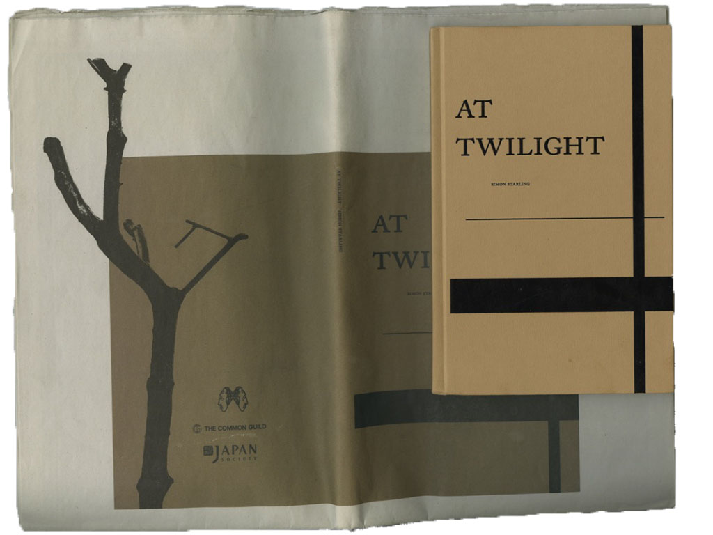
This book was designed by Åbäke with Delphine Bourit. On the back cover of the book has the names of more people who participated, and for the first, there is Åbäke. Åbäke. Åbäke.

Who then is Åbäke?


Åbäke is a London-based collective of four graphic designers. Patrick Lacey from the UK, Kajsa Ståhl from Sweden, Benjamin Reichen and Maki Suzuki from France. They have been working together since 2000 after studying at Royal College of Art in London.

If you know Swedish language then you would smile at the name of the studio, because it means ‘clumsy’ in Swedish, but it also has the meaning of ‘ghost’ in Japanese language.
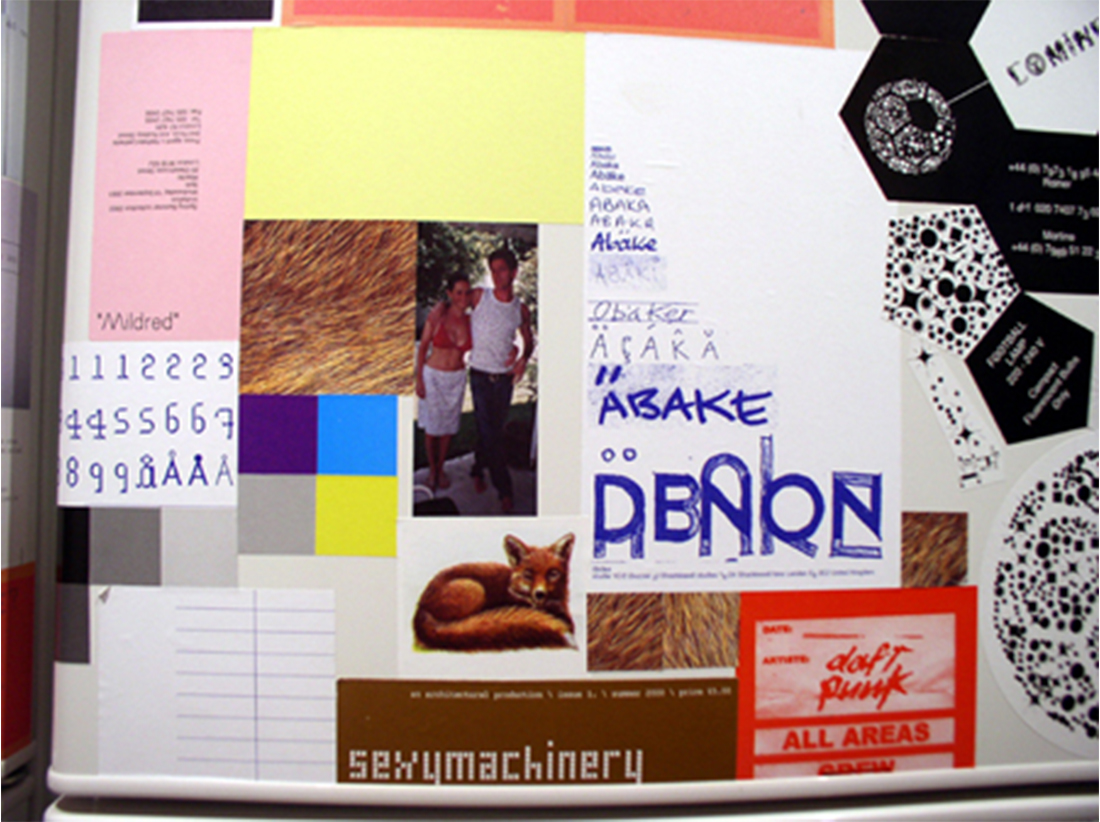
They have worked on magazine Sexymachinery(2000–2008), restaurant Trattoria(2003), the publishing project Dent-De-Leone(2009), the propaganda Victoria & AlferD Museum(2010) and so on.


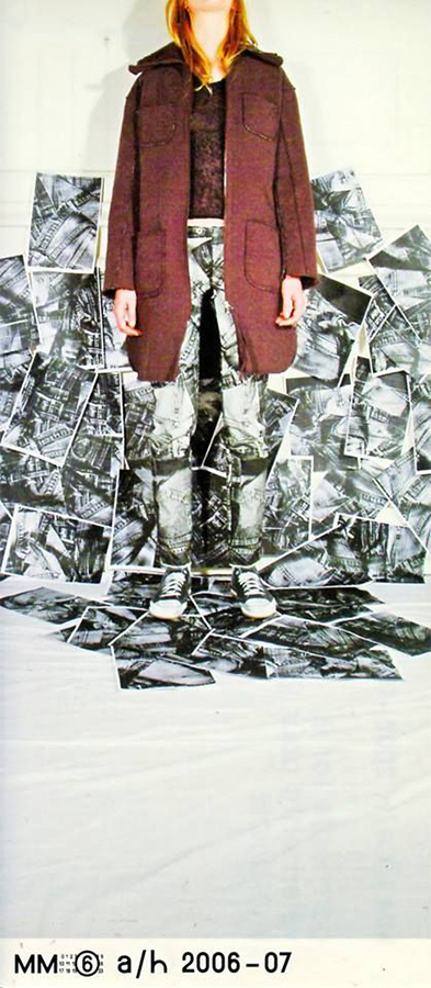
© Shift [left] © Maison Martin Margiela / Åbäke[right]

Active since 2000, they have collaborated with many Galleries and with fashion designers such as Hussein Chalayan and Maison Martin Margiela, artists such as Ryan Gander, Johanna Billing, and bands such as Daft Punk. If you search more about them, you will find out that they are the co-founder of Kitsuné.

Kitsuné is well known as ‘Maison Kitsuné’, which is French fashion label. Åbäke established Kitsuné in 2001 with Masaya Kuroki and Gildas Loaëc.

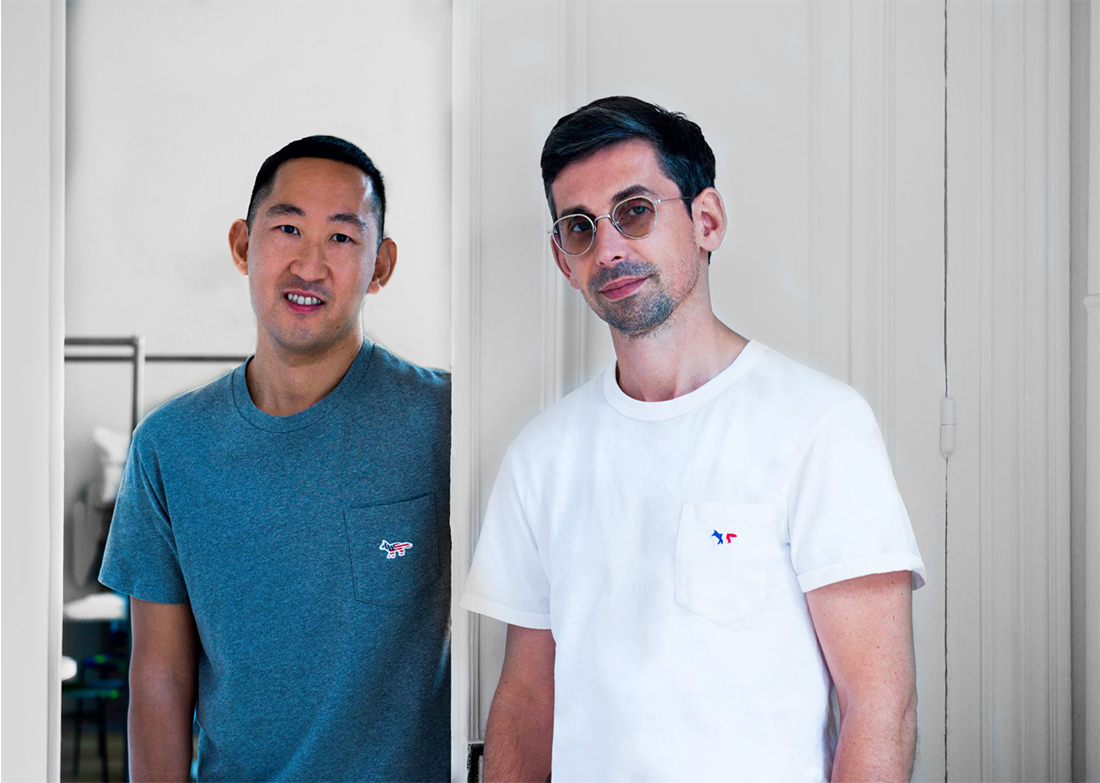
Masaya Kuroki and Gildas Loaëc  © Maison Kitsuné


At the beginning, Kitsuné was French electronic music record label. Gildas Loaëc is French DJ who was the manager and art director of Daft Punk. He met Japanese-French designer Masaya Kuroki when he went to watch ’interstellar 5555 (Interstella 5555: The 5tory of the 5ecret 5tar 5ystem – produced by Daft Punk, Cédric Hervet and Emmanuel de Buretel with Toei Animation under the supervision of Leiji Matsumoto)’.  They found their common interest and made the label together with Åbäke.

Kitsuné, which already has a large fan base in Europe and the U.S., begun to be recognized as a fashion label in 2005, showing their first fashion collection and the mixed album ‘Compilation Kitsuné Maison 1’ at the same time at ‘Palais de Tokyo’, one of the famous museums in Paris.

Following the website of Maison Kitsuné, “Maison” is the French word for “house”, and “Kitsuné” is the Japanese word for “fox”, a symbol of versatility.

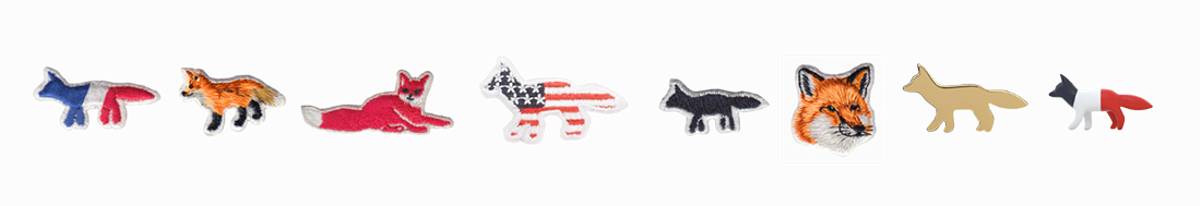
Fox symbol logo of Maison Kitsuné  © Maison Kitsuné

As the fox possesses the power to change its appearance in the Legend, Maison Kitsuné always has been tried to adapt its repertoire according to inspiration. The philosophy that Maison Kitsune pursues is that they try to change their material and style freely according to their inspiration, as their name suggests, it is quite similar to what Åbäke is doing.

If you follow the steps of Åbäke, then you will see much of their projects were coming together with concentrations on the social aspect and the collaboration. Their events usually comes with different sources like film, dancing, eating and cooking and teaching. They are also singers, painters, photographers, members of bands, furniture designers, curators, fashion designers, DJs and teachers. These are also happening at Kitsuné. They are usually coming up with collaborations between different fields as well.

Just as Åbäke runs many workshops with students along with their own projects, Kitsuné is creating their own thing while also discovering and growing artists. Further more, as Åbäke collaborates with agencies and artists, Kitsuné is also performing collaboration with artists and fashion labels. Although their fields are not quite the same, it is clear that they inspire each other.

In the interview with Japan-based international online magazine ‘Shift’, In 2003, Åbäke said that with Kitsuné they are able, because of their different fields of knowledge, to work in music, clothes and events.

I seem that it is important to talk about Kitsuné when I looked at Åbäke because they have different shapes, but same steps to each other. I am still waiting for the reply from Åbäke that I asked about Kitsuné, but I think there is no doubt that this one big galaxy -Kitsuné- is definitely the greatest cocktail of Åbäke.

Ryan Gander: Artists' Coctail. designed by Åbäke, Rietveld library number: gand 5

{any suggestions for a good title?}


Sunday, February 3, 2019

By reading an interview about Åbäke, a design collective of four, I found out that they decided to work together using one name, one emailadress, one bank account and one invoicing system. The group started in 2000 and at that time they always worked together on their projects. Nowadays they’re working more individually as “It seemed that only working within the four of us was leading to implosion”. I find this promise that they made very beautiful and intriguing, since I personally think it’s very unusual and brave to commit to each other like this. Because it’s so unusual, it also raised a lot of questions.
After reading this interview I wrote the following text about my thoughts around the decisions they made. I asked Åbäke to read it and to cross out certain statements that they don’t agree with and questions that would have a negative answer, those are marked red. Logically, the green stands for positive answers and agreement. I would advise you to read the interview before continuing reading.

The construct Åbäke made (sharing name, money) is really similar to the essence of marriage. People mostly marry out of love and therefore they feel the need to share (name and property) and promise each other (financial) support unconditionally. Even though the idea of marriage got romanticized, the foundation is really practical and pragmatical. But, the main goal of it is to become happy together forever. When it comes to work though, I’ve learnt that the main goal is to become successful. I wonder, did Åbäke become a group just because they liked to be together? Or to become successful? Most probably a combination.
If the reason would be success, would this need to be a group also state the presence of insecurities of one’s own abilities? If so, is that necessarily a bad thing? Or is forming a group actually proof of self-knowledge and honesty?

In this specific interview it’s really clear to me that being successful for Åbäke doesn’t necessarily means earning a lot of money, having a lot of free time next to work or becoming famous, it’s mostly being able to develop great work.
For myself and with me many others, I believe that I have the same goal, but I’ve learnt that the way to measure the “greatness” of a work is simply by the reward. In a way money or acknowledgement do translate back to me how much effort or work is worth. That’s also a reason why I find this promise so fascinating. Do you gain or lose acknowledgement when you share a name? Does it feels as nice to be acknowledged for a work someone else made under the same name as it does when you’ve made something on your own? Would it be more rewarding to receive money straight away to your bank account? So you can measure for each project separately what kind of work you delivered. Or does it work the other way around? That by getting the same amount paid every month, no performance seems worth less or more than the other.
Now that I write this I also realize a part in the interview about how interesting projects pay less than boring ones. Maybe that’s the reason to not even choose money as a way to measure achievements, since it’s apparently not that reliable.

But then there’s still the shared name. Although I think I’m understanding it more and more while writing this, I still don’t think I would be able to share my artist name with my boyfriend for example. Even though I would marry him if he’d ask, share everything together, both using the same name feels like I’m giving up a part of myself. I think it could have a lot to do with pride as well, and that’s mainly because of the creative part.
For example, if I would work as a waitress in a restaurant, I would also make a commitment to my boss, under specific terms and conditions. But, in this situation there’s a hierarchy; I’m working in the name of my boss, following his rules, not out of my own ideas. Everyone visiting the restaurant is also aware of that the way I work isn’t out of me as a person, but me fulfilling my boss’s expectations.

When working creatively though, the whole point is ideas being executed by this one exact person. The maker is crucial when it comes to creativity since that’s the person that creates the outcome. You could say that the work is carrying the makers identity. And aren’t we all proud of our identity? So what happens with your identity when you share it with multiple people? Does it gets lost? Or does it become even bigger/better? Is it even possible to identify an identity in a name at all? And if so, what happens then with this pride when you share a name? Is this identity actually as important as I just stated? Or is it just a way for artists to cover up their ego’s? Is it my ego that makes me hesitant to even thinking of sharing my name?
And when you’d look less into the emotional side of it, but more to the actual working process, does it releases work pressure to share a name? Or does the responsibility of others makes you work even harder?

I would also like to get back to this implosion they mentioned before in the interview. Something implodes when the pressure from outside is higher than the pressure inside.* Would the outside in this case then mean work related expectations from outside the group? Or, would both the outside and the inside represent the group itself? And again, what is the motive to stick together after a near-implosion, is it love, loyalty, or the pursuit of success?

In any case, I personally think it’s a very admirable way of being a collective. Also I’m happy that it invited me to rethink motives, certain constructs, and being an individual. It actually made me feel disconnected from myself and the reasons why I like to be busy with art. After I had a talk with Åbäke, a lot of questions still remained. What do I want? What do I need to get there? But, I also ended up with one really good advice. – Although it can be helpful to think about these things, it can also be helpful to let go of this assume that there has to be one higher goal. A better question to ask would be, why do I like what I’m doing now? In that way a person could spent hours on finding the right curve for the letter Å. The key isn’t necessarily to strive and long for “the great” but to find joy in small things and make them as great and important as you feel like.
“Success is mostly about being able to develop great work.”

*Åbäke did point out to me that after an implosion, an explosion occurs.


AT TWILIGHT // SIMON STARLING

When our teacher was explaining us in the Rietveld library to choose a book that the library obtained last year to eventually write about the design of it, I couldn’t really focus as there was this book sticking out on the shelf of which i thought i liked the texture. I went to have a look at it. As the teacher’s voice faded, the book cover became clearer. Turned out that it didn’t look like how i thought it did, but after going through the rest of the library, I still preferred this one. 

What made the book catch my eye was first of all that it was wrapped in plastic, as if it’s something really precious. And secondly it was a, I thought, white book that had brown bakery paper around it, as if it was handmade. This wasn’t the book though, and neither did it have brown bakery paper around it; I think it’s an extension of the actual book. The reason I do is because this “extension” has the form of a newspaper which makes it seem less important than the book that was also inside the plastic. Also in this newspaper there’s mostly big pictures shown, that probably aren’t the subject of the book but are there to support the context of the book.

The book itself has a very minimalist appearance, brown matte hardcover with black letters and three lines. But, when you open it, the first page is a very bright purple paper. After that, for the first half of the book it has brown paper and an often used font. Turns out it’s a play: probably the reason to choose an easy readable font and well structured text over the pages. The second half of the book has white pages and a more playful appearance. The font comes across less mature to me and also there’s a lot of pictures, even scanned in papers with written notes on it in this half of the book. I find it quite interesting how these simple choices changed the book into something special.

Simon Starling : at twilight, a play for two actors, three musicians, one dancer, eight masks (and a donkey costume). designer: Åbäke,  publisher: Dent-De-Leone, Rietveld Library Cat. no: star 2


Log in
subscribe