Skip to Content Skip to Search Go to Top Navigation Go to Side Menu


"Uncategorized" Category


Back To The Future ? !


Friday, July 5, 2019

Designblog has been an online student project as part of the Amsterdam Gerrit Rietveld Academie, Basic Year program |Design Theory & Research, since 2007.

All this time we have been publishing our efforts out in the open for all students of the program and beyond, creating a horizontal process of education. The data base we created is unique and phenomenal and still represents the distinctly personal views of such a diverse student community. The program amalgamated viewpoints on relations between art and design. We hope you enjoyed it as much as we did.

As the project evolved from a basic blog in the early beginning x to the last upgrade, its evolution as a digital medium also became a regular part of our researches. This can still be experienced in the many projects students developed on this subject. Just before Designblog was terminated at the summer of 2019 we still did organize a workshop on the disintegration of this medium over such a long period of existence

Thank you all for following us . . . . .

Henk Groenendijk (moderator)
and all participating students

June 2019

Reality Machine


Thursday, December 6, 2018

  When I saw Eliasson’s book in the library, I was really surprised by how emotional I still get just by looking at the name of him. The feeling of vomiting when I saw his exhibition last time in Beijing came back to me quietly yet so familiarly.
  And on the way back carrying this book to upstairs, I met a few friends smoking at the gate, they asked:“Oh, do you like his work?” I laughed and said “I kind of vomit last time at his exhibition, but yet I chose him to write an essay, I really can’t answer this question so frivolously now. 

  Maybe that’s exactly why I chose his book, I want to discuss this complicated emotion in the form of language. Yes, language, by creating another kind of “reality” on the base of concept to connect with the “reality” he tries to present in his work.

  What can I remember about his last work? I remember the crowded crowd in the orange light which made them look like pale zombie , and everyone was either taking picture or standing there for minutes without moving — taking selfies. Kids were jumping and shouting, having so much wild fun. And the air conditioner is working so good, maybe too good, maybe that’s part of reason I wanted to vomit, my stomach always react really strongly to cold air. 

  Why? I could’t stop asking myself at the exhibition, why I (and so many people) spent at least an hour on cars —it was a quite remote museum, to come here, to experience this kind of, what he called “Reality”. When we can see the real rain, the real sunset, is this kind of imitation “reality” of the nature, somehow touches us more than the real “reality”?

  It is very beautiful, I was thinking, it’s almost like the beauty like when I see the real rainbow, then I thought about isn’t the vulnerable and unpredictable character makes rainbow so strikingly impressive? Then what is this ? You drive an hour and paid something like 20 euros, to go into this huge artificial box, which is so cold that makes you wanna vomit in the hot summer, and in this totally dark space when outside is so sun shining , you saw the beauty of nature, and you praised, “Ah, what a sublime scene of this blue planet that we call home.”


Book Info ?Olafur Eliasson Reality Machine

eila 11

The first search…


Wednesday, December 5, 2018

Looking across the spines, looking for something that will excite my eyes and brain. looking for something I will like, that will make me feel something. So many titles of enticement. The search started with colour. What is the best scheme? The text doesn’t appeal but the colours do and vice versa. The high contrast of complementary colours creates a vibrant look especially when used at full saturation. The colour scheme must be managed well so it is not jarring. Many books later I start to think of harmonies, they usually match well and create serene and comfortable designs. Analogous colour schemes are often found in nature and are harmonious and pleasing to the eye. I have stumbled upon a trove of material. The search has been narrowed and now the idea of colour appeal does not suffice. The search then narrows to binding technique. The differences stand out. I try to purely focus on the physical aesthetics of the book. Focusing on what I like and what appeals to my eyes. As i blouse I seem to stumble upon more and more books which could be candidates. The diversity is wide and intimidating, many thousands of books stand in front of me, decisions need to be made. My choices have been narrowed down to mostly graphic design books. As I conduct the final steps of the test; browsing through the books. I judge purely on my own likes and dislikes. I am not satisfied with my final books so I go back to the search. Suddenly a book stands out to me, the binding is complex yet satisfyingly simple and minimalist. I pick up the book titled “restless typographer”.  I sit down at the table and start to flick through the  book and my mind is made up. This is the book I must choose. It spoke to me and I listened.


All events are even.


Tuesday, December 4, 2018

For my third book search I was trying to focus on the keyword ‘minimal’. I went to the art bookshelf and totally forgot about my word. I was so much enjoying all the different books from all these different artists. I just wanted to pick one which had nothing to do with any of my keywords. But then the teacher came and saw me struggling with making a choice. He kindly reminded me of my keywords so that made it much more easy for me to make up my mind. I only had to look for the most minimalistic book I could find. 

‘ALL EVENTS ARE EVEN’ from MARK BORTHWICK – PURPLE BOOKS is the name of the book. Which was another reason for me to choose this book because of my second word ‘Network’. 

The book is so minimalistic as a white A5 paper with only a few black letters on it. While looking at the inside of the book, I only saw black and white pictures of people dressing up and posing for the camera, smiling. I thought the book was very boring. I never would have even come across this book if it wasn’t for this assignment. But because it was fitting so well with my keywords and also becáuse I would never have taken it, it was perfect. 

Writing about a book that you don’t know or don’t need to know is difficult. But searching for a book in an art library that you never would have seen is super interesting. From now on I will only let my subjective opinion choose a book. Not only the content matters. But also the design. 


Bort 1

Tribal Writing


Sunday, December 2, 2018

It’s funny how quickly people can learn something. Maybe learning isn’t the correctly chosen word in this case, perhaps it should be adjusting, or ‘changing’ or maybe even unlearning.

I say this because i noticed how the third time in the library my way of searching a new book in the way that is expected of us, was easier then the times before. Of course the day, the other influences in life itself has a big influence on the way you search and look for a book in an objective way, but it did feel like the new ‘insight’ was there a bit.

I noticed it by the feeling I had. Being sure of my choice, during the whole process. Walking in to the library, taking my time to stroll along the books, not being impatient or unsure about the choice I will make.

Looking at the backsizes of the books instead of the cover. The two previous books I had were both a bit odd in terms of size. The first one was longer then a4, but thinner, the second book was longer then a4 if you had it in a landscape position. So I decided that for the third book I wanted an ‘off’ size as well. This made is efficiently easier. With a filter I walked around, feeling like I had a direction I knew I had to follow. Starting in the lower part of the library, flipping through some books, not finding the right one, then, after quite a while I decided to walk up the stairs. Starting in the corner where I had found my first book, about textiles, I spelt made my way to the right, and saw a yellow cover. I had touched this book before. I had seen it, flipped through it already, I realised as I was holding the square book with a yellow coloured cover I didn’t like. But even though i enjoyed the book. The simplistic tattoo designs fitted well together with the square simplistic pages. I didn’t read the small sentences that were written down. Although I didn’t read it, I did notice how contradictory the font fitted with the designs. Simply by the round lettertype and the sharp drawings.

What links this third search to the others (especially the first book) is the instinctive search and the listening to what felt right. Besides this, the contradictory of the outside and the inside of the book was very present, just like the other books I had chosen.

908.9-din-1

Dionysus in the contemporary dance


Saturday, December 1, 2018

These violent delights have violent ends

And in their triumph die, like fire and powder,

Which as they kiss consume.

-William Shakespeare,Romeo and Juliet


   Dionysus was never out of our flesh and bones, even under the brightest sun shine, this irresistible longing for self-destructive euphoria.The establishment of self-identity always comes with the feeling of isolation, when I know I am myself, then I will know, the rest of the world is the other, or it is the other way around, we can say it is exactly by kicking out the part we think is not “me”, by defining the other, we started to build out this boundary of self identity.

  How do we solve this?

  By destroying “ourselves”, in the act and scene which can make you forget who you are, we unite with the whole world, with other people again.Forget who I am, forget how is beneficial for “me”.

  That’s how these pictures of dance attracted me, I saw those indistinct shapes that my eyes can not find one spot to focus, then the line between reality and delusion started becoming blurred. I looked at these pictures in right in front of me, but strangely enough, I can only see the images once appeared in my dreams. A tide of emotion rose and clouded my rational judgment, I’d rather give up analyzing the process of my captivation and enrapturement for this moment of pure extasy.

  What can we really capture by photography? All the story happening in the moment, the mixed fluid emotions, can we really pass these to the viewer of our book? How much can we really even understand ourselves, and then not losing in the process of passing? I think this book is giving me the answer for these questions in a metaphoric way. 

Book info? Pina Bausch  791.4

same attitude


Thursday, November 29, 2018

I needed to choose a book on the tree keywords that I had with the first book that I choose only on subjective raisons. One of them was my keyword `Nina´. Nina is a good friend of mine how is traveling at the moment. She will come back this week so that’s also the raison that she is more in my mined. She likes a lot of thinks and her room is full with all kinds of different stuff. A lot of thinks are reminding me of here. She likes attention and takes good care of herself. She loves to changes here clothes an do here makeup. She is the only friend of my that is using make-up. Her attitude remind me of the figure on the front of the book. Not so serious and little rebellion. She is doing here makeup. It’s a Japanese prints. Something that Nina loves a lot. She has a tree of them in here room. She likes a lot of differed cultures. the Japanese woman doesn’t have female hands. The fingers are a bit weird. I like it when thinks are not perfect. Nina doesn’t have female hands ether. There fingers are a bit bigger. What she would also like about the woman is the thing in here hair. It’s a stick that holds her hair together.  Nina is making them herself. The other sides of the book are not so interesting. There is not much to see, and I found I a bit boring. I think it was getting my attention because of the book in front of I that I took. I think its not necessary so have more on the outside of the book. The attention goes more to the inside, and there is much to see.

On the inside of the book you see a lot of Japanese prints where the leaves are falling of the trees. With a lot of well chosen yellow, brow and orang colours. Its looks like the people on the prints like the autumn and that they are sitting at a place where they can see the seasons chancing. They look so peaceful and careless. There are also prints with only landscapes. Sometimes you see a person wondering to the nature. The landscapes are very different form each other. It looks like pictures that I would make when I´m traveling. But still they are made in the same way with the same technic. So you see the different county’s through the eyes of the Japanese culture.

*753.1ill1*

Contra contra contradiction


Thursday, November 29, 2018

As I walk into the silence of the library I think about the strategy I will use to find my second book. I think about my three previous used keywords: instinct, courage, and contradiction. 

The first logic step would be to firstly follow the keyword ‘instinct’. So I slowly walk by the thousands of books, observing, stroking the covers, hoping I will be pulled towards one, like a magnet. As the pressure of silence and choosing begins to come up, I decide to use the computer. Still the source which is easiest and most tempting to turn to. 

The letters which form the word instinctive do not yield anything. It would’ve been an interesting find. Finding a word with the keyword ‘instinctive’ through an opposite way.

There goes my easy way out to find a book which I think would connect with my previous three keywords. 

So I continue with the second, courage. This time  few books show up, but none in one of shelves we are allowed to take a book from. Another sight, another loss of another keyword. 

Finally I put my last keyword in the source machine, contradiction. Last but not least, it results in a find. A book by Robert Venturi: Complexity and Contradiction in Architecture. I followed the directions that were given me and found a boring looking book on the second top shelve. Opposite from my first book I noticed the cover was very flexible and didn’t feel like a ‘concrete’, constructed book. A bit disappointed with my find I sat down and began to observe the book. Having very little knowledge about architecture I noticed that I had some ‘primitive’ expectations of the book. As said before it had a flexible cover, which stood opposite from my

dav

. I had expected a firm book, since I refer architecture to firm structures. Strong, solid, tight and well constructed buildings. In that sense the  format of the book really was contradictory to it’s subject. 

717 ven 1

The 2


Thursday, November 29, 2018

Project on the city


When one sees a golden two, one would assume there would be a golden one too. In the space of the library, on a shelf filled with spines of books, I found the pair. One of the books had a golden ‘’1’’ on its spine, the spine on the right had a golden ‘’2’’. I immediately linked them as a pair, an unseparated duo that could be read apart, but had to be put next to each other in a space like this. The sizes were exactly the same, oddly enough. I would like to assume that a follow up book, is a bigger, greater, thicker,  larger, better book. But in this case it was not.
 When one sees a golden one, one would not assume there would be golden two too. One book can live by itself, but a second book would need a partner two life. A duo, a pair, contains a two. First I took apart the book with the 2. The 1 lived peaceful by itself on the shelf. But when I turned the tables and took away the 1 instead of the 2. The sight of just a book with a big golden ‘’2’’ written on, was an odd sight. No, not odd, it was peculiar. I kept staring at it and walking back and forth in the space, to figure out why it was such a

peculiar sight to see this book without its partner in crime. And suddenly it came to me. I could never imagine someone courageously putting a random number on the spine in such a fat font and such a big size. It almost covered one third of this spine. They did not ask for subtlety, it needed to be ‘’grande’’. That was an act of boldness, just putting it out there.


Dries Van Noten


Thursday, November 22, 2018

“My eternal soul,

Observe your vow

In spite of the night

And the day on fire.”

-Arthur Rimbaud, A Season In Hell


The big gazing eyes on the cover of the book grabbed my attention at the first sight,It reminded me of this poem from the French poet Rimbaud.


I also like it in black and white.It is not that I don’t like color. On the contrary, I think I like color too much to tolerant it being abused in a wrong way. And I don’t always have enough time to find the right color or the right combination of colors, so to keep everything minimal, I developed this obsession for black.


I also like it because the whole book is very thin, I like the artists who keep things minimal.I believe they spent more time in choosing behind the work, to only keep the best things.


When I opened the book, the vogue and zoomed-in images, it’s almost becoming some kind of abstract painting.I can only see the back of the models in the most of pictures, that also makes me feel attracted, the mystery in the movement go their body. They come and go at ease, at their own pace. They are very independent while I felt invited, but there is no pressure that I have to either.


I also really like the casual and comfortable feeling when they are in those clothes, they can run and dance at ease.It is them who is wearing the clothes, but not only as a living hanger to present those clothes.I think fashion design for me, in the end will come back to the point of how it actually makes you feel when you wear it.Do you feel comfortable in it? Do you feel restricted ?Does this clothes make you feel more of being yourself or somebody else?If it is somebody else, is it a better person or a worse person?


Information about the book:

Dries Van Noten   Women’s Collection Summer 1998

907.8

industrious art : innovation in pattern


Thursday, November 22, 2018

Strolling around a library without having an idea what you’re looking for, felt just as difficult as drifting around a supermarket without knowing what to eat… I found myself a bit lost in feeling what I wanted. Hoping that all of a sudden I’d instinctively grab a book and have an inner feeling telling me it was right. Which didn’t happen the way I expected, but did eventually happen.

The first thing I noticed as I picked up the book I chose, was the complete contradictory which was visible by the title and the cover. A book about textiles, with a textile cover, covered with a plastic layer. 

Is this done on purpose? What does it serve for? For the sake of protection? The sake of deifying? 

On the first sight they immediately play with layers, plastic, prints, the textile cover.

The black big square where the title is shown on, feels badly placed. A bombastic frame which gives a feeling of ‘harshness’, creates an opposite atmosphere of the rest of a book. 

All seems to be a courageous game. Super well designed, but risky. 

Colours jumping from soft green and blue, to bright orange. Straight, direct lines, covered by seemingly hand drawn, disorganised patterns. As an organised mess. And to think this was just the cover. 

Thick, narrow (29 cm), not quite even pages, which show bright, colourful, and diverse displays. From documentation, to installations, finished works, sketches . This resulted in a feeling of  ‘travelling’. By the diversity of the pages, there was a curious feeling arising, not knowing what to stumble on on the next page. As writing about it now, I realise I find it a playful, coordinated book.

The few lines that are written are carefully placed. Usually in the upper right corner. On the background, leaving all the space for the work, which tell  and show you most. 

But the real decisive moment was when I looked down. I was wearing the book.

Yes this is the right book to take.


779.7-stro-1


Show your face.


Thursday, November 22, 2018

The first reason for me to choose this book was because of the form. The book had a strong appearance because of the size, compact but heavy. Also I loved the fact that it didn’t matter were you started. You could begin in the middle of the book but also at the end. The randomness where to begin was a very important part for me to choose this book. It didn’t tell a story but it gave you an impression of the time and subject of the book. The raw and tacky images were cut together and therefore intense to look at. It got my attention because, for instance, it gave me inspiration to make more collages. The book is very well designed for someone like me, very visual. I think allot in visuals in order to understand a concept or subject. The moment I took this book from the bookshelf and quickly looked through it, my hart made a small leap and so I knew that I had to take it.

As I was browsing through the book I immediately had an emotional relation to it. I thought about my mother. It felt like I was browsing through her student life, it had the same atmosphere as her stories about that time. Crazy parties where people show a different side of them or wear extravagant clothes, alcohol, drugs, sex. To provoke or really to be themselves? To create a conversation or to rebel against the “normal” society? To really want to be a part of something. Of course all these thoughts came after looking at the book and knowing more about the content. But also this was my subjective reaction to the book. I tried to relate these thought to myself and my surrounding. Am I living the design of this book at the Rietveld Academie? Am I experiencing life like a collage? Do I also have to dig in to the centre of this scene in order to be part of something? To show my face at every event that is taking place, to socialize and network? Or can my work speak for itself and be successful without people knowing me? 


907.8-fri-1

We are in this together


Tuesday, May 9, 2017

Writing for the sake of writing

Make a blog post about nothing or whatever

Here are random connections to random posts on a blog that everyone is obligated to update. Why? Just because. Do you ever read anything because you have to? When does it happen mostly?

School? Aren’t you studying what you like? Aren’t you supposed to study what you like?

Work? Yh you had to work somewhere. Those readings are probably boring but you need to eat and pay rent so here we go. Capitalism. Sigh.

Government mail. Can’t read those though, they’re all in Dutch. “We killed the tree now it’s your turn to struggle. Folded in half. Eight fold. Figure it out somehow. Or don’t. Whatever. Couldn’t care less. Careless.

I am sorry if you’re reading this because you have to. I wish you didn’t. But bear with me. We can power through this together. We will come out of this different. We will learn something.

I am not going to teach you though. You can only learn yourself. Ask yourself questions. Or don’t. Don’t ask questions if you don’t feel like it. Listen to your body. That pressure you feel on your chest? That fire you can’t put out, your back burning, pay attention to it. Relax. Use this moment to listen to yourself. It is hard, Everything could be hard. Sometimes its hard to leave your bed, I know that way too well. Sometimes working two shifts in a row is not as hard as making yourself some breakfast or picking up that paper from the floor, that has been there for a month.

Don’t be hard on yourself. Accept your weakness. You don’t have to love yourself. Its great if you do, but don’t be hard on yourself if you don’t. One day you will. You don’t have to love yourself in order for someone to love you. I love you. Just for you. For you fears and struggles. For your carefree attitude. Or absence of it. It’s ok to care. Its hard but you’re gonna be fine. You’re special. You’re unique. You’re so cute when you laugh. I don’t have anything funny to tell you right now, though. Kinda feel guilty for it, sorry. But I will learn to accept it. One day. One thing at a time. Or after ten thousand times. Lets change together. Its ok if you don’t want to. It’s ok if you did. Every thing is different. Every day is different. Every day you’re different and the same in a way.

All the bad and good is in you, you don’t have to look for it anywhere else. Just take a look inside. You also can take a look at someone else. Its fine to look up to people. You’re someone’s hero too. Somebody looks at you and realizes they could be better. Sometimes they don’t believe it because of how awesome you are. They should read this post too. But only if they want to. It is also ok if they have to. I hope they feel better after reading it. I hope it could make you feel more at ease. It’s ok If it couldn’t. Sometimes we can’t help but worry about things. This world is stressful enough. We just have to navigate through it. Do you know that just looking at you could make somebody’s day better? You look so radiant when you feel inspired! It’s contagious! Its ok if you feel shy for people looking at you. Don’t worry, they are in their own heads. It’s ok if you feel shy anyway. It’s ok if you don’t want people to look at you. I respect your desires. You’re a great person. But you don’t have to be great to be respected. You deserve love. You deserve peace.

It’s ok if you like when people look at you, you deserve to be the center of attention. You’re such a fun and outgoing person when you feel like it. Sometimes you don’t and I appreciate that. Everyone needs time for themselves. Some people probably don’t. But you do you! It’s important to recharge from time to time. For you it may mean all the time. Maybe you need to reach out for support. I hope you have your support system. It sucks if you don’t! Let’s try go through this together then. I am so glad we met like this. Through our eyes. Or ears. Maybe fingers. I hope you are having a good day. Or that it’s a little bit better now that we spent some time together. I hope you know your worth. It’s ok if you don’t yet. It could take some time to get there, especially living in the system that is thriving from you not knowing it. Remember it when you feel like you’re not enough. You’re more than enough, you have everything you need to be you. I am sorry if you don’t! Please, reach out for the support. You deserve every bit of it. Please, do. You are valid. You make this world so much better. I love you.

Observation


Friday, May 5, 2017

A day of observation ; visiting a museum.

To see, watch, perceive or notice

Visiting a museum always end for me daydreaming about other artists. Influenced by the atmospheres of the art and people visiting the museum. So I wrote down my observation and daydreams of an artwork in the exhibition of the Kunsthal te Rotterdam.

Cars, motorcycles, egg, hamburger, portraits and colorful vanitas. Walking into a hall full of pictures; was my first reaction of the exhibition of hyperrealism in the Kunsthal te Rotterdam. Coming closer to this images; amazed by the fact that these where paintings.
In front of a painting there was a man saying to his wife; ’Yes, you can really see that this is a painting, because the artist did not paint it perfectly.’ Pointing out all different kind of lines and spots which where not perfect according to him.
My observing of these paintings was also absolutely triggered. How is this possible? Is this a picture painted over? Is it really not a picture? Also searching for spots to confirm that it are paintings.

Rod Penner Rod Penner

Rod Penner 


Passing all the work I noticed all the American subjects. Especially the landscapes of Rod Penner ; painter. Staring at his work I found it very intriguing how he translated the light so beautiful in these paintings. Every shade, light stripe and reflection he paid attention to. He is not only painting the landscape itself but also the atmosphere that is connected to the landscape. Not only the houses/signs are giving a clue to the American landscapes but also the atmosphere itself is very recognizable.

The beautiful light and atmospheres of Rod Penner reminded me of two photographers ; Gregory Crewdson and Tod Hido.

2077 Tod Hido Tod Hido

 Tod Hido


Tod Hido is photographing landscape/houses in America. He got a amazing series of photographs called ‘Homes at night. Tod is using long exposure and most of the time the only light source is the light from inside the house. He is also searching for very specific moments and houses that are making this series so great.

Gregory Crewdson  Untitled__Merchants_Row__08large

Gregory Crewdson


Gregory is photographing cinematic landscapes in small towns of America. He is making beautiful images where he is influencing the light and the scene. It is very interesting how he and his team are building up these scenes and you can see that in his documentary Gregory Crewdson : brief encounters.

Inspired by a day of Kunsthal te Rotterdam
Hyperrealism ; 50 years of painting.
Exhibition from the 25th of January till the 5th of June 2017.

cyber and (un)aware


Monday, December 1, 2014


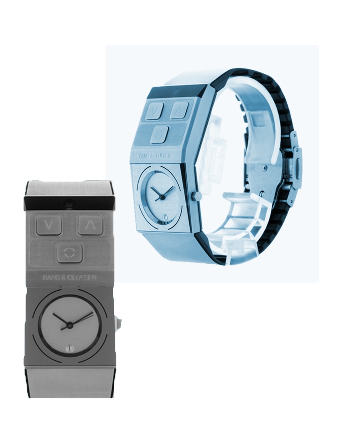
Jacob Jensen’s 1997 waterproof Beowatch (produced by bang & olufsen) was designed as a personal, unisex timepiece that makes telling time convenient and accessible. additionally, it also functioned as a remote control that controlled the volume of later bang & olufsen music centers. this design prompted me to question its present-day relevance in the design exhibition at the stedelijk museum, Amsterdam. over the last two decades the technology industry has undoubtedly grown and so has the way in which people engage with methods of measuring time. it is noticeable that less people wear wrist-watches everyday and the norm has adapted to using smartphones or other multifunctional devices to keep track of time.

this research will further discuss the design of the Beowatch in relation to the myriad of social questions it raises such as today’s security in wearable, intelligent technology and the aesthetics of unisex design.

b&o-image1

few wearable objects are designed to be unisex, particularly jewellery (if we classify a wristwatch as jewellery). i am drawn to the statement this wristwatch is indirectly raising about society’s perceived aesthetics of gender. the design is created as ‘neutral’, an object that is seen through its own entity- regardless of preconceived ideas of masculine and feminine beauty. throughout history, wearable objects or fashion, has had a very divisive characteristic – creating standards and room for assumptions. this design forgoes these notions and is created as its own autonomous form.

balancing aesthetic and (multi)functionality reiterates how the Beowatch was very modern for its time;.Jensen’s approach to design drew my attention as he states “…we expand our concept of…what a watch should look like. the sight of an object does not necessarily have to show its function…” (1994, Jacob Jensen design [paperback], Paul Schäfer). this relationship between functionality and aesthetic is a core issue that designers are faced with.

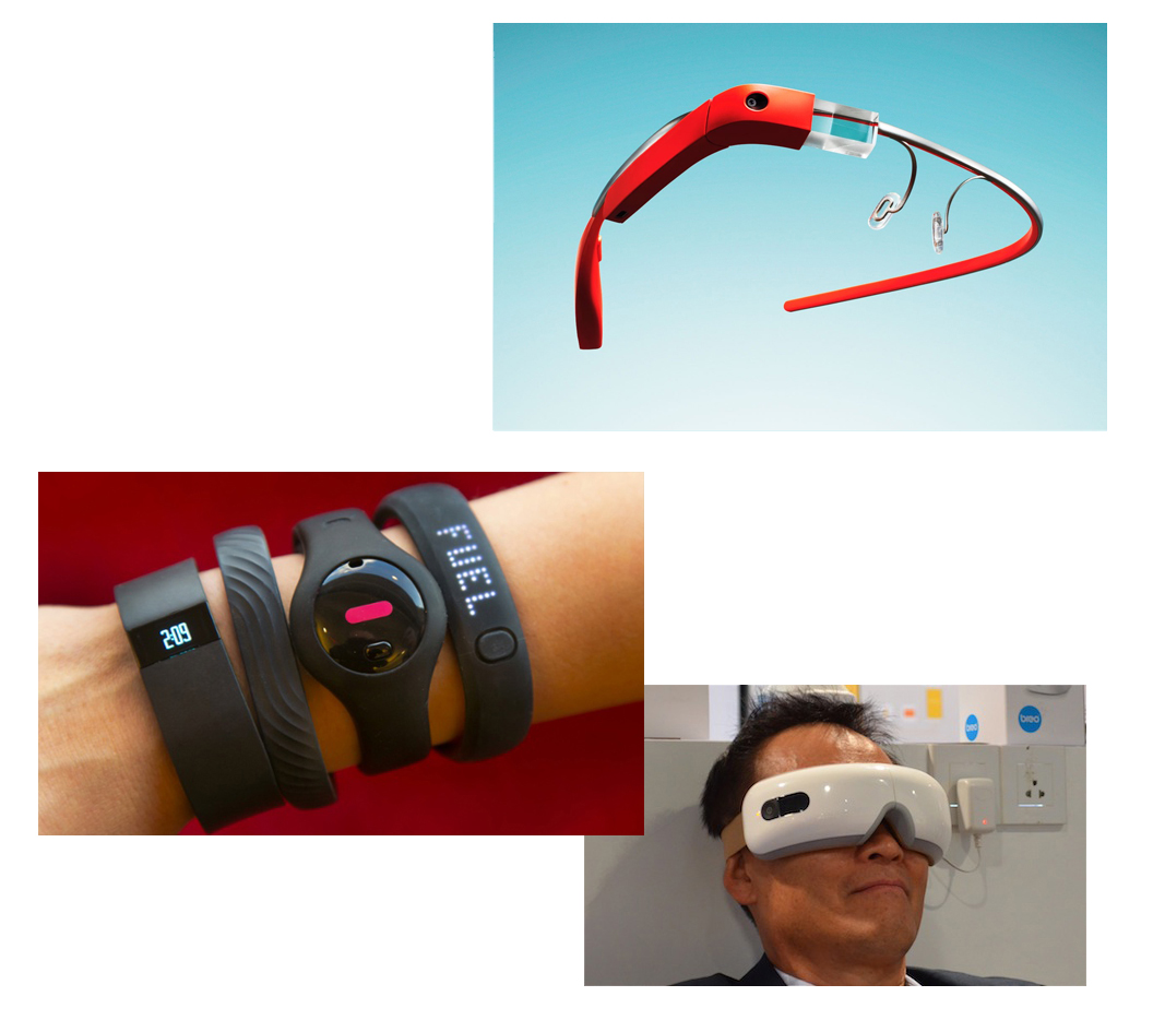
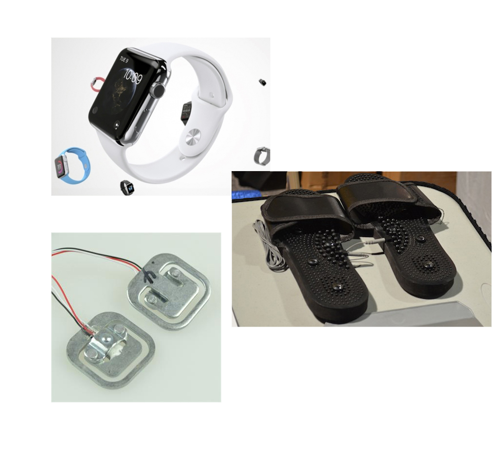
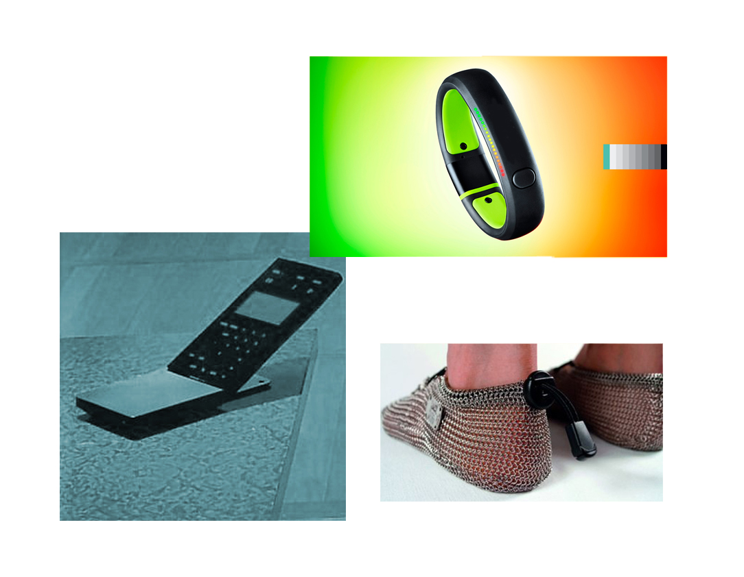
however, it is a challenge nowadays between technology and its external design. technology is becoming increasingly intelligent with wristbands/watches that gather data to measure heart rates, count steps, give directions, forecast weather, play music, interact with other devices, predict the position of the moon etc  and the visual appeal of wearing this technology. for example with the recent design release of Apple’s iwatch and Google’s glasses there is already considerable criticism on this ‘cyber-human’ image and artificial intelligence we are sometimes reluctantly and often unavoidably accepting.

b&o-image2

Jensen redesigned the concept of a remote control in the Beowatch by making it multifunctional (acting as a remote control and timepiece). similarly, designers today are changing conventional objects into ergonomic designs that fabricate, sync or react together with the human body. there is an evident focus from the technology industry to attach these gadgets and lumped plastic to people especially by getting them onto wrists. of course there are many benefits of having such tools; they are accessible, readily available and can make tasks faster. however, the fact that these devices become so quickly absorbed into the culture of everyday society is blurring the boundaries of our true basic needs.

they are also perhaps just purely adding insult to injury- for example do people need to know how little sleep they are getting? or if they have eaten too much on one day compared to the next? or if they have skipped a day of exercise? this data collection that these devices provide may give us information but it is still not enough, what is more important is the reasoning- why we slept/ate bad and missed exercise, for example. simply knowing these facts without reasoning is the added ‘insult’ to the injury/damage that has already been created. for instance if your watch tells you that you haven’t exercised enough, things that you probably know already, would you change your routine just because your watch is telling you? in most cases, not. there are versatile calculations everywhere, but the problem is what to do with this information and how to interpret it.

it is irrefutable that the pace of technological advancement is remarkable; but this also affords the risk that people will develop a better reading of their technology/ wristbands and lose their sensitivity and awareness in reading their own bodies.

b&o-image3

since the Beowatch, wrist technology has advanced further than the individual, as over the past decade debates have risen over personal security and privacy. it is unknown to the individual how much is known about them through their digital dossier. we are uncertain about where our information is stored or if it is being used for analysis; examples we have witnessed recently include the NSA files, cyber-hacks with phone applications and celebrities, Facebook scandals, Wiki-leaks and much more. these personal items have the potential act as a sensor or tracker, they constantly collect data which are ‘invisibly’ fed to different networks. though this subject may seem far fetched from the design of the Beowatch, the design is relevant as it marks part of the evolution of our technological reliance and dependence. it is uncertain where this line is between the personal object and a device that is actually just a form of data to a bigger establishment.

b&o-image4

the Beowatch nowadays represents a certain phase in design (1993-1996) as well as the literal time. it represents the start of multifunctional, human-fitted technology. though now the object is more about its face than its function, being presented in a showcase at the Stedelijk Museum, it is still highly relevant and raises many direct and indirect issues. As the son of Jacob Jensen said in an interview: “a product which survives the test of time, even when it has been out distanced by technology, contains a concise idea carried out at the right time, and with an aim of thorough reworking” (Timothy Jensen in Jacob Jensen design, 1994, Paul Schäfer). though technology has definitely distanced since 1997, the design of the Beowatch has survived by providing a mark for its time as well as offering insight into how we should speculate the future of cyber-human technology.


‘beautiful morning’ ( comment)


Tuesday, May 6, 2014

When i saw this tag, i felt i needed one. A beautiful morning.

the text described various things, but the interesting part i got out of it was, live life slow, and you will enjoy it the most. when you get fed up by everything else, you should just focus. focus on what is there, and see what it brings you,

what is really there (?) always that question that is there. is it that, what we feel, what we see, what we touch, maybe even what we miss. a slow beautiful morning, will pass by. what will attract our eyes? dirty dishes, stains on the windows, some old clothes on the floor,  the things you knew that you had to do? the things you thought they would stay away, the things you don’t want to see coming, the crack in the wall, crumbles on the table, the flowers next to it, the people outside, the blue sky that is there, the birds who are nesting in the tree next to your house, your nephews birthday that is coming up, your birthday will be soon to, the sun that is getting up, your breakfast that taste’s much better now, the things you accomplished yesterday which you don’t have to do again, your favorite shirt clean and on again, your music on the background, the realization you will have to go outside to go to school, the sun on your face, the train you manage to get this time, and the school that starts your day again. the people who you missed during holiday, the tea in the morning, fresh baking smell trough the school,

Eventually it is the way you look at it, the way you remember it, will feel it, recognize it again and again.

‘Just look at the bright side of life.’

about those…


Sunday, April 13, 2014

uncategorized?

like not black
not white
not even gray
why can’t you define this time?
define define divide define
no category
what about you?
what’s your favorite category anyway?
well, what’s your category anyway?
feel better while categorizing, not this time
no gender, no nationality, no ideology, no what, now what?
no nothing
nothing
nothing
something
some thing
some think
thin thin thin thin thin
line between defined and undefined
they are neutral, they are lost, or just hard to define
that’s it

in the end not such a bad category.


Log in
subscribe