Skip to Content Skip to Search Go to Top Navigation Go to Side Menu


"green" Tag


The Aesthetic Green


Wednesday, November 29, 2017

Facing the future access to resources and the wish to preserve today’s climate, changes need to be made.
Looking at the world of design there has always been a tendency to broaden the horizon of consumers, buyers and users. Designers found ways to deal with daily life difficulties, which weren’t considered as a problem until there was a solution, as well as they made groundbreaking discoveries. Some designers are pioneers in developing and processing innovative materials into aesthetic products and others find solutions for social and psychological conflicts by approaching them from unusual angles.
In the last years the concept of sustainable design raised and increased, showing it’s today’s presence in plenty of remarkable projects with approaches diffusing across various disciplines as fashion, architecture, product design and even fiction.

grün3 grün4 grün5 grün7  

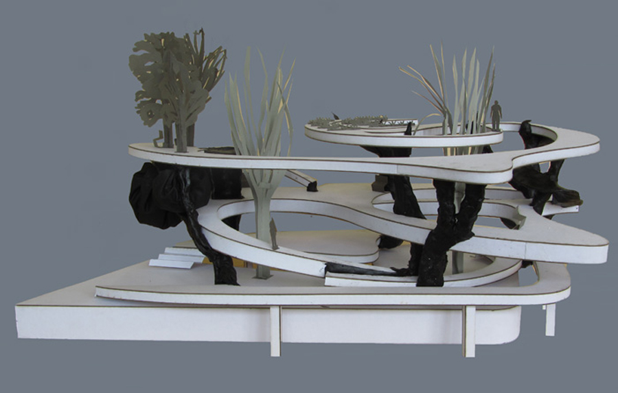
This is to be seen at exhibitions such as ‘Change The System’ in the Museum Boijmans Van Beuningen, where many projects were dedicated to sustainability.
So Eric Klarenbeek, called the designer of the unusual, who developed a 3D printing material based on straw, water and Mycellium, the threadlike vegetative part of fungus. Printed into a thin layer of bio-plastic the material can gain stability through drying and – in Klarenbeek’s case – become a chair. He went even further and created possibilities to 3D print with only local materials as algae, potato etc.
Remarkable is the aesthetic presence of the final products. Cups, vases, bowls, which you simply want to hold in your hand but cannot as they are displayed in the showcases. This might be what makes a researcher become a designer: using the power of aesthetics to create a bridge leading from innovative development to the manifestation of the product in daily life.

Unfortunately many green designers are seen as criminals when it comes to aesthetics. Next to the pursuing of sustainability as something of moral value, aesthetics are sometimes seen as luxury and therefore a waist of energy.
People who are already familiar with sustainable values, seem to see the beauty in the ethics.
However, this understanding of beauty requires the motivation to consume with a small footprint. A motivation which wants to be spread.
Thus, the power of an object’s visual appearance shouldn’t be underestimated. It can communicate and celebrate ideals and make users value the object and what it stands for.
Experiments in interaction design even reveal that people consider objects they emotionally bond to, as more functional – and use them more likely.

In the end we conserve only what we love.”
Baba Dioum

Thus objects which don’t attract us on an emotional level, will simply not be used and kept.
If it’s not beautiful, it’s not sustainable. Aesthetic attraction is not a superficial concern – it’s an environmental imperative.” wrote Lance Horsey in his book The Shape of Green. He is the first to write and examine the relationship of sustainability and beauty. According to him “beauty could save the planet” as in the end people consume and use what they love. Horsey here uses the example of wolves and dogs to enhance his theory:

The fate of many things depends on whether they please people. Wolves might seem heartier than dogs, but there are 50 million dogs in the world and only ten thousand wolves. Which has adapted better? This view of nature may give you pause—should other species exist just to please us? But as a principle for design, it is essential. If you want something to last, make it as lovable as a Labrador.

grün7 grün4 grün5 grün3

We personalize things we use – and we use things which are personal.
Based on this theses, Jonathan Chapman helps to create an alternative consumer’s philosophy, than our present ‘throw away’ society has. He developed a new design strategy, called Emotionally Durable Design.
Through the conscious shaping and strengthening of the emotional bonding between consumer and object, one can endure the using period and thus reduce waste. According to him this can be achieved through the consideration of the following five elements:

How users share a unique personal history with the product: Narrative
How the product is perceived as autonomous and in possession of its own free will: Consciousness
Can a user be made to feel a strong emotional connection to a product? Attachment
The product inspires interactions and connections beyond just the physical relationship: Fiction
How the product ages and develops character through time and use: Surface

This results in products such as the Stain tea cup of Bethan Laura Wood – an object which gains character through being used. It builds up an individual pattern of tea stains, according to the personal ways of drinking tea.
To establish this design approach further, Lance Horsey asks the question:

What if we created a different approach to aesthetics, one based on intelligence and not intuition? Can we be as about how things look as we are about how they work?

Answers will lead to new aesthetics based on the complex connections of efficiency, sustainability, character, endurance, and the potential to develop with the users personal demand. An understanding of aesthetics which goes beyond an object’s physical presence.

Distinguishing Colors


Wednesday, November 28, 2012

Tobias Mayer [1723 – 1762] was a self-taught mathematician. In 1758 he invents the so called “Colour Triangle” which is a color-system based on his research of how many colors the eye is capable of distinguishing. He took red (R), yellow (Y) and blue (B) as the three basic colors, more specific: cinnabar, massicot and azurite.
He started using a system called “The-Twelve-Part-Rule” to find the colors distinguish by the eye. He assumed that twelve was the perfect amount of parts from the three colors to mix. For this system he made this formula: R4Y4B4 and in this formula he would change the amount of the three colors by always ending up with the result of twelve parts in all. In the end it led him to 91 different colors that where distinguishable for the eye. Afterwards he applied black (K) and white (W) to create light and dark in his 91 colors. With black and white he would use up to 4 parts of either black or white, but still with the limit of 12 parts in all, formula: R3Y2B3K4 (or W4). This led him to 819 different colors that the eye was capable of distinguishing.

As shown on the attached picture no.1 The Colour Triangle by Tobias Mayer is, at least for me, not showing more than 66 small triangles with 33 different colors and 303 small white triangles, which is not really concur with explained results of his calculations. So I must admit that I don’t really agree that these colors shown in the Colour-Triangle are the colors the eye is capable to distinguishing, because that is exactly what I can’t do with at least 336 of the triangles. His Colour Triangle was not published, but in 1775 G. C. Lichtenberg made a replication of the Colour Triangle which is a triangle with 28 different colors taken out of the research by Tobias Mayer shown at the second picture.

MY INTERPRETATION AND FINAL PROJECT

What I found both interesting and important was to solve the mystery about the 786 missing colors in his color system and especially the missing GREEN.

*

By the way; in my silkscreen print I made the circle a typical grass-green color. I chose that color to highlight which color I really missed in his system although it makes sense considdering how Mayer calculated and mixed his 819 different colors.

*

First I was thinking to actually mix all colors by using his mathematical system. But soon I found out it was too comprehensive to work as mathematical as he did with exact amount of paint in 819 different mixes of colors.

If he really did it I give him credit for that!

*

Next idea was to make the spectator experience the colors and experiment with them by mixing the colors themselves.

My first thought of the final result was to make an binocular where you could put inside 12 round plexiglass-circles in either the color blue, red or yellow and then try to distinguish the different color-result by looking through this binocular.

Unfortunately
the plexiglass was way too thick and strong in color
so it was not possible to mix the colors through them.

*

Then I tried to do it with transperant paper on a light table. It worked out really good. It was much easier to mix the colors and it worked out with his mathematic system. The result where really strong and captured the spectator to keep adding more papers to the light table continue making different combinations.

*

I ended up using a projector to make it even stronger.

Next to it the transparent paper in red, yellow and blue was placed.

And then it was up to the spectator to make different results of which colors it was possible to get in that method of finding colors distinguishing for the eye….

The various try outs I present here are a remake of the real hands-on presentation.

By trying these different ways of mixing the colors I really got confirmed that it is absolutely strange that Tobias Mayer didn’t end up with a green or at least greenish color in his system. There came up green nuances and green color, but somehow he couldn’t distinguish them from other colors.

I was happy to get the possibility to mix the colors my self and let others do the same. Also just to enjoy the beautiful end result of what was projected on the wall!

*

The Green Apple


Tuesday, October 23, 2012


IMG_0451mirte_redu IMG_0513mirte_redu
How would a park of the future look like, knowing that our cities will keep on growing and keep on getting denser? I tried to answer that question, with the need to experience greenery in busy cities. [Images from graduation show presentation]


In my thesis I try to find an answer to the underlying question: How can green improve an urban living environment? For which in this research I specifically take a look at New York, a metropolis with high density that will keep on growing rapidly over the coming years. NYC plays a leading role in the field of green development. My main question reads: which lessons can be drawn from the innovative green projects in New York City.
To be able to answer my main question, I first took a step back. I did research about what a city actually means, how the process of urbanization took place, which problems it produced and why these issues are considered problems. After this the young trend Landscape Urbanism is studied. These ideas focus on new ways of shaping an urban design, according ‘horizontal landscapes’ instead of ‘vertical building’.

spread_page31-32
De High Line, "Miracle above Manhattan" New Yorkers float over busy streets in an innovative park, Paul Goldberger voor National Geographic.
De High Line is bedacht door Joshua David en Robert Hammond. Twee buurtbewoners met een hart voor de verlaten spoorlijn die in 1999 de non-profit organisatie ?Friends of the High Line' opzetten, en zo het initiatief namen tot de ontwikkeling van de oude treinrails..page 31/32 of thesis


My research consists out of three parts. First the problems of urbanization are analyzed, making use of the created historical context. The pioneers of greener cities will be discussed. Next to this the subject infrastructure, livability on street level and food supply are discussed.
The second chapter shows a series of solutions how green is used to regain peace and space in the city. Also is described how this added greenery could improve the urban ecology at the same time.
The last part focuses on case studies in New York. The research method is based on fieldwork and interviews with related people at the spot. I looked into what kind of influence the projects had on the city and its inhabitants and what examples other cities adopt.

Minolta DSC big model2_redu
I made research models out of ceramics. Like in the final design concept, living plants form the structure in this earlier intuitive models. After keeping them inside over the wintertime the young trees started growing. This experiment shows in smaller scale how growth takes over, allowed to complete the design.


not the excess of people but the lack of green is what threatens the mental health of townspeople“.

With this knowledge the people of New York commit themselves, supported by a strong governmental policy, to make their city greener and more livable. This is what makes the trend that helped the ‘Big Apple’ change into a ‘Green Apple’ so interesting and relevant: The approach both top-down and bottom-up at the same time. This is an innovatory model that fits well within the current economical recession, because the city is not only developed on governmental initiatives and financing but there is also searched for other possibilities and money sources.


Pdf-icon Download this thesis: The Green Apple [dutch language]

The green book


Wednesday, January 18, 2012


this post is part of he subjective library project “Unopened Book

the book can be found at the Rietveld library : catalog no : 757.4-schm

“AVATAR green”


Friday, April 15, 2011

In the avatar-project (design class) I am focusing on, and working with color, color and psychology. At first I found this lamp interesting because of it’s color. I am looking and trying to translate the colours around me and therefore I reacted to the lamp.
From what I have learned about green is that it’s a calming color, pleasing to the senses. For example hospitals uses light green rooms, and that is because green is concluded after studies to have the most calming effect on the patients. But more than that green is a symbol for cycle of life in the nature, and this lamp is the evidence of why, because it is naturally created as an result of the cycle of life.
Green is an ideal color to work with in interior design, because it dominates the nature and we are so used to see it, and therefore it harmonizes with us. In this lamp, green was not an active choice from the designer, it came out of nature itself. This is what I think is beautiful with this lamp. It is like the lamp is created as a platform, for the creation itself. The dark green is a result of living algae, which requires only sunlight, CO2 (carbon dioxide), and water. When taking care of the algae, light is created, in form of tiny amounts of electricity ”breathed” out from the algae.
This is functioning not only as a lamp but in a way a reminder of the ecological system we live in, a reminder of the responsibility we have, because we are a part in it. If I as the owner of the lamp take care of the algae it will reward me with light. So the lamp has two functions according to me, a source of light, a reminder of the cycle of life. Because the light comes is created in an environmental friendly way it also reminds me of the issues of earth, but I don’t think this lamp ”forces” me to think environmental-friendly, neither puts guilt on my shoulders, for me this lamp is instead of a political piece somehow very poetical.

Mike Thompson created the design of the Latro (Latin for thief) based on a recently proven technology whereby tiny amounts of electricity were tapped from living algae. Latro combines the energy potential of algae and the functionality of a hanging lamp. Synthesizing both nature and technology in one form, Latro is a living, breathing product. Algae require only sunlight, carbon dioxide (CO2) and water, offering a remarkably simple way of producing energy. Owners of Latro are required to treat it like a pet – feeding and caring for the algae that will reward them with light.”

Kandinsky’s Color Theory


Tuesday, December 8, 2009

Since I have chosen books in which the yellow color has been part of the content in different contexts, I took a book by Wassily Kandinsky for the last posting. The book describes a Color Theory according to Wassily Kandinsky, “Concerning the Spiritual in Art”. Here is his theory of the color yellow and the color that he thinks is the most opposite of yellow (blue).

Yellow means “warm,” “cheeky and exciting,” “disturbing for people,” “typical earthly color,” “compared with the mood of a person it could have the effect of representing madness in color […] an attack of rage, blind madness, maniacal rage.

Blue means “deep, inner, supernatural, peaceful “Sinking towards black, it has the overtone of a mourning that is not human.” “typical heavenly color”

Number: Kan 5

FAST, BABY YOU HAVE TO THINK FASTER.


Monday, February 16, 2009

FAST, BABY YOU HAVE TO THINK FASTER.
Because this will not work in OUR reality.
No, I can’t think like this.
That is what she said.
My answer was: my apologies, but i simply don’t have any time left.
Would you mind?
The next one please.
GOD what a nightmare.
Where are my feelings?
No not necessary they make me run out off time,
and time is MONEY AND THAT IS WORTH A LIFE, even your life realize that.
YES MADAM. I said.
A LONG LIFE WISHED FOR THE ASIANS,
said my boss.
AND WILL BE REPEATED BY ALL THE  BOSSES IN THE WORLD TODAY.
TOP SPEED MY BELOVED FRIEND.
CAN YOU GO 2000 k/m a hour?
DOESN’T MATTER THE MACHINE CAN.
RAPID.
BLACK.
WHAT A NATION
WHAT A LIFE.
And there it went.
MY TIME
MY LIFE.
MADAM it’s o.k now.
It is different here, they name it SLOW.
I can glance at you,
only you will not be able to see me.
AND I WILL NOT BE ABLE TO TELL YOU,
THAT YOU WILL MISS THE ART IN YOU MY CHILD.

posted by Beties Sadaty


Log in
subscribe