Skip to Content Skip to Search Go to Top Navigation Go to Side Menu


"modernism" Tag


Goed Maar Mooi?!


Thursday, April 25, 2019

In this quick visual essay I would like to discuss some personal observations I’ve made based upon visiting the Bauhaus exhibition and being involved in contemporary graphic design. Bauhaus has had a tremendous influence on typography and was the “standard” for at least 50 years in the 20th century. Interface design is still heavily influenced by the movement and school.
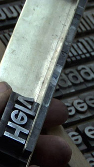
I ran into the following type-design when visiting the exhibition:
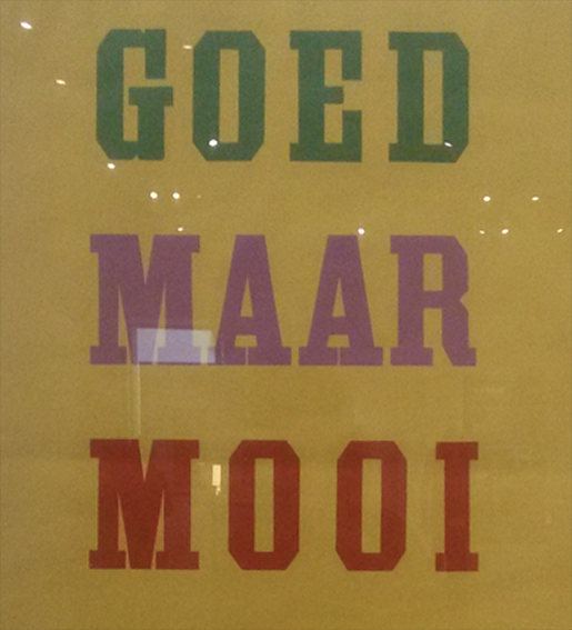
"Goed Maar Mooi"

It says “Goed maar mooi” meaning something along the lines of “Good but pretty” which reminds me of similar phrases like “less is more”. I think this mantra encapsulates my observations quite nicely. Bauhaus seems to have a reputation of being mostly function-driven, however I think there was a lot of thought put into aesthetic qualities as well. Bauhaus is well known for the rounded typeface design by Herbert Bayer:

The Bauhaus Typeface

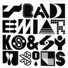
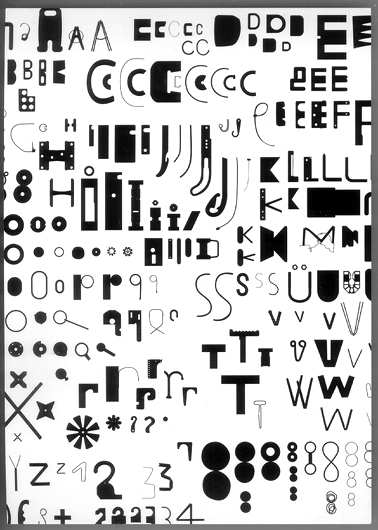
The rounded shapes are well-associated with Bauhaus and play a big part in their identity. Along with a modern-looking sans-serif look.  However I’ve also noticed a great focus on experimentation with grid-systems such as in the following examples:

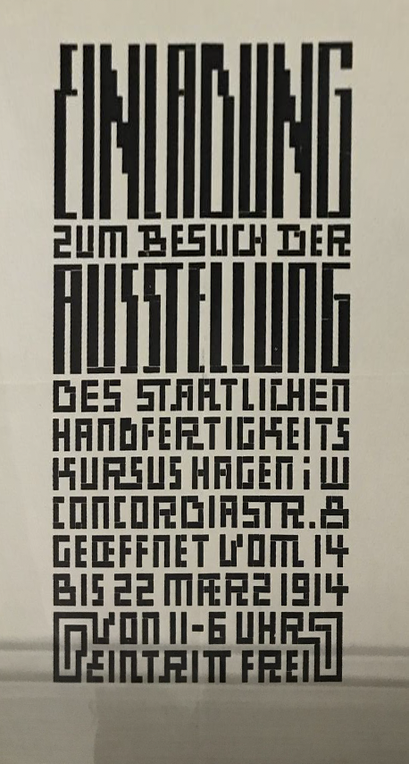
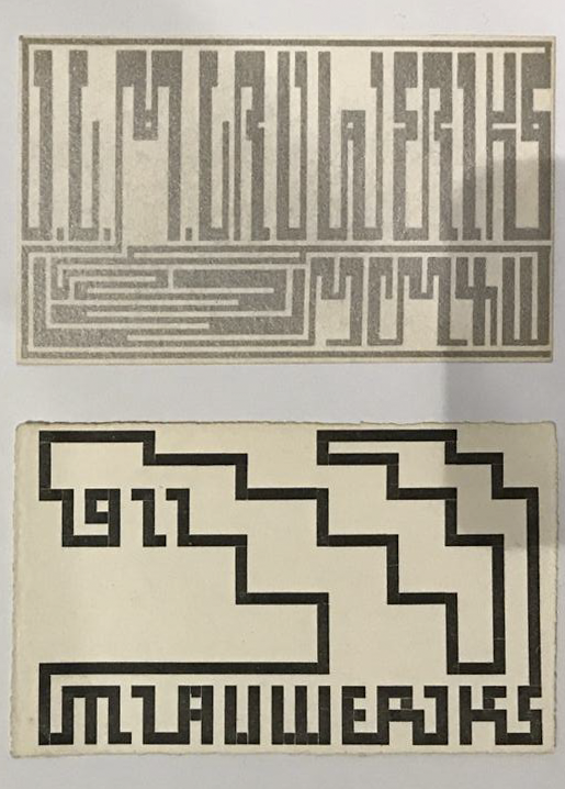
Examples of grid-based design in the Bauhaus exhibition

I’d like to return to the previous “Good but pretty” mantra established before.
If we interpret “good” as “functional” or in this case: “legible”  I think these examples are less “good” than the previously mentioned rounded typeface Bauhaus is known for. The designer seems to painstakingly stick to an established grid, providing some kind of design-guideline. You lose legibility with this approach. This makes me wonder if these typefaces were design with a  specific function in mind, such as Wim Crouwel’s Neue Alphabet or the typeface used in trams in Amsterdam. The designs however do speak to the “pretty” part of the mantra: the grid system creates an interesting look still popular today.

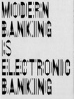
I think recent design trends in large companies have shifted towards a Bauhaus mentality of being functional. Especially to be legible on a small phone-screen this goes for  typefaces, logo’s, icon’s etc. The minimal interface design popularised by Apple’s iPhone has seeped through a lot of modern-day interface design and identity design.

Jonathan Ive, chief design at Apple, has mentioned Dieter Rams as an influence in this text.
Dieter Rams has in-turn mentioned Bauhaus as an influence in an interview.
Rowan Moore also mentioned this in the article: Bauhaus at 100: its legacy in five key designs he wrote for The Guardian about Bauhaus’ 100 year anniversary. The article also mentioned objects such as signs in airports and Ikea chairs, it’s definitely worth a read.

The iPhone interface

I would relate the functional layout, rounded corners and minimal icons to the Bauhaus school. Both excel at bringing order to something very complex. A phone can basically do anything you want it to these days, the functionality exceeds past technology bij combining cameras, computers, maps and music players all in one device. It is a real challenge to make a user-friendly device with so many options. I think the unified grid-system, easy-to-read iconography and interface allow for this to be the case.
Apple has consistently been using sans-serif typefaces in recent years and even introduced it’s own “San Francisco” typeface for their iOS operating system.
Traditional fashion houses have changed their “heritage” looking serif typefaces to modern looking. Companies such as Google, eBay and Instagram have opted to change their former intricate logo’s to more minimal “flat” interpretations of their previous logo’s.

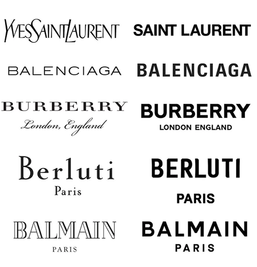
Various Fashion logo's

I have observed younger contemporary designers rebel against this direction by coming up with wild and eclectic designs. I have heard arguments that people consider the sans-serif looking too safe and “same-y” do these fashion houses lose a piece of their identity when they’re all getting sans-serif redesigns by Peter Saville?
Another point I would like to rise that goes hand-in-hand with the rise of eclectic designs is the rise of analog (looking) designs. I personally like this

It’s an easy task to create a perfectly-uniform and perfectly-straight line in Photoshop. However it’s very difficult, or rather impossible, to create a realistic pencil-drawing or oil-painting. As people drift away from the “flat” design trends they end up with textures found in analog work.

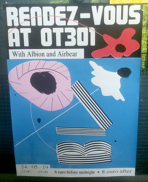
I personally think it’s interesting smaller contemporary designers have been taking risks in this regard by creating an eclectic mix by juxtaposing Bauhaus aspects such as clean sans-serif typefaces with serif typefaces and interesting textures and imperfections.
This recent development could be seen as “Modernism and Eclecticism”. The “Rendez-Vous at OT301” typeface is still reminiscent of the Bauhaus aesthetic. However, it is combined with Serif typefaces that have an imperfect look, like how the width of the type saying “6 euro before midnight” and “8 euro after” differs. The poster appears to be screen-printed but the red layer isn’t aligned perfectly. The black “eyes” also have a distinct textures look as if they’re hand-painted. This eclectic mix of elements makes the individual elements stronger in my opinion. The distinct characteristics of the “hand-painted” eyes are accentuated by placing them next to the perfectly clean “Rendez-Vous” header.

Objectiefied Bits


Friday, January 30, 2009

Maybe you find it puzzling that this posting about Helvetica and Wim Crouwel starts with an image of Paul Elliman’s “Bits” Alphabet.

Extremes can sometimes meet when you least expect it, and this fascinates me. It became apparent again during the investigation by the FoundationYear C group, into Gary Hustwitt’s Movie “Helvetica” and our consequently visit to the Wim Crouwel exhibit last month at the “van Abbemuseum”.

left: Bits by Paul Elliman, right: Objectified by Build (click images for blog info)

“Bits” was developed by Paul Elliman in the mid 90ties and published in the 15th (Cities) issue of Fuse’s conceptual Font Box. quote: “Language moves between us and the world on patterns of repetition and variation, and a mimetic example of this might be something like an alphabet”
Later, in 2004, it was included in the Cooper-Hewitt Design Triennial N.Y. which made “concept type” part of the established design world.

Gary Hustwitt’s new documentary “Objectified” takes design, and as a matter of fact “Bits” too, one step further by making it popular in the same way as he did with “Helvetica”.

Modernist thinking, or even constructivist-, lays at the base of the “Helvetica” concept and the work of Wim Crouwel, as this first movie on typography has him stated. As a true Dutch graphic design icon Wim Crouwel illustrated this through work, presented at the library exhibition of the van Abbemuseum, celebrating his 70th birthday. A small but beautiful display of catalogues and posters made for both this and the Stedelijk Museum in Amsterdam.


pages by Crouwel versus pages by Jan van Toorn from publication “Het Debat”

Extremes met in person when Crouwel and Jan van Toorn celebrated their life long controversy with a recurrence of their famous 1970 debate. Functionalism versus engagement. Jan van Toorn succeeded Crouwel as a designer at this museum under the directorate of Jean Leering to manifest in an inspiring cooperation what that leads to in terms of exhibition concepts and graphic design (“Museum in Motion” at the library). Jean Leering also closely work together with Jan Slothouber (read part 1 of C group’s research) at the TU-Delft where the published several internal essay’s on the philosophical and social consequences of design.


80/20/100 © Nijhof&Lee booksellers – Laurenz Brunner, final exam poster

More research was conducted to explore related content or work approach of other designers like, Laurenz Brunner’s “Akkurat”, his successful contemporary remake of Helvetica, Experimental Jetset convicted users of Helvetica, the cooperation “8020100” between Vivid Gallery in Rotterdam and Nijhof&Lee Bookstore in Amsterdam. Context was created by turning the focus on Adriaan Frutiger, designer of Helvetica’s conscientious alternative “Univers”. To further explore the relation to language and image we further focused our investigating efforts on the visual legacy of Charles & Ray Eames, the “El Hema” exhibition/store and Massin‘s timeless publication “Letter and Image“.

With the inclusion of Belgian artist Guy Rombouts the full circle of our focus on type design was completed. The investigation into his visual language concept “AZart” will be presented soon in a separated part 3 C_group posting. This was part II of the C_group research
All researches linked in this posting can be downloaded in A4 format and are also available as hard copy research prints at the ResearchFolders available at the academy library

D group /Type Design, from Experimental to Corporate


Tuesday, April 22, 2008

Helvetica is a feature-length independent film by Gary Hewitt, about typography, graphic design and global visual culture. It looks at the proliferation of one typeface (which is celebrating its 50th birthday this year) as part of a larger conversation about the way type affects our lives. (http://www.helveticafilm.com/) Helvetica introduces type as more than common. A specialized design discipline.

helvetica movie image1helvetica movie image2

A lecture by Henk Groenendijk on experiments in type design, related to ‘developping cultural and economical progress in the 1950-’70, gave more insight in the context that proved so fertile for Helvetica’s rise to stardom.

Indiana Number-paintingLogo’s from fiftiesSandberg Experimenta TypograficaModern Banking

Time and space is a given phenomenon in education at the Rietveld Academie, where things constantly present themselves in past and contemporary creative projects. As an almost casual gesture, some 2nd year students from the graphic design department dropped by to present their recent type designs in progress.

Student type design

Finally research material was edited down to A4 sized guided tours into selected subjects. All subjects presented in this list are also available as hard copy research prints at the ResearchFolders available at the Rietveld library.

As usual we selected subjects with a direct connection to the context of the presented material in this classbloc. In this case Helvetica the Movie” and its content, was researched through subjects like the Corporate Alphabet, Wim Crouwel, Laurenz Brunner, Experimental Jetset, Norm type design and their publication “TheThing” or Letterpress.

The lecture gave a much broader perspective from which researches like de Stijl fonts, Buro Destruct, Zaph Dingbats, the Univers Font, Systemfonts, Swiss Style/Modernisme, Guy Rombout‘s AZart and Edward Fella were initiated. Widening the discussion towards the Helvetica subject by adding links to the actuality, some more subjects were added, Jonathan Barnbrook. Richard Niessen, Type Radio, Emigre‘s Zuzana Licko, Jonathan Puckey‘s Type Tool, the mysterious typebased posters of Michel Schuurman and ultimately the concept of Dead Type by Hansjakob Fehr


Log in
subscribe