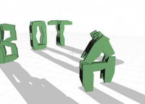
stop imagining that a book must have one line, that wraps over and over again, in the same way that onE side of a record album has only one groove, And see a text like a symphony with many voices running continuously in any directIon.
every voice is a body on its own.
it moveS, It grows, it makes decisions. each letter is alive in its own world. enter this world and don’t be worried, like all good video games it teaches you how to play as it goes along, and gets more and more challenging as your skills within this world grow. the game stays one teasing half-step ahead of yoU but that’s why you play on.
ask yourself: what is possible to do with, within, and without language?
letters, words and other symbols are information we surround ourselves with every day. transferring messages from A to B, typography is an image we created, an image-language we are dependAnt on.
in print, type is fixed, stAtic and permanent. on-screen –though not permanent– type is largely inanimate. text remains an inactive tool of communication. our current understanding of type assumes it to be of static nature, limited to properties such as form and colour. Introducing temporal media (Video/animation) changing with time, type is growing A new property.
type behaves. type evolves. or as the artist eduardo kac put it in 1997:
considering the dynamic capabilities of conteMporary, digital media, our static definitions of type seem very outdated.
early feature films contained temporal typography, featuring largely static text, presented in sequences and subjected to cinematic transitions. it was not until the 1960s when alfred hitchcock’s north by northwest (1959) opening title sequence—created by saul bass— hit the screens, containing animated text, featuring credits that “flew” in from OFf-screen, and finally faded out into the film itself. a similar technique was also employed by bass in psycho (1960).
Since then, motion graphics, particularly the brand identities of film and television production companies, increasingly contain animated type. they hAve become trivial.
look at MTV’s idents from 2010:
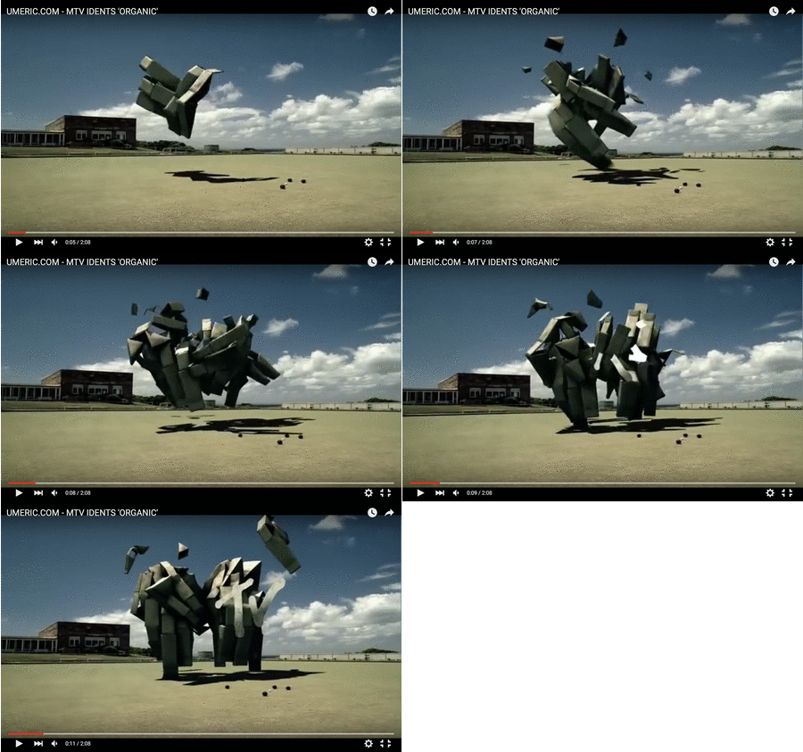
MTV ident ‘organic’ (1/12)
several animated bricks fly around over a football yard, a yard possibly all american teenage kIddies can Identify with. an everyday life scenery in which each part of this ‘brick-matter’ seems to move independently, following an instinct i don’t understand. eventually, after a moment of non-control, Each brick is being drawn to one another to form the brand’s identity
– a moving ‘M’ connecting with a ‘TV’.
moving shapes, merging into one.
2010’s animation at its beSt – but this we know already.
nikita pashenkov, creator of 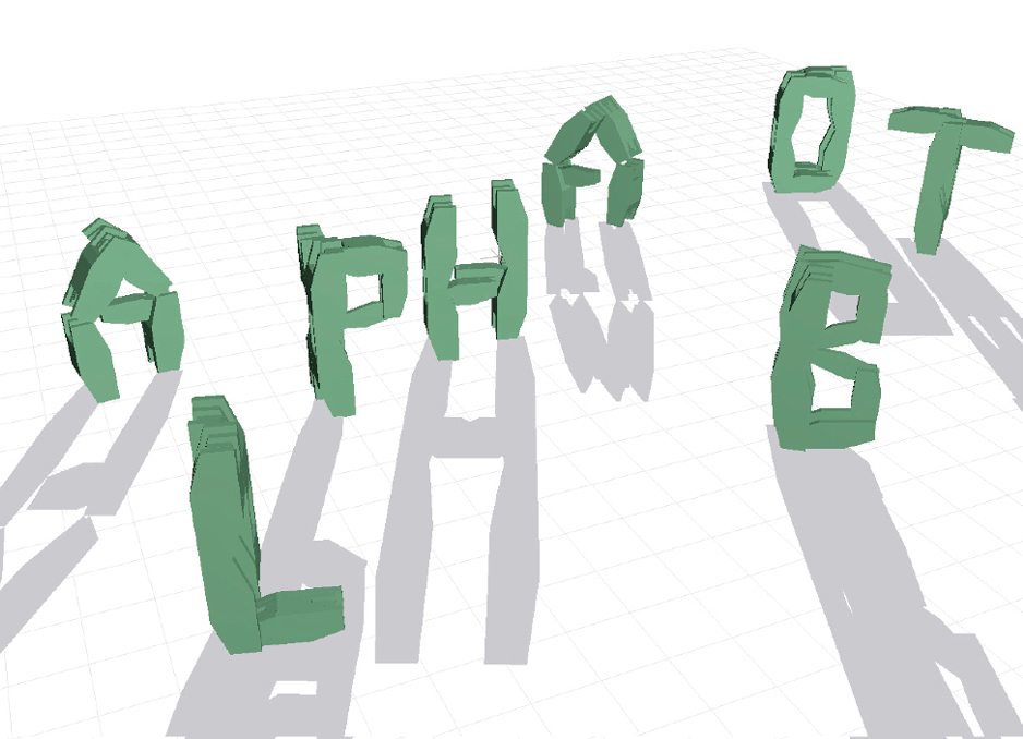 (2001), a virtual robot that may transform to take the shape of any letter of the alphabet, was one of the first programmers who gave life to a type being that consistently alters its form.
a single form may present multiple letters through processes of morphing, rotation or DEconstruction. multiple forms may present a single letter through processes of reorganization. the ‘alphabot’ transforms, firstly becoming the letter ‘A’, then ‘B’, and so on. without moving, It changes; it assumes a new identity. by this iNvention, type started to transform and mutate, to hide and interact. yet its new identity of behavior remains controlled by the human hand. the user types in a command – the robot translates – the letTer acts.
i ask
you answer
A > B
the relationship remains uneven.
asking about the post-human condition, our role and relation with the machine or the digital world is a field I want to explore. human humanizing his surrounding. liking the letter’s motion to human gestures would therefore be a reasonable step to take when it comes to giving type a ‘life’. suddenly the letter has a leg, an arm, a finger pointing towards an information, i long to discover. he she it nods or shakes his her its body into a wild dance. he she it helps me by speaking my language. i feel connecteD, I am close to ‘A’ – to ‘B’. but especially this way of personification is indicating the human’s urge to control his surrounding. i want To understand you, so you have to be like me.
let me suggest another relation.
what about a dynamic text in independent motion, a typography in complete metamorphosis? changing within space rather than moving across space (opening title sequences), merging from and into illegible visual elements?
a new self-sufficient algorithm, making own decisions for you to observe and thErefore creating a character with character, an identity expressing itself. a new ‘aliveness’ among us?
one body/many letters, many letters/one body
i am many.
a letter Is many.
in ‘beer’, a flash animation by komninos zervos (shown above), each letter undergoes a process of metamorphosis. two letters merge, becoming a single form, and thereby introducing a third letter. other Forms Move Independently, Adopting The Shape of one letter, then morphing into another. the forms, in flux, change between legible letters and abstract glyphs. their fluid deformation leads to new identities looking at the examples given, one can notIce that most of them come from a tIme between 5 and 15 years ago.
where are the contemporary examples?
there is, at present, no substantial research into the properties and perception of fLuid typography. familiar methods for the analysis of typography have failed to keep pace with the development of digital technologies as they do not allow themselves to grow and allow additional dimensions such as fluid type’s capability to react and behave. there is an urge to re-evaluate our understanding of the nature of type just as to accept the notion that a single letterform may have various autonomous identiTIes.
nevertheless there do exist contemporary examples for other fluid forms of autonomous life within the worlds of the non-human or non-animal, namely the technological, alGorythmical.
take a look at ian cheng’s `emissary forks at perfection’
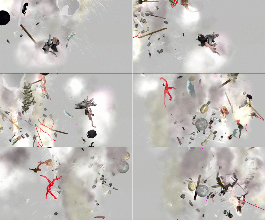
a Digital (a)live simulation and (foreveR) Ongoing story (2015- the very now) on screen in which cheng created different life forms through algorithms. beyond human control, an artificial intelligence called talus tWenty Nine manages the landscape, compulsively gambling on which character survives and which one may see the light of this randomly animated world for the first time. pushed together to occupy the same landscape, each form threatens to destabilize and mutate the other. “here, a story mAy escape its classical fixity and indefinitely procrastinate its conclusion.”
but back to typography.
giviNg type an autonomous life beyond control, you may ask yourself,
what’s in there for you?
if the game seems to only lead you towarDs lost battles and dead ends,
why should you keep on playing?
rethinking the human urge to find productivity in all that surrounds him Is a value to question. a certain un-readability arising from non-constant, fluid words, slogans and messages is indeed confusing but this situation of senselessness at first sight leADs to an encounter asking way more about the relation between human and a the letter itself. think of your probably long gone tamagotchi friends. you buIld a relationshIp by observIng them, listening to their needs, caring for them, so they care for you.
A = B
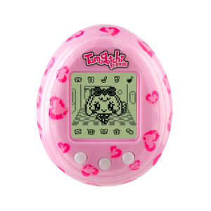
so why not entering this world of uncertAin messages hidden within the abstract structures of unreadable forms and images if there stilL Is the chance of reaching this certain point, as you’ve learned enough, to get into the neXT Level?
aS you know, the game stayS onE teasiNg halF-STep aheAd of you.
bUT that’S wHy yOU
pLAy ON
