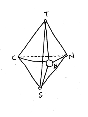
Skip to Content Skip to Search Go to Top Navigation Go to Side Menu


"translation" Tag


NU- A N C – ES OF NO.


Sunday, January 29, 2017

giphy 2


The book design has a strange appeal;

boring Facebook blue and random pages in between. Unsettling uppercase letters of split up words all over one page, very prose looking straight aligned text on the other. A woman holding a picture of another woman lying naked under a zebra. Low resolution smiley face.


Nuances_of_no_5Nuances_of_no_4


Hanne Lippard graduated Rietveld as a graphic designer, but then carried her words from printed matter to sound files and live performance. ‘Nuances of No’ is her book, a collection of written work released in 2013. In making the book, she designs her own content, which allows her to create a similar voice to her sound work.

Visual information like spaces provoke silences in the readers head voice.

By the placement of the words on the page in relation to each other, or switching or removing letters and making slip of the tongues, she also plays with language, takes attention to sounds and stretches their meanings.

(variations)
[audio:https://designblog.rietveldacademie.nl/wp-content/uploads/2017/01/variations.mp3|titles=variations]

As your eye is guided through the page, text sounds like poetry.

(every word)
[audio:https://designblog.rietveldacademie.nl/wp-content/uploads/2017/01/every-woord.mp3|titles=every word]

The design of the word becomes the form of her voice.

In her spoken works she has a monotone, articulate, clean and soft tone which is robotic yet sounds as if it could be coming from somewhere inside your head.
This similar feeling is present in the book as well, this time through the colour of Facebook; trustworthy, artificial and sort of anonymous. Some pages in between have pixelated smiley faces and click button images taking the reader into a virtual world context, which adds to the atmosphere she creates.

(underscore)
[audio:https://designblog.rietveldacademie.nl/wp-content/uploads/2017/01/underscore.mp3|titles=underscore]

The design of Hanna Lippard [x] serves to vocalize her written thought in ‘nuances of no’; making the words surround the reader in the mind.

(echo)
[audio:https://designblog.rietveldacademie.nl/wp-content/uploads/2017/01/echo-she-wants.mp3|titles=echo]

One or two voices.

(goodbye)
[audio:https://designblog.rietveldacademie.nl/wp-content/uploads/2017/01/end-goodbyee.mp3|titles=goodbye]


*soundfiles are readings from the book in my voice. only (echo) is my words in my voice.


Nuances of no. /Rietveld library catalogue no : lippa 1

“What can I say?”


Saturday, February 20, 2016

The world is pretty big, it’s cool we fit on it. Beat Muller and Wendelin Hess also noticed that the world indeed is pretty big. They were asked to do a visual essay for the Eye Magazine with their opinion about the neutrality of a country in a global world. They answered pretty clean cut clear with:

“Die Unmöglichkeit der Neutralität”


Muller-+-Hess_1500


They put together an image-based alphabet,    mixing Swiss mountains,    portraits of the pope, bloody guys, sports,     porn and by this stimulating the     uncontrollable    visual    stream of today.

                                                                                                            We are very visually orientated animals; from cave paintings to computers. We did not start communication with words. Homo sapiens first attempts at passing information took on the form of cave paintings. A small child first learns to draw before it is able to master more complex communication.   28.000 years after the first cave painting the alphabet emerged in Ancient Egypt. From then on communication in written word gradually took over. When you look at newspapers over 100 years old you see a large amount of text and an absence of pictures. Compared with newspapers from today they look like a dry toast morning read. In The Netherlands the best selling newspaper would be ‘De Telegraaf’. When you compare their percentage of image use with other papers they have the highest. It seems like visual language is gradually taking over written words, like we are going back in history.


Naamloos-22


The origin of text and the origin of visualizing seem to have the same goal: communication. Somewhere between the two lay contradictions and overlaps. We often need one of the two to translate the other of the two. For example on your computer; The computer used to be a very complex machine that could only be used by trained experts. Only when the Graphical User Interface (GUI) was introduced did computers become everyday appliances. This means that the computer actually is a big bang bomb of information, codes and things we don’t really understand. This GUI translates all this information into images, metaphorical images we recognize and know the means of. It is an international language, all over the world people from different cultures use the same icons, folder buttons and trashcans.

Naamloos-2Amsterdam_Lawrence_Weiner_Translation

We are constantly translating things we want to say into something other people can understand. When the Dutch artist, Bas Jan Ader made ‘too sad to tell you’ [x] he was too sad to tell you. He communicated visually rather than with words. When I feel too sad to tell you I send you a Crying Face Emoji. Like caveman, like baby, like Bas, we reach out for visual communication.

 Naamloos-3

                                                              Image and language need each other, sometimes. Sometimes they become each other: like slogans. Slogans balance on the edge of image and language. The words in a slogan are not working as a neutral informative tool. The words in a slogan become images loaded with suggestions. Reading becomes looking and looking becomes reading. We become image readers, because we understand images more rapidly.

An artist who works with the tension between words and images is Ed Ruscha, an American artist born in Omaha, Nebraska. His interest in words and typography are the main subject in his paintings, prints and photographs. The words, sentences and phrases in his work often radiate more than only a neutral meaning. When I look at the word “The” in the image below, it no longer looks like a word but becomes a picture, leaving its body, getting new meanings and becoming a word again.

12am215ed-ruscha-ooo

The combination of a (background) image and a ‘word’ provoke a lot of suggestions that ask for multiple interpretations. You could say that these text-images explore the possibilities and limitations of non-verbal communication. Ruscha is aware that letters, as well as words can speak. Different forms of lettering can change the meaning of a word. About his liquid letters he claims “I could make an “o” stupid or I could make it hopeless or anyway I want it to be and it would still be an “o”. He wrestles with the question “What can I say?” and “How can I say it?” Language is like a loaded gun, and we shoot, so what can i say?


From colour to sound


Wednesday, December 12, 2012

The CMN colour system was created in 1986 in Italy. It shows how colours change. How they can get brighter and eventually become white (bianco) or darker, thus resulting in black (nero). They can also become transparent (trasparente) or reflective (speculare). The CMN-86 colour system is about how colours appear, change and disappear. Going from dark to bright and from reflective to transparent, a specific colour can become very different, this system takes that fact into consideration, as the only one!

This system takes the shape of a tetrahedron, originally met in Plato’s geometrical ideas of colours. It can be combined with other systems in order to not only express the origins of the colours but also reflect the intentions of the observer. C is for “colori” an etymologically interesting word that means “something disguised and revealed”. In other words, something is taken away from white light (original essence) so that the object is revealed.

Synesthesia is a condition in which one sense (for example, hearing) is simultaneously perceived as if by one or more additional senses such as sight. Another form of synesthesia joins objects such as letters, shapes, numbers or people’s names with a sensory perception such as smell, color or flavor. The word synesthesia comes from two Greek words, syn (together) and aisthesis (perception). After some research I found out that synesthesia is divided in different types according to what senses are involved. The specific one concerning sound and color  is called Chromesthesia. I wanted to use that as a base for my work and try to find a way to combine this scientific fact with the colour system I’m working on.

Instead of imagining a color moving and evolving into the tetrahedron, let’s imagine a sound.

thus:
Color = sound
Bianco = high pitch
Nero = low pitch
Transparente = puissance
Speculare = delay

I first decided to work with sounds of everyday-life like opening the fridge, cooking, turning the light on. I wanted so see what could happen to this typical sounds within this new system.
These sounds were finally too complex and couldn’t really make the system clear and understandable, I preferred to use a really simple and pure sound and make it move in the system to reveal its logic. I made a book so, while you are listening, you can see where the sound is located on the tetrahedron and, therefore, grasp the system.

[audio:https://designblog.rietveldacademie.nl/wp-content/uploads/2012/12/1-track-011.mp3|titles=1-track-01]

[audio:https://designblog.rietveldacademie.nl/wp-content/uploads/2012/12/2-track-02.mp3|titles=2 track 02]

[audio:https://designblog.rietveldacademie.nl/wp-content/uploads/2012/12/3-track-03.mp3|titles=3 track 03]

[audio:https://designblog.rietveldacademie.nl/wp-content/uploads/2012/12/4-track-04.mp3|titles=track 04]

[audio:https://designblog.rietveldacademie.nl/wp-content/uploads/2012/12/5-track-05.mp3|titles=track 05]

[audio:https://designblog.rietveldacademie.nl/wp-content/uploads/2012/12/6-track-06.mp3|titles=track 06]

[audio:https://designblog.rietveldacademie.nl/wp-content/uploads/2012/12/7-track-07.mp3|titles=track 07]

[audio:https://designblog.rietveldacademie.nl/wp-content/uploads/2012/12/8-track-08.mp3|titles=track #08]

[audio:https://designblog.rietveldacademie.nl/wp-content/uploads/2012/12/9-track-09.mp3|titles=track #09]

[audio:https://designblog.rietveldacademie.nl/wp-content/uploads/2012/12/10-track-10.mp3|titles=track #10]

[audio:https://designblog.rietveldacademie.nl/wp-content/uploads/2012/12/11-track-11.mp3|titles=track #11]

[audio:https://designblog.rietveldacademie.nl/wp-content/uploads/2012/12/12-track-12.mp3|titles=track #12]

My project consists of the translation of a visual system regarding colour to a visual system regarding sound. The original CMN system shows how colour appears, changes and disappears,  from black to white, across reflection and transparency. This system is a way to apprehend a colour and its nature within a defined scientific tetrahedron-shaped space. Applying it to sound give us a way to approach sounds in a different angle, sounds can become autonomous elements of our environment.
Then, we could imagine to use this system on other matters like smell, touch, feelings, … and give a tangible and reachable reality to the unspeakable.

A Printed Book History 3 : Complutensian Polyglot


Monday, May 14, 2012

The Complutensian Polyglot Bible, 1514

With my clothes still wet and after being forced to leave all my stuff in the lockers, I was finally ready to be impressed by one of the books in the vitrines. We were the only visitors at the whole “UvA Special Collections”, and after the difficult and rainy bicycle ride we were no more than 10, a small group from different nationalities which in a way resembled the layout of the Complutensian Polyglot Bible.

Printed in Alcalá de Henares, Spain in 1514, it was the first bible made in more than one language, Hebrew, Latin and Greek. Translation is always a problematic thing to do, specially in such as “precise” text as the Bible but not only in terms of meaning, using the same book for more than one text seems like a pretty risky design work. The first example of such a hard labour would probably  be the Rosseta stone [x], that became the most useful tool to understand the hieroglyphs from old Egypt. Made in 196 b.C and as well in three scrips, Egyptian, Demotic, and Ancient Greek, but with a pretty classical way of arranging the different languages, in three different paragraphs.

The main characteristic that makes the Polyglot Bible specially appealing is precisely the way that the text is arranged in the page, in parallel columns of different sizes that also combine different ways of reading (as it happens with the Hebrew and the other two languages). That idea seems really modern, and the look of the page looks quite similar to the once of a modern newspaper. If I think in contemporary polyglot texts the first examples that come to my mind are the magazines from the airplanes or the mails from the school, and in both cases one language follows the other, so the same meaning never shares the same space with all the troubles that come with that. After a small mental struggle trying to remember a similar graphic structure I realize that now we can find it in something that we all use, Google Translate.

post by Juan de Porras Isla

SM Research@TS2


Thursday, May 19, 2011

Berlage’s secret

For the people that have a big interest in hanging clocks the reading about the Berlage clock could have been exiting, for all the other people it was three times nothing. People that are against the cut downs in art should turn their head and look the other way, because if you find out that someone that studies on a clock for a year and finally comes with nothing is probably not worth any grants.

It is wonderful that a museum gives a look inside their research department. The presentations on the Amsterdam School and the Gijs Bakker dress were interesting to listen to and even though both of the researches weren’t finished on the moment of presentation, both of the researchers could justify very well what they did. The presentation on the Berlage clock was about a failure, about a broken clock with no information to be found, about a lot of compromises with an not original and not working clock as the result. As a researcher there is a chance that you’re not much of a speaker but if you can’t prepare a presentation after a year maybe you should make the decision and keep it with only the presentation of the work itself.

[by Taro Lennaerts]

Influence of the collar!

The radical design duo Gijs Bakker and Emmy van Leersum, famous for there futuristic creations, had there most sensational show in 1967 at the stedelijkmuseum. Not much remained of there fitting mini dresses with large metal collars, only one set of collar and dress survived and is now in the Stedelijk Museum collection.

At the time Gijs and Emmy’s works were not always appreciated and even considered instruments of torture by critics. Now 40 years later this new mentality in jewellery design founded by Emmy and Gijs is part of dutch design history and till today of great influence in designers works all over.[x]

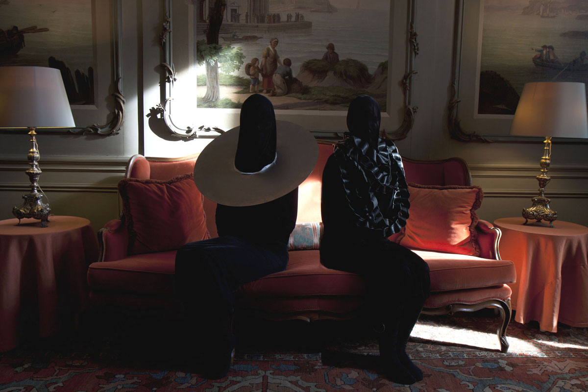
rubber and metal collar by Katja Hannula and Giulia Shah, February 2011

[by Giulia Shah]

bijoux et le minimalisme

Emmy van Leersum's and Gijs Bakker's designs can be summarized as futuristic (similar > Pierre Cardin, Andre Courrèges) and conceptually groundbreaking (the ''unisex clothing'' > similar > Jean Paul Gaultier, Claude Cahun.)
The comparance of Courrèges's and Cardin's ''Space Age'' collection (towards Bakker and van Leersum) is intriguing and i was fascinated by the experimental jewelry (extreme sizes, unwearable, minimalistic and the Avant Gardistic approach.)

conceptually it's very interesting for me [according to the idea > jewelry without it's historical ballast and just a pure essence] and the awareness of exhibiting their works in a stable conceptual way, the free spirit thinking and the idea that aesthetics are not ''the main essence'' but that a concept is nr. 1 comforted me and made me feel challenged in several ways.

Equal [according >conceptual influence]:

Jean Paul Gaultier has a very similar way of thinking [reappyling gender codes, equality between female and male etc] and the idea of creating a unisex-line is fascinating. The idea's [according to groups, minority's, majority's etc] do remind me of Deleuze and Guattari. There is a equality [according to my aesthetical approach] according to Stanley Kubrick's 2001: A Space Odyssey [Djinn Chair by Olivier Morgue], Wiliiam Klein's ''The Model Couple'' and the ballets of Hans van Manen.

All by all; this similar approach has nothing to do with ''being similar or comparable'', it just has to do with the moment and the things that seemed equal [could be through a feeling, a aesthetical view point, etc.]

[by Petros Orfanos]

Share Our Stories

”After three hours of listening to lectures about design and designobjects everybody was a bit bored. This was not because of the content, but about the way it was presented and the retorical skills of the speakers. But see it from a other point of view than only the level of entertainment. What is the importance of art/design research and making it available to the general public? In my opinion it’s a opportunity, that it is made accessible, for everyone that is interested or wants to participate in preserving/documenting history. Cause this is what we saw. Not a great story, but people asking for help to make a great story. If you think about this, there is still a lot we need to find out to complete it. After a certain amount of time information gets lost and also the possibilities of creating a clear picture about history. Today some of the stories might be boring or uninteresting. It even can stay that way, but when times goes by it can become relevant and important. It is not up to us to make that judgement, but for later generations still to come. For now we need to search, share and organize information. So everybody has the same opportunity, like us, to access our history in the best way possible.”

[by Herman Paskamp]

obsurbed by research

Quite interesting to see these curators completely absorbed by researching one subject. Information was given about the 1960’s fashion of Emmy van Leersum and Gijs Bakker, the Amsterdamse School and then there was some dribble about the restoration of an old clock. In the following text I will focus on the first of these subjects.

It was compelling to learn from Marjan Boot that styles of dressing that are now totally accepted (a woman wearing pants) or trite (a jumpsuit) were completely groundbreaking back when van Leersum and Bakker gave their (apparently legendary) fashion show. Little proof that the show ever even happened remains today, so the curator explained her challenge was to represent the fashion show’s relevance and atmosphere in an exhibition with what little information and material was left of it.

My problem with this is, it’s not really possible to translate the excitement of then into a gallery now. If you exhibit remains of a fashion show in a museum, you will always be hindered by the limited possibilities. No matter how much information and material you collect, it will still come down to some text on the wall, dressed up mannequins behind glass and maybe (how exciting!) some moving pictures and sound on a screen. I’m not saying it shouldn’t be done, just that it will surely be disappointing experience to anyone expecting something as edgy and provocative as the original fashion show.

It will probably be a nice sunday afternoon for anyone who was young and hip and probably wealthy (and probably still is, rich bastards) and really with it and happening when it was still 1967. They will be reminded of the olden days and for them, but only for them, it will come alive again. Then they will go home again and read some Gerard Reve while smoking a pipe and listening to Vivaldi or whatever, after which they will go to bed and probably die in their sleep. God why don’t all these old people and curators just die already.

Unfortunately the tape Ms. Boot located with the music of the show was not yet in her possession so we did not get to listen to the pounding beats of early electronic music, which frankly excites me more than fashion.

[by Senne Hartland]

Liza on ‘over de jurk van Gijs Bakker’

It was in 1967 that a sensational show took place in the Stedelijk Museum. In this show futuristic creations of Gijs Bakker and Emmy van Leersum were presented, among music from Karlheinz Stockhausen. Only one dress remained, still I do think they have quite a elaborated idea about what the show must have been like. Marjan Boot, the conservator leading the research, put forward that she wanted to know (even) more about the show in order to find a way to present it in this time. I don’t actually know if she’ll ever know enough to get the right ‘feeling‘ back. I know this sounds vague, but since we’re not living in the sixties there’s no way we can present the work in the same way, or in another way but grasping the same ‘spirit’, as back then. Some things are just great because they happen at a certain place in a certain time, and we can’t bring them back. It’s a bit like childhood memories; we want to re-encounter them, but we will never succeed. Maybe this quality of time in relation to ‘memories’ is what make the ‘memory’ even more valuable.
So my advice is don’t try to hard to make people re-experience a faded memory. (I don’t want to say that you shouldn’t present it, but do it in a simple way, just pictures and the dress, and don’t be disappointed to hear that people didn’t ‘feel it’ )

[by Liza Prins]


Log in
subscribe