Skip to Content Skip to Search Go to Top Navigation Go to Side Menu


"symbols" Tag


The Power of Simplicity.


Friday, October 26, 2012

Adrian Frutiger, born in 1928 in Interlaken Switzerland, is the creator of the ‘Univers’ and ‘Frutiger’ typefaces. Besides typefaces he is also known for signets, logos, corporate typefaces and corporate identities for publishers and industrial enterprises. At a young age he experimented with invented scripts and stylized handwriting frustrated as he was with the formal, cursive penmanship being enforced at the Swiss school he was attending. At the age of sixteen, he was interested in sculpture and learned woodcutting, engraving and calligraphy. His father discouraged him to continu his studies in sculpture and encouraged him to go work in the printing business. Even though he was in the world of printing, he kept his love for sculpture which influenced a great part of his type forms.

But in this research I will only talk about his independent works, the symbols; the forms and counterforms.


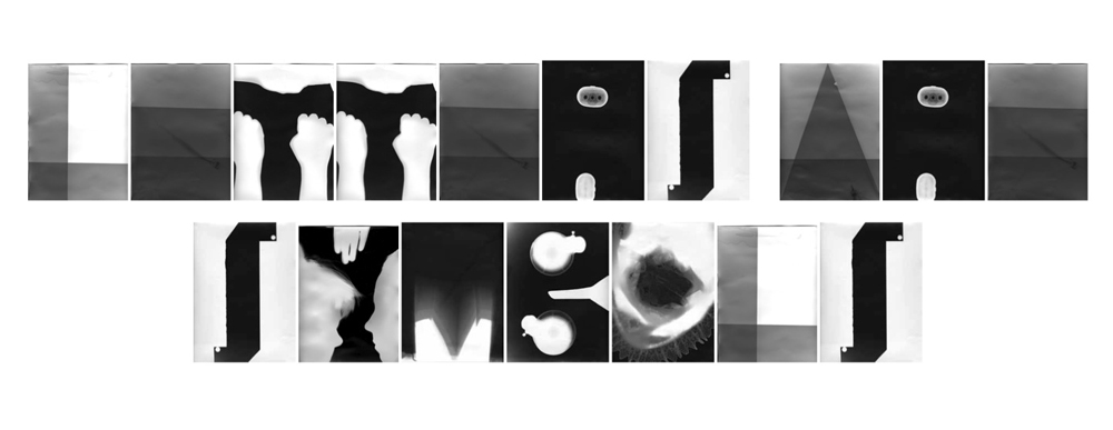
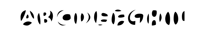
Generally speaking, form and counterforms, is the way in which the type and its background have an effect on each other. We can also say; letters or in this case, symbols are created by positive and negative shapes. The positive shape is referred to as the form, the negative shape is referred to as the counterform.

It is easy to make a negative or positive image and reverse it afterwards, but the meaning of the symbols will change completely. This is what Frutiger wanted. Nothing has one meaning, the imagination of our thoughts is so wide that you cannot give it a name. Even though Frutiger gave his symbols names, titles, or better said feelings, I for example do not feel the same way as he does about those symbols. Which is a nice thing, because we do not share the same past, we lived in different periods, so this influences the way of how I look at it. The forms are recognizable in my eyes, you can easily define the subject of it. In the counterforms though, it is a bit difficult because the symbols are not free in space anymore. They are encircled, outlined, which confuses the imagination to think ‘out of the box’. Even though they are connected with each other, they obtain different atmospheres. 


This is an example of forms – positive

               This is an example of counterforms – negative

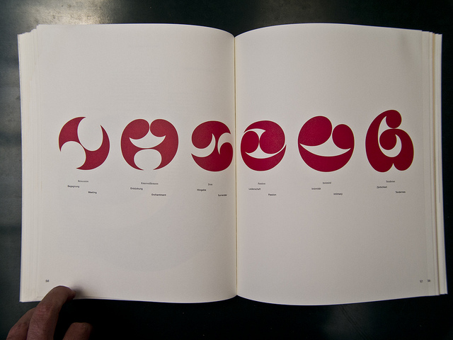
The symbols are ‘Frutiger Symbols’ and ‘Frutiger Stone’ was made to express Frutiger’s thinking, feelings and opinion in signs. It is a symbol font of plants, animals and stars as well as religious and mythological symbols. This typeface builds a completely new design system, which offers endless possibilities, the “world language system” as Frutiger said. Better formulated, the entire spiritual world of his mind or even our minds becomes readable trough symbols. There’s no need to use letters to express ourself, only symbols matter. The simplicity of letting go our feelings on paper, with a brush or in woodcutting. 

An example of Frutiger Stone

The idea of universal connections determines his thinking and marks all his creative work. No need for intellectual capacity for reading the signs, Frutiger wanted people to use their dreams to understand his work. Which is a beautiful idea, but almost impossible. Because our thinking does not always match the way Frutiger wanted. His symbols were in a way, a spontaneous interactions between his feeling at that time and what his hand was doing with those informations.

I truly like the fact that all the symbols are connected witch each other yet not completely. In his forms there is a representation of movement, there’s always a beginning but never an ending. He thought that he could always find a way to make it “better”, “uglier”, more “aggressive” or put more “emotions” in it. Nothing was in his eyes finished. Like the human existence and thoughts, which were the main themes of the forms, he asked himself often the same questions about life, beauty and our thoughts. Those impressions of the feelings he had at that moment fit well in his forms.

While I am talking about a way to communicate with each other without using the alphabet, I can show you an example that is still in use: Charles de Gaulle Airport at Roissy, France.

He was asked to make a new directional sign system. The yellow background with the white letters in French and the black letters in English is an invention of Frutiger. I think this task which was given to him, completed his way of thinking. Frutiger wanted to make an universal language connected with symbols to make it understandable for everyone, young and old. It is remarkable how those symbols hit us in the eyes, and what it means to us. I can imagine that when you are in a hurry to catch your flight you would not have the time or the ability to read, only to see symbols. It makes live easier, understandable and there is no speaking or wrong communication. There’s only one language that we all do speak Frutiger’s language, and that is the symbol-language.

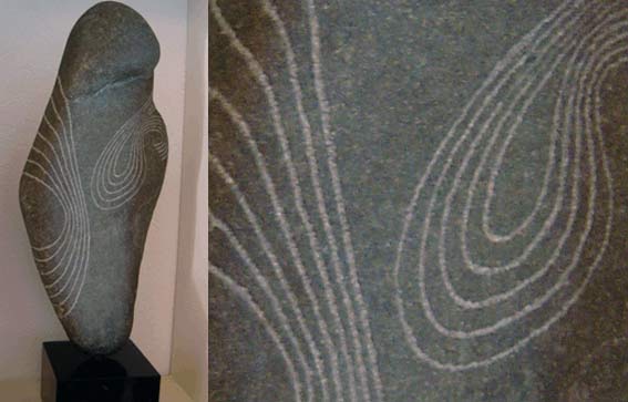
Frutiger is found in the work of the Romanian sculptor C. Brancusi, who made sculptures that represented what Frutiger wanted in his works. Leave the unnecessary for what it is and focus on what you want to see, to feel. Trying to reach the perfection. Frutiger took note for his forms and counterforms. He also developed some sculpture himself.


Frutiger opened a door to express ourself, our feelings and thoughts in symbols, an international language without knowledge, but only the use of our dreams and our unconscious. We share the same feelings, but we do not show them equally. And this is in my opinion the essence of what Frutiger wanted to show us. Nothing is the same, yet it is.

If you want to know more about Adrian Frutiger and all his typefaces, there’s a documentary The man of Black and White – Adrian Frutiger by Christine Kopp and Christoph Frutiger. There’s also a good paper about Frutiger’s life and works; Travail de Maturité « A.Frutiger »; Frutiger .


Letters


Thursday, March 10, 2011

Song Through 21st Century Eyes


Thursday, September 9, 2010

I have to admit, that this was the first time I’ve heard of Irma Boom, although I have already seen a few of the books she has designed before.

Her way of thinking and working has always seemed to me kinda normal/typical for a good graphic designer – passionate, curious, perfectionist and stubborn.

Chinese brush set of 3

I have chosen the Song book, because it seemed to me like an example of a well designed book. What I liked the most about the book is, that  (like Irma says in the description) the colors of the  pages are based on traditional Chinese color schemes. This detail made the book special/different than a normal book/ to me. It is something I don’t understand. I don’t know about those color schemes, but this made me want to know more.

At first, what caught my eye was the red silk foldable chinese box covered with red silk from the outside, bright pink inside.  The book is about two different chinese ceramics styles – that’s why it’s all white, with a blind-stamped vase on the matte porcelain looking cover. The pages paper is yellowish, about 90gr thick, makes a feel of silk again. I can clearly see, how the paper color works together with the print. It feels exactly like it should- expensive and exclusive. Most of the book’s contents are images, but the text is written in both english and chinese.

foldable_box_book

XX- ,The Book


Saturday, January 9, 2010

XX- is based on a research-approach that focuses on the intensive examination of typography and writing in all its social, societal and aesthetic ways of application. In the 2006 ‘typography class’ at the Leipzig Academy of Visual Arts, we (Elisabeth Hinrichs, Aileen Ittner and Daniel Rother) developed our project on the visual implementation of “symbols of power” in writing systems under the conditions of a totalitarian regime. In particular, we examined the way in which the SS (Nazi SS 1925-45) presented and visually legitimated itself by means of a constructed sign . A collection of sources was created on the basis of intensive research in libraries, state archives and the Internet as well as of interviews with contemporary witnesses. This collection was the starting point and the foundation of that book XX-, The SS-Rune as a special Character on Typewriters.

In its three chapters FEMALE (FRAU), SIGN (ZEICHEN), MACHINE (MASCHINE) the book XX examines the way in which administration, communication and technology were an elementary condition of the functioning of the annihilation apparatus in the Third Reich.

The book’s content consists in visual (advertising and propaganda images, files) and textual fragments (contemporary, philosophical, sociological statements as well as statements related to cultural studies and encyclopedic entries).In it, history is interpreted, displayed and arranged. In this sophisticated way of dealing with history which makes its documents visible and discloses them for use the book XX- questions its sources and their perception. In its hybrid composition as a file as well as a book its design employs filing techniques such as a registry, catchwords, numeration and categorisation and embeds these into a book format.

The book XX- is composed as a symbiosis of a file and a book cover and thus refers to its sources: The archive and literature. Constructed solely of visual and textual fragments, it uses available literature (contemporary statements, encyclopedic entries, philosophical, sociological, political and linguistical standpoints as well as statements related to cultural studies) and images (advertising- and propaganda images of the 30s and 40s, files).

In the book, fragments are juxtaposed without them being commented in way resembling an archive. Thus, they demand an independent analysis and an autonomous evaluation of the different opinions by the reader. The selective constellation of the sources takes on the book’s structures: Their succession and compilation are fixedand thus generate a new content. The resulting hybrid presents history and questions its alleged absoluteness and unambiguousness at the same time.

The book XX- questions its sources and their perception In a sophisticated way of dealing with history that makes its documents visible and discloses them for use. Thus the closeness of the book as a medium is abrogated in favour of a new perception of historiography. History is interpreted,  displayed and arranged in a reflection of the medium.

by Elisabeth Hinrichs, Aileen Ittner, Daniel Rother

Title: XX- (The SS-Rune as a special Character on Typewriters)
Series: orange files. Studies on Grammatology # 1 [orange files. Studien zur Grammatologie]
Editors: Julia Blume, Prof. Günter Karl Bose, Institute for Book Design at the Leipzig Academy of Visual Arts [Institut für Buchkunst der Hochschule für Grafik und Buchkunst Leipzig] Leipzig 2009
324 pages, 198 images, 420 citations, hard cover, cost €49
ISBN: 978-3-932865-55-8

Symbols


Thursday, September 10, 2009

The noise from the boots that hit the cold wet floor, yelling men shouting and cursing, fork lift trucks and pallets that hit the floor with a loud bang. And the ice-cold air from the freezers. This all together make you realize your in the fishing harbors of IJmuiden. Typical for this environment.

From their sixteenth age the lads in IJmuiden are ready to work in these harbors or as fishermen on sea. They get the full gear. A blue overall, yellow boots, yellow gloves, a tattoo of an anchor, ship or mermaid. And of course the golden earrings.

Atelier Ted Noten made a collection of earrings called “New identifications”. My personal connection with that work is simple. In the city IJmuiden where I was born all the men wear these earrings. These 18kt earrings will cover the costs for the funeral when fishermen die in a storm out in the open sea.

Ted Noten his series have new images/symbols from the 21st century as Ipod’s, windmills, skateboards and so on.


Log in
subscribe