Skip to Content Skip to Search Go to Top Navigation Go to Side Menu


"Dieter Roth" Tag


On JSF, Dieter Roth & Lissitzky


Thursday, January 21, 2010

‘Our time demands designs that have their origin in elementary forms (geometry).’ was written on the wall of the Van Abbemuseum. It is a quote by El Lissitzky. This need for basic shapes can be retrieved throughout his entire oeuvre. But personally this idea manifested itself mostly in a children’s book by his doing, named: ‘Story of Two Squares’

With this first Suprematist book, Lissitzky created a story about two squares that – with the help of a circle – transform the world. When first published in 1922, it brought about a radical change of the established idea about what a book is. It showed a new way to organize typography, and how to relate text with elementary shapes.

Inventing a fresh literary language is a rare phenomenon, but it happens. The German creative centipede Dieter Roth (Diter Rot) would be a good example. His experimental books had a great influence on the art world in the ’60 & ‘70s. Roth considered grammar to be restricting the freedom. Therefore he created his own rules; he used letters independently, or placed them upside-down. Letters were given sound, or the power to fly over the pages. Also, Roth attacks the paper – cuts, destroys, rebuilds – while reacting on his impulses.

In 1957 he created a children’s book – Kinderbuch – that is full of colors and shapes that blend and dance. Roth only suggests through form & color what it is about, leaving everything to the imagination.

We haven’t seen this kind of radical reaction against the general perception of what books should look like in a long time. The only name that occurs is that of the young American writer Jonathan Safran Foer. One could say about the texts of JSF that they have ‘their origin in elementary forms.’ Not specifically in geometrical shapes, but in the typography through which he builds shapes. Foer allows dots and commas to speak. For example in Everything is Illuminated; when words fall short he does not force himself to go look for the right ones, but instead creates a graphical field of dots that speak for themselves.

Or – as in Extremely Loud & Incredibly Close – he turns the end of his novel into a flipbook (see bottom). Sometimes the letters go crazy and become unreadable.

Furthermore, JSF combines all these forms and images with virtuous prose.

Not everyone agrees though on the geniality of this new form of writing, referring to JSF sarcastically as ‘a daring young author’. Harry Siegel (

A group’s researched book-concepts


Monday, March 10, 2008

TM-City SMCS Warhol_Index TM-City SMCS

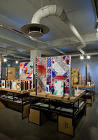
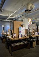
After many month we finally present the research results into 25 selected books from the “Collections Groenendijk”. During a one-hour event every student was presented with the opportunity to start-up a research into the manifest art or design concepts presented in these unique book designs. Designers Julia Born and Will Holder were presented through an interview-DVD made by the graduate program of the “Werkplaats Typografie Arnhem” for the Chaumont festival workshop 2005. Others projects, by Richard Niessen or Andy Warhol, were presented at an visit to the Stedelijk CS, where their books were displayed in context. Coralie Vogelaar (a Sandberg Master) came to visit us in person to give insight in her work and ideas and lecture on the concept behind her latest publication “Masters of Rietveld: design in the 21st Century” published recently by the Sandberg Insitute /Design [above: Niessen TM-City / Warhol Index-Book

A New Art World
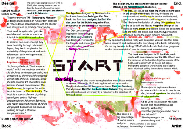
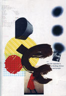
Caetano de Carvalho on “A New Art World” by Richard Niessen + Ad de Jong

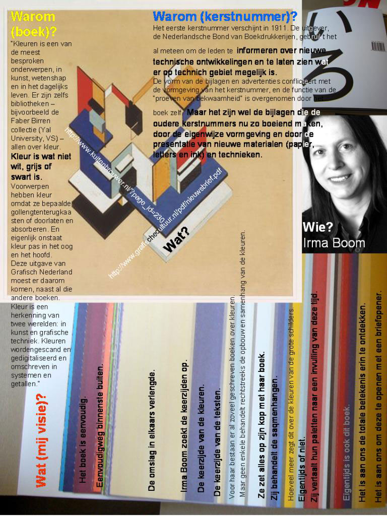
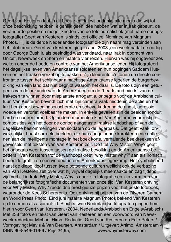
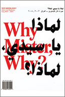
Research material was edited down to A4 sized guided tours into these subjects. All subjects presented in this list are also available as hard copy prints at the Research Folders at the library. The investigation focussed on the following book titles: Ed van der Elsken’s “Love Story in St Germain“, Irma Boom’s Grafisch Nederland 2005 on Color, “Start A New Art World”(published above), the acclaimed cooperation between photographer Geert van Kesteren and designer Linda van Deursen “Why Mister Why“, “Hhalo” by Julia Born and Rebecca Stephany’s “Archiving Today”project. Last 3 ladies all teaching at graphic design department.

SpoerrieThe ThingThe Thing Norm design Swiss TypeS M L XL

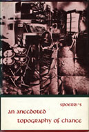
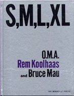
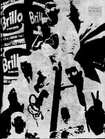
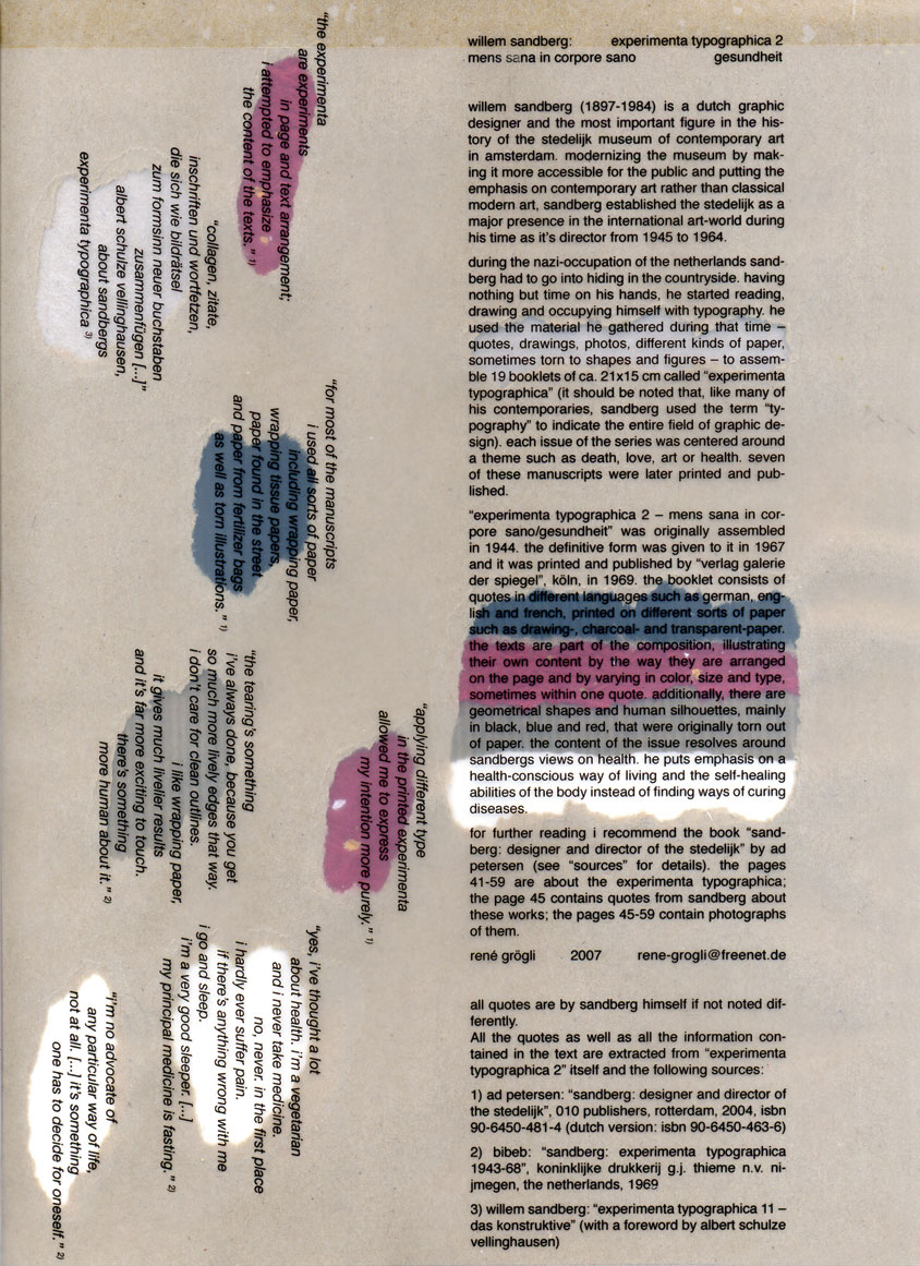
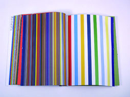
Daniel Spoerrie “An Anecdoted Topography of Chance“(extra info), Dieter Roth’s “Dieter Roth Band 10“, “S M L XL“by Koolhaas, Sandbergs “Experimenta Typographica“: Mens Sana in Corpore Sano and “Counterprint” by Karel Martens. “The Thing” by Norm designstudio, Andy Warhols classic 1967 “Index-Book”, Will Holder’s “Catalogue“: starring Gijs Muller, Edward Ruscha’s “Colored Peolple”, Richard Niessen’s piece de résistance TM-City.

Why Mister Why GN2005:Color

Sandberg Institute Master: Coralie Vogelaar with “The Photoshop” and “De Hedendaagse Ontwerper”, Gerald van der Kaap’s original ” HoverHover” and the monumental cooperation between Jonathan Barnbrook and Damien Hirst “I want to spend the rest of my life everywhere, with everyone, one to one, always, forever, now”.

Dot Dot Dot X Hester Permanent Food 15

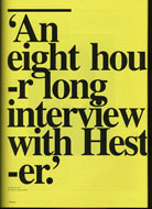
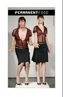
Finaly some highly conceptual magazine concepts like, the 1980′s I-D magazine 2, Jop van Bennekom with Re-magazine: ‘Hester‘, Permanent Food or Stuart Bailey’s “Dot Dot Dot” magazine.


Log in